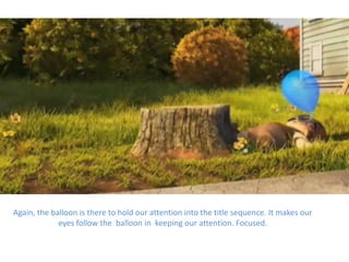
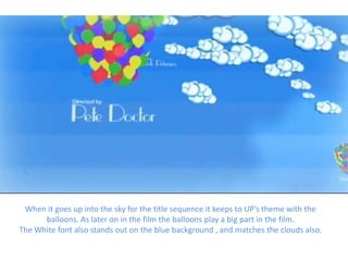
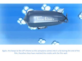
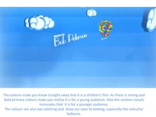
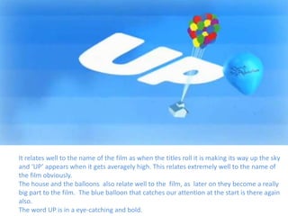
UP title sequence – Doug
          Burnett
      By Daisy Nicholls
This is the lead up to the UP title sequence. The little boy is running along with a
balloon and the blue balloon keeps your eyes focused onto the screen on what's
               happening as your eyes move along with the balloon.
This is the title sequence starting off . It has the makers Walt Disney to start it off to inform
 us that they are the makers. It has the words slightly tilted on the pavement which makes
     you tilt your head to look and read it, to make it more interesting for us as viewers.
The broken curb on the title sequence relates to paradise falls in which they visit later on
                                           in the film.
The font size is fairly small in consideration to the rest of the screen , which doesn't make
  it very eye catching in front of the cracked pavement, as little children may be more
                      interested in the boy jumping over the pavement.
Again, the balloon is there to hold our attention into the title sequence. It makes our
             eyes follow the balloon in keeping our attention. Focused.
When it goes up into the sky for the title sequence it keeps to UP’s theme with the
      balloons. As later on in the film the balloons play a big part in the film.
The White font also stands out on the blue background , and matches the clouds also.
Again, this keeps to the UP’s theme as this aeroplane comes into it a lot during the end of the
               film, therefore they have matched the credits with the film well.
The colours make you know straight away that it is a children’s film. As there is strong and
bold primary colours make you realise it is for a young audience. Also the cartoon clouds
                       insinuates that it is for a younger audience.
 The colours are also eye catching and draw our eyes to looking, especially the colourful
                                         balloons.
It relates well to the name of the film as when the titles roll it is making its way up the sky
and ‘UP’ appears when it gets averagely high. This relates extremely well to the name of
the film obviously.
The house and the balloons also relate well to the film, as later on they become a really
big part to the film. The blue balloon that catches our attention at the start is there again
also.
The word UP is in a eye-catching and bold.

Up title sequence – doug burnett

  • 1.
    UP title sequence– Doug Burnett By Daisy Nicholls
  • 2.
    This is thelead up to the UP title sequence. The little boy is running along with a balloon and the blue balloon keeps your eyes focused onto the screen on what's happening as your eyes move along with the balloon.
  • 3.
    This is thetitle sequence starting off . It has the makers Walt Disney to start it off to inform us that they are the makers. It has the words slightly tilted on the pavement which makes you tilt your head to look and read it, to make it more interesting for us as viewers.
  • 4.
    The broken curbon the title sequence relates to paradise falls in which they visit later on in the film. The font size is fairly small in consideration to the rest of the screen , which doesn't make it very eye catching in front of the cracked pavement, as little children may be more interested in the boy jumping over the pavement.
  • 5.
    Again, the balloonis there to hold our attention into the title sequence. It makes our eyes follow the balloon in keeping our attention. Focused.
  • 6.
    When it goesup into the sky for the title sequence it keeps to UP’s theme with the balloons. As later on in the film the balloons play a big part in the film. The White font also stands out on the blue background , and matches the clouds also.
  • 7.
    Again, this keepsto the UP’s theme as this aeroplane comes into it a lot during the end of the film, therefore they have matched the credits with the film well.
  • 8.
    The colours makeyou know straight away that it is a children’s film. As there is strong and bold primary colours make you realise it is for a young audience. Also the cartoon clouds insinuates that it is for a younger audience. The colours are also eye catching and draw our eyes to looking, especially the colourful balloons.
  • 9.
    It relates wellto the name of the film as when the titles roll it is making its way up the sky and ‘UP’ appears when it gets averagely high. This relates extremely well to the name of the film obviously. The house and the balloons also relate well to the film, as later on they become a really big part to the film. The blue balloon that catches our attention at the start is there again also. The word UP is in a eye-catching and bold.