A collection oftools and techniques that are used to
convert data into meaningful information.
Descriptive Biostatics
Inferential Biostatics
Statistics:
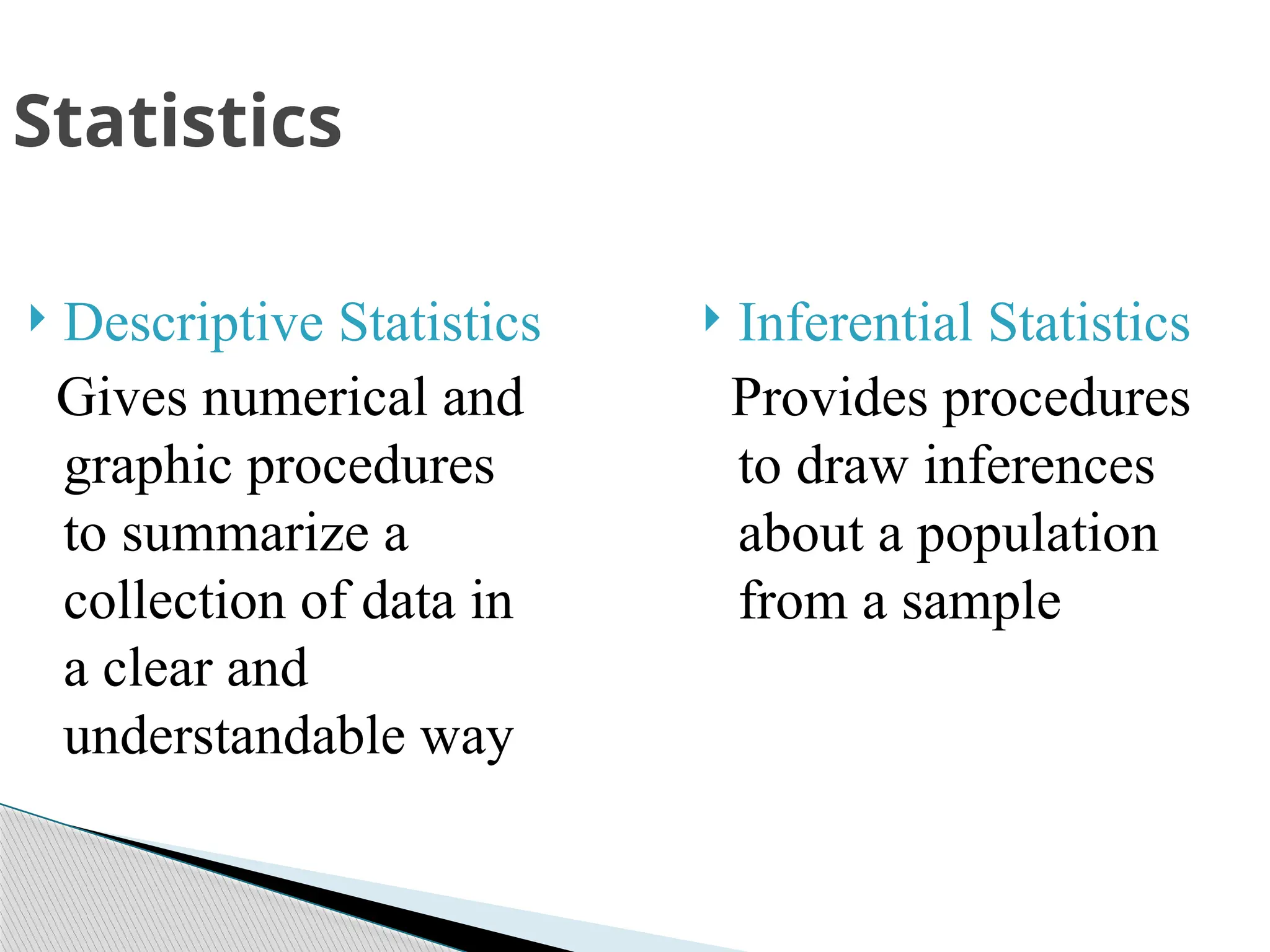
Descriptive Statistics
Givesnumerical and
graphic procedures
to summarize a
collection of data in
a clear and
understandable way
Inferential Statistics
Provides procedures
to draw inferences
about a population
from a sample
Statistics
5.
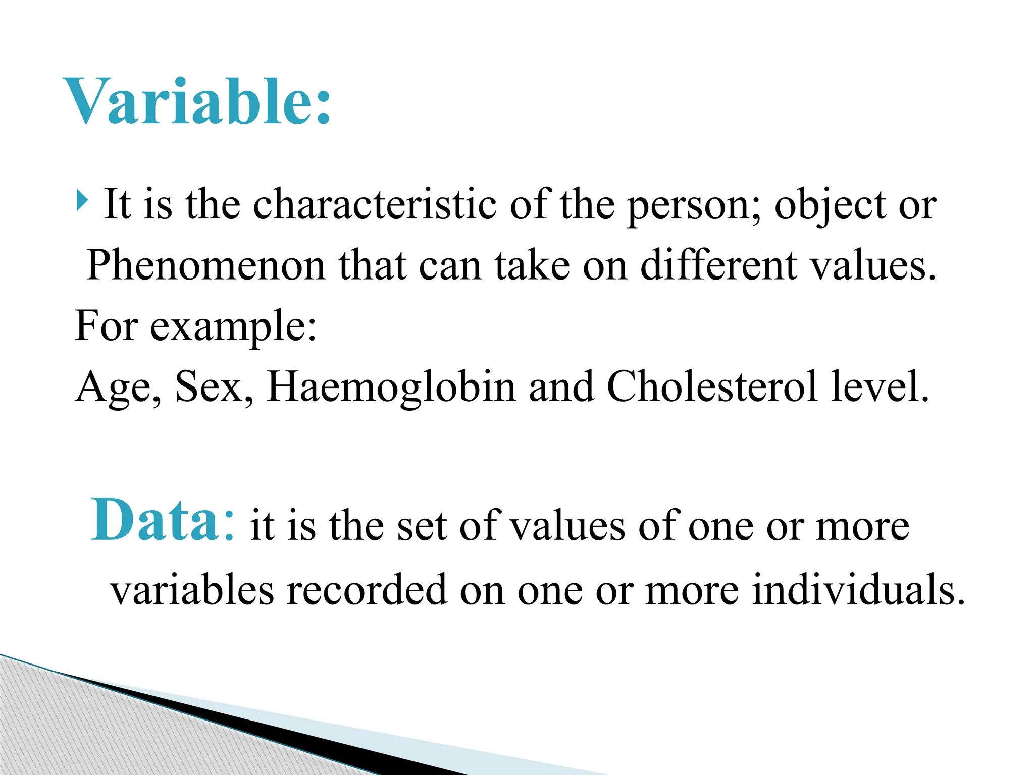
It isthe characteristic of the person; object or
Phenomenon that can take on different values.
For example:
Age, Sex, Haemoglobin and Cholesterol level.
Data: it is the set of values of one or more
variables recorded on one or more individuals.
Variable:
6.
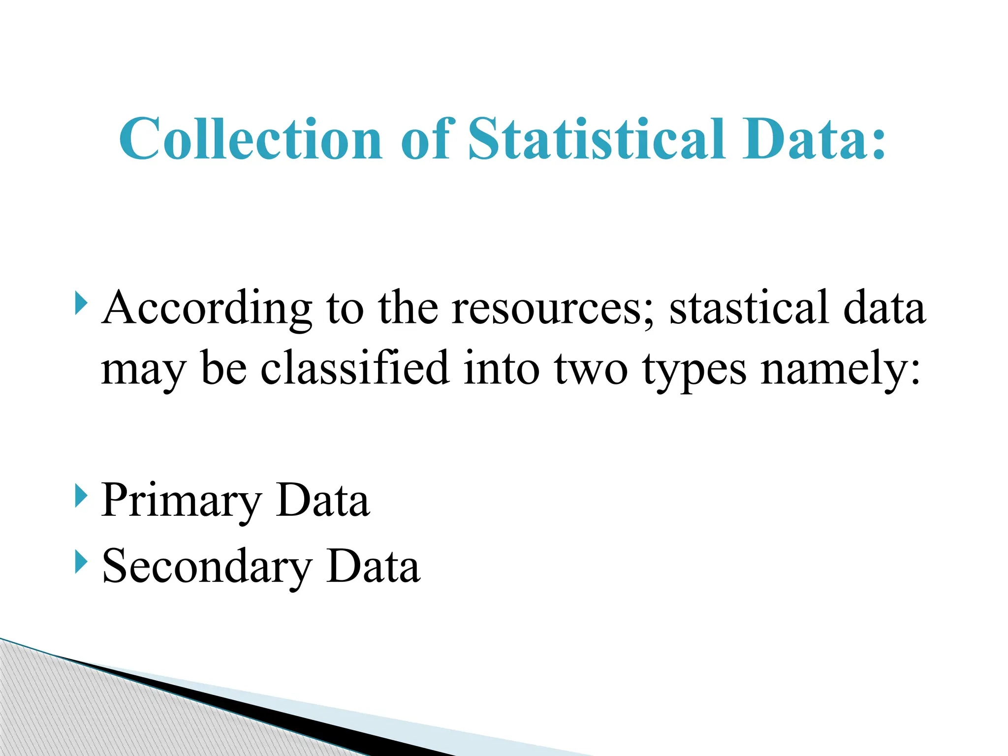
According tothe resources; stastical data
may be classified into two types namely:
Primary Data
Secondary Data
Collection of Statistical Data:
7.
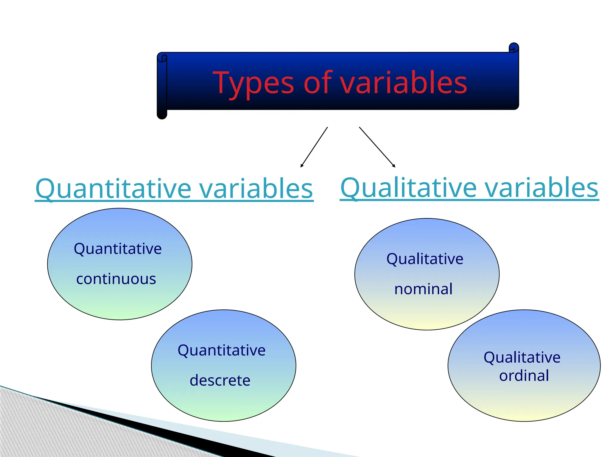
Types of Data
Primary Data
Secondary Data
QualitativeData
quantitativeData
8.
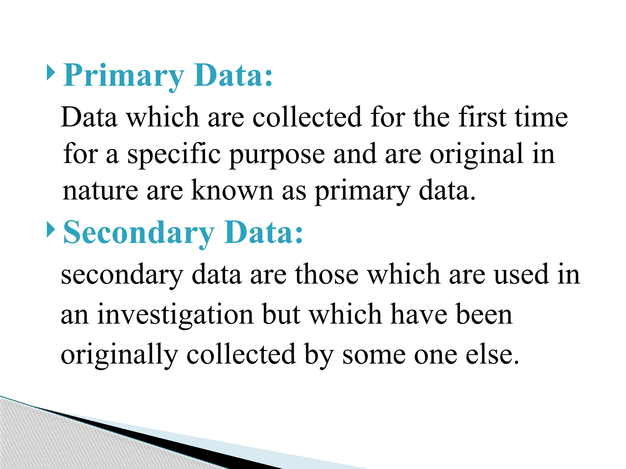
Primary Data:
Datawhich are collected for the first time
for a specific purpose and are original in
nature are known as primary data.
Secondary Data:
secondary data are those which are used in
an investigation but which have been
originally collected by some one else.
9.
Primary dataYour own questionnaire, survey,
information
Data from a book newspaper magazine, or
internet
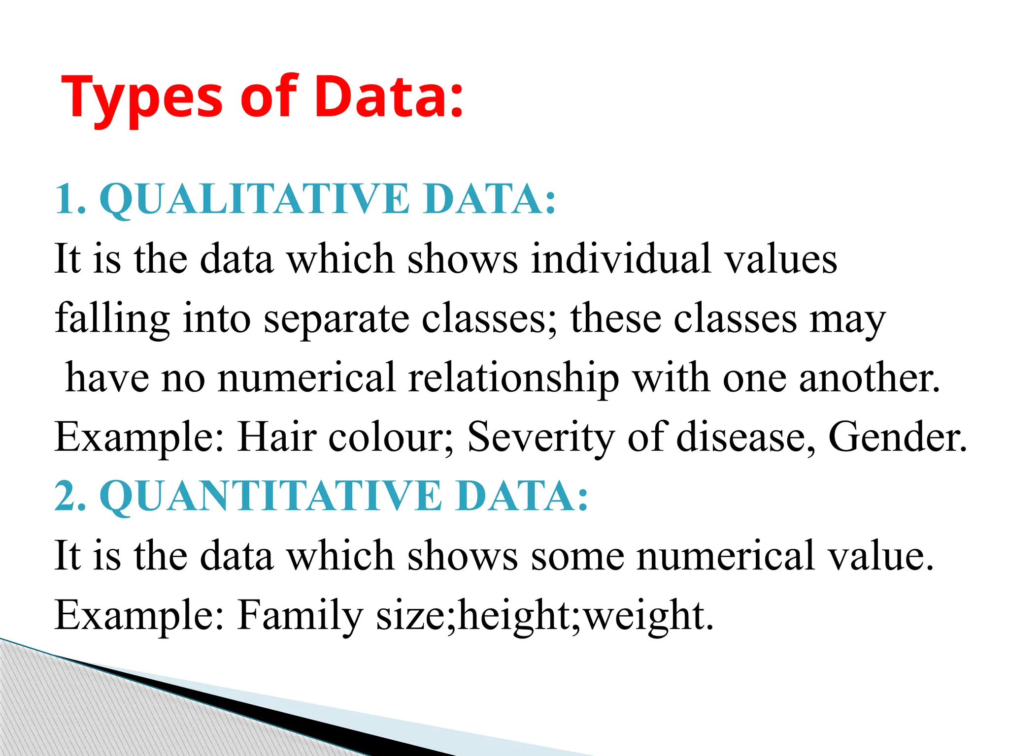
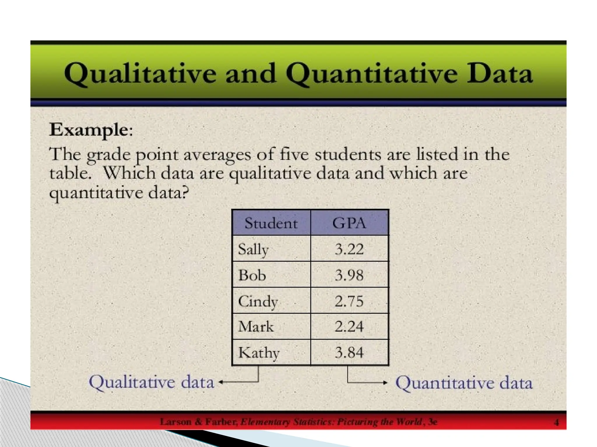
1. QUALITATIVE DATA:
Itis the data which shows individual values
falling into separate classes; these classes may
have no numerical relationship with one another.
Example: Hair colour; Severity of disease, Gender.
2. QUANTITATIVE DATA:
It is the data which shows some numerical value.
Example: Family size;height;weight.
Types of Data:
12.
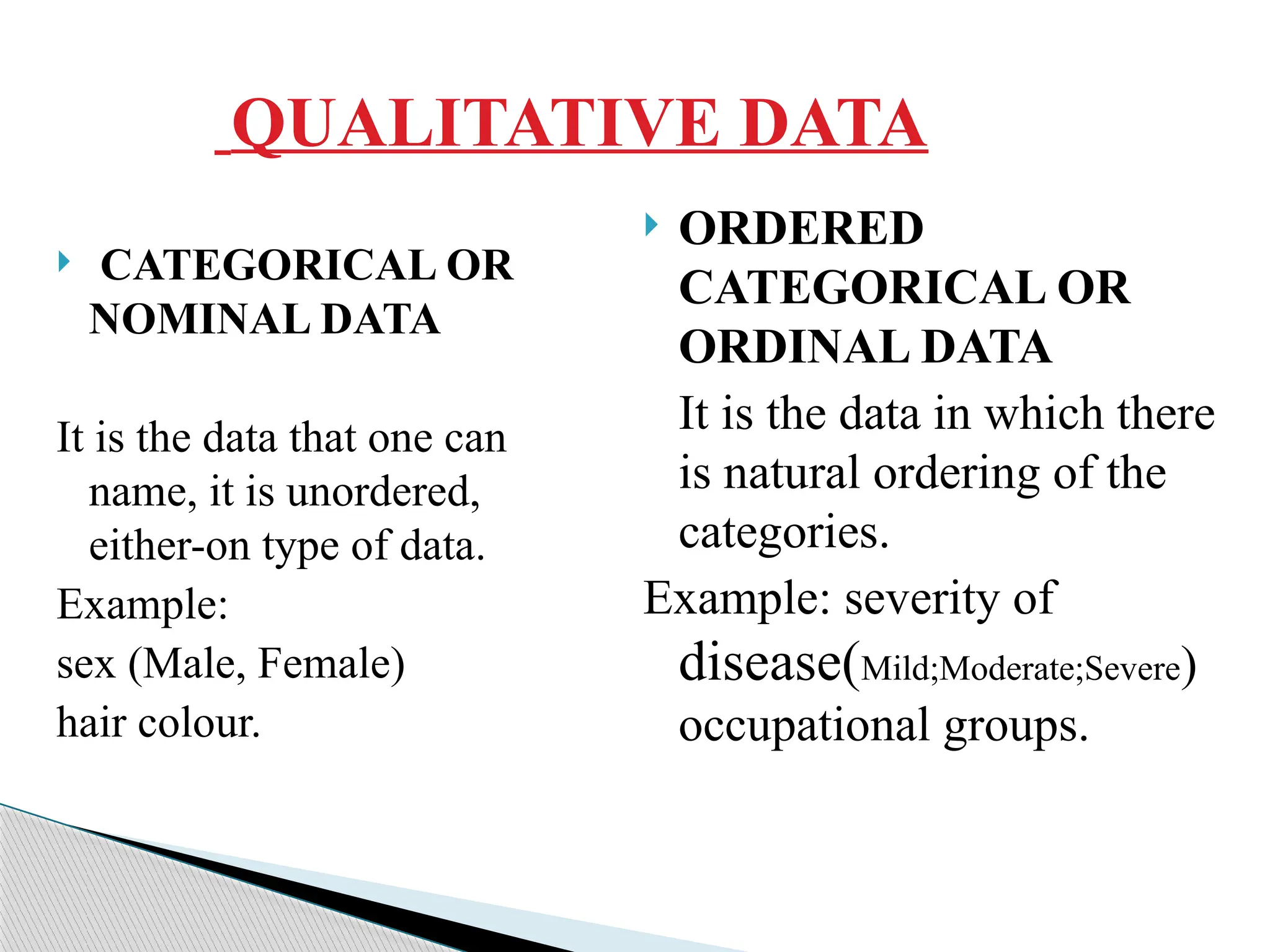
QUALITATIVE DATA
CATEGORICALOR
NOMINAL DATA
It is the data that one can
name, it is unordered,
either-on type of data.
Example:
sex (Male, Female)
hair colour.
ORDERED
CATEGORICAL OR
ORDINAL DATA
It is the data in which there
is natural ordering of the
categories.
Example: severity of
disease(Mild;Moderate;Severe)
occupational groups.
13.
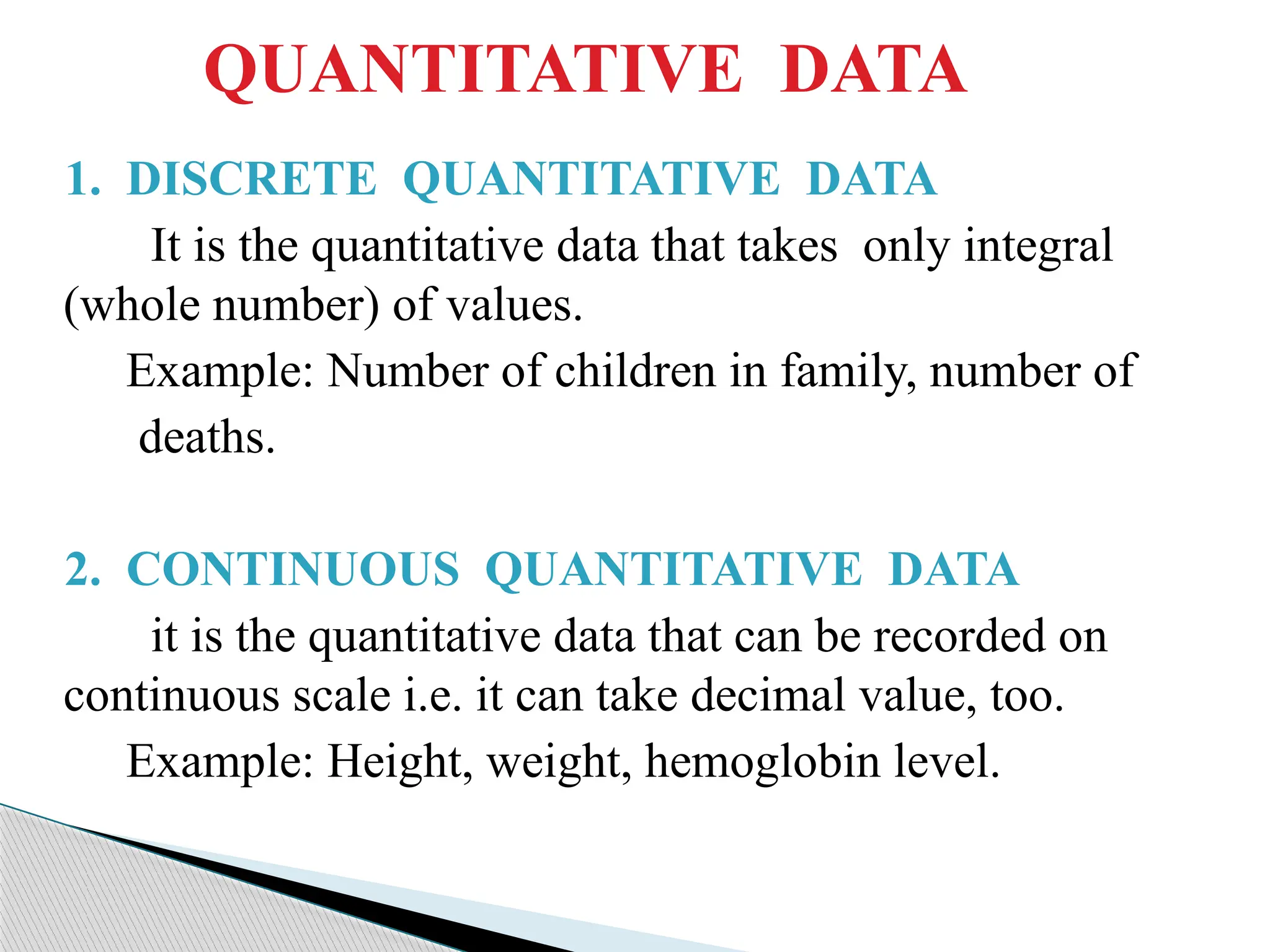
QUANTITATIVE DATA
1. DISCRETEQUANTITATIVE DATA
It is the quantitative data that takes only integral
(whole number) of values.
Example: Number of children in family, number of
deaths.
2. CONTINUOUS QUANTITATIVE DATA
it is the quantitative data that can be recorded on
continuous scale i.e. it can take decimal value, too.
Example: Height, weight, hemoglobin level.
15.
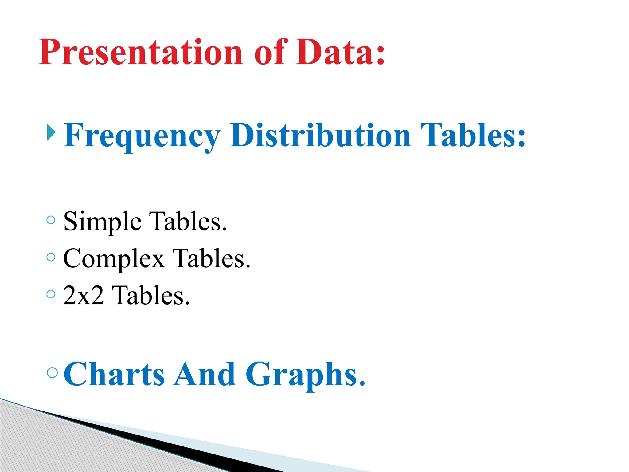
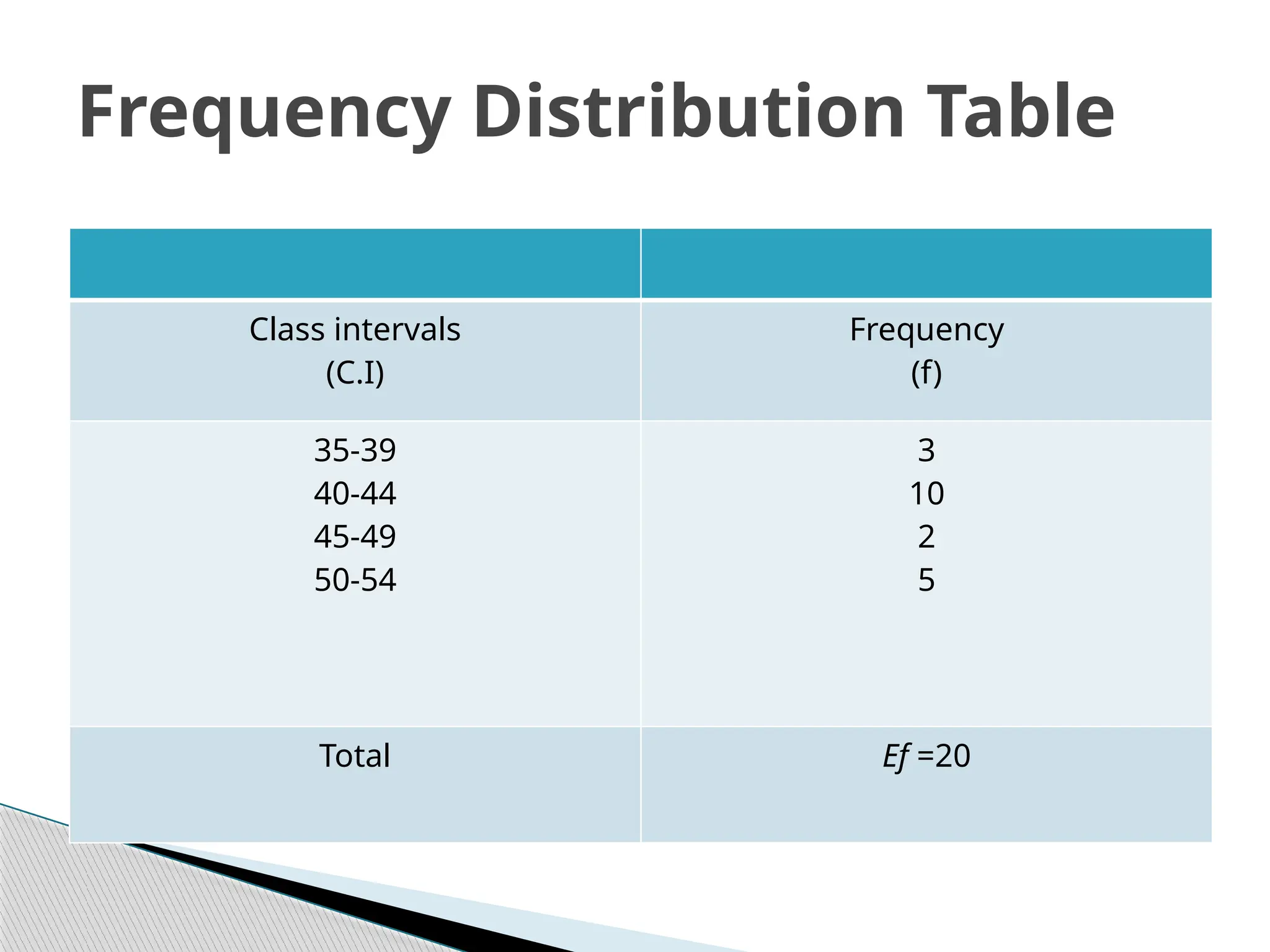
Frequency DistributionTables:
o Simple Tables.
o Complex Tables.
o 2x2 Tables.
oCharts And Graphs.
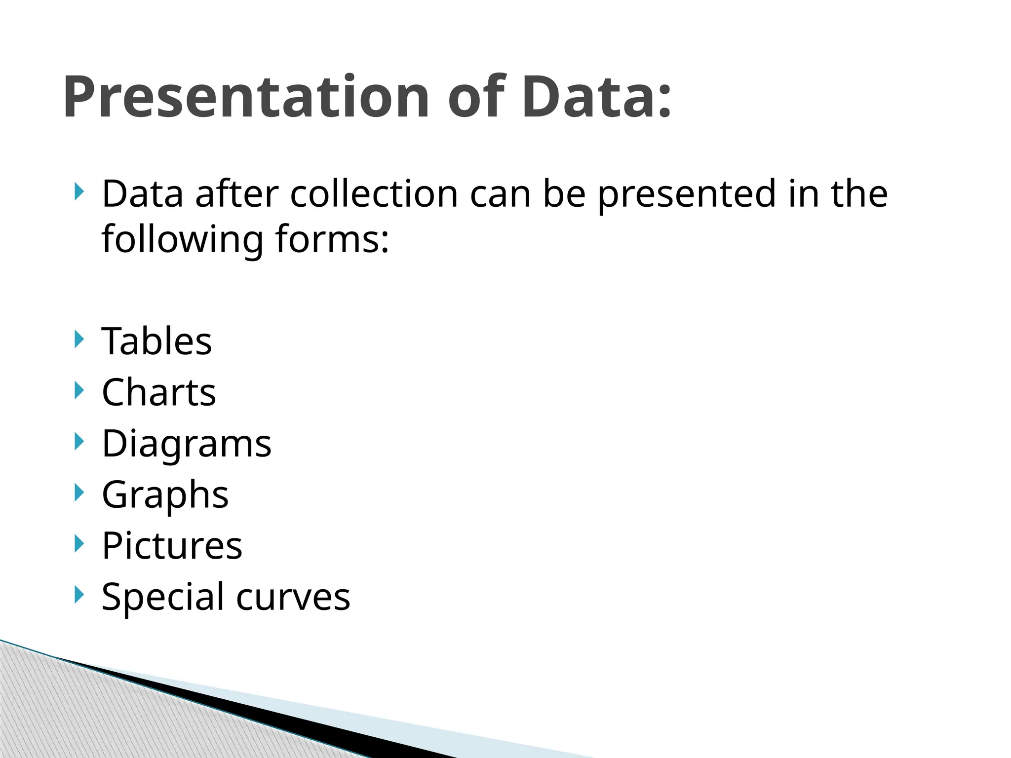
Presentation of Data:
16.
Data aftercollection can be presented in the
following forms:
Tables
Charts
Diagrams
Graphs
Pictures
Special curves
Presentation of Data:
17.
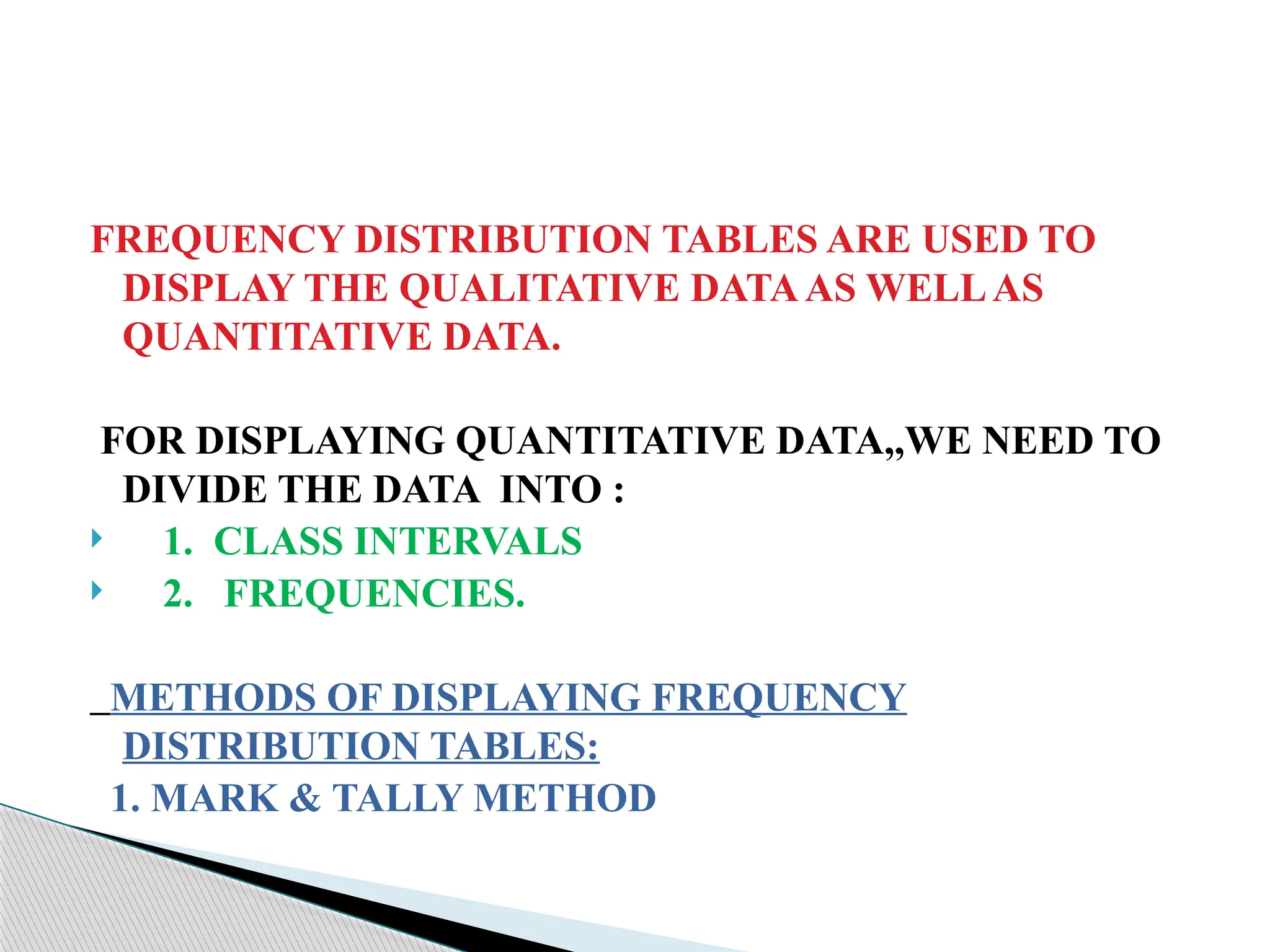
FREQUENCY DISTRIBUTION TABLESARE USED TO
DISPLAY THE QUALITATIVE DATAAS WELLAS
QUANTITATIVE DATA.
FOR DISPLAYING QUANTITATIVE DATA,,WE NEED TO
DIVIDE THE DATA INTO :
1. CLASS INTERVALS
2. FREQUENCIES.
METHODS OF DISPLAYING FREQUENCY
DISTRIBUTION TABLES:
1. MARK & TALLY METHOD
18.
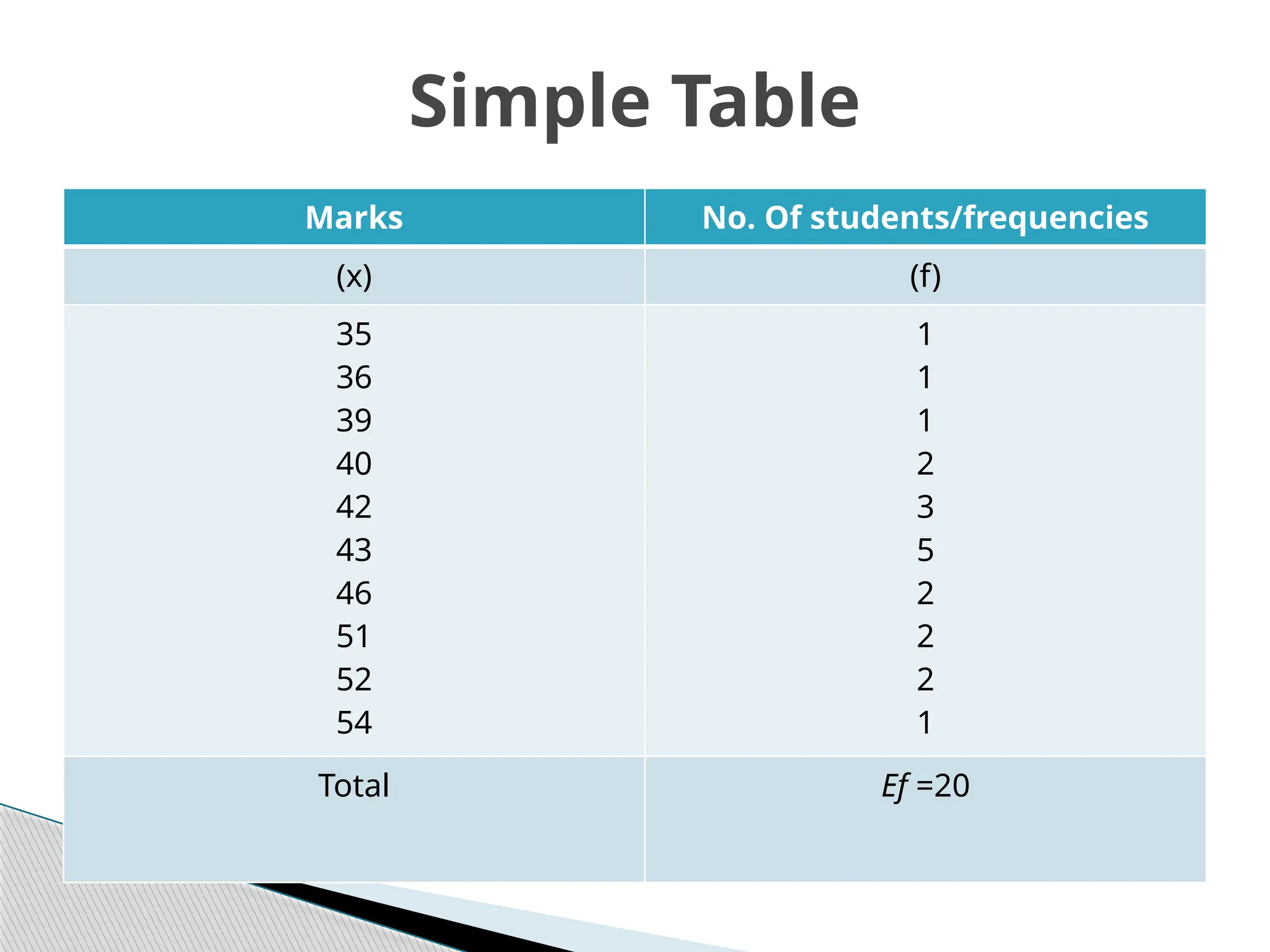
Marks No. Ofstudents/frequencies
(x) (f)
35
36
39
40
42
43
46
51
52
54
1
1
1
2
3
5
2
2
2
1
Total Ef =20
Simple Table
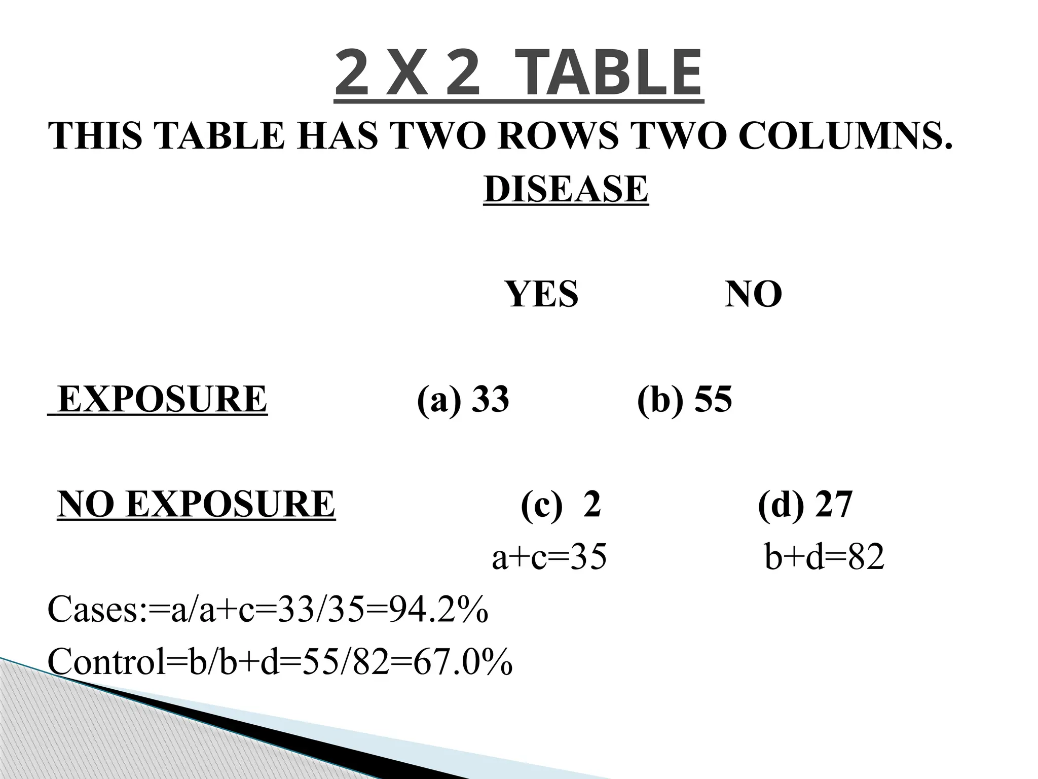
THIS TABLE HASTWO ROWS TWO COLUMNS.
DISEASE
YES NO
EXPOSURE (a) 33 (b) 55
NO EXPOSURE (c) 2 (d) 27
a+c=35 b+d=82
Cases:=a/a+c=33/35=94.2%
Control=b/b+d=55/82=67.0%
2 X 2 TABLE
22.
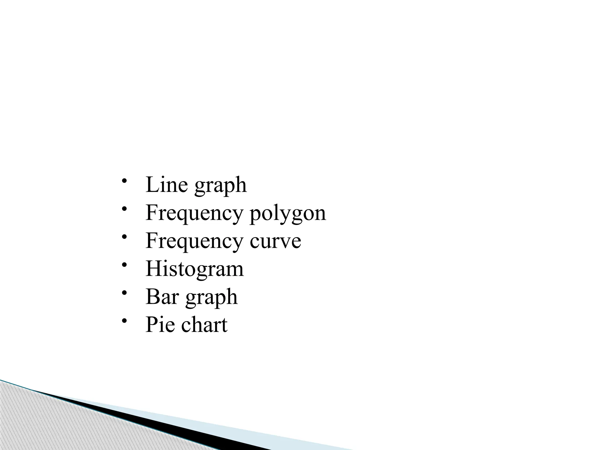
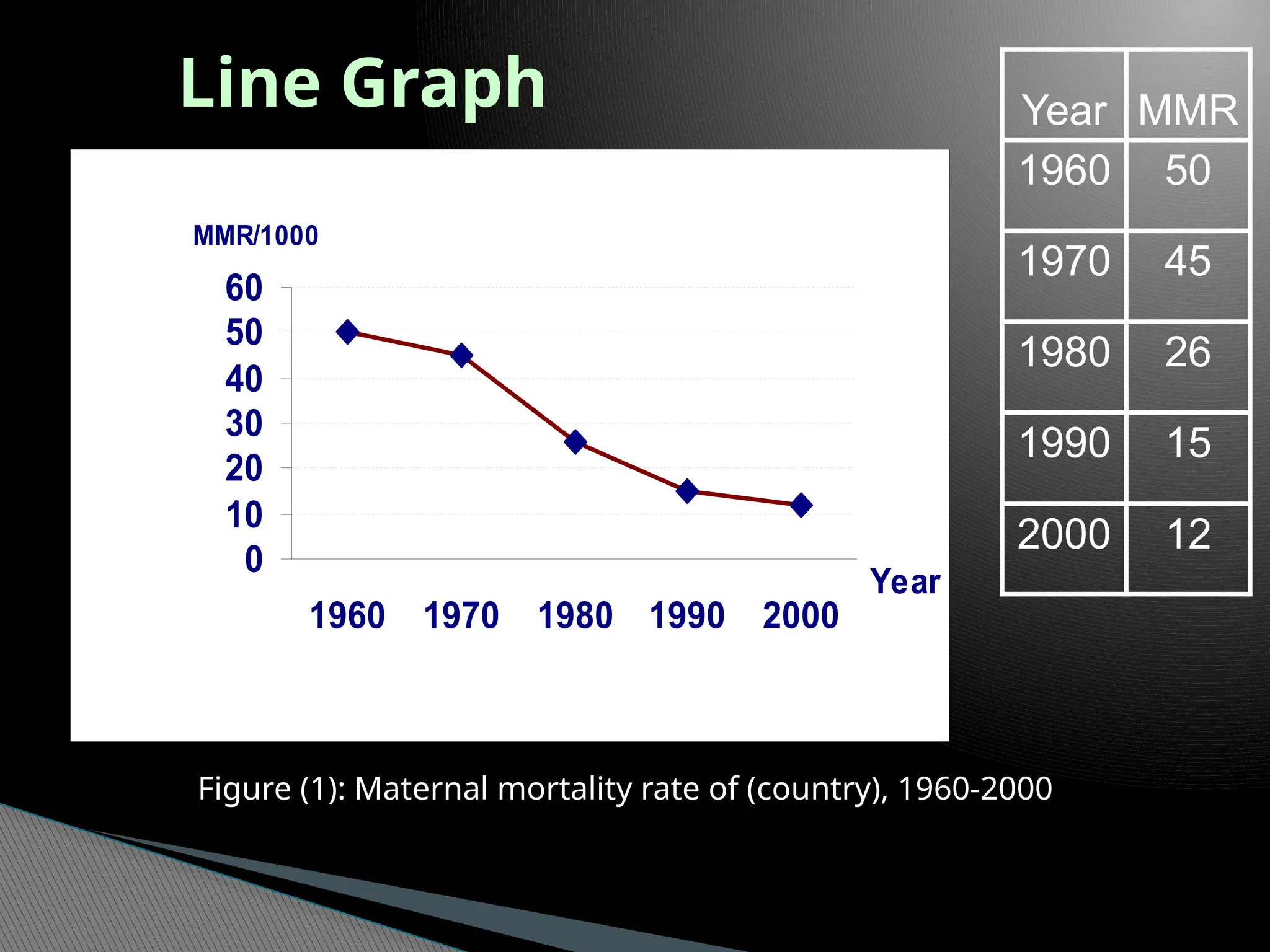
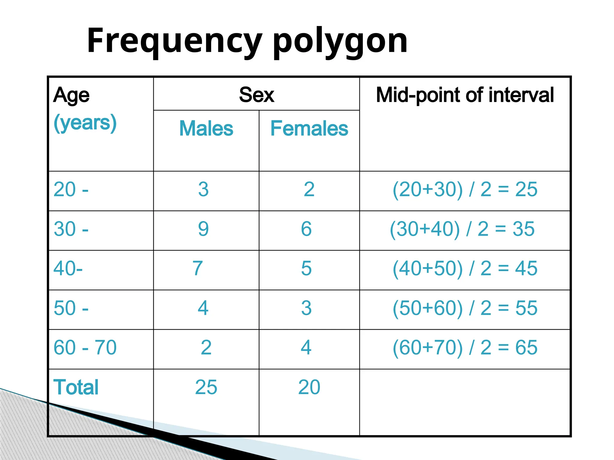
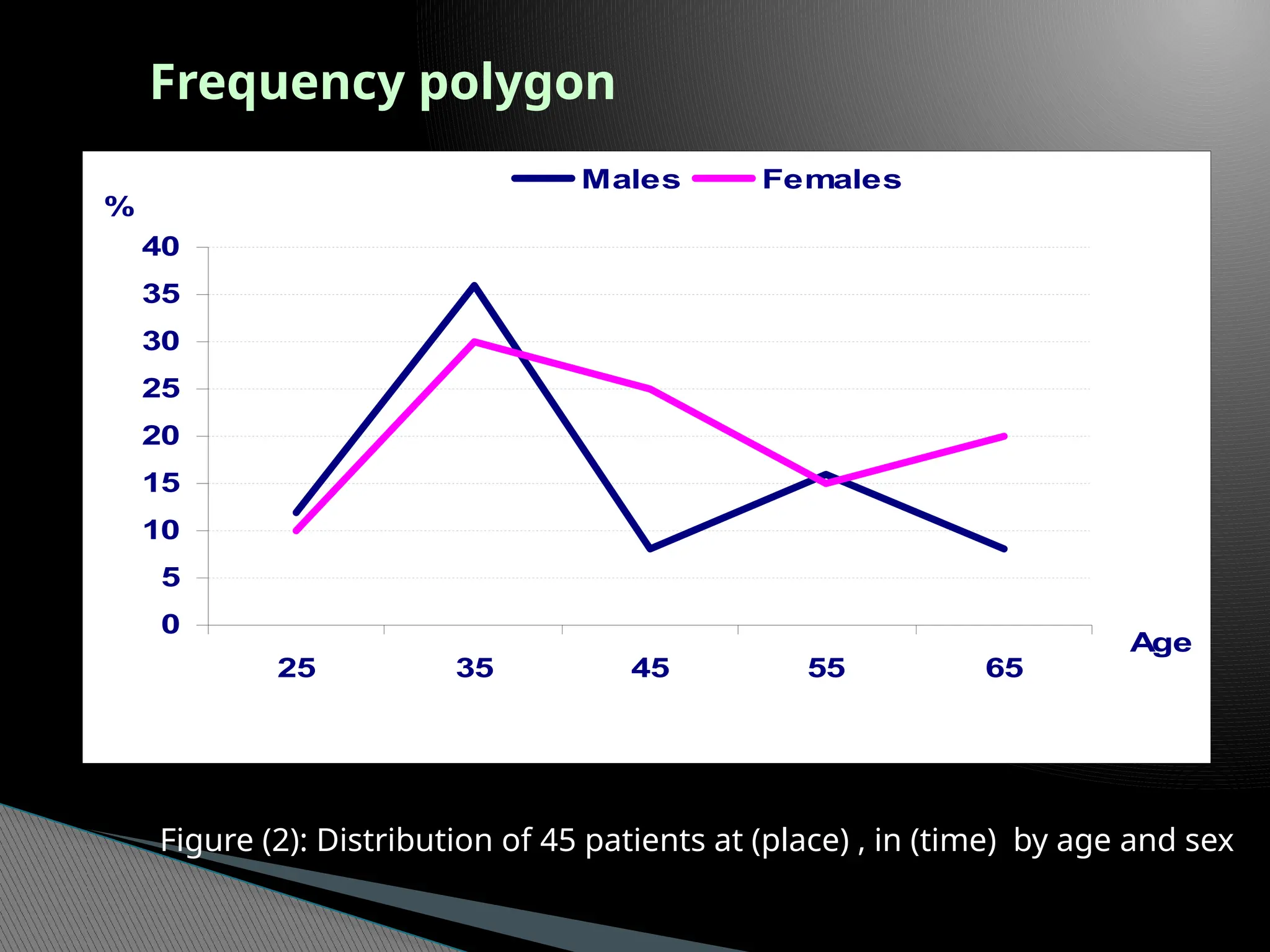
• Line graph
•Frequency polygon
• Frequency curve
• Histogram
• Bar graph
• Pie chart
23.
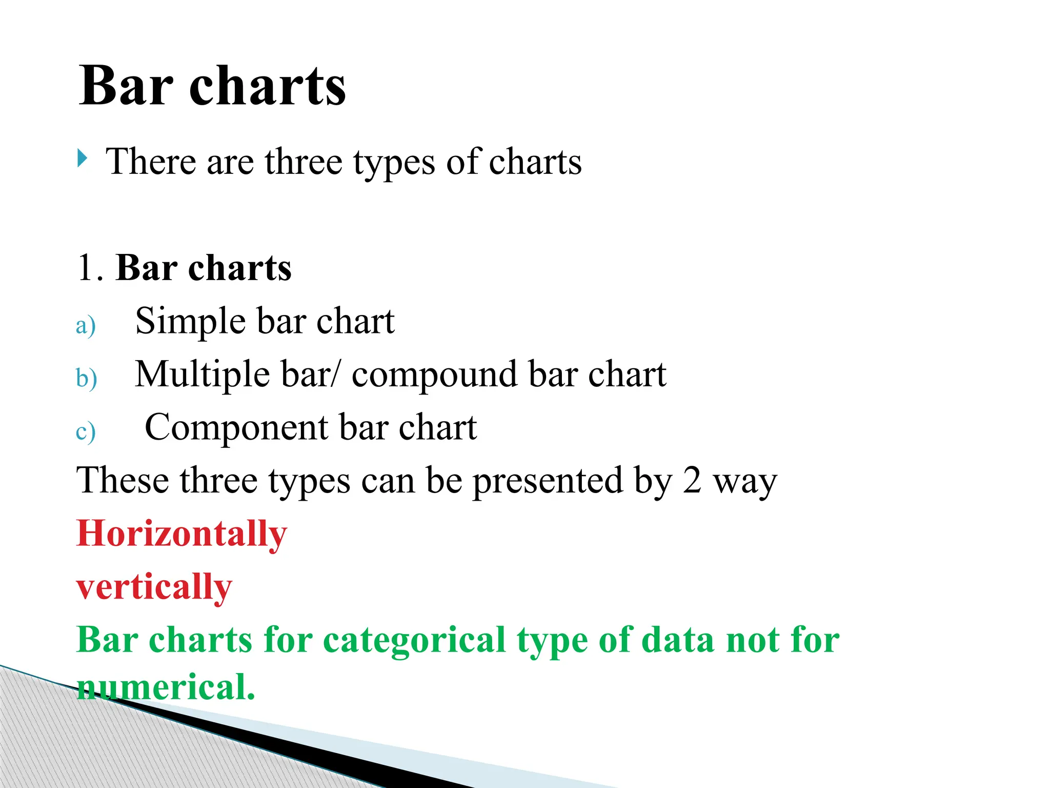
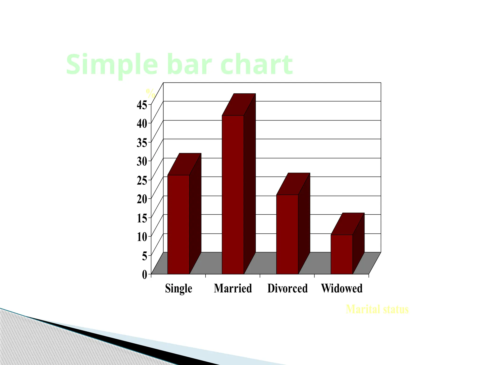
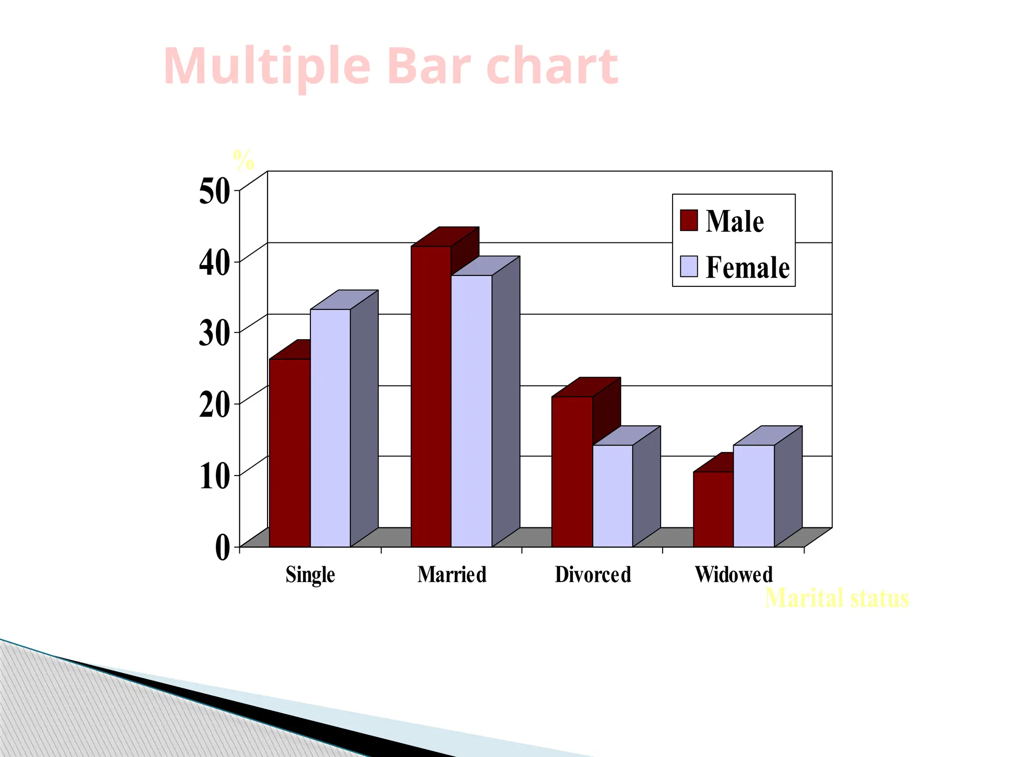
There arethree types of charts
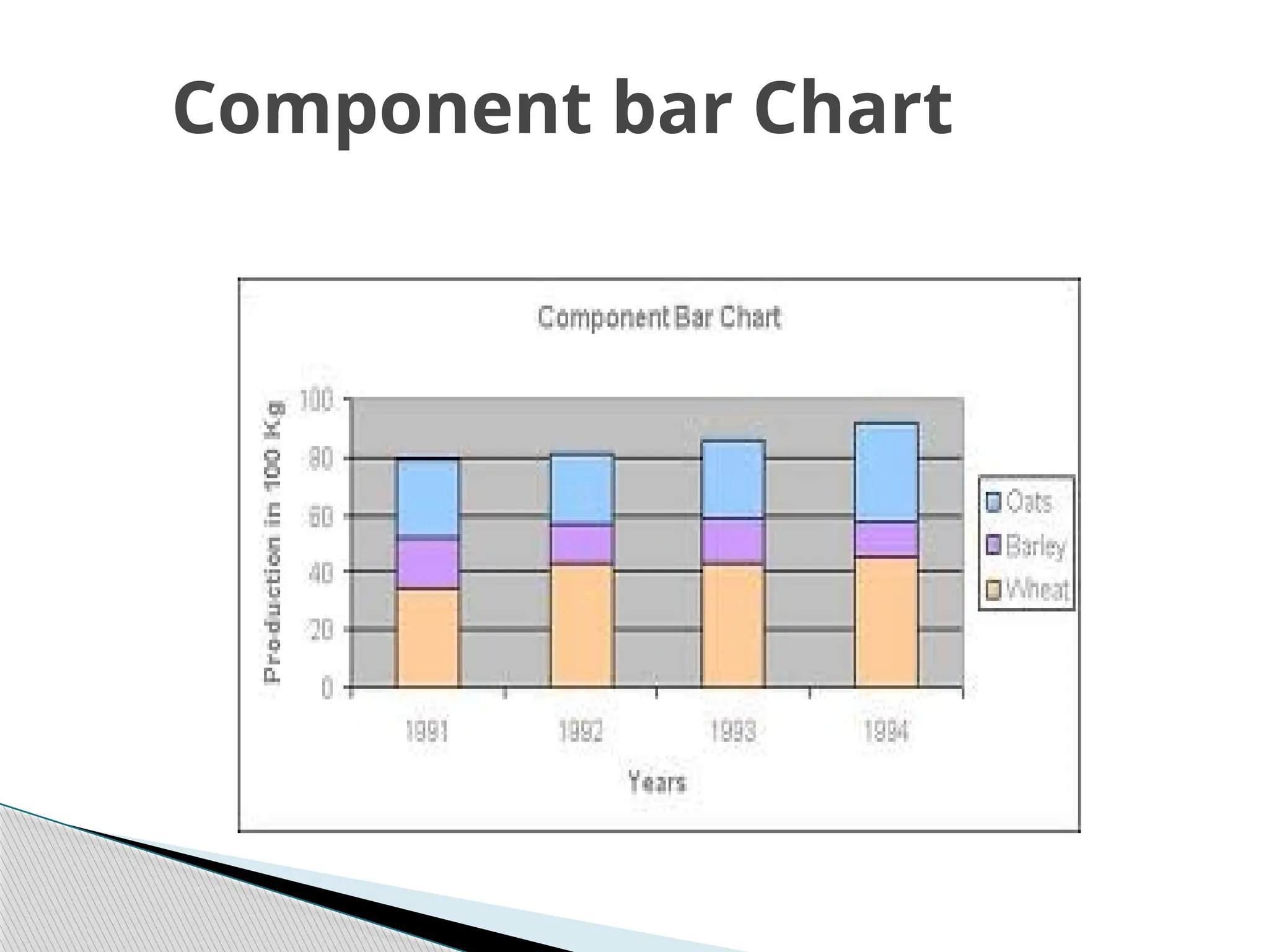
1. Bar charts
a) Simple bar chart
b) Multiple bar/ compound bar chart
c) Component bar chart
These three types can be presented by 2 way
Horizontally
vertically
Bar charts for categorical type of data not for
numerical.
Bar charts
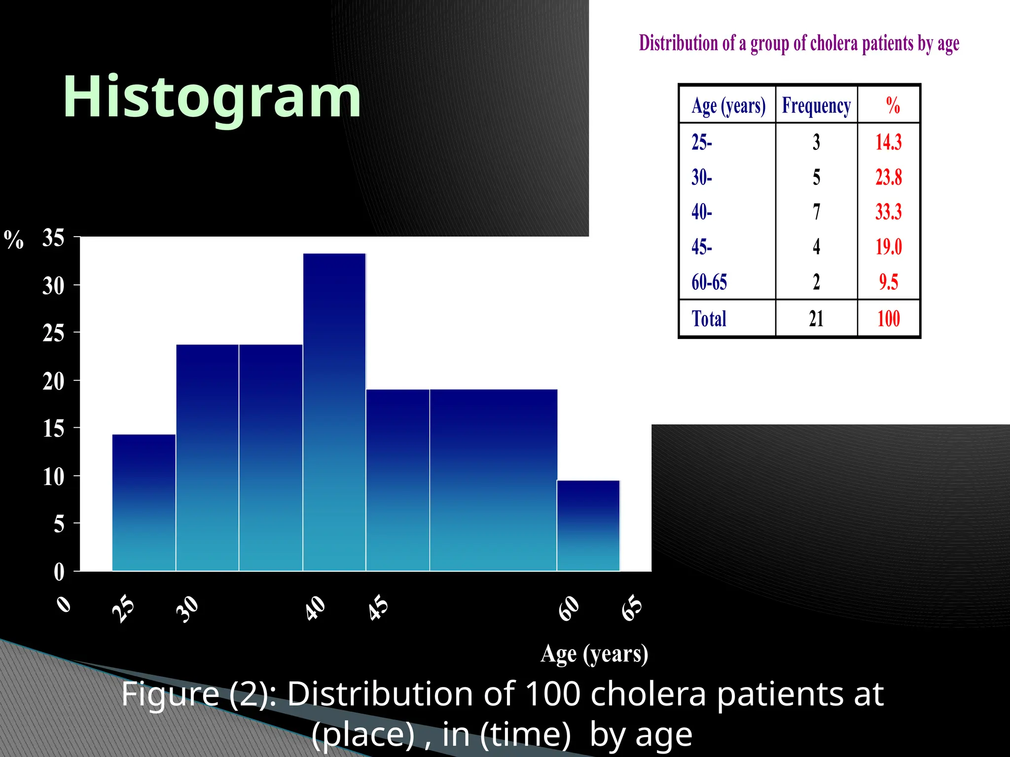
Histogram
Distribution of agroup of cholera patients by age
Age (years) Frequency %
25-
30-
40-
45-
60-65
3
5
7
4
2
14.3
23.8
33.3
19.0
9.5
Total 21 100
0
5
10
15
20
25
30
35
Age (years)
%
Figure (2): Distribution of 100 cholera patients at
(place) , in (time) by age
31.
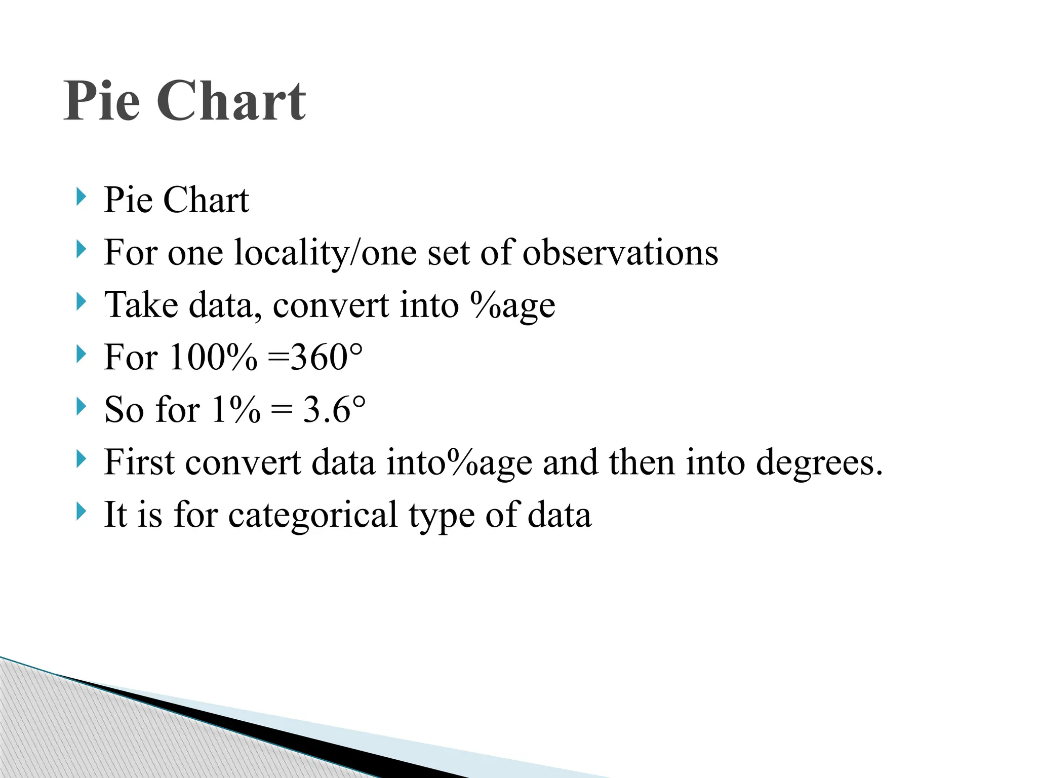
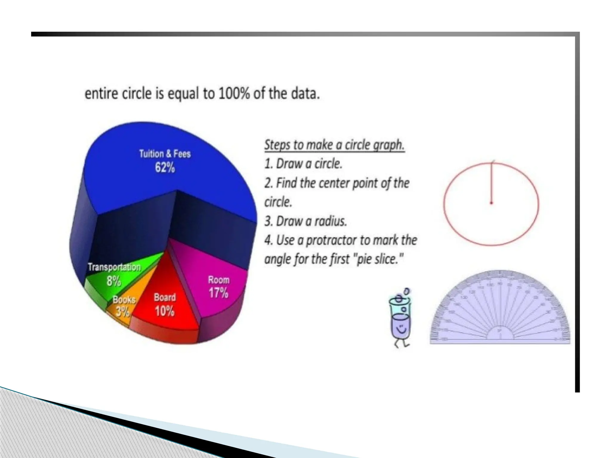
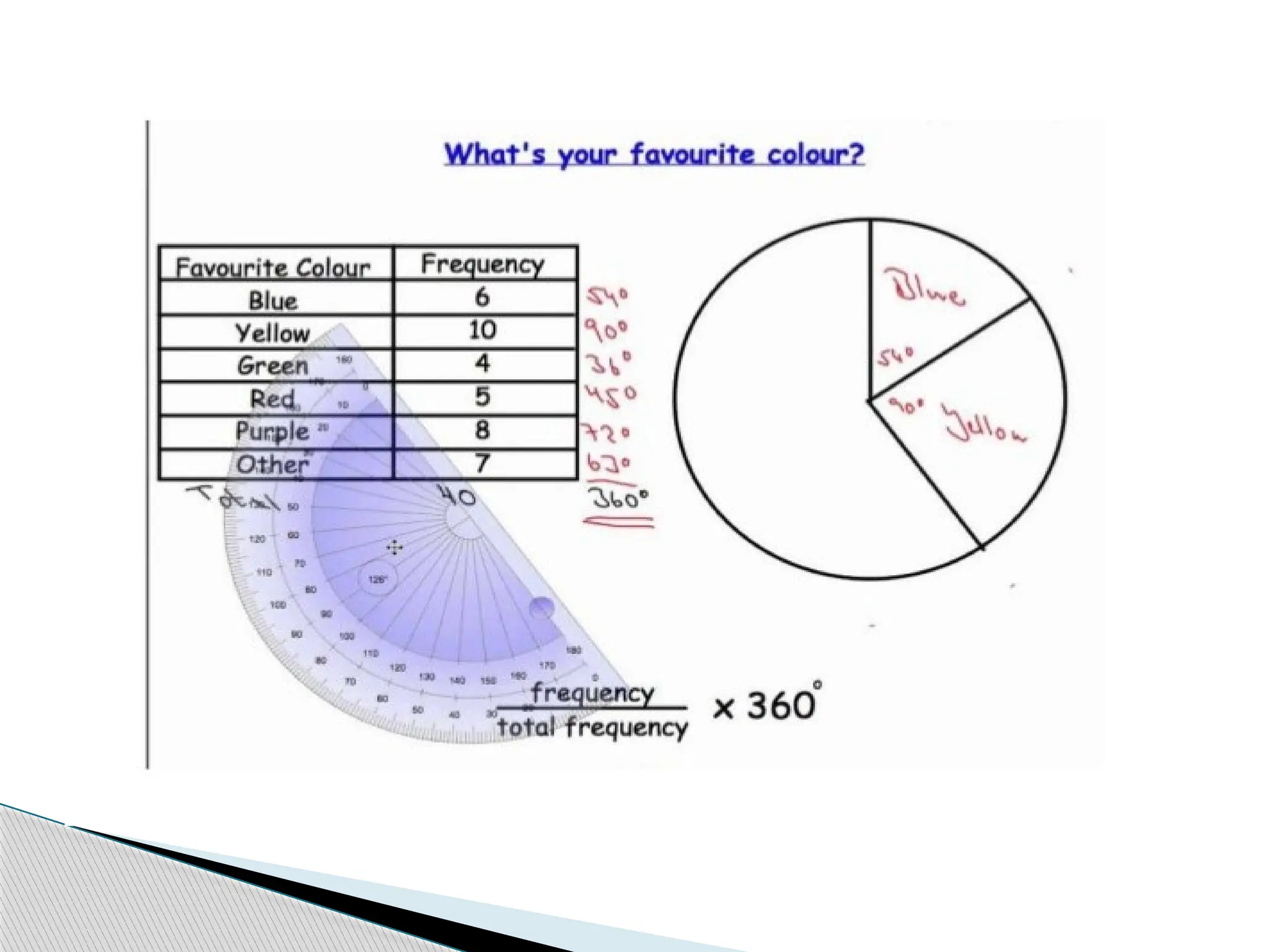
Pie Chart
For one locality/one set of observations
Take data, convert into %age
For 100% =360°
So for 1% = 3.6°
First convert data into%age and then into degrees.
It is for categorical type of data
Pie Chart