Storyboard 2nd draft
•Download as DOC, PDF•
0 likes•92 views
2ND draft storyboard
Report
Share
Report
Share

Recommended
Improving my movie magazine
The document describes improvements made to a movie magazine. The writer deleted a star graphic advertising free cinema tickets and instead wrote about winning tickets inside. They also added more "sell lines" to make the magazine cover appeal to a wider audience rather than just being about one film. These included mentioning One Direction and Twilight to attract teenagers. The writer hoped including these popular topics would encourage readers to buy the magazine to read about the featured movie as well.
My storyboard
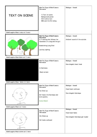
The storyboard document outlines 24 shots to be used in a film trailer. Shot types include establishing shots, close-ups, tracking shots, and text-on-scene shots. Camera movements include zooms, pans, and jumps. Dialogue includes non-diegetic sound effects, ambient noise, and a voiceover. The shots follow a girl running through woods with increasing tension, then cut to text slides with the director/actors/film title before ending on a fade to darkness.
Changing movie trailer after audience feedback
The document discusses changes made to a movie trailer based on audience feedback. The creator added more sound effects like a dog whine and loud bang from a website to increase tension. Shots in the trailer were also made darker with low key lighting to make the viewer feel the villain is always present and create a more tense viewing experience.
Making my film trailer
The document discusses the process of editing a movie trailer, including ordering shots, selecting good shots, adding non-diegetic sound, adjusting opacity of eye shots, formatting glowing text, including establishing shots of woods, and issues with file corruption requiring re-exporting the trailer to share it on YouTube.
Making magazine cover
The document describes creating a magazine cover using Serif PhotoPlus X5 and Serif DrawPlus X5. The creator used a different picture than the movie poster, keeping the silhouette in the distance over a wooded background instead of black. Text was added in Serif DrawPlus for more options. Additional smaller pictures were included at the bottom to resemble real magazines, with the cover focusing on the mystery of the movie.
Using prezi
Using Prezi, the author was able to format text with different colors, fonts, and alignments on slides and insert images and YouTube videos by copying links. The author also learned how to delete unnecessary slides from the presentation path or create new paths to add additional content.
Making my movie poster
The document discusses the process of creating movie posters using PhotoPlus X5 and SerifDraw X5 software. Key steps included inserting background images and eyes as layers, editing the eyes to make them stand out, experimenting with text placement and effects, and adjusting silhouette images. The creator tried different designs, such as adding dripping blood text and movie stills, before settling on a poster with blood dripping down and credits at the bottom to promote the fictional movie for Halloween.
Making movie trailer 2
The filmmaker reused shots and sounds from the start of their movie trailer. They included a part where the actress speaks directly to the camera that they did not like, but felt was important to show someone is watching her. They also copied a 5-6 second section of quick flashing shots from the Women in Black movie trailer and added a non-diegetic sound to it for their own trailer.
Recommended
Improving my movie magazine
The document describes improvements made to a movie magazine. The writer deleted a star graphic advertising free cinema tickets and instead wrote about winning tickets inside. They also added more "sell lines" to make the magazine cover appeal to a wider audience rather than just being about one film. These included mentioning One Direction and Twilight to attract teenagers. The writer hoped including these popular topics would encourage readers to buy the magazine to read about the featured movie as well.
My storyboard
The storyboard document outlines 24 shots to be used in a film trailer. Shot types include establishing shots, close-ups, tracking shots, and text-on-scene shots. Camera movements include zooms, pans, and jumps. Dialogue includes non-diegetic sound effects, ambient noise, and a voiceover. The shots follow a girl running through woods with increasing tension, then cut to text slides with the director/actors/film title before ending on a fade to darkness.
Changing movie trailer after audience feedback
The document discusses changes made to a movie trailer based on audience feedback. The creator added more sound effects like a dog whine and loud bang from a website to increase tension. Shots in the trailer were also made darker with low key lighting to make the viewer feel the villain is always present and create a more tense viewing experience.
Making my film trailer
The document discusses the process of editing a movie trailer, including ordering shots, selecting good shots, adding non-diegetic sound, adjusting opacity of eye shots, formatting glowing text, including establishing shots of woods, and issues with file corruption requiring re-exporting the trailer to share it on YouTube.
Making magazine cover
The document describes creating a magazine cover using Serif PhotoPlus X5 and Serif DrawPlus X5. The creator used a different picture than the movie poster, keeping the silhouette in the distance over a wooded background instead of black. Text was added in Serif DrawPlus for more options. Additional smaller pictures were included at the bottom to resemble real magazines, with the cover focusing on the mystery of the movie.
Using prezi
Using Prezi, the author was able to format text with different colors, fonts, and alignments on slides and insert images and YouTube videos by copying links. The author also learned how to delete unnecessary slides from the presentation path or create new paths to add additional content.
Making my movie poster
The document discusses the process of creating movie posters using PhotoPlus X5 and SerifDraw X5 software. Key steps included inserting background images and eyes as layers, editing the eyes to make them stand out, experimenting with text placement and effects, and adjusting silhouette images. The creator tried different designs, such as adding dripping blood text and movie stills, before settling on a poster with blood dripping down and credits at the bottom to promote the fictional movie for Halloween.
Making movie trailer 2
The filmmaker reused shots and sounds from the start of their movie trailer. They included a part where the actress speaks directly to the camera that they did not like, but felt was important to show someone is watching her. They also copied a 5-6 second section of quick flashing shots from the Women in Black movie trailer and added a non-diegetic sound to it for their own trailer.
Making magazine cover
The document describes creating a magazine cover for a movie using photo editing software. The creator used different photos for the movie poster and magazine cover, adding text and additional photos to the bottom of the cover. Bright colors and a competition were included to attract readers, and the magazine was priced at £1.50 with an October 2013 date to coincide with the movie's release.
Improving my movie poster
The document summarizes changes made to a movie poster based on feedback. The key points are:
1) The image was made brighter to better see the eyes and face of the character.
2) The eyes were edited to appear red to stand out more and convey danger, matching the red text.
3) The text font and boldness were changed to be less "girly" and more appropriate based on feedback. A red Candy Buzz BTN font was chosen.
Making magazine cover
The document describes creating a magazine cover for a movie poster using photo editing software. The creator used different photos than the movie poster and added text boxes for the magazine title and other elements. Additional photos were included at the bottom to resemble real magazines. The magazine cover was designed to promote an upcoming mystery movie release in October 2013 by making the movie seem like the main focus.
Improving my movie magazine
The document describes improvements made to a movie magazine after receiving feedback. Key changes included adding more "sell lines" to promote additional content beyond just the featured film, such as a poster and competition. Sell lines about One Direction and Twilight were included to appeal to the target 15-16 year old audience. The color of an exclusive behind-the-scenes text was changed to red to make it stand out more.
All pics together
The document describes photographing a makeup-altered model meant to look scared and upset. Various lighting techniques were tried, including turning lights off, using matches, and incorporating flashes. Photos on the floor were also attempted. The favorites used match lighting, reminiscent of horror movie posters, and candle lighting bringing out effects in the model's face.
Improving poster
The document describes improvements made to ancillary texts for a movie trailer and media magazine cover. For the movie trailer, the layout was reorganized and images were faded around the edges. Logos and actor names were also repositioned. For the magazine cover, the font and colors were changed. The competition text was made red and underlined to attract readers. Bright colors of red, yellow and white were used on the magazine cover to appeal to audiences.
Question 4
The student used SlideShare to upload documents and powerpoints to their Blogger site during the construction, research, and planning stages of their project. They also learned about websites like soundbible.com and freeplaymusic.com that provide copyright-free music and sound effects, which helped them add a soundtrack to the movie trailer they created for a school project.
Making my magazine logo
The document describes how a student made their own logo for a magazine by using various drawing tools in their art program. They started with a circle tool to make shapes for a film reel design. An eraser tool was used to add depth by showing the inside of the reel. Additional tools like a pencil, wiggly line, and square were employed to add shading, film rolls, and white sections. The finished logo was then used to underline the magazine's title.
Changing my movie trailer
I received feedback on my movie trailer that suggested muting some shots with background noise issues and changing the color and animating the word "Mystery" in the text to red to draw more attention to the name of the film. In response, I muted background sound in early shots and changed all instances of "Mystery" to animated red text based on the feedback to improve my movie trailer.
Women in black anaylsis
The film The Woman in Black was directed by James Watkins and stars Daniel Radcliffe. Radcliffe is a highly professional actor and his star power helped promote the low-budget film, which cost around £9 million to make. The trailer uses camera angles, editing, lighting, color, and sound to create an unsettling and suspenseful atmosphere for viewers. Dark cinematography, a creepy voiceover, and unnerving music build tension as unseen threats lurk in the shadows.
Movie magazines
The document discusses various design elements of magazine covers, including why two main colors are typically used, why the main image covers the masthead, why all text is in capital letters, why only one main image is included, why sell lines are used, and why certain other elements like the date and barcode are included and placed where they are.
Changes to my magazine cover
The document describes how someone looked at their movie magazine poster and decided to modify it by adding a banner at the top and including additional text to make it seem more realistic and visually appealing.
Doc2
The filmmaker needed to add establishing shots and footage of a character walking alone to fill gaps in their film, but the videos and a recorded voiceover wouldn't import into their video editing software or upload to YouTube. They will need to shoot new videos and re-record the voiceover.
Making magazine cover
The document describes creating a magazine cover for a movie using photo editing software. The creator used different photos for the movie poster and magazine cover, adding text and additional photos to the bottom of the cover. Bright colors and a competition were included to attract readers, and the magazine was priced at £1.50 with an October 2013 date to coincide with the movie's release.
Making adjustments after feedback
The student received feedback on their movie trailer that identified some areas for improvement. They made several adjustments based on this feedback, including shortening the blackout times, adding actor names, and slowing down the final eye shot. They also added their production company logo and changed the release date shown to match their movie poster. Some shots were darkened to better fit the desired effect. Additional filming may still be needed to fully address the feedback.
Making the text
I created a movie poster by writing the word "MYSTERY" in capital letters. I used a raindrop shape tool to add a red blood effect and animated it with a line tool to look realistic. I also added blood to the gaps in the letters like the R for more effect.
Choosing a font
The document discusses choosing a font for a movie trailer. The initial font received feedback that it was too "girly" and didn't fit the genre of the film. Several other fonts were considered but rejected for various reasons, such as not being bold enough or not suiting the genre. Ultimately, a font with a "ghostly feel" was selected and will be used in capital letters for the movie trailer, as it was deemed effective and fitting for the genre.
Movie posters
The document discusses reasons for various design elements in movie posters, including: having half of the character's face hidden to make them look vulnerable; including a shadow on the face to suggest a dark side or twist; using a specific font to make the text look old and torn; adding a glow on the face to leave questions about the film's content; putting the actor's name and release date to promote the film; showing scenes from the film instead of fitting all characters; and using red text and slogans to emphasize danger or fear. It also discusses why including social media links could help access a new target audience.
More Related Content
Viewers also liked
Making magazine cover
The document describes creating a magazine cover for a movie using photo editing software. The creator used different photos for the movie poster and magazine cover, adding text and additional photos to the bottom of the cover. Bright colors and a competition were included to attract readers, and the magazine was priced at £1.50 with an October 2013 date to coincide with the movie's release.
Improving my movie poster
The document summarizes changes made to a movie poster based on feedback. The key points are:
1) The image was made brighter to better see the eyes and face of the character.
2) The eyes were edited to appear red to stand out more and convey danger, matching the red text.
3) The text font and boldness were changed to be less "girly" and more appropriate based on feedback. A red Candy Buzz BTN font was chosen.
Making magazine cover
The document describes creating a magazine cover for a movie poster using photo editing software. The creator used different photos than the movie poster and added text boxes for the magazine title and other elements. Additional photos were included at the bottom to resemble real magazines. The magazine cover was designed to promote an upcoming mystery movie release in October 2013 by making the movie seem like the main focus.
Improving my movie magazine
The document describes improvements made to a movie magazine after receiving feedback. Key changes included adding more "sell lines" to promote additional content beyond just the featured film, such as a poster and competition. Sell lines about One Direction and Twilight were included to appeal to the target 15-16 year old audience. The color of an exclusive behind-the-scenes text was changed to red to make it stand out more.
All pics together
The document describes photographing a makeup-altered model meant to look scared and upset. Various lighting techniques were tried, including turning lights off, using matches, and incorporating flashes. Photos on the floor were also attempted. The favorites used match lighting, reminiscent of horror movie posters, and candle lighting bringing out effects in the model's face.
Viewers also liked (7)
More from SamanthaHabgood
Improving poster
The document describes improvements made to ancillary texts for a movie trailer and media magazine cover. For the movie trailer, the layout was reorganized and images were faded around the edges. Logos and actor names were also repositioned. For the magazine cover, the font and colors were changed. The competition text was made red and underlined to attract readers. Bright colors of red, yellow and white were used on the magazine cover to appeal to audiences.
Question 4
The student used SlideShare to upload documents and powerpoints to their Blogger site during the construction, research, and planning stages of their project. They also learned about websites like soundbible.com and freeplaymusic.com that provide copyright-free music and sound effects, which helped them add a soundtrack to the movie trailer they created for a school project.
Question 4
The student used SlideShare to upload documents and powerpoints to their Blogger site during the construction, research, and planning stages of their project. They also learned about websites like soundbible.com and freeplaymusic.com that provide copyright-free music and sound effects, which helped them add a soundtrack to the movie trailer they created for a school project.
Making my magazine logo
The document describes how a student made their own logo for a magazine by using various drawing tools in their art program. They started with a circle tool to make shapes for a film reel design. An eraser tool was used to add depth by showing the inside of the reel. Additional tools like a pencil, wiggly line, and square were employed to add shading, film rolls, and white sections. The finished logo was then used to underline the magazine's title.
Changing my movie trailer
I received feedback on my movie trailer that suggested muting some shots with background noise issues and changing the color and animating the word "Mystery" in the text to red to draw more attention to the name of the film. In response, I muted background sound in early shots and changed all instances of "Mystery" to animated red text based on the feedback to improve my movie trailer.
Women in black anaylsis
The film The Woman in Black was directed by James Watkins and stars Daniel Radcliffe. Radcliffe is a highly professional actor and his star power helped promote the low-budget film, which cost around £9 million to make. The trailer uses camera angles, editing, lighting, color, and sound to create an unsettling and suspenseful atmosphere for viewers. Dark cinematography, a creepy voiceover, and unnerving music build tension as unseen threats lurk in the shadows.
Movie magazines
The document discusses various design elements of magazine covers, including why two main colors are typically used, why the main image covers the masthead, why all text is in capital letters, why only one main image is included, why sell lines are used, and why certain other elements like the date and barcode are included and placed where they are.
Changes to my magazine cover
The document describes how someone looked at their movie magazine poster and decided to modify it by adding a banner at the top and including additional text to make it seem more realistic and visually appealing.
Doc2
The filmmaker needed to add establishing shots and footage of a character walking alone to fill gaps in their film, but the videos and a recorded voiceover wouldn't import into their video editing software or upload to YouTube. They will need to shoot new videos and re-record the voiceover.
Making magazine cover
The document describes creating a magazine cover for a movie using photo editing software. The creator used different photos for the movie poster and magazine cover, adding text and additional photos to the bottom of the cover. Bright colors and a competition were included to attract readers, and the magazine was priced at £1.50 with an October 2013 date to coincide with the movie's release.
Making adjustments after feedback
The student received feedback on their movie trailer that identified some areas for improvement. They made several adjustments based on this feedback, including shortening the blackout times, adding actor names, and slowing down the final eye shot. They also added their production company logo and changed the release date shown to match their movie poster. Some shots were darkened to better fit the desired effect. Additional filming may still be needed to fully address the feedback.
Making the text
I created a movie poster by writing the word "MYSTERY" in capital letters. I used a raindrop shape tool to add a red blood effect and animated it with a line tool to look realistic. I also added blood to the gaps in the letters like the R for more effect.
Choosing a font
The document discusses choosing a font for a movie trailer. The initial font received feedback that it was too "girly" and didn't fit the genre of the film. Several other fonts were considered but rejected for various reasons, such as not being bold enough or not suiting the genre. Ultimately, a font with a "ghostly feel" was selected and will be used in capital letters for the movie trailer, as it was deemed effective and fitting for the genre.
Movie posters
The document discusses reasons for various design elements in movie posters, including: having half of the character's face hidden to make them look vulnerable; including a shadow on the face to suggest a dark side or twist; using a specific font to make the text look old and torn; adding a glow on the face to leave questions about the film's content; putting the actor's name and release date to promote the film; showing scenes from the film instead of fitting all characters; and using red text and slogans to emphasize danger or fear. It also discusses why including social media links could help access a new target audience.
What to put at the end of a movie trialer
The document discusses the difficulty in choosing how to lay out the end of a movie trailer. Google was used to find information on what to include at the end of a movie trailer. An image was found that provided helpful information for what to put at the end of the movie trailer.