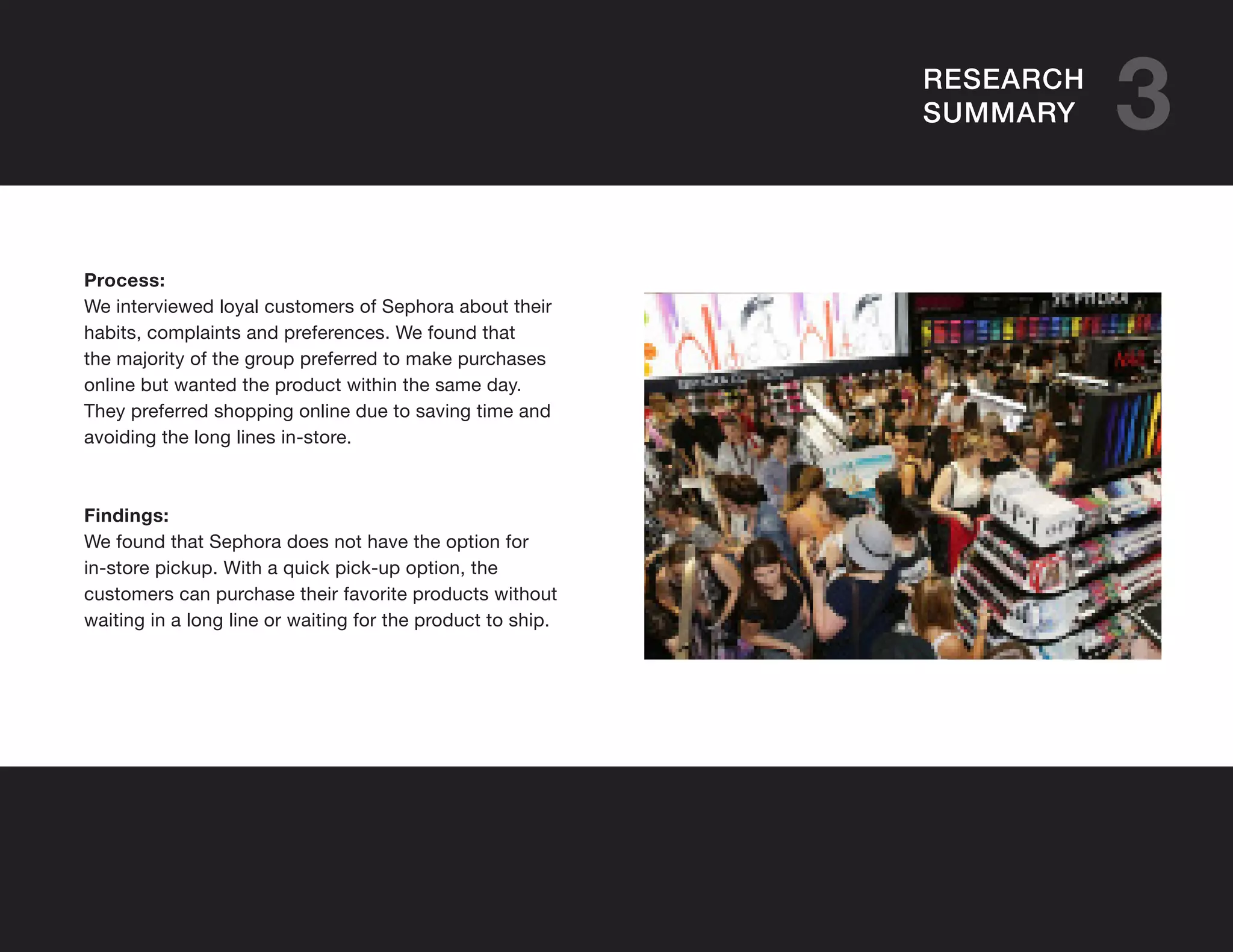
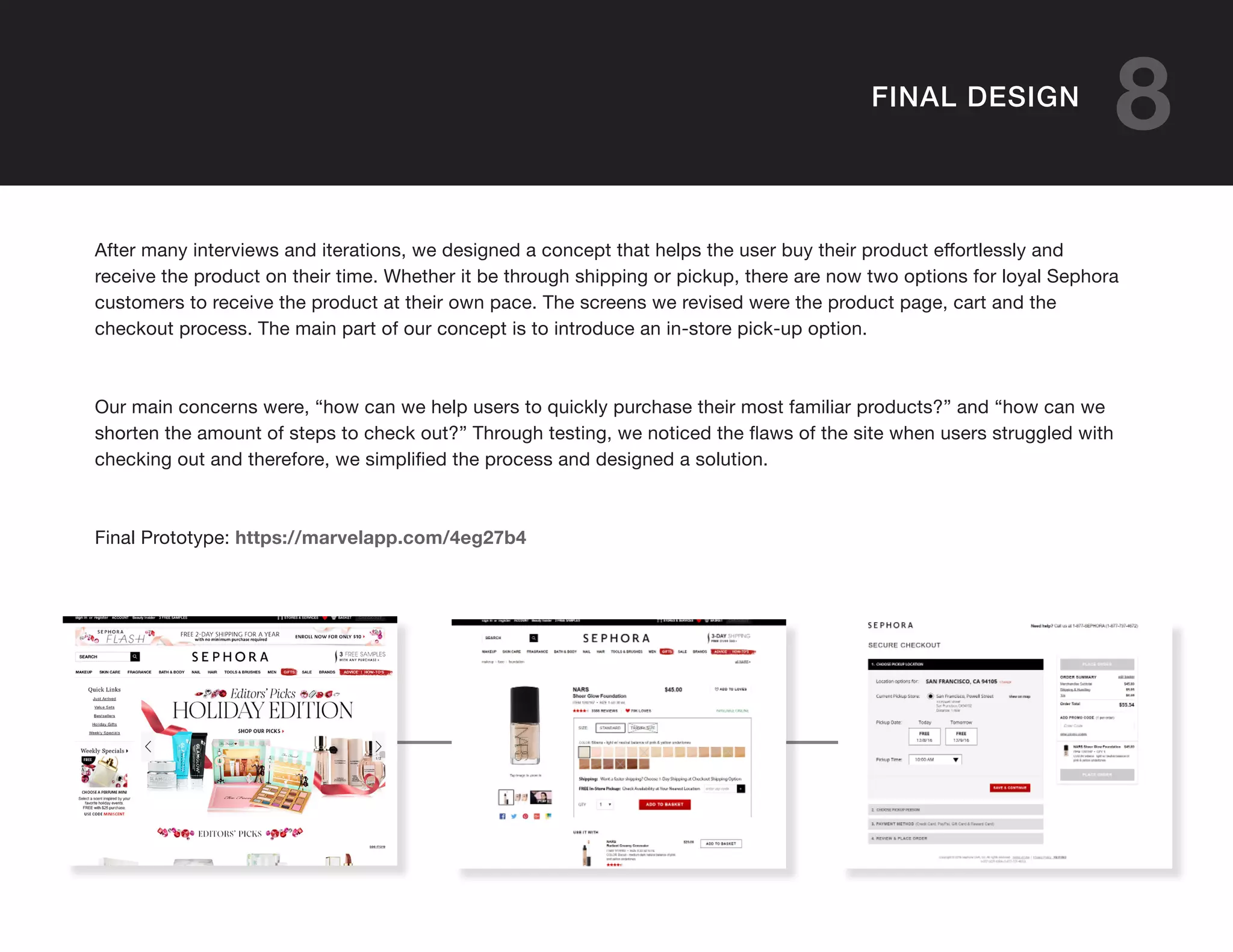
SEPHORA
SEPHORAWebsite Redesign by Diana Wi, Nhan Pham and Danting Zhan
TABLE OF CONTENTS
2 ABOUT
3 RESEARCH
SUMMARY
4 PERSONA
5 USER FLOW
7 USER TESTING
8 FINAL DESIGN
6 INTERVIEWS
Sephora is an open-floor makeup store that
sells a collection of popular brands and it’s own
brand of makeup. Their mission is to give their
customers the best products and shopping
experience by providing top product
specialists. They stand for quality over
quantity when it comes to great products.
2ABOUT
3RESEARCH
SUMMARY
Process:
We interviewed loyal customers of Sephora about their
habits, complaints and preferences. We found that
the majority of the group preferred to make purchases
online but wanted the product within the same day.
They preferred shopping online due to saving time and
avoiding the long lines in-store.
Findings:
We found that Sephora does not have the option for
in-store pickup. With a quick pick-up option, the
customers can purchase their favorite products without
waiting in a long line or waiting for the product to ship.
4PERSONA
Tanya
Age: 27
Location: San Francisco, CA
Full-time Masters student at
Academy of Art University
Skill: AI/ INDD/ PS/ Sketches
Most Used Applications:
Mobile Apps/ Sephora Website/
AAU Website/ Youtube/ Google/
Farfetch/ Selfridges
Hobbies:
Food/ Eating at good restaurants/
Movies/ Buy makeup products
Shopping Preference:
Online: 80% of the time. Mainly
used for discounts and Black
Friday.
In-Store: 20% of time.
To try new products, if sold out
online or if it is urgent.
Summary:
Tanya is a full time masters student at
Academy of Art University. She enjoys
fashion and pays attention to styling
herself. She will check online to see if
the items are available in-store so she
can get it immediately. She likes to buy
makeup products from Sephora, but
the checkout line is always long. She
wants to save her time and doesn’t
want to queue up for more than twenty
minutes for check out.
5USER FLOW
Home Search Result
Product
Page
Add to Basket
Schedule
Pick Up
Check Out
Reminder
Go to Store
Pick Up
6INTERVIEWS
After interviewing shoppers and evaluating the website, we came up with sketches for our main concept as
to which function needed to be redesigned and updated.
7USER TESTING
After testing the low-fidelity prototypes, we moved onto
the final solution. We found that people were still confused
about sections that were merging so we found a better way
of grouping info that belong together. There was also
confusion about checking availability in specific locations
since we had not included that in our tests. The user didn’t
know if it were available online or in-stores and would like
to be able to see that.
“It’s good to know that it is available where you need
it, not at the last minute when you’ve already added it
to our cart and put in all credit card information.”
- User 1
“Sometimes the store may not have the product and it
sucks to find out they don’t have it available
at the last minute.”
- User 2
7USER TESTING // HIGH-FIDELITY
v1
v2
8FINAL DESIGN
After many interviews and iterations, we designed a concept that helps the user buy their product effortlessly and
receive the product on their time. Whether it be through shipping or pickup, there are now two options for loyal Sephora
customers to receive the product at their own pace. The screens we revised were the product page, cart and the
checkout process. The main part of our concept is to introduce an in-store pick-up option.
Our main concerns were, “how can we help users to quickly purchase their most familiar products?” and “how can we
shorten the amount of steps to check out?” Through testing, we noticed the flaws of the site when users struggled with
checking out and therefore, we simplified the process and designed a solution.
Final Prototype: https://marvelapp.com/4eg27b4
THANK YOU FOR LISTENING!THANK YOU FOR LISTENING!

Sephora-Presentation

  • 1.
    SEPHORA SEPHORAWebsite Redesign byDiana Wi, Nhan Pham and Danting Zhan
  • 2.
    TABLE OF CONTENTS 2ABOUT 3 RESEARCH SUMMARY 4 PERSONA 5 USER FLOW 7 USER TESTING 8 FINAL DESIGN 6 INTERVIEWS
  • 3.
    Sephora is anopen-floor makeup store that sells a collection of popular brands and it’s own brand of makeup. Their mission is to give their customers the best products and shopping experience by providing top product specialists. They stand for quality over quantity when it comes to great products. 2ABOUT
  • 4.
    3RESEARCH SUMMARY Process: We interviewed loyalcustomers of Sephora about their habits, complaints and preferences. We found that the majority of the group preferred to make purchases online but wanted the product within the same day. They preferred shopping online due to saving time and avoiding the long lines in-store. Findings: We found that Sephora does not have the option for in-store pickup. With a quick pick-up option, the customers can purchase their favorite products without waiting in a long line or waiting for the product to ship.
  • 5.
    4PERSONA Tanya Age: 27 Location: SanFrancisco, CA Full-time Masters student at Academy of Art University Skill: AI/ INDD/ PS/ Sketches Most Used Applications: Mobile Apps/ Sephora Website/ AAU Website/ Youtube/ Google/ Farfetch/ Selfridges Hobbies: Food/ Eating at good restaurants/ Movies/ Buy makeup products Shopping Preference: Online: 80% of the time. Mainly used for discounts and Black Friday. In-Store: 20% of time. To try new products, if sold out online or if it is urgent. Summary: Tanya is a full time masters student at Academy of Art University. She enjoys fashion and pays attention to styling herself. She will check online to see if the items are available in-store so she can get it immediately. She likes to buy makeup products from Sephora, but the checkout line is always long. She wants to save her time and doesn’t want to queue up for more than twenty minutes for check out.
  • 6.
    5USER FLOW Home SearchResult Product Page Add to Basket Schedule Pick Up Check Out Reminder Go to Store Pick Up
  • 7.
    6INTERVIEWS After interviewing shoppersand evaluating the website, we came up with sketches for our main concept as to which function needed to be redesigned and updated.
  • 8.
    7USER TESTING After testingthe low-fidelity prototypes, we moved onto the final solution. We found that people were still confused about sections that were merging so we found a better way of grouping info that belong together. There was also confusion about checking availability in specific locations since we had not included that in our tests. The user didn’t know if it were available online or in-stores and would like to be able to see that. “It’s good to know that it is available where you need it, not at the last minute when you’ve already added it to our cart and put in all credit card information.” - User 1 “Sometimes the store may not have the product and it sucks to find out they don’t have it available at the last minute.” - User 2
  • 9.
    7USER TESTING //HIGH-FIDELITY v1 v2
  • 10.
    8FINAL DESIGN After manyinterviews and iterations, we designed a concept that helps the user buy their product effortlessly and receive the product on their time. Whether it be through shipping or pickup, there are now two options for loyal Sephora customers to receive the product at their own pace. The screens we revised were the product page, cart and the checkout process. The main part of our concept is to introduce an in-store pick-up option. Our main concerns were, “how can we help users to quickly purchase their most familiar products?” and “how can we shorten the amount of steps to check out?” Through testing, we noticed the flaws of the site when users struggled with checking out and therefore, we simplified the process and designed a solution. Final Prototype: https://marvelapp.com/4eg27b4
  • 11.
    THANK YOU FORLISTENING!THANK YOU FOR LISTENING!