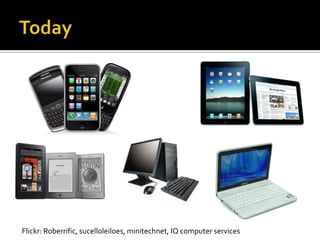
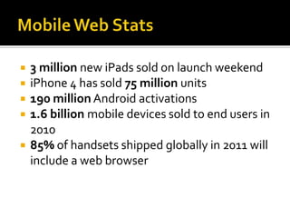
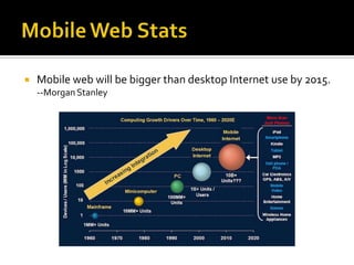
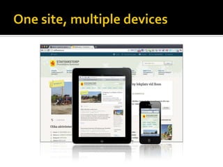
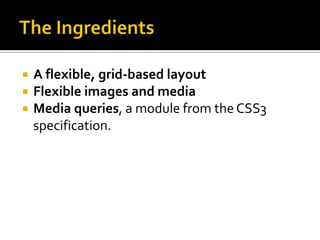
An Introduction

Presenter: Erikk Ross (eross@aii.edu)
Flickr: Roberrific, sucelloleiloes, minitechnet, IQ computer services
   3 million new iPads sold on launch weekend
   iPhone 4 has sold 75 million units
   190 million Android activations
   1.6 billion mobile devices sold to end users in
    2010
   85% of handsets shipped globally in 2011 will
    include a web browser
   Mobile web will be bigger than desktop Internet use by 2015.
    --Morgan Stanley
How do you design a
web site that works well
on all devices?
The long and short of it is that we’re designing
for more devices, more input types, more
resolutions than ever before. The web has moved
beyond the desktop, and it’s not turning back.

– Ethan Marcotte
   Multiple web sites for different devices
   http://site.com/mobile/
   http://mobile.site.com
   http://site.com/ipad/
   http://site.com/iphone/
   http://site.com/android
   http://site.com/ridiculous/
It’s what some of us were going for
with “liquid” web design back in the
1990s, only it doesn’t suck.
–Jeffrey Zeldman
   Example Sites
   Responsive Web Design by
    Ethan Marcotte
   157 pages
   $9 for the e-book
   www.abookapart.com
   Go buy it now, I’ll wait
   A flexible, grid-based layout
   Flexible images and media
   Media queries, a module from the CSS3
    specification.
   No more fixed sizes
     Do not use px…ever. Seriously.
   What about widths?
     %
   What about font sizes?
     em
#blog .main {
            float:   right;
            width:   420px;
 }
 #blog .aside {
            float:   left;
            width:   204px;
 }

    target / context = result
    Left Column:
      204 / 637 = .32025117
    Right column:
      420 /637 = .659340659
#blog .main {
            float:   right;
            width:   65.9340659%; /* 429 / 637 */
 }
 #blog .aside {
            float:   left;
            width:   32.025117%; /* 204 / 637 */
 }
   target / context = result


   Buy this book
img {
   max-width: 100%;
}

  The image will now resize and reflow itself
   proportionally
  It will never be larger than its container.
  Will grow or shrink based on container size
  Can be applied to other HTML tags too:

 img, video, object {
    max-width: 100%;
 }
   Used to change the layout of the page based
    on the size of the display.
@media screen and (max-width: 1100px) {
   /* any screen size 1100px and less will have the following CSS
applied */
 }

@media screen and (max-width: 660px) {
   /* any screen size 660px and less will have the following CSS
applied */
 }

@media screen and (max-width: 340px) {
   /* any screen size 340px and less will have the following CSS
applied */
 }
   Ethan Marcotte’s article that coined the term
    http://www.alistapart.com/articles/responsive-web-design/
   Responsive Web Design, the book
    http://www.abookapart.com/products/responsive-web-design
   Fluid Images, by Ethan Marcotte (Chapter 3 of the book)
    http://www.alistapart.com/articles/fluid-images/
   Fluid Grids, by Ethan Marcotte
    http://www.alistapart.com/articles/fluidgrids/
   Responsive Web Design, another article by Ethan Marcotte
    http://www.netmagazine.com/features/responsive-web-design
   CSS3 Media Queries
    http://webdesignerwall.com/tutorials/css3-media-queries
   Mediaqueries.es, a list of sites using Responsive Web Design techniques
    http://mediaqueri.es/
   This presentation
    http://www.slideshare.net/erikkross/responsive-web-design-12143547

Responsive web design

  • 1.
  • 4.
    Flickr: Roberrific, sucelloleiloes,minitechnet, IQ computer services
  • 5.
    3 million new iPads sold on launch weekend  iPhone 4 has sold 75 million units  190 million Android activations  1.6 billion mobile devices sold to end users in 2010  85% of handsets shipped globally in 2011 will include a web browser
  • 6.
    Mobile web will be bigger than desktop Internet use by 2015. --Morgan Stanley
  • 7.
    How do youdesign a web site that works well on all devices?
  • 8.
    The long andshort of it is that we’re designing for more devices, more input types, more resolutions than ever before. The web has moved beyond the desktop, and it’s not turning back. – Ethan Marcotte
  • 10.
    Multiple web sites for different devices  http://site.com/mobile/  http://mobile.site.com  http://site.com/ipad/  http://site.com/iphone/  http://site.com/android  http://site.com/ridiculous/
  • 13.
    It’s what someof us were going for with “liquid” web design back in the 1990s, only it doesn’t suck. –Jeffrey Zeldman
  • 16.
    Example Sites
  • 17.
    Responsive Web Design by Ethan Marcotte  157 pages  $9 for the e-book  www.abookapart.com  Go buy it now, I’ll wait
  • 18.
    A flexible, grid-based layout  Flexible images and media  Media queries, a module from the CSS3 specification.
  • 19.
    No more fixed sizes  Do not use px…ever. Seriously.  What about widths?  %  What about font sizes?  em
  • 20.
    #blog .main { float: right; width: 420px; } #blog .aside { float: left; width: 204px; }  target / context = result  Left Column:  204 / 637 = .32025117  Right column:  420 /637 = .659340659 #blog .main { float: right; width: 65.9340659%; /* 429 / 637 */ } #blog .aside { float: left; width: 32.025117%; /* 204 / 637 */ }
  • 21.
    target / context = result  Buy this book
  • 22.
    img { max-width: 100%; }  The image will now resize and reflow itself proportionally  It will never be larger than its container.  Will grow or shrink based on container size  Can be applied to other HTML tags too: img, video, object { max-width: 100%; }
  • 23.
    Used to change the layout of the page based on the size of the display. @media screen and (max-width: 1100px) { /* any screen size 1100px and less will have the following CSS applied */ } @media screen and (max-width: 660px) { /* any screen size 660px and less will have the following CSS applied */ } @media screen and (max-width: 340px) { /* any screen size 340px and less will have the following CSS applied */ }
  • 24.
    Ethan Marcotte’s article that coined the term http://www.alistapart.com/articles/responsive-web-design/  Responsive Web Design, the book http://www.abookapart.com/products/responsive-web-design  Fluid Images, by Ethan Marcotte (Chapter 3 of the book) http://www.alistapart.com/articles/fluid-images/  Fluid Grids, by Ethan Marcotte http://www.alistapart.com/articles/fluidgrids/  Responsive Web Design, another article by Ethan Marcotte http://www.netmagazine.com/features/responsive-web-design  CSS3 Media Queries http://webdesignerwall.com/tutorials/css3-media-queries  Mediaqueries.es, a list of sites using Responsive Web Design techniques http://mediaqueri.es/  This presentation http://www.slideshare.net/erikkross/responsive-web-design-12143547