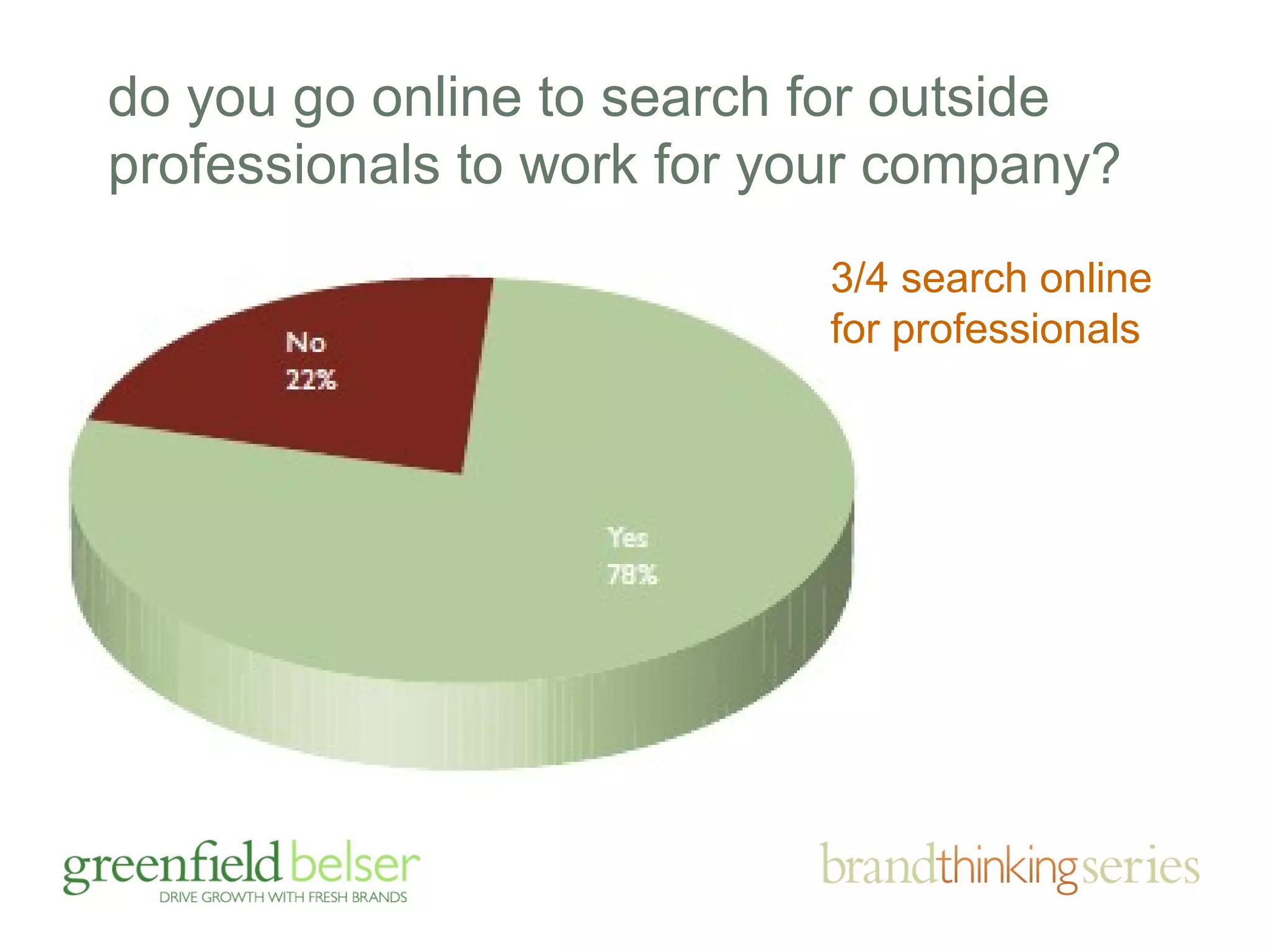
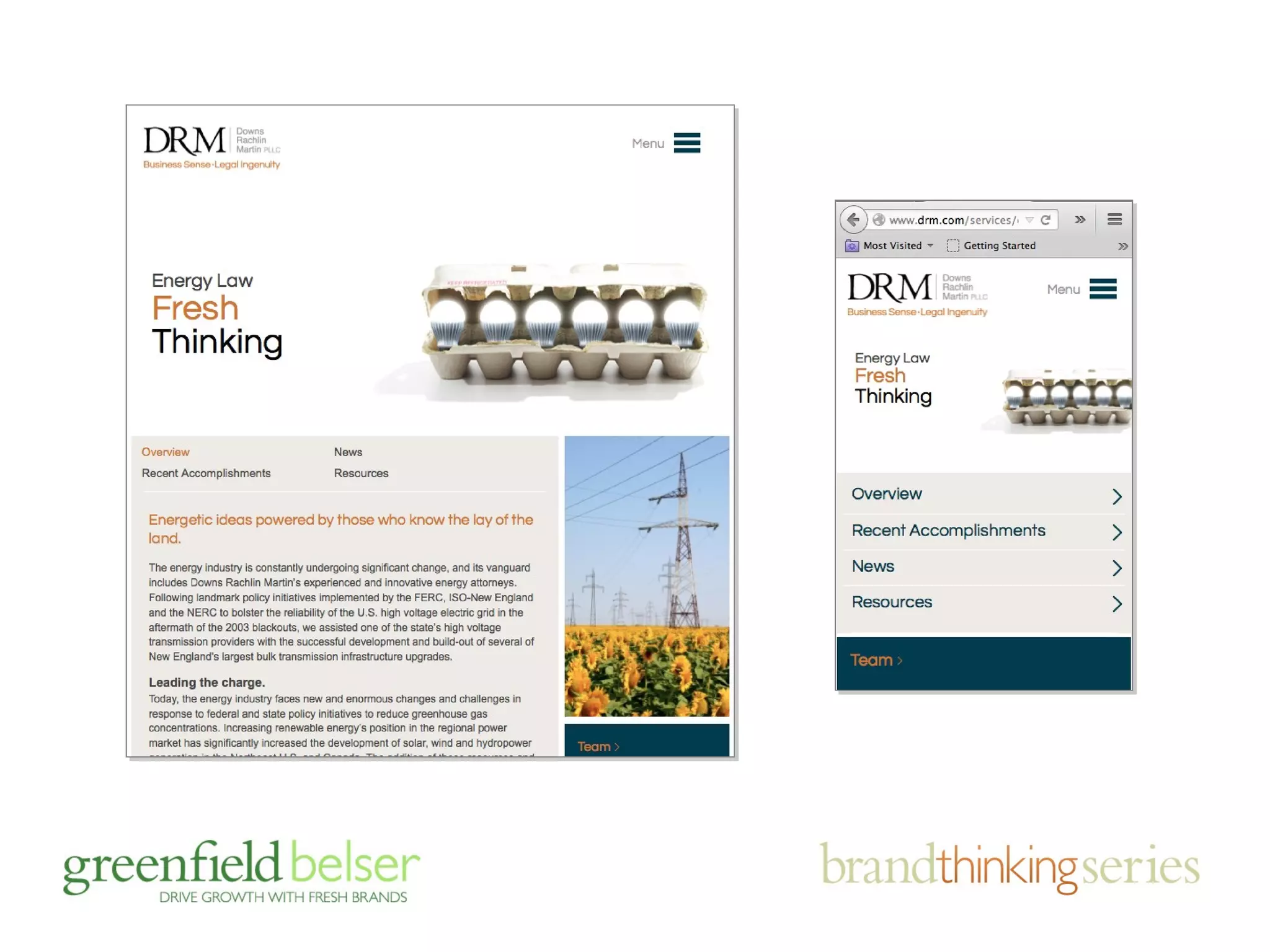
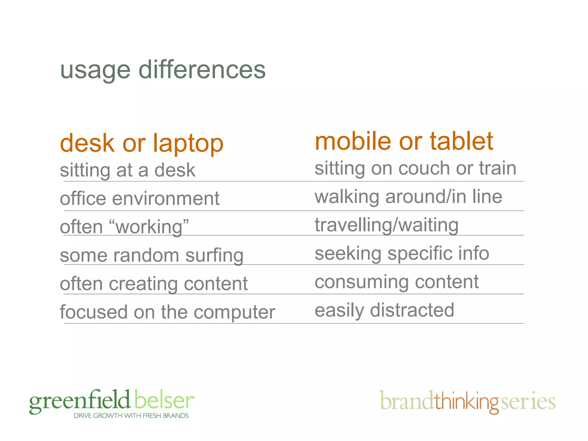
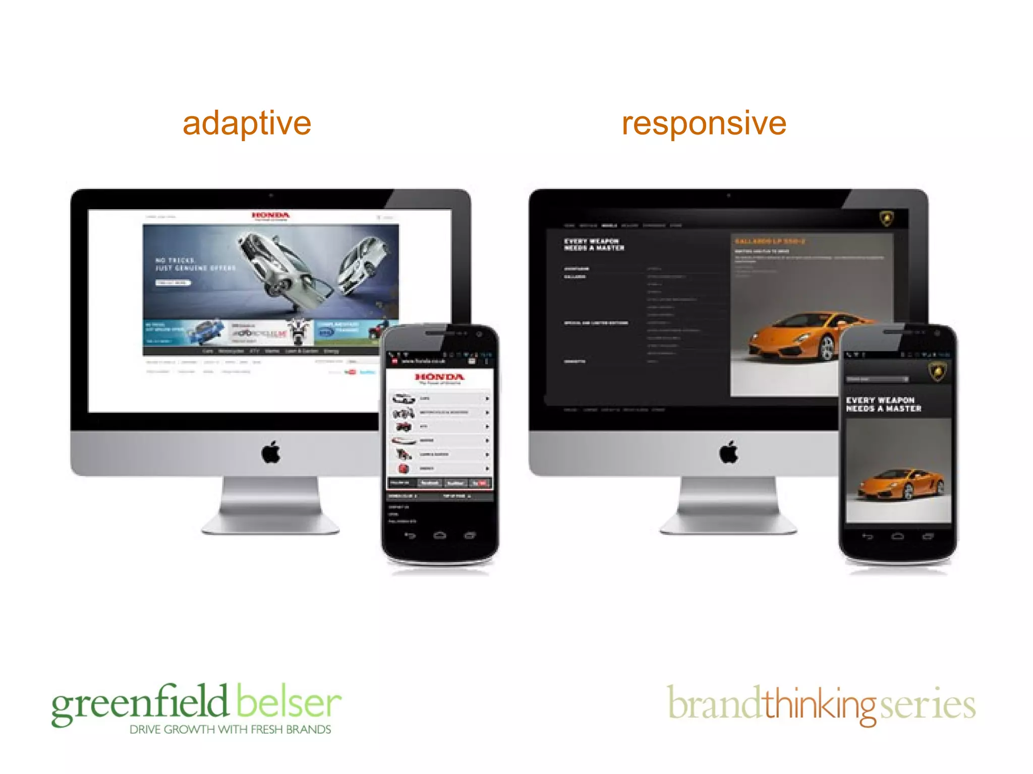
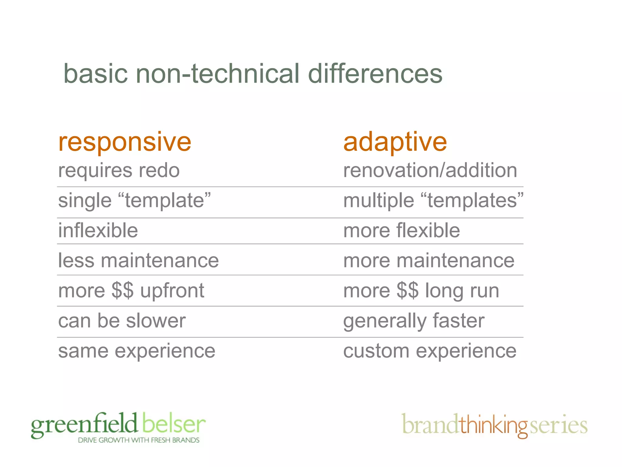
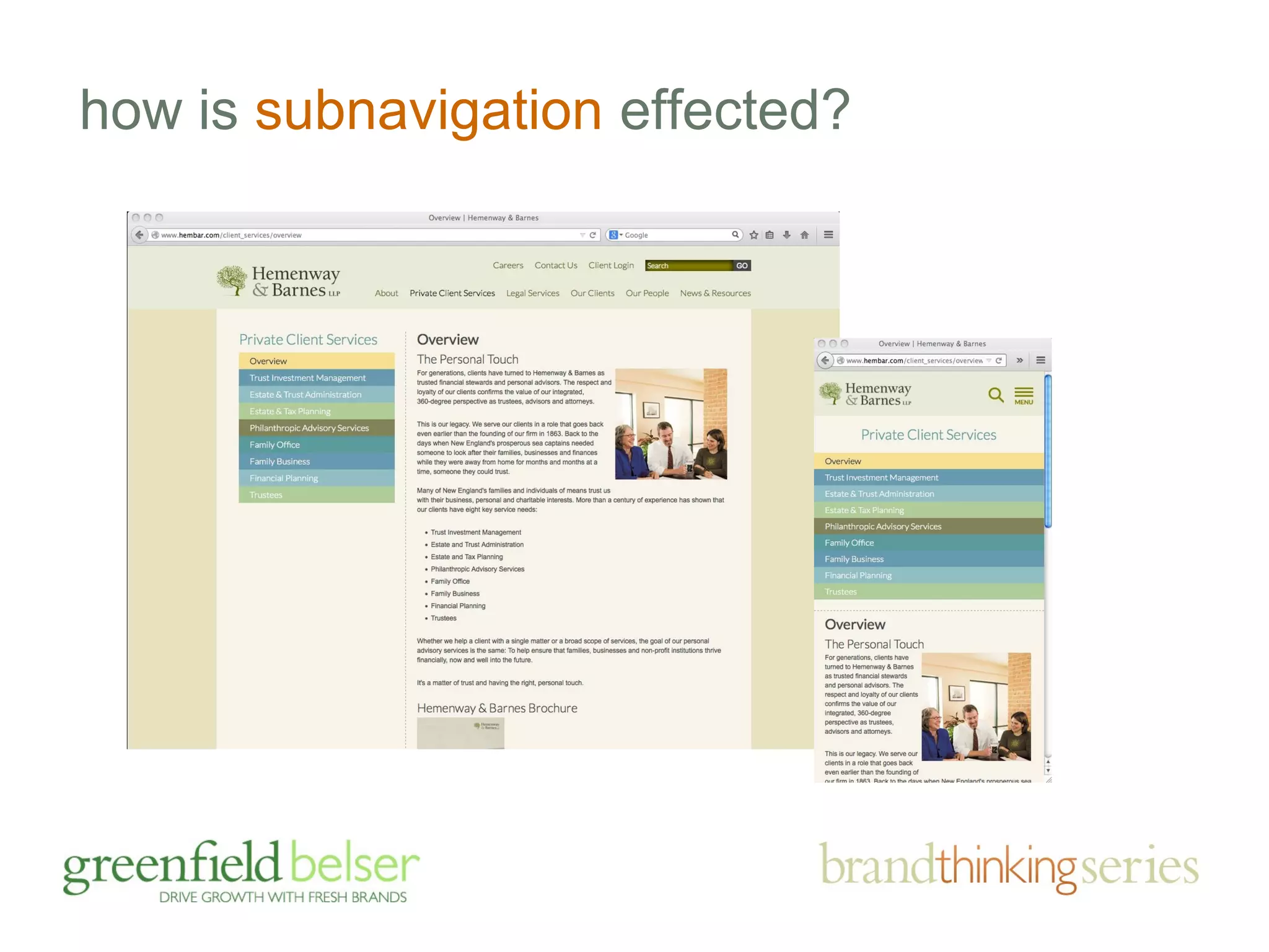
RESPONSIBLE WEB DESIGN 
design that responds 
smartly to brand 
challenges and devices 
of all shapes 
and sizes 
11/11/2014
if you like this program, you may also like
agenda 
• the importance of brands and sites 
• responding to brand challenges 
• the business case for mobile friendly 
• mobile friendly: adaptive v. responsive 
• device friendly design tips
agenda 
• the importance of brands and sites 
• responding to brand challenges 
• the business case for mobile friendly 
• mobile friendly: adaptive v. responsive 
• device friendly design tips
fact finding has always guided us…
how important is your site…?
facts on the go: 
your buyers are online, in droves
how often do you use the Internet 
for purposes other than email? 
email excluded, 94% go online daily
do you go online to search for outside 
professionals to work for your company? 
3/4 search online 
for professionals
how do you find firms?
how important are these Internet sources for 
learning about professionals? 
85% consider Web 
sites important
how likely is it that your decision to put a new 
professional services firm on your short list would be 
influenced by your perception of the quality or lack 
of quality of the firm’s Web site? 
3/4 (76%) say they are likely to be influenced by your Web site’s quality
have you ever put a professional services 
provider on your short list based on 
information you found on their Web site? 
1/2 put professionals on their short list based on Web site info.
yes, web is important, but on the flip side …
professional services marketers 
don’t give their sites and other brand 
building efforts high marks, really?
CMOs believe 
their brand is 
moderately to 
extremely 
important 
Managing 
Partners believe 
their brand is 
moderately to 
extremely 
important 
only 26% 
find their brands 
very helpful 
95% 92%
1 5
agenda 
• the importance of brands and sites 
• responding to brand challenges 
• the business case for mobile (duh!) 
• mobile friendly: adaptive v. responsive 
• device friendly design tips
“without strategy, design is veneer”
repositioning an entire brand to 
shake misperceptions and align 
with marketing goals
earning attention and carving out 
differentiation in the big apple
final point on branding and web 
design, first impressions matter …
agenda 
• the importance of brands and sites 
• responding to brand challenges 
• the business case for mobile (duh!) 
• mobile friendly: adaptive v. responsive 
• device friendly design tips
by 2014, more people will access 
the internet from mobile devices 
than from desk or laptop computers 
— Morgan Stanley
in a small world, “context is king”
mobile or tablet 
sitting on couch or train 
walking around/in line 
travelling/waiting 
seeking specific info 
consuming content 
easily distracted 
usage differences 
desk or laptop 
sitting at a desk 
office environment 
often “working” 
some random surfing 
often creating content 
focused on the computer
other obvious differences 
less real estate 
less bandwidth 
touch input 
hard to type
your site on mobile
your mobile site on mobile
agenda 
• the importance of brands and sites 
• responding to brand challenges 
• the business case for mobile (duh!) 
• mobile friendly: adaptive v. responsive 
• device friendly design tips
the best way to adapt to smaller screens?
both allow sites to be viewed on mobile 
devices and various screen sizes to make 
for a more user friendly experience … 
they achieve it differently
device agnostic vs device specific display
adaptive responsive
basic non-technical differences 
responsive 
requires redo 
single “template” 
inflexible 
less maintenance 
more $$ upfront 
can be slower 
same experience 
adaptive 
renovation/addition 
multiple “templates” 
more flexible 
more maintenance 
more $$ long run 
generally faster 
custom experience
agenda 
• the importance of brands and sites 
• responding to brand challenges 
• the business case for mobile (duh!) 
• mobile friendly: adaptive v. responsive 
• device friendly design tips
deliver brand consistency
include brand promise
don’t forgo pictures
still tell stories
make contact an 
“easy button” 
remember that mobile 
often means going 
somewhere; make it 
easy for your visitor to 
get there
vertical scrolling, yes, 
but … 
a drop down menu 
button allows ease of 
navigation and key 
message or function 
delivery
vertical scrolling, yes, 
but … 
a simple menu 
revealed; ideally, 
accessible from every 
page
vertical scrolling, yes, 
but … 
by the way, rule of 
thumb is no more 
than three “touches” 
to get where you want 
to go
offer search functionality 
but not at the expense 
of valuable space for 
relevant content
offer search functionality 
make your search 
boxes wide enough so 
that users are not 
limited by space
link full site if adaptive 
the full site link offers 
visitors the ability to 
see your desk top site 
on mobile if they 
choose
include logo on 
every page 
the comfortable 
default for going home
include logo on 
every page 
the comfortable 
default for getting 
home
leave finger space 
lets not reinvent the 
wheel, follow Apple 
typically 1 cm by 1cm 
padding
size fonts appropriately
size fonts appropriately 
remember reading is 
a chore on the web 
and even more so on 
mobile
give the personal touch 
your people can own 
the smaller screen, 
too
adapt to screen orientations
avoid logins 
and registrations 
they will deter users 
from visiting your 
mobile site 
if registration is the 
point, like an event, 
make it simple
streamline form fields 
the fewer fields the 
better (also note 
keyboard overtakes 
half the screen)
now the hard part, rationalizing content
cut the fat 
don’t 
include all 
information 
from full 
site; this will 
require 
choices
sell in small places 
key messages can live 
comfortably with key 
functionality
cut the fat 
lead with content 
carrying words or 
images and descriptive 
titles to avoid disinterest 
or wasted clicks
be even smarter about 
images and video 
don’t shy away from 
video and images; 
can be a captivating 
alternative to reading 
must be relevant to 
the content; can’t 
decorate
be even smarter about 
images and video 
leverage 3rd party 
video players (for 
consistency, tracking, 
SEO, speed, playlists, 
etc.); e.g., YouTube
other design/content considerations
how does navigation change?
where does content move to?
drawing the line on photos?
how is subnavigation effected?
questions? 
• the importance of brands and sites 
• responding to brand challenges 
• the business case for mobile 
• mobile friendly: adaptive v. responsive 
• device friendly design tips
RESPONSIBLE WEB DESIGN 
design that responds 
smartly to brand 
challenges and devices 
of all shapes 
and sizes 
April 18, 2012
mobile site or app?
an app vs. a mobile friendly site 
(a luxury apartment landlord offers both for different purposes) 
Task centric: 
pay my rent, 
arrange a 
service call 
Info centric: 
search for 
new digs or 
upgrade

Responsible, Responsive Design Webinar - November 12, 2014

  • 1.
    RESPONSIBLE WEB DESIGN design that responds smartly to brand challenges and devices of all shapes and sizes 11/11/2014
  • 2.
    if you likethis program, you may also like
  • 3.
    agenda • theimportance of brands and sites • responding to brand challenges • the business case for mobile friendly • mobile friendly: adaptive v. responsive • device friendly design tips
  • 4.
    agenda • theimportance of brands and sites • responding to brand challenges • the business case for mobile friendly • mobile friendly: adaptive v. responsive • device friendly design tips
  • 5.
    fact finding hasalways guided us…
  • 6.
    how important isyour site…?
  • 7.
    facts on thego: your buyers are online, in droves
  • 8.
    how often doyou use the Internet for purposes other than email? email excluded, 94% go online daily
  • 9.
    do you goonline to search for outside professionals to work for your company? 3/4 search online for professionals
  • 10.
    how do youfind firms?
  • 11.
    how important arethese Internet sources for learning about professionals? 85% consider Web sites important
  • 12.
    how likely isit that your decision to put a new professional services firm on your short list would be influenced by your perception of the quality or lack of quality of the firm’s Web site? 3/4 (76%) say they are likely to be influenced by your Web site’s quality
  • 13.
    have you everput a professional services provider on your short list based on information you found on their Web site? 1/2 put professionals on their short list based on Web site info.
  • 14.
    yes, web isimportant, but on the flip side …
  • 15.
    professional services marketers don’t give their sites and other brand building efforts high marks, really?
  • 17.
    CMOs believe theirbrand is moderately to extremely important Managing Partners believe their brand is moderately to extremely important only 26% find their brands very helpful 95% 92%
  • 19.
  • 20.
    agenda • theimportance of brands and sites • responding to brand challenges • the business case for mobile (duh!) • mobile friendly: adaptive v. responsive • device friendly design tips
  • 21.
  • 22.
    repositioning an entirebrand to shake misperceptions and align with marketing goals
  • 38.
    earning attention andcarving out differentiation in the big apple
  • 55.
    final point onbranding and web design, first impressions matter …
  • 60.
    agenda • theimportance of brands and sites • responding to brand challenges • the business case for mobile (duh!) • mobile friendly: adaptive v. responsive • device friendly design tips
  • 61.
    by 2014, morepeople will access the internet from mobile devices than from desk or laptop computers — Morgan Stanley
  • 64.
    in a smallworld, “context is king”
  • 65.
    mobile or tablet sitting on couch or train walking around/in line travelling/waiting seeking specific info consuming content easily distracted usage differences desk or laptop sitting at a desk office environment often “working” some random surfing often creating content focused on the computer
  • 66.
    other obvious differences less real estate less bandwidth touch input hard to type
  • 67.
  • 68.
  • 70.
    agenda • theimportance of brands and sites • responding to brand challenges • the business case for mobile (duh!) • mobile friendly: adaptive v. responsive • device friendly design tips
  • 71.
    the best wayto adapt to smaller screens?
  • 72.
    both allow sitesto be viewed on mobile devices and various screen sizes to make for a more user friendly experience … they achieve it differently
  • 76.
    device agnostic vsdevice specific display
  • 77.
  • 78.
    basic non-technical differences responsive requires redo single “template” inflexible less maintenance more $$ upfront can be slower same experience adaptive renovation/addition multiple “templates” more flexible more maintenance more $$ long run generally faster custom experience
  • 79.
    agenda • theimportance of brands and sites • responding to brand challenges • the business case for mobile (duh!) • mobile friendly: adaptive v. responsive • device friendly design tips
  • 80.
  • 81.
  • 82.
  • 83.
  • 84.
    make contact an “easy button” remember that mobile often means going somewhere; make it easy for your visitor to get there
  • 85.
    vertical scrolling, yes, but … a drop down menu button allows ease of navigation and key message or function delivery
  • 86.
    vertical scrolling, yes, but … a simple menu revealed; ideally, accessible from every page
  • 87.
    vertical scrolling, yes, but … by the way, rule of thumb is no more than three “touches” to get where you want to go
  • 88.
    offer search functionality but not at the expense of valuable space for relevant content
  • 89.
    offer search functionality make your search boxes wide enough so that users are not limited by space
  • 90.
    link full siteif adaptive the full site link offers visitors the ability to see your desk top site on mobile if they choose
  • 91.
    include logo on every page the comfortable default for going home
  • 92.
    include logo on every page the comfortable default for getting home
  • 93.
    leave finger space lets not reinvent the wheel, follow Apple typically 1 cm by 1cm padding
  • 94.
  • 95.
    size fonts appropriately remember reading is a chore on the web and even more so on mobile
  • 96.
    give the personaltouch your people can own the smaller screen, too
  • 97.
    adapt to screenorientations
  • 98.
    avoid logins andregistrations they will deter users from visiting your mobile site if registration is the point, like an event, make it simple
  • 99.
    streamline form fields the fewer fields the better (also note keyboard overtakes half the screen)
  • 100.
    now the hardpart, rationalizing content
  • 101.
    cut the fat don’t include all information from full site; this will require choices
  • 102.
    sell in smallplaces key messages can live comfortably with key functionality
  • 103.
    cut the fat lead with content carrying words or images and descriptive titles to avoid disinterest or wasted clicks
  • 104.
    be even smarterabout images and video don’t shy away from video and images; can be a captivating alternative to reading must be relevant to the content; can’t decorate
  • 105.
    be even smarterabout images and video leverage 3rd party video players (for consistency, tracking, SEO, speed, playlists, etc.); e.g., YouTube
  • 106.
  • 107.
  • 108.
  • 109.
    drawing the lineon photos?
  • 110.
  • 112.
    questions? • theimportance of brands and sites • responding to brand challenges • the business case for mobile • mobile friendly: adaptive v. responsive • device friendly design tips
  • 113.
    RESPONSIBLE WEB DESIGN design that responds smartly to brand challenges and devices of all shapes and sizes April 18, 2012
  • 114.
  • 115.
    an app vs.a mobile friendly site (a luxury apartment landlord offers both for different purposes) Task centric: pay my rent, arrange a service call Info centric: search for new digs or upgrade

Editor's Notes

  • #4 Cover lots of ground Please ask questions during the presentation. If we slow down too much, I’ll speed it up. You may be suprised at what you see
  • #5 Cover lots of ground Please ask questions during the presentation. If we slow down too much, I’ll speed it up. You may be suprised at what you see
  • #6 Marketing Ecosystem art (inside of poster)
  • #9 Everyday is an opportunity because everyone goes to the Internet every day.
  • #12 Sue, how does this relate to our earlier position that Martindale no longer matters? Says here 70% use directories and Martindale can certainly claim a share of that. Optimization is important. Reaching out to clients is important Blogging might surprise you
  • #13 Of course, this begs the question: what is quality? According to _________, factors affecting the perception of quality are aesthetic appeal impact? clarity of message ease of navigation Sue: do we have information from our survey of Jackson Lewis.
  • #14 This begs the question: what are they looking for?
  • #17 GB Power Point Guidelines Logo Use the newest tag line “Make Your Firm Unique” on the bottom of every slide. Background Every slide’s background should be white with the exception of the closing slide which should be entirely black but for the logo on top. Font Headlines: Use “Verdana” (Truetype) for each character in the presentation. Body Copy: Use “Arial” (Truetype) for each character in the presentation. Do not use boldface. Headlines This text should be lower-case 36-point font. The text is green with a grey shadow (see next page notes for specs). Center all headlines. Text Make body text black and 24 to 28-point font. Always keep healthy margins. Do not put too much text on the page. If you have a large block of text, break it up. Don’t depend on Burkey or Joe or Jeffrey automatically to do so. Bullets Do not utilize the default circle bullets. Use square bullets. Balance design and spacing for visual appeal.
  • #18 Green Specs: R - 0, G - 95, B - 0 C - 28, M - 0, Y - 29, K - 48 H - 120%, S - 100%, B - 38% Grayscale - 30% Shadow Specs: Grayscale - 57% 315˚ on slider Offset - 3 pt Softness - 5 pt Transparency - 25%
  • #19 Green Specs: R - 0, G - 95, B - 0 C - 28, M - 0, Y - 29, K - 48 H - 120%, S - 100%, B - 38% Grayscale - 30% Shadow Specs: Grayscale - 57% 315˚ on slider Offset - 3 pt Softness - 5 pt Transparency - 25%
  • #20 Green Specs: R - 0, G - 95, B - 0 C - 28, M - 0, Y - 29, K - 48 H - 120%, S - 100%, B - 38% Grayscale - 30% Shadow Specs: Grayscale - 57% 315˚ on slider Offset - 3 pt Softness - 5 pt Transparency - 25%
  • #21 Cover lots of ground Please ask questions during the presentation. If we slow down too much, I’ll speed it up. You may be suprised at what you see
  • #61 Cover lots of ground Please ask questions during the presentation. If we slow down too much, I’ll speed it up. You may be suprised at what you see
  • #71 Cover lots of ground Please ask questions during the presentation. If we slow down too much, I’ll speed it up. You may be suprised at what you see
  • #80 Cover lots of ground Please ask questions during the presentation. If we slow down too much, I’ll speed it up. You may be suprised at what you see
  • #113 Cover lots of ground Please ask questions during the presentation. If we slow down too much, I’ll speed it up. You may be suprised at what you see