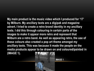
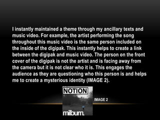
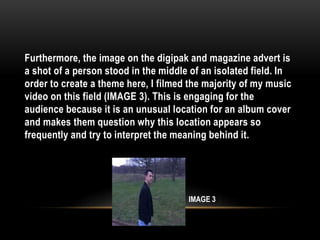
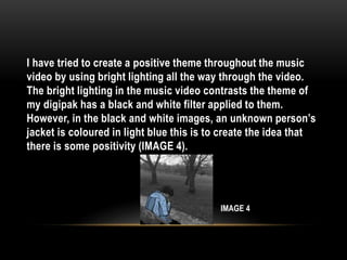
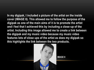
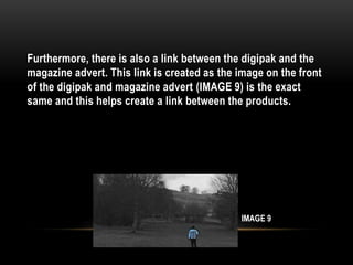
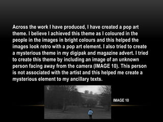
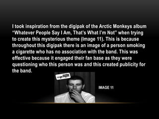
By Ciaran Emmett
QUESTION 2: HOW EFFECTIVE IS THE
COMBINATION OF YOUR MAIN PRODUCT
AND ANCILLARY TEXTS?
My main product is the music video which I produced for ‘17’
by Milburn. My ancillary texts are a digipak and magazine
advert. I tried to create a retro brand identity in my ancillary
texts. I did this through colouring in certain parts of the
images to make it appear more retro and represent that
Milburn are a retro band. As well as appearing retro, the use of
these colours also created a pop art theme amongst my
ancillary texts. This was because it made the people on the
media products appear to be drawn on and coloured/painted in
(IMAGE 1).
IMAGE 1
I instantly maintained a theme through my ancillary texts and
music video. For example, the artist performing the song
throughout this music video is the same person included on
the inside of the digipak. This instantly helps to create a link
between the digipak and music video. The person on the front
cover of the digipak is not the artist and is facing away from
the camera but it is not clear who it is. This engages the
audience as they are questioning who this person is and helps
me to create a mysterious identity (IMAGE 2).
IMAGE 2
Furthermore, the image on the digipak and magazine advert is
a shot of a person stood in the middle of an isolated field. In
order to create a theme here, I filmed the majority of my music
video on this field (IMAGE 3). This is engaging for the
audience because it is an unusual location for an album cover
and makes them question why this location appears so
frequently and try to interpret the meaning behind it.
IMAGE 3
I have tried to create a positive theme throughout the music
video by using bright lighting all the way through the video.
The bright lighting in the music video contrasts the theme of
my digipak has a black and white filter applied to them.
However, in the black and white images, an unknown person’s
jacket is coloured in light blue this is to create the idea that
there is some positivity (IMAGE 4).
IMAGE 4
It is important to maintain a constant theme throughout all
three products. This is so that my products and represents a
brand whilst appearing professional. Building a brand is
important because it allows you to develop and build a fan
base/audience, creating more success for the album and artist.
Having a well-known brand means that the products will be
easier to recognise and make the products more likely to sell
through the popularity. This links to my music video as the
video I produced could be perceived as positive as the lead is
simply performing the song and there is no negative story line
to follow this music video.
I created themes in my ancillary texts through colour and text.
Firstly, I created a colour theme as all images were in black
and white however, the people in the images clothing was
coloured in so that they stood out and created a pop art
theme. I took influence from Oasis as they have a retro style in
a lot of their albums (IMAGE 5) so I have attempted to create a
retro styled digipak and magazine advert.
IMAGE 5
I used text in order to try and create a coherent theme in my
ancillary texts. Milburn’s logo (IMAGE 6) is a cursive lowercase
font. I took influence off of this and made all of the text in my
magazine advert lowercase to match the band’s logo and
create a simplified theme.
IMAGE 6
The only exception from this was that I made the name of the
album ‘Notion’ bold and capitalised (IMAGE 7). This was to
make it clear which was the album name on the magazine
advert. In order to create a clearer theme and link between my
ancillary texts and music video, I would either have the
unknown person upon the ancillary texts in the music video as
part of the band. This would allow me to represent the artist
clearer through the ancillary texts and create a more popular
identity for the audience.
IMAGE 7
In my digipak, I included a picture of the artist on the inside
cover (IMAGE 8). This allowed me to follow the purpose of the
digipak as one of the main aims of it is to promote the artist
and I feel that I achieved this by including a close-up of the
artist. Including this image allowed me to create a link between
the digipak and my music video because my music video
features lots of close ups of the artist as does my digipak so
this highlights the link between the two products.
IMAGE 8
Furthermore, there is also a link between the digipak and the
magazine advert. This link is created as the image on the front
of the digipak and magazine advert (IMAGE 9) is the exact
same and this helps create a link between the products.
IMAGE 9
I believe that it is important to have an effective combination
across my three media products because it allowed me to
create and represent a brand identity. Having a brand identity
is important because it can help produce a reputation for the
artist if they are linked to a well-known theme. This will
increase the publicity of the band and make all three media
products appear more professional.
Across the work I have produced, I have created a pop art
theme. I believe I achieved this theme as I coloured in the
people in the images in bright colours and this helped the
images look retro with a pop art element. I also tried to create
a mysterious theme in my digipak and magazine advert. I tried
to create this theme by including an image of an unknown
person facing away from the camera (IMAGE 10). This person
is not associated with the artist and this helped me create a
mysterious element to my ancillary texts.
IMAGE 10
I took inspiration from the digipak of the Arctic Monkeys album
“Whatever People Say I Am, That’s What I’m Not” when trying
to create this mysterious theme (Image 11). This is because
throughout this digipak there is an image of a person smoking
a cigarette who has no association with the band. This was
effective because it engaged their fan base as they were
questioning who this person was and this created publicity for
the band.
IMAGE 11
I believe that I created a strong brand identity. However, it
could have been stronger/clearer if I had used bold capitalised
text all the way throughout the ancillary texts with all pieces of
text. Another way in which I could have developed by brand
identity is to use pop colours for my text in order to reiterate
and emphasise the pop art theme.
Another example of how I could improve my brand identity
across the three ancillary texts is if the image upon the front
covers of my digipak and magazine advert of the person stood
in the middle field, there was a slight bit of inconsistency
across these images. There was inconsistency because the
colour of the jacket was slightly different shades of blue in
each image. This made my ancillary texts appear slightly
unprofessional. I would have tried to make my brand identity
clearer by using the exact same image next time so that my
ancillary texts appear more professional.
I tried to create a bold simplistic house style of my work. I
believe that I created a simplistic house style with my colours
by only using plain colours such as black and white text. A key
factor in this decision was to ensure that the main attention
went into the pop art theme as this played a key part in
representing my brand identity. I also used bold capitalised
text so that the artist and album name stood out to the
audience.

Question 2

  • 1.
    By Ciaran Emmett QUESTION2: HOW EFFECTIVE IS THE COMBINATION OF YOUR MAIN PRODUCT AND ANCILLARY TEXTS?
  • 2.
    My main productis the music video which I produced for ‘17’ by Milburn. My ancillary texts are a digipak and magazine advert. I tried to create a retro brand identity in my ancillary texts. I did this through colouring in certain parts of the images to make it appear more retro and represent that Milburn are a retro band. As well as appearing retro, the use of these colours also created a pop art theme amongst my ancillary texts. This was because it made the people on the media products appear to be drawn on and coloured/painted in (IMAGE 1). IMAGE 1
  • 3.
    I instantly maintaineda theme through my ancillary texts and music video. For example, the artist performing the song throughout this music video is the same person included on the inside of the digipak. This instantly helps to create a link between the digipak and music video. The person on the front cover of the digipak is not the artist and is facing away from the camera but it is not clear who it is. This engages the audience as they are questioning who this person is and helps me to create a mysterious identity (IMAGE 2). IMAGE 2
  • 4.
    Furthermore, the imageon the digipak and magazine advert is a shot of a person stood in the middle of an isolated field. In order to create a theme here, I filmed the majority of my music video on this field (IMAGE 3). This is engaging for the audience because it is an unusual location for an album cover and makes them question why this location appears so frequently and try to interpret the meaning behind it. IMAGE 3
  • 5.
    I have triedto create a positive theme throughout the music video by using bright lighting all the way through the video. The bright lighting in the music video contrasts the theme of my digipak has a black and white filter applied to them. However, in the black and white images, an unknown person’s jacket is coloured in light blue this is to create the idea that there is some positivity (IMAGE 4). IMAGE 4
  • 6.
    It is importantto maintain a constant theme throughout all three products. This is so that my products and represents a brand whilst appearing professional. Building a brand is important because it allows you to develop and build a fan base/audience, creating more success for the album and artist. Having a well-known brand means that the products will be easier to recognise and make the products more likely to sell through the popularity. This links to my music video as the video I produced could be perceived as positive as the lead is simply performing the song and there is no negative story line to follow this music video.
  • 7.
    I created themesin my ancillary texts through colour and text. Firstly, I created a colour theme as all images were in black and white however, the people in the images clothing was coloured in so that they stood out and created a pop art theme. I took influence from Oasis as they have a retro style in a lot of their albums (IMAGE 5) so I have attempted to create a retro styled digipak and magazine advert. IMAGE 5
  • 8.
    I used textin order to try and create a coherent theme in my ancillary texts. Milburn’s logo (IMAGE 6) is a cursive lowercase font. I took influence off of this and made all of the text in my magazine advert lowercase to match the band’s logo and create a simplified theme. IMAGE 6
  • 9.
    The only exceptionfrom this was that I made the name of the album ‘Notion’ bold and capitalised (IMAGE 7). This was to make it clear which was the album name on the magazine advert. In order to create a clearer theme and link between my ancillary texts and music video, I would either have the unknown person upon the ancillary texts in the music video as part of the band. This would allow me to represent the artist clearer through the ancillary texts and create a more popular identity for the audience. IMAGE 7
  • 10.
    In my digipak,I included a picture of the artist on the inside cover (IMAGE 8). This allowed me to follow the purpose of the digipak as one of the main aims of it is to promote the artist and I feel that I achieved this by including a close-up of the artist. Including this image allowed me to create a link between the digipak and my music video because my music video features lots of close ups of the artist as does my digipak so this highlights the link between the two products. IMAGE 8
  • 11.
    Furthermore, there isalso a link between the digipak and the magazine advert. This link is created as the image on the front of the digipak and magazine advert (IMAGE 9) is the exact same and this helps create a link between the products. IMAGE 9
  • 12.
    I believe thatit is important to have an effective combination across my three media products because it allowed me to create and represent a brand identity. Having a brand identity is important because it can help produce a reputation for the artist if they are linked to a well-known theme. This will increase the publicity of the band and make all three media products appear more professional.
  • 13.
    Across the workI have produced, I have created a pop art theme. I believe I achieved this theme as I coloured in the people in the images in bright colours and this helped the images look retro with a pop art element. I also tried to create a mysterious theme in my digipak and magazine advert. I tried to create this theme by including an image of an unknown person facing away from the camera (IMAGE 10). This person is not associated with the artist and this helped me create a mysterious element to my ancillary texts. IMAGE 10
  • 14.
    I took inspirationfrom the digipak of the Arctic Monkeys album “Whatever People Say I Am, That’s What I’m Not” when trying to create this mysterious theme (Image 11). This is because throughout this digipak there is an image of a person smoking a cigarette who has no association with the band. This was effective because it engaged their fan base as they were questioning who this person was and this created publicity for the band. IMAGE 11
  • 15.
    I believe thatI created a strong brand identity. However, it could have been stronger/clearer if I had used bold capitalised text all the way throughout the ancillary texts with all pieces of text. Another way in which I could have developed by brand identity is to use pop colours for my text in order to reiterate and emphasise the pop art theme.
  • 16.
    Another example ofhow I could improve my brand identity across the three ancillary texts is if the image upon the front covers of my digipak and magazine advert of the person stood in the middle field, there was a slight bit of inconsistency across these images. There was inconsistency because the colour of the jacket was slightly different shades of blue in each image. This made my ancillary texts appear slightly unprofessional. I would have tried to make my brand identity clearer by using the exact same image next time so that my ancillary texts appear more professional.
  • 17.
    I tried tocreate a bold simplistic house style of my work. I believe that I created a simplistic house style with my colours by only using plain colours such as black and white text. A key factor in this decision was to ensure that the main attention went into the pop art theme as this played a key part in representing my brand identity. I also used bold capitalised text so that the artist and album name stood out to the audience.