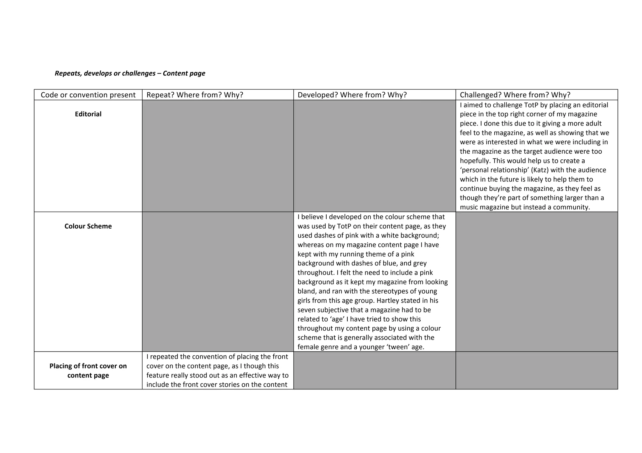
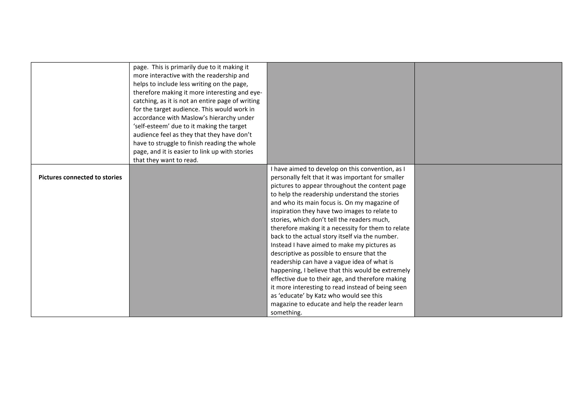
Repeats,	
  develops	
  or	
  challenges	
  –	
  Content	
  page	
  
Code	
  or	
  convention	
  present	
   Repeat?	
  Where	
  from?	
  Why?	
   Developed?	
  Where	
  from?	
  Why?	
   Challenged?	
  Where	
  from?	
  Why?	


Editorial	


   I	
  aimed	
  to	
  challenge	
  TotP	
  by	
  placing	
  an	
  editorial	
  
piece	
  in	
  the	
  top	
  right	
  corner	
  of	
  my	
  magazine	
  
piece.	
  I	
  done	
  this	
  due	
  to	
  it	
  giving	
  a	
  more	
  adult	
  
feel	
  to	
  the	
  magazine,	
  as	
  well	
  as	
  showing	
  that	
  we	
  
were	
  as	
  interested	
  in	
  what	
  we	
  were	
  including	
  in	
  
the	
  magazine	
  as	
  the	
  target	
  audience	
  were	
  too	
  
hopefully.	
  This	
  would	
  help	
  us	
  to	
  create	
  a	
  
‘personal	
  relationship’	
  (Katz)	
  with	
  the	
  audience	
  
which	
  in	
  the	
  future	
  is	
  likely	
  to	
  help	
  them	
  to	
  
continue	
  buying	
  the	
  magazine,	
  as	
  they	
  feel	
  as	
  
though	
  they’re	
  part	
  of	
  something	
  larger	
  than	
  a	
  
music	
  magazine	
  but	
  instead	
  a	
  community.	


Colour	
  Scheme	


   I	
  believe	
  I	
  developed	
  on	
  the	
  colour	
  scheme	
  that	
  
was	
  used	
  by	
  TotP	
  on	
  their	
  content	
  page,	
  as	
  they	
  
used	
  dashes	
  of	
  pink	
  with	
  a	
  white	
  background;	
  
whereas	
  on	
  my	
  magazine	
  content	
  page	
  I	
  have	
  
kept	
  with	
  my	
  running	
  theme	
  of	
  a	
  pink	
  
background	
  with	
  dashes	
  of	
  blue,	
  and	
  grey	
  
throughout.	
  I	
  felt	
  the	
  need	
  to	
  include	
  a	
  pink	
  
background	
  as	
  it	
  kept	
  my	
  magazine	
  from	
  looking	
  
bland,	
  and	
  ran	
  with	
  the	
  stereotypes	
  of	
  young	
  
girls	
  from	
  this	
  age	
  group.	
  Hartley	
  stated	
  in	
  his	
  
seven	
  subjective	
  that	
  a	
  magazine	
  had	
  to	
  be	
  
related	
  to	
  ‘age’	
  I	
  have	
  tried	
  to	
  show	
  this	
  
throughout	
  my	
  content	
  page	
  by	
  using	
  a	
  colour	
  
scheme	
  that	
  is	
  generally	
  associated	
  with	
  the	
  
female	
  genre	
  and	
  a	
  younger	
  ‘tween’	
  age.	


Placing	
  of	
  front	
  cover	
  on	
  
content	
  page	


I	
  repeated	
  the	
  convention	
  of	
  placing	
  the	
  front	
  
cover	
  on	
  the	
  content	
  page,	
  as	
  I	
  though	
  this	
  
feature	
  really	
  stood	
  out	
  as	
  an	
  effective	
  way	
  to	
  
include	
  the	
  front	
  cover	
  stories	
  on	
  the	
  content	


page.	
  	
  This	
  is	
  primarily	
  due	
  to	
  it	
  making	
  it	
  
more	
  interactive	
  with	
  the	
  readership	
  and	
  
helps	
  to	
  include	
  less	
  writing	
  on	
  the	
  page,	
  
therefore	
  making	
  it	
  more	
  interesting	
  and	
  eye-­‐
catching,	
  as	
  it	
  is	
  not	
  an	
  entire	
  page	
  of	
  writing	
  
for	
  the	
  target	
  audience.	
  This	
  would	
  work	
  in	
  
accordance	
  with	
  Maslow’s	
  hierarchy	
  under	
  
‘self-­‐esteem’	
  due	
  to	
  it	
  making	
  the	
  target	
  
audience	
  feel	
  as	
  they	
  that	
  they	
  have	
  don’t	
  
have	
  to	
  struggle	
  to	
  finish	
  reading	
  the	
  whole	
  
page,	
  and	
  it	
  is	
  easier	
  to	
  link	
  up	
  with	
  stories	
  
that	
  they	
  want	
  to	
  read.	


Pictures	
  connected	
  to	
  stories	


   I	
  have	
  aimed	
  to	
  develop	
  on	
  this	
  convention,	
  as	
  I	
  
personally	
  felt	
  that	
  it	
  was	
  important	
  for	
  smaller	
  
pictures	
  to	
  appear	
  throughout	
  the	
  content	
  page	
  
to	
  help	
  the	
  readership	
  understand	
  the	
  stories	
  
and	
  who	
  its	
  main	
  focus	
  is.	
  On	
  my	
  magazine	
  of	
  
inspiration	
  they	
  have	
  two	
  images	
  to	
  relate	
  to	
  
stories,	
  which	
  don’t	
  tell	
  the	
  readers	
  much,	
  
therefore	
  making	
  it	
  a	
  necessity	
  for	
  them	
  to	
  relate	
  
back	
  to	
  the	
  actual	
  story	
  itself	
  via	
  the	
  number.	
  
Instead	
  I	
  have	
  aimed	
  to	
  make	
  my	
  pictures	
  as	
  
descriptive	
  as	
  possible	
  to	
  ensure	
  that	
  the	
  
readership	
  can	
  have	
  a	
  vague	
  idea	
  of	
  what	
  is	
  
happening,	
  I	
  believe	
  that	
  this	
  would	
  be	
  extremely	
  
effective	
  due	
  to	
  their	
  age,	
  and	
  therefore	
  making	
  
it	
  more	
  interesting	
  to	
  read	
  instead	
  of	
  being	
  seen	
  
as	
  ‘educate’	
  by	
  Katz	
  who	
  would	
  see	
  this	
  
magazine	
  to	
  educate	
  and	
  help	
  the	
  reader	
  learn	
  
something.	


Question 1 - evaluation content page

  • 1.
    Repeats,  develops  or  challenges  –  Content  page   Code  or  convention  present   Repeat?  Where  from?  Why?   Developed?  Where  from?  Why?   Challenged?  Where  from?  Why?     Editorial         I  aimed  to  challenge  TotP  by  placing  an  editorial   piece  in  the  top  right  corner  of  my  magazine   piece.  I  done  this  due  to  it  giving  a  more  adult   feel  to  the  magazine,  as  well  as  showing  that  we   were  as  interested  in  what  we  were  including  in   the  magazine  as  the  target  audience  were  too   hopefully.  This  would  help  us  to  create  a   ‘personal  relationship’  (Katz)  with  the  audience   which  in  the  future  is  likely  to  help  them  to   continue  buying  the  magazine,  as  they  feel  as   though  they’re  part  of  something  larger  than  a   music  magazine  but  instead  a  community.       Colour  Scheme       I  believe  I  developed  on  the  colour  scheme  that   was  used  by  TotP  on  their  content  page,  as  they   used  dashes  of  pink  with  a  white  background;   whereas  on  my  magazine  content  page  I  have   kept  with  my  running  theme  of  a  pink   background  with  dashes  of  blue,  and  grey   throughout.  I  felt  the  need  to  include  a  pink   background  as  it  kept  my  magazine  from  looking   bland,  and  ran  with  the  stereotypes  of  young   girls  from  this  age  group.  Hartley  stated  in  his   seven  subjective  that  a  magazine  had  to  be   related  to  ‘age’  I  have  tried  to  show  this   throughout  my  content  page  by  using  a  colour   scheme  that  is  generally  associated  with  the   female  genre  and  a  younger  ‘tween’  age.       Placing  of  front  cover  on   content  page     I  repeated  the  convention  of  placing  the  front   cover  on  the  content  page,  as  I  though  this   feature  really  stood  out  as  an  effective  way  to   include  the  front  cover  stories  on  the  content      
  • 2.
          page.    This  is  primarily  due  to  it  making  it   more  interactive  with  the  readership  and   helps  to  include  less  writing  on  the  page,   therefore  making  it  more  interesting  and  eye-­‐ catching,  as  it  is  not  an  entire  page  of  writing   for  the  target  audience.  This  would  work  in   accordance  with  Maslow’s  hierarchy  under   ‘self-­‐esteem’  due  to  it  making  the  target   audience  feel  as  they  that  they  have  don’t   have  to  struggle  to  finish  reading  the  whole   page,  and  it  is  easier  to  link  up  with  stories   that  they  want  to  read.       Pictures  connected  to  stories             I  have  aimed  to  develop  on  this  convention,  as  I   personally  felt  that  it  was  important  for  smaller   pictures  to  appear  throughout  the  content  page   to  help  the  readership  understand  the  stories   and  who  its  main  focus  is.  On  my  magazine  of   inspiration  they  have  two  images  to  relate  to   stories,  which  don’t  tell  the  readers  much,   therefore  making  it  a  necessity  for  them  to  relate   back  to  the  actual  story  itself  via  the  number.   Instead  I  have  aimed  to  make  my  pictures  as   descriptive  as  possible  to  ensure  that  the   readership  can  have  a  vague  idea  of  what  is   happening,  I  believe  that  this  would  be  extremely   effective  due  to  their  age,  and  therefore  making   it  more  interesting  to  read  instead  of  being  seen   as  ‘educate’  by  Katz  who  would  see  this   magazine  to  educate  and  help  the  reader  learn   something.