The document discusses conventions used in the design of various media products for an indie folk artist named Natasha North. Key conventions discussed include:
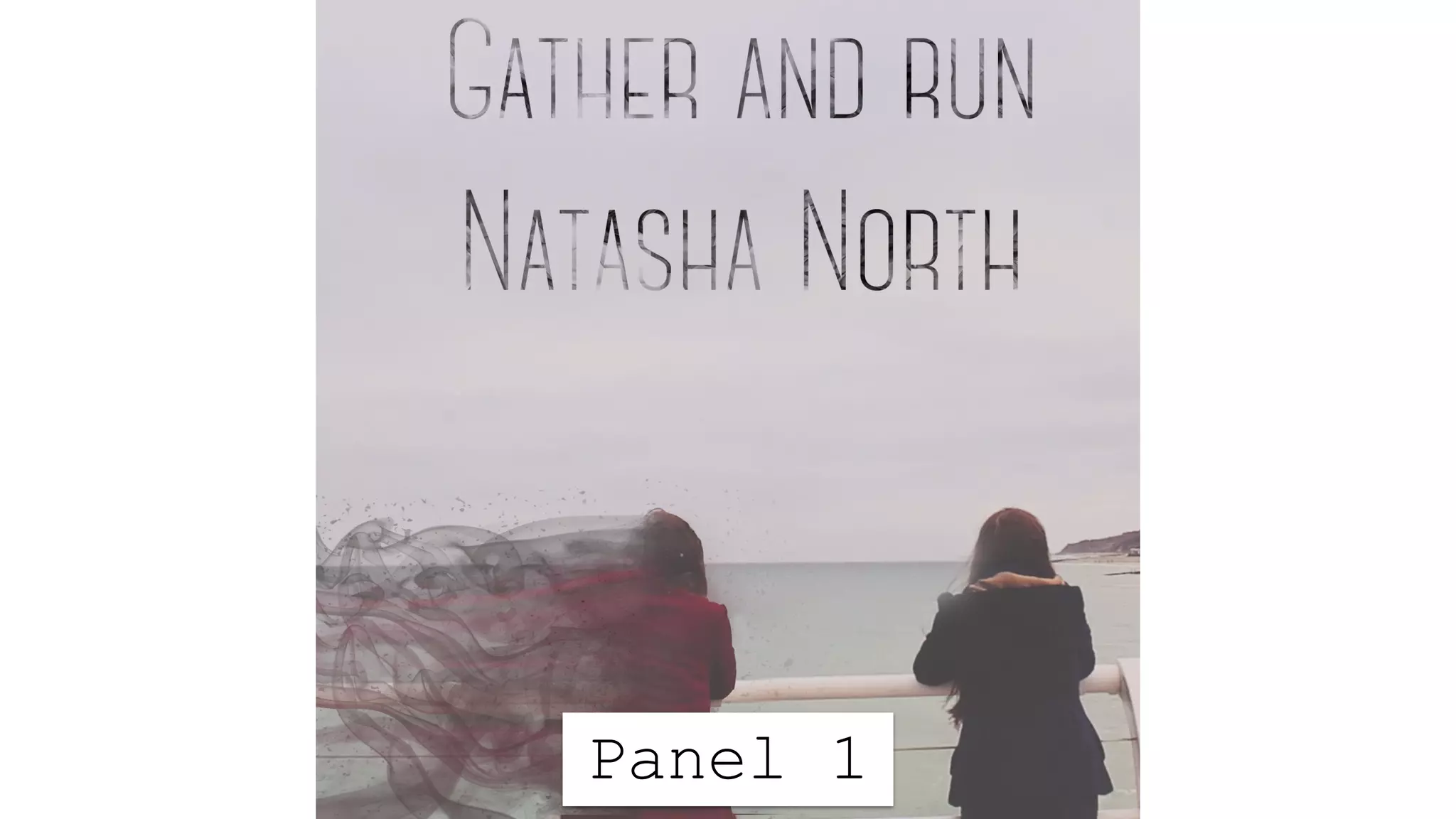
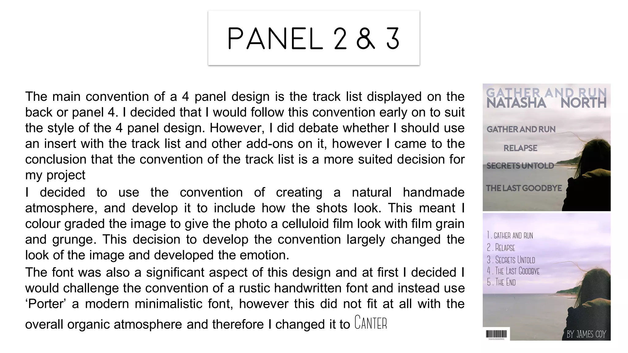
- Using a 4 panel layout for the digipak, as seen in other artists' works.
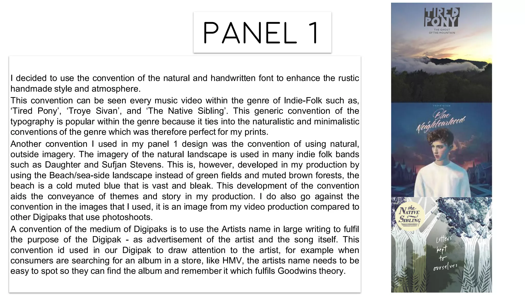
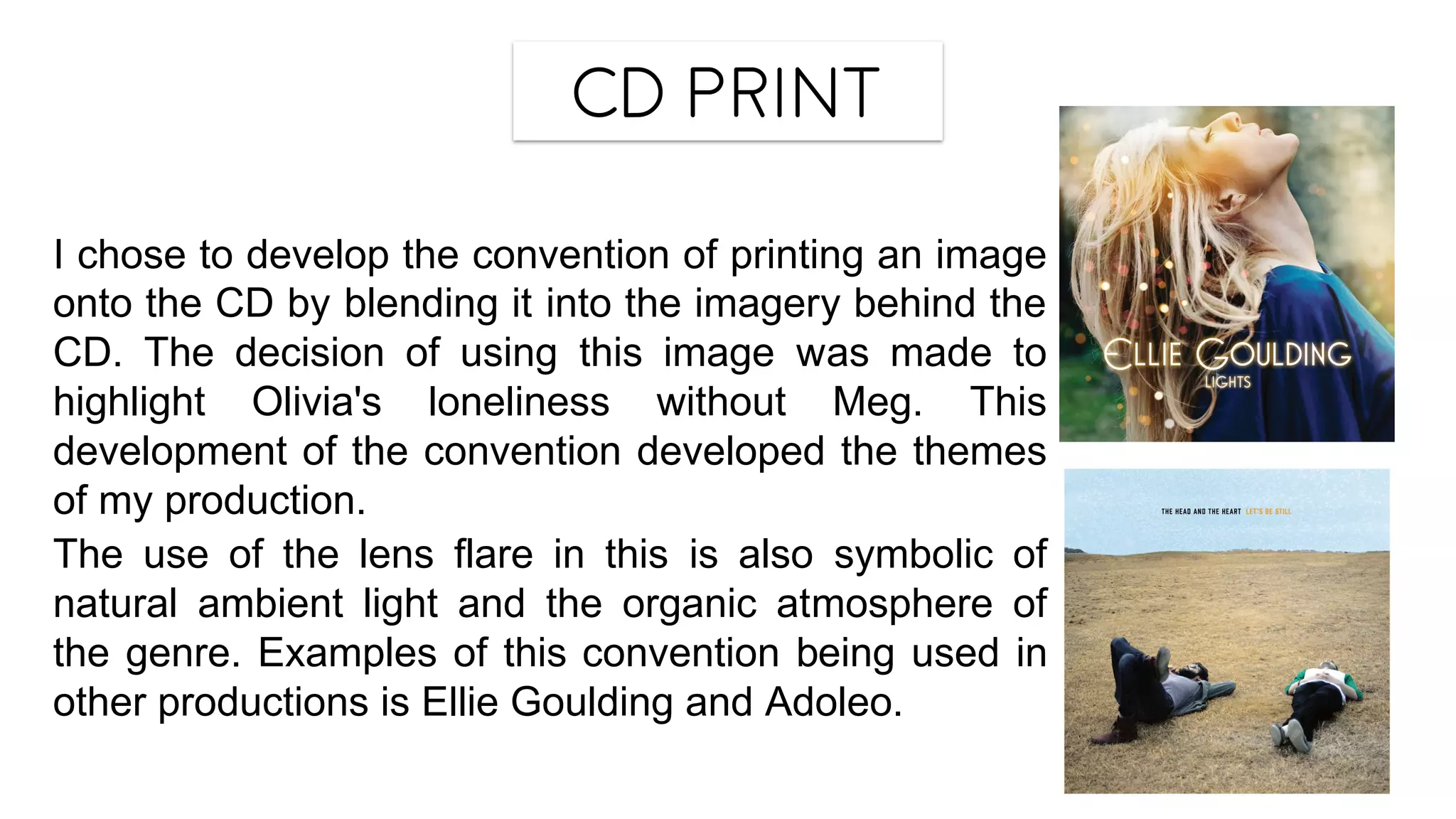
- Incorporating natural, handwritten fonts and imagery of nature/landscapes, popular within the indie folk genre.
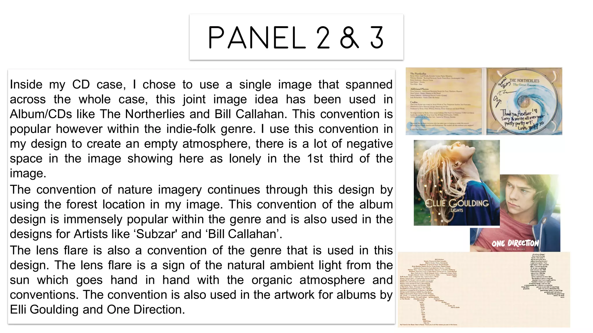
- Spanning a single image across the CD case, as done by other indie folk artists.
- Including the track list on the back panel, following convention.
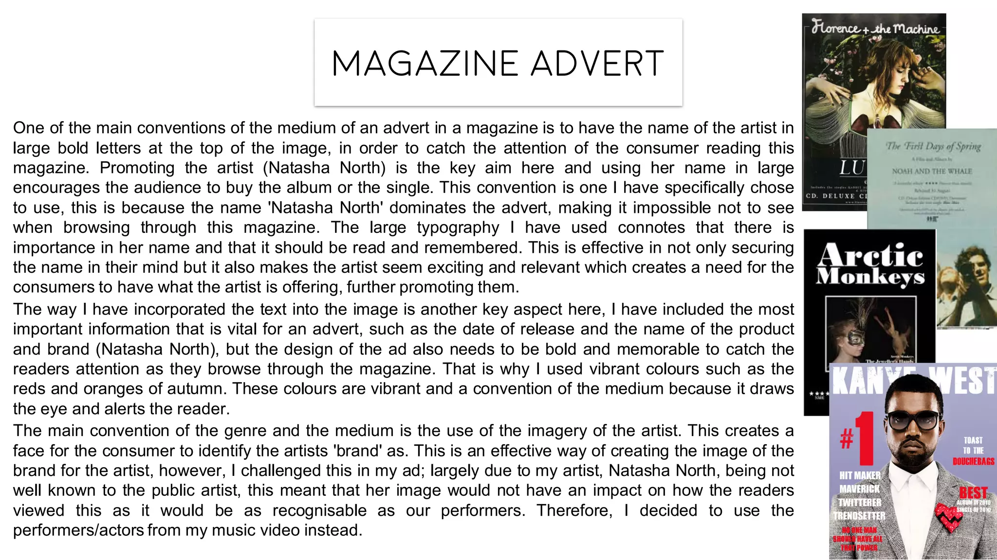
- Featuring the artist's name prominently in magazine ads to catch readers' attention.
The document also discusses ways some conventions were developed or challenged