Download to read offline
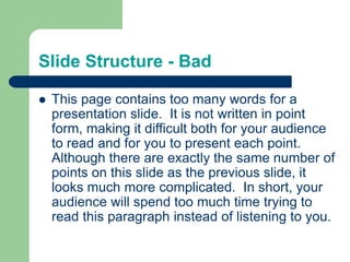
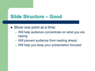
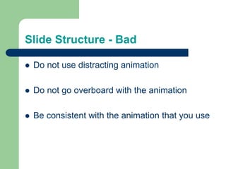
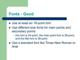


The document offers comprehensive guidelines for creating effective PowerPoint slides, emphasizing the importance of structure, font choice, color contrast, and the use of graphs. It highlights common pitfalls such as excessive wordiness, distracting animations, and poor background choices. Ultimately, the recommended practices aim to enhance audience engagement and comprehension during presentations.


