Download to read offline


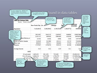
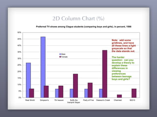
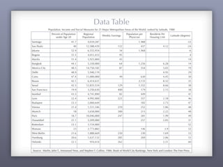
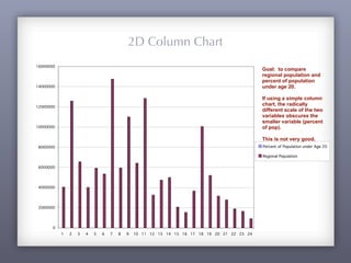
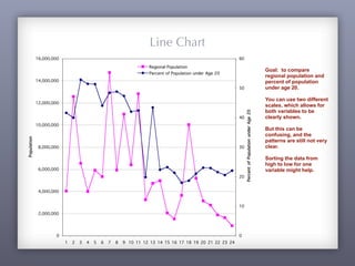
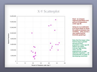
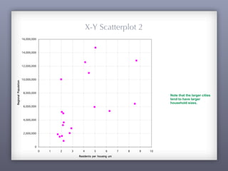
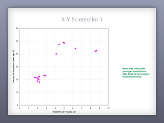
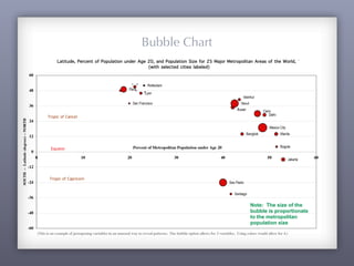


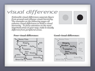

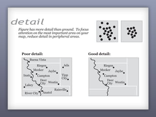


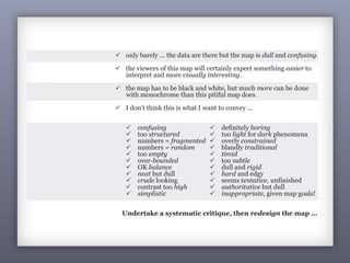


This document provides guidance on best practices for presenting data graphics and tables. It discusses common mistakes to avoid, such as using awkward abbreviations or not including complete source citations. It also provides examples of different types of charts and graphs (e.g. pie charts, bar charts, scatterplots) to effectively display relationships between multiple variables in data. The examples illustrate population and demographic data for various cities to compare variables like population size, age distribution, and household occupancy. Overall, the document aims to help readers design clear and informative data visualizations.


