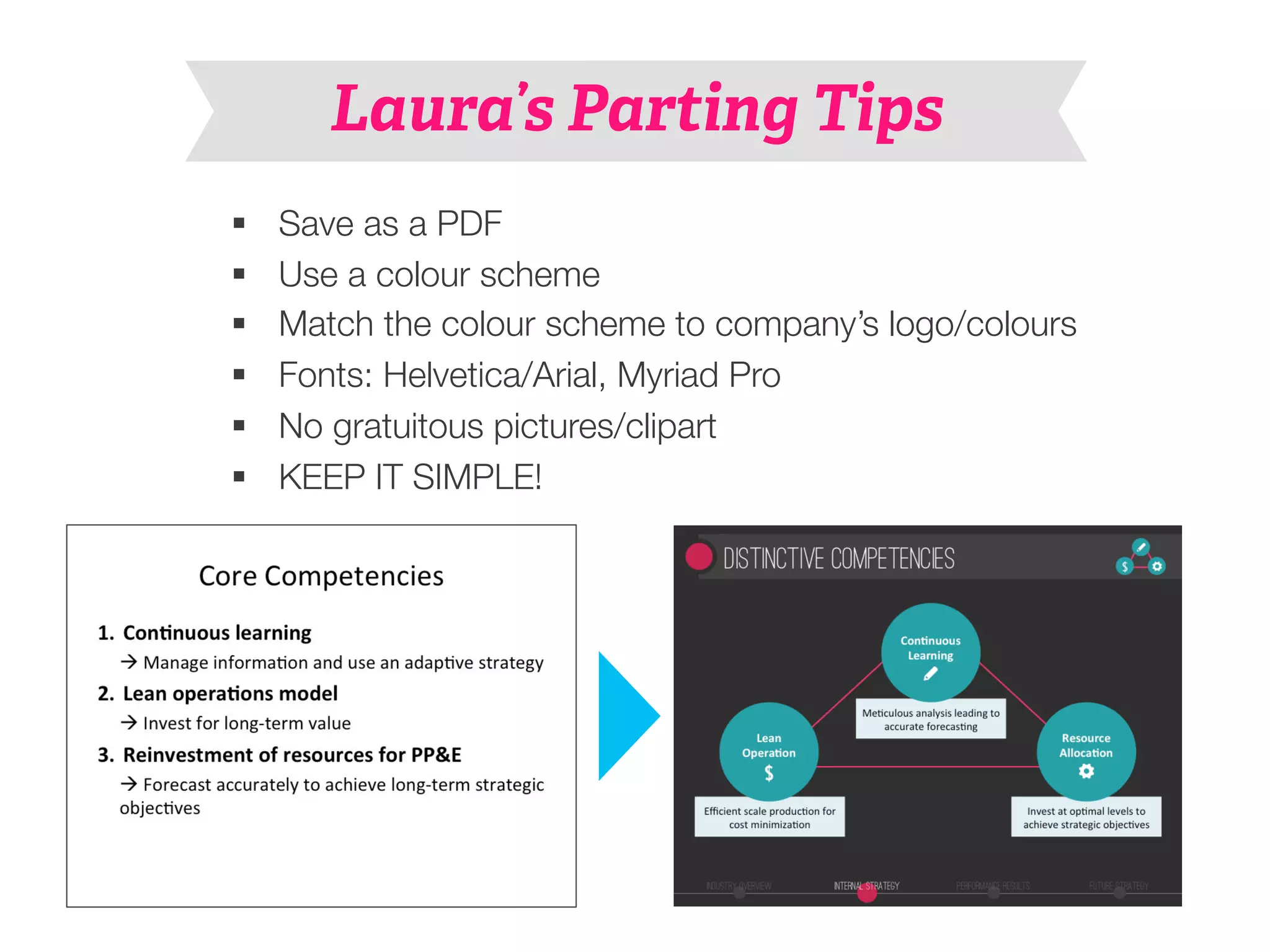
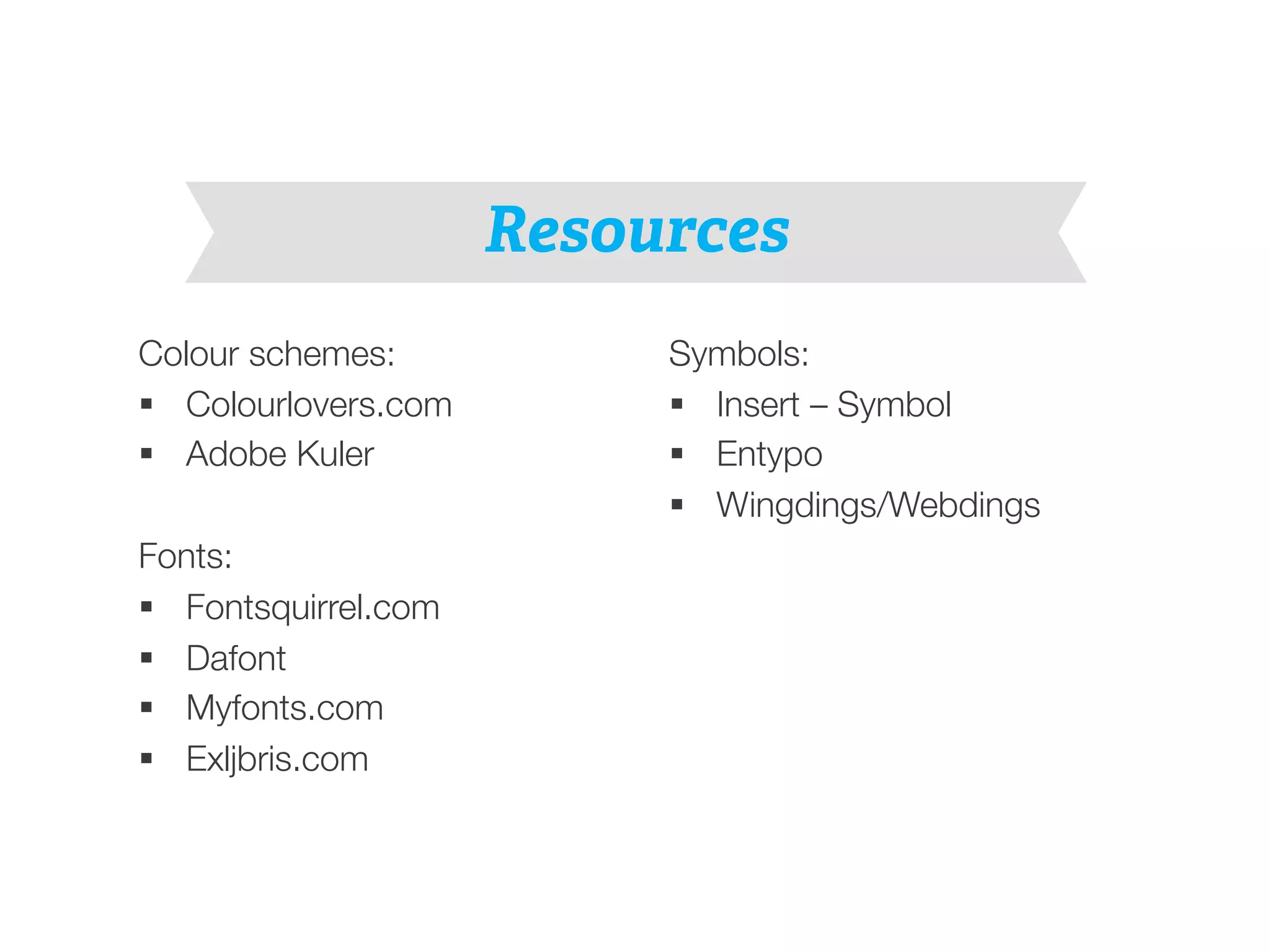
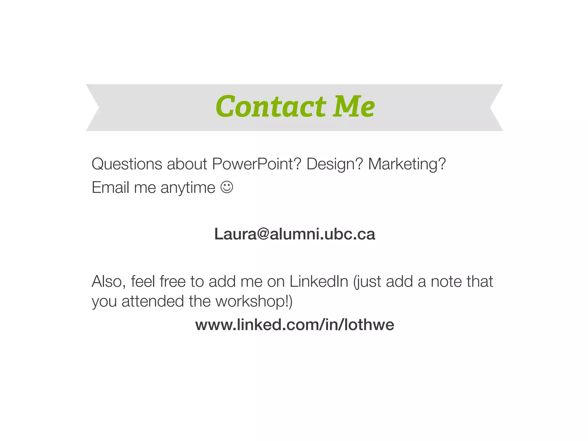
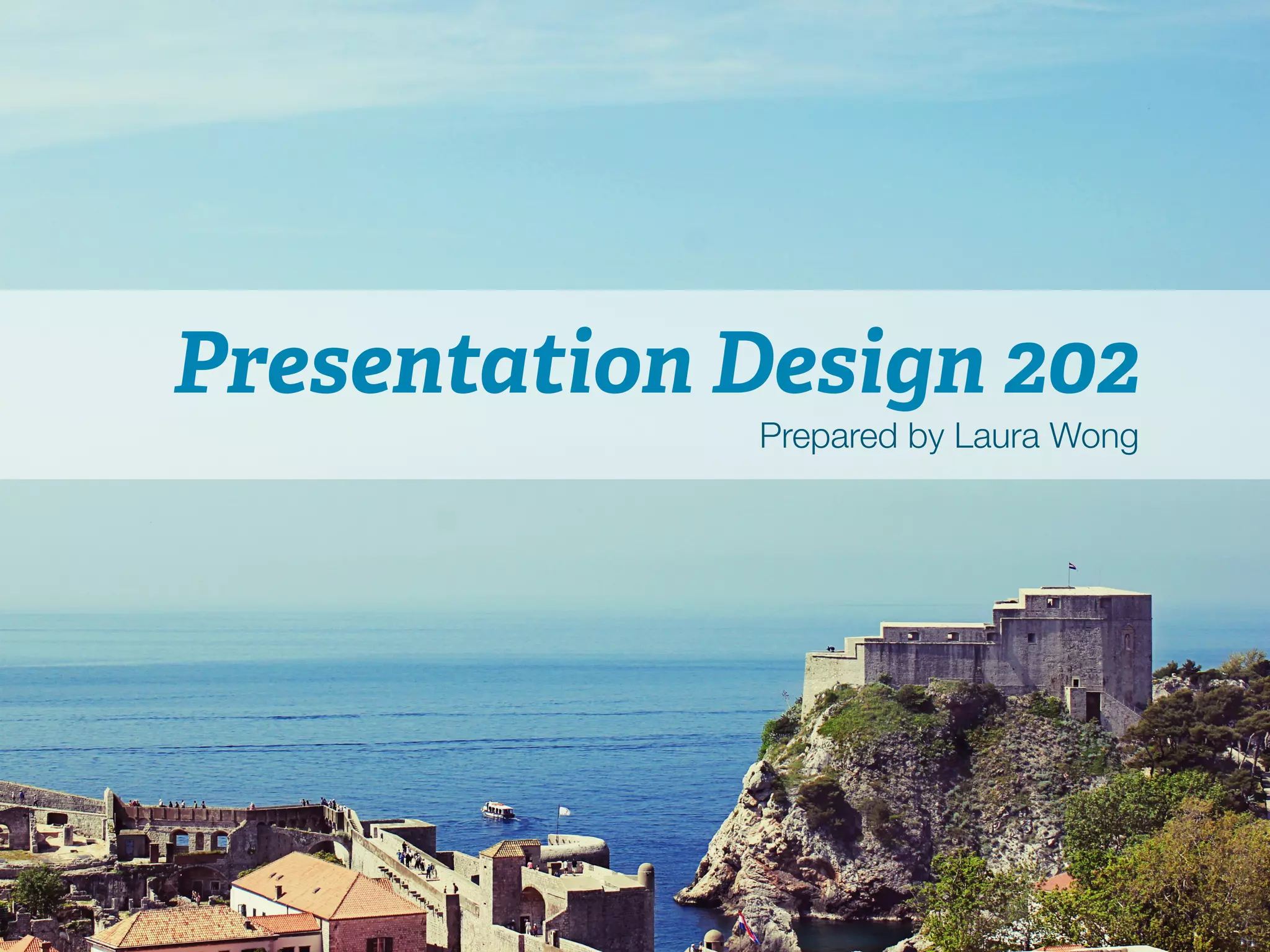
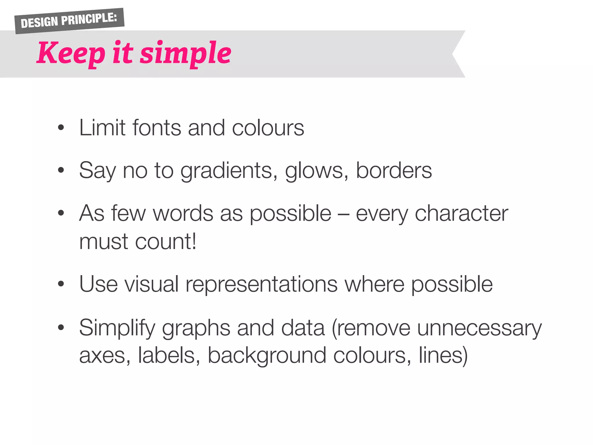
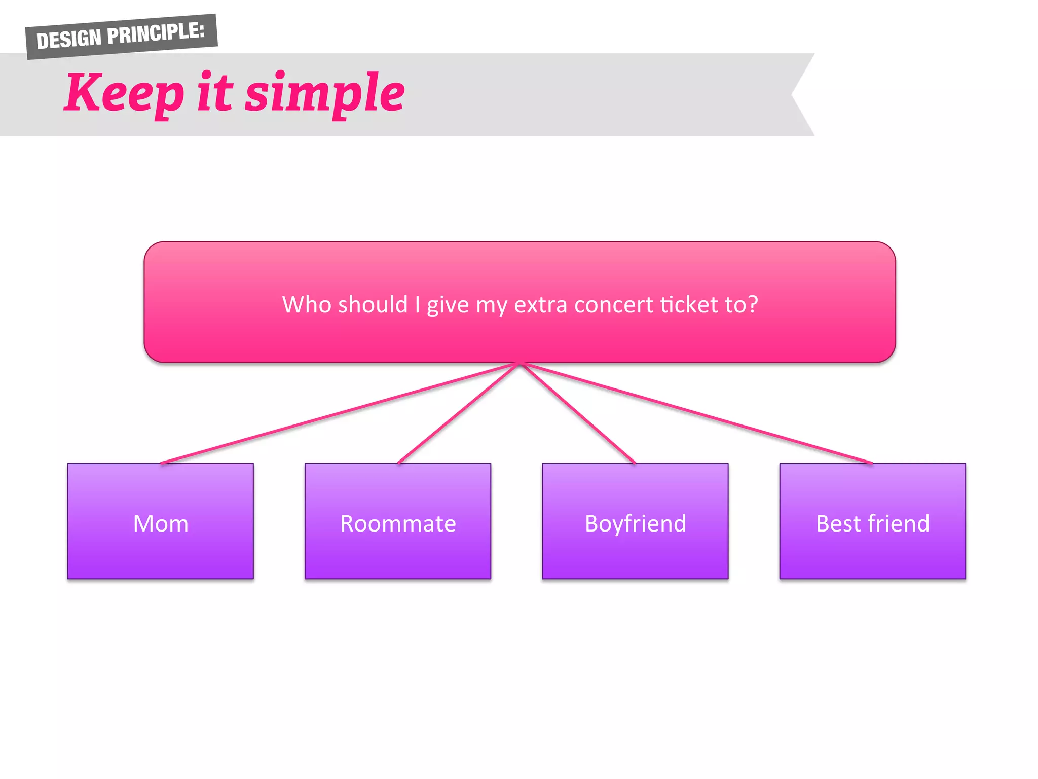
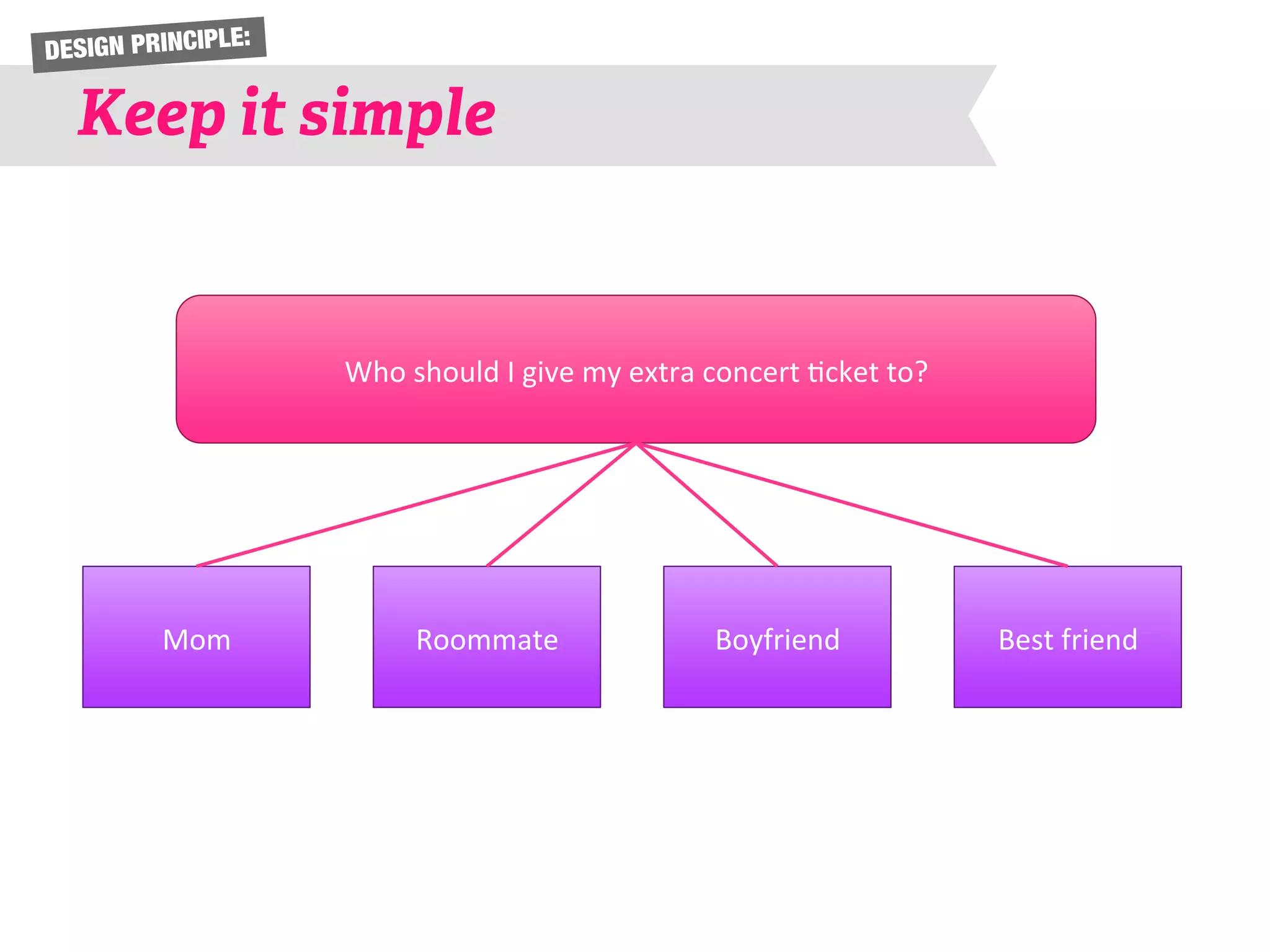
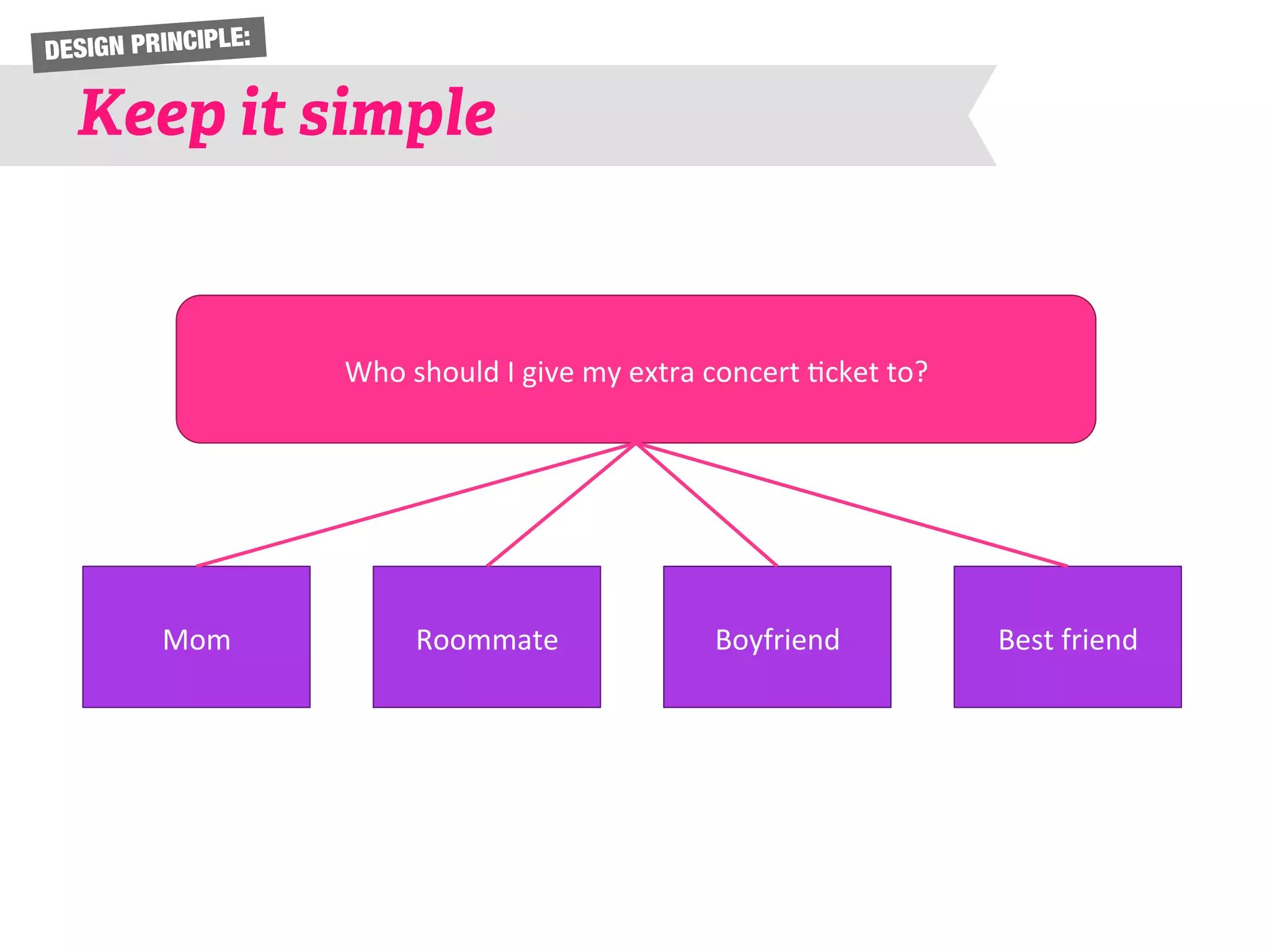
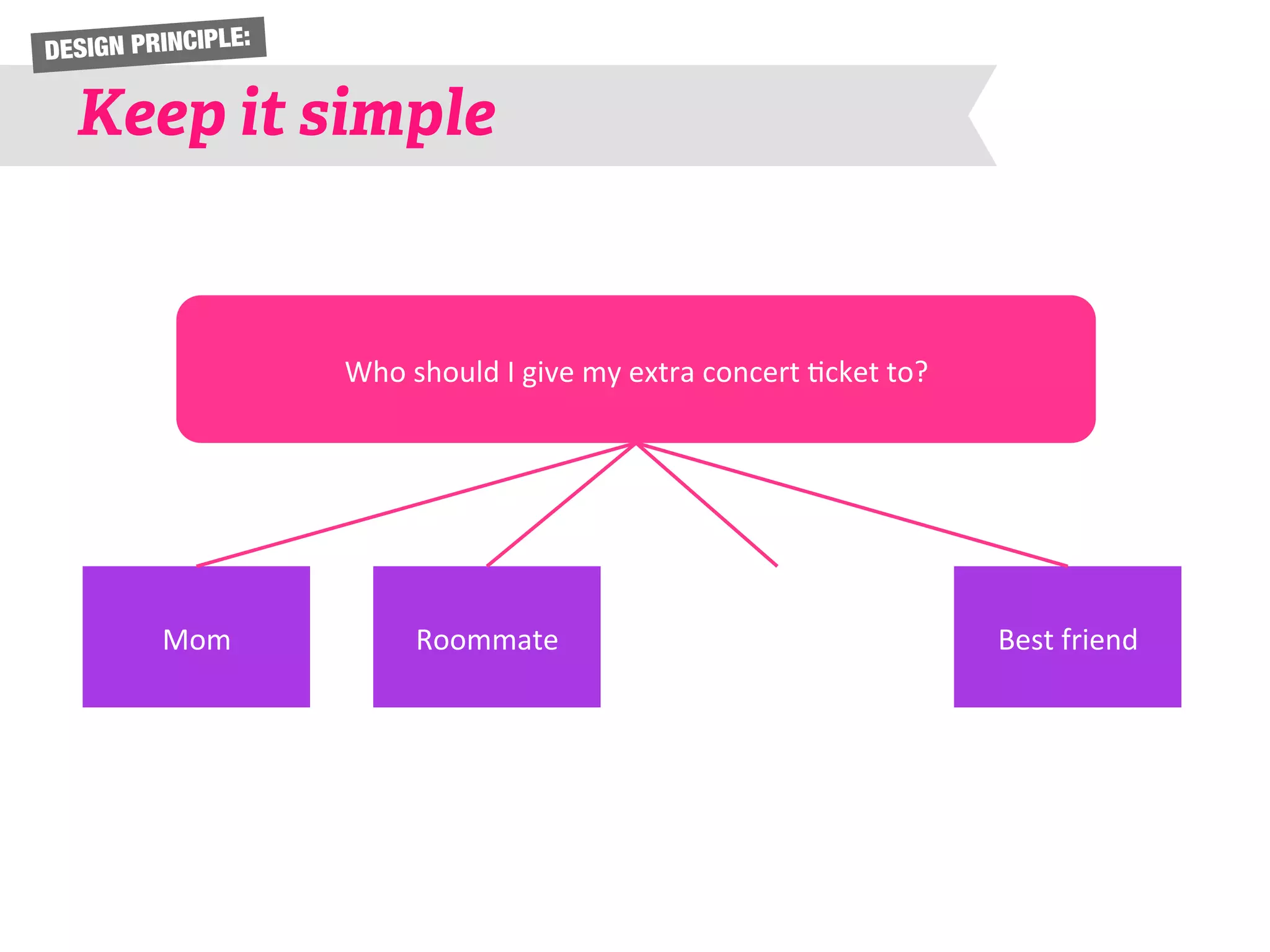
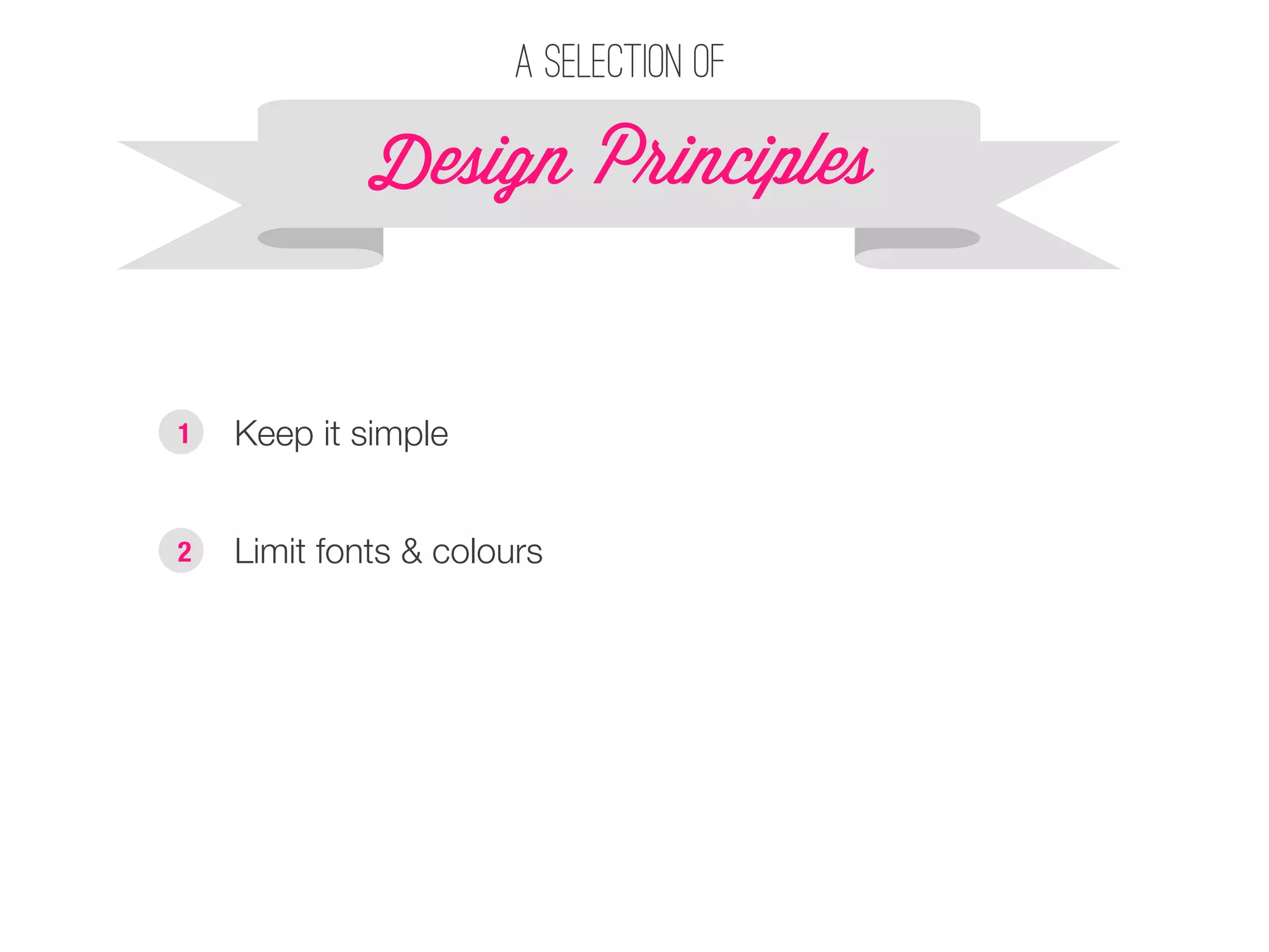
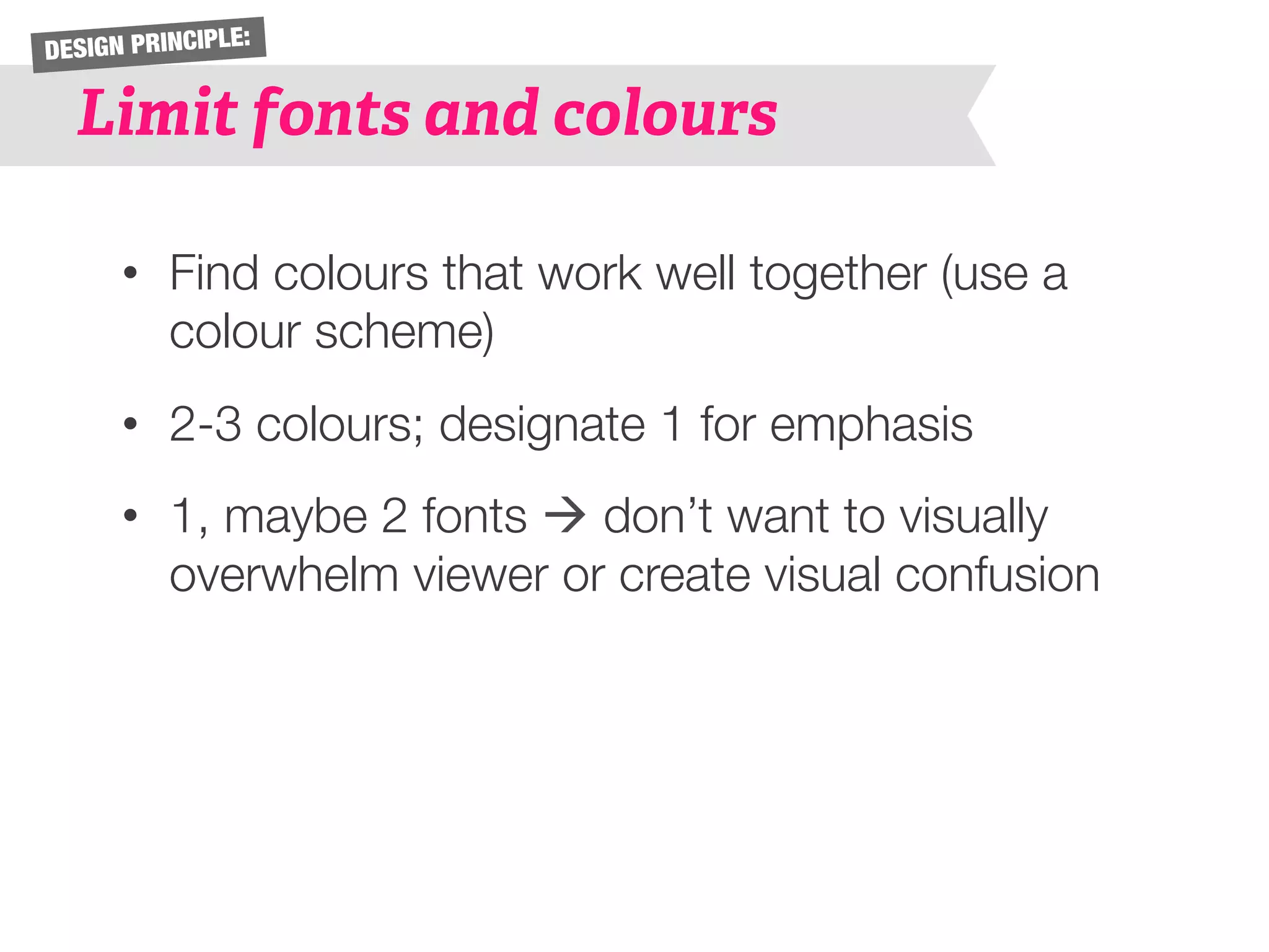
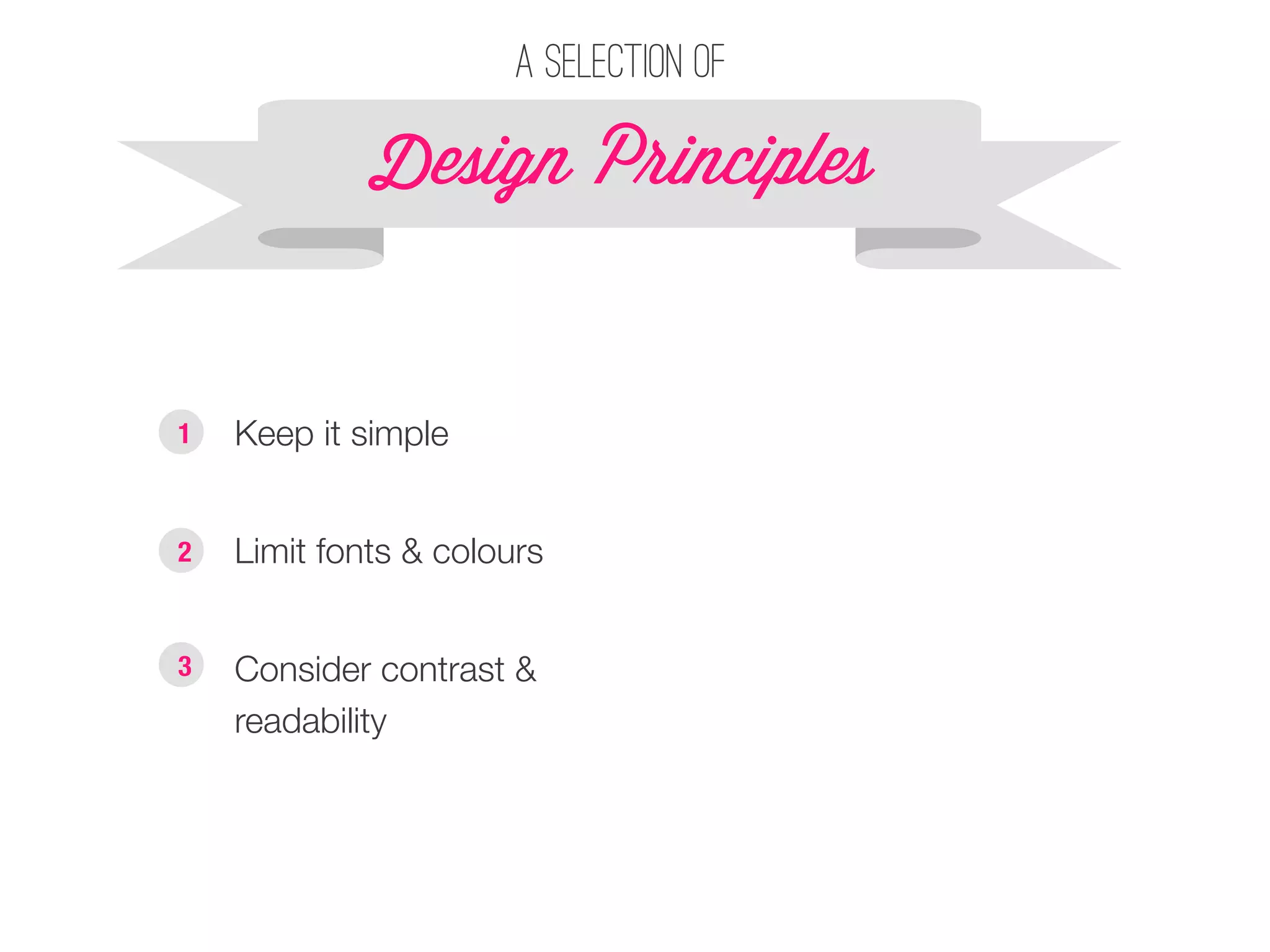
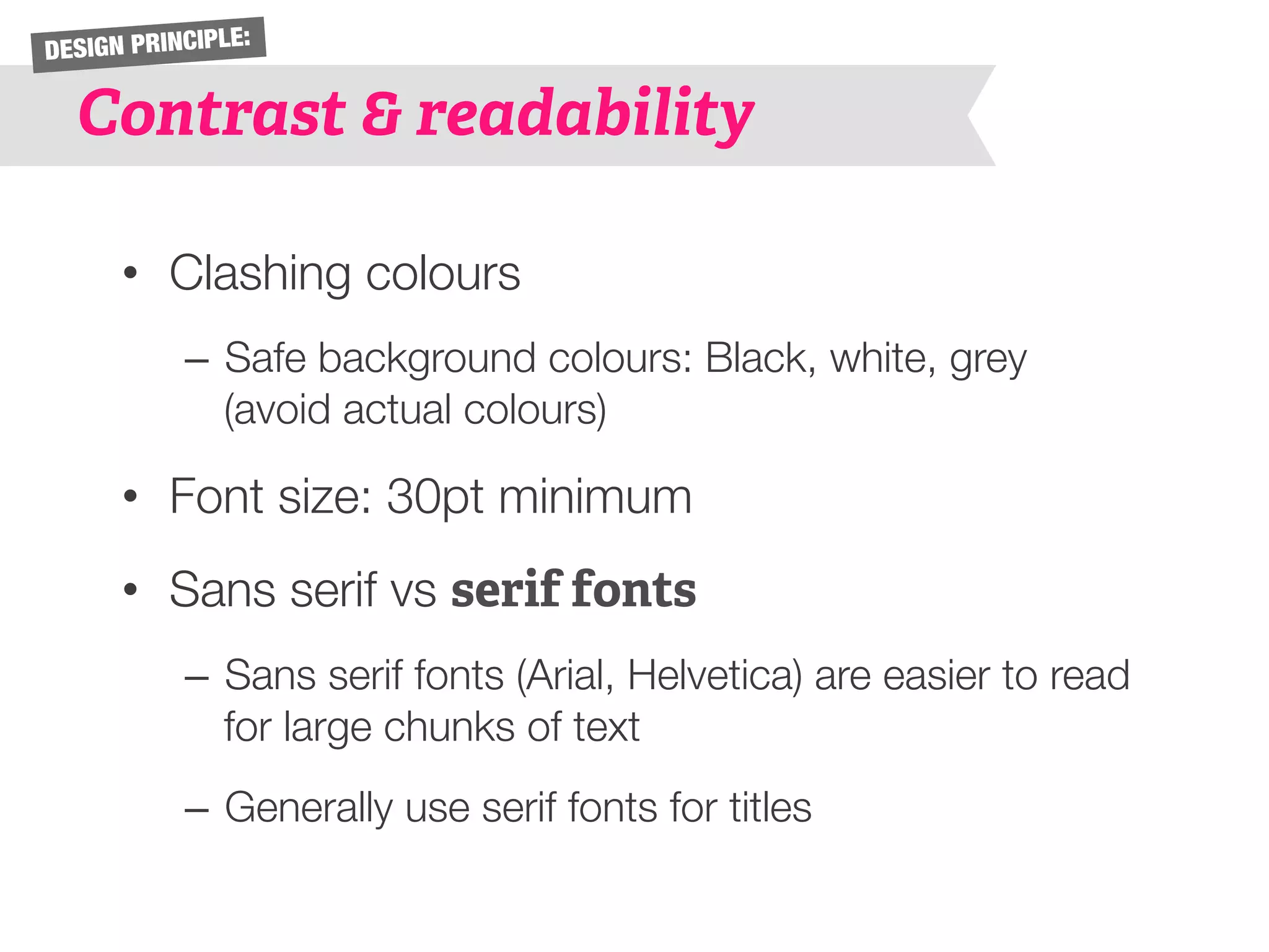
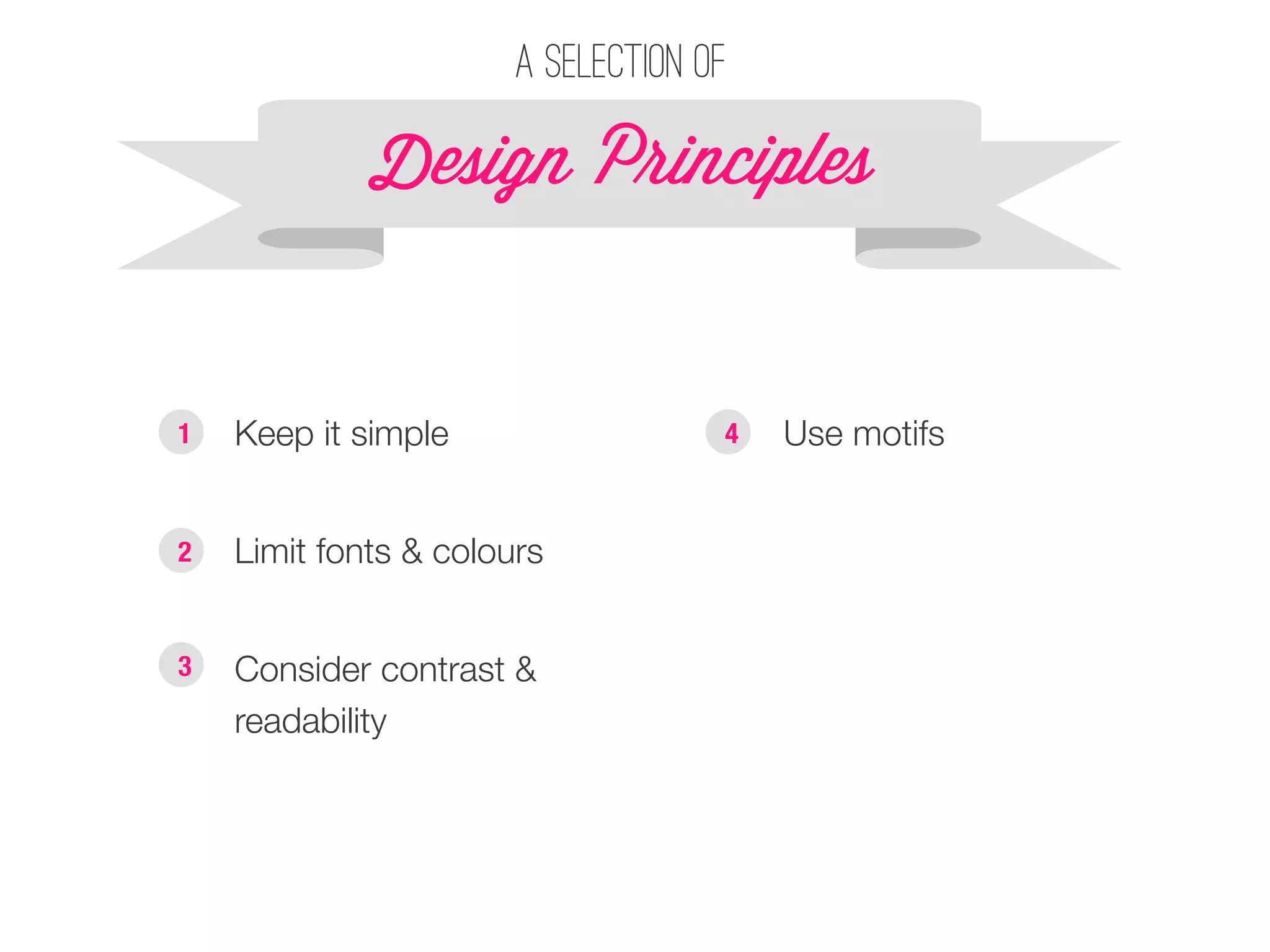
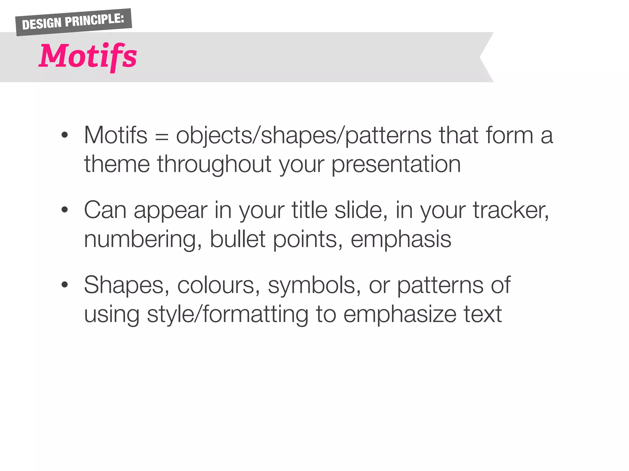
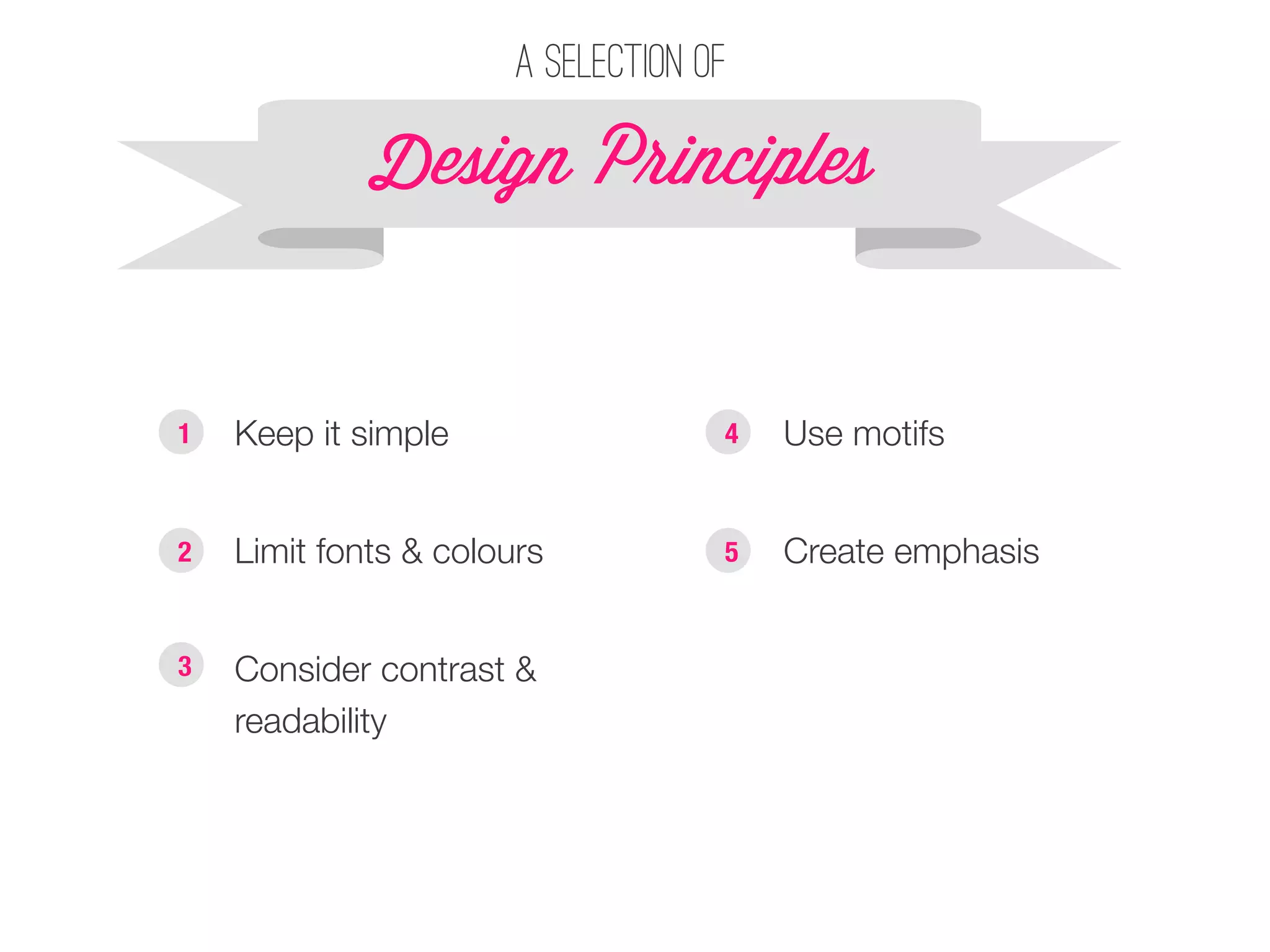
Presentation Design 202 
Prepared by Laura Wong
Laura Wong 
• Self-taught graphic designer 
• 1st place in CMABC Case Competition 
(2011), 1st place in Manitoba International 
Marketing Competition (2013), 3rd place in 
Brazil Case Competition (2014) 
• TA for COMM 202 and works full time for 
the Vancouver Canucks
Learning Outcome
Design P!inciples 
§ Keep it simple 
A selection of 
1
DESIGN PRINCIPLE: 
Keep it simple 
• Limit fonts and colours 
• Say no to gradients, glows, borders 
• As few words as possible – every character 
must count! 
• Use visual representations where possible 
• Simplify graphs and data (remove unnecessary 
axes, labels, background colours, lines)
DESIGN PRINCIPLE: 
Keep it simple 
Who 
should 
I 
give 
my 
extra 
concert 
6cket 
to? 
Mom 
Roommate 
Boyfriend 
Best 
friend
DESIGN PRINCIPLE: 
Keep it simple 
Who 
should 
I 
give 
my 
extra 
concert 
6cket 
to? 
Mom 
Roommate 
Boyfriend 
Best 
friend
DESIGN PRINCIPLE: 
Keep it simple 
Who 
should 
I 
give 
my 
extra 
concert 
6cket 
to? 
Mom 
Roommate 
Boyfriend 
Best 
friend
DESIGN PRINCIPLE: 
Keep it simple 
Who 
should 
I 
give 
my 
extra 
concert 
6cket 
to? 
Mom 
Roommate 
Boyfriend 
Best 
friend
DESIGN PRINCIPLE: 
Keep it simple 
Who 
should 
I 
give 
my 
extra 
concert 
6cket 
to? 
Mom 
Roommate 
Best 
friend
A selection of 
Design P!inciples 
§ Keep it simple 
1 
§ Limit fonts & colours 
2
DESIGN PRINCIPLE: 
Limit fonts and colours 
• Find colours that work well together (use a 
colour scheme) 
• 2-3 colours; designate 1 for emphasis 
• 1, maybe 2 fonts à don’t want to visually 
overwhelm viewer or create visual confusion
A selection of 
Design P!inciples 
§ Keep it simple 
1 
§ Limit fonts & colours 
2 
§ Consider contrast & 
readability 
3
DESIGN PRINCIPLE: 
Contrast & readability 
• Clashing colours 
– Safe background colours: Black, white, grey 
(avoid actual colours) 
• Font size: 30pt minimum 
• Sans serif vs serif fonts 
– Sans serif fonts (Arial, Helvetica) are easier to read 
for large chunks of text 
– Generally use serif fonts for titles
A selection of 
Design P!inciples 
1 § Keep it simple 
§ Use motifs 
§ Limit fonts & colours 
2 
§ Consider contrast & 
readability 
3 
4
DESIGN PRINCIPLE: 
Motifs 
• Motifs = objects/shapes/patterns that form a 
theme throughout your presentation 
• Can appear in your title slide, in your tracker, 
numbering, bullet points, emphasis 
• Shapes, colours, symbols, or patterns of 
using style/formatting to emphasize text
A selection of 
Design P!inciples 
§ Keep it simple 
§ Limit fonts & colours 
§ Consider contrast & 
readability 
§ Use motifs 
§ Create emphasis 
1 
2 
3 
4 
5
DESIGN PRINCIPLE: 
Emphasis 
• Can be done through colour, font size, 
bolding, spacing, CAPS 
• For graphs/data: highlight key points using 
colour 
• Don’t overdo it or it will lose its effect!
A selection of 
Design P!inciples 
§ Keep it simple 
§ Limit fonts & colours 
§ Consider contrast & 
readability 
§ Use motifs 
§ Create emphasis 
§ Visuals vs. words 
1 
2 
3 
4 
5 
6
DESIGN PRINCIPLE: 
Visuals vs. Words 
• Use symbols or fonts (such as Wingdings/ 
Webdings) to visually represent words 
• Use simple images (not clipart!) to convey an 
idea faster than words can
DEMO: 
Slide Master 
• Learn the keyboard shortcut! 
• When you open up the Slide Master, do NOT 
edit the top “daddy” slide unless you want 
something to show up on EVERY slide 
• When creating a tracker, duplicate the slide 
multiple times and change the colour of the 
tracker on each of the slides 
• When you exit the slide master, you can use your 
templates by [Home tab > Layout > Title and 
Content (or whatever slide you used)]
DEMO: 
Smart Art 
• Use smart art to save time 
• Can use it to make a quick tracker 
• Not really that “smart”… difficult to format 
and rearrange/position to your liking
DEMO: 
Alignment & distribution 
• If you have 3+ shapes and want to space 
them evenly, go to [Home tab > Format > 
Arrange > Align or Distribute > Distribute 
horizontally/vertically] 
• Use the same path above to align shapes/ 
text boxes to the same line 
• When moving shapes around, a dotted line 
may appear to help you center/align objects 
in relation to each other
DEMO: 
Colour schemes 
• Once you have chosen a colour 
scheme (see resources), go to 
[Themes tab > Theme Options > 
Colors > Create Theme Colors] 
• To input your colour scheme, 
double click on one of the Accent 
boxes – you will need the RGB 
code of each colour 
• Click Apply to All – this colour 
scheme will now always be 
available when you open 
PowerPoint!
Laura’s Parting Tips 
§ Save as a PDF 
§ Use a colour scheme 
§ Match the colour scheme to company’s logo/colours 
§ Fonts: Helvetica/Arial, Myriad Pro 
§ No gratuitous pictures/clipart 
§ KEEP IT SIMPLE!
Colour schemes: 
§ Colourlovers.com 
§ Adobe Kuler 
Fonts: 
§ Fontsquirrel.com 
§ Dafont 
§ Myfonts.com 
§ Exljbris.com 
Resources 
Symbols: 
§ Insert – Symbol 
§ Entypo 
§ Wingdings/Webdings
Contact Me 
Questions about PowerPoint? Design? Marketing? 
Email me anytime J 
Laura@alumni.ubc.ca! 
! 
Also, feel free to add me on LinkedIn (just add a note that 
you attended the workshop!) 
www.linked.com/in/lothwe!

Presentation Design 202

  • 1.
    Presentation Design 202 Prepared by Laura Wong
  • 2.
    Laura Wong •Self-taught graphic designer • 1st place in CMABC Case Competition (2011), 1st place in Manitoba International Marketing Competition (2013), 3rd place in Brazil Case Competition (2014) • TA for COMM 202 and works full time for the Vancouver Canucks
  • 3.
  • 4.
    Design P!inciples §Keep it simple A selection of 1
  • 5.
    DESIGN PRINCIPLE: Keepit simple • Limit fonts and colours • Say no to gradients, glows, borders • As few words as possible – every character must count! • Use visual representations where possible • Simplify graphs and data (remove unnecessary axes, labels, background colours, lines)
  • 6.
    DESIGN PRINCIPLE: Keepit simple Who should I give my extra concert 6cket to? Mom Roommate Boyfriend Best friend
  • 7.
    DESIGN PRINCIPLE: Keepit simple Who should I give my extra concert 6cket to? Mom Roommate Boyfriend Best friend
  • 8.
    DESIGN PRINCIPLE: Keepit simple Who should I give my extra concert 6cket to? Mom Roommate Boyfriend Best friend
  • 9.
    DESIGN PRINCIPLE: Keepit simple Who should I give my extra concert 6cket to? Mom Roommate Boyfriend Best friend
  • 10.
    DESIGN PRINCIPLE: Keepit simple Who should I give my extra concert 6cket to? Mom Roommate Best friend
  • 11.
    A selection of Design P!inciples § Keep it simple 1 § Limit fonts & colours 2
  • 12.
    DESIGN PRINCIPLE: Limitfonts and colours • Find colours that work well together (use a colour scheme) • 2-3 colours; designate 1 for emphasis • 1, maybe 2 fonts à don’t want to visually overwhelm viewer or create visual confusion
  • 13.
    A selection of Design P!inciples § Keep it simple 1 § Limit fonts & colours 2 § Consider contrast & readability 3
  • 14.
    DESIGN PRINCIPLE: Contrast& readability • Clashing colours – Safe background colours: Black, white, grey (avoid actual colours) • Font size: 30pt minimum • Sans serif vs serif fonts – Sans serif fonts (Arial, Helvetica) are easier to read for large chunks of text – Generally use serif fonts for titles
  • 15.
    A selection of Design P!inciples 1 § Keep it simple § Use motifs § Limit fonts & colours 2 § Consider contrast & readability 3 4
  • 16.
    DESIGN PRINCIPLE: Motifs • Motifs = objects/shapes/patterns that form a theme throughout your presentation • Can appear in your title slide, in your tracker, numbering, bullet points, emphasis • Shapes, colours, symbols, or patterns of using style/formatting to emphasize text
  • 17.
    A selection of Design P!inciples § Keep it simple § Limit fonts & colours § Consider contrast & readability § Use motifs § Create emphasis 1 2 3 4 5
  • 18.
    DESIGN PRINCIPLE: Emphasis • Can be done through colour, font size, bolding, spacing, CAPS • For graphs/data: highlight key points using colour • Don’t overdo it or it will lose its effect!
  • 19.
    A selection of Design P!inciples § Keep it simple § Limit fonts & colours § Consider contrast & readability § Use motifs § Create emphasis § Visuals vs. words 1 2 3 4 5 6
  • 20.
    DESIGN PRINCIPLE: Visualsvs. Words • Use symbols or fonts (such as Wingdings/ Webdings) to visually represent words • Use simple images (not clipart!) to convey an idea faster than words can
  • 21.
    DEMO: Slide Master • Learn the keyboard shortcut! • When you open up the Slide Master, do NOT edit the top “daddy” slide unless you want something to show up on EVERY slide • When creating a tracker, duplicate the slide multiple times and change the colour of the tracker on each of the slides • When you exit the slide master, you can use your templates by [Home tab > Layout > Title and Content (or whatever slide you used)]
  • 22.
    DEMO: Smart Art • Use smart art to save time • Can use it to make a quick tracker • Not really that “smart”… difficult to format and rearrange/position to your liking
  • 23.
    DEMO: Alignment &distribution • If you have 3+ shapes and want to space them evenly, go to [Home tab > Format > Arrange > Align or Distribute > Distribute horizontally/vertically] • Use the same path above to align shapes/ text boxes to the same line • When moving shapes around, a dotted line may appear to help you center/align objects in relation to each other
  • 24.
    DEMO: Colour schemes • Once you have chosen a colour scheme (see resources), go to [Themes tab > Theme Options > Colors > Create Theme Colors] • To input your colour scheme, double click on one of the Accent boxes – you will need the RGB code of each colour • Click Apply to All – this colour scheme will now always be available when you open PowerPoint!
  • 25.
    Laura’s Parting Tips § Save as a PDF § Use a colour scheme § Match the colour scheme to company’s logo/colours § Fonts: Helvetica/Arial, Myriad Pro § No gratuitous pictures/clipart § KEEP IT SIMPLE!
  • 26.
    Colour schemes: §Colourlovers.com § Adobe Kuler Fonts: § Fontsquirrel.com § Dafont § Myfonts.com § Exljbris.com Resources Symbols: § Insert – Symbol § Entypo § Wingdings/Webdings
  • 27.
    Contact Me Questionsabout PowerPoint? Design? Marketing? Email me anytime J Laura@alumni.ubc.ca! ! Also, feel free to add me on LinkedIn (just add a note that you attended the workshop!) www.linked.com/in/lothwe!