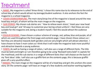
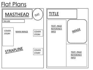
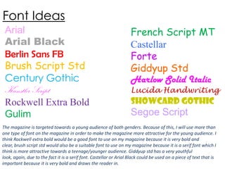
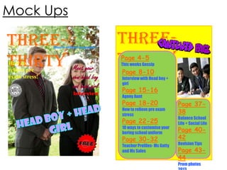
Preliminary Task
Ella Smith
Treatment
• NAME: My magazine is called ‘three-thirty’. I chose this name due to its relevance to the end of
school day of which would attract my teenage/student audience. It also anchors the fact the
magazine is a school magazine.
• COVER STORY/STRAPLINE: The main story/strap line of the magazine is based around the new
head boy and girl, of whom will be the main image on the magazine.
• SUB STORIES: My chosen sub stories are: ‘ How to relieve exam stress’, ‘meet your new head
boy and head girl’ and ‘10 ways to customize your boring school uniform’. I feel these are very
suitable for the magazine and ,being a student myself, I feel this would attract the audience
easily.
• COLOUR SCHEME: I have chosen a colour scheme of orange, red, yellow, blue and purple; all of
which are used throughout the front page and contents page. I have chosen these colours as I
feel they are attractive towards both genders and are very bright which will attract attention. I
have chosen to have 5 main colors as I think that it will make the magazine look more youthful
and attractive towards a young audience.
• FONTS: As well as having a range of colors, I will also use a range of different fonts. The title
must be bold and bright so I am therefore going to be using ‘Rockwell extra bold’ in capitals for
the masthead, and the sub stories in a range of different fonts that I will choose on the basis of
my ‘font ideas’ slide. I will also use a graffiti font on the contents page, this is because graffiti
gives off a very youthful effect.
• IMAGES: The main image on the magazine will be of a head boy and girl; this anchors the cover
story. On the contents page I will have an image of a few students and teacher working together.
Mood board
Flat Plans
TITLE

MASTHEAD
TAG LINE

COVER
STORY

MAIN IMAGE

COVER
STORY

COVER
STORY

TEXT- PAGE
REFERENCE
INFO

TEXT- PAGE
REFERENCE
INFO
Font Ideas
Arial
Arial Black
Berlin Sans FB
Brush Script Std
Century Gothic
Kunstler Script
Rockwell Extra Bold
Gulim

French Script MT
Castellar
Forte
Giddyup Std
Harlow Solid Italic

Lucida Handwriting

Showcard Gothic

Segoe Script

The magazine is targeted towards a young audience of both genders. Because of this, I will use more than
one type of font on the magazine in order to make the magazine more attractive for the young audience. I
think Rockwell extra bold would be a good font to use on my magazine because it is very bold and
clear, brush script std would also be a suitable font to use on my magazine because it is a serif font which I
think is more attractive towards a teenage/younger audience. Giddyup std has a very youthful
look, again, due to the fact it is a serif font. Castellar or Arial Black could be used on a piece of text that is
important because it is very bold and draws the reader in.
Mock Ups

THREETHIRTY

Harris official magazine

How to
relieve pre
exam stress!

THREETHIRTY
Page 4-5

Meet your
new head boy
and head girl

Interview

This weeks Gossip

Page 8-10

Interview with Head boy +
girl

Page 15-16
Agony Aunt

Page 18-20

How to relieve pre exam
stress

Page 22-25

10 ways to customise your
boring school uniform

Page 30-32

Teacher Profiles- Ms Gatty
and Ms Sales

Page 3738

Balance School
Life + Social Life

Page 4042
Revision Tips

Page 4344
Prom photos
Photoshoot Planning
 The photographs for my front cover will be taken on the 22nd of
October 2013. I will take them inside my school with a digital
camera.
 The photographs will be of a head boy and girl standing, both
giving direct address.
 There are no concerns regarding weather due to the fact the
pictures will be taken inside.
Audience Feedback
 I asked some students in my class about what they think of my ideas so far. From this I gained some very
beneficial information that will effect the way I carry out the production of my magazine front cover.
 The students agreed that the cover story (head boy and head girl) was a good one, and thought it would
attract many other students. They also agreed that my chosen sub stories would work well will my student
audience : ‘‘ How to relieve exam stress’, ‘meet your new head boy and head girl’ and ‘10 ways to customize
your boring school uniform’.
 One thing the students disagreed with was my chosen color scheme. They said, judged on my mock up, that
the colors used on the front cover don’t work well together and look slightly messy. Because of this, I am
going to change my color scheme into something that is less tangled and more complementary.
 Another piece of useful feedback I got from my audience was to add some puffs to my front page in order to
make it look more eye-catching and exciting. Because of this I am going to incorporate some small puff to
my front page. I was inspired by my mood board to add some mini clocks showing the time of 3.30; I think
this is a good idea as it will make the front cover look more engaging as well as anchoring the title of the
magazine: ‘Three-thirty’.

Preliminary task

  • 1.
  • 2.
    Treatment • NAME: Mymagazine is called ‘three-thirty’. I chose this name due to its relevance to the end of school day of which would attract my teenage/student audience. It also anchors the fact the magazine is a school magazine. • COVER STORY/STRAPLINE: The main story/strap line of the magazine is based around the new head boy and girl, of whom will be the main image on the magazine. • SUB STORIES: My chosen sub stories are: ‘ How to relieve exam stress’, ‘meet your new head boy and head girl’ and ‘10 ways to customize your boring school uniform’. I feel these are very suitable for the magazine and ,being a student myself, I feel this would attract the audience easily. • COLOUR SCHEME: I have chosen a colour scheme of orange, red, yellow, blue and purple; all of which are used throughout the front page and contents page. I have chosen these colours as I feel they are attractive towards both genders and are very bright which will attract attention. I have chosen to have 5 main colors as I think that it will make the magazine look more youthful and attractive towards a young audience. • FONTS: As well as having a range of colors, I will also use a range of different fonts. The title must be bold and bright so I am therefore going to be using ‘Rockwell extra bold’ in capitals for the masthead, and the sub stories in a range of different fonts that I will choose on the basis of my ‘font ideas’ slide. I will also use a graffiti font on the contents page, this is because graffiti gives off a very youthful effect. • IMAGES: The main image on the magazine will be of a head boy and girl; this anchors the cover story. On the contents page I will have an image of a few students and teacher working together.
  • 3.
  • 4.
    Flat Plans TITLE MASTHEAD TAG LINE COVER STORY MAINIMAGE COVER STORY COVER STORY TEXT- PAGE REFERENCE INFO TEXT- PAGE REFERENCE INFO
  • 5.
    Font Ideas Arial Arial Black BerlinSans FB Brush Script Std Century Gothic Kunstler Script Rockwell Extra Bold Gulim French Script MT Castellar Forte Giddyup Std Harlow Solid Italic Lucida Handwriting Showcard Gothic Segoe Script The magazine is targeted towards a young audience of both genders. Because of this, I will use more than one type of font on the magazine in order to make the magazine more attractive for the young audience. I think Rockwell extra bold would be a good font to use on my magazine because it is very bold and clear, brush script std would also be a suitable font to use on my magazine because it is a serif font which I think is more attractive towards a teenage/younger audience. Giddyup std has a very youthful look, again, due to the fact it is a serif font. Castellar or Arial Black could be used on a piece of text that is important because it is very bold and draws the reader in.
  • 6.
    Mock Ups THREETHIRTY Harris officialmagazine How to relieve pre exam stress! THREETHIRTY Page 4-5 Meet your new head boy and head girl Interview This weeks Gossip Page 8-10 Interview with Head boy + girl Page 15-16 Agony Aunt Page 18-20 How to relieve pre exam stress Page 22-25 10 ways to customise your boring school uniform Page 30-32 Teacher Profiles- Ms Gatty and Ms Sales Page 3738 Balance School Life + Social Life Page 4042 Revision Tips Page 4344 Prom photos
  • 7.
    Photoshoot Planning  Thephotographs for my front cover will be taken on the 22nd of October 2013. I will take them inside my school with a digital camera.  The photographs will be of a head boy and girl standing, both giving direct address.  There are no concerns regarding weather due to the fact the pictures will be taken inside.
  • 8.
    Audience Feedback  Iasked some students in my class about what they think of my ideas so far. From this I gained some very beneficial information that will effect the way I carry out the production of my magazine front cover.  The students agreed that the cover story (head boy and head girl) was a good one, and thought it would attract many other students. They also agreed that my chosen sub stories would work well will my student audience : ‘‘ How to relieve exam stress’, ‘meet your new head boy and head girl’ and ‘10 ways to customize your boring school uniform’.  One thing the students disagreed with was my chosen color scheme. They said, judged on my mock up, that the colors used on the front cover don’t work well together and look slightly messy. Because of this, I am going to change my color scheme into something that is less tangled and more complementary.  Another piece of useful feedback I got from my audience was to add some puffs to my front page in order to make it look more eye-catching and exciting. Because of this I am going to incorporate some small puff to my front page. I was inspired by my mood board to add some mini clocks showing the time of 3.30; I think this is a good idea as it will make the front cover look more engaging as well as anchoring the title of the magazine: ‘Three-thirty’.