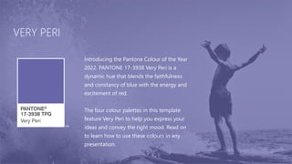
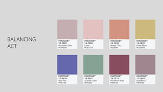
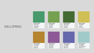
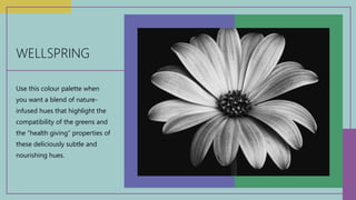
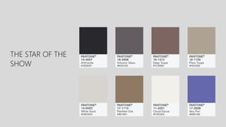
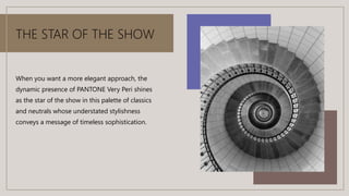
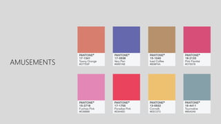
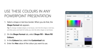
PANTONE®
COLOUR OF THE YEAR 2022
VERY PERI
Introducing the Pantone Colour of the Year
2022. PANTONE 17-3938 Very Peri is a
dynamic hue that blends the faithfulness
and constancy of blue with the energy and
excitement of red.
The four colour palettes in this template
feature Very Peri to help you express your
ideas and convey the right mood. Read on
to learn how to use these colours in any
presentation.
BALANCING
ACT
BALANCING ACT
Use this colour palette when
you want a balance between
warm and cool. PANTONE Very
Peri is intensified within this
artfully calibrated palette,
injecting a feeling of liveliness
and visual vibration.
WELLSPRING
WELLSPRING
Use this colour palette when
you want a blend of nature-
infused hues that highlight the
compatibility of the greens and
the “health giving” properties of
these deliciously subtle and
nourishing hues.
THE STAR OF THE
SHOW
THE STAR OF THE SHOW
When you want a more elegant approach, the
dynamic presence of PANTONE Very Peri shines
as the star of the show in this palette of classics
and neutrals whose understated stylishness
conveys a message of timeless sophistication.
AMUSEMENTS
AMUSEMENTS
Use this colour palette when you want to tell a
joyous and whimsical story. In this palette,
PANTONE Very Peri injects a sense of playful
freshness into the design, exuding a good-
natured warmth that quickly engages the eye.
USE THESE COLOURS IN ANY
POWERPOINT PRESENTATION
1. Select a shape or text box border. When you do that, the
Shape Format tab appears.
2. On the Shape Format tab, select Shape Fill > More Fill
Colours.
3. In the Colours box, select the Customised tab.
4. Enter the Hex value of the colour you want to use.
Tip: To change multiple shapes or text boxes, click the first shape or text box,
and then press and hold Ctrl while you click the other shapes or text boxes.

Pantoine.pptx

  • 1.
  • 2.
    VERY PERI Introducing thePantone Colour of the Year 2022. PANTONE 17-3938 Very Peri is a dynamic hue that blends the faithfulness and constancy of blue with the energy and excitement of red. The four colour palettes in this template feature Very Peri to help you express your ideas and convey the right mood. Read on to learn how to use these colours in any presentation.
  • 3.
  • 4.
    BALANCING ACT Use thiscolour palette when you want a balance between warm and cool. PANTONE Very Peri is intensified within this artfully calibrated palette, injecting a feeling of liveliness and visual vibration.
  • 5.
  • 6.
    WELLSPRING Use this colourpalette when you want a blend of nature- infused hues that highlight the compatibility of the greens and the “health giving” properties of these deliciously subtle and nourishing hues.
  • 7.
    THE STAR OFTHE SHOW
  • 8.
    THE STAR OFTHE SHOW When you want a more elegant approach, the dynamic presence of PANTONE Very Peri shines as the star of the show in this palette of classics and neutrals whose understated stylishness conveys a message of timeless sophistication.
  • 9.
  • 10.
    AMUSEMENTS Use this colourpalette when you want to tell a joyous and whimsical story. In this palette, PANTONE Very Peri injects a sense of playful freshness into the design, exuding a good- natured warmth that quickly engages the eye.
  • 11.
    USE THESE COLOURSIN ANY POWERPOINT PRESENTATION 1. Select a shape or text box border. When you do that, the Shape Format tab appears. 2. On the Shape Format tab, select Shape Fill > More Fill Colours. 3. In the Colours box, select the Customised tab. 4. Enter the Hex value of the colour you want to use. Tip: To change multiple shapes or text boxes, click the first shape or text box, and then press and hold Ctrl while you click the other shapes or text boxes.