Development Software 2 – DOS200S
1-5 | P a g e
Window Form Applications Using Visual C++
WINDOWS FORM CONTROLS
Objectives and Learning Areas:
For this Assignment you will be tested on the following areas:
1. Identify common Windows Form Controls
2. Identify control properties
3. Identify what values control properties can contain.
Introduction
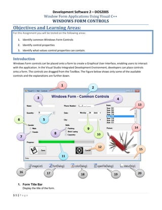
Windows Form controls can be placed onto a form to create a Graphical User Interface, enabling users to interact
with the application. In the Visual Studio Integrated Development Environment, developers can place controls
onto a form. The controls are dragged from the ToolBox. The Figure below shows only some of the available
controls and the explanations are further down.
1. Form Title Bar
Display the title of the form.
Development Software 2 – DOS200S
2-5 | P a g e
2. Label Control
Windows Forms Label controls are used to display text or images that cannot be edited by the user. They
are used to identify objects on a form—to provide a description of what a certain control will do if clicked,
for example, or to display information in response to a run-time event or process in your application.
Because the Label control cannot receive focus, it can also be used to create access keys for other
controls.
Some Properties:
- Name: Indicates the name used in the code to identify the object
- Text: The text associated with the control
- AutoSize: Enables automatic resizing based on the font size
- BorderStyle: Determines if the label has a visible border
- Font: The font used to display text in the control
- FontColor: The foreground color of this control which is used to display the text
3. Text Box
Windows Forms text boxes are used to get input from the user or to display text. The TextBox control is
generally used for editable text, although it can also be made read-only. Text boxes can display multiple
lines, wrap text to the size of the control, and add basic formatting. The TextBox control provides a single
format style for text displayed or entered into the control. To display multiple types of formatted text, use
the RichTextBox control.
Some Properties:
- Name Indicates the name used in the code to identify the object
- Font: The font used to display text in the control
- FontColor: The foreground color of this control which is used to display the text
- Text: The text associated with the control
4. Masked Text Box
The maskedTextBox control uses a mask to distinguish between a proper and improper user input. With
this control the user is restricted to input formatted data according to its mask. The user can for example
input a telephone number in a particular format.
The Mask Property allows the user enter the input format. Eg. (000) 000-0000 will allow to user to enter a
telephone number – ‘0219521236’
5. Numeric Drop Down
Display a single numeric value that the user can increment and decrement by click the up and down
buttons on the control.
Some Properties:
- Name: Indicates the name used in the code to identify the object.
- Maximum: Indicates the maximum value for the control.
- Minimum: Indicates the minimum value for the control.
- Value: The current value of the control.
6. Group Box
Windows Forms GroupBox controls are used to provide an identifiable grouping for other controls.
Typically, you use group boxes to subdivide a form by function. For example, you may have an order form
that specifies mailing options such as which overnight carrier to use. Grouping all options in a group box
Development Software 2 – DOS200S
3-5 | P a g e
gives the user a logical visual cue. The GroupBox control is similar to the Panel control; however, only the
GroupBox control displays a caption, and only the Panel control can have scroll bars.
Some Properties:
- Name: Indicates the name used in the code to identify the object.
- Text: The text associated with the control
7. Radio Button
Windows Forms RadioButton controls present a set of two or more mutually exclusive choices to the user.
While radio buttons and check boxes may appear to function similarly, there is an important difference:
when a user selects a radio button, the other radio buttons in the same group cannot be selected as well.
Some Properties:
- Name: Indicates the name used in the code to identify the object.
- Text: The text associated with the control
- Checked: Indicates whether the radio button is checked or not (true or false).
8. Check Box
The Windows Forms CheckBox control indicates whether a particular condition is on or off. It is commonly
used to present a Yes/No or True/False selection to the user. You can use check box controls in groups to
display multiple choices from which the user can select one or more. It is similar to the RadioButton control,
but any number of grouped CheckBox controls may be selected.
Some Properties:
- Name: Indicates the name used in the code to identify the object.
- Text: The text associated with the control
- Checked: Indicates whether the radio button is checked or not (true or false).
9. DateTime Picker
The Windows Forms DateTimePicker control allows the user to select a single item from a list of dates or
times. When used to represent a date, it appears in two parts: a drop-down list with a date represented in
text, and a grid that appears when you click on the down-arrow next to the list.
Some Properties:
- Name: Indicates the name used in the code to identify the object.
- Format: Determines whether dates are displayed using standard or custom formatting.
Options are – Long, Short, Time and Custom.
- MaxDate: The maximum date that can be selected.
- MinDate: The minimum date that can be selected.
- Value: The current date/time value for this control.
10. Combo Box
The Windows Forms ComboBox control is used to display data in a drop-down combo box. By default, the
ComboBox control appears in two parts: the top part is a text box that allows the user to type a list item.
The second part is a list box that displays a list of items from which the user can select one.
Some Properties:
- Name: Indicates the name used in the code to identify the object.
- Items: Items in the combo box. This is a collection of items.
- Text: The text associated with the control
Development Software 2 – DOS200S
4-5 | P a g e
11. Progress Bar
The Windows Forms ProgressBar control indicates the progress of an action by displaying an appropriate
number of rectangles arranged in a horizontal bar. When the action is complete, the bar is filled. Progress
bars are commonly used to give the user an indication of how long to wait for a protracted action to
complete—for instance, when a large file is being loaded.
Some Properties:
- Name: Indicates the name used in the code to identify the object.
- Maximum: The upper bound of the range that this progress bar is working with.
- Minimum: The lower bound of the range that this progress bar is working with.
- Value: The current value for the progress bar, in the range specified by the minimum and
maximum properties.
12. Button
The Windows Forms Button control allows the user to click it to perform an action. The Button control can
display both text and images. When the button is clicked, it looks as if it is being pushed in and released.
Some Properties:
- Name: Indicates the name used in the code to identify the object.
- Text: The text associated with the control
- ImageList: The Image List is to get the image to display on the control
- ImageKey: The index of the image in the Image List to display on the control.
- ImageAlign: The alignment of the image that will be displayed on the control.
- TextAlign: The alignment of the text that will be displayed on the control.
13. List Box
A Windows Forms ListBox control displays a list of items from which the user can select one or more.
Some Properties:
- Name: Indicates the name used in the code to identify the object.
- Items: Items in the combo box. This is a collection of items.
- SelectionMode: Indicates if the list box is to be single-select (One), multi-select (MultiSimple) or not
selectable (None).
14. Picture Box
The Windows Forms PictureBox control is used to display graphics in bitmap, GIF, JPEG, metafile, or icon
format.
Some Properties:
- Name: Indicates the name used in the code to identify the object.
- Image: The image displayed in the picture box.
- SizeMode: Controls how the picture box will handle image placement and control sizing. The
options are – Normal, StretchImage, AutoSize, CenterImage and Zoom.
15. Status Bar
The Windows Forms StatusBar control is used on forms as an area, usually displayed at the bottom of a
window, in which an application can display various kinds of status information. StatusBar controls can
Development Software 2 – DOS200S
5-5 | P a g e
have status-bar panels on them that display icons to indicate state, or a series of icons in an animation that
indicate a process is working; for example, Microsoft Word indicating that the document is being saved.
Some Propeties:
- Name: Indicates the name used in the code to identify the object.
- Items: Collection of items to display on the Status bar.
16. ImageList Control
The Windows Forms ImageList component is used to store images, which can then be displayed by
controls. An image list allows you to write code for a single, consistent catalog of images.
Some Propeties:
- Name: Indicates the name used in the code to identify the object.
- Images: The images stored in this image list.
- ImageSize: The size of individual images in the image list.
17. Font Dialog Control
The Windows Forms FontDialog component is a pre-configured dialog box. It is the same Font dialog box
exposed by the Windows operating system. The component inherits from the CommonDialog class.
Method to open the font dialog is ShowDialog() or Show()
The Property that contains the selected font is the Font property
18. Color Dialog Control
The Windows Forms ColorDialog component is a pre-configured dialog box that allows the user to select a
color from a palette and to add custom colors to that palette. It is the same dialog box that you see in other
Windows-based applications to select colors. Use it within your Windows-based application as a simple
solution in lieu of configuring your own dialog box.
Method to open the color dialog is ShowDialog() or Show()
The Property that contains the selected color is the Color property
19. Open File Dialog Control
The Windows Forms OpenFileDialog component is a pre-configured dialog box. It is the same Open File
dialog box exposed by the Windows operating system. It inherits from the CommonDialog class.
Method to open the color dialog is ShowDialog() or Show()
The Property that contains the selected file name is the FileName property.
20. StatusStrip Control: See Status Bar (15)
-----END OF DOCUMENT-----

Notes windows form controls gui applications

  • 1.
    Development Software 2– DOS200S 1-5 | P a g e Window Form Applications Using Visual C++ WINDOWS FORM CONTROLS Objectives and Learning Areas: For this Assignment you will be tested on the following areas: 1. Identify common Windows Form Controls 2. Identify control properties 3. Identify what values control properties can contain. Introduction Windows Form controls can be placed onto a form to create a Graphical User Interface, enabling users to interact with the application. In the Visual Studio Integrated Development Environment, developers can place controls onto a form. The controls are dragged from the ToolBox. The Figure below shows only some of the available controls and the explanations are further down. 1. Form Title Bar Display the title of the form.
  • 2.
    Development Software 2– DOS200S 2-5 | P a g e 2. Label Control Windows Forms Label controls are used to display text or images that cannot be edited by the user. They are used to identify objects on a form—to provide a description of what a certain control will do if clicked, for example, or to display information in response to a run-time event or process in your application. Because the Label control cannot receive focus, it can also be used to create access keys for other controls. Some Properties: - Name: Indicates the name used in the code to identify the object - Text: The text associated with the control - AutoSize: Enables automatic resizing based on the font size - BorderStyle: Determines if the label has a visible border - Font: The font used to display text in the control - FontColor: The foreground color of this control which is used to display the text 3. Text Box Windows Forms text boxes are used to get input from the user or to display text. The TextBox control is generally used for editable text, although it can also be made read-only. Text boxes can display multiple lines, wrap text to the size of the control, and add basic formatting. The TextBox control provides a single format style for text displayed or entered into the control. To display multiple types of formatted text, use the RichTextBox control. Some Properties: - Name Indicates the name used in the code to identify the object - Font: The font used to display text in the control - FontColor: The foreground color of this control which is used to display the text - Text: The text associated with the control 4. Masked Text Box The maskedTextBox control uses a mask to distinguish between a proper and improper user input. With this control the user is restricted to input formatted data according to its mask. The user can for example input a telephone number in a particular format. The Mask Property allows the user enter the input format. Eg. (000) 000-0000 will allow to user to enter a telephone number – ‘0219521236’ 5. Numeric Drop Down Display a single numeric value that the user can increment and decrement by click the up and down buttons on the control. Some Properties: - Name: Indicates the name used in the code to identify the object. - Maximum: Indicates the maximum value for the control. - Minimum: Indicates the minimum value for the control. - Value: The current value of the control. 6. Group Box Windows Forms GroupBox controls are used to provide an identifiable grouping for other controls. Typically, you use group boxes to subdivide a form by function. For example, you may have an order form that specifies mailing options such as which overnight carrier to use. Grouping all options in a group box
  • 3.
    Development Software 2– DOS200S 3-5 | P a g e gives the user a logical visual cue. The GroupBox control is similar to the Panel control; however, only the GroupBox control displays a caption, and only the Panel control can have scroll bars. Some Properties: - Name: Indicates the name used in the code to identify the object. - Text: The text associated with the control 7. Radio Button Windows Forms RadioButton controls present a set of two or more mutually exclusive choices to the user. While radio buttons and check boxes may appear to function similarly, there is an important difference: when a user selects a radio button, the other radio buttons in the same group cannot be selected as well. Some Properties: - Name: Indicates the name used in the code to identify the object. - Text: The text associated with the control - Checked: Indicates whether the radio button is checked or not (true or false). 8. Check Box The Windows Forms CheckBox control indicates whether a particular condition is on or off. It is commonly used to present a Yes/No or True/False selection to the user. You can use check box controls in groups to display multiple choices from which the user can select one or more. It is similar to the RadioButton control, but any number of grouped CheckBox controls may be selected. Some Properties: - Name: Indicates the name used in the code to identify the object. - Text: The text associated with the control - Checked: Indicates whether the radio button is checked or not (true or false). 9. DateTime Picker The Windows Forms DateTimePicker control allows the user to select a single item from a list of dates or times. When used to represent a date, it appears in two parts: a drop-down list with a date represented in text, and a grid that appears when you click on the down-arrow next to the list. Some Properties: - Name: Indicates the name used in the code to identify the object. - Format: Determines whether dates are displayed using standard or custom formatting. Options are – Long, Short, Time and Custom. - MaxDate: The maximum date that can be selected. - MinDate: The minimum date that can be selected. - Value: The current date/time value for this control. 10. Combo Box The Windows Forms ComboBox control is used to display data in a drop-down combo box. By default, the ComboBox control appears in two parts: the top part is a text box that allows the user to type a list item. The second part is a list box that displays a list of items from which the user can select one. Some Properties: - Name: Indicates the name used in the code to identify the object. - Items: Items in the combo box. This is a collection of items. - Text: The text associated with the control
  • 4.
    Development Software 2– DOS200S 4-5 | P a g e 11. Progress Bar The Windows Forms ProgressBar control indicates the progress of an action by displaying an appropriate number of rectangles arranged in a horizontal bar. When the action is complete, the bar is filled. Progress bars are commonly used to give the user an indication of how long to wait for a protracted action to complete—for instance, when a large file is being loaded. Some Properties: - Name: Indicates the name used in the code to identify the object. - Maximum: The upper bound of the range that this progress bar is working with. - Minimum: The lower bound of the range that this progress bar is working with. - Value: The current value for the progress bar, in the range specified by the minimum and maximum properties. 12. Button The Windows Forms Button control allows the user to click it to perform an action. The Button control can display both text and images. When the button is clicked, it looks as if it is being pushed in and released. Some Properties: - Name: Indicates the name used in the code to identify the object. - Text: The text associated with the control - ImageList: The Image List is to get the image to display on the control - ImageKey: The index of the image in the Image List to display on the control. - ImageAlign: The alignment of the image that will be displayed on the control. - TextAlign: The alignment of the text that will be displayed on the control. 13. List Box A Windows Forms ListBox control displays a list of items from which the user can select one or more. Some Properties: - Name: Indicates the name used in the code to identify the object. - Items: Items in the combo box. This is a collection of items. - SelectionMode: Indicates if the list box is to be single-select (One), multi-select (MultiSimple) or not selectable (None). 14. Picture Box The Windows Forms PictureBox control is used to display graphics in bitmap, GIF, JPEG, metafile, or icon format. Some Properties: - Name: Indicates the name used in the code to identify the object. - Image: The image displayed in the picture box. - SizeMode: Controls how the picture box will handle image placement and control sizing. The options are – Normal, StretchImage, AutoSize, CenterImage and Zoom. 15. Status Bar The Windows Forms StatusBar control is used on forms as an area, usually displayed at the bottom of a window, in which an application can display various kinds of status information. StatusBar controls can
  • 5.
    Development Software 2– DOS200S 5-5 | P a g e have status-bar panels on them that display icons to indicate state, or a series of icons in an animation that indicate a process is working; for example, Microsoft Word indicating that the document is being saved. Some Propeties: - Name: Indicates the name used in the code to identify the object. - Items: Collection of items to display on the Status bar. 16. ImageList Control The Windows Forms ImageList component is used to store images, which can then be displayed by controls. An image list allows you to write code for a single, consistent catalog of images. Some Propeties: - Name: Indicates the name used in the code to identify the object. - Images: The images stored in this image list. - ImageSize: The size of individual images in the image list. 17. Font Dialog Control The Windows Forms FontDialog component is a pre-configured dialog box. It is the same Font dialog box exposed by the Windows operating system. The component inherits from the CommonDialog class. Method to open the font dialog is ShowDialog() or Show() The Property that contains the selected font is the Font property 18. Color Dialog Control The Windows Forms ColorDialog component is a pre-configured dialog box that allows the user to select a color from a palette and to add custom colors to that palette. It is the same dialog box that you see in other Windows-based applications to select colors. Use it within your Windows-based application as a simple solution in lieu of configuring your own dialog box. Method to open the color dialog is ShowDialog() or Show() The Property that contains the selected color is the Color property 19. Open File Dialog Control The Windows Forms OpenFileDialog component is a pre-configured dialog box. It is the same Open File dialog box exposed by the Windows operating system. It inherits from the CommonDialog class. Method to open the color dialog is ShowDialog() or Show() The Property that contains the selected file name is the FileName property. 20. StatusStrip Control: See Status Bar (15) -----END OF DOCUMENT-----