Download as PDF, PPTX


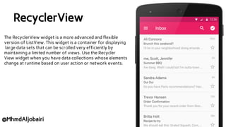
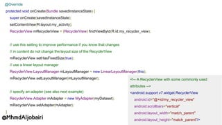
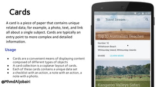
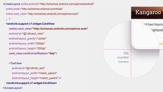

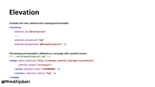
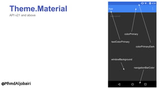
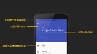
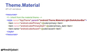
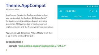
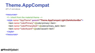

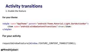
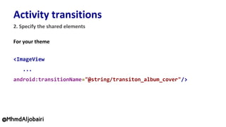

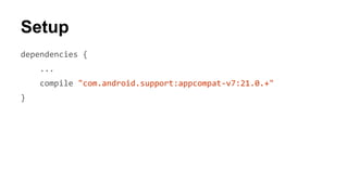
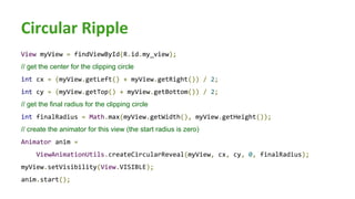


The document outlines the implementation of Material Design components in Android development, focusing on RecyclerView and CardView usage. It provides code snippets demonstrating how to set up these components, manage data collections, and utilize elevation and transitions. Additionally, it discusses themes and dependencies necessary for integrating Material Design into applications.