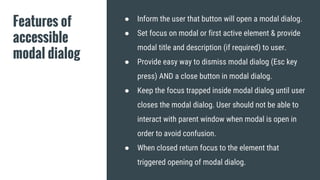
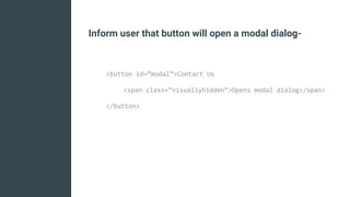
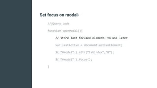
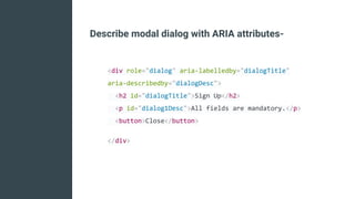
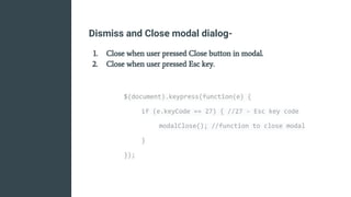
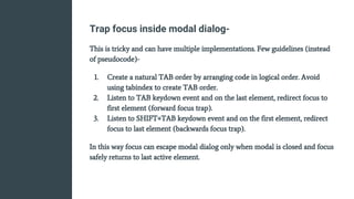
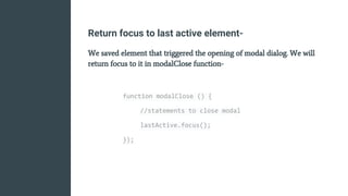
Modal Dialogs
How to make them accessible
Vinod Tiwari
Consultant - UI & Accessibility
I am a Software Professional
with over 7 years of experience
in web design & development
and passion to develop usable &
accessible products.
Twitter - @vinodt_
LinkedIn - www.linkedin.com/in/vinod-t
Modal dialog is a common UX
design pattern and serves as a
good way to deliver contextual
information, notifications,
important actions while saving
screen real estate.
Image Source - drupal.org
Alternate view on Modal Dialogs
Modal dialog is a window that forces the user to interact with it
before they can continue with what they were doing.
Often used when a user is forced to make an important
decision or take action that needs additional information.
Example- “Save, Don’t Save, Cancel” dialog when closing a
word document.
Some people argue that Modal Dialogs can be confusing for
screen reader users and should be used sparingly, in turn
disappointing the UX designer who thinks it's good
experience for all (visual) users and fits well into design.
Modal dialogs are popular with designers and users as they
provide fast, focussed & contextual interaction avoiding
unnecessary page loads/redirection.
So let's make modal dialog accessible!
Features of
accessible
modal dialog
● Inform the user that button will open a modal dialog.
● Set focus on modal or first active element & provide
modal title and description (if required) to user.
● Provide easy way to dismiss modal dialog (Esc key
press) AND a close button in modal dialog.
● Keep the focus trapped inside modal dialog until user
closes the modal dialog. User should not be able to
interact with parent window when modal is open in
order to avoid confusion.
● When closed return focus to the element that
triggered opening of modal dialog.
“focus” for a screen reader is the
place that is currently being read.
Implementation
Following slides have (sort of) pseudocode to implement
each step but is good enough for web developers to get the
gist.
Inform user that button will open a modal dialog-
<button id=”modal”>Contact Us
<span class=”visuallyhidden”>Opens modal dialog</span>
</button>
Set focus on modal-
//jQuery code
function openModal(){
// store last focused element- to use later
var lastActive = document.activeElement;
$( “#modal” ).attr(“tabindex”,”0”);
$( “#modal” ).focus();
}
Describe modal dialog with ARIA attributes-
<div role="dialog" aria-labelledby="dialogTitle"
aria-describedby="dialogDesc">
<h2 id="dialogTitle">Sign Up</h2>
<p id="dialog1Desc">All fields are mandatory.</p>
<button>Close</button>
</div>
Dismiss and Close modal dialog-
1. Close when user pressed Close button in modal.
2. Close when user pressed Esc key.
$(document).keypress(function(e) {
if (e.keyCode == 27) { //27 - Esc key code
modalClose(); //function to close modal
}
});
Trap focus inside modal dialog-
This is tricky and can have multiple implementations. Few guidelines (instead
of pseudocode)-
1. Create a natural TAB order by arranging code in logical order. Avoid
using tabindex to create TAB order.
2. Listen to TAB keydown event and on the last element, redirect focus to
first element (forward focus trap).
3. Listen to SHIFT+TAB keydown event and on the first element, redirect
focus to last element (backwards focus trap).
In this way focus can escape modal dialog only when modal is closed and focus
safely returns to last active element.
Return focus to last active element-
We saved element that triggered the opening of modal dialog. We will
return focus to it in modalClose function-
function modalClose () {
//statements to close modal
lastActive.focus();
});
Making modal dialog accessible requires some work but it
significantly enhances user experience.
Totally Worth It!
Thank you!
There could be business use-case to auto-open a modal
dialog like for “Newsletter Subscription”.
Please DON’T

Making modal dialogs accessible

  • 1.
    Modal Dialogs How tomake them accessible
  • 2.
    Vinod Tiwari Consultant -UI & Accessibility I am a Software Professional with over 7 years of experience in web design & development and passion to develop usable & accessible products. Twitter - @vinodt_ LinkedIn - www.linkedin.com/in/vinod-t
  • 3.
    Modal dialog isa common UX design pattern and serves as a good way to deliver contextual information, notifications, important actions while saving screen real estate. Image Source - drupal.org
  • 4.
    Alternate view onModal Dialogs Modal dialog is a window that forces the user to interact with it before they can continue with what they were doing. Often used when a user is forced to make an important decision or take action that needs additional information. Example- “Save, Don’t Save, Cancel” dialog when closing a word document.
  • 5.
    Some people arguethat Modal Dialogs can be confusing for screen reader users and should be used sparingly, in turn disappointing the UX designer who thinks it's good experience for all (visual) users and fits well into design.
  • 6.
    Modal dialogs arepopular with designers and users as they provide fast, focussed & contextual interaction avoiding unnecessary page loads/redirection. So let's make modal dialog accessible!
  • 7.
    Features of accessible modal dialog ●Inform the user that button will open a modal dialog. ● Set focus on modal or first active element & provide modal title and description (if required) to user. ● Provide easy way to dismiss modal dialog (Esc key press) AND a close button in modal dialog. ● Keep the focus trapped inside modal dialog until user closes the modal dialog. User should not be able to interact with parent window when modal is open in order to avoid confusion. ● When closed return focus to the element that triggered opening of modal dialog.
  • 8.
    “focus” for ascreen reader is the place that is currently being read.
  • 9.
    Implementation Following slides have(sort of) pseudocode to implement each step but is good enough for web developers to get the gist.
  • 10.
    Inform user thatbutton will open a modal dialog- <button id=”modal”>Contact Us <span class=”visuallyhidden”>Opens modal dialog</span> </button>
  • 11.
    Set focus onmodal- //jQuery code function openModal(){ // store last focused element- to use later var lastActive = document.activeElement; $( “#modal” ).attr(“tabindex”,”0”); $( “#modal” ).focus(); }
  • 12.
    Describe modal dialogwith ARIA attributes- <div role="dialog" aria-labelledby="dialogTitle" aria-describedby="dialogDesc"> <h2 id="dialogTitle">Sign Up</h2> <p id="dialog1Desc">All fields are mandatory.</p> <button>Close</button> </div>
  • 13.
    Dismiss and Closemodal dialog- 1. Close when user pressed Close button in modal. 2. Close when user pressed Esc key. $(document).keypress(function(e) { if (e.keyCode == 27) { //27 - Esc key code modalClose(); //function to close modal } });
  • 14.
    Trap focus insidemodal dialog- This is tricky and can have multiple implementations. Few guidelines (instead of pseudocode)- 1. Create a natural TAB order by arranging code in logical order. Avoid using tabindex to create TAB order. 2. Listen to TAB keydown event and on the last element, redirect focus to first element (forward focus trap). 3. Listen to SHIFT+TAB keydown event and on the first element, redirect focus to last element (backwards focus trap). In this way focus can escape modal dialog only when modal is closed and focus safely returns to last active element.
  • 15.
    Return focus tolast active element- We saved element that triggered the opening of modal dialog. We will return focus to it in modalClose function- function modalClose () { //statements to close modal lastActive.focus(); });
  • 16.
    Making modal dialogaccessible requires some work but it significantly enhances user experience. Totally Worth It!
  • 17.
    Thank you! There couldbe business use-case to auto-open a modal dialog like for “Newsletter Subscription”. Please DON’T