LOUD MAG TITLES - WHICH ONE?
•Download as PPTX, PDF•
0 likes•130 views
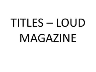
This document lists the rankings of titles submitted to Loud Magazine, with "THIS WILL BE MY TITLE!" ranked first out of the five submissions.
Report
Share
Report
Share

Recommended
BLOG VIEWS! Audience :)
This blog has been viewed by people around the world since it was set up. The blog shows the total number of worldwide views it has received. Most of the views have come from people located in the United Kingdom.
Questionnaire Results - Contents Page
Questionnaire conducted in Northumberland Street, Newcaslte, 2/4/2011 aimed towards a teenage audience.
Media Project - Short Film Presentation
The document summarizes a short chase film project created by students. It describes the plot of the film involving a threatening text message. Limited areas for filming resulted in shooting around the school. Shots included close-ups, medium shots, and long shots showing the chase from different angles. Effects like black and white and fades were added in editing. Strengths included coming up with the storyline and plan quickly and keeping within the time limit. Weaknesses were editing and some weak camera angles. The project helped students learn camera and editing skills for future work.
Magazine Cover Analysis' - RESEARCH & PLANNING
The document analyzes a magazine cover promoting a horror film. It notes that the dark colors and clothing on the cover help set the horror genre. The character's blood-stained hand also conveys the genre. Small text is scattered around the cover to promote other magazine content and increase interest. Typical magazine cover conventions like large film titles are replaced with more realism, like barcodes and prices. This makes the cover look more like a real magazine.
Producing my feature article
Producing my first feature article for the music magazine 'Loud!' was a great learning experience. I interviewed several up-and-coming indie bands and wrote a 2000 word article highlighting their music styles and discussing their rise to popularity on the local scene. The article was well received by readers and helped launch my career as a music journalist.
Production of Horror Poster
The document summarizes the steps taken to design a movie poster for a horror film. The designer darkened the image, added an intense close-up of the character's face. Text was added at the bottom with the director and producers' names. Slogans and release date were included to highlight the horror genre. Age ratings and studio logos were also incorporated, with the film title standing out in red to connote blood. Reviews and a magazine cover were added last to make the poster and magazine more realistic.
Audience Research Poster
This document discusses audience research conducted to determine which of four examples people preferred for a poster. The research presented the four examples to participants and tracked their preferences. The results showed that example four was the most preferred option and will be used as the final poster design.
Analysis Paranormal Activity Poster
The poster shows an image of two vulnerable-looking sleeping children with a demon looming between them, conveying that the girls are victims. It informs audiences that the film is a prequel that will show how the paranormal activity began. Key details like the film title, slogans, and release date are prominently featured and formatted consistently with previous films to clearly communicate this information to viewers.
Professional Photograph Analysis
This document analyzes and discusses the effectiveness of three horror movie posters. It notes that the first poster only shows the killer's face lit up against a black background, keeping the image simple while conveying the horror genre. It then analyzes a second poster showing a creepy character holding a phone to relate to the film's title of "One Missed Call." Finally, it discusses a third poster showing both the larger killer towering over the smaller victim at the bottom to demonstrate power dynamics and suggest vulnerability, while also depicting the film's setting and the killer's red eyes.
Front Cover Questionnaire
The document contains a music magazine questionnaire asking for feedback on various aspects of the magazine's front cover design, including the color scheme, what catches the eye first, whether the price seems reasonable, and if the cover looks professionally presented. It also asks what, if anything, the respondent would change on the cover to meet their standards and asks them to explain their choices.
Photo Analysis
The photograph is effective for a horror film poster because it only shows the killer's lit up face without revealing anything else about the plot, maintaining simplicity. The black background represents the darkness and horror genre which typically uses this color scheme. The mask looks vaguely scary to audiences, indicating it is for a horror film.
Dimension Production Company
Dimension Films will produce and distribute the horror trailer. While not the largest production company, Dimension Films has found success with horror franchises such as Halloween, Scream, and Piranha 3D. Dimension Films was founded in 1992 by Bob Weinstein and has experience producing popular horror and comedy films.
A2 Media Evaluation - TEXT VERSION
This document contains Shaun Liddle's evaluation of his A2 Media Studies coursework, which included creating a horror film trailer and ancillary materials like posters and a magazine cover. He analyzed how his work used and challenged conventions of the horror genre. Audience feedback helped him improve his projects. Throughout the course, Shaun learned new skills using technologies like Photoshop, iMovie, Audacity, and blogs to research, plan, construct, and evaluate his work.
In what ways does your media product use, develop or challenge forms and conv...
My media product uses and challenges conventions of real horror trailers and films. By analyzing many horror trailers, I incorporated common conventions like costume design, music, and locations. However, I broke conventions by making the killer a woman rather than a man. I also used normal teenage costumes rather than dark costumes typically seen in horror. While some conventions like codes around genre representation are followed, theories on narrative structure and character types are challenged as my story includes atypical elements.
What have you learned from audience feedback?
The document discusses how the author gathered audience feedback through questionnaires to evaluate and improve their media products for an A2 coursework assignment. Questionnaires were used to collect opinions on an ancillary task and moving image task from target audiences aged 15-30. Feedback highlighted both positive and negative aspects, which allowed the author to change elements that audiences disliked, such as reducing text on a magazine cover or adjusting scene lengths. Gathering this audience input helped ensure the final products better suited the needs and preferences of the intended viewers.
Horror Trailer Closed Questionnaire Results
The survey results showed that the horror trailer was well-received by the target audience. 100% of respondents liked the trailer, its name "Vengeance", and said they would see the film if it premiered in cinemas. While most also understood the genre, liked the characters and locations, some had preferences about the soundtrack, makeup or wanted something more original. But the majority feedback was positive overall.
Horror Trailer Closed Questionnaire
The document is a closed questionnaire about a horror trailer, asking respondents about their age, gender, and opinions on aspects of the trailer such as whether they liked it, found it easy to understand, liked the soundtrack, name, number of characters, idea of a female killer, costumes/makeup/props, range of locations, and whether they would see the full film in theaters.
Horror Trailer Open Questionnaire
The document is a questionnaire for viewers of a horror trailer to provide feedback on their age, gender, what they liked about the trailer, their favorite part, if anything should be changed, if it made them want to see the full film, how easy it was to understand the genre of the trailer, how the trailer relates to other promotional tasks, and any other horror films it compares to. Respondents are asked to fill in blanks or provide short written responses to multiple questions about the unidentified horror trailer.
Calendar for what to do!!
This document outlines a production schedule for February/March 2012 and March 2012. It shows the schedule for filming, uploading footage, editing, tightening any loose ends to make sure everything is done, and the premiere date during the last week of March 2012.
Audience Research
The document discusses audience research conducted to determine which magazine readers prefer. Pie charts were created showing the results of asking a specific audience range which magazine they prefer. The results found that example one was the preferred magazine, so it will be used for the proper ancillary task.
Landscape Horror Poster Analysis
The landscape horror movie poster depicts an innocent-looking boy standing next to a girl with blood coming from her mouth and yellow eyes, representing a juxtaposition of good and evil. Its landscape orientation and use of dark and red colors to symbolize death and blood diverges from traditional portrait horror posters. The repetitive slogan is meant to become embedded in people's minds to promote the film.
Skills & Concepts
1) The document discusses Shaun Liddle's skills and concepts learned in AS and A2 Media Studies, including creativity, research and planning, digital technology, and using conventions from real media texts.
2) In AS Media Studies, Shaun learned skills like using Photoshop but felt they could have analyzed more source materials. In A2, they have conducted more research and planned roles for their group project.
3) Shaun gained experience using different technologies like cameras, editing software, and blogger. They have also learned how to analyze real media texts and apply conventions to their own work.
1st Draft Horror Trailer Storyboard
The document appears to be a draft of some kind. It contains no other information beyond the title "1st Draft", so a 3 sentence summary cannot provide any meaningful details about the content or purpose of the document. The document title "1st Draft" suggests it may be an early version of a longer work, but without seeing the actual content no conclusions can be drawn about the topic or key points being drafted.
PRODUCTION OF HORROR MAGAZINE
The document describes the process of designing a magazine cover for a horror film called "Vengeance". Key details include:
- Using a black background and darkening the image to represent the horror genre.
- Adding the title "PREMIERE" in white to indicate the type of magazine.
- Including the date, price, and text like "MASSIVE PREVIEW SPECIAL!" to make it appealing to readers.
- Featuring the film title in red and additional text about contents to draw in the target audience.
Horror Photograph Analysis
This photograph makes a good horror movie poster as it only shows the killer's face lit up on a black background, giving away nothing else about the film while keeping it simple. The black background represents the horror genre and darkness, which is a typical convention for horror posters. From the poster, the audience can tell it is for a horror film as the mask looks vaguely scary.
What makes a good photograph?
The document discusses a horror film poster photograph. It notes that the poster only shows the face of the killer, keeping the film details simple and not giving anything away. The black background signifies the horror genre and darkness. Only the killer's face is lit up, using lighting intentionally. Within the killer's eyes, another character can be seen screaming, another horror film convention.
Questionnaire Results
This document asks a series of questions about horror movie preferences and conventions. It asks how often one goes to the cinema, their preferred genre, best location for a horror film, who should be the killer, where people watch horror trailers, what makes an effective trailer, and whether trailers should show the film in order or mixed up. It also asks for ideas for good horror movie names.
Audience Questionnarie - Horror Trailer. RESEARCH & PLANNING
The document is an audience questionnaire about horror movie preferences. It asks respondents about their cinema attendance habits and preferred genres. It also asks about favorite locations and characters for horror films, whether the killer should be male or female, and preferences for horror trailers, including what makes an effective trailer and the order of shots. Respondents are also asked to provide potential names for horror movies.
More Related Content
Viewers also liked
Analysis Paranormal Activity Poster
The poster shows an image of two vulnerable-looking sleeping children with a demon looming between them, conveying that the girls are victims. It informs audiences that the film is a prequel that will show how the paranormal activity began. Key details like the film title, slogans, and release date are prominently featured and formatted consistently with previous films to clearly communicate this information to viewers.
Professional Photograph Analysis
This document analyzes and discusses the effectiveness of three horror movie posters. It notes that the first poster only shows the killer's face lit up against a black background, keeping the image simple while conveying the horror genre. It then analyzes a second poster showing a creepy character holding a phone to relate to the film's title of "One Missed Call." Finally, it discusses a third poster showing both the larger killer towering over the smaller victim at the bottom to demonstrate power dynamics and suggest vulnerability, while also depicting the film's setting and the killer's red eyes.
Front Cover Questionnaire
The document contains a music magazine questionnaire asking for feedback on various aspects of the magazine's front cover design, including the color scheme, what catches the eye first, whether the price seems reasonable, and if the cover looks professionally presented. It also asks what, if anything, the respondent would change on the cover to meet their standards and asks them to explain their choices.
Photo Analysis
The photograph is effective for a horror film poster because it only shows the killer's lit up face without revealing anything else about the plot, maintaining simplicity. The black background represents the darkness and horror genre which typically uses this color scheme. The mask looks vaguely scary to audiences, indicating it is for a horror film.
Dimension Production Company
Dimension Films will produce and distribute the horror trailer. While not the largest production company, Dimension Films has found success with horror franchises such as Halloween, Scream, and Piranha 3D. Dimension Films was founded in 1992 by Bob Weinstein and has experience producing popular horror and comedy films.
Viewers also liked (6)
More from shaunliddle
A2 Media Evaluation - TEXT VERSION
This document contains Shaun Liddle's evaluation of his A2 Media Studies coursework, which included creating a horror film trailer and ancillary materials like posters and a magazine cover. He analyzed how his work used and challenged conventions of the horror genre. Audience feedback helped him improve his projects. Throughout the course, Shaun learned new skills using technologies like Photoshop, iMovie, Audacity, and blogs to research, plan, construct, and evaluate his work.
In what ways does your media product use, develop or challenge forms and conv...
My media product uses and challenges conventions of real horror trailers and films. By analyzing many horror trailers, I incorporated common conventions like costume design, music, and locations. However, I broke conventions by making the killer a woman rather than a man. I also used normal teenage costumes rather than dark costumes typically seen in horror. While some conventions like codes around genre representation are followed, theories on narrative structure and character types are challenged as my story includes atypical elements.
What have you learned from audience feedback?
The document discusses how the author gathered audience feedback through questionnaires to evaluate and improve their media products for an A2 coursework assignment. Questionnaires were used to collect opinions on an ancillary task and moving image task from target audiences aged 15-30. Feedback highlighted both positive and negative aspects, which allowed the author to change elements that audiences disliked, such as reducing text on a magazine cover or adjusting scene lengths. Gathering this audience input helped ensure the final products better suited the needs and preferences of the intended viewers.
Horror Trailer Closed Questionnaire Results
The survey results showed that the horror trailer was well-received by the target audience. 100% of respondents liked the trailer, its name "Vengeance", and said they would see the film if it premiered in cinemas. While most also understood the genre, liked the characters and locations, some had preferences about the soundtrack, makeup or wanted something more original. But the majority feedback was positive overall.
Horror Trailer Closed Questionnaire
The document is a closed questionnaire about a horror trailer, asking respondents about their age, gender, and opinions on aspects of the trailer such as whether they liked it, found it easy to understand, liked the soundtrack, name, number of characters, idea of a female killer, costumes/makeup/props, range of locations, and whether they would see the full film in theaters.
Horror Trailer Open Questionnaire
The document is a questionnaire for viewers of a horror trailer to provide feedback on their age, gender, what they liked about the trailer, their favorite part, if anything should be changed, if it made them want to see the full film, how easy it was to understand the genre of the trailer, how the trailer relates to other promotional tasks, and any other horror films it compares to. Respondents are asked to fill in blanks or provide short written responses to multiple questions about the unidentified horror trailer.
Calendar for what to do!!
This document outlines a production schedule for February/March 2012 and March 2012. It shows the schedule for filming, uploading footage, editing, tightening any loose ends to make sure everything is done, and the premiere date during the last week of March 2012.
Audience Research
The document discusses audience research conducted to determine which magazine readers prefer. Pie charts were created showing the results of asking a specific audience range which magazine they prefer. The results found that example one was the preferred magazine, so it will be used for the proper ancillary task.
Landscape Horror Poster Analysis
The landscape horror movie poster depicts an innocent-looking boy standing next to a girl with blood coming from her mouth and yellow eyes, representing a juxtaposition of good and evil. Its landscape orientation and use of dark and red colors to symbolize death and blood diverges from traditional portrait horror posters. The repetitive slogan is meant to become embedded in people's minds to promote the film.
Skills & Concepts
1) The document discusses Shaun Liddle's skills and concepts learned in AS and A2 Media Studies, including creativity, research and planning, digital technology, and using conventions from real media texts.
2) In AS Media Studies, Shaun learned skills like using Photoshop but felt they could have analyzed more source materials. In A2, they have conducted more research and planned roles for their group project.
3) Shaun gained experience using different technologies like cameras, editing software, and blogger. They have also learned how to analyze real media texts and apply conventions to their own work.
1st Draft Horror Trailer Storyboard
The document appears to be a draft of some kind. It contains no other information beyond the title "1st Draft", so a 3 sentence summary cannot provide any meaningful details about the content or purpose of the document. The document title "1st Draft" suggests it may be an early version of a longer work, but without seeing the actual content no conclusions can be drawn about the topic or key points being drafted.
PRODUCTION OF HORROR MAGAZINE
The document describes the process of designing a magazine cover for a horror film called "Vengeance". Key details include:
- Using a black background and darkening the image to represent the horror genre.
- Adding the title "PREMIERE" in white to indicate the type of magazine.
- Including the date, price, and text like "MASSIVE PREVIEW SPECIAL!" to make it appealing to readers.
- Featuring the film title in red and additional text about contents to draw in the target audience.
Horror Photograph Analysis
This photograph makes a good horror movie poster as it only shows the killer's face lit up on a black background, giving away nothing else about the film while keeping it simple. The black background represents the horror genre and darkness, which is a typical convention for horror posters. From the poster, the audience can tell it is for a horror film as the mask looks vaguely scary.
What makes a good photograph?
The document discusses a horror film poster photograph. It notes that the poster only shows the face of the killer, keeping the film details simple and not giving anything away. The black background signifies the horror genre and darkness. Only the killer's face is lit up, using lighting intentionally. Within the killer's eyes, another character can be seen screaming, another horror film convention.
Questionnaire Results
This document asks a series of questions about horror movie preferences and conventions. It asks how often one goes to the cinema, their preferred genre, best location for a horror film, who should be the killer, where people watch horror trailers, what makes an effective trailer, and whether trailers should show the film in order or mixed up. It also asks for ideas for good horror movie names.
Audience Questionnarie - Horror Trailer. RESEARCH & PLANNING
The document is an audience questionnaire about horror movie preferences. It asks respondents about their cinema attendance habits and preferred genres. It also asks about favorite locations and characters for horror films, whether the killer should be male or female, and preferences for horror trailers, including what makes an effective trailer and the order of shots. Respondents are also asked to provide potential names for horror movies.
Final Destination 5 - Textual Analysis
The trailer for Final Destination 5 uses several horror film conventions to build tension and suggest impending doom. It begins with an establishing shot of the object that kills a character. Intercut with this are shots of a woman preparing for laser eye surgery who voices concern that "a lot is going on" in her life. As the surgery begins, monitors show increasing danger from the machine. The woman screams for help as the machine malfunctions, highlighting her vulnerability. Voiceovers explain the film's premise of characters cheating death but being killed later in strange accidents. The trailer cuts between past and present scenes and uses faster edits and music to create excitement and suggest the gruesome fates that await the characters.
Textual Analysis - Sorority row
The trailer begins by establishing the fun, party atmosphere of a university sorority house. However, it soon takes a dark turn when a prank goes wrong and a girl is accidentally killed. Her body is hidden and the murder is covered up. In the present, on graduation day, someone begins killing the sorority sisters and leaving threatening messages. The trailer cuts between the past and present to build suspense around who the killer is and leaves viewers on edge to find out what happens next.
Textual analysis of paranormal activity 3 trailer
The trailer begins with home video footage of two children playing, establishing the film's focus on a family. Shots gradually become more ominous as paranormal events are hinted at through changes in audio and imagery. Text inserts advertise secrets being revealed about past activity and the film's October release date. The trailer uses pacing, camera techniques, and clips from the previous films to draw viewers in without revealing too many plot details, generating intrigue around the third installment.
Sorority Row Poster Analysis - RESEARCH & PLANNING
The document analyzes the poster for the horror film "Sorority Row" and discusses various design elements and their symbolic meanings. Specifically, it notes that the dark background relates to the horror genre, the burning house represents the characters' lives burning away, and the positioning of light and dark implies a journey into hell. It also comments on how the cast is presented as close friends, the slashed title connotes blood, and the slogan effectively teases the secret storyline.
More from shaunliddle (20)
In what ways does your media product use, develop or challenge forms and conv...
In what ways does your media product use, develop or challenge forms and conv...
Audience Questionnarie - Horror Trailer. RESEARCH & PLANNING
Audience Questionnarie - Horror Trailer. RESEARCH & PLANNING
Sorority Row Poster Analysis - RESEARCH & PLANNING
Sorority Row Poster Analysis - RESEARCH & PLANNING
Recently uploaded
Colour Theory for Painting - Fine Artist.pdf
This document is all about Colour Theory for Fine Artist / Painter.
HOW TO USE PINTEREST_by: Clarissa Credito
This tutorial offers a step-by-step guide on how to effectively use Pinterest. It covers the basics such as account creation and navigation, as well as advanced techniques including creating eye-catching pins and optimizing your profile. The tutorial also explores collaboration and networking on the platform. With visual illustrations and clear instructions, this tutorial will equip you with the skills to navigate Pinterest confidently and achieve your goals.
Fashionista Chic Couture Mazes and Coloring AdventureA
Fashionista Chic Couture Maze & Coloring Adventures is a coloring and activity book filled with many maze games and coloring activities designed to delight and engage young fashion enthusiasts. Each page offers a unique blend of fashion-themed mazes and stylish illustrations to color, inspiring creativity and problem-solving skills in children.
All the images mentioned in 'See What You're Missing'
We've gathered together all of the images mentioned in Will Gompertz's 'See What You're Missing'
一比一原版加拿大多伦多大学毕业证(uoft毕业证书)如何办理
一模一样【微信:A575476】【加拿大多伦多大学毕业证(uoft毕业证书)成绩单Offer】【微信:A575476】(留信学历认证永久存档查询)采用学校原版纸张、特殊工艺完全按照原版一比一制作(包括:隐形水印,阴影底纹,钢印LOGO烫金烫银,LOGO烫金烫银复合重叠,文字图案浮雕,激光镭射,紫外荧光,温感,复印防伪)行业标杆!精益求精,诚心合作,真诚制作!多年品质 ,按需精细制作,24小时接单,全套进口原装设备,十五年致力于帮助留学生解决难题,业务范围有加拿大、英国、澳洲、韩国、美国、新加坡,新西兰等学历材料,包您满意。
【业务选择办理准则】
一、工作未确定,回国需先给父母、亲戚朋友看下文凭的情况,办理一份就读学校的毕业证【微信:A575476】文凭即可
二、回国进私企、外企、自己做生意的情况,这些单位是不查询毕业证真伪的,而且国内没有渠道去查询国外文凭的真假,也不需要提供真实教育部认证。鉴于此,办理一份毕业证【微信:A575476】即可
三、进国企,银行,事业单位,考公务员等等,这些单位是必需要提供真实教育部认证的,办理教育部认证所需资料众多且烦琐,所有材料您都必须提供原件,我们凭借丰富的经验,快捷的绿色通道帮您快速整合材料,让您少走弯路。
留信网认证的作用:
1:该专业认证可证明留学生真实身份
2:同时对留学生所学专业登记给予评定
3:国家专业人才认证中心颁发入库证书
4:这个认证书并且可以归档倒地方
5:凡事获得留信网入网的信息将会逐步更新到个人身份内,将在公安局网内查询个人身份证信息后,同步读取人才网入库信息
6:个人职称评审加20分
7:个人信誉贷款加10分
8:在国家人才网主办的国家网络招聘大会中纳入资料,供国家高端企业选择人才
→ 【关于价格问题(保证一手价格)
我们所定的价格是非常合理的,而且我们现在做得单子大多数都是代理和回头客户介绍的所以一般现在有新的单子 我给客户的都是第一手的代理价格,因为我想坦诚对待大家 不想跟大家在价格方面浪费时间
对于老客户或者被老客户介绍过来的朋友,我们都会适当给一些优惠。
选择实体注册公司办理,更放心,更安全!我们的承诺:可来公司面谈,可签订合同,会陪同客户一起到教育部认证窗口递交认证材料,客户在教育部官方认证查询网站查询到认证通过结果后付款,不成功不收费!
一比一原版美国亚利桑那大学毕业证(ua毕业证书)如何办理
一模一样【微信:A575476】【美国亚利桑那大学毕业证(ua毕业证书)成绩单Offer】【微信:A575476】(留信学历认证永久存档查询)采用学校原版纸张、特殊工艺完全按照原版一比一制作(包括:隐形水印,阴影底纹,钢印LOGO烫金烫银,LOGO烫金烫银复合重叠,文字图案浮雕,激光镭射,紫外荧光,温感,复印防伪)行业标杆!精益求精,诚心合作,真诚制作!多年品质 ,按需精细制作,24小时接单,全套进口原装设备,十五年致力于帮助留学生解决难题,业务范围有加拿大、英国、澳洲、韩国、美国、新加坡,新西兰等学历材料,包您满意。
【业务选择办理准则】
一、工作未确定,回国需先给父母、亲戚朋友看下文凭的情况,办理一份就读学校的毕业证【微信:A575476】文凭即可
二、回国进私企、外企、自己做生意的情况,这些单位是不查询毕业证真伪的,而且国内没有渠道去查询国外文凭的真假,也不需要提供真实教育部认证。鉴于此,办理一份毕业证【微信:A575476】即可
三、进国企,银行,事业单位,考公务员等等,这些单位是必需要提供真实教育部认证的,办理教育部认证所需资料众多且烦琐,所有材料您都必须提供原件,我们凭借丰富的经验,快捷的绿色通道帮您快速整合材料,让您少走弯路。
留信网认证的作用:
1:该专业认证可证明留学生真实身份
2:同时对留学生所学专业登记给予评定
3:国家专业人才认证中心颁发入库证书
4:这个认证书并且可以归档倒地方
5:凡事获得留信网入网的信息将会逐步更新到个人身份内,将在公安局网内查询个人身份证信息后,同步读取人才网入库信息
6:个人职称评审加20分
7:个人信誉贷款加10分
8:在国家人才网主办的国家网络招聘大会中纳入资料,供国家高端企业选择人才
→ 【关于价格问题(保证一手价格)
我们所定的价格是非常合理的,而且我们现在做得单子大多数都是代理和回头客户介绍的所以一般现在有新的单子 我给客户的都是第一手的代理价格,因为我想坦诚对待大家 不想跟大家在价格方面浪费时间
对于老客户或者被老客户介绍过来的朋友,我们都会适当给一些优惠。
选择实体注册公司办理,更放心,更安全!我们的承诺:可来公司面谈,可签订合同,会陪同客户一起到教育部认证窗口递交认证材料,客户在教育部官方认证查询网站查询到认证通过结果后付款,不成功不收费!
一比一原版美国加州大学圣地亚哥分校毕业证(ucsd毕业证书)如何办理
一模一样【微信:A575476】【美国加州大学圣地亚哥分校毕业证(ucsd毕业证书)成绩单Offer】【微信:A575476】(留信学历认证永久存档查询)采用学校原版纸张、特殊工艺完全按照原版一比一制作(包括:隐形水印,阴影底纹,钢印LOGO烫金烫银,LOGO烫金烫银复合重叠,文字图案浮雕,激光镭射,紫外荧光,温感,复印防伪)行业标杆!精益求精,诚心合作,真诚制作!多年品质 ,按需精细制作,24小时接单,全套进口原装设备,十五年致力于帮助留学生解决难题,业务范围有加拿大、英国、澳洲、韩国、美国、新加坡,新西兰等学历材料,包您满意。
【业务选择办理准则】
一、工作未确定,回国需先给父母、亲戚朋友看下文凭的情况,办理一份就读学校的毕业证【微信:A575476】文凭即可
二、回国进私企、外企、自己做生意的情况,这些单位是不查询毕业证真伪的,而且国内没有渠道去查询国外文凭的真假,也不需要提供真实教育部认证。鉴于此,办理一份毕业证【微信:A575476】即可
三、进国企,银行,事业单位,考公务员等等,这些单位是必需要提供真实教育部认证的,办理教育部认证所需资料众多且烦琐,所有材料您都必须提供原件,我们凭借丰富的经验,快捷的绿色通道帮您快速整合材料,让您少走弯路。
留信网认证的作用:
1:该专业认证可证明留学生真实身份
2:同时对留学生所学专业登记给予评定
3:国家专业人才认证中心颁发入库证书
4:这个认证书并且可以归档倒地方
5:凡事获得留信网入网的信息将会逐步更新到个人身份内,将在公安局网内查询个人身份证信息后,同步读取人才网入库信息
6:个人职称评审加20分
7:个人信誉贷款加10分
8:在国家人才网主办的国家网络招聘大会中纳入资料,供国家高端企业选择人才
→ 【关于价格问题(保证一手价格)
我们所定的价格是非常合理的,而且我们现在做得单子大多数都是代理和回头客户介绍的所以一般现在有新的单子 我给客户的都是第一手的代理价格,因为我想坦诚对待大家 不想跟大家在价格方面浪费时间
对于老客户或者被老客户介绍过来的朋友,我们都会适当给一些优惠。
选择实体注册公司办理,更放心,更安全!我们的承诺:可来公司面谈,可签订合同,会陪同客户一起到教育部认证窗口递交认证材料,客户在教育部官方认证查询网站查询到认证通过结果后付款,不成功不收费!
2024 MATFORCE Youth Poster Contest Winners
This document announces the winners of the 2024 Youth Poster Contest organized by MATFORCE. It lists the grand prize and age category winners for grades K-6, 7-12, and individual age groups from 5 years old to 18 years old.
Heart Touching Romantic Love Shayari In English with Images
Explore our beautiful collection of Romantic Love Shayari in English to express your love. These heartfelt shayaris are perfect for sharing with your loved one. Get the best words to show your love and care.
My storyboard for a sword fight scene with lightsabers
My storyboard for a sword fight scene with lightsabers
➒➌➎➏➑➐➋➑➐➐ Dpboss Matka Guessing Satta Matka Kalyan panel Chart Indian Matka ...
➒➌➎➏➑➐➋➑➐➐ Dpboss Matka Guessing Satta Matka Kalyan panel Chart Indian Matka ...➒➌➎➏➑➐➋➑➐➐Dpboss Matka Guessing Satta Matka Kalyan Chart Indian Matka
KALYAN MATKA | MATKA RESULT | KALYAN MATKA TIPS | SATTA MATKA | MATKA.COM | MATKA PANA JODI TODAY | BATTA SATKA | MATKA PATTI JODI NUMBER | MATKA RESULTS | MATKA CHART | MATKA JODI | SATTA COM | FULL RATE GAME | MATKA GAME | MATKA WAPKA | ALL MATKA RESULT LIVE ONLINE | MATKA RESULT | KALYAN MATKA RESULT | DPBOSS MATKA 143 | MAIN MATKARecently uploaded (20)
storyboard: Victor and Verlin discussing about top hat
storyboard: Victor and Verlin discussing about top hat
Fashionista Chic Couture Mazes and Coloring AdventureA
Fashionista Chic Couture Mazes and Coloring AdventureA
All the images mentioned in 'See What You're Missing'
All the images mentioned in 'See What You're Missing'
Heart Touching Romantic Love Shayari In English with Images
Heart Touching Romantic Love Shayari In English with Images
My storyboard for a sword fight scene with lightsabers
My storyboard for a sword fight scene with lightsabers
➒➌➎➏➑➐➋➑➐➐ Dpboss Matka Guessing Satta Matka Kalyan panel Chart Indian Matka ...
➒➌➎➏➑➐➋➑➐➐ Dpboss Matka Guessing Satta Matka Kalyan panel Chart Indian Matka ...
LOUD MAG TITLES - WHICH ONE?
- 1. TITLES – LOUD MAGAZINE
- 2. 5TH PLACE
- 3. 4TH PLACE
- 4. 3RD PLACE
- 5. 2ND PLACE
- 6. WINNER THIS WILL BE MY TITLE!