


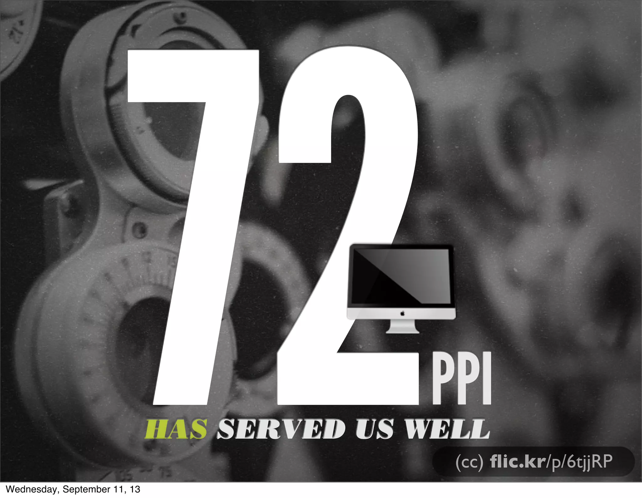
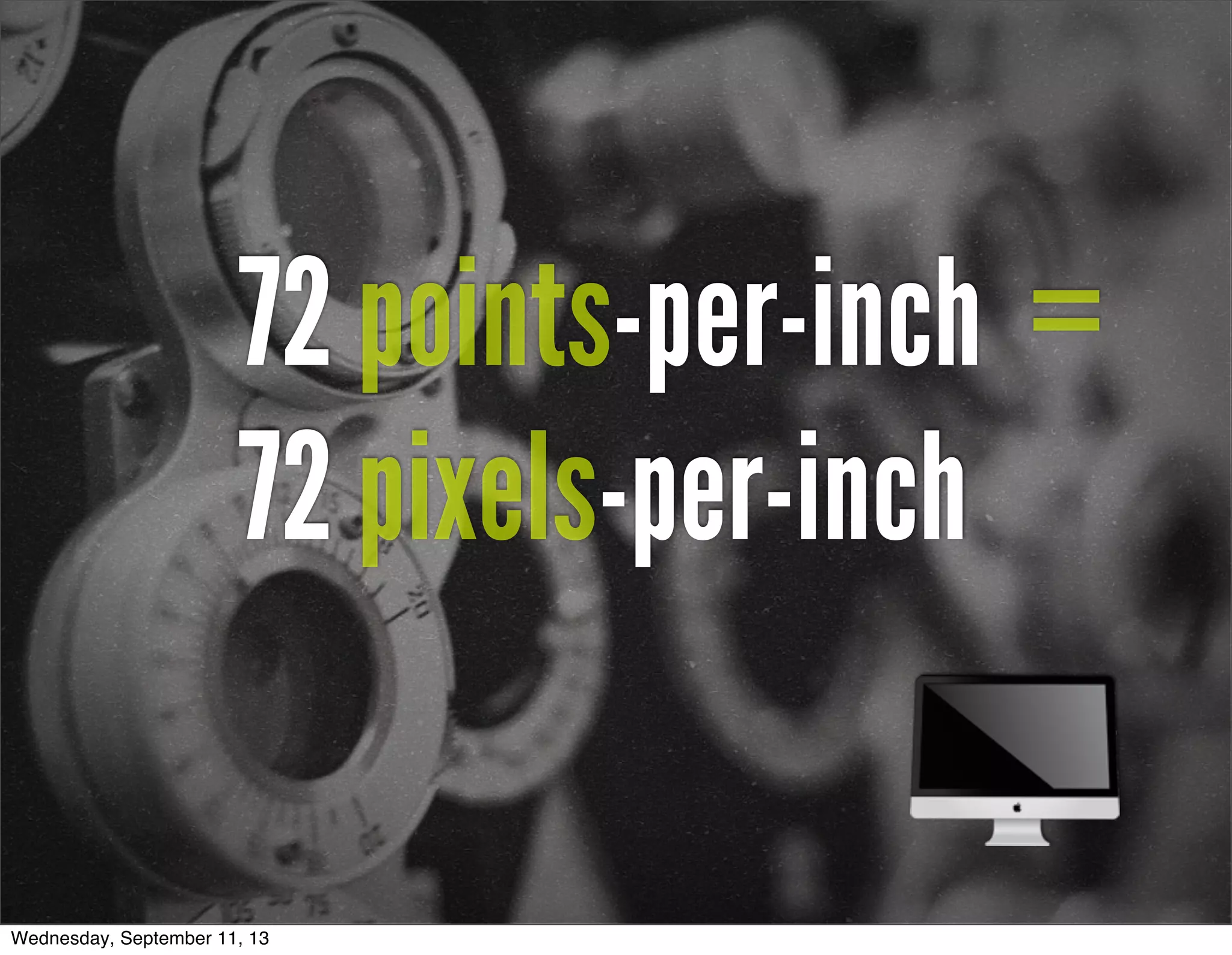
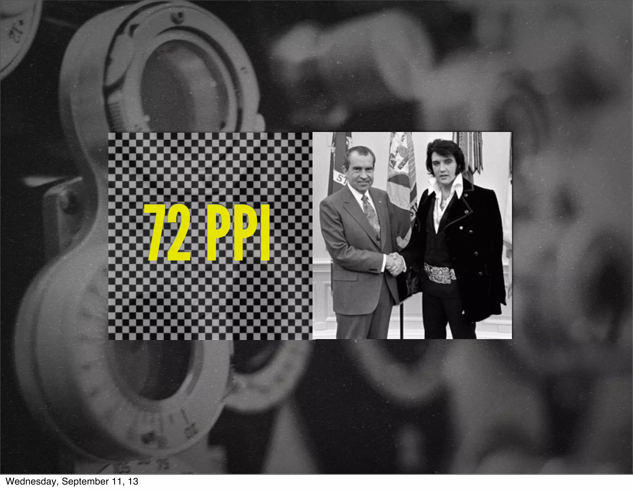
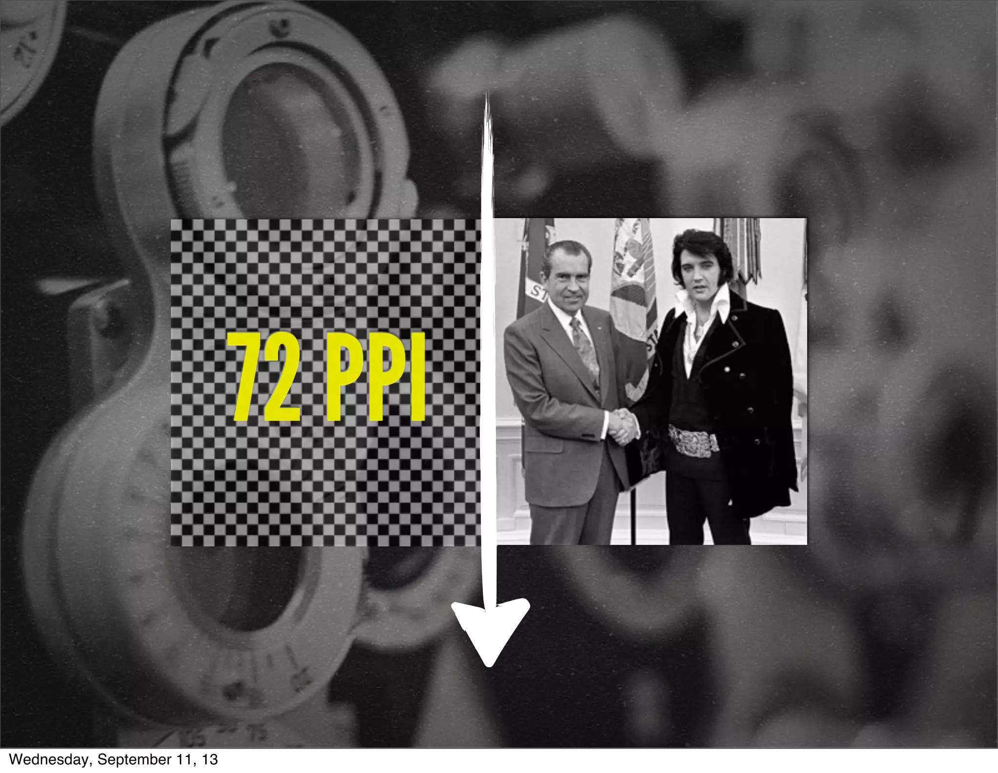
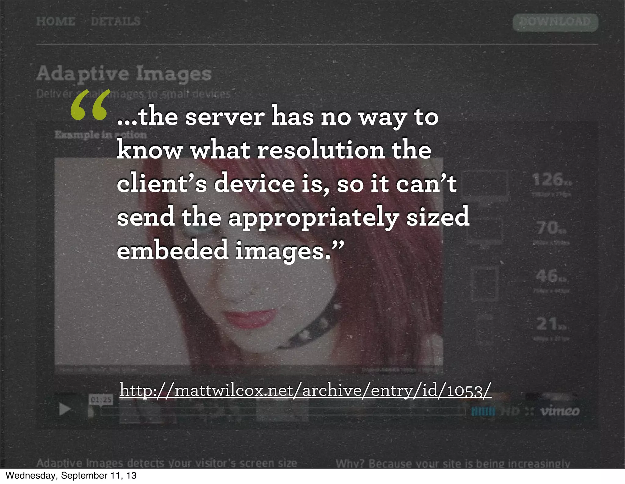
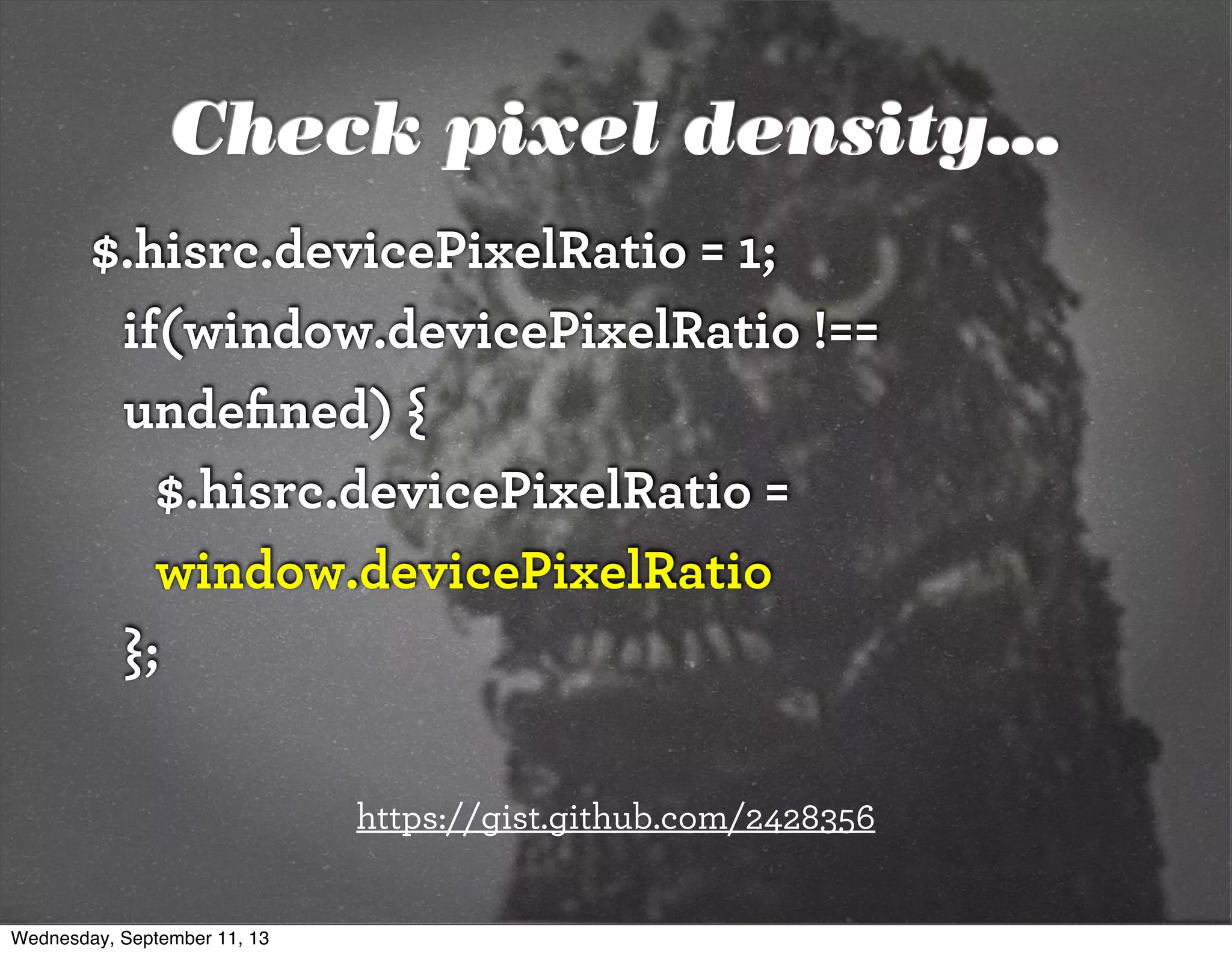
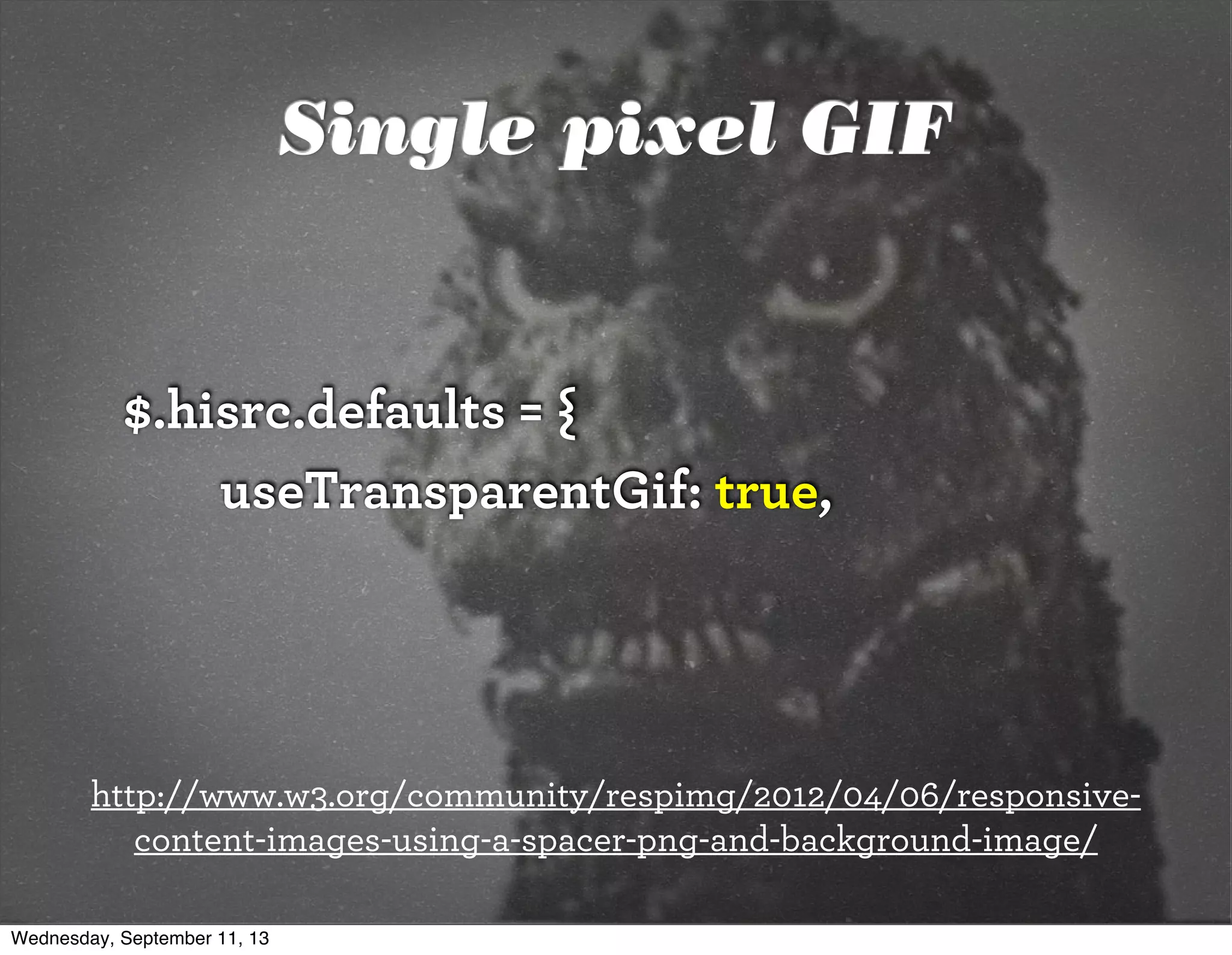
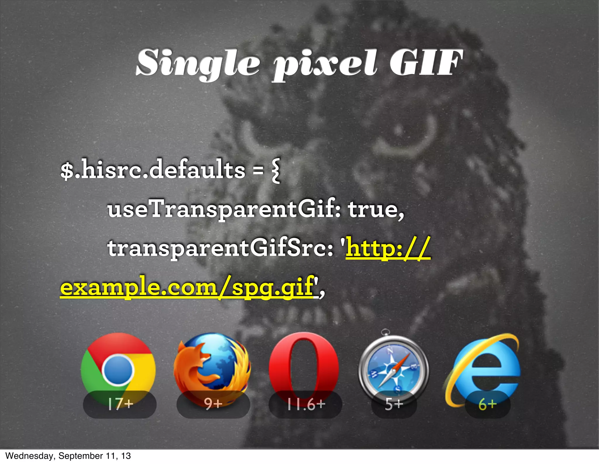
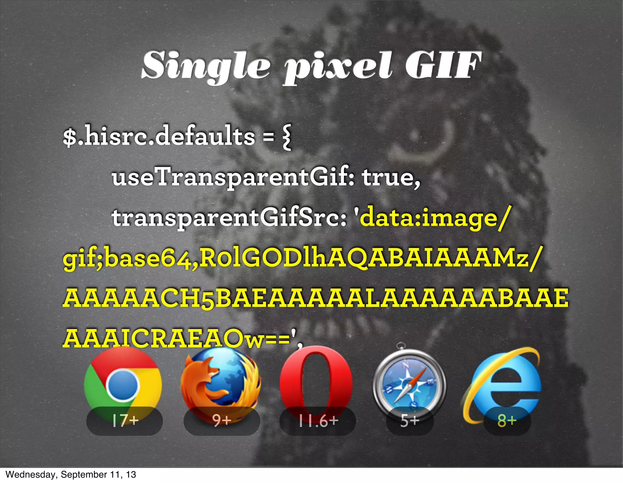
![72 points-per-inch
x [1+(1/3)]
= 96 PPI
Wednesday, September 11, 13](https://image.slidesharecdn.com/adaptive-imagesv14-130911193737-phpapp01/75/jqconatx-Adaptive-Images-for-Responsive-Web-Design-35-2048.jpg)
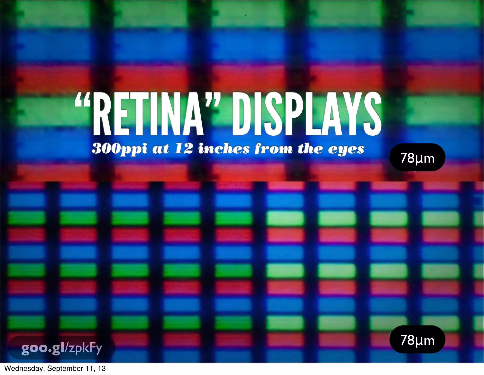
![[In 2013, Intel sees their
product line] offer a higher
resolution experience than a
top-of-the-line 1080p HDTV.”
“
http://liliputing.com/2012/04/intel-retina-laptop-
desktop-displays-coming-in-2013.html
Wednesday, September 11, 13](https://image.slidesharecdn.com/adaptive-imagesv14-130911193737-phpapp01/75/jqconatx-Adaptive-Images-for-Responsive-Web-Design-38-2048.jpg)
![Native speed test
// @Modernizr's network-connection.js
connection = navigator.connection || {
type: 0 }, // polyfill
isSlowConnection = connection.type == 3
|| connection.type == 4
| /^[23]g$/.test(connection.type);
http://davidbcalhoun.com/2010/using-navigator-connection-android
Wednesday, September 11, 13](https://image.slidesharecdn.com/adaptive-imagesv14-130911193737-phpapp01/75/jqconatx-Adaptive-Images-for-Responsive-Web-Design-52-2048.jpg)

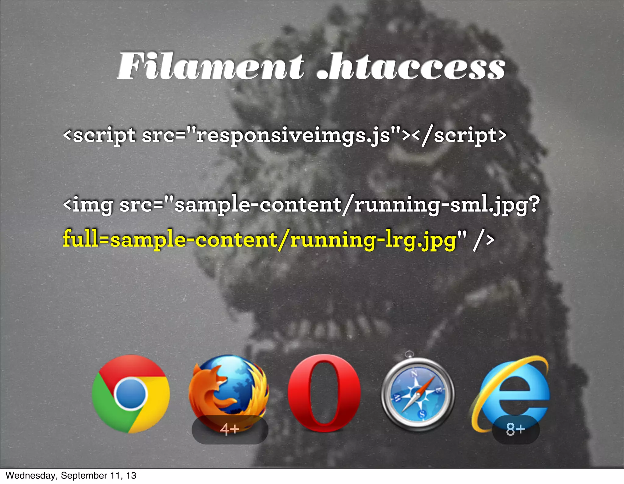
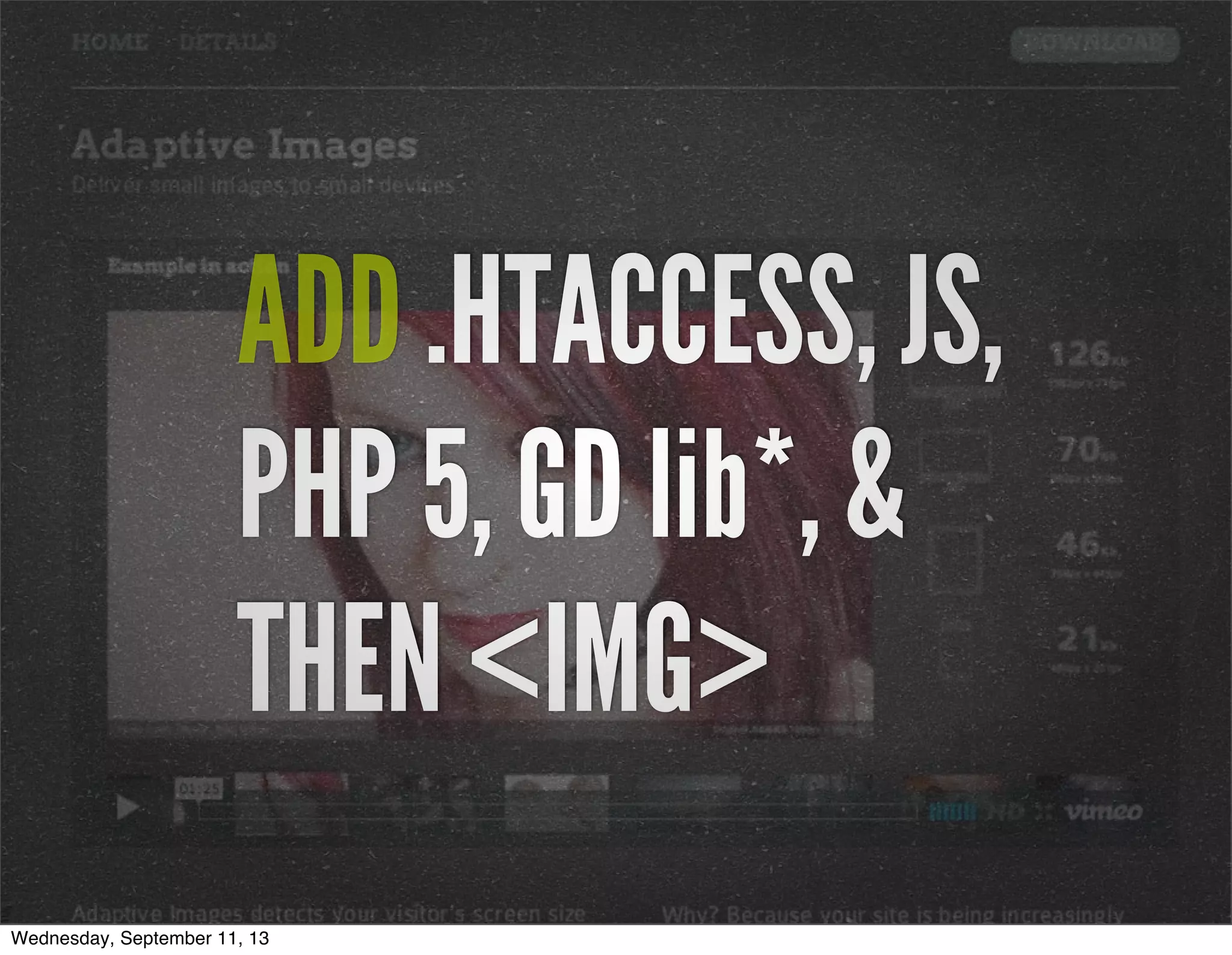
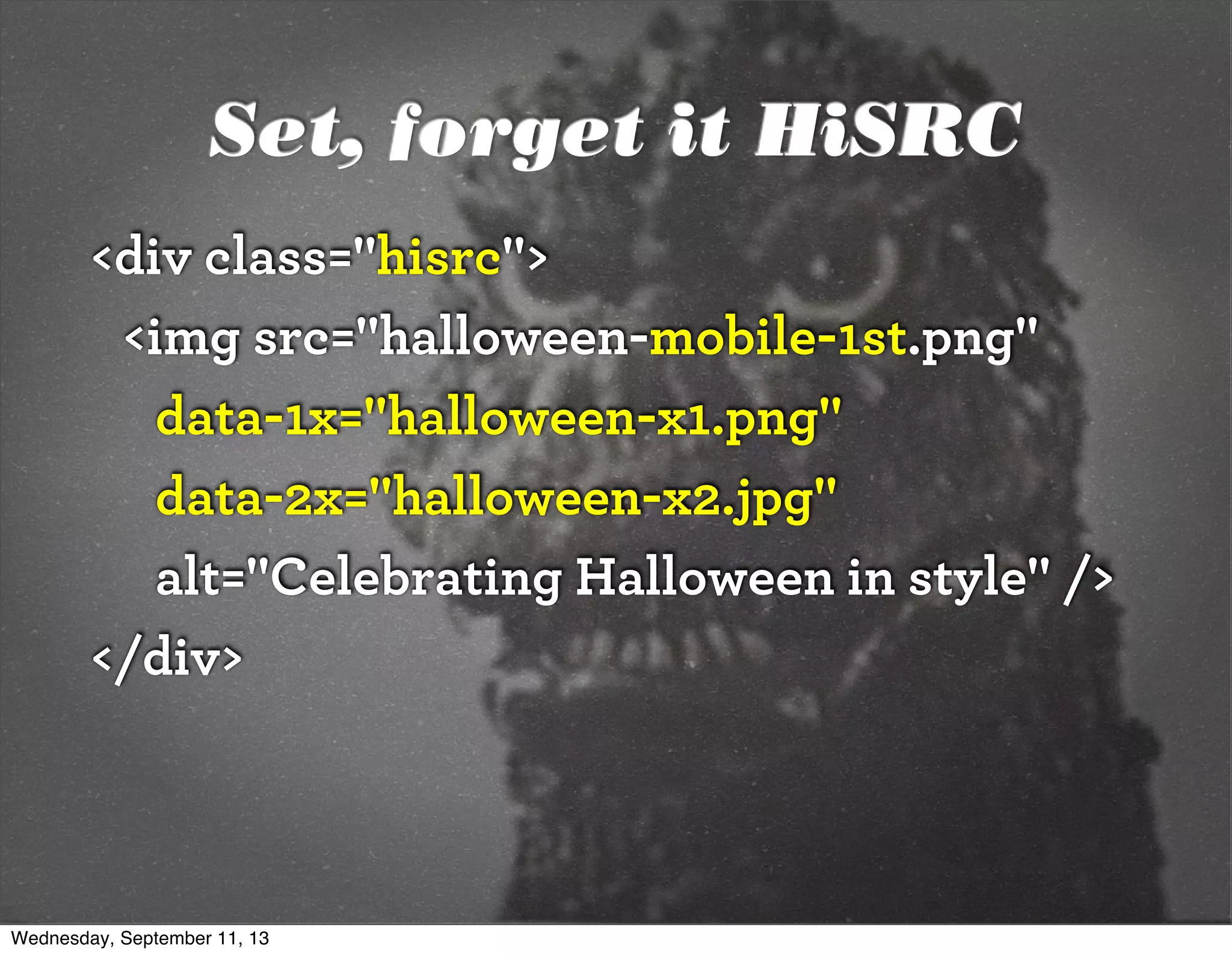
![Filament .htaccess
# Responsive Images
# Mobile-First images that scale responsively and responsibly
# Copyright 2010, Scott Jehl, Filament Group, Inc
# Dual licensed under the MIT or GPL Version 2 licenses.
# //Start Responsive Images
RewriteEngine On
# direct image requests to temp
RewriteCond %{QUERY_STRING} full=(.*)&?
RewriteRule (.*)rwd-router/.*.(jpe?g|png|gif|webp) $1%1 [L]
# ignore trap for non-image requests, rewrite URL without trap segment
RewriteRule (.*)rwd-router/(.*)$ $1$2
# //End Responsive Images
https://github.com/filamentgroup/Responsive-Images
Wednesday, September 11, 13](https://image.slidesharecdn.com/adaptive-imagesv14-130911193737-phpapp01/75/jqconatx-Adaptive-Images-for-Responsive-Web-Design-56-2048.jpg)


![Modernizr check
if(!Modernizr.svg){
var images =
document.getElementsByTagName("img");
for(var i = 0; i < images.length; i++){
var src = images[i].src.split(".");
images[i].src = src[0] + ".png";
}
}
http://stackoverflow.com/questions/12846852/
svg-png-extension-switch
Wednesday, September 11, 13](https://image.slidesharecdn.com/adaptive-imagesv14-130911193737-phpapp01/75/jqconatx-Adaptive-Images-for-Responsive-Web-Design-105-2048.jpg)


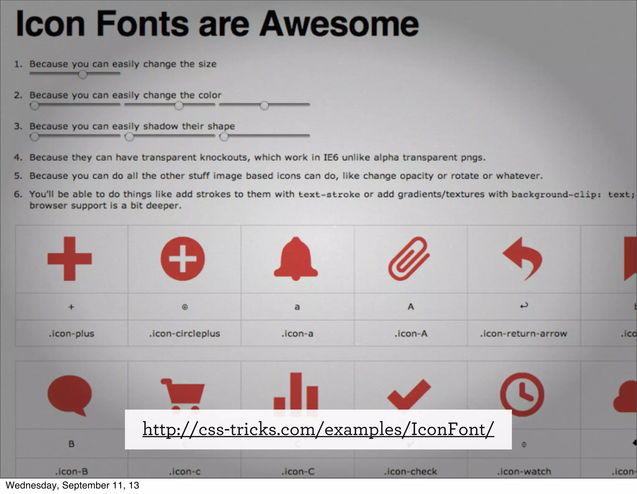
![Font-based icons
<style>
[data-icon]:before {
font-family: 'icon-font';
content: attr(data-icon);
}
</style>
<a href="http://example.com/cloud/save/">
<span data-icon="C" aria-hidden="true"></span>
Save to Cloud
</a>
Wednesday, September 11, 13](https://image.slidesharecdn.com/adaptive-imagesv14-130911193737-phpapp01/75/jqconatx-Adaptive-Images-for-Responsive-Web-Design-117-2048.jpg)


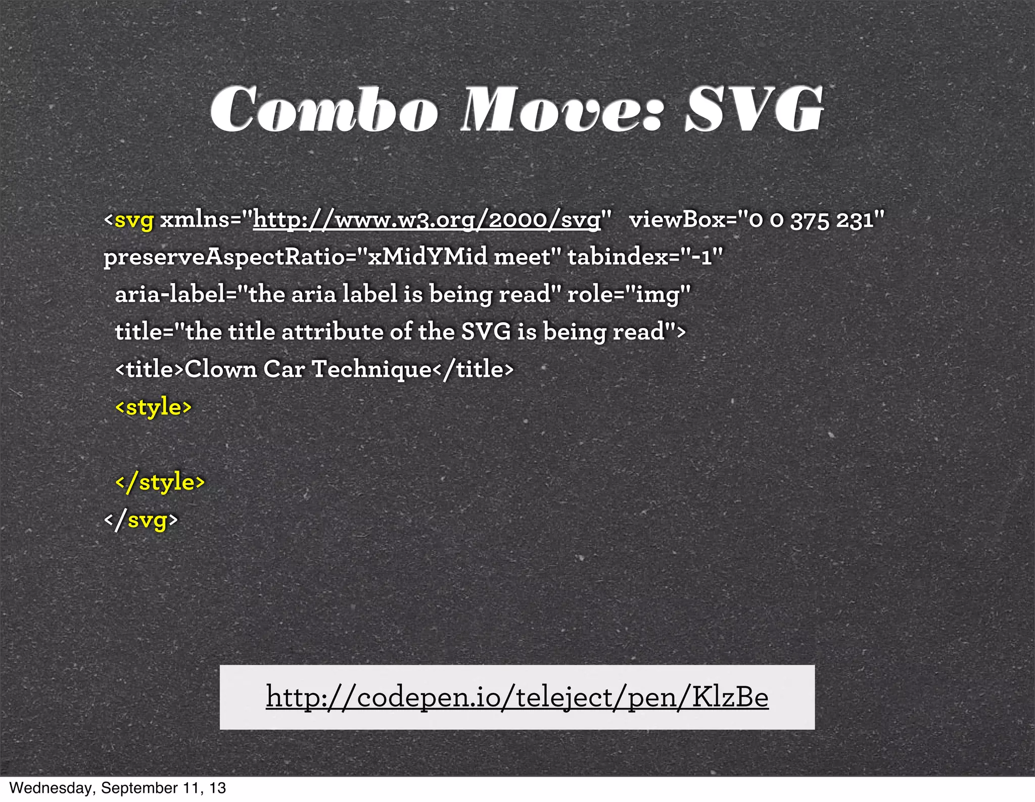
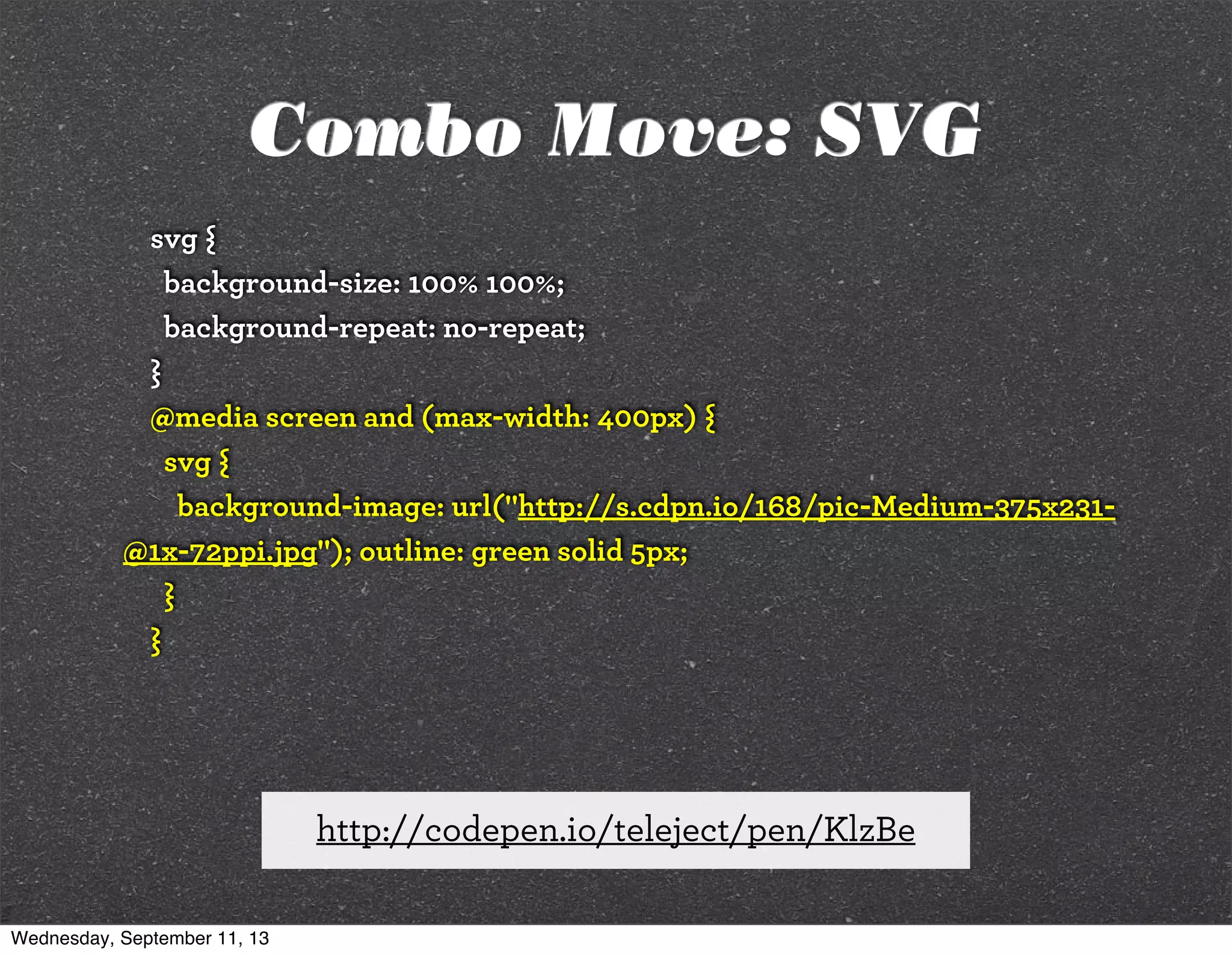
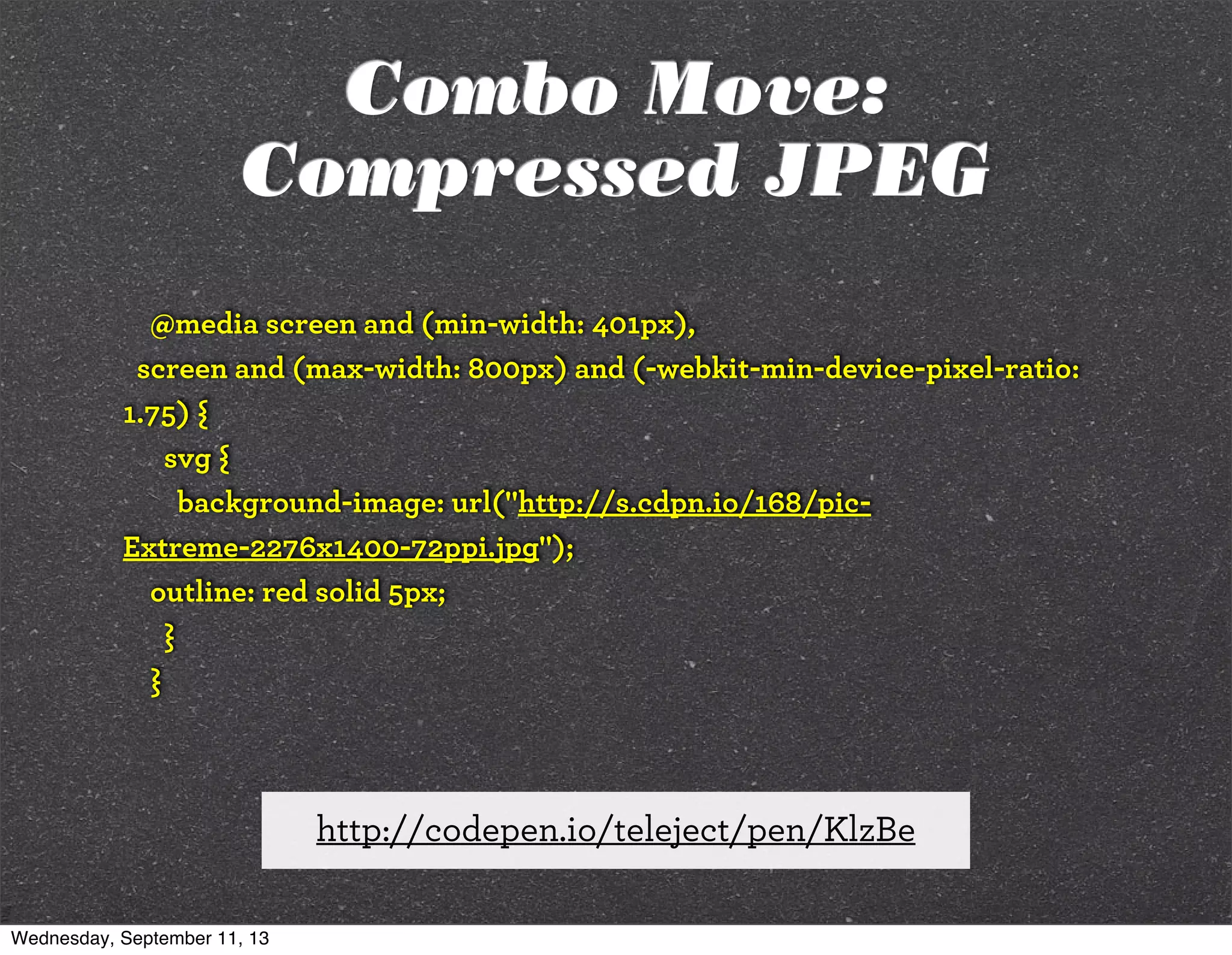
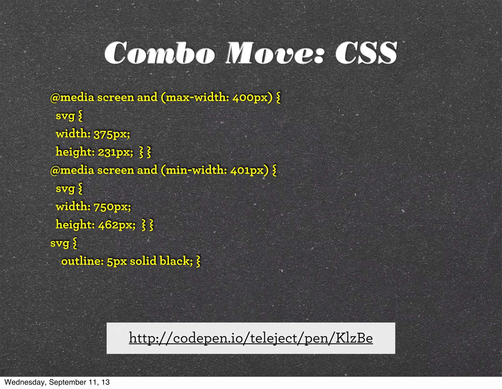
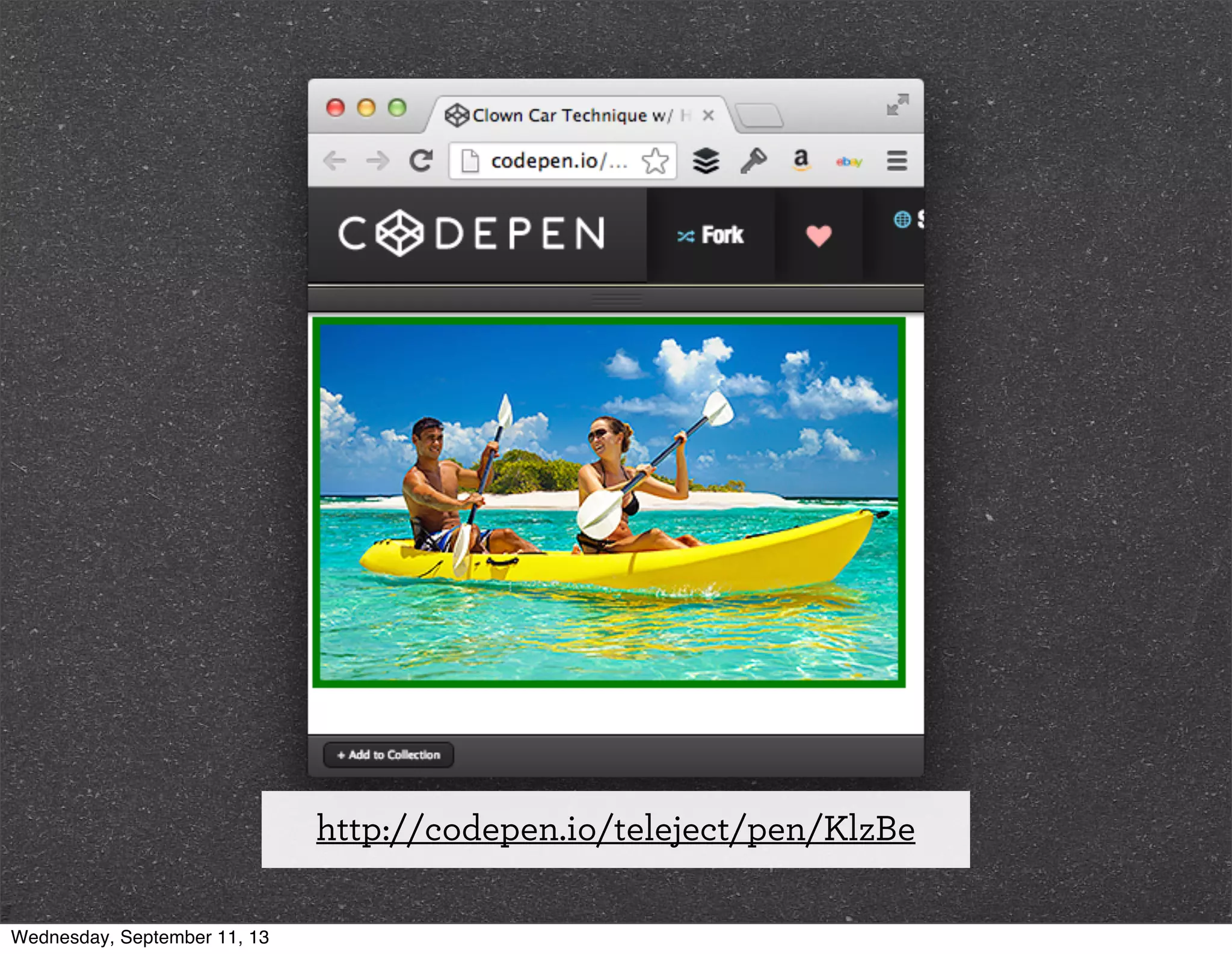
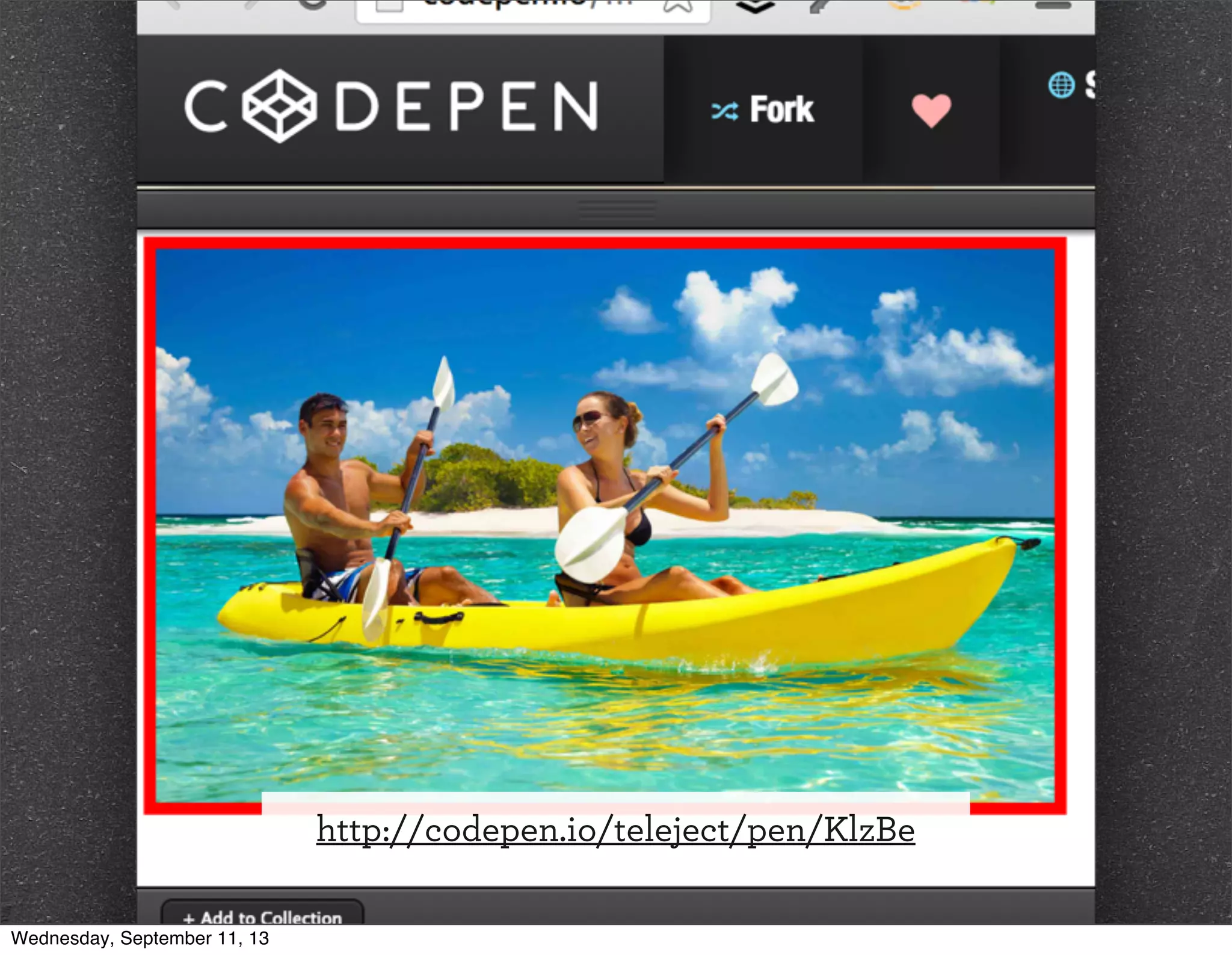
![<svg xmlns="http://www.w3.org/2000/svg" viewBox="0 0 375 231"
preserveAspectRatio="xMidYMid meet" tabindex="-1"
aria-label="the aria label is being read" role="img"
title="the title attribute of the SVG is being read">
<title>Clown Car Technique</title>
<style>
</style>
<foreignObject>
<!--[if lte IE 8]>
<img src="../images/mobile-first.png" width="375" height="231"
alt="put alt attribute text here"/>
<![endif]-->
</foreignObject>
</svg>
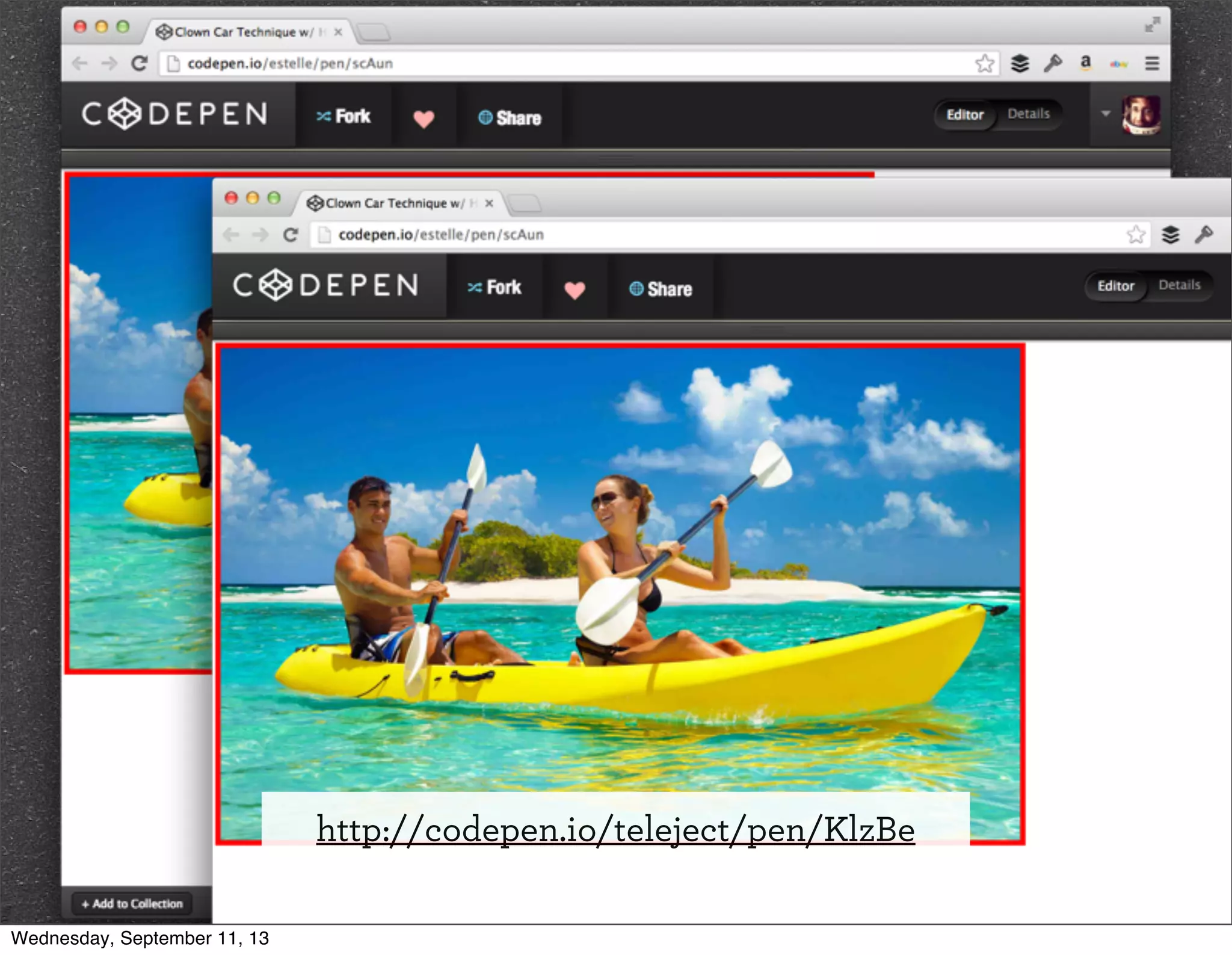
http://codepen.io/teleject/pen/KlzBe
Wednesday, September 11, 13](https://image.slidesharecdn.com/adaptive-imagesv14-130911193737-phpapp01/75/jqconatx-Adaptive-Images-for-Responsive-Web-Design-143-2048.jpg)


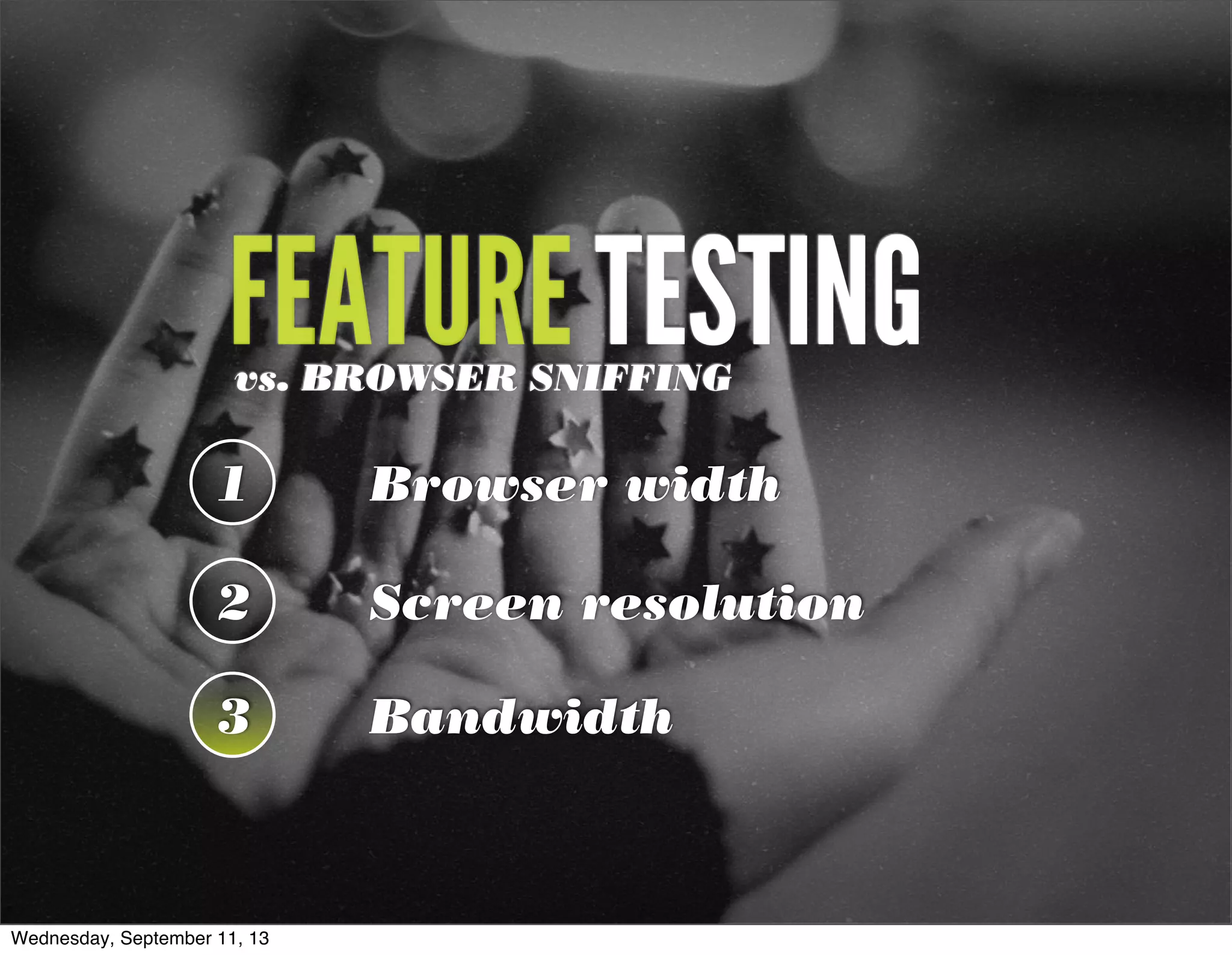
This document summarizes Christopher Schmitt's presentation on adaptive images in responsive web design. It discusses using feature testing versus browser sniffing to determine the appropriate image to serve, including testing browser width, screen resolution, and bandwidth. It then covers various techniques for serving adaptive images, such as using .htaccess files, the <picture> element, srcset attributes, and JavaScript libraries. It emphasizes using a mobile-first approach and progressive enhancement to provide the best experience for all devices.


![[rwdsummit] Adaptive Images in Responsive Web Design](https://cdn.slidesharecdn.com/ss_thumbnails/adaptive-imagesv18-1-140325201134-phpapp02-thumbnail.jpg?width=640&height=640&fit=bounds)
![[peachpit] Adaptive Images in Responsive Web Design](https://cdn.slidesharecdn.com/ss_thumbnails/peachpit-schmitt-adaptive-images-v2-130925150604-phpapp01-thumbnail.jpg?width=640&height=640&fit=bounds)
![[parisweb] Adaptive Images in Responsive Web Design](https://cdn.slidesharecdn.com/ss_thumbnails/adaptive-imagesv15v2-131014003217-phpapp01-thumbnail.jpg?width=640&height=640&fit=bounds)
![[cssdevconf] Adaptive Images in Responsive Web Design](https://cdn.slidesharecdn.com/ss_thumbnails/adaptive-imagesv16-131021133151-phpapp01-thumbnail.jpg?width=640&height=640&fit=bounds)
![[refreshaustin] Adaptive Images in Responsive Web Design](https://cdn.slidesharecdn.com/ss_thumbnails/adaptive-imagesv7-130410122323-phpapp02-thumbnail.jpg?width=640&height=640&fit=bounds)
![[wvbcn] Adaptive Images in Responsive Web Design](https://cdn.slidesharecdn.com/ss_thumbnails/adaptive-imagesv13v2-130629093334-phpapp01-thumbnail.jpg?width=640&height=640&fit=bounds)

![[convergese] Adaptive Images in Responsive Web Design](https://cdn.slidesharecdn.com/ss_thumbnails/2012-adaptive-images-convergese-120509135732-phpapp01-thumbnail.jpg?width=640&height=640&fit=bounds)
![[cssdevconf] Adaptive Images in RWD](https://cdn.slidesharecdn.com/ss_thumbnails/adaptive-imagesv6-121210084537-phpapp02-thumbnail.jpg?width=640&height=640&fit=bounds)
![[psuweb] Adaptive Images in Responsive Web Design](https://cdn.slidesharecdn.com/ss_thumbnails/adaptive-images-psuwebv2-130606095220-phpapp01-thumbnail.jpg?width=640&height=640&fit=bounds)
![[html5tx] Adaptive Images in Responsive Web Design](https://cdn.slidesharecdn.com/ss_thumbnails/adaptive-images-html5tx-130202100125-phpapp01-thumbnail.jpg?width=640&height=640&fit=bounds)
![[refreshpitt] Adaptive Images in Responsive Web Design](https://cdn.slidesharecdn.com/ss_thumbnails/adaptive-imagesv10-130609110047-phpapp01-thumbnail.jpg?width=640&height=640&fit=bounds)
![[rwdsummit2012] Adaptive Images in Responsive Web Design](https://cdn.slidesharecdn.com/ss_thumbnails/schmitt-adaptive-imagesv2-120829225201-phpapp02-thumbnail.jpg?width=640&height=640&fit=bounds)
![[drupalcampatx] Adaptive Images in Responsive Web Design](https://cdn.slidesharecdn.com/ss_thumbnails/adaptive-imagesv12v2-130623122711-phpapp01-thumbnail.jpg?width=640&height=640&fit=bounds)
![[wcatx] Adaptive Images in Responsive Web Design](https://cdn.slidesharecdn.com/ss_thumbnails/wcatx-adaptive-images-130518143751-phpapp01-thumbnail.jpg?width=640&height=640&fit=bounds)
![[HEWEBFL] Adaptive Images in Responsive Web Design](https://cdn.slidesharecdn.com/ss_thumbnails/hewebfl-adaptive-images2-130423085801-phpapp02-thumbnail.jpg?width=640&height=640&fit=bounds)
![[CSSDevConf] Adaptive Images in Responsive Web Design 2014](https://cdn.slidesharecdn.com/ss_thumbnails/adaptive-images-cssdevconf-141013185313-conversion-gate02-thumbnail.jpg?width=640&height=640&fit=bounds)
![[HEWEBAR 2012] Adaptive Images in Responsive Web Design](https://cdn.slidesharecdn.com/ss_thumbnails/hewebar-2012-adaptive-images-in-rwd-120729151800-phpapp02-thumbnail.jpg?width=640&height=640&fit=bounds)
![[Austin WordPress Meetup] Adaptive Images in Responsive Web Design](https://cdn.slidesharecdn.com/ss_thumbnails/adaptiveimages-wpaustinmeetup-150204100924-conversion-gate01-thumbnail.jpg?width=640&height=640&fit=bounds)
![[funka] Adaptive Images in Responsive Web Design](https://cdn.slidesharecdn.com/ss_thumbnails/adaptive-images-funkav5-150415072902-conversion-gate01-thumbnail.jpg?width=640&height=640&fit=bounds)

![[artifactconf] Github for People Who Don't Code](https://cdn.slidesharecdn.com/ss_thumbnails/github-for-people-that-dont-code-131115221827-phpapp02-thumbnail.jpg?width=640&height=640&fit=bounds)

![[sxsw2013] Extremely Compressed JPEGs](https://cdn.slidesharecdn.com/ss_thumbnails/adaptive-imagesfordwmgv7-130312172016-phpapp01-thumbnail.jpg?width=640&height=640&fit=bounds)
![[amigos] HTML5 and CSS3](https://cdn.slidesharecdn.com/ss_thumbnails/html5-and-css3v6-130208132048-phpapp01-thumbnail.jpg?width=640&height=640&fit=bounds)
![[convergefl] Adaptive Images in Responsive Web Design](https://cdn.slidesharecdn.com/ss_thumbnails/christopher-schmitt-adaptive-images-121014200507-phpapp02-thumbnail.jpg?width=640&height=640&fit=bounds)
![[HEWEBAR 2012] Beyond Desktop Browsing (HTML5)](https://cdn.slidesharecdn.com/ss_thumbnails/hewebar-2012-beyond-desktop-browsing-120729151254-phpapp01-thumbnail.jpg?width=640&height=640&fit=bounds)
![[O'Reilly] HTML5 Design](https://cdn.slidesharecdn.com/ss_thumbnails/html5-workshop-111215160913-phpapp01-thumbnail.jpg?width=640&height=640&fit=bounds)
![[heweb11] CSS3 Makeover](https://cdn.slidesharecdn.com/ss_thumbnails/css3-makeover-111027113114-phpapp01-thumbnail.jpg?width=640&height=640&fit=bounds)
![[heweb11] HTML5 Makeover](https://cdn.slidesharecdn.com/ss_thumbnails/html5-makeover-111027112644-phpapp01-thumbnail.jpg?width=640&height=640&fit=bounds)
![[edUi] HTML5 Workshop](https://cdn.slidesharecdn.com/ss_thumbnails/html5-workshop-2-111014103112-phpapp02-thumbnail.jpg?width=640&height=640&fit=bounds)


