Jake media
•Download as DOCX, PDF•
0 likes•275 views

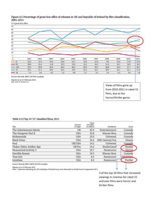
Views of 15-rated films increased from 2010 to 2011, especially for horror and thriller genres. Three of the top 10 films that saw increased viewings in cinemas for 15-rated or over films were horror and thriller films.
Report
Share
Report
Share

Recommended
Jake media
Views of 15 rated films increased from 2010-2011, with 3 of the top 10 films that saw rising viewership in cinemas being horror and thriller films, suggesting the horror/thriller genre contributed to higher attendance for older-audience films during that period.
Evaluation question 4
The document discusses British film classification and ratings. It explains the ratings system used by the British Board of Film Classification (BBFC) which ranges from U to 18. Films rated 12A, 12, 15 and 18 can contain increasing levels of violence, language, sexual content and other mature themes. The document then analyzes similar thriller films to determine that its own film sequence, which includes strong language, drug use, abuse and bloody violence, would merit a 15 rating in the UK. Feedback from teachers and classmates supported this rating. The filmmakers conducted audience research through a questionnaire to help target their 15-year-old audience.
Evaluation question four
The document discusses rating certificates for films and determining the appropriate rating for a thriller media product. Research found that over half of thriller films shown on the BBFB receive a 15 rating, allowing strong language, drug use, sexual references and violence. Feedback from questionnaires indicated that most respondents believed a 15 rating would be most suitable since the plot involving a kidnapped victim could emotionally affect younger viewers. Considering typical audiences for thriller films and the questionnaire feedback, the document concludes that a 15 rating is most appropriate for the media product.
Secondry research
The document summarizes research on movie audiences for different genres. It finds that cinema audiences overall are mostly males and females aged 15-24 who go most on Saturdays and Sundays. Horror movie audiences tend to be young adults aged 15-25 and adults 30+ who enjoy being scared. Audiences for supernatural horrors skew youngest at 15-25, while psychological horror audiences are more varied in age. Slasher film audiences are predominantly 18-25 year old males attracted to violence and gore over plot. Trailers help audiences decide which movies to see by providing a sense of what happens. The film The Sixth Sense successfully attracted its target demographic of 15-25 year old males and females.
Evaluation question 4
The target audience for the media product is 15-20 year olds. A survey found that this age group enjoys the build-up of suspense in thriller films. The film receives a 15 age rating, allowing it to include blood and gore that makes it more interesting. Research confirmed this 15+ rating was appropriate. The typical audience member is a 17 year old male student who enjoys thriller films, books, and games and going to the cinema with friends.
Question 4 for evaluation
We conducted surveys to determine the target audience for our short horror film. The surveys showed that teenagers aged 15-30 and both males and females like horror films equally and would enjoy watching our film. Younger children are easily scared by horror movies, and older audiences generally dislike the genre, so our target audience is people aged 15-30 of both genders.
Result Analysis
The document summarizes research conducted on movie preferences by age and gender. It found that those under 16, especially boys, prefer comedies and action movies while girls that age also enjoy romances. Those aged 16-18 prefer action, adventure, thrillers and horrors. Adults aged 19-21 and over 30 most like thrillers, action, sci-fi, comedy and romance. The research also found that thrillers appeal most to males from teens to mid-30s. Based on this, the document outlines a plan to target a new thriller movie to audiences aged 15-26, combining psychological and action elements with an enigmatic plot and fast pacing, and releasing it online.
Legal and ethical issues
Lauren Whyte discusses several legal and ethical issues regarding her film Pursued. She believes the film does not break any laws as it does not include anything too extreme, and child actors were supervised. No animals were harmed during filming. The story is also original and does not adapt any existing works, avoiding copyright issues. Royalty-free music and sounds were used to prevent copyright problems. A health and safety risk assessment was completed prior to filming. The film would likely receive a 12 certificate as no visual violence is shown. Representations of gender and youth could be seen as stereotypical but may be broken as the film progresses. Representations of violence rely on imagination rather than visuals.
Thepactgroupanalysis 121021130631-phpapp01
The document analyzes and summarizes the trailer for the horror movie "The Pact". It discusses various film techniques used to set the tone and build suspense, including the dark and deserted mise-en-scene, static and interference on phone calls, an increasing heartbeat, and shaky camera work that places the audience in the perspective of the attacker. The analysis highlights how elements like the changing lock, black screens, unnatural sounds, and juxtaposition of light and dark or safety and danger manipulate the audience's sense of unease and suspense throughout the trailer.
Evaluation question 1
This document analyzes how Jake Scott's media product challenges or develops conventions of real media products.
It discusses several ways Jake's magazine front cover compares to real magazines, such as using a group photo instead of a solo shot and including two people not fully in frame. The masthead and placement of cover lines are similar to real magazines.
The contents page draws from conventions of Billboard, Q Magazine, and Vibe Magazine, including charts, color schemes, images, and promotional text. It sectioned different parts like Billboard.
The double page spread includes a pulled quote and interview columns like in Q Magazine, with natural and performance photos of the featured artists.
Evaluation 5 fc
The document summarizes key design elements of a magazine cover and how they work to attract and engage the target audience. The large masthead at the top catches readers' eyes and establishes brand recognition. Additional headlines and images throughout the cover promote featured stories and draw readers further into exploring the magazine's contents. Quotes, models, and direct addresses are used to create a sense of interaction and pull readers into the magazine's world. Consistent colors, fonts, and design elements reinforce the brand and make the magazine easy for the audience to recognize.
Evaluation question 6
Jake Scott used various media technologies to create a music magazine, including GIMP editing software, Photoshop, WordPress, YouTube, and Microsoft Word and PowerPoint. A Nikon D3000 camera was used to take high quality photos of models for the magazine. A Kodak camera took pictures for the contents page and original ideas. A laptop and school computers were used to edit photos, research similar products, plan and design the magazine, and upload work to a blog. A printer/scanner was used to scan drafts and research for the blog. The magazine was created using GIMP software, and Paint was used to crop screenshots. A memory stick stored work files for easy transport. Creating the magazine taught Jake new
Evaluation Question 1
This document analyzes how Jake Scott's media product challenges or develops conventions of real media products.
It discusses several design elements of Jake's magazine cover and how they compare to real magazines, such as using a group photo which breaks conventions. The masthead and colors also differ from typical magazines.
The contents page is inspired by Billboard and includes charts, images, and sections on the music industry like real magazines. Columns, images, and pulled quotes are used on the double page spread similar to conventions in Q magazine.
Evaluation Question 1
This document analyzes how Jake Scott's media product challenges or develops conventions of real media products.
It discusses several ways Jake's magazine front cover compares to real magazines, such as using a group photo instead of a solo shot and including two people not fully in frame. The masthead and placement of cover lines are similar to real magazines.
The contents page draws from conventions of Billboard, Q Magazine, and Vibe Magazine, including charts, color schemes, images, and promotional text. It sectioned different parts like Billboard.
The double page spread includes a pulled quote image and interview columns like in Q Magazine. Live performance photos emulate styles from other magazines.
Prem lim analysis
The document summarizes the design elements and creative choices made for the front cover of a magazine aimed at children. Key details included setting the scene of a girl in an autumn forest to convey the feeling of returning to school. Bright colors and graphics are used throughout to attract children's attention. Photographing the girl with an extreme long shot helps establish the setting and makes the scenario more believable. The magazine title, fonts, text sizes, and other stylistic elements were carefully selected to stand out and engage young readers.
Fonts
This document lists 6 short phrases: Star Avenue, Mouse deco, Market Deco, Grass Hopper, Air Conditioner, and Lettres ombrées ornées. It does not provide any context or explanation for these phrases.
Front Cover School Magazine
This newspaper article highlights top back-to-school items, secondary school exam results from local schools, and family activities and deals in and around Bracknell, England. Students can also collect tickets from issues of the Prime newspaper to win a day out at Legoland.
More Related Content
More from Jake Scott
Thepactgroupanalysis 121021130631-phpapp01
The document analyzes and summarizes the trailer for the horror movie "The Pact". It discusses various film techniques used to set the tone and build suspense, including the dark and deserted mise-en-scene, static and interference on phone calls, an increasing heartbeat, and shaky camera work that places the audience in the perspective of the attacker. The analysis highlights how elements like the changing lock, black screens, unnatural sounds, and juxtaposition of light and dark or safety and danger manipulate the audience's sense of unease and suspense throughout the trailer.
Evaluation question 1
This document analyzes how Jake Scott's media product challenges or develops conventions of real media products.
It discusses several ways Jake's magazine front cover compares to real magazines, such as using a group photo instead of a solo shot and including two people not fully in frame. The masthead and placement of cover lines are similar to real magazines.
The contents page draws from conventions of Billboard, Q Magazine, and Vibe Magazine, including charts, color schemes, images, and promotional text. It sectioned different parts like Billboard.
The double page spread includes a pulled quote and interview columns like in Q Magazine, with natural and performance photos of the featured artists.
Evaluation 5 fc
The document summarizes key design elements of a magazine cover and how they work to attract and engage the target audience. The large masthead at the top catches readers' eyes and establishes brand recognition. Additional headlines and images throughout the cover promote featured stories and draw readers further into exploring the magazine's contents. Quotes, models, and direct addresses are used to create a sense of interaction and pull readers into the magazine's world. Consistent colors, fonts, and design elements reinforce the brand and make the magazine easy for the audience to recognize.
Evaluation question 6
Jake Scott used various media technologies to create a music magazine, including GIMP editing software, Photoshop, WordPress, YouTube, and Microsoft Word and PowerPoint. A Nikon D3000 camera was used to take high quality photos of models for the magazine. A Kodak camera took pictures for the contents page and original ideas. A laptop and school computers were used to edit photos, research similar products, plan and design the magazine, and upload work to a blog. A printer/scanner was used to scan drafts and research for the blog. The magazine was created using GIMP software, and Paint was used to crop screenshots. A memory stick stored work files for easy transport. Creating the magazine taught Jake new
Evaluation Question 1
This document analyzes how Jake Scott's media product challenges or develops conventions of real media products.
It discusses several design elements of Jake's magazine cover and how they compare to real magazines, such as using a group photo which breaks conventions. The masthead and colors also differ from typical magazines.
The contents page is inspired by Billboard and includes charts, images, and sections on the music industry like real magazines. Columns, images, and pulled quotes are used on the double page spread similar to conventions in Q magazine.
Evaluation Question 1
This document analyzes how Jake Scott's media product challenges or develops conventions of real media products.
It discusses several ways Jake's magazine front cover compares to real magazines, such as using a group photo instead of a solo shot and including two people not fully in frame. The masthead and placement of cover lines are similar to real magazines.
The contents page draws from conventions of Billboard, Q Magazine, and Vibe Magazine, including charts, color schemes, images, and promotional text. It sectioned different parts like Billboard.
The double page spread includes a pulled quote image and interview columns like in Q Magazine. Live performance photos emulate styles from other magazines.
Prem lim analysis
The document summarizes the design elements and creative choices made for the front cover of a magazine aimed at children. Key details included setting the scene of a girl in an autumn forest to convey the feeling of returning to school. Bright colors and graphics are used throughout to attract children's attention. Photographing the girl with an extreme long shot helps establish the setting and makes the scenario more believable. The magazine title, fonts, text sizes, and other stylistic elements were carefully selected to stand out and engage young readers.
Fonts
This document lists 6 short phrases: Star Avenue, Mouse deco, Market Deco, Grass Hopper, Air Conditioner, and Lettres ombrées ornées. It does not provide any context or explanation for these phrases.
Front Cover School Magazine
This newspaper article highlights top back-to-school items, secondary school exam results from local schools, and family activities and deals in and around Bracknell, England. Students can also collect tickets from issues of the Prime newspaper to win a day out at Legoland.
More from Jake Scott (12)
Jake media
- 1. Views of films gone up from 2010-2011 in rated 15 films, due to the horror/thriller genre. 3 of the top 10 films that increased viewings in cinemas for rated 15 and over films were horror and thriller films.
- 2. This is the information I have found out from the ‘Pearl and Dean’ website giving me key information on audience age and groups. Having now found this I would defiantly want to change my age range from 15-30 to just 15-24.