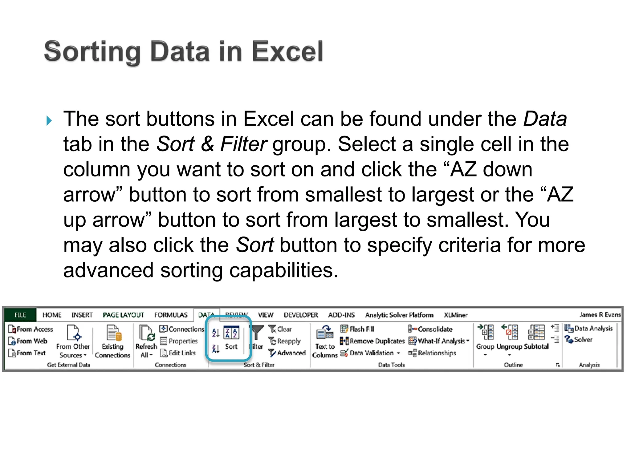
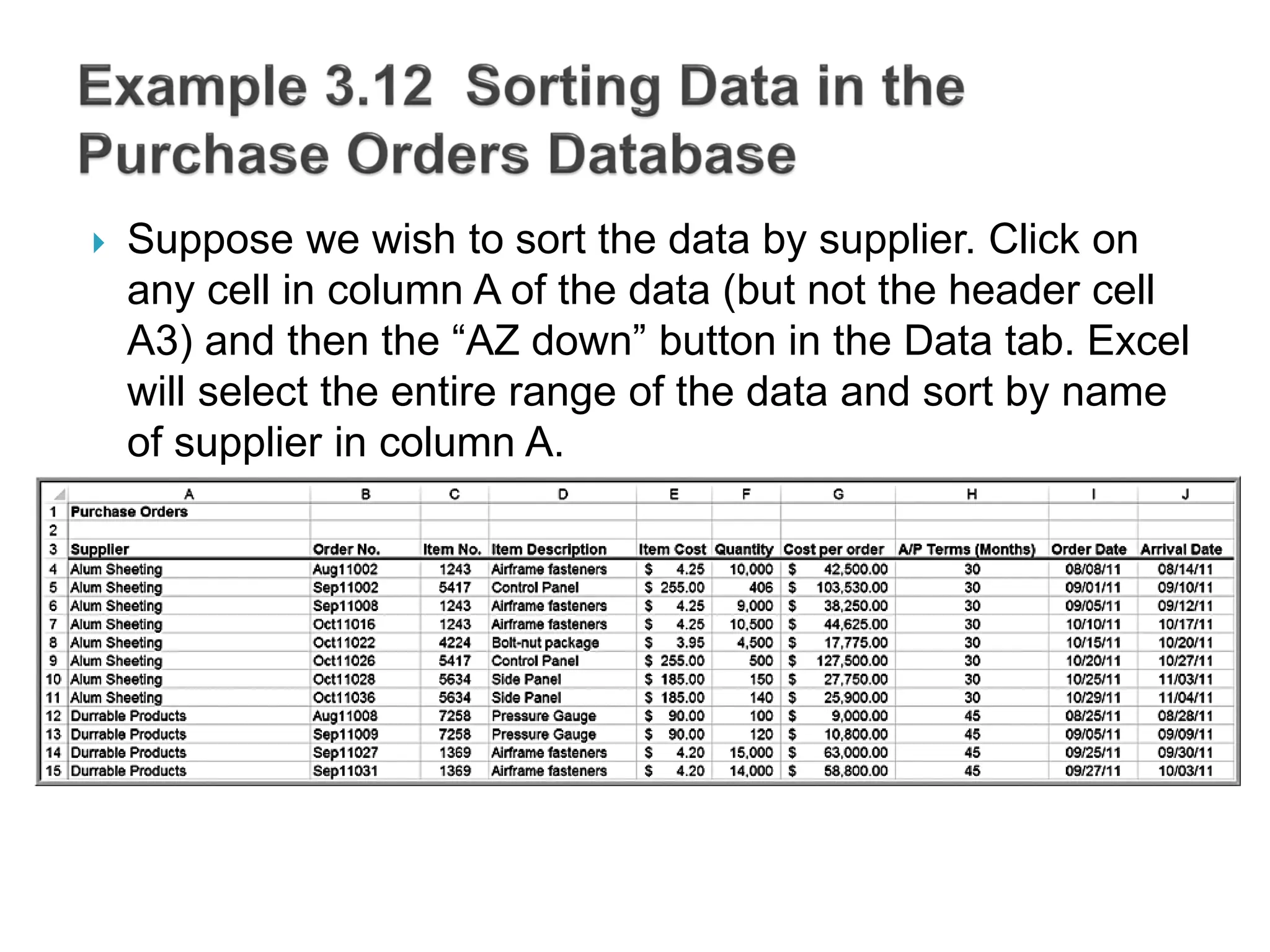
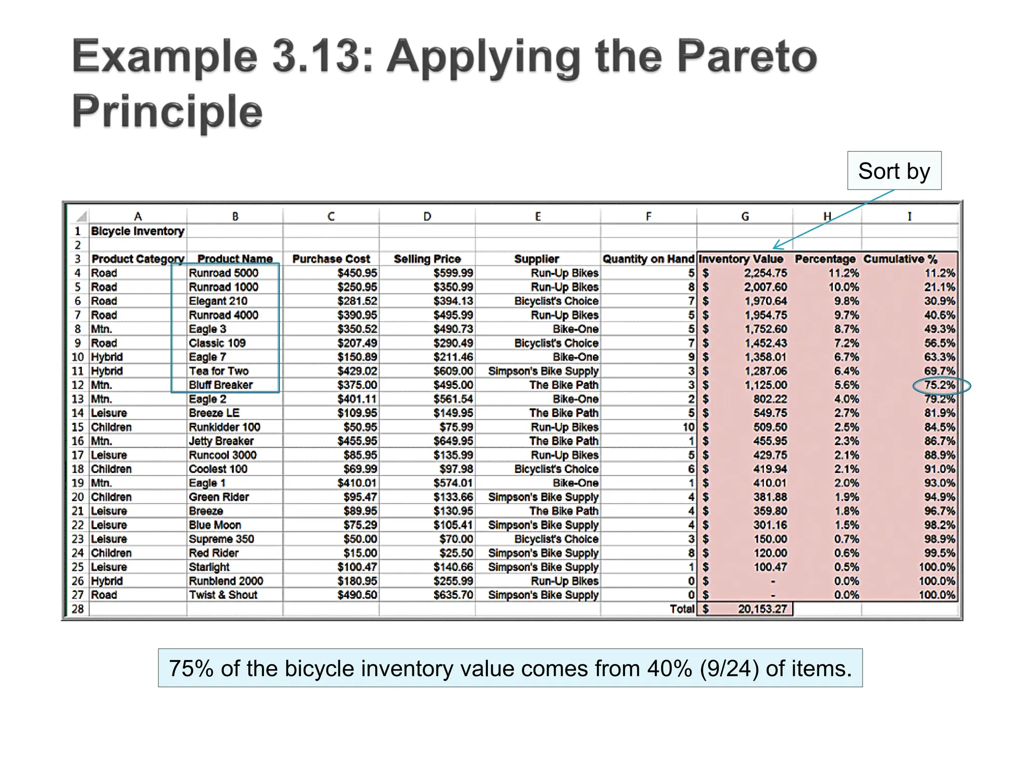
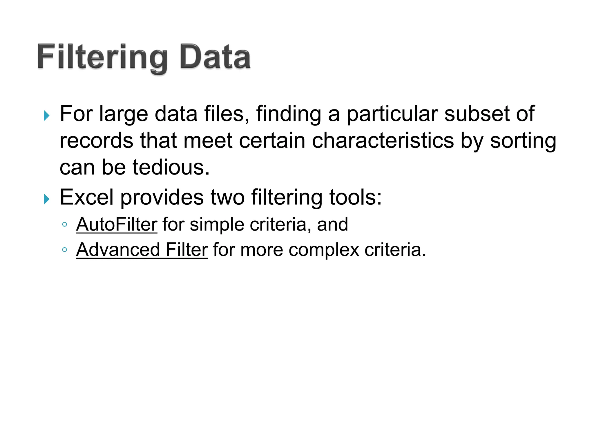
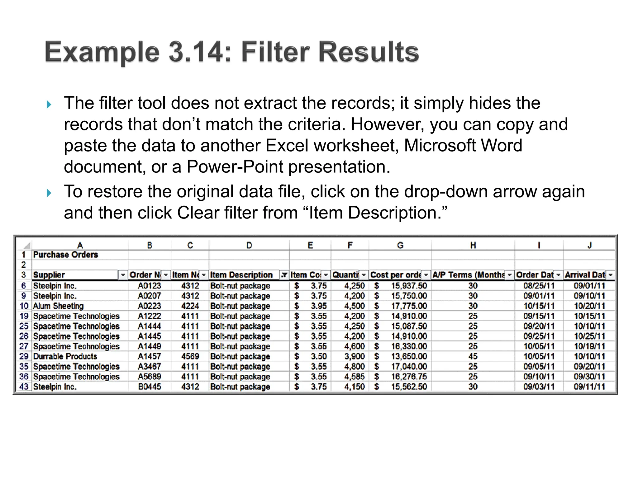
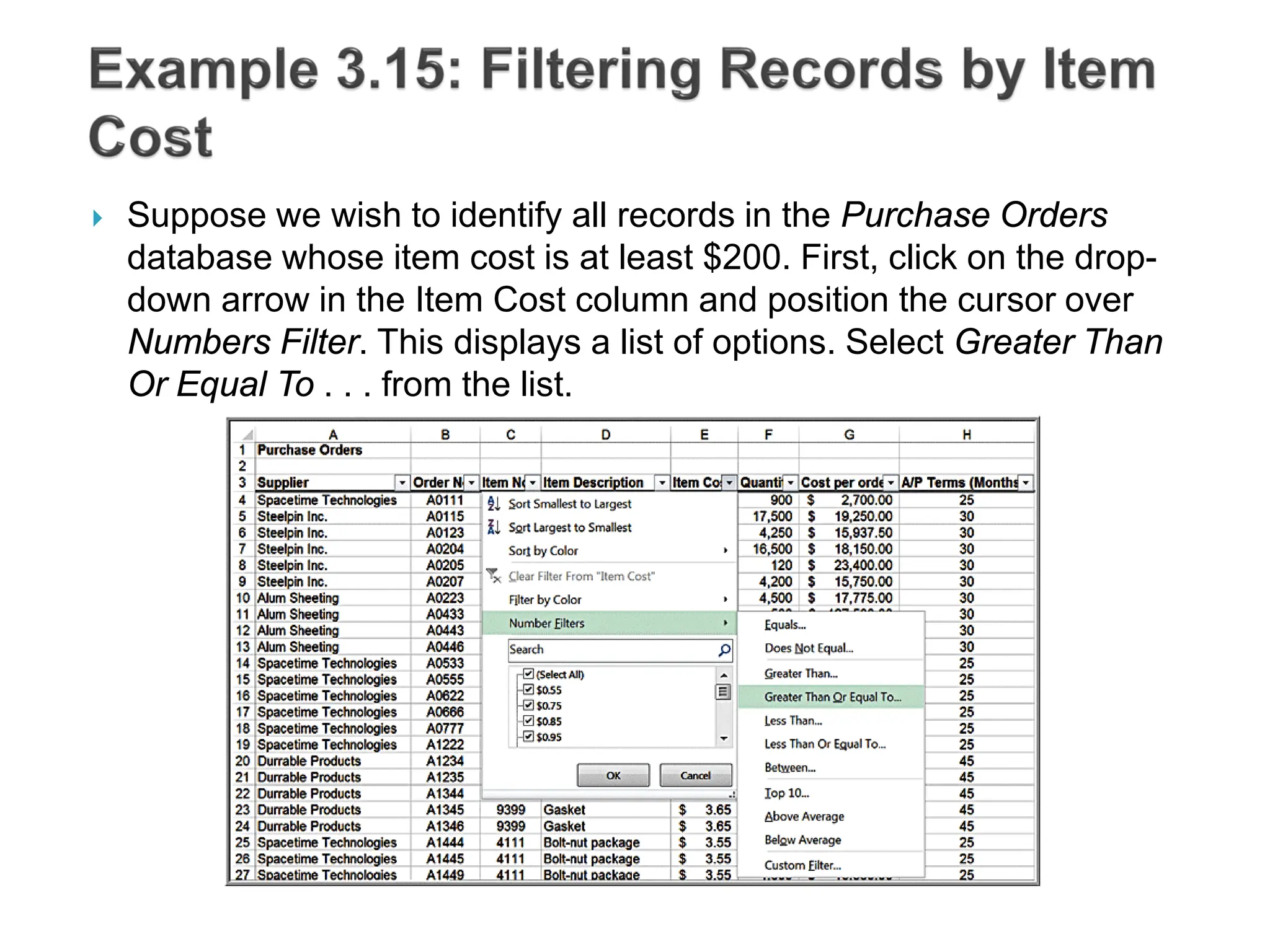
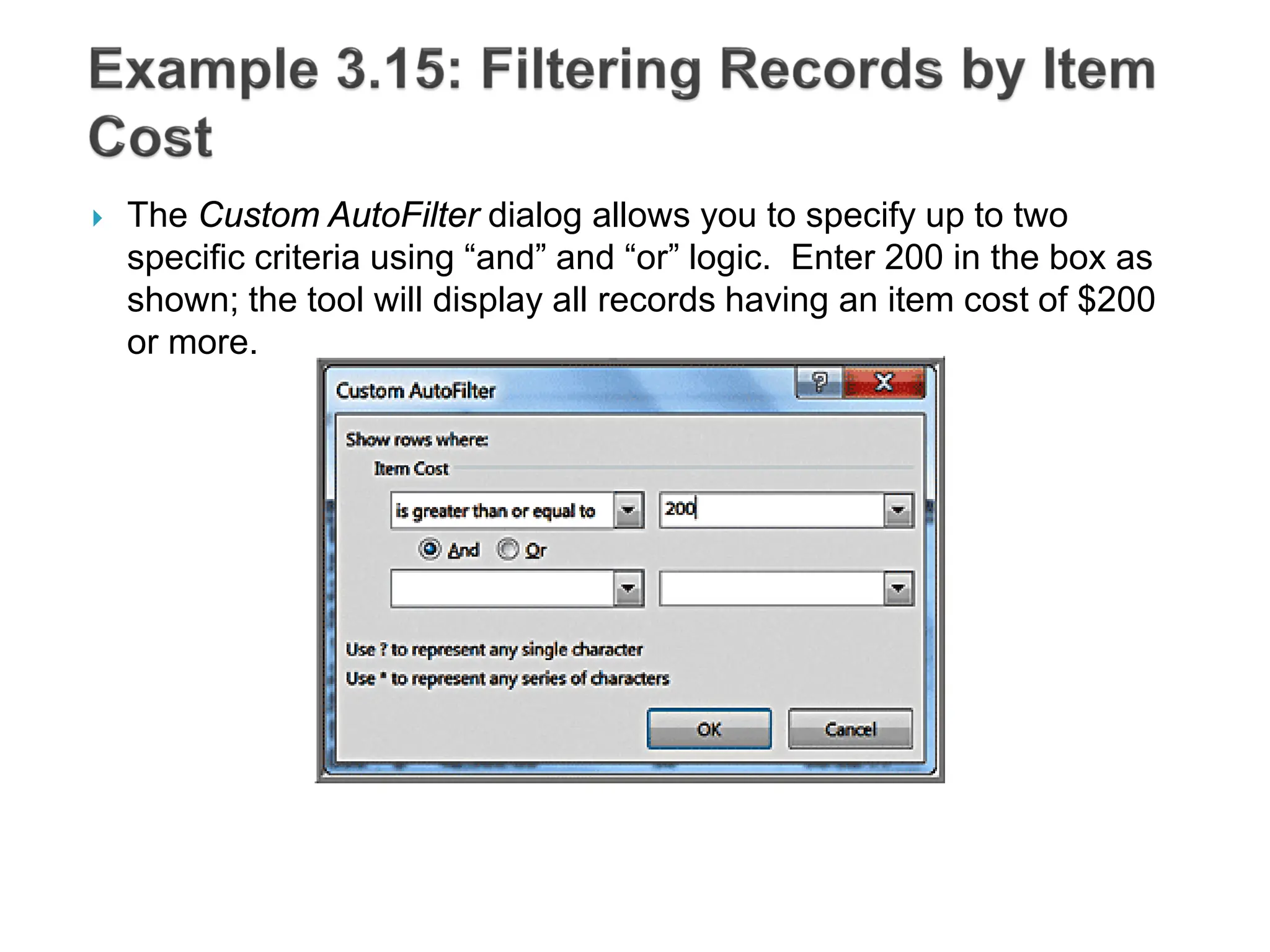
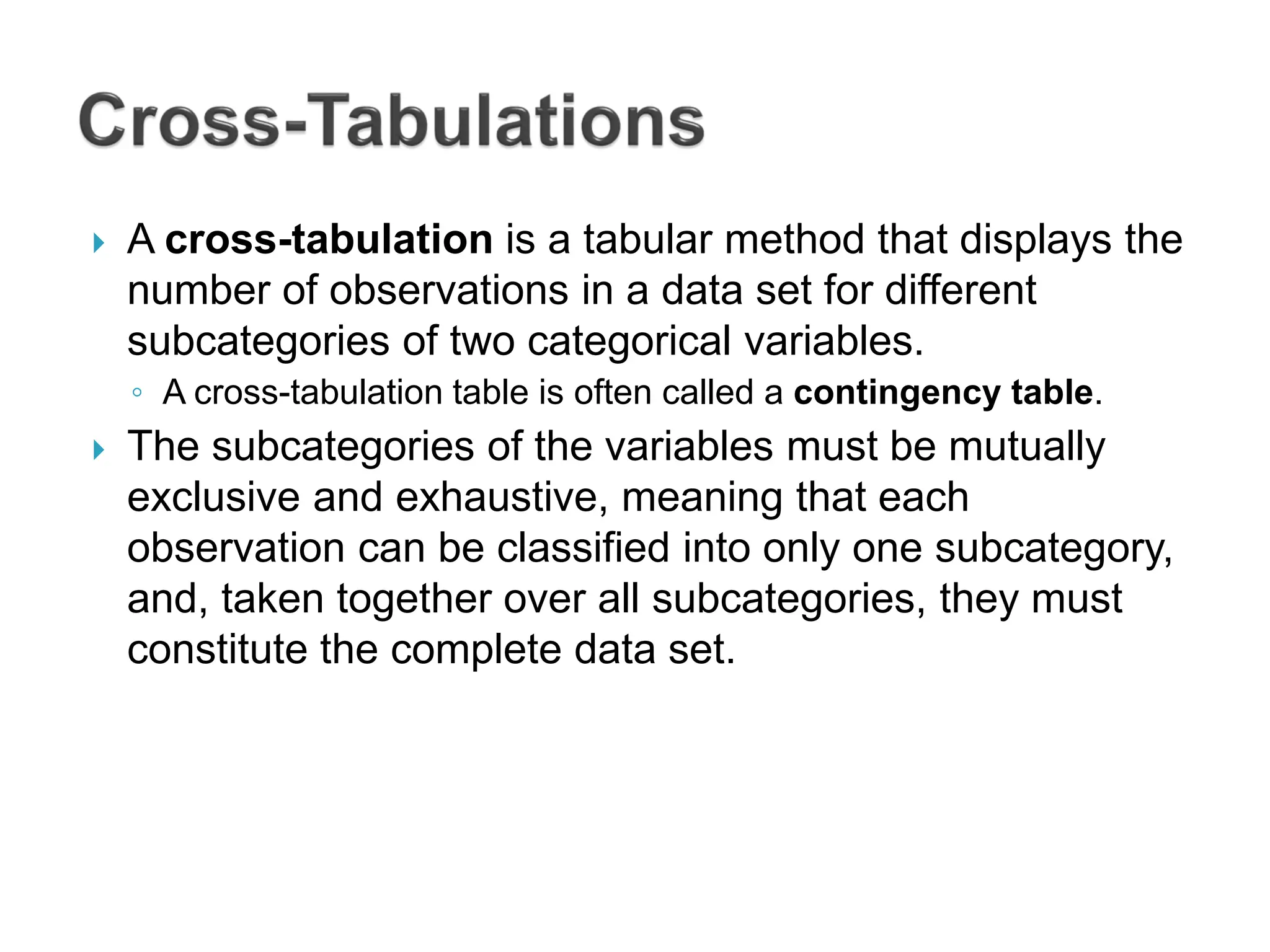
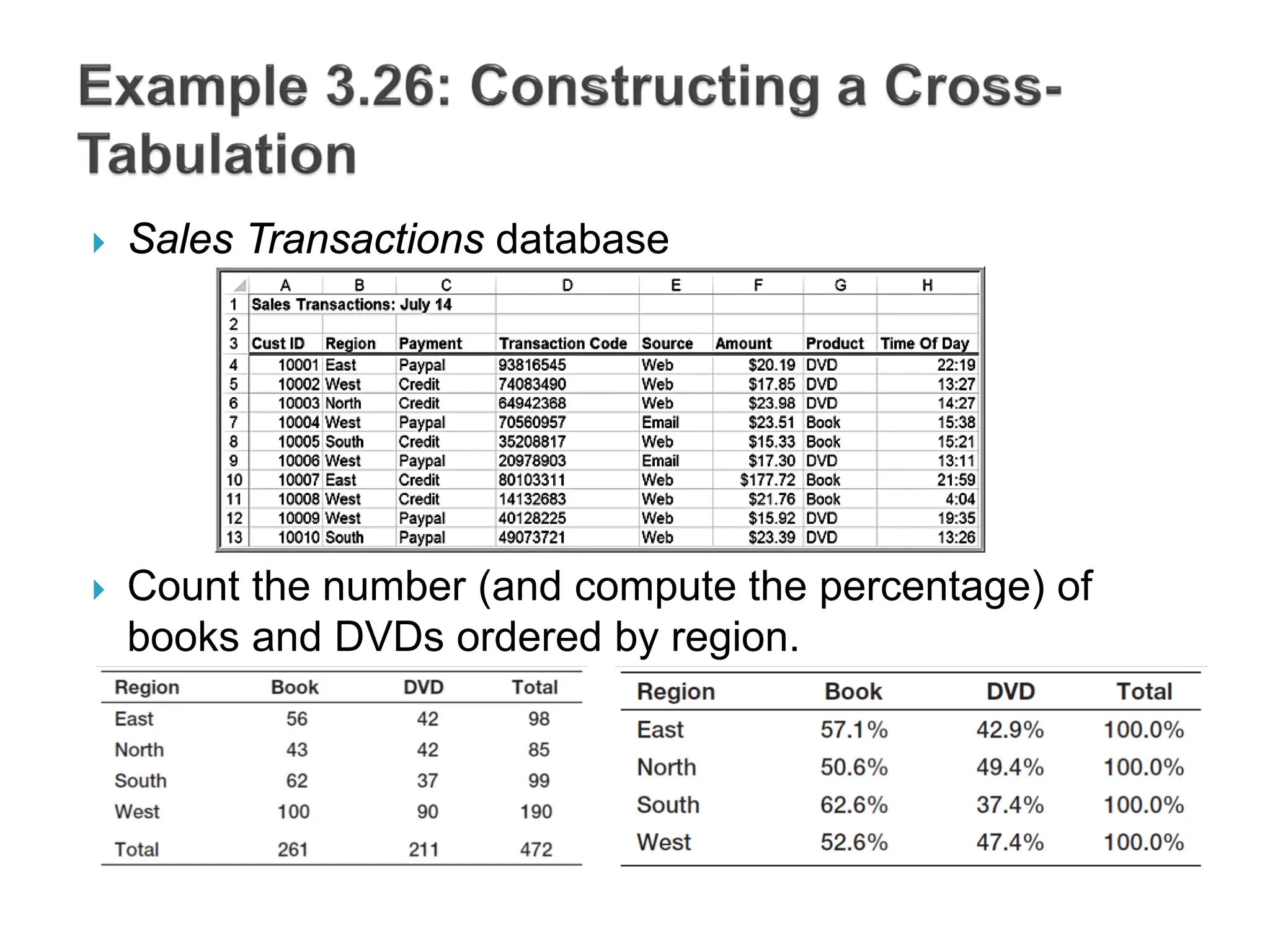
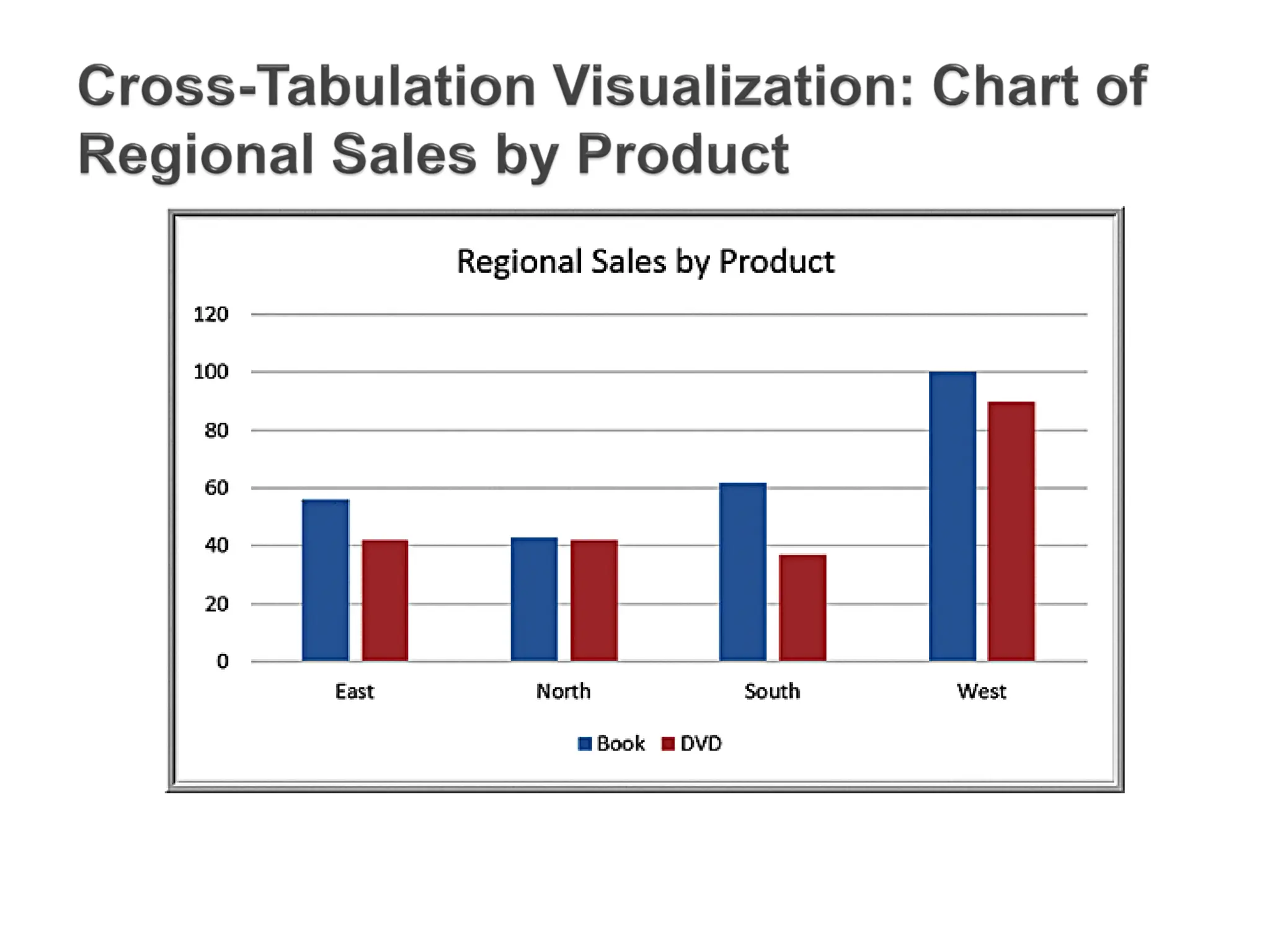
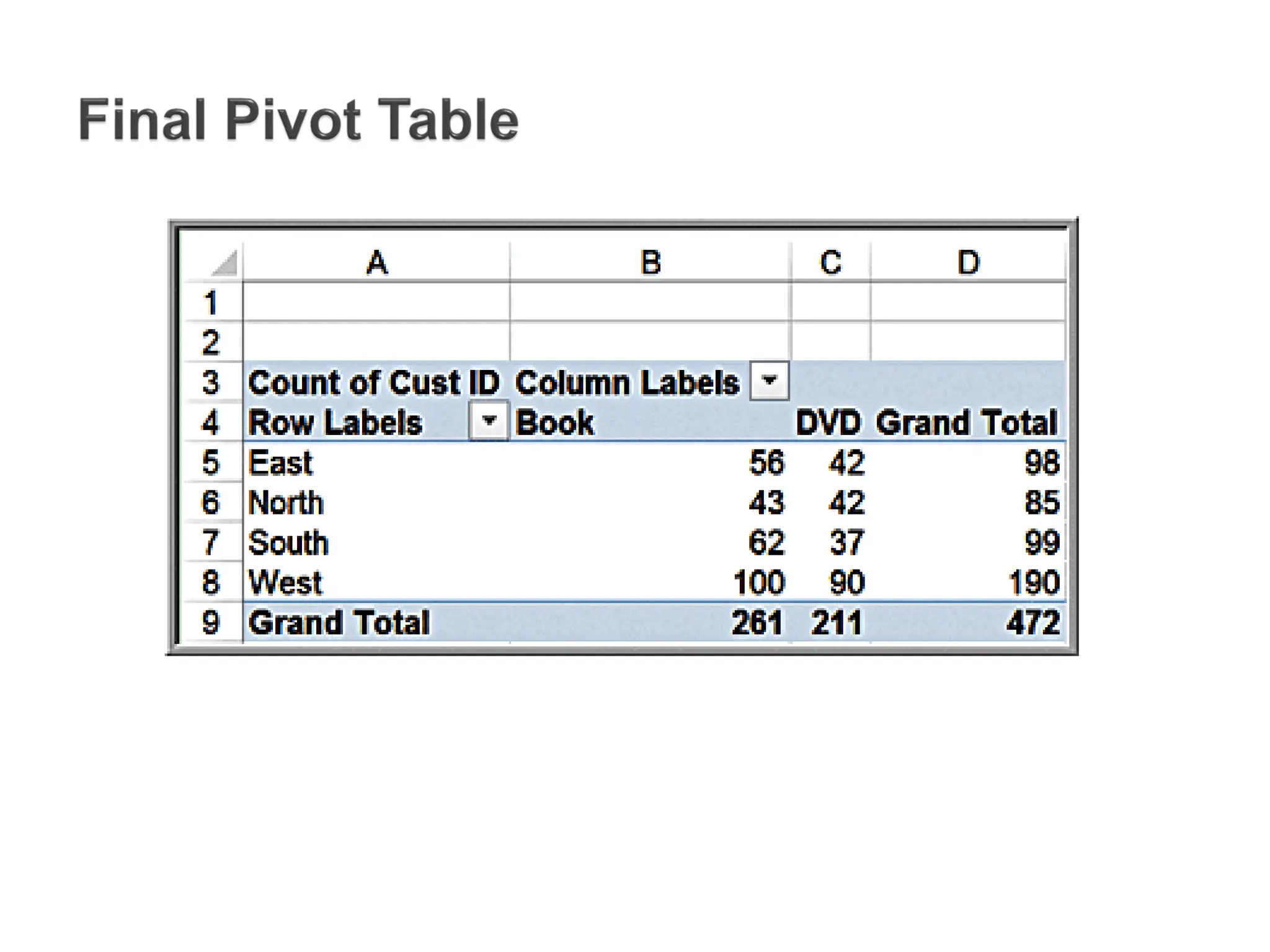
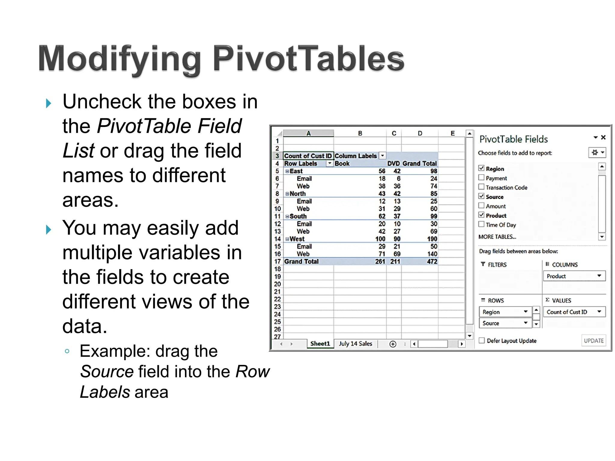
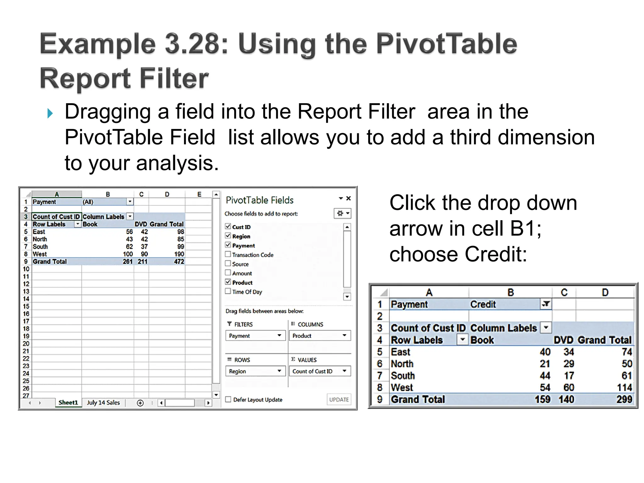
This document discusses various methods for visualizing and summarizing data. It describes different types of charts like column charts, line charts, pie charts, and scatter plots that can be used to visualize quantitative data. It also discusses tools in Excel for filtering, sorting, and summarizing data in tables and how techniques like Pareto analysis can help identify key factors.


![ Suppose that in the Credit Risk Data table, we wish to calculate the
total amount of savings in column C. We could, of course, simply
use the function =SUM(C4:C428). However, with a table, we could
use the formula =SUM(Table1[Savings]). The table name,Table1,
can be found (and changed) in the Properties group of the Table
Tools Design tab. Note that Savings is the name of the header in
column C. One of the advantages of doing this is that if we add new
records to the table, the calculation will be updated automatically,](https://image.slidesharecdn.com/banalytics2eppt03-240401003701-3f310006/75/Introduction-to-Business-analytics-unit3-29-2048.jpg)