GROUP 2 -TECHNICAL PRESENTATION
USE OF AI IN POWER BI WITH EXAMPLES
Presenting By
1. Vidhyashree A S
2. Ambika
3. Anurag Gundapi
4. Pragati Shankar Jadhav
5. Soundarya S
6. Sinan Ali
7. Rajesh Arjun Bendugade
8. Sruthika Raj
9. Mohammad Museb Bankapur
2.
AI VISUALS INPOWER BI
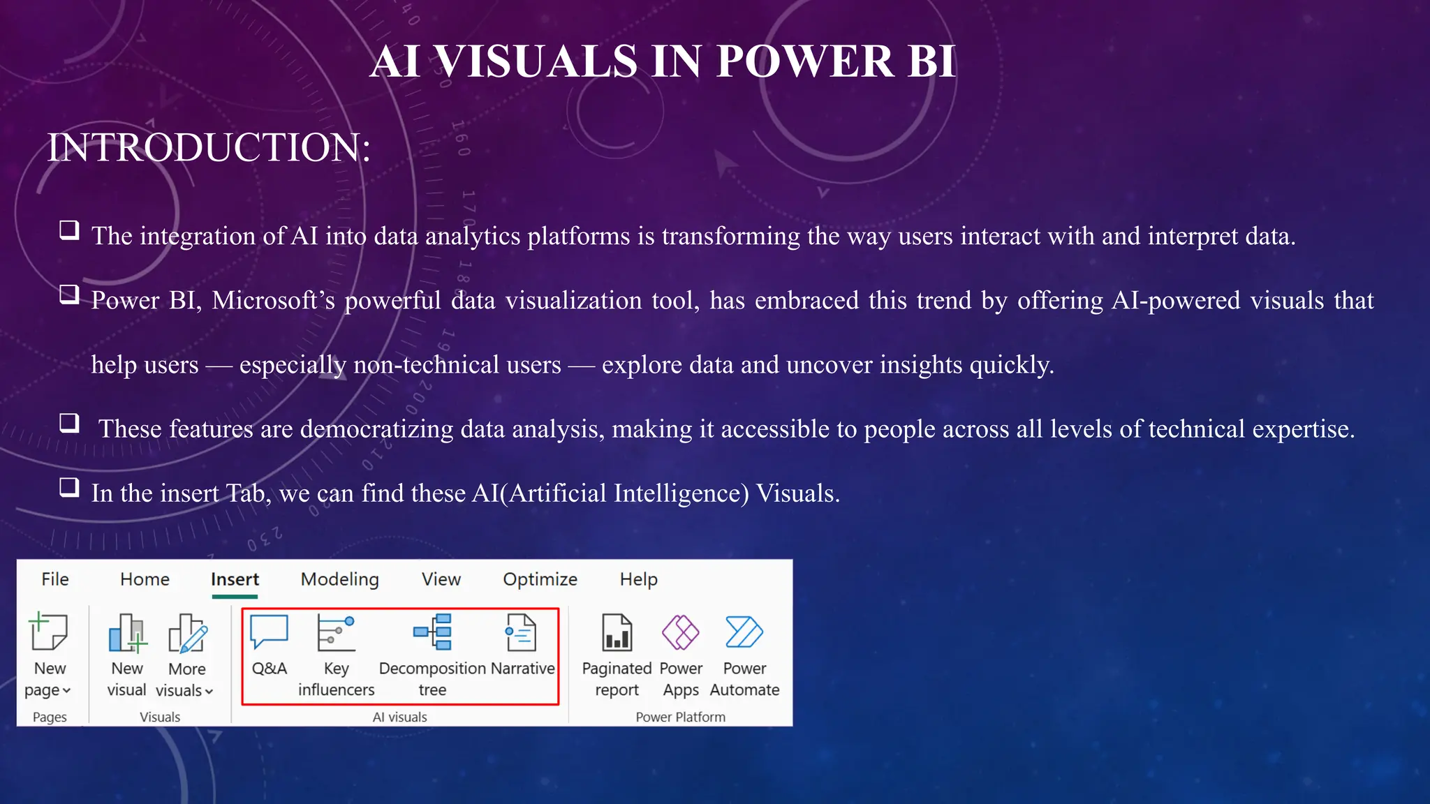
INTRODUCTION:
The integration of AI into data analytics platforms is transforming the way users interact with and interpret data.
Power BI, Microsoft’s powerful data visualization tool, has embraced this trend by offering AI-powered visuals that
help users — especially non-technical users — explore data and uncover insights quickly.
These features are democratizing data analysis, making it accessible to people across all levels of technical expertise.
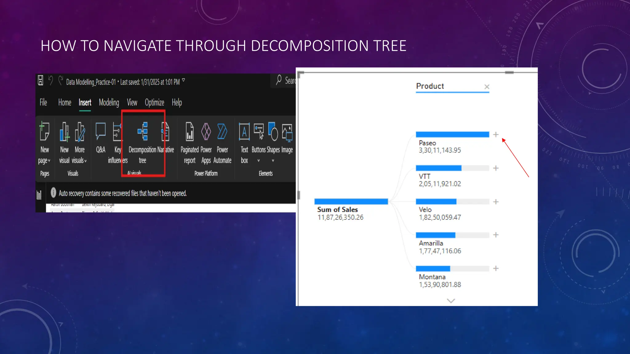
In the insert Tab, we can find these AI(Artificial Intelligence) Visuals.
3.
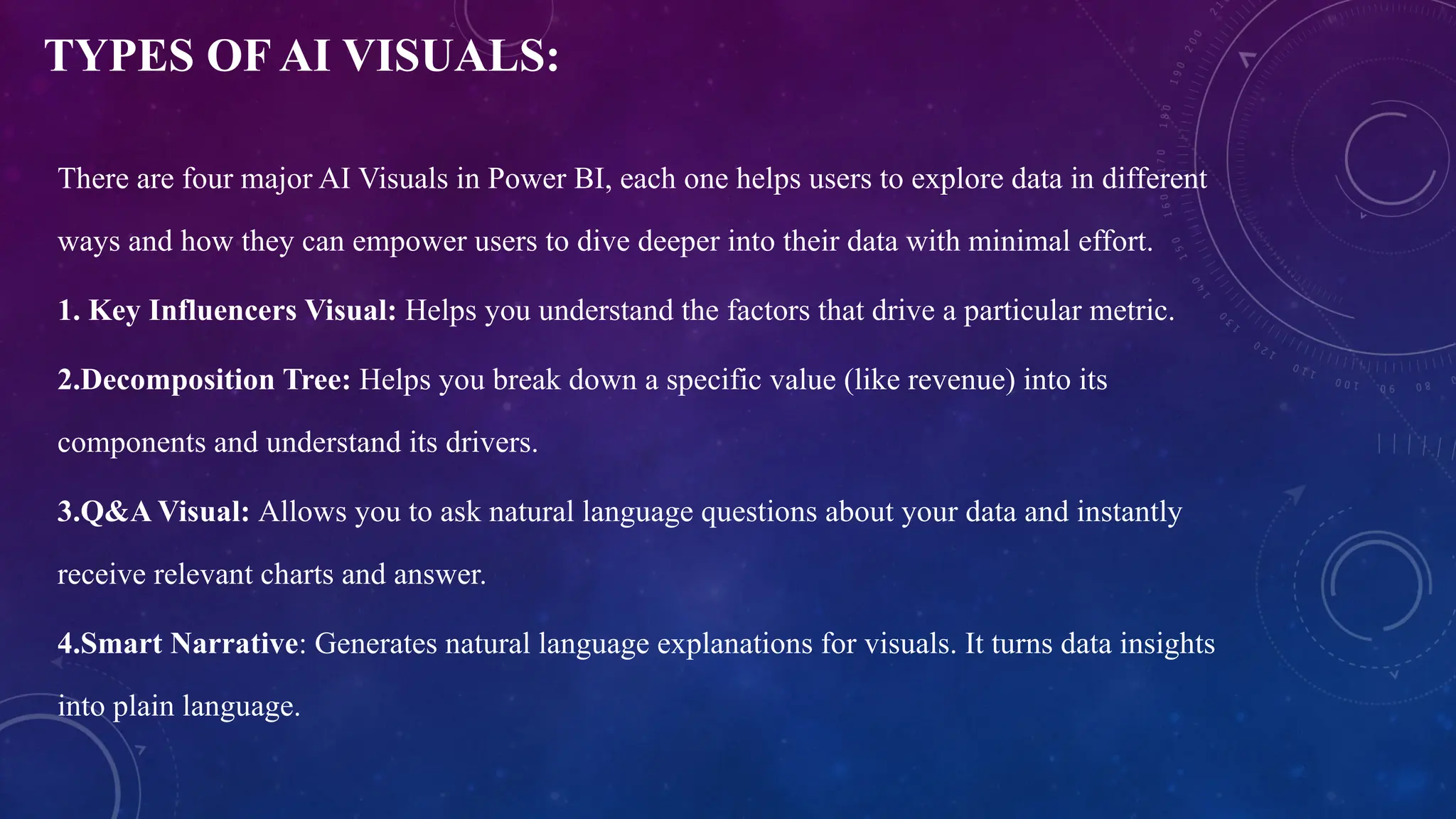
TYPES OF AIVISUALS:
There are four major AI Visuals in Power BI, each one helps users to explore data in different
ways and how they can empower users to dive deeper into their data with minimal effort.
1. Key Influencers Visual: Helps you understand the factors that drive a particular metric.
2.Decomposition Tree: Helps you break down a specific value (like revenue) into its
components and understand its drivers.
3.Q&A Visual: Allows you to ask natural language questions about your data and instantly
receive relevant charts and answer.
4.Smart Narrative: Generates natural language explanations for visuals. It turns data insights
into plain language.
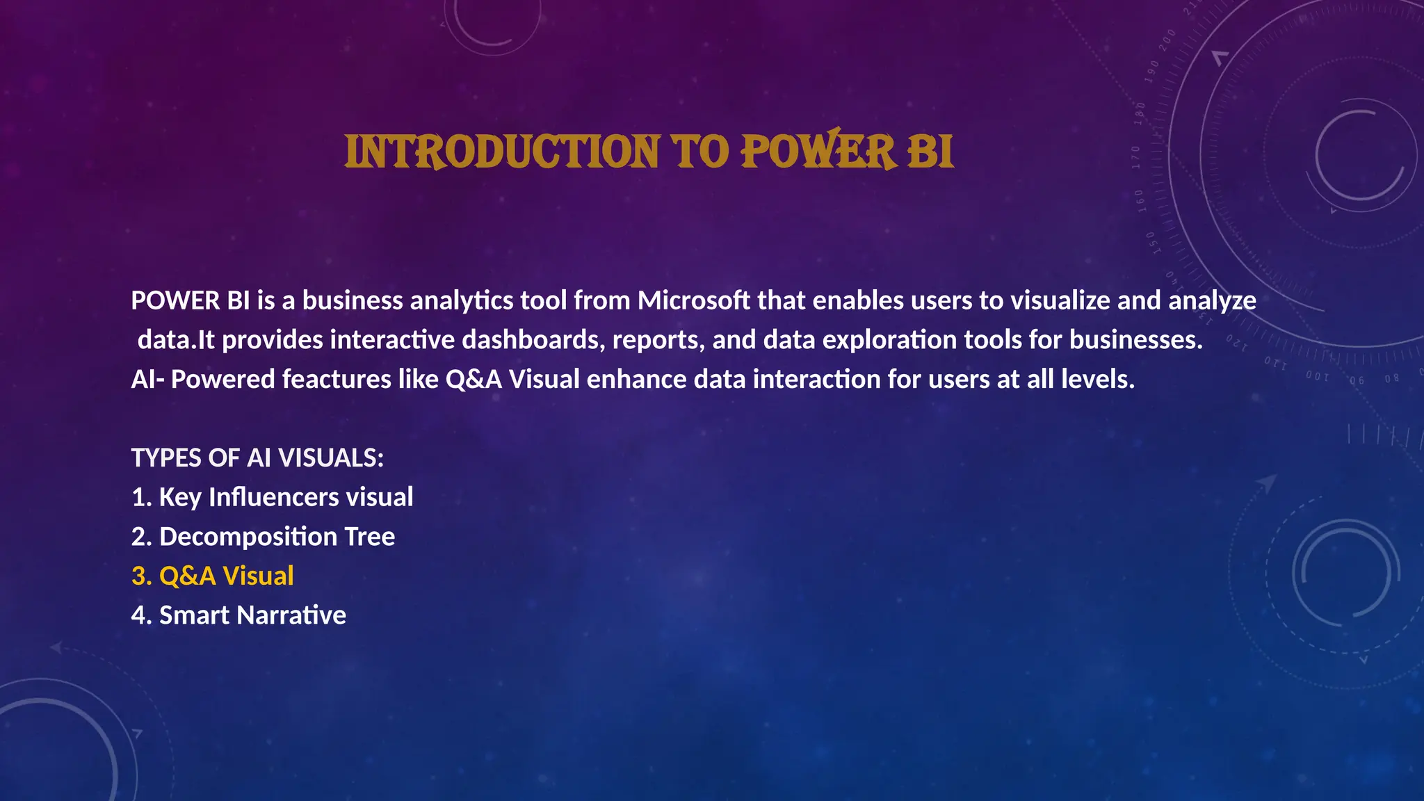
INTRODUCTION TO POWERBI
POWER BI is a business analytics tool from Microsoft that enables users to visualize and analyze
data.It provides interactive dashboards, reports, and data exploration tools for businesses.
AI- Powered feactures like Q&A Visual enhance data interaction for users at all levels.
TYPES OF AI VISUALS:
1. Key Influencers visual
2. Decomposition Tree
3. Q&A Visual
4. Smart Narrative
6.
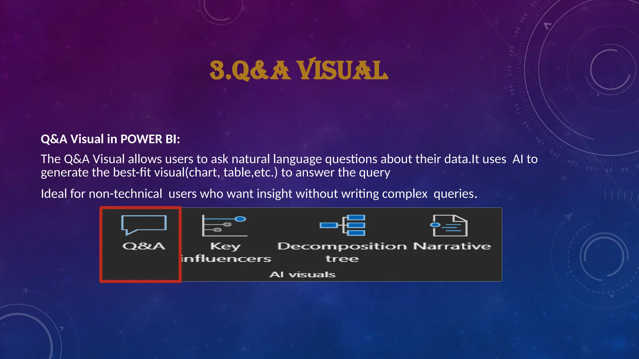
3.Q&A VISUAL
Q&A Visualin POWER BI:
The Q&A Visual allows users to ask natural language questions about their data.It uses AI to
generate the best-fit visual(chart, table,etc.) to answer the query
Ideal for non-technical users who want insight without writing complex queries.
7.
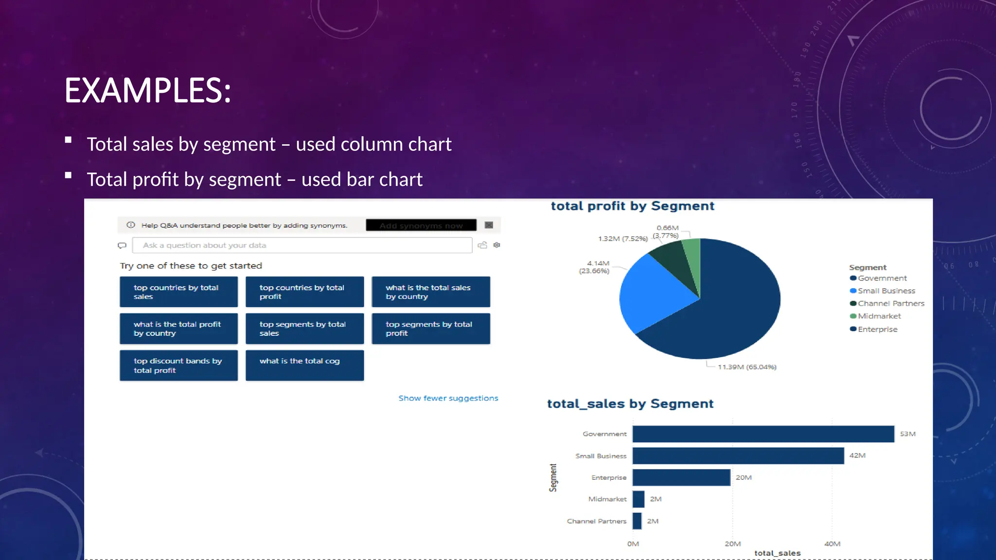
EXAMPLES:
Total salesby segment – used column chart
Total profit by segment – used bar chart
8.
BENEFITS OF USINGFOR Q&A VISUAL
User – friendly: Makes it easy for non- technical user to explore data.
Faster Insights: Quickly provides answers to questions without needing manual report
creation.
Increased Efficiency:Saves time by automating the process of data exploration and
visualization.
Accurate Visuals: AI generates Visuals that best represent the data, reducing the need for
manual design.
9.
LIMITATION OF Q&AVISUAL
Data Quality: AI’s effectiveness depends on the quality of the data.
Complex Queries: some advanced queries may require manual report creation or custom DAX
formulas.
Learning Curve: New users may need some time to understand how to phrase questions effectively
for best results.
Conclusion
The AI – powered Q&A Visual in Power BI simplifies data exploration and reporting.It empowers users
to generate insights quickly and efficiently through natural language interaction, By leveraging AI,
business can make data –driven decisions faster with minimal technical exprties.
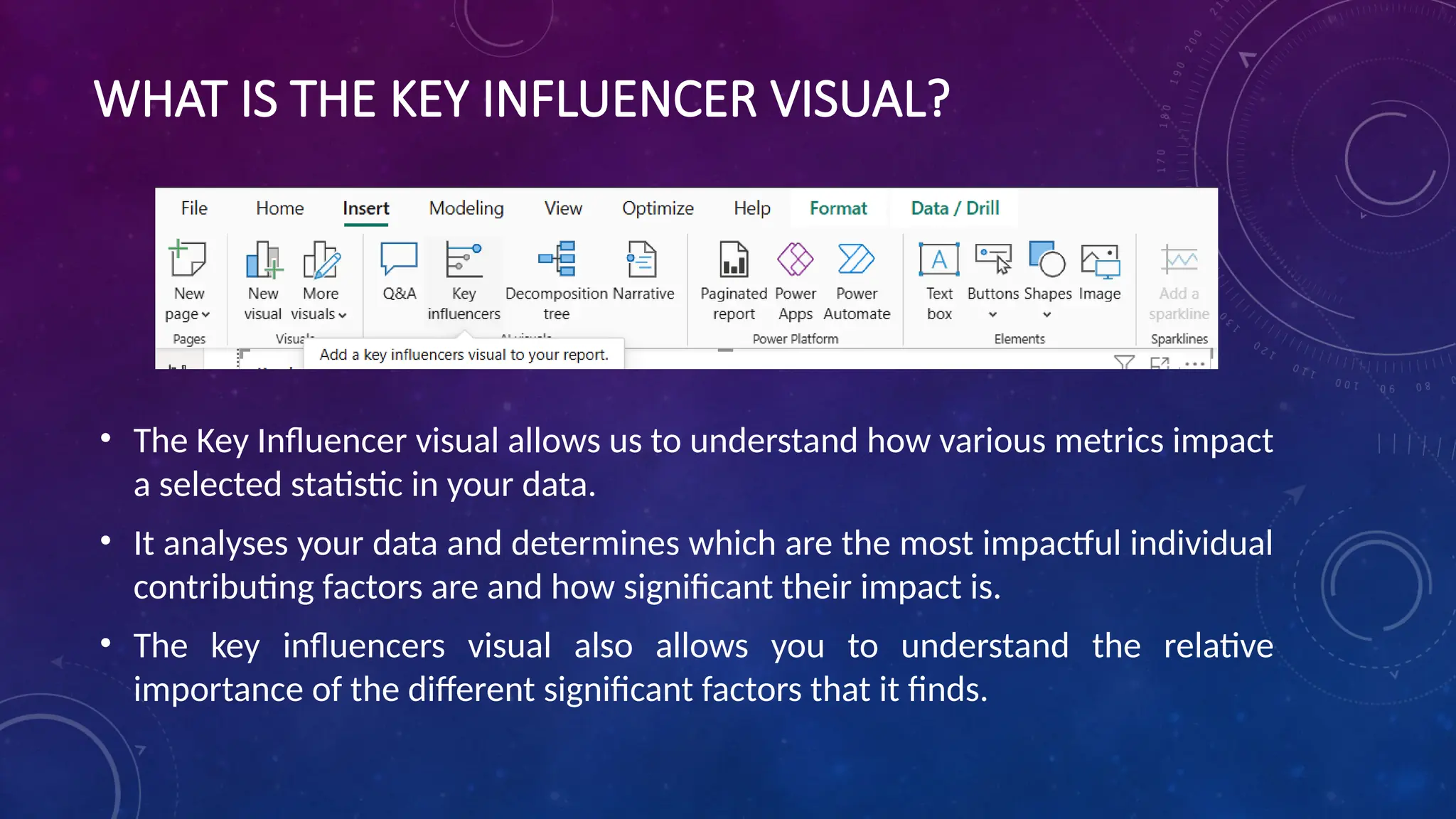
WHAT IS THEKEY INFLUENCER VISUAL?
• The Key Influencer visual allows us to understand how various metrics impact
a selected statistic in your data.
• It analyses your data and determines which are the most impactful individual
contributing factors are and how significant their impact is.
• The key influencers visual also allows you to understand the relative
importance of the different significant factors that it finds.
12.
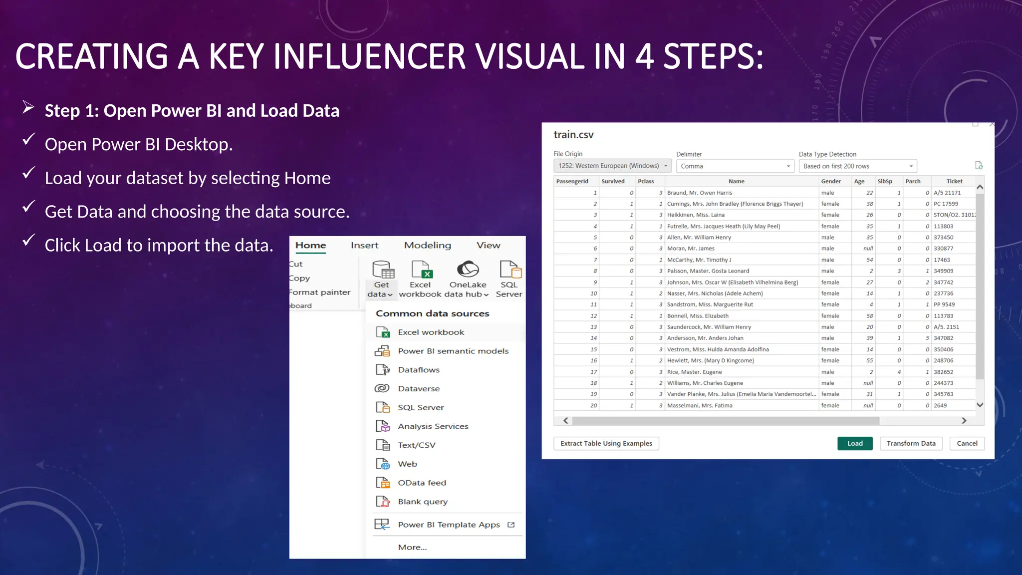
CREATING A KEYINFLUENCER VISUAL IN 4 STEPS:
Step 1: Open Power BI and Load Data
Open Power BI Desktop.
Load your dataset by selecting Home
Get Data and choosing the data source.
Click Load to import the data.
13.
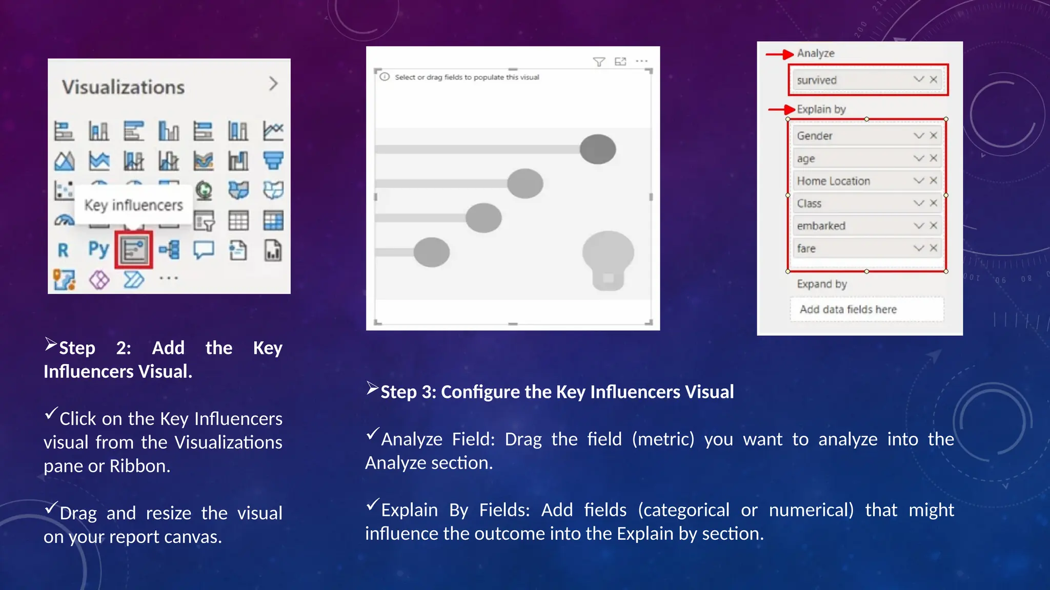
Step 2: Addthe Key
Influencers Visual.
Click on the Key Influencers
visual from the Visualizations
pane or Ribbon.
Drag and resize the visual
on your report canvas.
Step 3: Configure the Key Influencers Visual
Analyze Field: Drag the field (metric) you want to analyze into the
Analyze section.
Explain By Fields: Add fields (categorical or numerical) that might
influence the outcome into the Explain by section.
14.
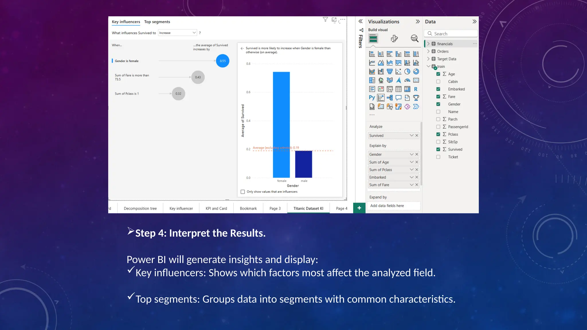
Step 4: Interpretthe Results.
Power BI will generate insights and display:
Key influencers: Shows which factors most affect the analyzed field.
Top segments: Groups data into segments with common characteristics.
15.
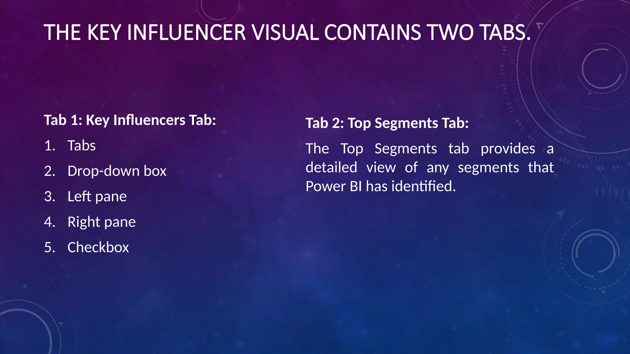
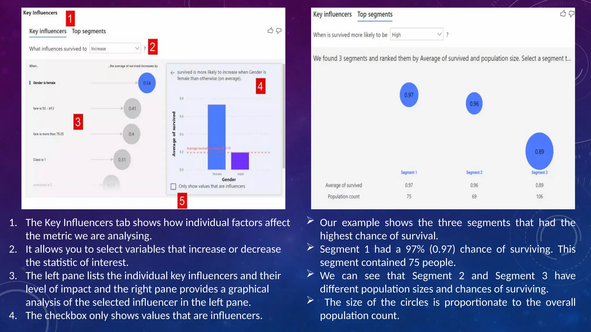
THE KEY INFLUENCERVISUAL CONTAINS TWO TABS.
Tab 1: Key Influencers Tab:
1. Tabs
2. Drop-down box
3. Left pane
4. Right pane
5. Checkbox
Tab 2: Top Segments Tab:
The Top Segments tab provides a
detailed view of any segments that
Power BI has identified.
16.
Our exampleshows the three segments that had the
highest chance of survival.
Segment 1 had a 97% (0.97) chance of surviving. This
segment contained 75 people.
We can see that Segment 2 and Segment 3 have
different population sizes and chances of surviving.
The size of the circles is proportionate to the overall
population count.
1. The Key Influencers tab shows how individual factors affect
the metric we are analysing.
2. It allows you to select variables that increase or decrease
the statistic of interest.
3. The left pane lists the individual key influencers and their
level of impact and the right pane provides a graphical
analysis of the selected influencer in the left pane.
4. The checkbox only shows values that are influencers.
17.
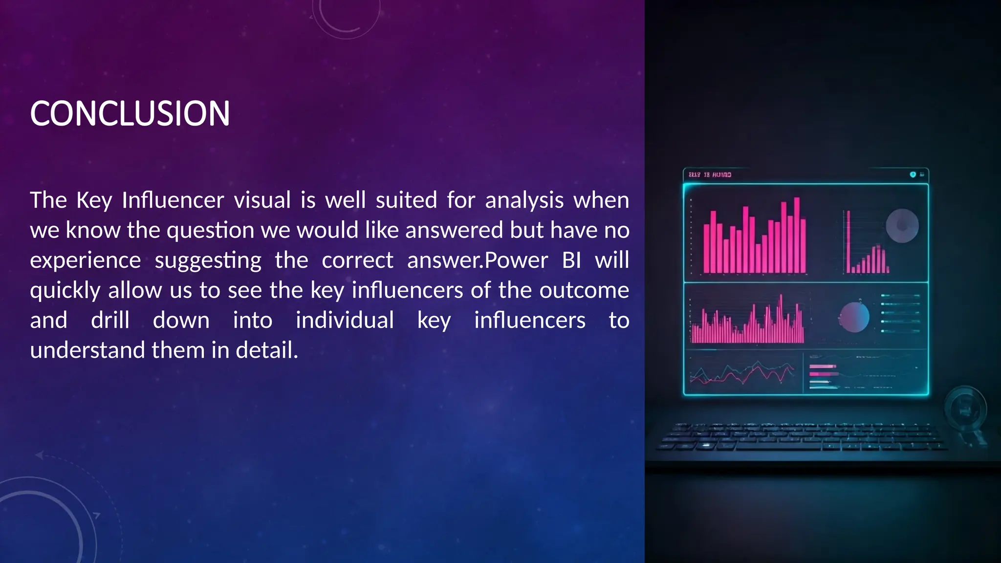
CONCLUSION
The Key Influencervisual is well suited for analysis when
we know the question we would like answered but have no
experience suggesting the correct answer.Power BI will
quickly allow us to see the key influencers of the outcome
and drill down into individual key influencers to
understand them in detail.
INTRODUCTION :
We breakdown (decompose) data into individual categories
and determine the average, sum, high, and low values using
different AI functions. This visual decomposition tree helps
in analyzing data very quickly in order to publish or export
business reports.
20.
Uses or aimof the decomposition tree:
•It provides an interactive and easy visual interface for data exploration.
•It helps in the aggregation of data and it’s easy to drill down.
•The drill-down technique helps in providing detailed data.
•Saves a lot of time by providing quick root cause analysis for finding patterns and
trends in data.
•The decomposition tree visuals let you analyze data across multiple dimensions.
•It provides visualization based on artificial intelligence (AI) like finding the next
category, or dimension, based on some criteria doing further drill down.
21.
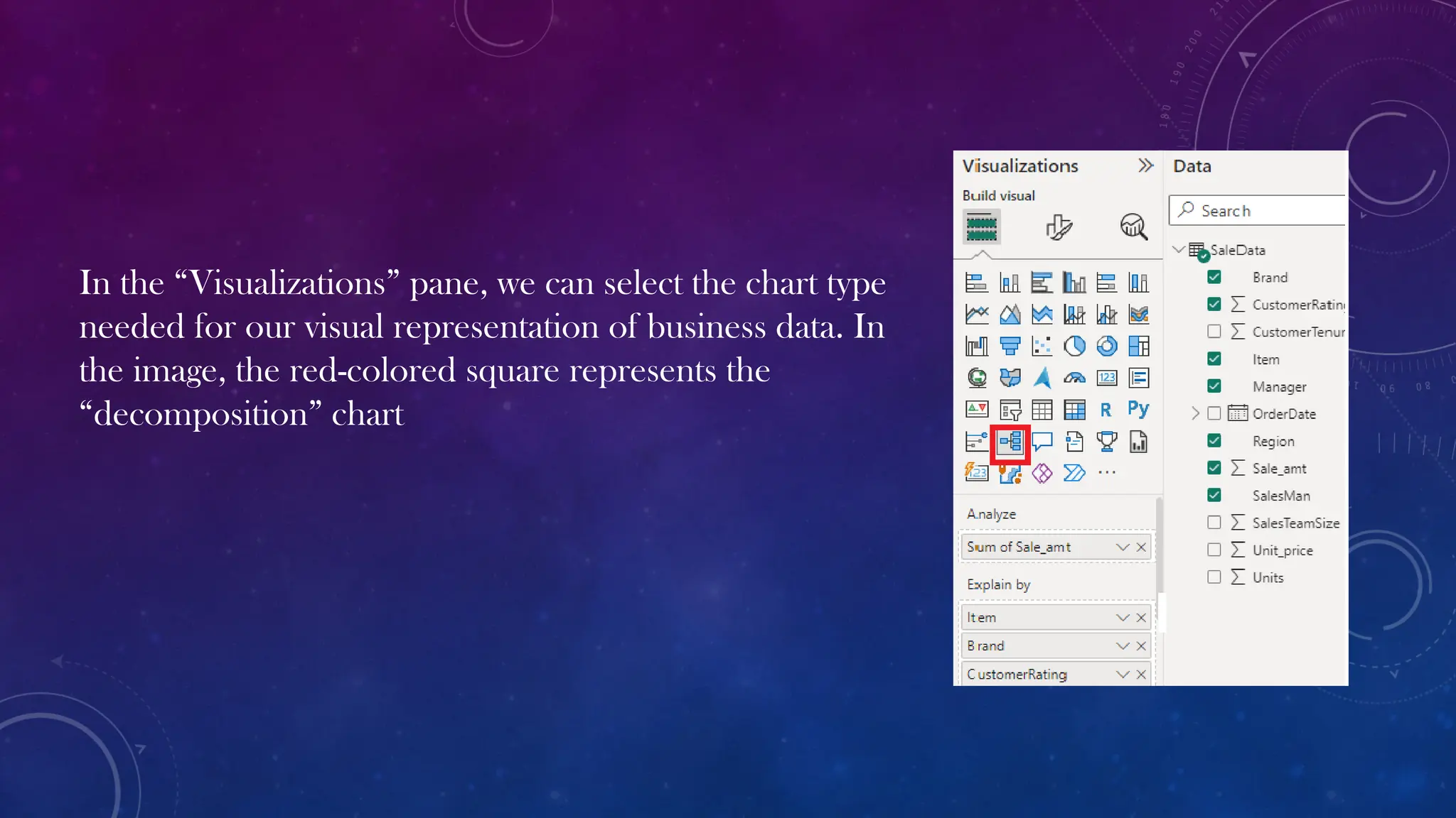
In the “Visualizations”pane, we can select the chart type
needed for our visual representation of business data. In
the image, the red-colored square represents the
“decomposition” chart
22.
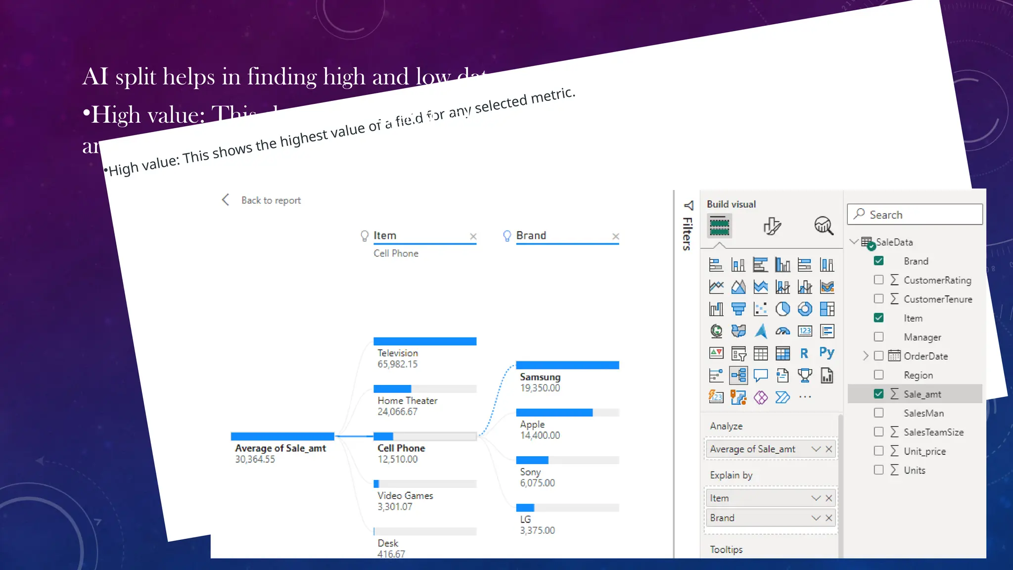
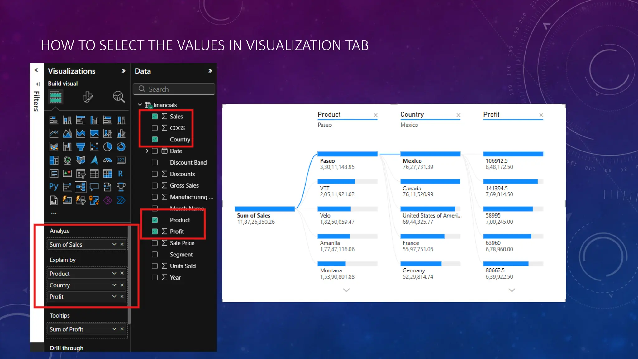
•High value: Thisshows the highest value of a field for any selected metric.
AI split helps in finding high and low data automatically.
•High value: This shows the highest value of a field for average of sale
amount .
23.
Conclusion:
Decomposition trees analyzeone value by one or multiple categories, or
dimensions. Keep selecting high value until the user has a decomposition tree
While trying out multiple dimensions in the decomposition tree or exploring the
data, one can find the hierarchy and dataset of interest using the drill-down
options.
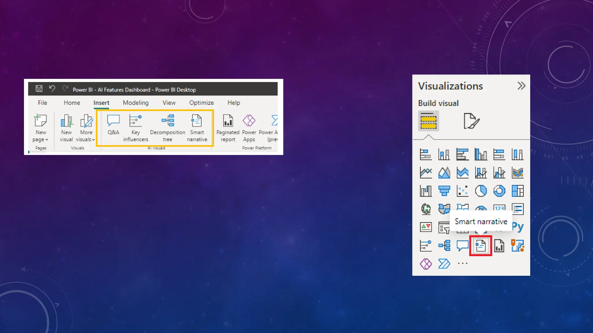
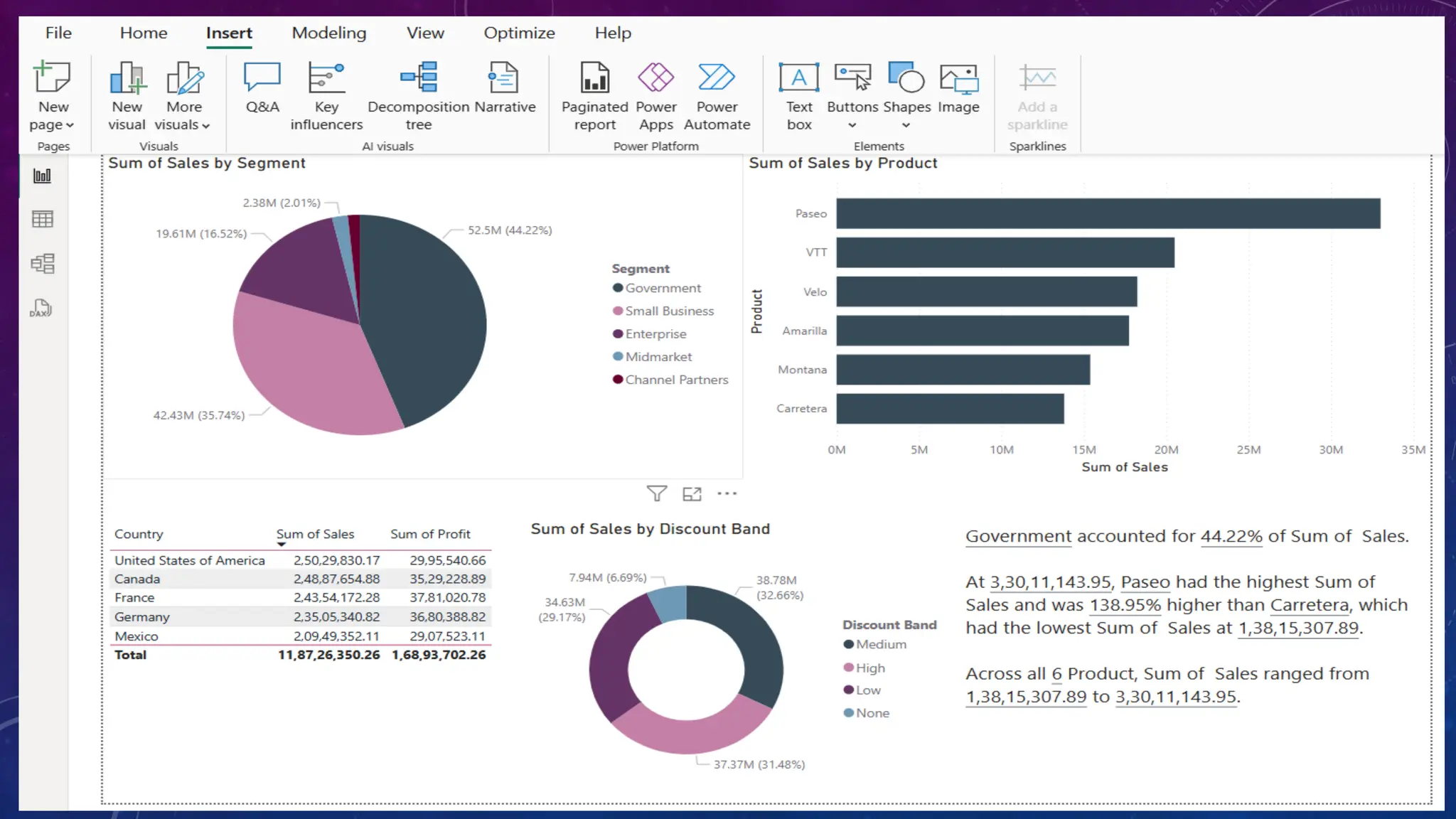
NARRATIVE
• Smart Narrativeis a visualisation in Microsoft Power BI that uses Artificial intelligence
(AI) to interpret data and generate commentary on the data presented. Smart
Narrative works like an assistant analyst, providing insights that may not be readily
apparent.
26.
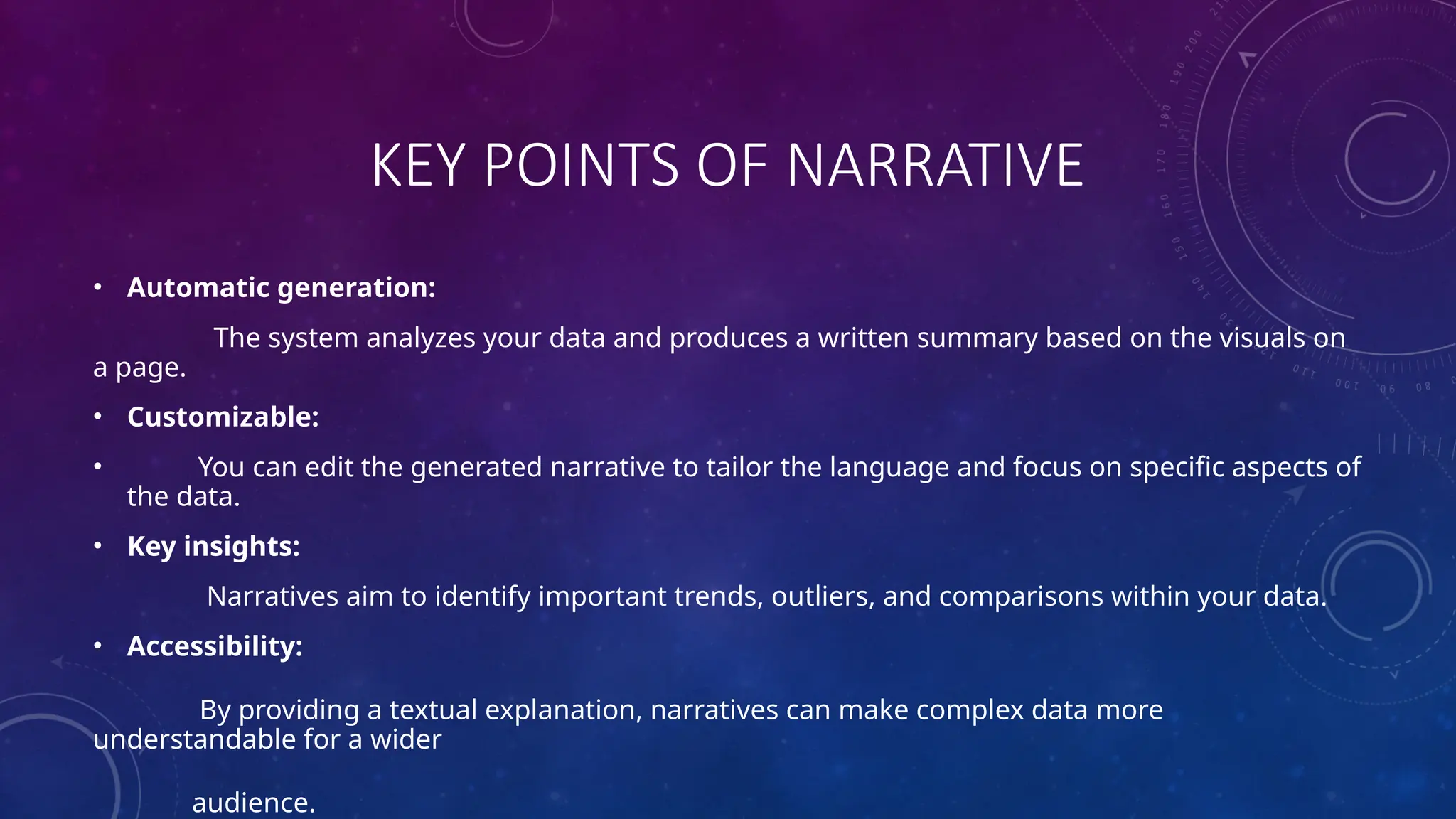
KEY POINTS OFNARRATIVE
• Automatic generation:
The system analyzes your data and produces a written summary based on the visuals on
a page.
• Customizable:
• You can edit the generated narrative to tailor the language and focus on specific aspects of
the data.
• Key insights:
Narratives aim to identify important trends, outliers, and comparisons within your data.
• Accessibility:
By providing a textual explanation, narratives can make complex data more
understandable for a wider
audience.
INTRODUCTION
THE Q&A VISUALIS BOTH A TOOL TO ALLOW YOUR REPORT USERS TO QUICKLY GET ANSWERS TO THEIR DATA, AND BY REPORT DESIGNERS TO CREATE VISUALS IN THEIR REPORTS BY
SIMPLY DOUBLE-CLICKING ANYWHERE ON A REPORT AND USING NATURAL LANGUAGE TO GET STARTED ASKING QUESTIONS OF THEIR DATA AND GENERATING AN ARRAY OF VISUALS
31.
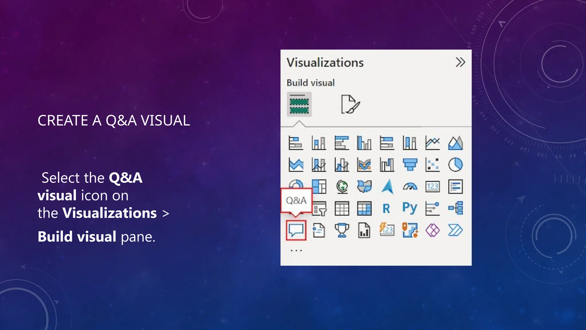
CREATE A Q&AVISUAL
Select the Q&A
visual icon on
the Visualizations >
Build visual pane.
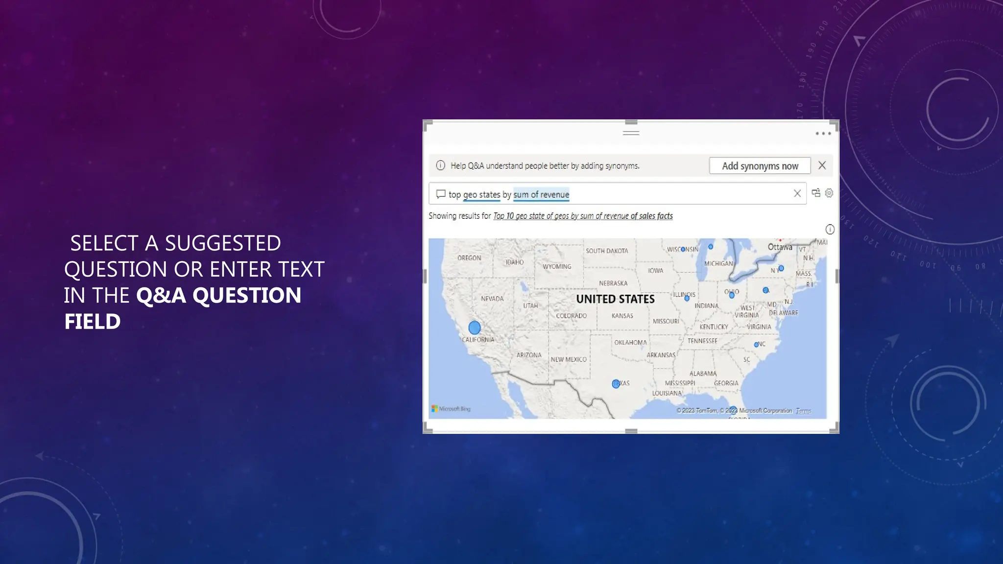
WHEN SHOULD IUSE A POWER BI Q&A VISUAL?
• The Q&A visual is most valuable when you are looking to produce
something quickly.
• It is perfect when trying things out or exploring, as it allows you to
develop multiple visuals very quickly.
• Power BI’s automated machine learning capabilities allow you to
experiment with multiple data models very quickly.
• Instead of building a visual for every possible question, the
Q&A visual allows users to ask and answer their own questions
interactively.
34.
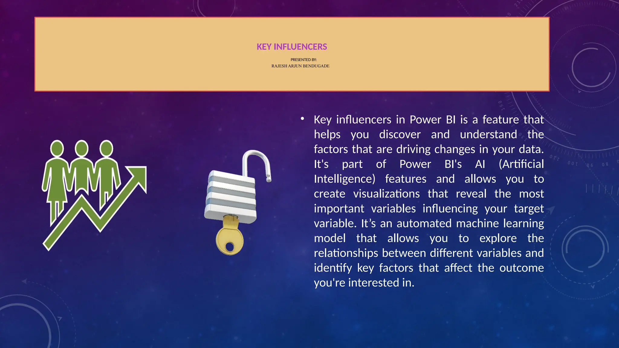
KEY INFLUENCERS
PRESENTED BY:
RAJESHARJUN BENDUGADE
• Key influencers in Power BI is a feature that
helps you discover and understand the
factors that are driving changes in your data.
It's part of Power BI's AI (Artificial
Intelligence) features and allows you to
create visualizations that reveal the most
important variables influencing your target
variable. It’s an automated machine learning
model that allows you to explore the
relationships between different variables and
identify key factors that affect the outcome
you're interested in.
35.
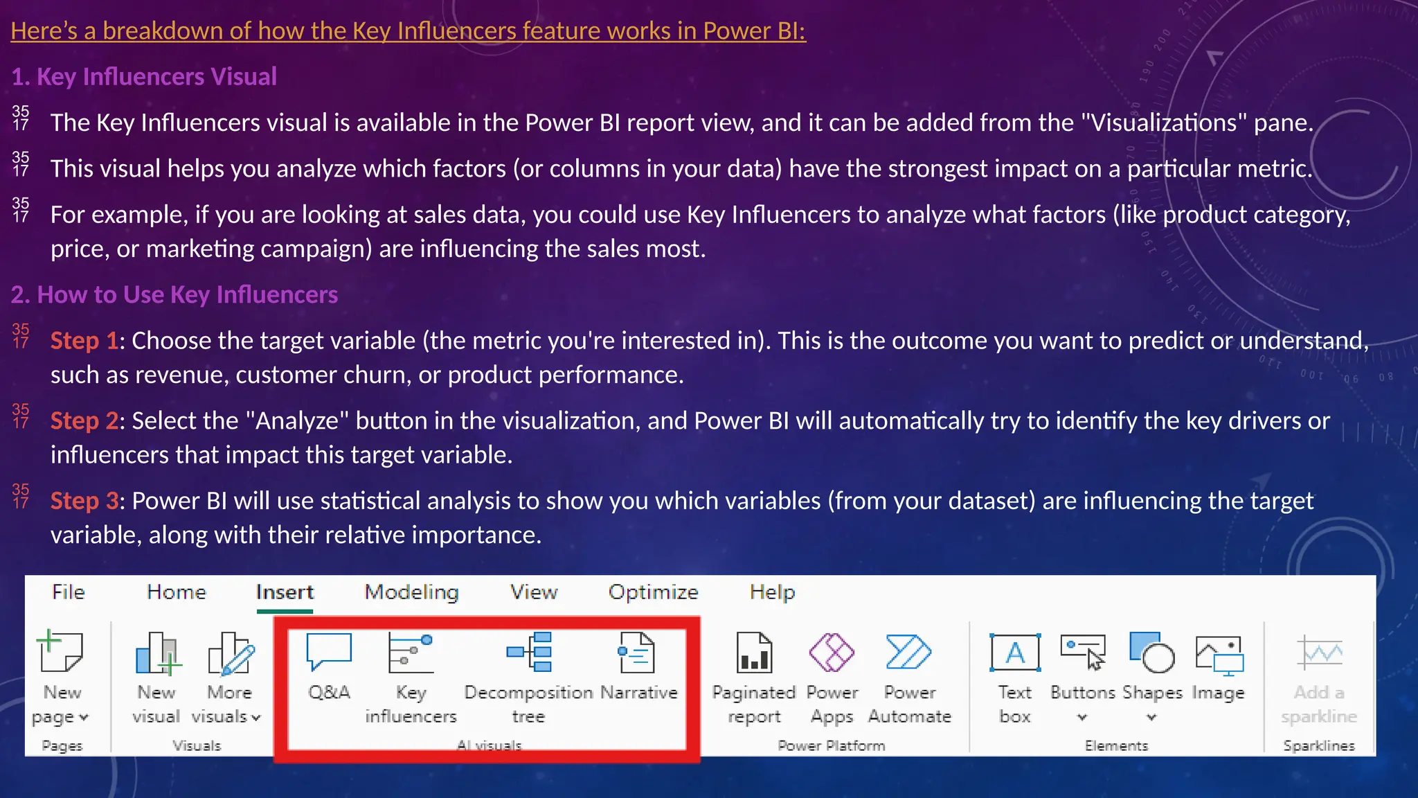
Here’s a breakdownof how the Key Influencers feature works in Power BI:
1. Key Influencers Visual
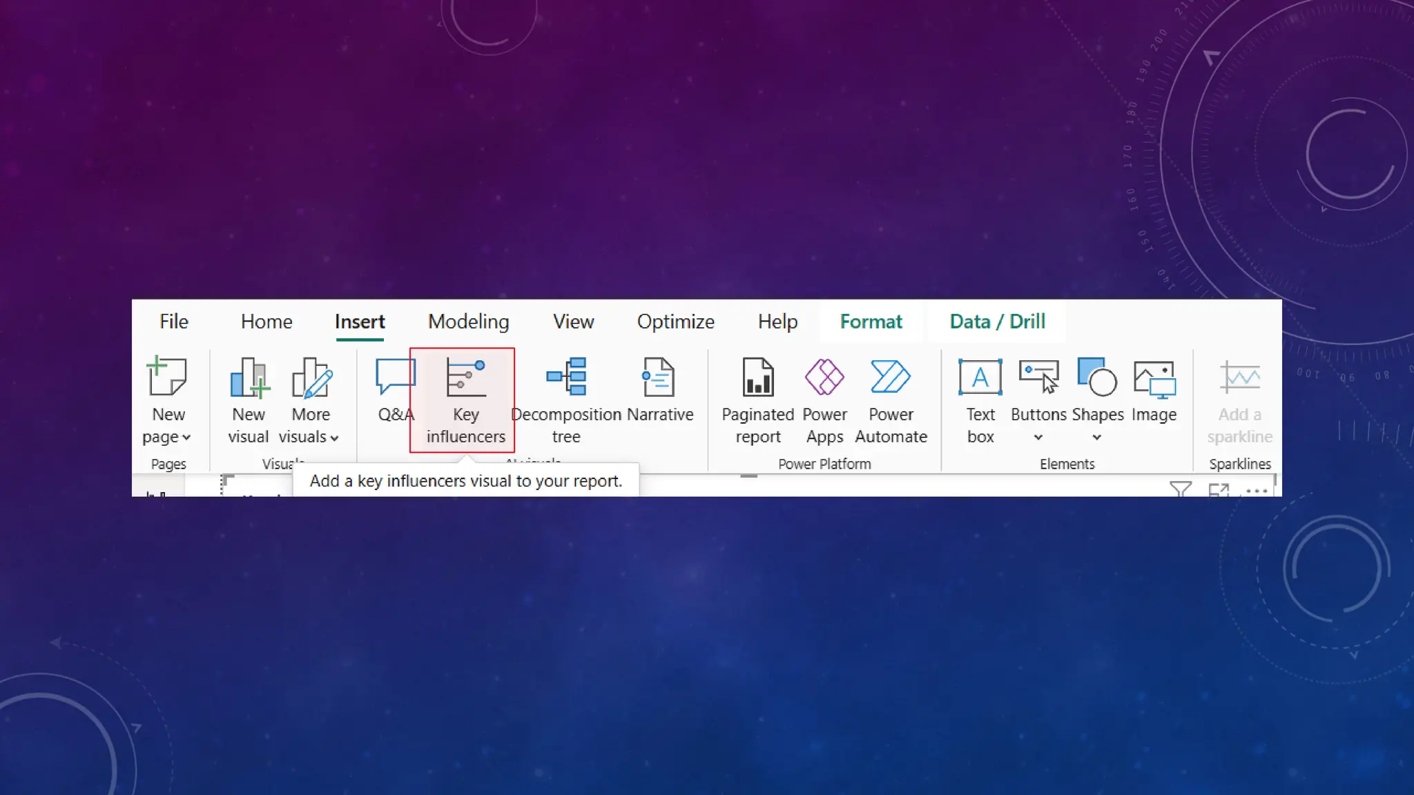
The Key Influencers visual is available in the Power BI report view, and it can be added from the "Visualizations" pane.
This visual helps you analyze which factors (or columns in your data) have the strongest impact on a particular metric.
For example, if you are looking at sales data, you could use Key Influencers to analyze what factors (like product category,
price, or marketing campaign) are influencing the sales most.
2. How to Use Key Influencers
Step 1: Choose the target variable (the metric you're interested in). This is the outcome you want to predict or understand,
such as revenue, customer churn, or product performance.
Step 2: Select the "Analyze" button in the visualization, and Power BI will automatically try to identify the key drivers or
influencers that impact this target variable.
Step 3: Power BI will use statistical analysis to show you which variables (from your dataset) are influencing the target
variable, along with their relative importance.
36.
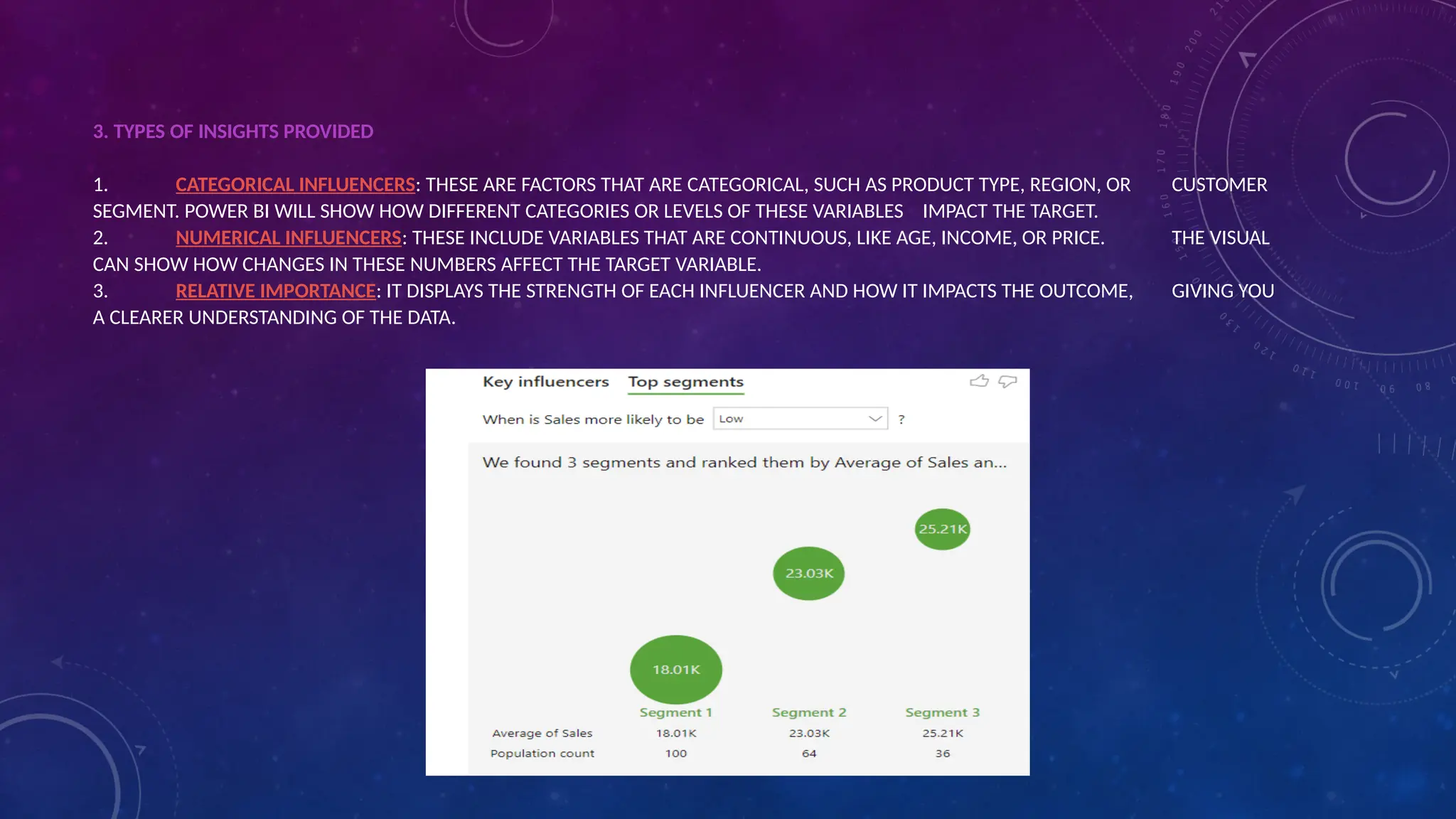
3. TYPES OFINSIGHTS PROVIDED
1. CATEGORICAL INFLUENCERS: THESE ARE FACTORS THAT ARE CATEGORICAL, SUCH AS PRODUCT TYPE, REGION, OR CUSTOMER
SEGMENT. POWER BI WILL SHOW HOW DIFFERENT CATEGORIES OR LEVELS OF THESE VARIABLES IMPACT THE TARGET.
2. NUMERICAL INFLUENCERS: THESE INCLUDE VARIABLES THAT ARE CONTINUOUS, LIKE AGE, INCOME, OR PRICE. THE VISUAL
CAN SHOW HOW CHANGES IN THESE NUMBERS AFFECT THE TARGET VARIABLE.
3. RELATIVE IMPORTANCE: IT DISPLAYS THE STRENGTH OF EACH INFLUENCER AND HOW IT IMPACTS THE OUTCOME, GIVING YOU
A CLEARER UNDERSTANDING OF THE DATA.
37.
4. Why It’sUseful
Automated Data Analysis: Key Influencers automatically performs statistical analysis, which is typically a complex and time-
consuming process, and presents the insights in an easy-to-understand format.
Data Exploration: It helps users explore the relationships in their data without needing advanced statistics knowledge. This is
especially useful for non-technical users or business analysts.
Discover Hidden Trends: It may reveal patterns or relationships that aren’t immediately obvious, leading to new insights and
a better understanding of your business.
5. How It Works Under the Hood
Power BI uses algorithms like regression analysis to uncover which variables have the most significant effect on the target
variable.
It can handle both categorical and continuous data and will generate a set of key influencers based on the data and the
relationships identified
38.
6. Limitations
RequiresClean Data: The Key Influencers visual works best when your data is clean and well-organized. Missing or incorrect
data can lead to inaccurate or incomplete results.
Complexity with Large Datasets: If your dataset is very large or contains many variables, it can sometimes be hard to get a
clear picture of what’s truly influencing your target.
Interpretation of Results: While Power BI can provide insights, interpreting the exact cause-and-effect relationships still
requires domain knowledge to make the most of the findings.
7. Additional Features
Insights about Interactions: In addition to simple correlations, Key Influencers can identify how multiple variables together
may be influencing the outcome.
Segmentation: You can segment the data to understand how different groups of data (like customers in different regions or
product types) are affected by the key influencers.
In summary, the Key Influencers feature in Power BI is a powerful tool to help us to uncover the most important drivers behind
our data, without needing deep statistical expertise. It’s great for quickly finding trends and making data-driven decisions based
on a clear understanding of the key variables that matter most.
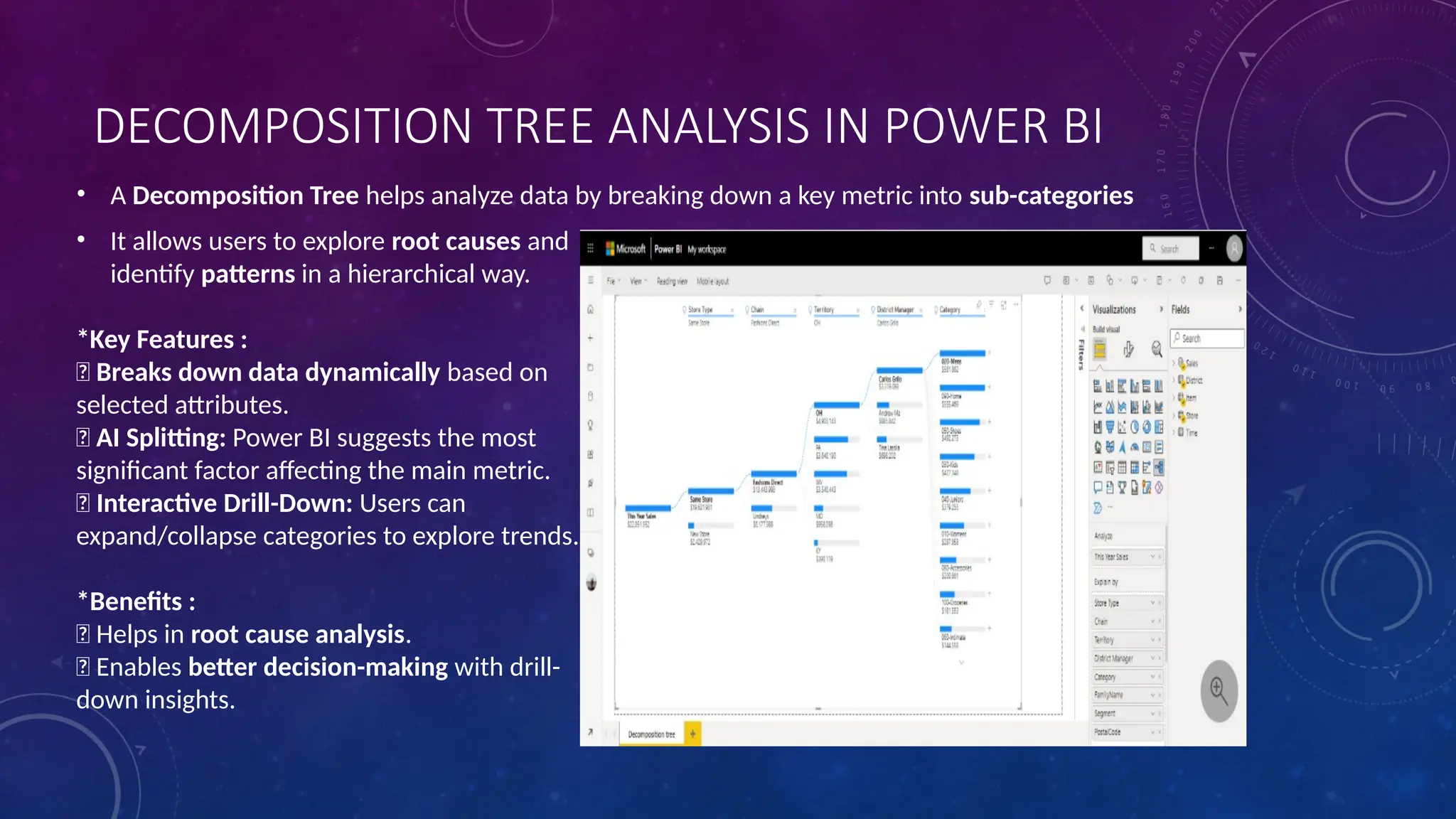
DECOMPOSITION TREE ANALYSISIN POWER BI
• A Decomposition Tree helps analyze data by breaking down a key metric into sub-categories
• It allows users to explore root causes and
identify patterns in a hierarchical way.
*Key Features :
✅ Breaks down data dynamically based on
selected attributes.
✅ AI Splitting: Power BI suggests the most
significant factor affecting the main metric.
✅ Interactive Drill-Down: Users can
expand/collapse categories to explore trends.
*Benefits :
✅ Helps in root cause analysis.
✅ Enables better decision-making with drill-
down insights.
WHAT IS SMARTNARRATIVE
• Smart narrative is a feature in Microsoft power bi that uses artificial intelligence to create summaries of
data and visuals
• It can help to analyse data trends and communicate data driven stories
46.
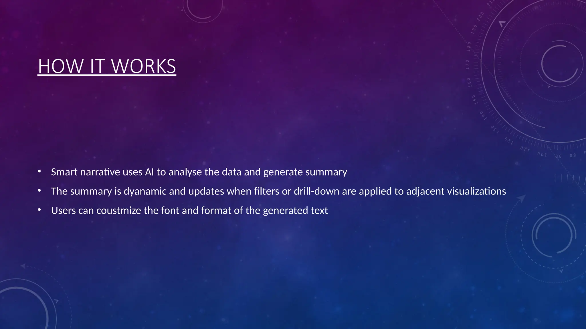
HOW IT WORKS
•Smart narrative uses AI to analyse the data and generate summary
• The summary is dyanamic and updates when filters or drill-down are applied to adjacent visualizations
• Users can coustmize the font and format of the generated text
47.
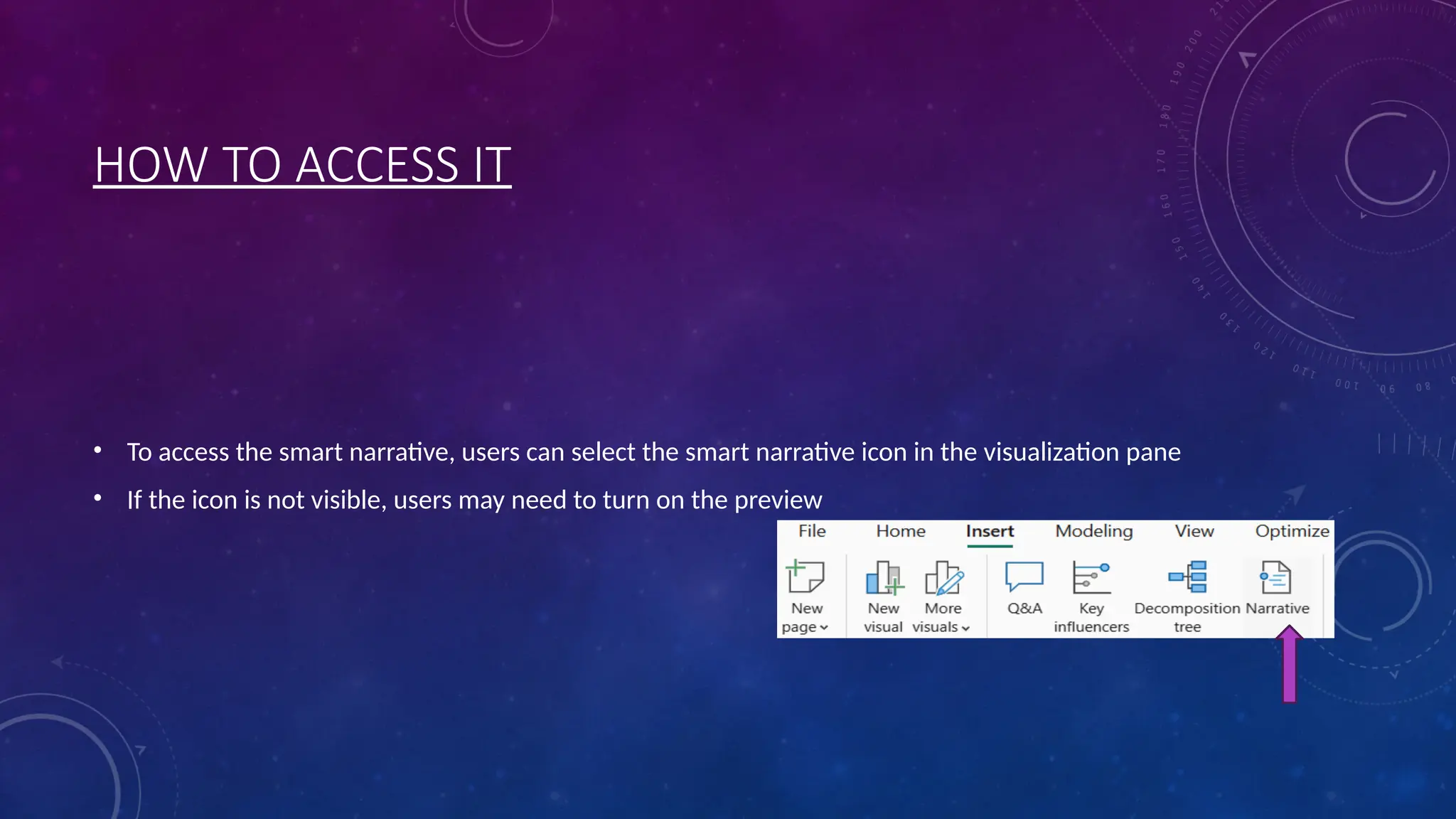
HOW TO ACCESSIT
• To access the smart narrative, users can select the smart narrative icon in the visualization pane
• If the icon is not visible, users may need to turn on the preview


![[DSC Europe 25] Miodrag Pesovic & Vladislav Radonjic - Federated Data Archite...](https://cdn.slidesharecdn.com/ss_thumbnails/gsbe3y5it5uhndi4e08e-1-251212103249-f1008e0c-thumbnail.jpg?width=640&height=640&fit=bounds)


![[DSC Europe 25] Aleksandra Dragicevic - AI-Boosted Research in Healthcare: Fr...](https://cdn.slidesharecdn.com/ss_thumbnails/iqwngszurf2r7pi1lnnj-4-aleksandra-dragicevic-ad-dsc-europe-conference-20-251208151905-37c3238a-thumbnail.jpg?width=640&height=640&fit=bounds)
![[DSC Europe 25] Vladimir Jelic - The AI-Driven Security Shift From Reactive D...](https://cdn.slidesharecdn.com/ss_thumbnails/6g5gj25mtjwayniqem1t-6-251209104645-7a5a5fc6-thumbnail.jpg?width=640&height=640&fit=bounds)
![[DSC Europe 25] Branko Urosevic -Rethinking Financial Talent: Integrating Cod...](https://cdn.slidesharecdn.com/ss_thumbnails/8jjrus8ttko6qj64f58f-3-251212103250-642c6374-thumbnail.jpg?width=640&height=640&fit=bounds)


![[DSC Europe 25] Marko Krstic - Understanding the AI Threat Landscape - Risks,...](https://cdn.slidesharecdn.com/ss_thumbnails/tiyim1ins5jvbrvzpzla-2-251209104645-c69d3553-thumbnail.jpg?width=640&height=640&fit=bounds)
![[DSC Europe 25] Nikolay Burlutskiy - Best Practices for Building Enterprise M...](https://cdn.slidesharecdn.com/ss_thumbnails/uirvaiuvq8y1w8hzd9tx-7-251212103249-2619edb4-thumbnail.jpg?width=640&height=640&fit=bounds)
![[DSC Europe 25] Milan Zdravkovic - The road less traveled in District Heating...](https://cdn.slidesharecdn.com/ss_thumbnails/nfaboniqwsz4ucyctnmy-2-milan-zdravkovic-dsc2025-the-road-less-traveled-in-district-heating-operation-251208151905-f56388a5-thumbnail.jpg?width=640&height=640&fit=bounds)
![[DSC Europe 25] Ivan Peric - Intelligence Swarm Logic and Techno-Functional M...](https://cdn.slidesharecdn.com/ss_thumbnails/7my7c97fsduiccadgavw-2-251212103249-5a03f7c6-thumbnail.jpg?width=640&height=640&fit=bounds)

![[DSC Europe 25] Dobrica Cosic - Savings by the Second: How Dynamic Pricing an...](https://cdn.slidesharecdn.com/ss_thumbnails/znp09f3smtqz3w2sq6wn-1-dobrica-cosic-savings-by-the-second-how-dynamic-pricing-and-smart-data-are-bu-251208151905-26e6f41e-thumbnail.jpg?width=640&height=640&fit=bounds)