Downloaded 40 times
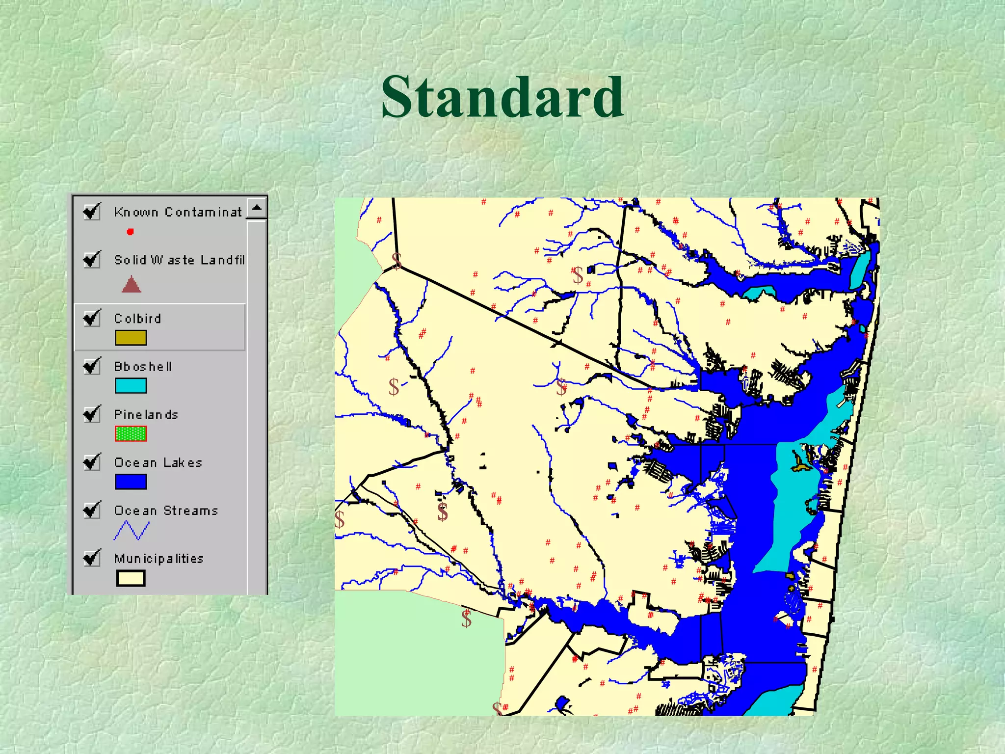

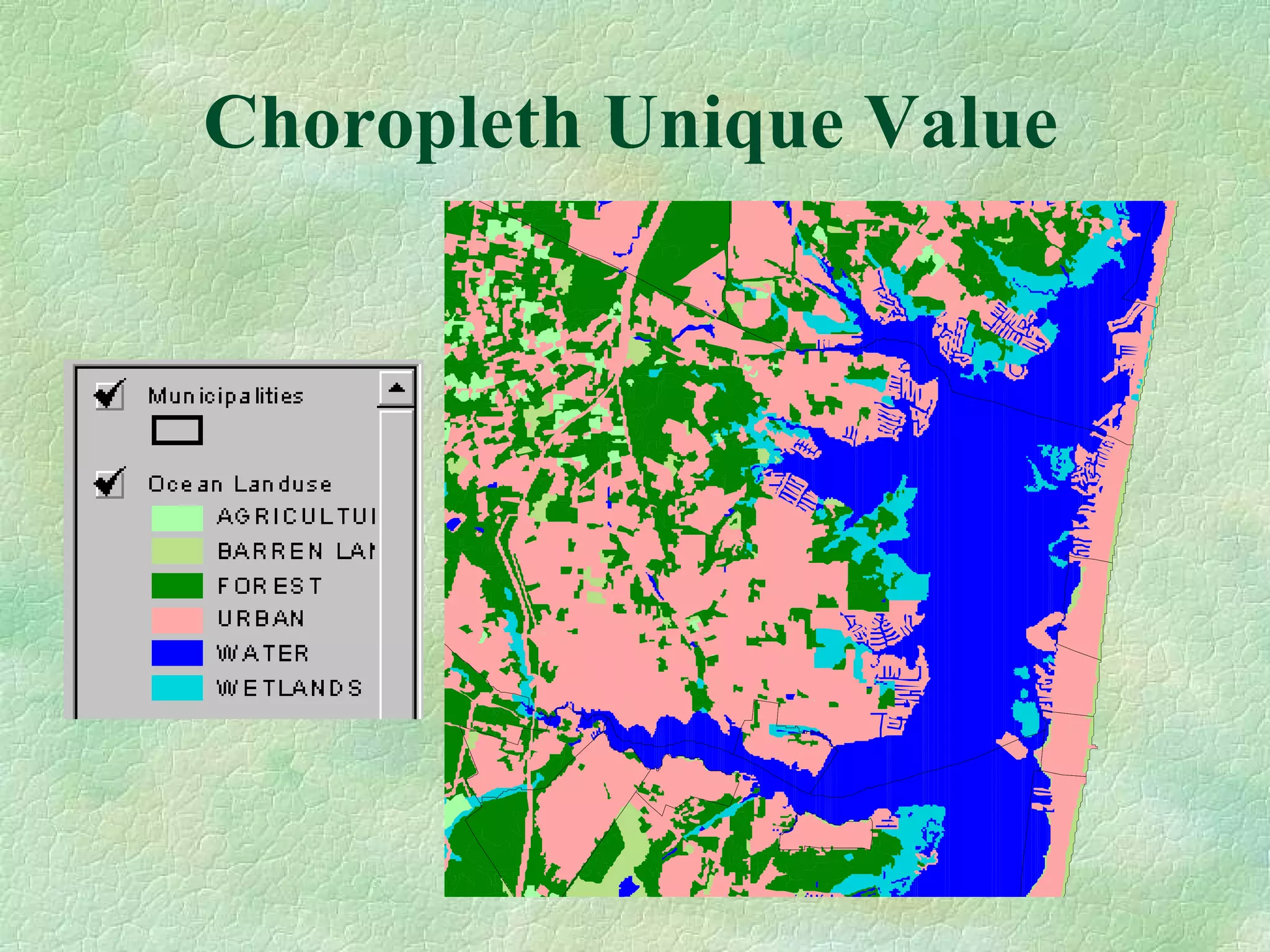
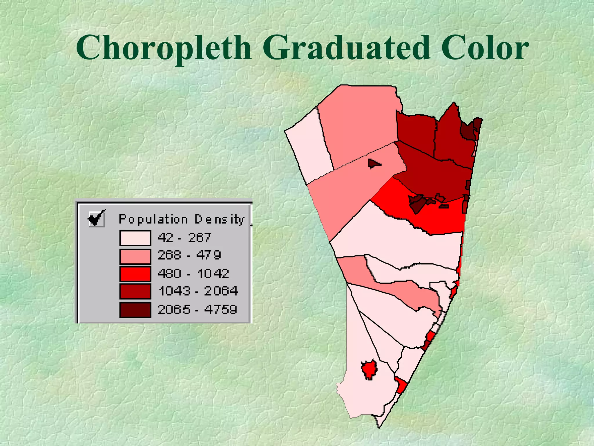


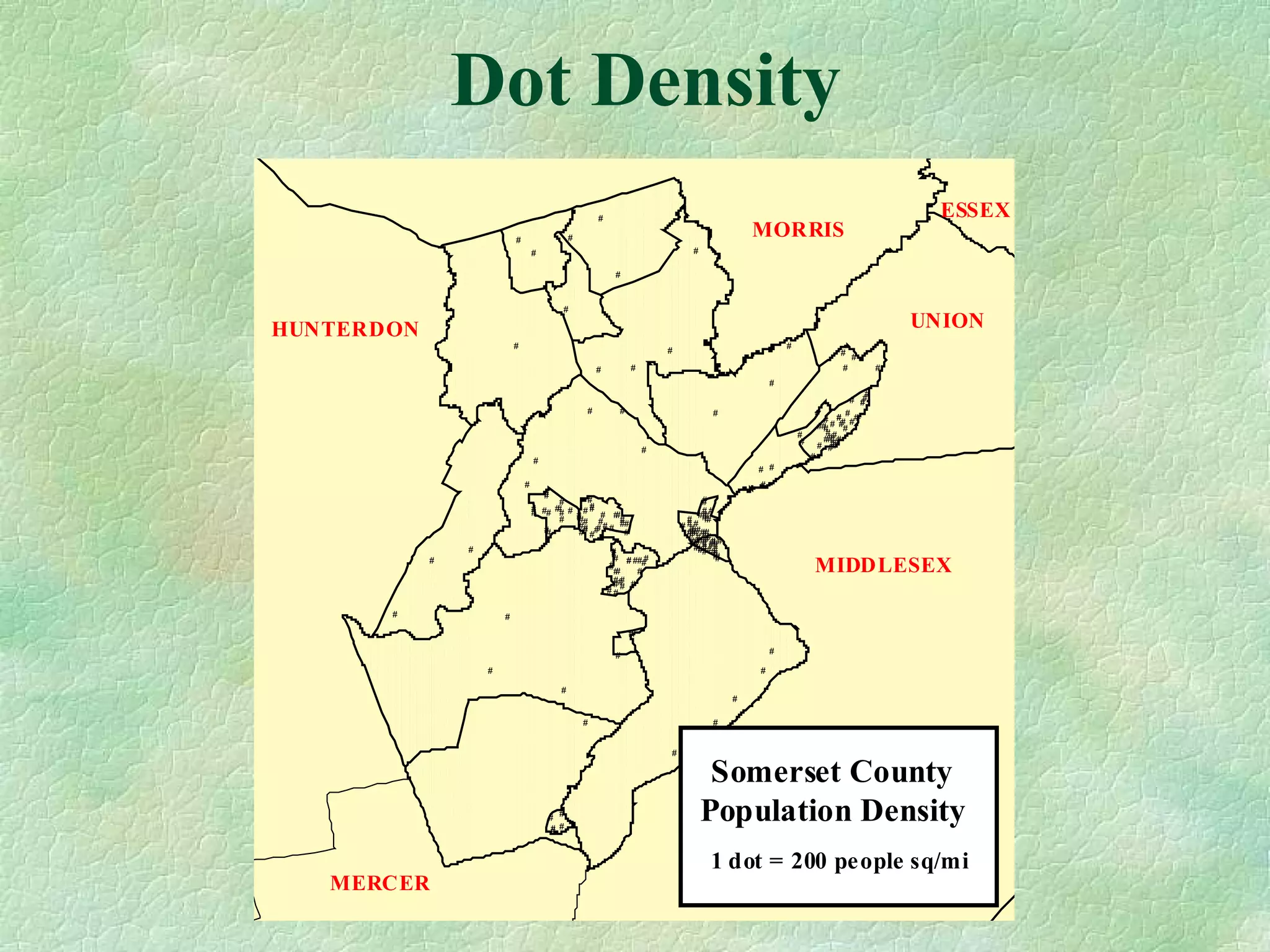
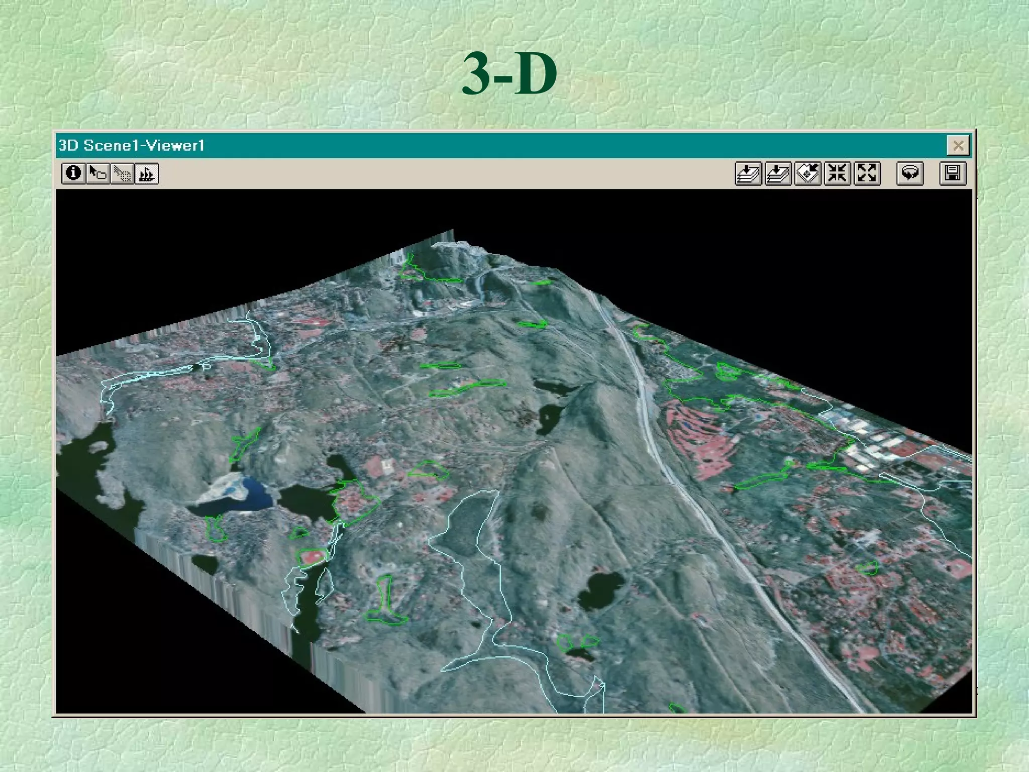
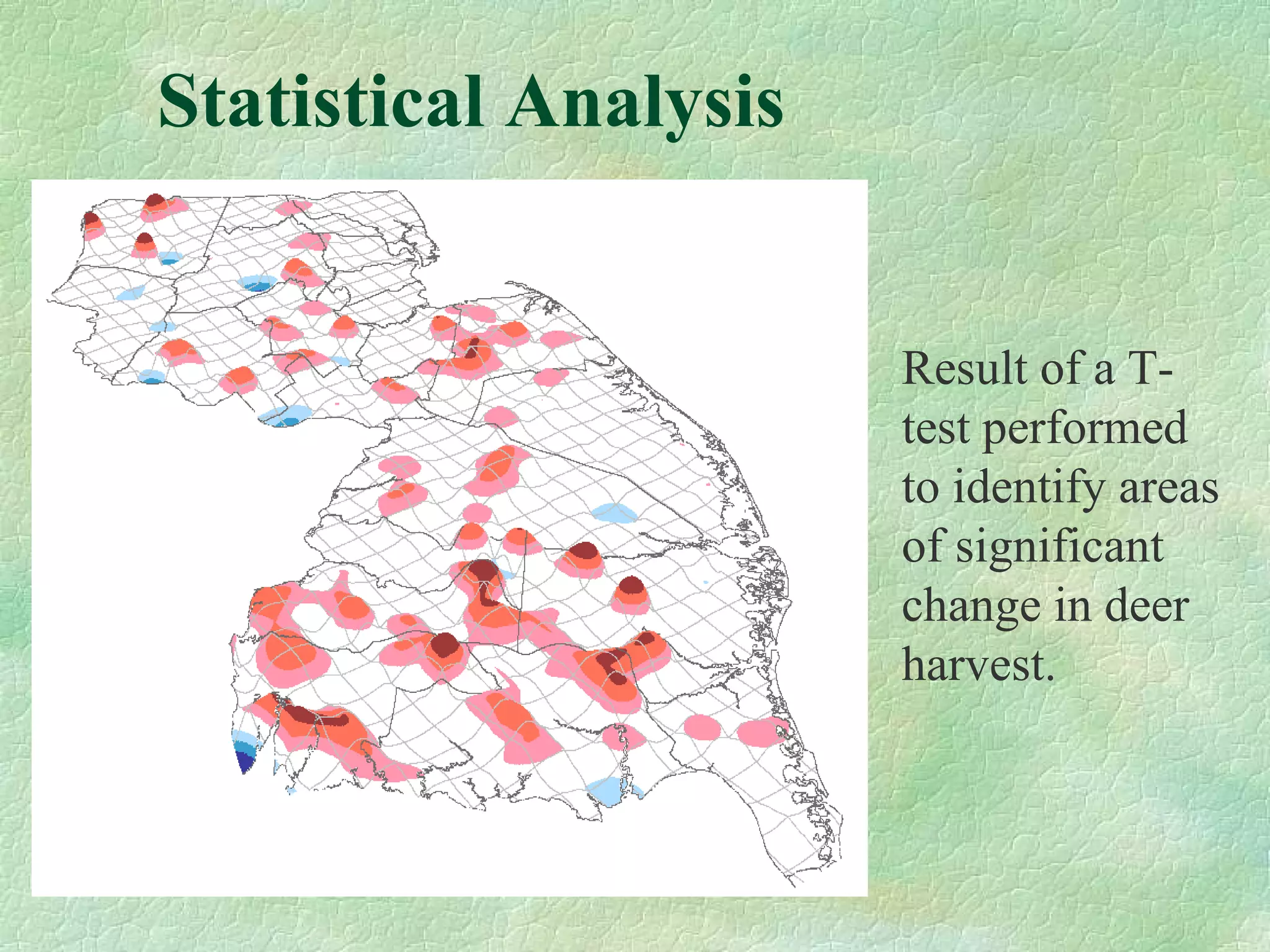
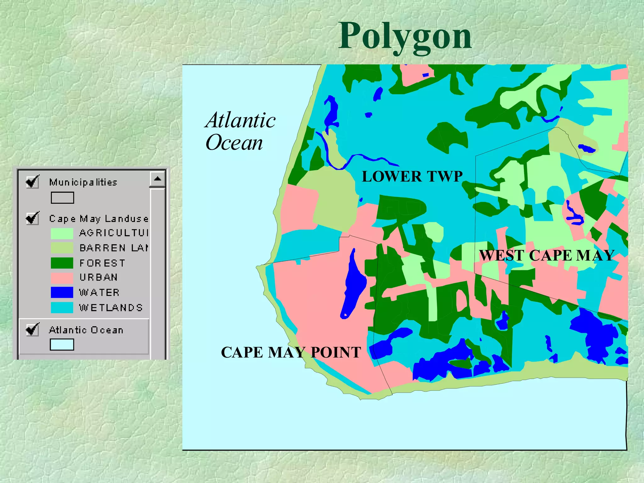


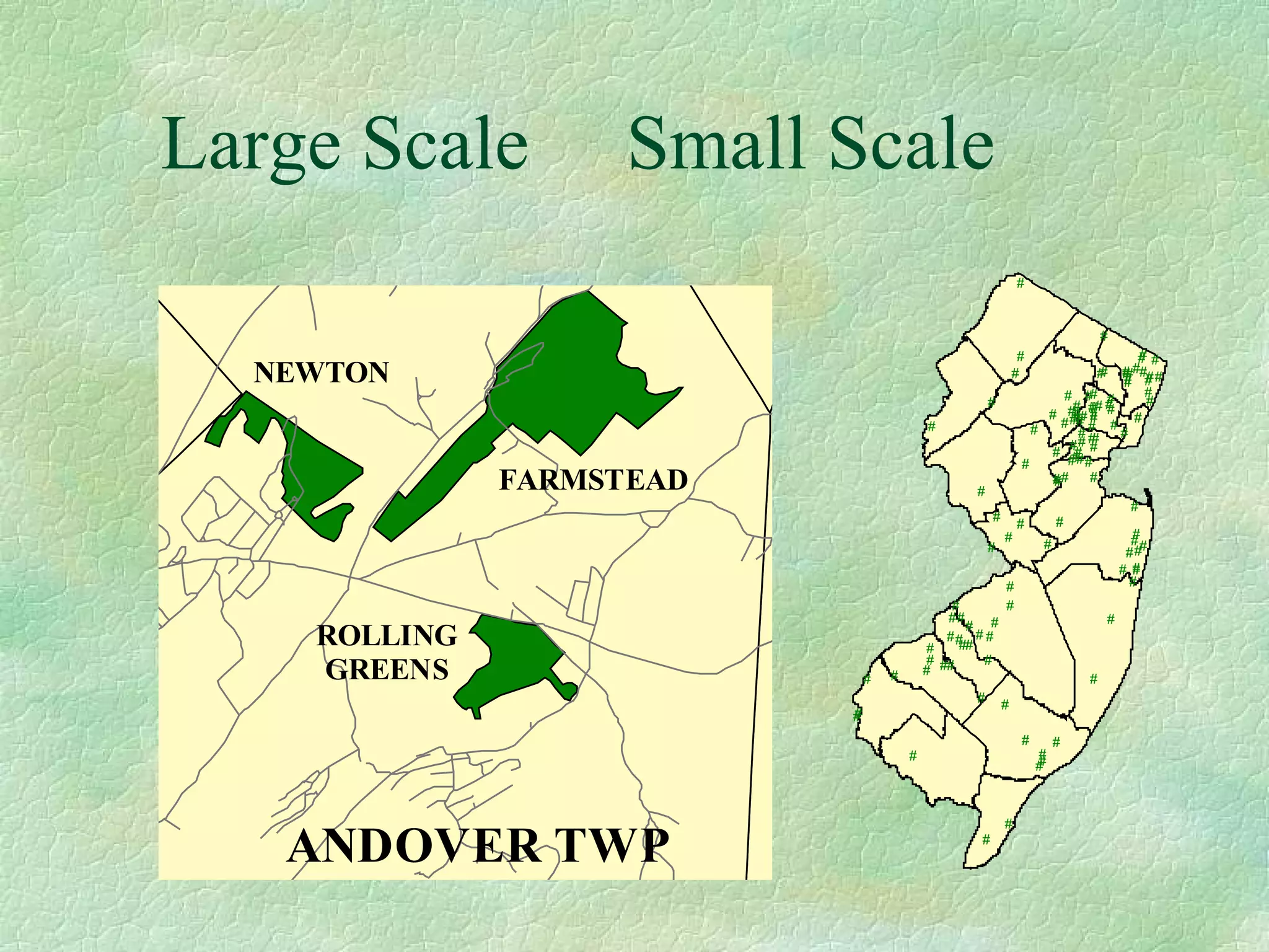
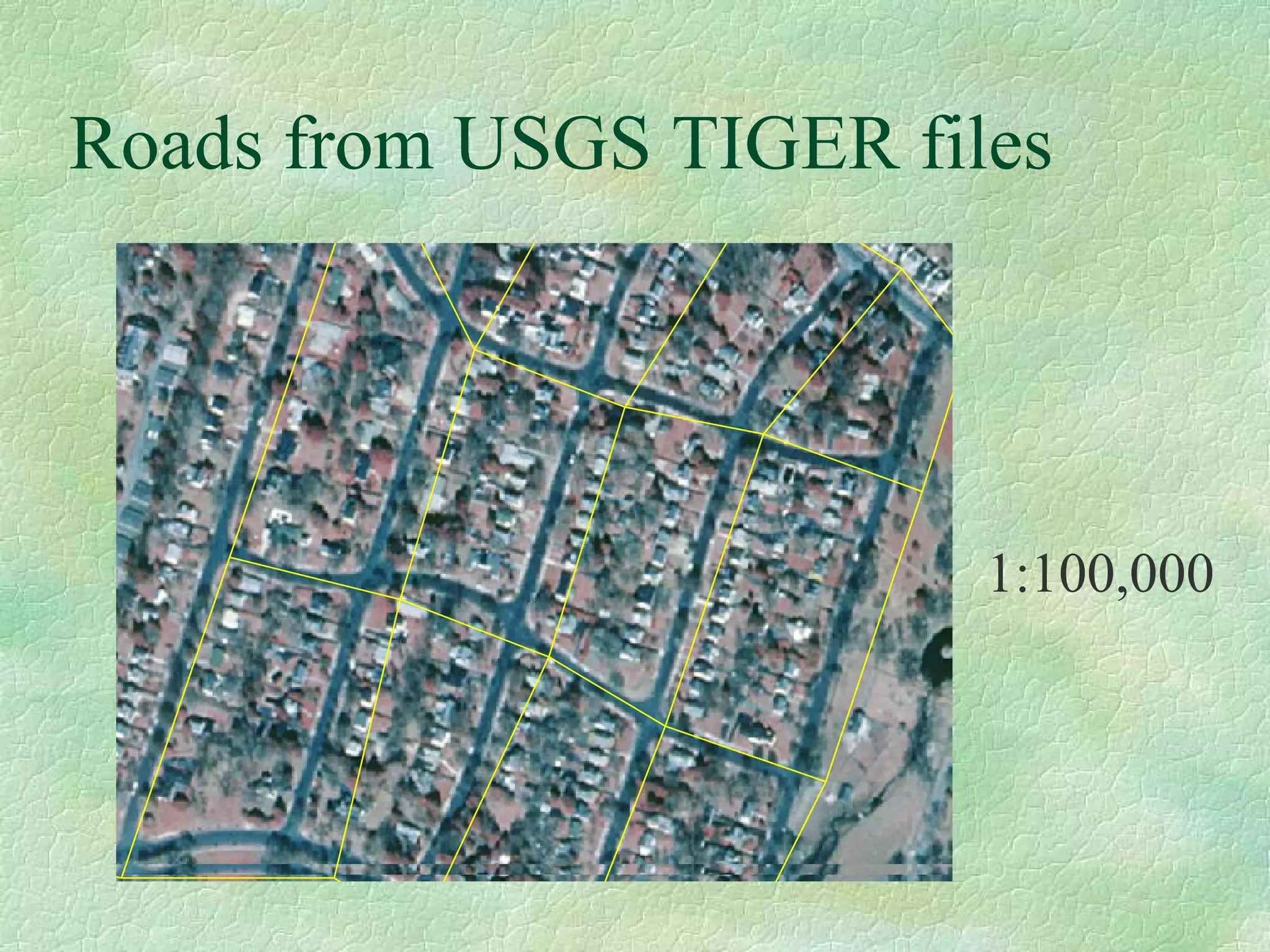

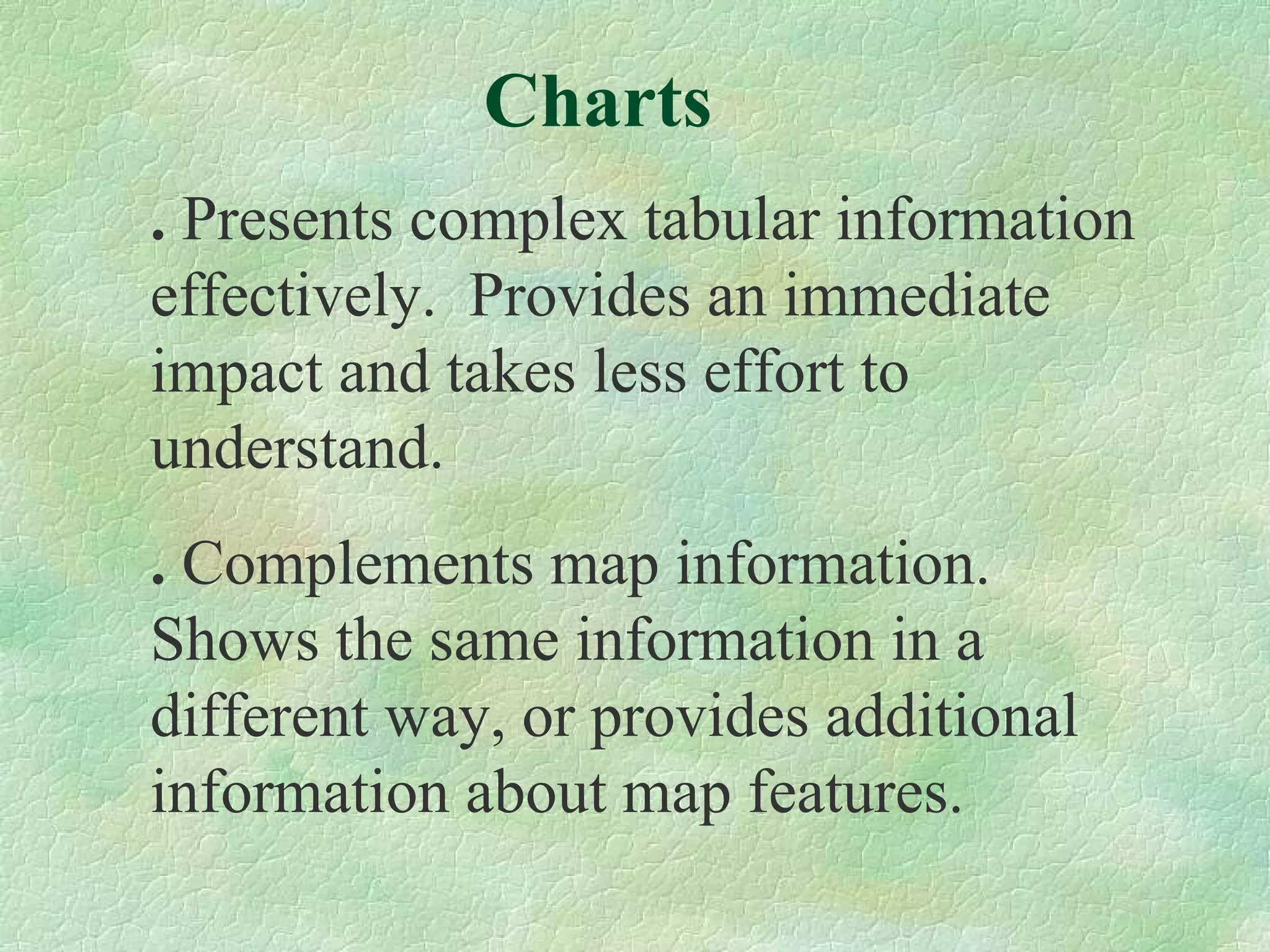
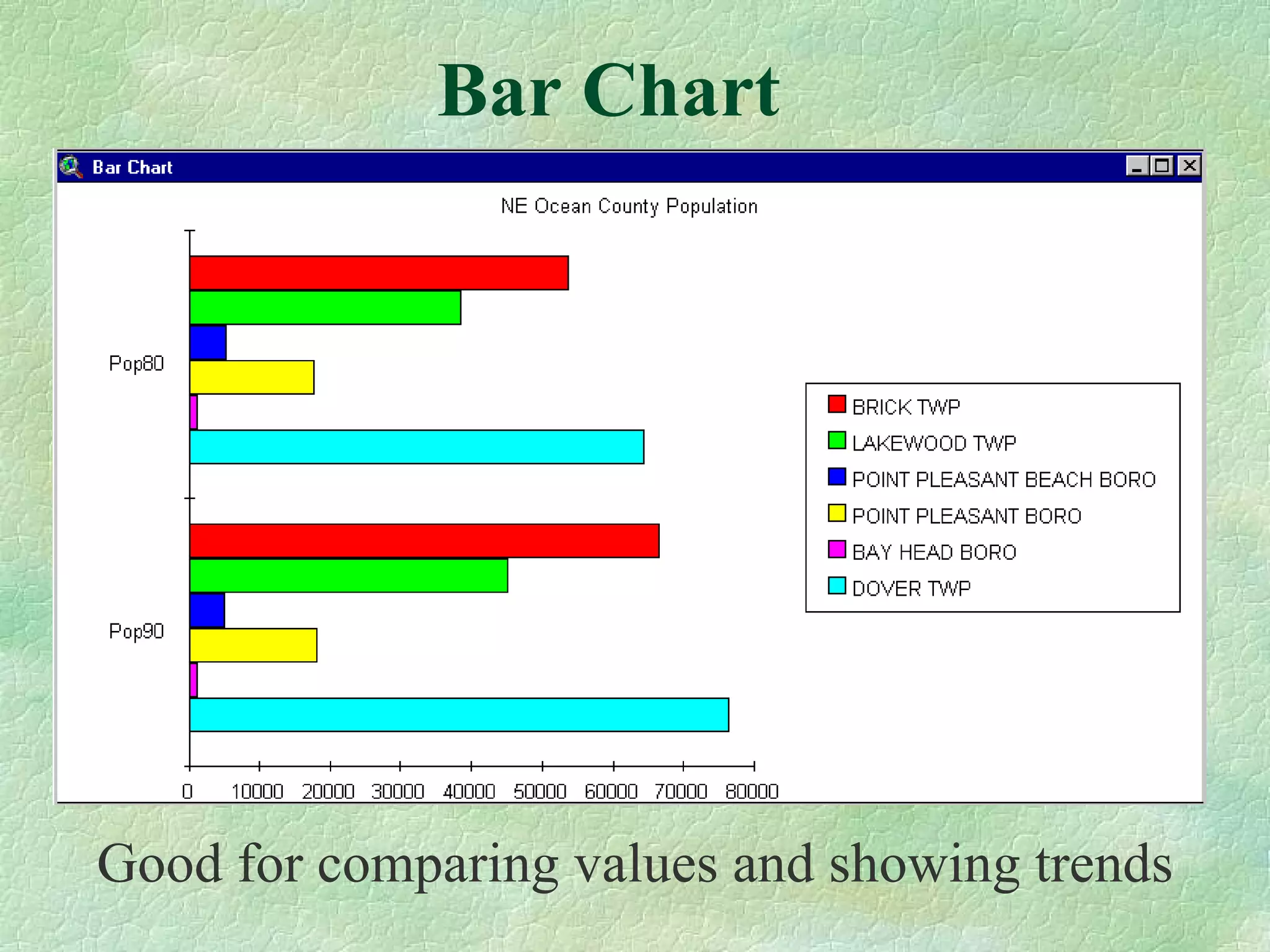
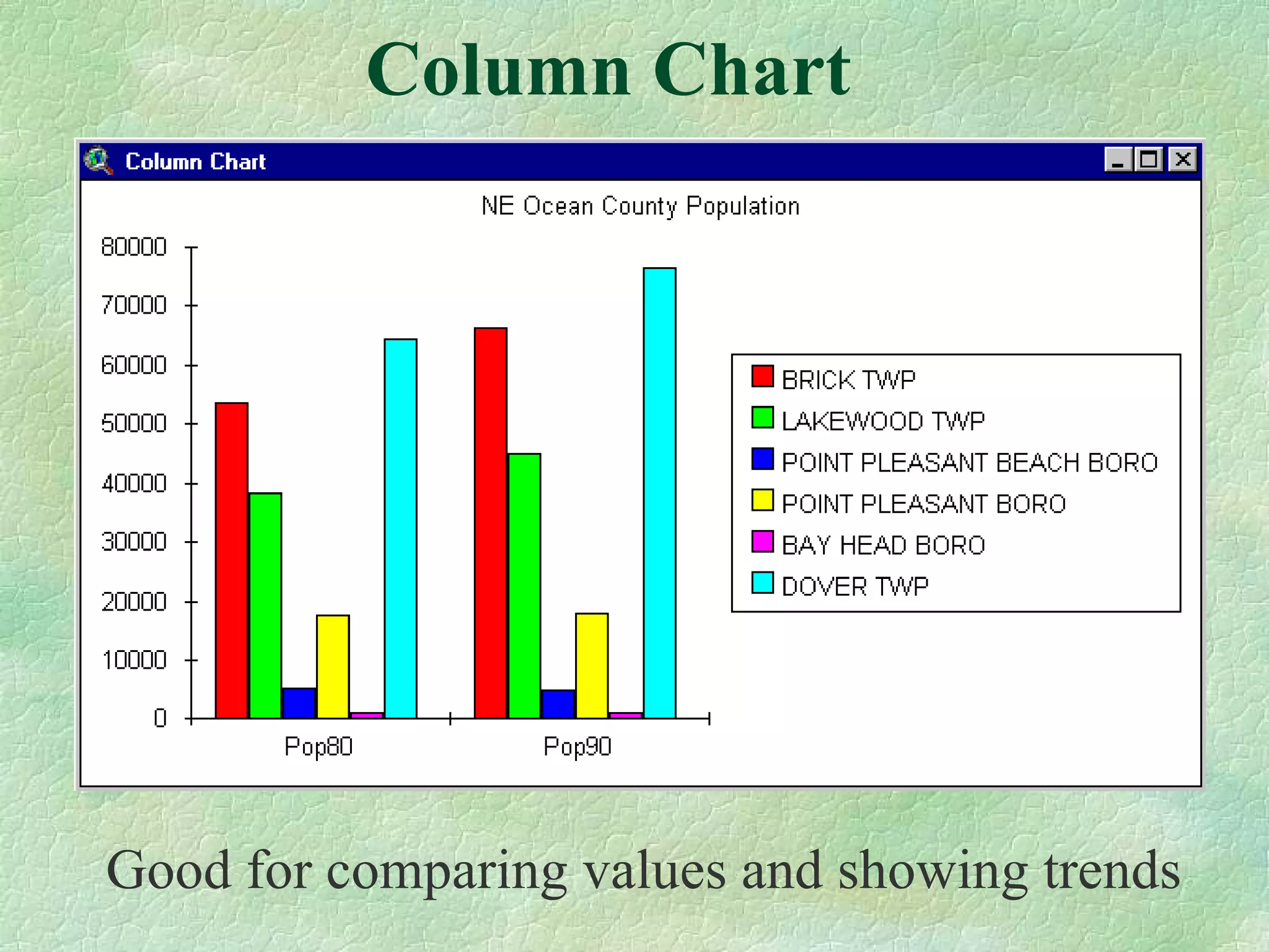

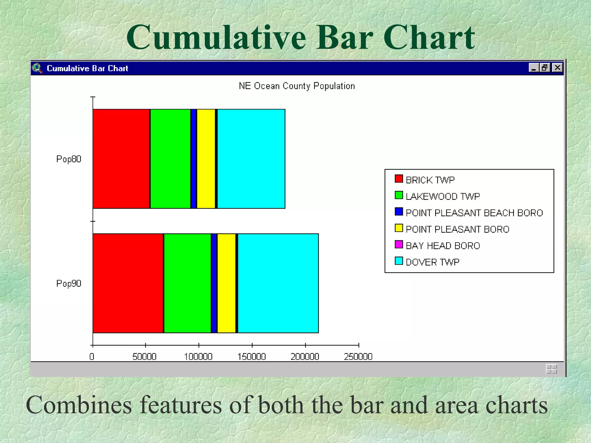

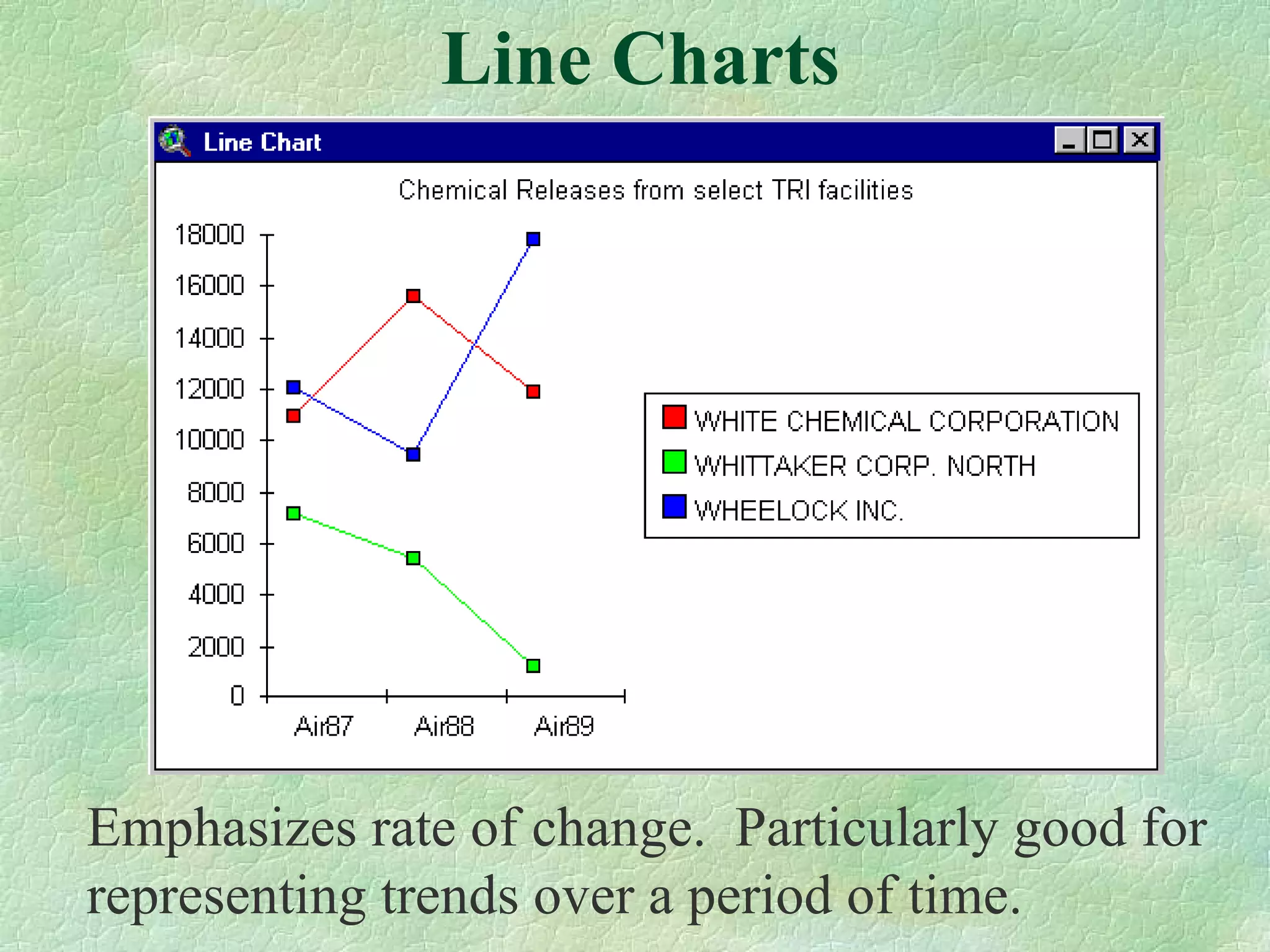
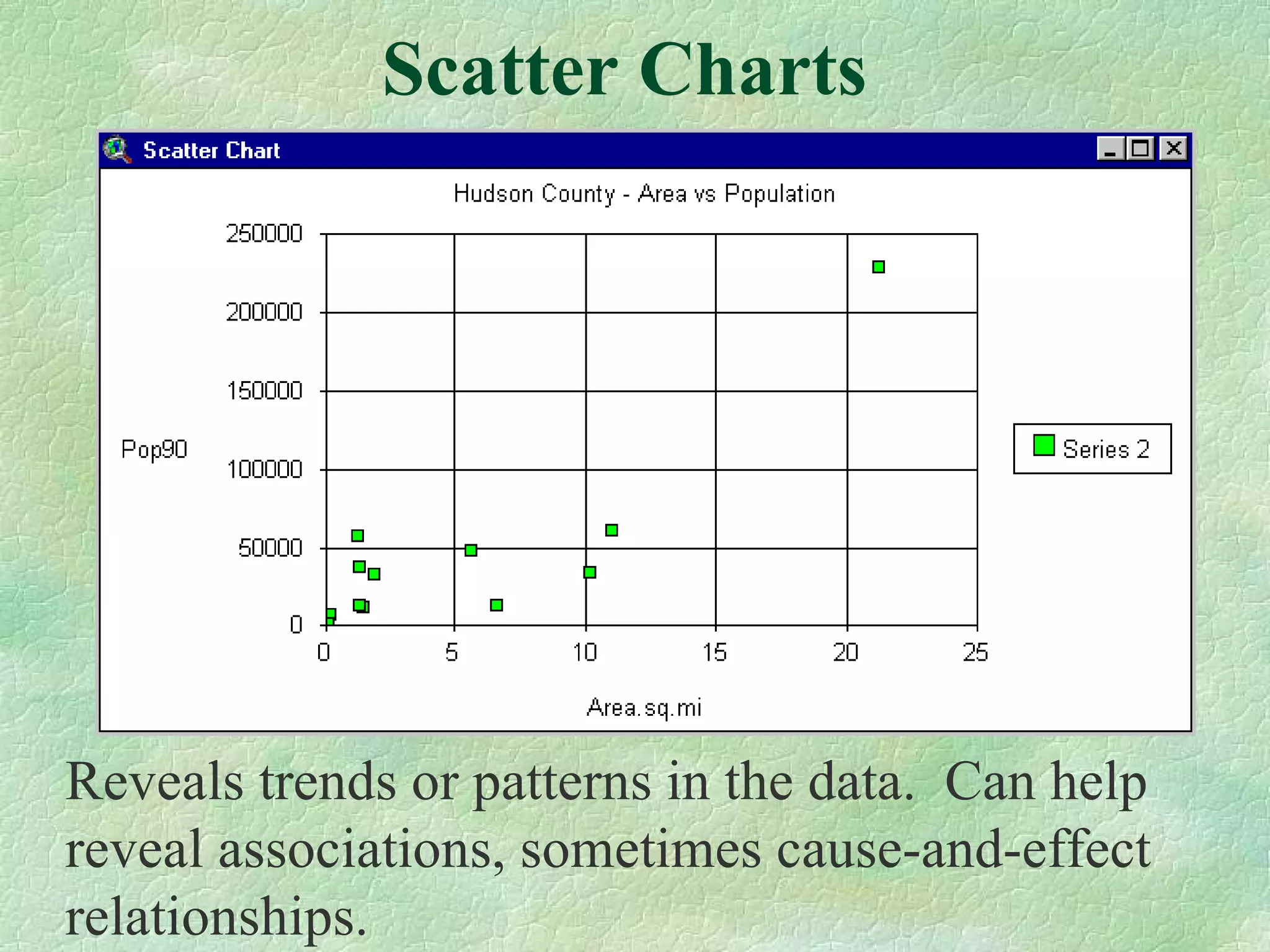

The document discusses different types of maps and charts that can be used to visualize data based on the message, data, audience, and context. It lists common map types like choropleth, graduated symbol, dot density, and 3D maps. It also lists different chart types useful for different purposes, such as bar charts for comparing values, area charts for showing total values, line charts for trends over time, and scatter plots for revealing patterns. The document provides guidance on selecting the most appropriate visual based on the characteristics of the data and the goals of the analysis or communication.