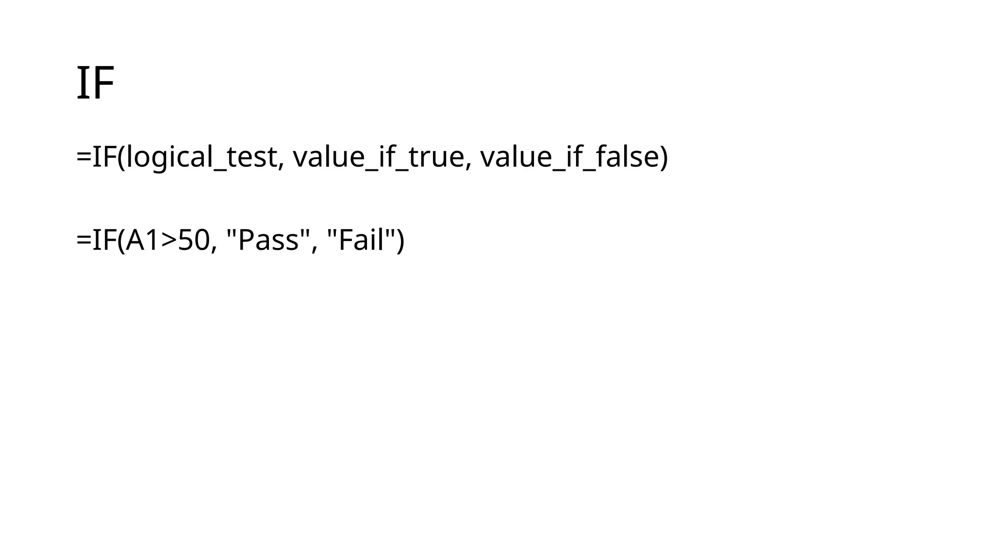
MATCH Function
• Syntax:
=MATCH(lookup_value,lookup_array, [match_type])
Returns the relative position of a value in a range.
Example:
=MATCH(85, B2:B10, 0) Finds the position of 85 in the range
→
B2:B10.
The lookup_array must be a single row OR a single
column.
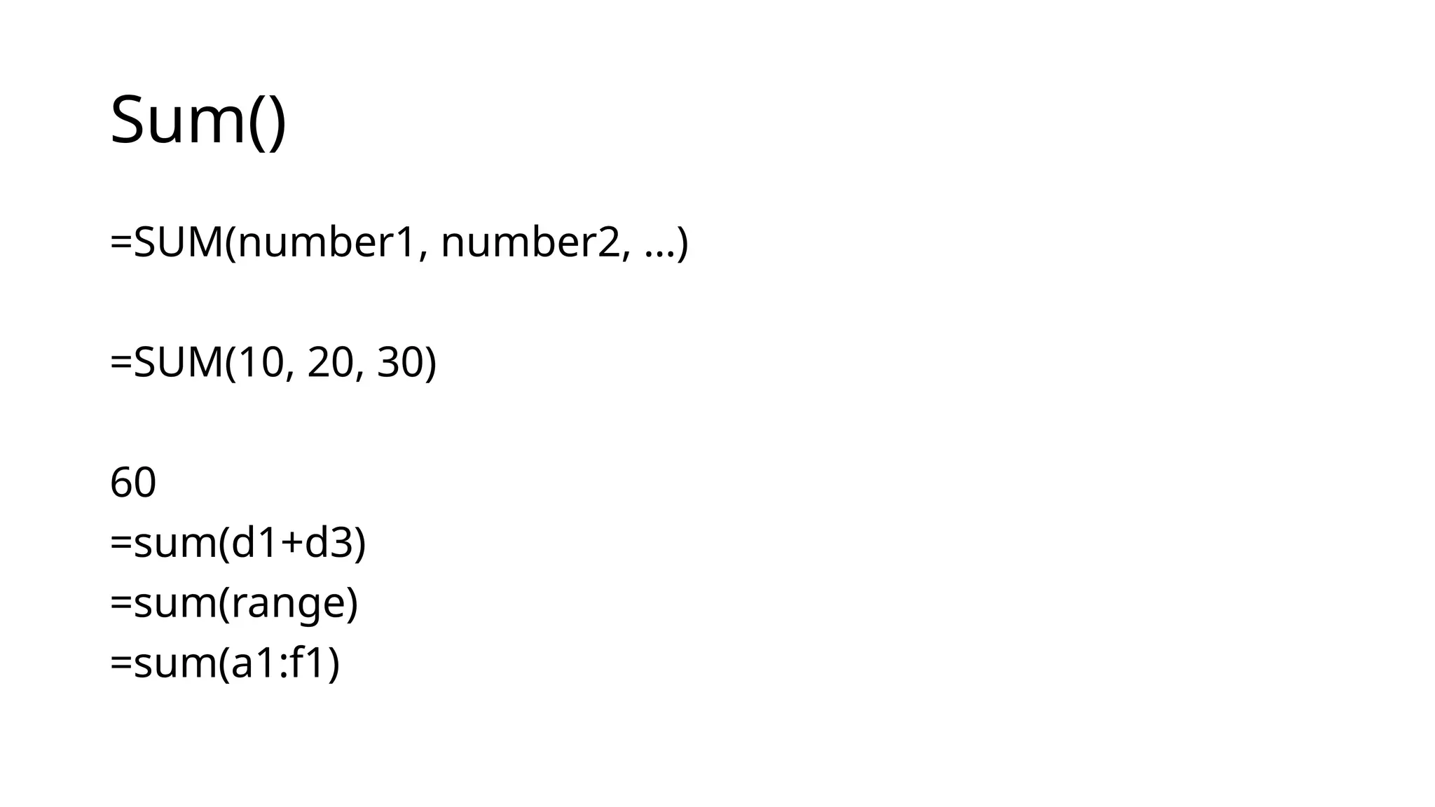
12.
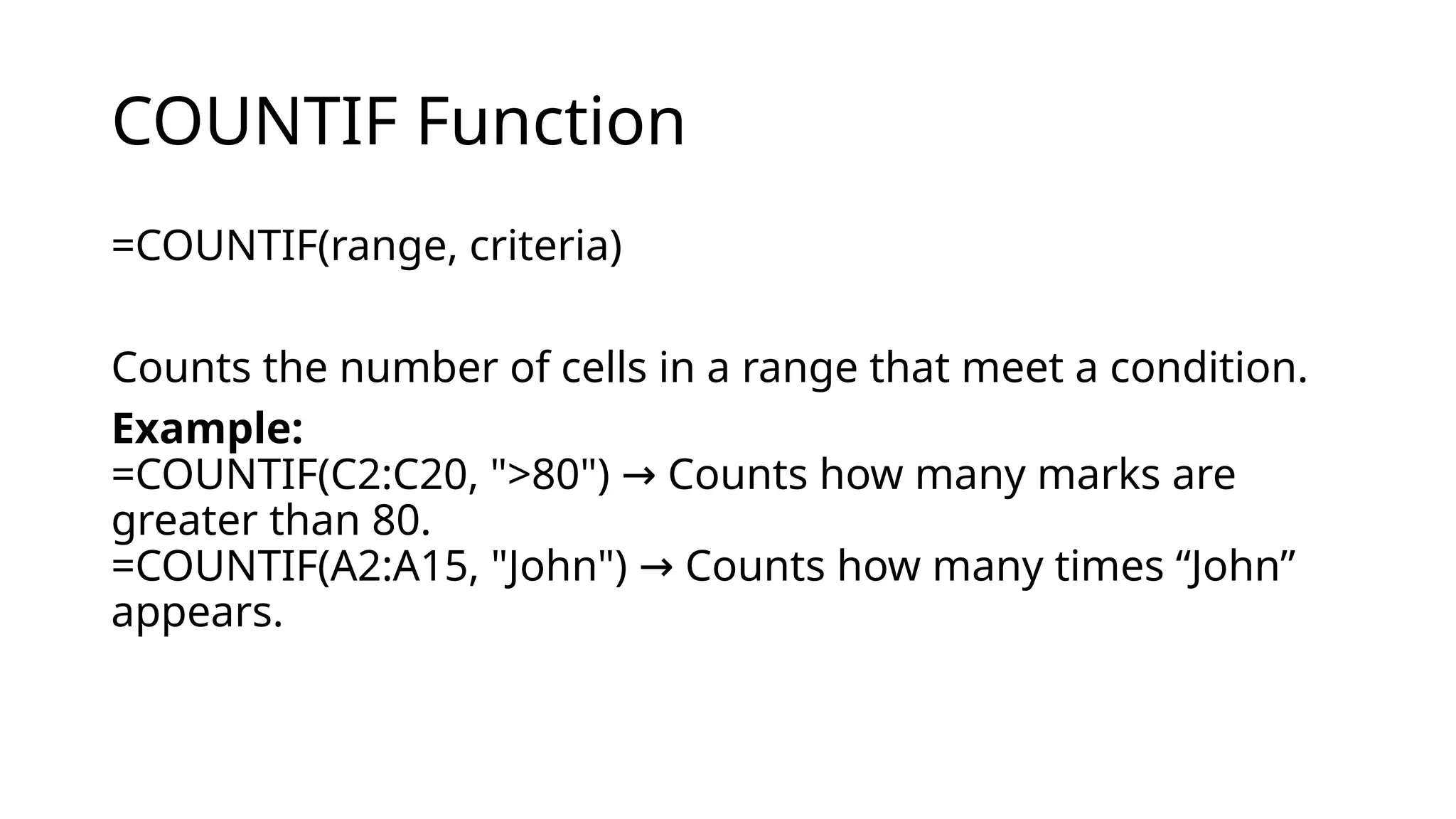
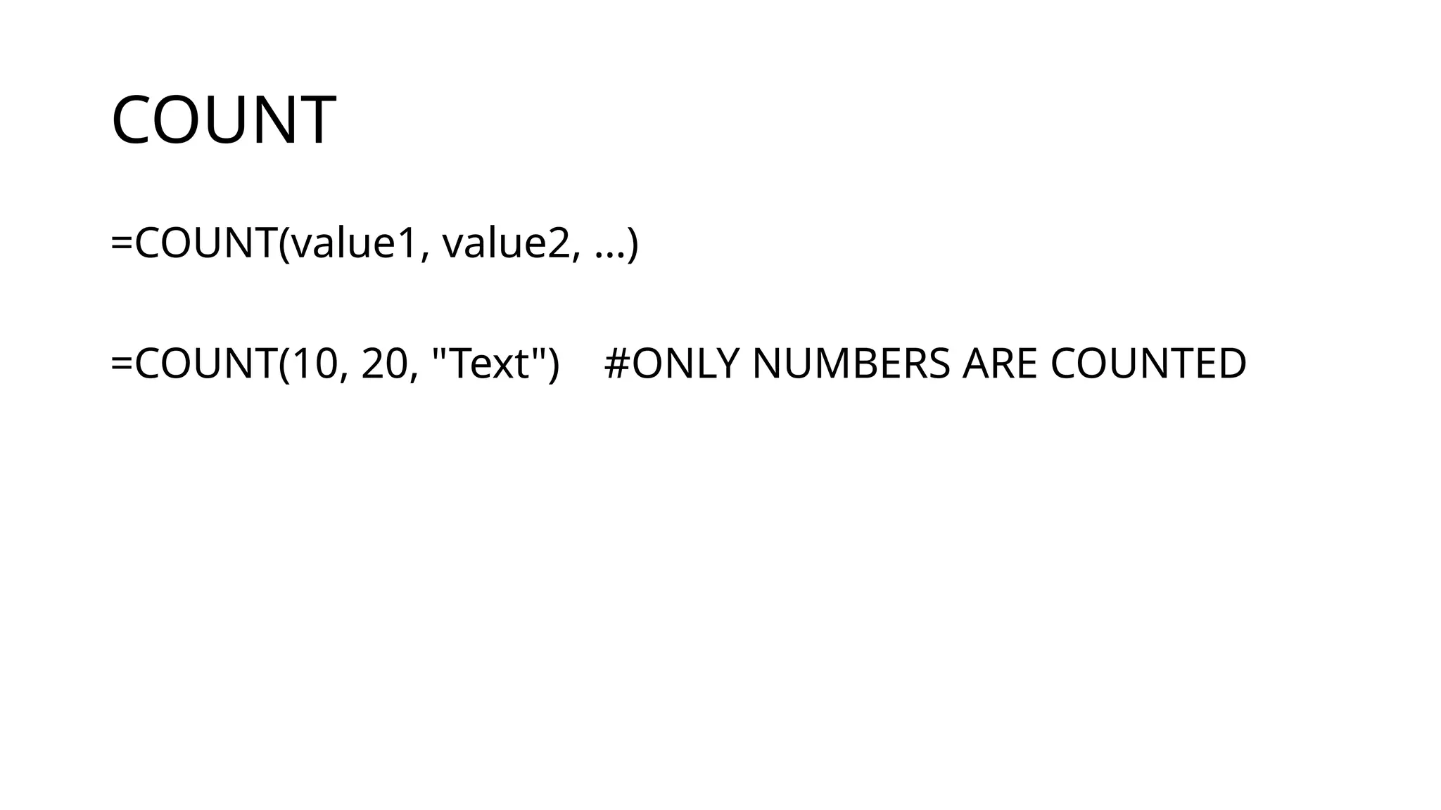
COUNTIF Function
=COUNTIF(range, criteria)
Countsthe number of cells in a range that meet a condition.
Example:
=COUNTIF(C2:C20, ">80") Counts how many marks are
→
greater than 80.
=COUNTIF(A2:A15, "John") Counts how many times “John”
→
appears.
13.
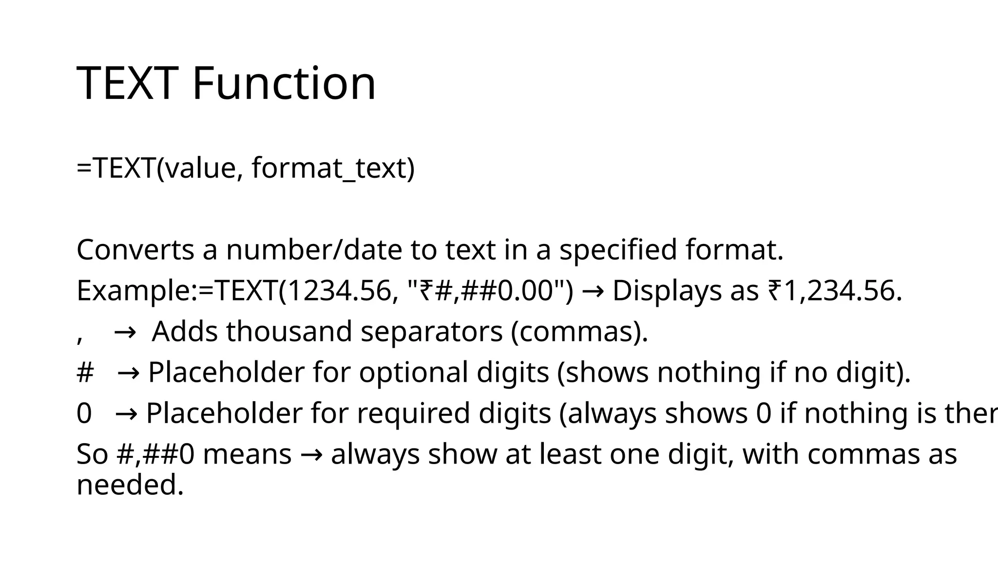
TEXT Function
=TEXT(value, format_text)
Convertsa number/date to text in a specified format.
Example:=TEXT(1234.56, "₹#,##0.00") Displays as ₹1,234.56.
→
, Adds thousand separators (commas).
→
# Placeholder for optional digits (shows nothing if no digit).
→
0 Placeholder for required digits (always shows 0 if nothing is ther
→
So #,##0 means always show at least one digit, with commas as
→
needed.
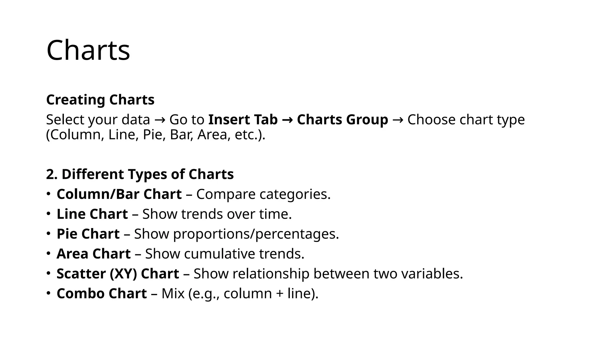
Charts
Creating Charts
Select yourdata Go to
→ Insert Tab Charts Group
→ Choose chart type
→
(Column, Line, Pie, Bar, Area, etc.).
2. Different Types of Charts
• Column/Bar Chart – Compare categories.
• Line Chart – Show trends over time.
• Pie Chart – Show proportions/percentages.
• Area Chart – Show cumulative trends.
• Scatter (XY) Chart – Show relationship between two variables.
• Combo Chart – Mix (e.g., column + line).
17.
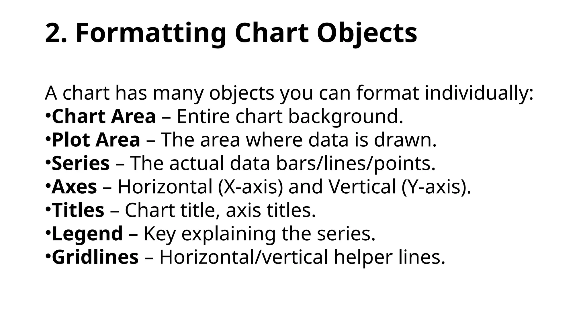
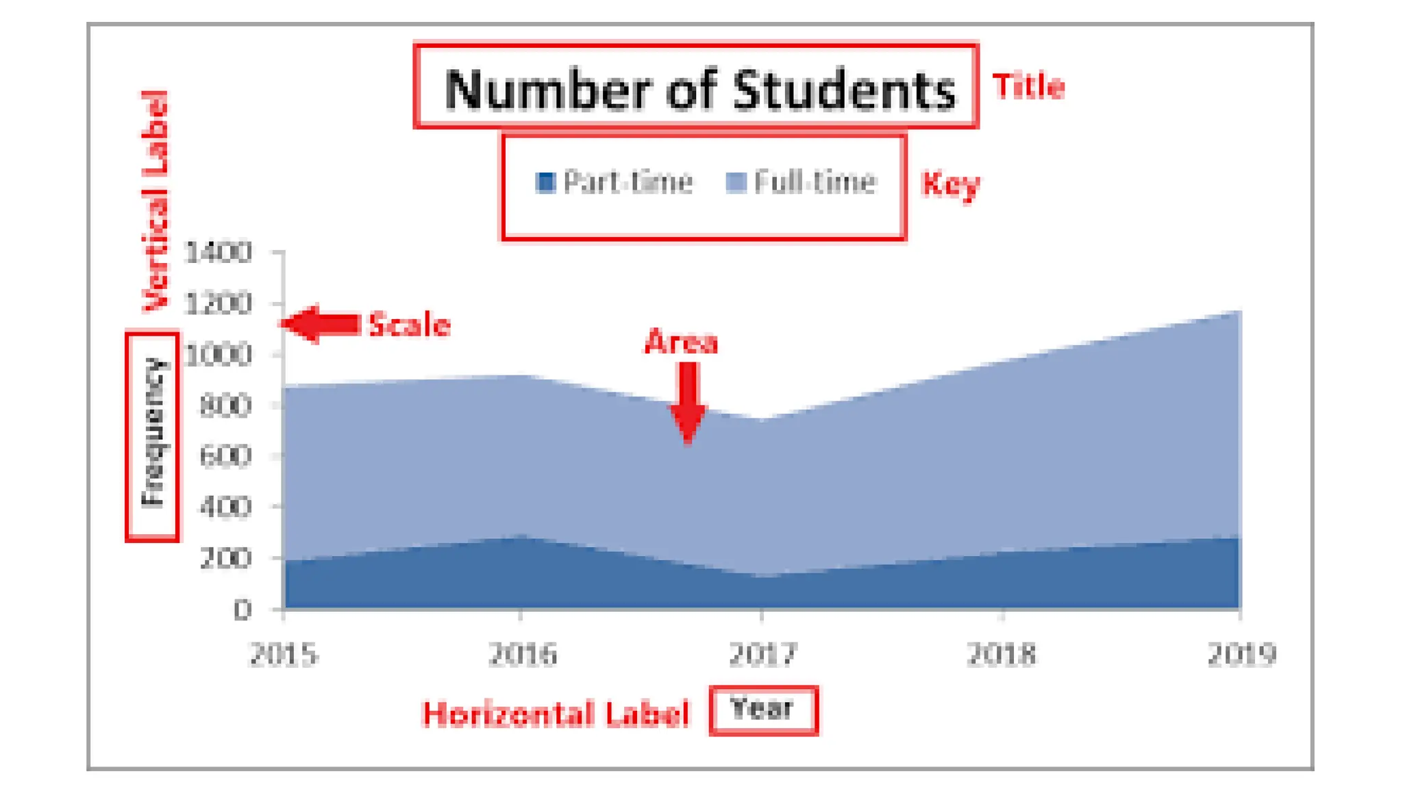
2. Formatting ChartObjects
A chart has many objects you can format individually:
•Chart Area – Entire chart background.
•Plot Area – The area where data is drawn.
•Series – The actual data bars/lines/points.
•Axes – Horizontal (X-axis) and Vertical (Y-axis).
•Titles – Chart title, axis titles.
•Legend – Key explaining the series.
•Gridlines – Horizontal/vertical helper lines.
19.
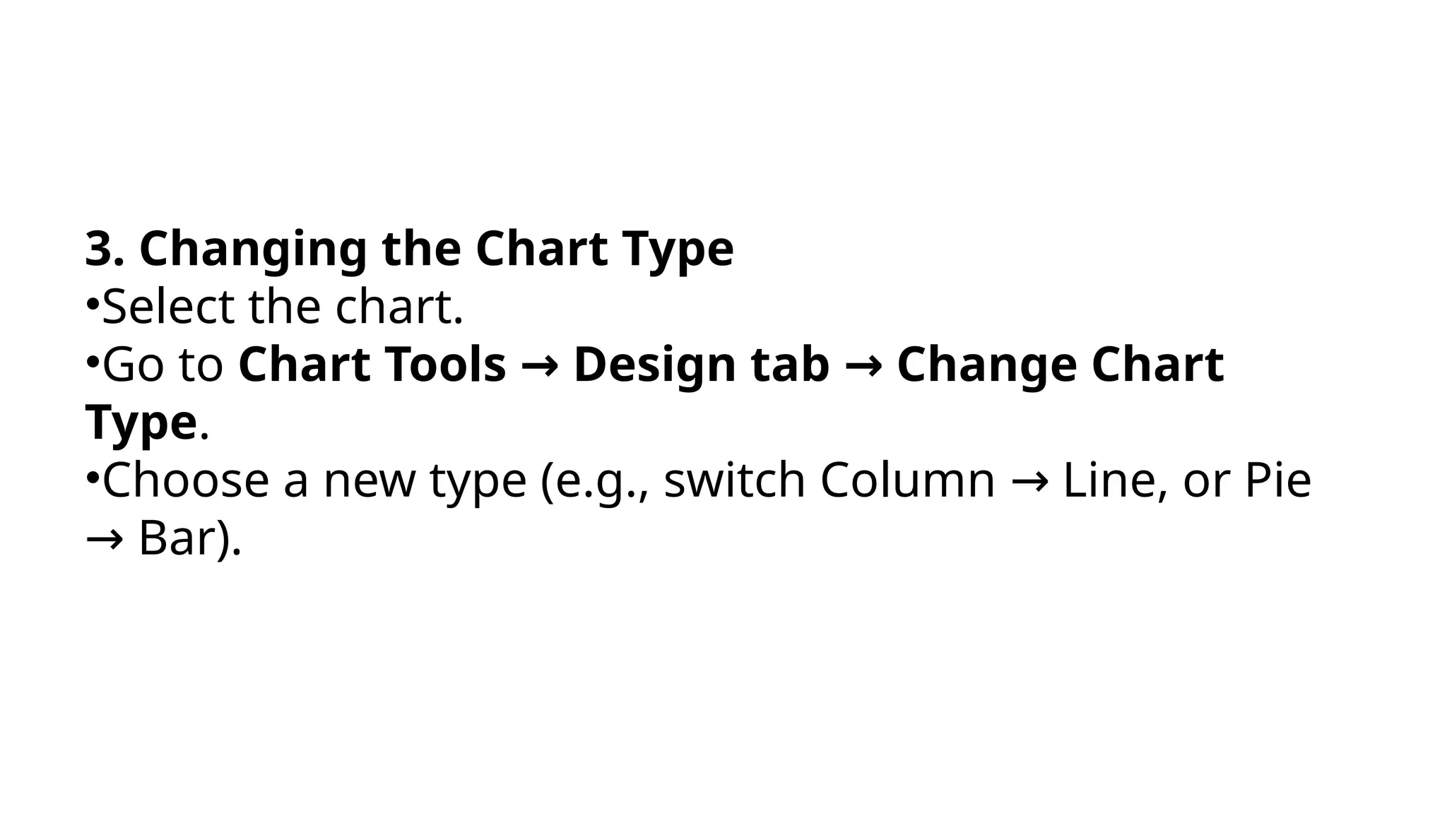
3. Changing theChart Type
•Select the chart.
•Go to Chart Tools Design tab Change Chart
→ →
Type.
•Choose a new type (e.g., switch Column Line, or Pie
→
Bar).
→
20.
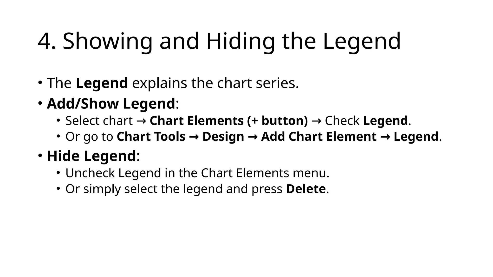
4. Showing andHiding the Legend
• The Legend explains the chart series.
• Add/Show Legend:
• Select chart → Chart Elements (+ button) Check
→ Legend.
• Or go to Chart Tools Design Add Chart Element Legend
→ → → .
• Hide Legend:
• Uncheck Legend in the Chart Elements menu.
• Or simply select the legend and press Delete.
21.
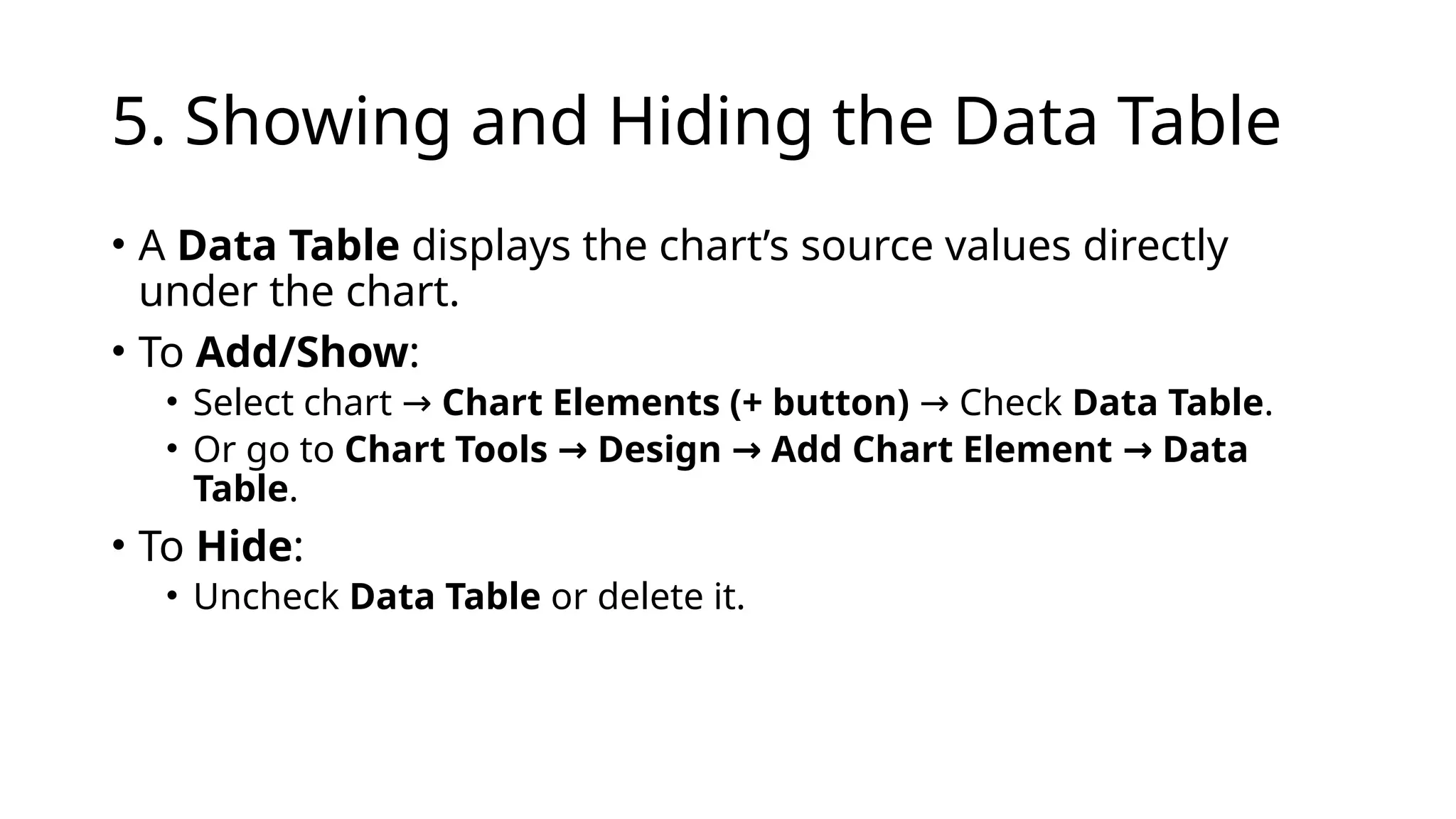
5. Showing andHiding the Data Table
• A Data Table displays the chart’s source values directly
under the chart.
• To Add/Show:
• Select chart → Chart Elements (+ button) Check
→ Data Table.
• Or go to Chart Tools Design Add Chart Element Data
→ → →
Table.
• To Hide:
• Uncheck Data Table or delete it.
22.
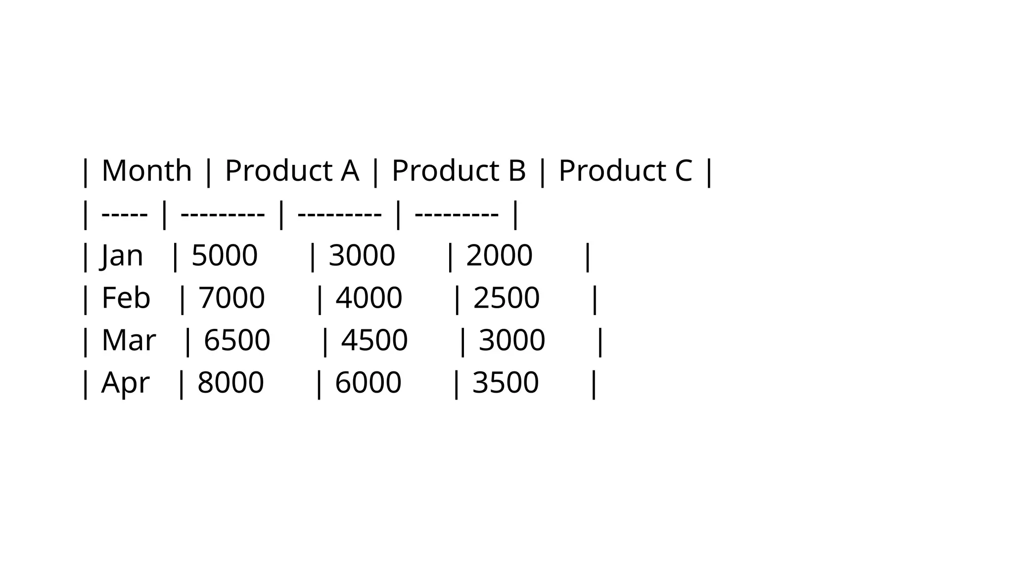
| Month |Product A | Product B | Product C |
| ----- | --------- | --------- | --------- |
| Jan | 5000 | 3000 | 2000 |
| Feb | 7000 | 4000 | 2500 |
| Mar | 6500 | 4500 | 3000 |
| Apr | 8000 | 6000 | 3500 |
23.
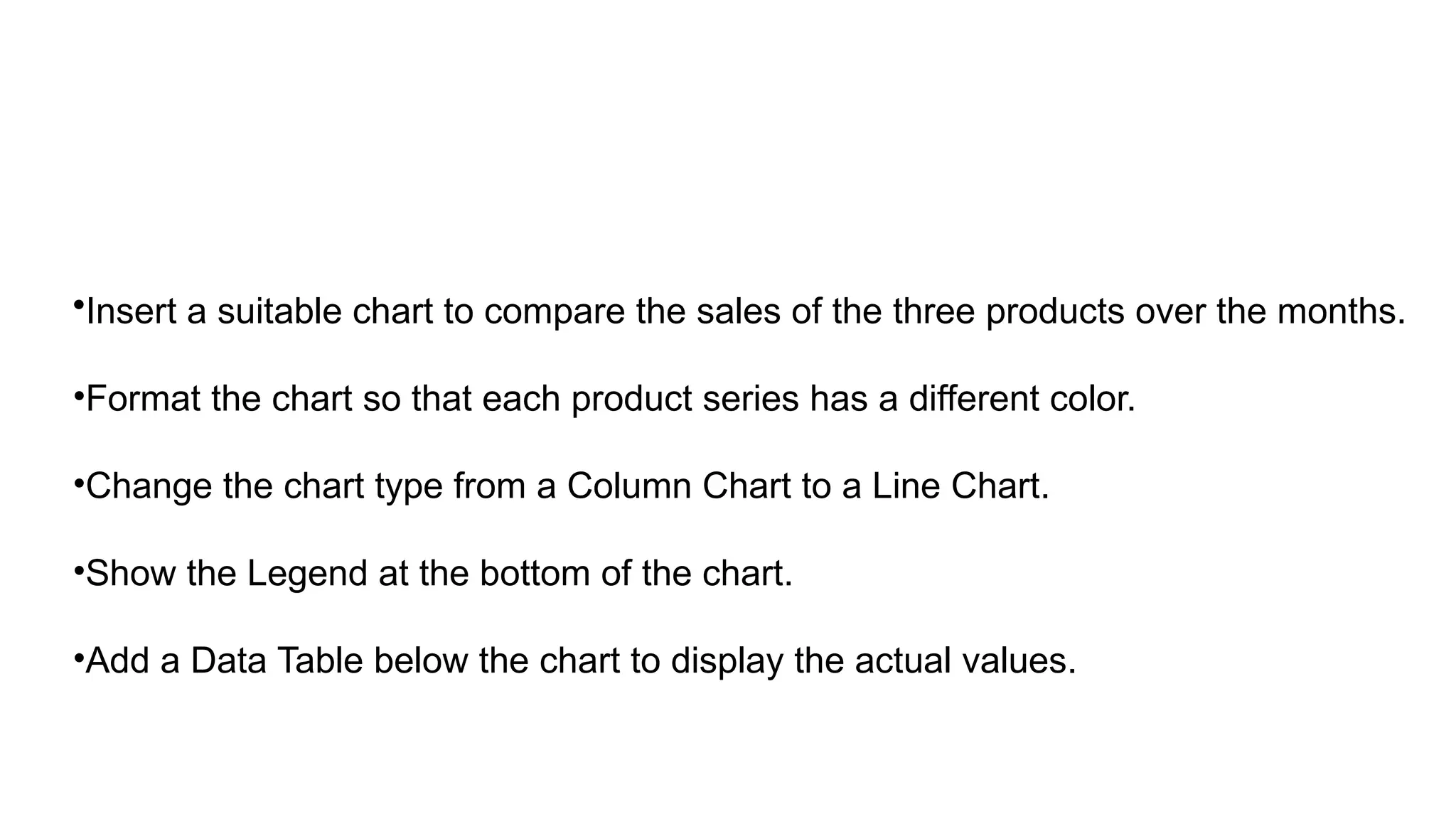
•Insert a suitablechart to compare the sales of the three products over the months.
•Format the chart so that each product series has a different color.
•Change the chart type from a Column Chart to a Line Chart.
•Show the Legend at the bottom of the chart.
•Add a Data Table below the chart to display the actual values.

![=VLOOKUP(lookup_value, table_array, col_index_num,
[range_lookup])
=VLOOKUP(101, A2:C10, 2, FALSE)
Looks up 101 in first column of A2:C10 and returns value from
2nd column](https://image.slidesharecdn.com/unit3-251112001036-c8a0960c/75/Formulas-and-functions-in-excel-unit-3-9-2048.jpg)
![=HLOOKUP(lookup_value, table_array, row_index_num,
[range_lookup])
=HLOOKUP("Math", A1:F3, 2, FALSE)
Finds “Math” in top row of A1:f3 and returns value from 2nd
row](https://image.slidesharecdn.com/unit3-251112001036-c8a0960c/75/Formulas-and-functions-in-excel-unit-3-10-2048.jpg)
![MATCH Function
• Syntax:
=MATCH(lookup_value, lookup_array, [match_type])
Returns the relative position of a value in a range.
Example:
=MATCH(85, B2:B10, 0) Finds the position of 85 in the range
→
B2:B10.
The lookup_array must be a single row OR a single
column.](https://image.slidesharecdn.com/unit3-251112001036-c8a0960c/75/Formulas-and-functions-in-excel-unit-3-11-2048.jpg)