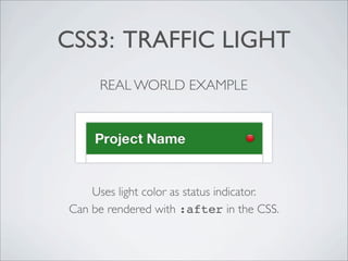
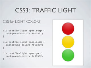
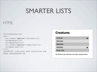
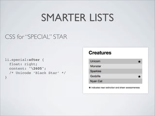
EYE CANDY WITHOUT IMAGES:

FUN WITH CSS3
       @shoshiroberts
WHAT ARE THE BENEFITS?

• Faster   page-load times

• Don’t    have to sacrifice usability in older browsers

• Spice    up layouts

• Makes    content easier to read (when used well)
CSS3: TRAFFIC LIGHT
REAL WORLD USES

• Status   indicators

• Buttons

• Backgrounds

• Page   adornment
CSS3: TRAFFIC LIGHT
HTML

<div class="traffic-light">
  <span class="stop"></span>
  <span class="slow"></span>
  <span class="go"></span>
</div>


Ideally use :before and :after in the CSS
instead of creating dummy html elements.
CSS3: TRAFFIC LIGHT
      REAL WORLD EXAMPLE


    Uses light color as status indicator.
Can be rendered with :after in the CSS.
CSS3: TRAFFIC LIGHT
CSS
div.traffic-light span {
  display: block;
  margin: 8px 0 0;
  width: 80px;
  height: 80px;
  content:'';
  background-color: #666; /* temporary, will be overwritten */
  border-top: 1px solid rgba(255,255,255,0.8);
    -moz-border-radius:      100px;
    -webkit-border-radius: 100px;
  border-radius:             100px;
    -moz-box-shadow:     0 0 4px rgba(0,0,0,0.8);
    -webkit-box-shadow: 0 0 4px rgba(0,0,0,0.8);
  box-shadow:            0 0 4px rgba(0,0,0,0.8);
    background-image:    -webkit-gradient(radial, 50% 0, 100, 50% 0, 0, from(rgba(255,255,255,0)),
                                                                  to(rgba(255,255,255,0.38)));
    background-image:       -moz-radial-gradient(top, ellipse cover, rgba(255,255,255,0.38) 0%,
                                                                     rgba(255,255,255,0) 100%);
    background-image:    -webkit-radial-gradient(top, ellipse cover, rgba(255,255,255,0.38) 0%,
                                                                     rgba(255,255,255,0) 100%);
  background-image:              radial-gradient(top, ellipse cover, rgba(255,255,255,0.38) 0%,
                                                                     rgba(255,255,255,0) 100%);
}
CSS3: TRAFFIC LIGHT
CSS for LIGHT COLORS

div.traffic-light span.stop {
  background-color: #D10A11;
}

div.traffic-light span.slow {
  background-color: #F6D200;
}

div.traffic-light span.go {
  background-color: #43C532;
}
SMARTER LISTS
HTML

<h1>Creatures</h1>
<ul>
  <li class="special">Unicorn</li>
  <li>Monster</li>
  <li>Sparkles</li>
  <li class="special">Godzilla</li>
  <li>Nyan Cat</li>
</ul>
<p>&#9733; indicates near extinction and
sheer awesomeness</p>
SMARTER LISTS
CSS for ZEBRA STRIPES
ul {
  width: 100%;
  padding: 0;
  list-style-type: none;
}
li {
  padding: 5px 10px;
  background: #C0C0C0;
  font-size: 1.2em;
  text-shadow: 0 1px 0 rgba(255,255,255,0.5);
}
li:nth-child(2n) {
  background: #DDD;
}
SMARTER LISTS
CSS for “SPECIAL” STAR


li.special:after {
  float: right;
  content: "2605";
  /* Unicode ‘Black Star’ */
}
WRAPPING IT UP
• CSS3     can make your websites pretty (just don’t go overboard)

• Faster   to load (still pay attention to your render times)

• Faster   to develop with

• Degrade      gracefully, and older browsers will play nicely

• You   can use it right now!
link to the demo code


     THANKS
     AND HAPPY HACKING!


@shoshiroberts for @ladieswhocode

Eye Candy Without Images: Fun With CSS3

  • 1.
    EYE CANDY WITHOUTIMAGES: FUN WITH CSS3 @shoshiroberts
  • 2.
    WHAT ARE THEBENEFITS? • Faster page-load times • Don’t have to sacrifice usability in older browsers • Spice up layouts • Makes content easier to read (when used well)
  • 3.
    CSS3: TRAFFIC LIGHT REALWORLD USES • Status indicators • Buttons • Backgrounds • Page adornment
  • 4.
    CSS3: TRAFFIC LIGHT HTML <divclass="traffic-light"> <span class="stop"></span> <span class="slow"></span> <span class="go"></span> </div> Ideally use :before and :after in the CSS instead of creating dummy html elements.
  • 5.
    CSS3: TRAFFIC LIGHT REAL WORLD EXAMPLE Uses light color as status indicator. Can be rendered with :after in the CSS.
  • 6.
    CSS3: TRAFFIC LIGHT CSS div.traffic-lightspan { display: block; margin: 8px 0 0; width: 80px; height: 80px; content:''; background-color: #666; /* temporary, will be overwritten */ border-top: 1px solid rgba(255,255,255,0.8); -moz-border-radius: 100px; -webkit-border-radius: 100px; border-radius: 100px; -moz-box-shadow: 0 0 4px rgba(0,0,0,0.8); -webkit-box-shadow: 0 0 4px rgba(0,0,0,0.8); box-shadow: 0 0 4px rgba(0,0,0,0.8); background-image: -webkit-gradient(radial, 50% 0, 100, 50% 0, 0, from(rgba(255,255,255,0)), to(rgba(255,255,255,0.38))); background-image: -moz-radial-gradient(top, ellipse cover, rgba(255,255,255,0.38) 0%, rgba(255,255,255,0) 100%); background-image: -webkit-radial-gradient(top, ellipse cover, rgba(255,255,255,0.38) 0%, rgba(255,255,255,0) 100%); background-image: radial-gradient(top, ellipse cover, rgba(255,255,255,0.38) 0%, rgba(255,255,255,0) 100%); }
  • 7.
    CSS3: TRAFFIC LIGHT CSSfor LIGHT COLORS div.traffic-light span.stop { background-color: #D10A11; } div.traffic-light span.slow { background-color: #F6D200; } div.traffic-light span.go { background-color: #43C532; }
  • 8.
    SMARTER LISTS HTML <h1>Creatures</h1> <ul> <li class="special">Unicorn</li> <li>Monster</li> <li>Sparkles</li> <li class="special">Godzilla</li> <li>Nyan Cat</li> </ul> <p>&#9733; indicates near extinction and sheer awesomeness</p>
  • 9.
    SMARTER LISTS CSS forZEBRA STRIPES ul { width: 100%; padding: 0; list-style-type: none; } li { padding: 5px 10px; background: #C0C0C0; font-size: 1.2em; text-shadow: 0 1px 0 rgba(255,255,255,0.5); } li:nth-child(2n) { background: #DDD; }
  • 10.
    SMARTER LISTS CSS for“SPECIAL” STAR li.special:after { float: right; content: "2605"; /* Unicode ‘Black Star’ */ }
  • 11.
    WRAPPING IT UP •CSS3 can make your websites pretty (just don’t go overboard) • Faster to load (still pay attention to your render times) • Faster to develop with • Degrade gracefully, and older browsers will play nicely • You can use it right now!
  • 12.
    link to thedemo code THANKS AND HAPPY HACKING! @shoshiroberts for @ladieswhocode