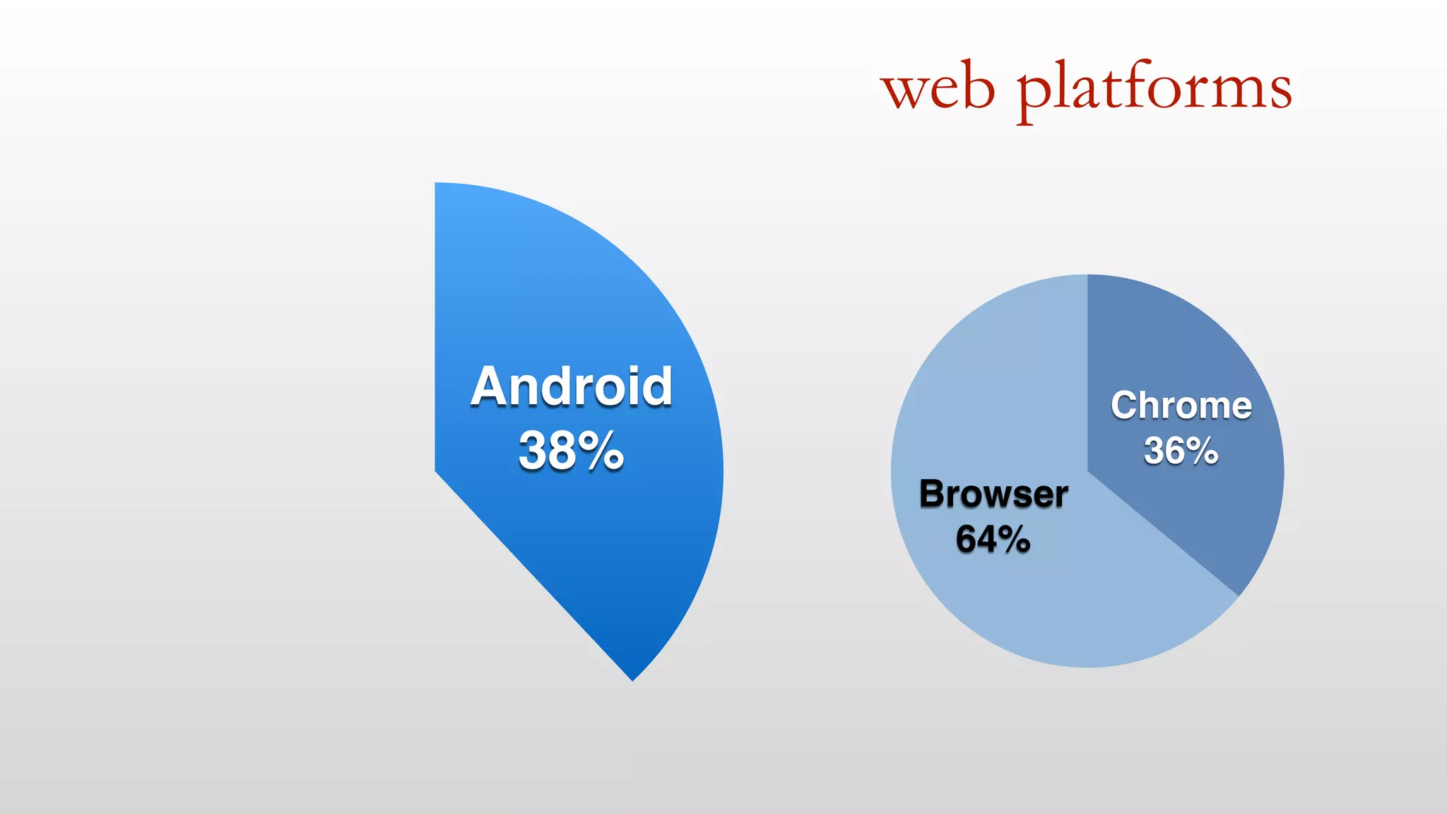
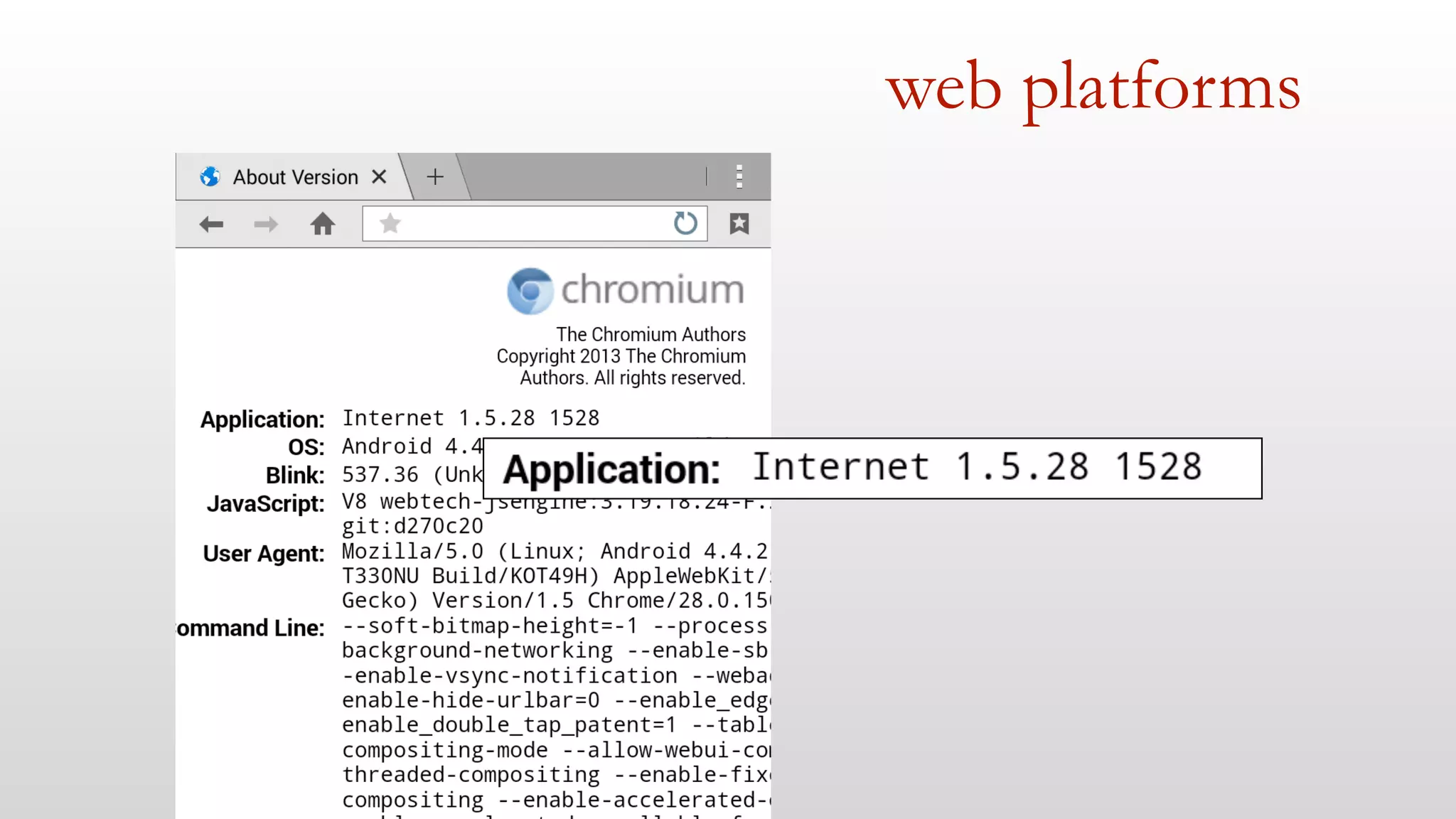
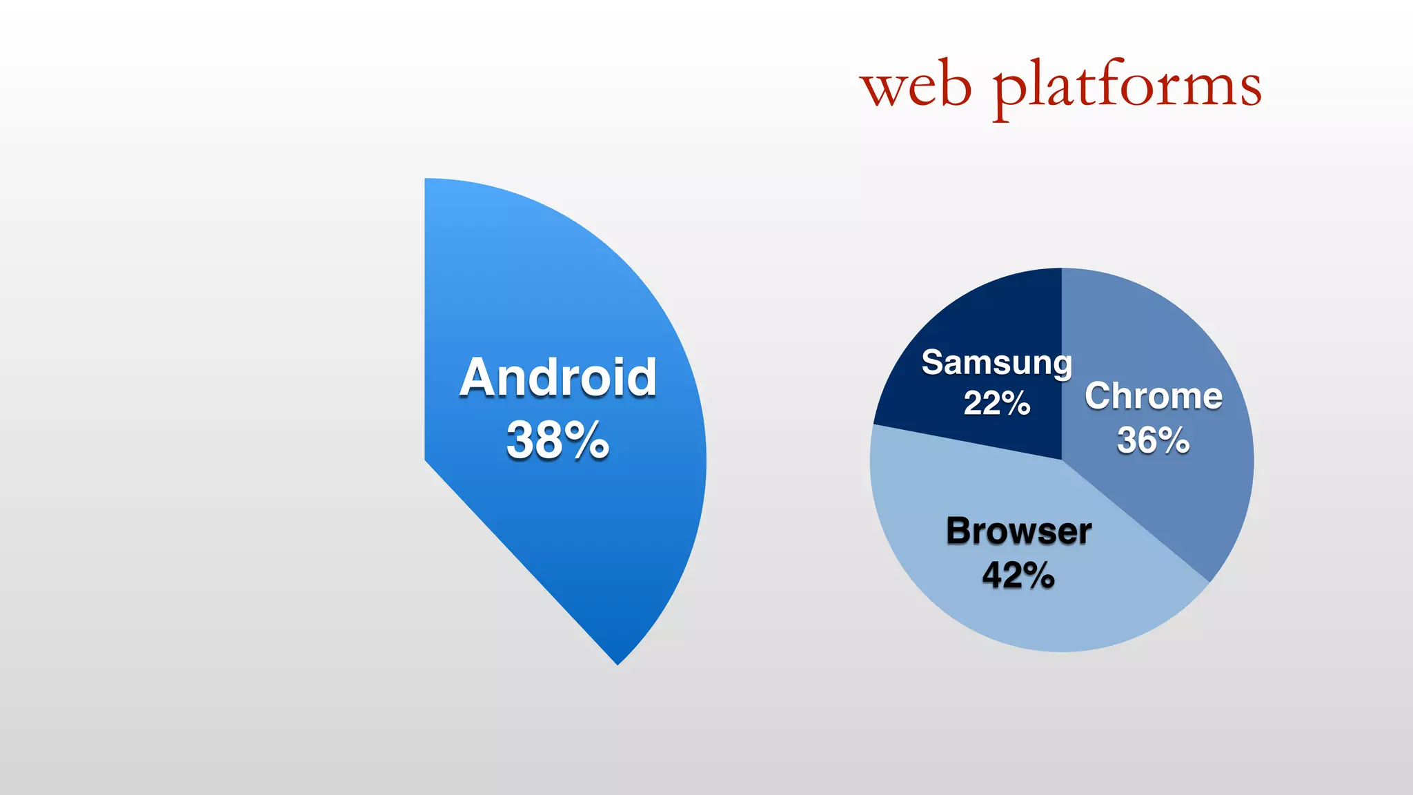
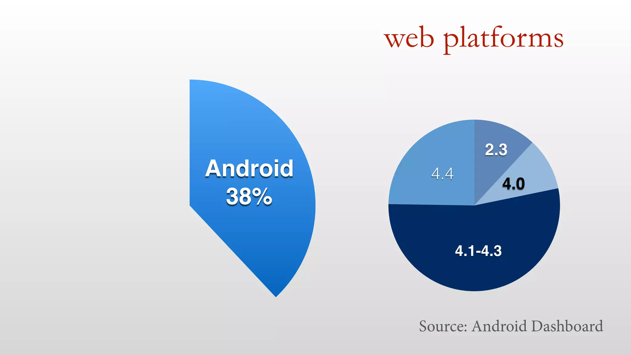
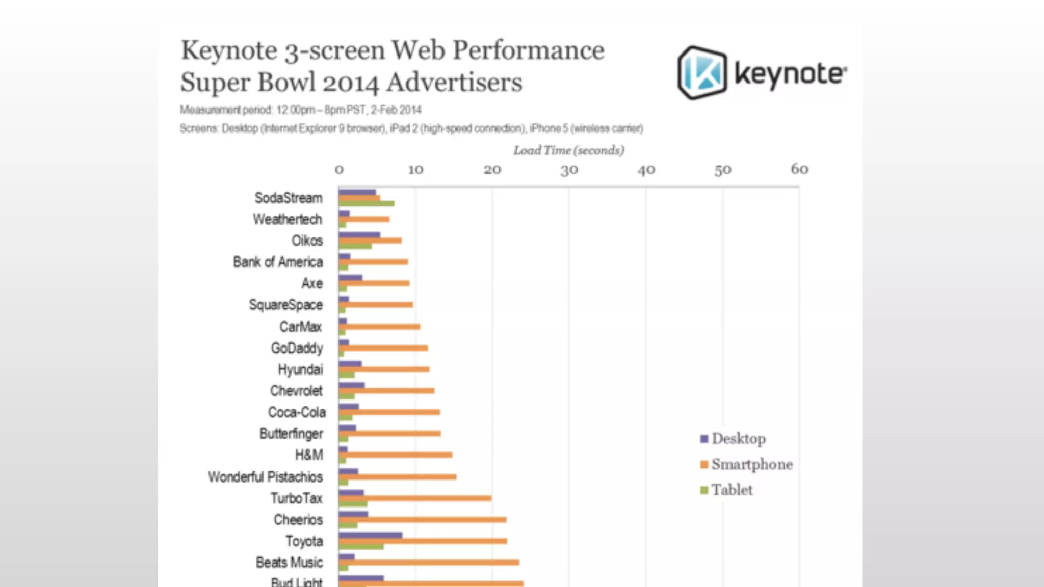
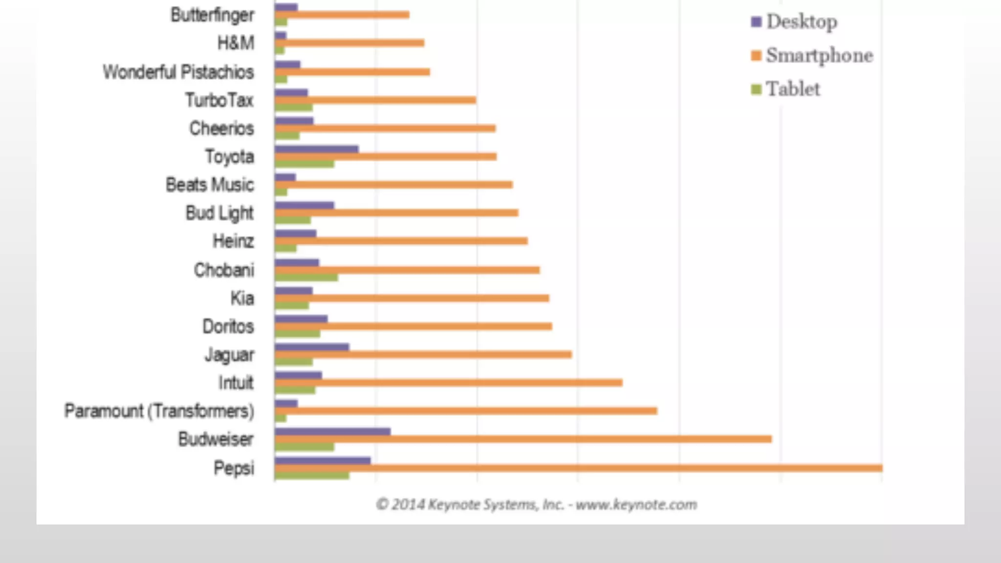
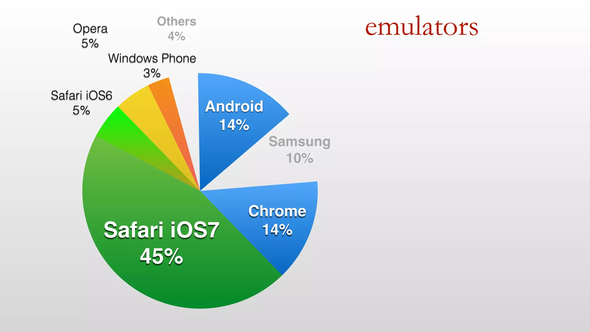
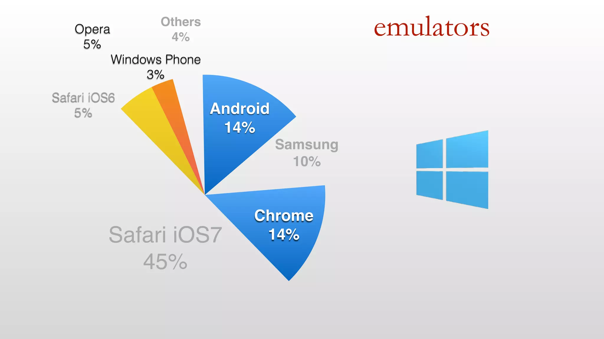
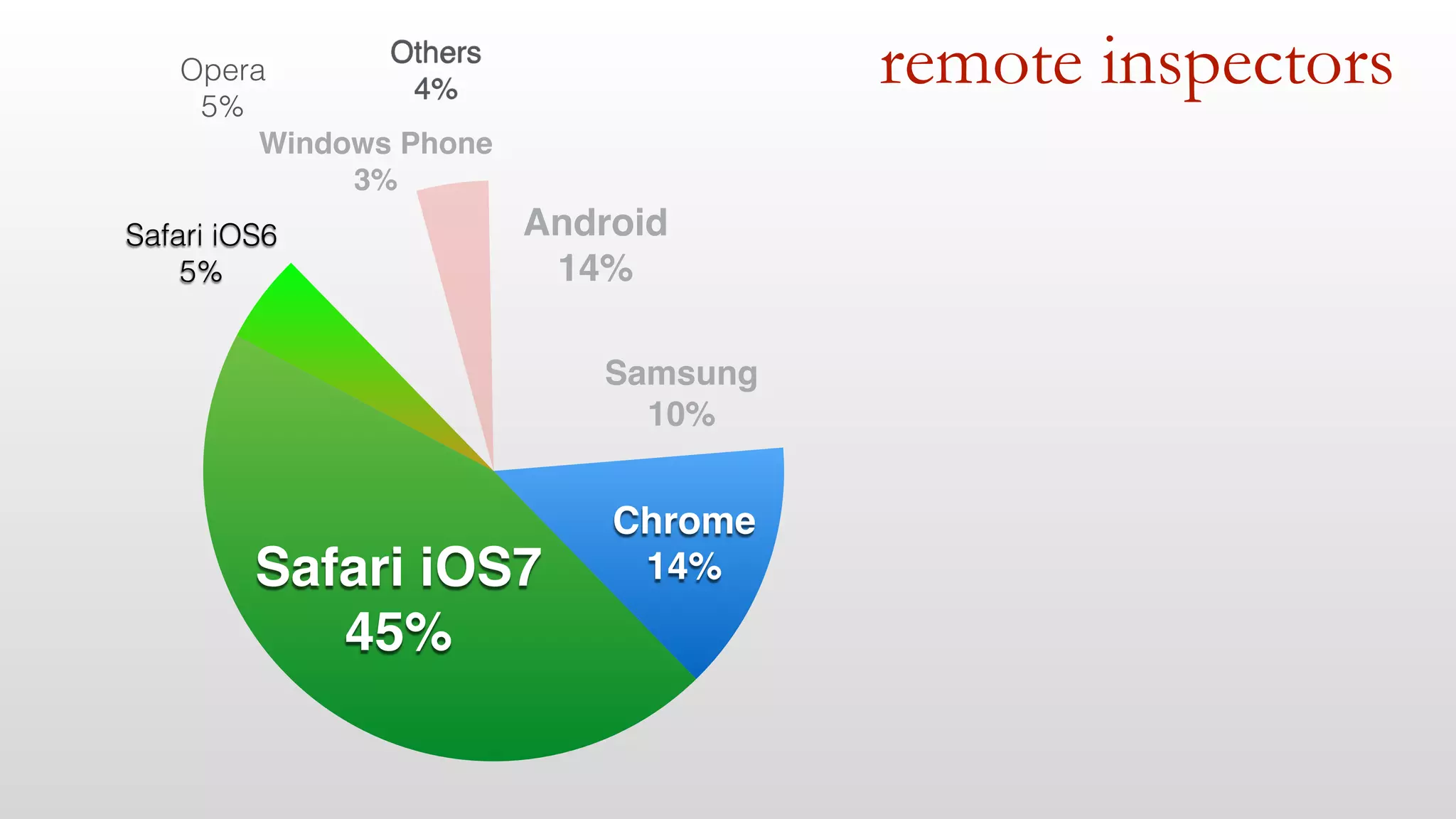
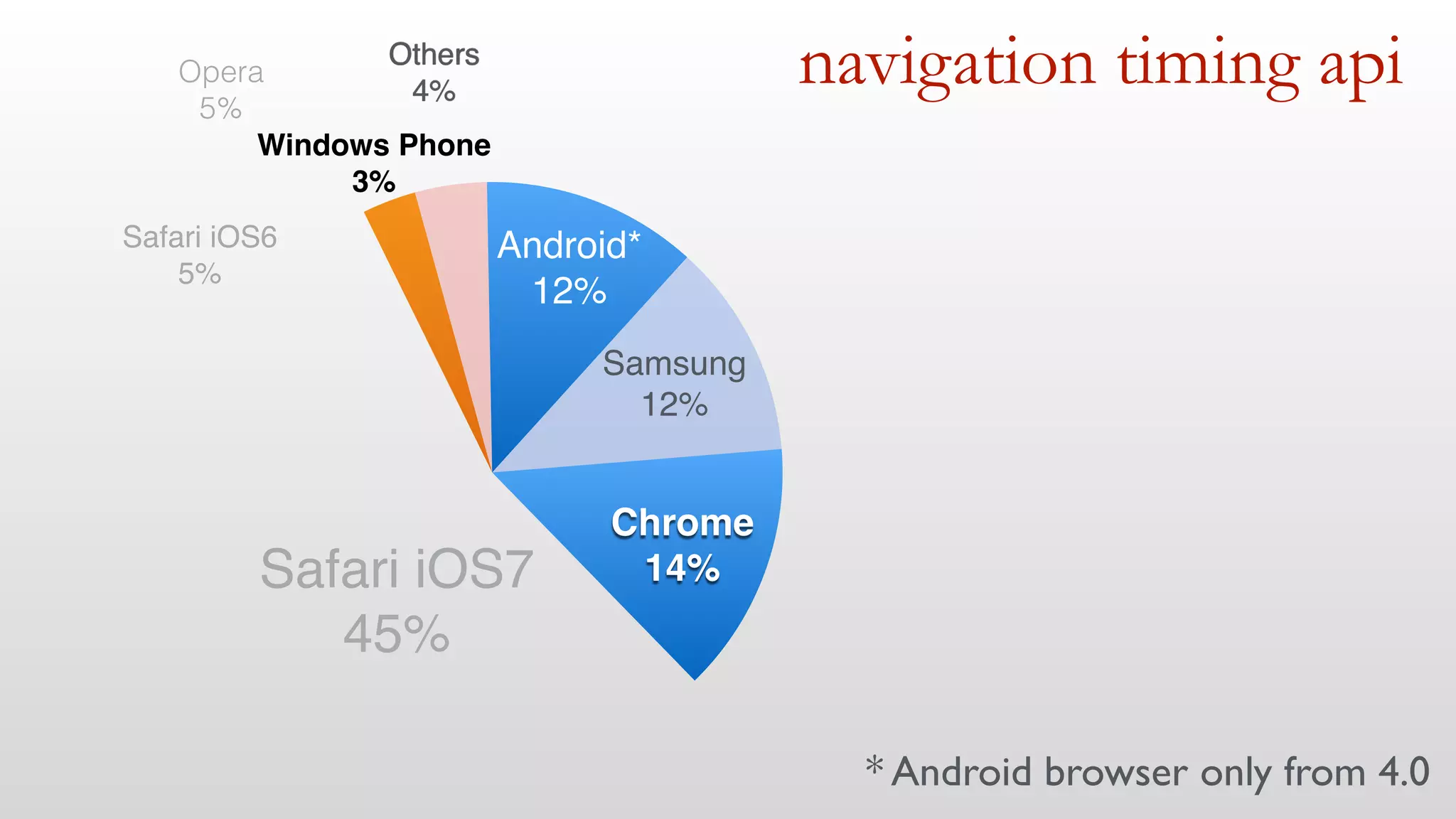
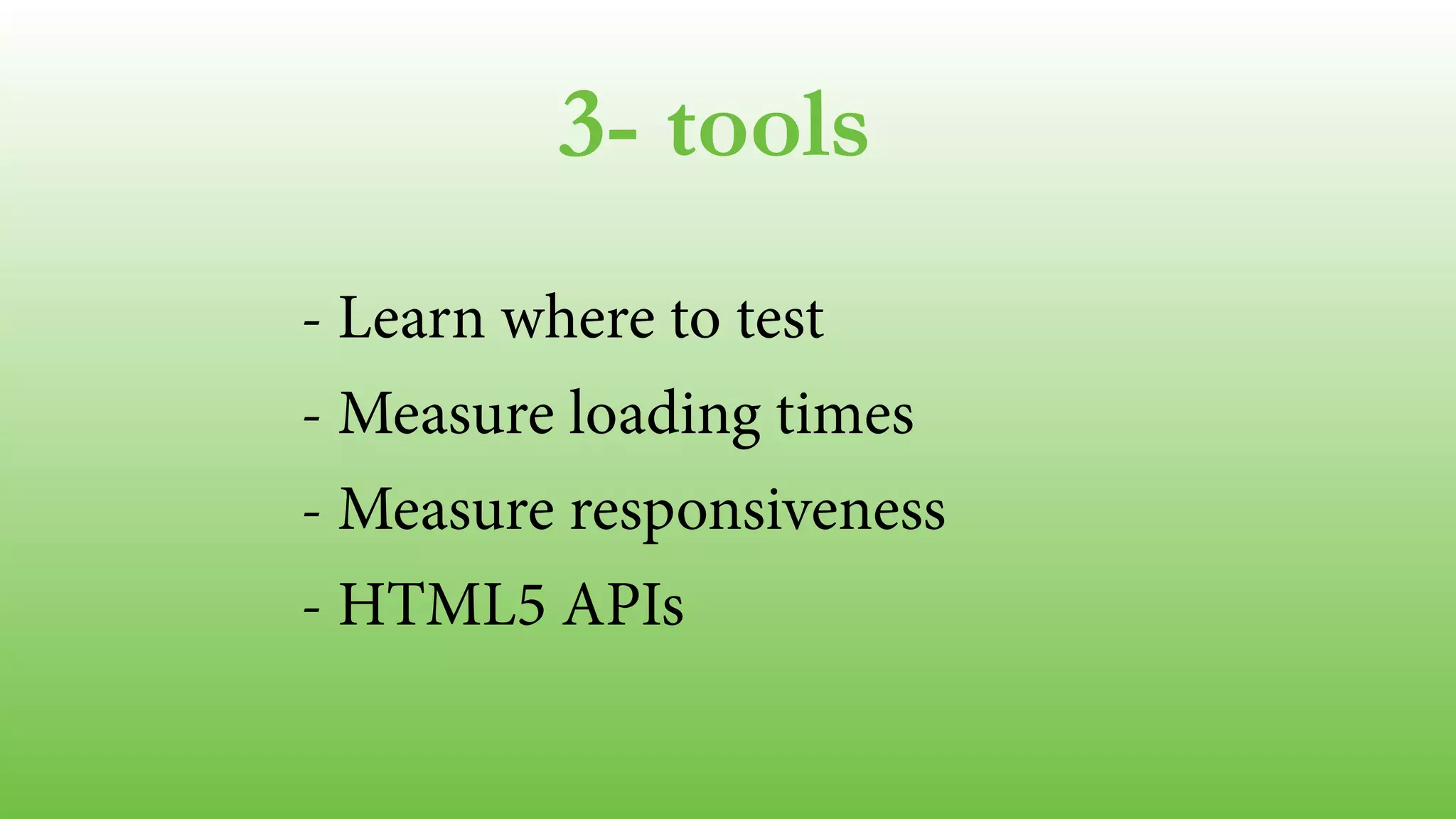
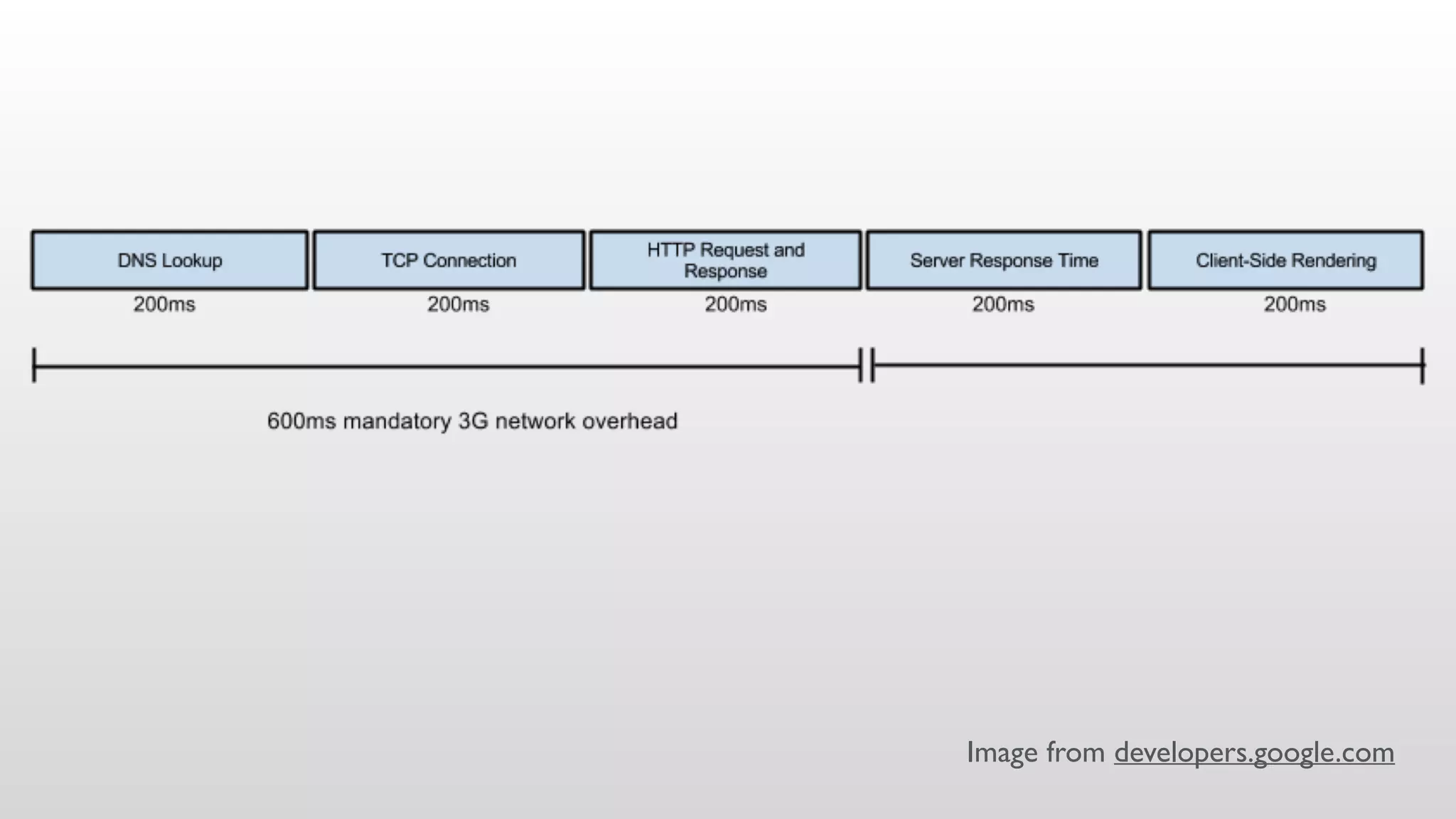
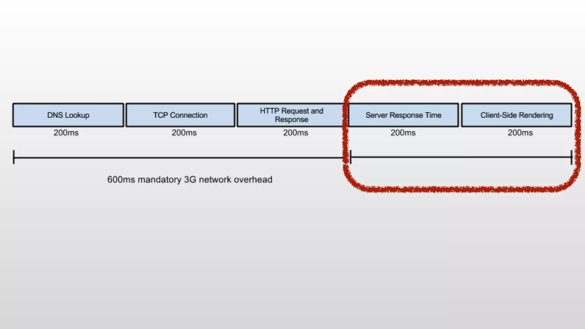
extreme web 
performance for 
mobile devices 
maximiliano @firtman 
firt.mobi 
New York, Sep 15 2014
Slides, links and tests 
firtman.github.io/velocity
questions 
yes, please 
! 
QA at the end 
office hours tomorrow
performance + mobile + web 
1- Mobile Web today 
2- Performance & Mobile 
3- Tools 
4- Initial loading & perception 
5- Responsiveness & experience
1- mobile web today* 
*today: september 2014
1- mobile web today 
- Web Platforms 
- The Android’s problem
web platforms
web platforms 
iOS and Android
Links at firt.mobi/velocity web platforms 
Adobe Digital Index 
NetMarketShare 
Akamai.io 
Wikimedia Stats 
StatCounter 
MOVR by WURFL
web platforms 
Windows Phone 
Others 
4% 
3% 
Opera 
5% 
iOS! 
50% 
Android! 
38%
web platforms 
Windows Phone 
Others 
4% 
3% 
Opera 
5% 
iOS! 
50% 
Android! 
38% 
Others? 
• Firefox 
• UC Browser 
• Nokia Browser 
• BlackBerry Browser
web platforms 
iOS! 
50% 
Safari! 
100%
web platforms 
iOS! 
50% 
6.x! 
11% 
7.x! 
89% 
Source: Apple
web platforms 
Safari iOS6 
5% 
Safari iOS7! 
45% 
Android! 
38%
web platforms 
Android! 
38%
web platforms 
Android! 
38% 
Browser! 
64% 
Chrome! 
36%
web platforms
web platforms
web platforms
LG G3
web platforms 
Android! 
38% 
Samsung! 
22% 
Browser! 
42% 
Chrome! 
36%
web platforms 
Android! 
38% 
4.4 
2.3 
4.1-4.3 
4.0 
Source: Android Dashboard
web platforms 
Windows Phone 
Others 
4% 
3% 
Opera 
5% 
iOS! 
50% 
Android! 
38%
web platforms 
Samsung! 
10% 
Android! 
15% 
Others 
4% 
Windows Phone 
3% 
Opera 
5% 
Safari iOS6 
5% 
Safari iOS7! 
45% 
Chrome! 
14% 
Others? 
• Firefox 
• UC Browser 
• Nokia Browser 
• BlackBerry Browser
1- mobile web today 
- Understand the real ecosystem 
- Android browsers 
- Don’t think you are an average user 
- May change future
2- mobile & performance 
- Perception 
- Differences 
- Cellular networks 
- Responsive Web Design
immediate feedback 100ms 
! 
perception 
Jakob Nielsen - Usability Engineering
perception 
immediate feedback 100ms 
losing user’s flow of thoughts 1s 
Jakob Nielsen - Usability Engineering
perception 
500ms delay, +26% user’s frustration 
Source: Radware
why do we need special 
care on mobile?
CPU and GPU 
Memory 
differences
CPU and GPU 
Memory 
differences 
5x
Long tail persists 
differences 
Source: MOVR by ScientiaMobile
Wifi 
differences
differences 
Wifi, public spaces?
differences 
Cellular connections
We have 4G! We don't need to 
worry about performance... 
( 
)
cellular 
100 
75 
50 
25 
0 
4G 2G/3G 
Only 4% is on 4G globally 
US Western Europe Asia Global
cellular 
100 
75 
50 
25 
0 
4G 2G/3G 
~30% of the time 4G was not used 
US Western Europe Asia Global
cellular networks 
Real Bandwidth (Mbps) 
2G 3G Wifi 4G 
0 2 4 6 8
RTT - latency 
cellular networks 
2G 
3G 
4G 
Home 
Min Max 
0 250 500 750 1000
latency 
request 
bandwidth
responsive web design
Responsive Web Design 
is a TOOL
Responsive Web Design 
is NOT a GOAL
Users DON’T care if your site is 
RESPONSIVE 
(in terms of RWD)
Users DO care if the site is 
FAST
Page size 
mobile vs desktop 
responsive web design 
Much smaller! 
6% 
Slightly smaller! 
22% 
Same Size! 
72% 
Source: guypo.com
Superbowl advertisers 
mobile approach 
responsive web design 
Responsive site! 
50% 
Desktop! 
7% 
Mobile ! 
43% 
Source: blogs.keynote.com
2- mobile and performance 
- Perception: 1s threshold 
- RTT latency 
- Test on low hardware and 2G/3G 
!
3- tools
3- tools 
- where 
- measuring loading times 
- measuring responsiveness 
- online tools 
- html5 apis
Simulator & Emulator 
Real device 
where
emulators 
Samsung! 
10% 
Android! 
14% 
Others! 
4% 
Windows Phone 
3% 
Opera 
5% 
Safari iOS6 
5% 
Safari iOS7! 
45% 
Chrome! 
14%
emulators 
Samsung! 
10% 
Android! 
14% 
Others! 
4% 
Windows Phone! 
3% 
Opera 
5% 
Safari iOS6 
5% 
Safari iOS7! 
45% 
Chrome! 
14%
emulators 
Samsung! 
10% 
Android! 
14% 
Others! 
4% 
Windows Phone 
3% 
Opera 
5% 
Safari iOS6 
5% 
Safari iOS7! 
45% 
Chrome! 
14%
DEMO
online tools
online tools
remote inspectors
remote inspectors 
Android! 
14% 
Samsung! 
10% 
Others! 
4% 
Windows Phone! 
3% 
Opera 
5% 
Safari iOS6 
5% 
Safari iOS7! 
45% 
Chrome! 
14%
Measuring 
DEMO
Proxies / Network sniffers 
• Charles Proxy 
• Fiddler 
tools 
Image from telerik fiddler
Connection simulators 
tools 
• Network link conditioner (Mac/iOS) 
• Charles Proxy 
• Clumsy for Windows 
• Net Limiter for Windows 
• SlowyApp for Mac 
• Chrome Developer Tools
Navigation Timing API 
• window.performance 
• Timestamps available 
html5 apis
navigation timing api 
Android*! 
12% 
Samsung! 
12% 
Others! 
4% 
Windows Phone! 
3% 
Opera 
5% 
Safari iOS6! 
5% 
Safari iOS7! 
45% 
Chrome! 
14% 
* Android browser only from 4.0
Navigation Timing API 
html5 apis 
In just 2 days…
navigation timing api 
Android! 
12% 
Samsung! 
12% 
Others! 
4% 
Windows Phone! 
3% 
Opera 
5% 
Safari iOS6/7! 
15% 
Safari iOS8! 
35% 
Chrome! 
14% 
in a few weeks…
Navigation Timing API 
html5 apis 
DEMO
Resource Timing API 
• Information per resource 
• Chrome and IE11 only 
html5 apis
Network information API 
html5 apis 
• Android Browser, Silk (spec #1) type 
• BlackBerry 10, old Firefox (spec #2) bandwidth 
• Firefox, Chrome for Android 38+ (spec #3) type
3- tools 
- Learn where to test 
- Measure loading times 
- Measure responsiveness 
- HTML5 APIs 
!
4- initial loading & perception
4- initial loading & perception 
- 1 second threshold 
- classic checklist 
- ATF and the rest 
- responsive web design 
- future visits
Image from developers.google.com
What!!? Do you expect a page load 
in 200ms? 
( 
)
No really, we just need the 
PERCEPTION
Let’s see 
HOW
= REDIRECTS
Redirects 
• From 150 to 1000 ms per redirect 
• mydomain.com -> m.mydomain.com 
• URL shorteners
Redirects 
DEMO
= APP BANNER
• From 1 to 5s
idontwantyourfuckingapp.tumblr.com
Basic browser behavior 
• Network Fetch 
• Parsing 
• Rendering
Basic browser behavior 
HTML 
JS CSS
Basic browser behavior 
HTML 
JS CSS 
BLOCKS PARSING BLOCKS RENDERING
The 14K limit
The 14K limit 
RTT 
• TCP slow start 
• Initial congestion window: ~14.6Kb (compressed) 
• > 14Kb will create another roundtrip
We need to separate 
ABOVE THE FOLD (ATF) 
content
ATF in 1s = 1 RTT ~ < 14Kb 
! 
! 
HTML + CSS + JavaScript 
Images? 
ATF
Avoid JavaScript frameworks 
ATF 
• Embrace Vanilla JS 
• If you really need them, load them after ATF 
• Think on alternatives or partial frameworks
Careful with Data URI in CSS 
ATF 
• Images are non-blocking by default 
• Using Data URI in CSS creates blocking images 
• Use them only on non-ATF external CSS
Compress resources 
• Use Gzip in HTTP 
• For text-based files only
Client side rendering 
ATF 
• Careful with client-side frameworks 
• Try to render the initial view server-side 
• Render at least a basic view
Client side rendering 
ATF 
• Careful with client-side frameworks 
• Try to render the initial view server-side 
• Render at least a basic view 
5x
Use illusion tricks 
ATF 
• Loading content animation 
• Minimal-ui viewport ASAP (RIP) 
• Remember to keep the user engaged in 1s
Web Fonts 
• Blocks text rendering 
• Fonts are bigger than 14Kb 
• Use them with care 
• Remove characters 
• Simplify glyphs 
ATF
Responsive Web Design
Responsive Web Design 
• Media queries block rendering (all of them) 
• ATF content on mobile is not the same
DON’T rely on 
RWD techniques only 
for first view
RESPONSIVE WEB DESIGN 
is the future
We are not saying go m.*
Responsive Web Design 
• Using same URL for mobile/desktop still a good a idea 
• Mix it with RESS / adaptive web design 
• Load media queries CSS async 
• Use server-side libraries 
• WURFL or DeviceAtlas
After ATF is ready 
• Load rest of your content 
• Gain experience while rendering ATF: 
current performance, screen density, bandwidth 
• Make decisions: HD/SD
Async scripts 
<script async src=""></script> HTML5
Defer non-ATF CSS 
• No defer or async attributes (yet) 
• Inject <link> after rendering 
• load, requestAnimationFrame
Speed future visits 
• Be cache friendly 
• Use Application Cache for ATF content 
• Create a custom cache
4- initial loading & perception 
- ATF in 1s (illusion) 
- No redirects, GZip, no scripts 
- Only ATF CSS, careful with fonts 
- Defer anything else 
!
5- responsiveness & experience
4- responsiveness & experience 
- consistent frame rate 
- immediate feedback 
- scrolling 
- your new enemy
consistent fps 
Keep framerate high and consistent 
• Main UI thread as free as possible 
• Avoid repainting (software bitmap calculations)
JavaScript 
framerate 
• Avoid DOM manipulations inside loops/scroll 
var e = document.querySelector("#test"); 
for (var i=0; i<100; i++) { 
// change e attributes 
}); 
JAVASCRIPT
CSS 
framerate 
• Promote GPU layers smartly 
selector { 
-webkit-transform: translateZ(0); 
-webkit-perspective: 1000; 
} 
! 
selector { 
z-index: 10; 
} 
CSS
Animations 
framerate 
• Don’t animate from JavaScript for basic stuff 
• Use requestAnimationFrame
remember 100ms immediate 
feedback?
Immediate feedback 
• The 300ms delay 
! 
• mobile viewport (“user-scalable=no” on some browsers) 
• FastClick solution
Immediate feedback 
! 
• FastClick solution
Immediate feedback 
! 
• Mobile Viewport on Chrome 
<meta name=viewport 
content="width=device-width"> 
HTML
Immediate feedback 
! 
• Mobile Fixed Viewport on IE 
<meta name=viewport 
content="width=device-width, 
user-scalable=no" > 
HTML
Immediate feedback 
! 
• CSS on IE 
html { 
-ms-touch-action: manipulation; 
touch-action: manipulation; 
} 
CSS
Distract the user
Storage for immediate feedback 
• web storage vs web sql vs indexeddb 
• think about async vs sync 
• Finally IndexedDB on iOS 8!
navigator.geolocation 
JAVASCRIPT 
.getCurrentPosition(cbOK, cbKO, 
{ maximumAge: 60000 }); 
Geolocation cache
Scrolling
Scrolling 
• avoid re-painting 
• use touch overflow for momentum 
• don’t use JavaScript scrollers 
• on large scrolling areas: copy native
Large scrolling areas 
Let’s copy native frameworks: 
• iOS: UITableView 
• Android: ListView & Adapters
Large scrolling areas 
• Object pool 
!
Infinite scroll 
• DOM vs. iframe vs. object pool 
• changes on iOS8
Your new enemy
NOT THE USER
YOUR DESIGNER
Careful with some design features 
• GPU vs CPU repaint 
• Important on scroll, transitions & animations
Careful with some design features 
• Transforms: translate, scale, rotate and opacity GPU 
• border-radius, gradients, shadows, filters CPU repaint
300 CSS pixels 
device px px ratio 
300 1.00 
390 1.30 
450 1.50 
600 2.00 
672 2.24 
900 3.00 
1200 4.00 
! 
Firefox OS 
Nexus 7 
Galaxy SII 
iPhone 5/6 
BB Z10 
iPhone 6 Plus 
LG G3
Careful with some design features 
• Deliver super high resolution images
5- responsiveness & experience 
- 100s feedback 
- Consistent fps 
- Avoid CPU repaints 
- Embrace GPU smartly 
- Profile & test 
!
uf! we've 
covered a lot! 
Picture from Simon Howden freedigitalphotos.net!
1- Mobile Web today 
2- Mobile Performance 
3- Tools 
4- Initial load & perception 
5- Responsiveness & experience
Slides, links and tests 
firtman.github.io/velocity
final thoughts 
- measure and profile on the real world 
- don’t redirect, reduce requests 
- atf content in 1s, defer the rest 
- be simple, be aggressive
you can reach a good experience 
Book signing: firt.mobi/pmw 
Wed 10.45am 
Office Hours: 
Tue 10.45am 
twitter: @firt 
mobilexweb.com 
Pictures)from)freedigitalphotos.net)

Extreme Web Performance for Mobile Devices - Velocity NY