Events profile_page_1234869680124198-3
•
0 likes•329 views
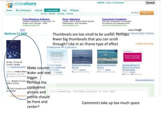
This document provides feedback on improving a user interface. It suggests making fewer but larger thumbnails that can be scrolled through, widening columns and increasing text size. It also recommends moving the conference picture and profile to the front, and reducing the size of comments to minimize wasted space. The sidebar could be more unified by creating a consistent visual flow from top to bottom rather than mixing different element types.
Report
Share
Report
Share

Recommended
Events Profile Page 1234869680124198 3
The document discusses improving thumbnail images on a website. It suggests using fewer but larger thumbnails that can be scrolled through like in an iframe. It also comments that the current comments take up too much space and the sidebar contains a mixture of different unsized elements, making it confusing. Reducing the size of comments and unifying the style and sizing of sidebar elements is recommended.
Cincinnati Tableau User Group Event #6
The document summarizes an agenda for a Tableau user group meeting in Cincinnati. The summary is:
1. The meeting will include presentations on using Tableau at the University of Cincinnati and a collaboration project. Attendees are encouraged to socialize.
2. Future events will focus on topics like hands-on learning and work experiences with Tableau. Locations, times, and topics are open for input.
3. Attendees are invited to join the Cincinnati Tableau user group page to receive updates and connect with other members.
Cincinnati Tableau User Group Event #8 (Mapping)
This document summarizes an upcoming Tableau user group event focused on mapping. The event will include tips and tricks on spatial data preparation, dual axis maps, and custom geographies. Attendees can learn about custom maps and customization techniques. The group meets monthly to discuss Tableau topics and networking opportunities are provided.
Cincinnati Tableau User Group Event #5
Cincinnati Tableau User Group Event #5 Presentation (Data Visualization Design Tips - Russell Spangler)
Tarea uned recursos audivisuales
Este documento habla sobre diferentes tipos de programas educativos como tutoriales, simuladores y programas de aprendizaje. Explica que los tutoriales incluyen una guía paso a paso para ayudar a los estudiantes a comprender conceptos y aplicarlos de manera interactiva. También describe que los simuladores permiten realizar prácticas a través de gráficos y animaciones para estimular a los estudiantes de una manera similar a situaciones reales. Finalmente, menciona que algunos programas buscan poner al estudiante en diferentes roles para que ten
Nectec Reports Post Today 081009
NECTEC reported traffic conditions in Bangkok via Twitter to provide real-time updates to drivers. The National Electronics and Computer Technology Center (NECTEC) used data from CCTV cameras and GPS systems to monitor traffic and post congestion levels on major roads. This allowed drivers to choose alternate routes to avoid delays based on the Twitter traffic updates from NECTEC.
LisVarelaResume
This document is a resume for Lis Varela that summarizes her employment history, education, skills, and experience. It lists her contact information and outlines her graphic design and media specialist experience at The Gathering and Sandy Robbins and Associates. Her skills include package design, page layout, branding, typography, photography, 3D rendering, and she has a degree in graphic design from the Fashion Institute of Design and Merchandising in Los Angeles.
Seja feliz e_pronto
1) A idiotice e a capacidade de rir de si mesmo são essenciais para a felicidade e para manter o relacionamento com o parceiro.
2) Ser adulto não significa perder a capacidade de brincar, contar piadas, e desfrutar dos pequenos prazeres da vida.
3) É importante viver intensamente cada momento e não se preocupar demais com problemas, pois a vida é passageira.
Maltrato infantil
Este documento habla sobre el maltrato infantil y cómo reconocerlo. Explica que el maltrato puede ser físico, emocional, sexual o por abandono y describe algunos signos que pueden indicar que un niño está siendo maltratado, como moretones, cambios de comportamiento o actitudes sexualizadas. También explica cómo saber si los padres no se preocupan adecuadamente por el bienestar de sus hijos, como no asistir a reuniones escolares o expresar poco afecto.
ot 204 Wozu Projektmanagement esp1-corrected
El documento explica qué es la administración de proyectos y por qué es importante. La administración de proyectos ayuda a garantizar que los proyectos se completen a tiempo y dentro del presupuesto para ayudar a las empresas a sobrevivir en mercados competitivos. Los proyectos son objetivos temporales distintos de los procesos regulares de una empresa. La administración de proyectos utiliza métodos para identificar riesgos tempranos y mantener el equilibrio entre el costo, el tiempo y la calidad de un proyecto.
Untitled
Construction can be divided into four main types: industrial, residential, commercial, and public works. Industrial construction includes factories and manufacturing facilities, while residential focuses on houses and apartment buildings. Commercial construction builds office buildings, malls, and other business structures, and public works deals with infrastructure projects like roads, bridges, dams, and government buildings.
Animation test
This document discusses testing animations on SlideShare. SlideShare allows users to upload PowerPoint and Keynote presentations which can include animations. The document tests different types of animations on SlideShare to see how they appear and function when viewed online rather than in the original presentation software.
Technology will save our minds & bodies presentation
This document discusses the history and future of medical technology. It describes how medical technology has advanced from early inventions like the ophthalmoscope to modern devices like electronic aspirin implants and gene editing using CRISPR. Electronic aspirin stimulates nerves to relieve headaches, while CRISPR allows precise genetic editing. The document also discusses upcoming water purification systems to provide safe drinking water and prevent disease in developing nations. Overall, the document outlines how medical technology has improved healthcare and argues it will continue doing so in the future.
Emigracion Gallega a Europa
España experimentó una gran emigración a otros países europeos en los años 1960 debido a la falta de oportunidades económicas. El gobierno español firmó acuerdos con otros países para regular y aprovechar esta emigración, enviando trabajadores no cualificados. Miles de españoles emigraron con el objetivo de trabajar duro y ahorrar dinero para mejorar su situación económica y la de sus familias.
Puppet barcampexercises.jzt
This document provides an introduction to using Puppet including quick primers on its basic concepts like resources, classes, nodes, and data parameters. It also gives examples of useful Puppet commands and demonstrates how to configure sudoers permissions on different operating systems using Puppet manifests and inheriting classes. References for additional Puppet documentation and guides are provided at the end.
Linktest
This one sentence document appears to be a title or heading stating "Presentation With link in notes". It suggests that a presentation contains a link included in the notes section.
More Related Content
Viewers also liked
Maltrato infantil
Este documento habla sobre el maltrato infantil y cómo reconocerlo. Explica que el maltrato puede ser físico, emocional, sexual o por abandono y describe algunos signos que pueden indicar que un niño está siendo maltratado, como moretones, cambios de comportamiento o actitudes sexualizadas. También explica cómo saber si los padres no se preocupan adecuadamente por el bienestar de sus hijos, como no asistir a reuniones escolares o expresar poco afecto.
ot 204 Wozu Projektmanagement esp1-corrected
El documento explica qué es la administración de proyectos y por qué es importante. La administración de proyectos ayuda a garantizar que los proyectos se completen a tiempo y dentro del presupuesto para ayudar a las empresas a sobrevivir en mercados competitivos. Los proyectos son objetivos temporales distintos de los procesos regulares de una empresa. La administración de proyectos utiliza métodos para identificar riesgos tempranos y mantener el equilibrio entre el costo, el tiempo y la calidad de un proyecto.
Untitled
Construction can be divided into four main types: industrial, residential, commercial, and public works. Industrial construction includes factories and manufacturing facilities, while residential focuses on houses and apartment buildings. Commercial construction builds office buildings, malls, and other business structures, and public works deals with infrastructure projects like roads, bridges, dams, and government buildings.
Animation test
This document discusses testing animations on SlideShare. SlideShare allows users to upload PowerPoint and Keynote presentations which can include animations. The document tests different types of animations on SlideShare to see how they appear and function when viewed online rather than in the original presentation software.
Technology will save our minds & bodies presentation
This document discusses the history and future of medical technology. It describes how medical technology has advanced from early inventions like the ophthalmoscope to modern devices like electronic aspirin implants and gene editing using CRISPR. Electronic aspirin stimulates nerves to relieve headaches, while CRISPR allows precise genetic editing. The document also discusses upcoming water purification systems to provide safe drinking water and prevent disease in developing nations. Overall, the document outlines how medical technology has improved healthcare and argues it will continue doing so in the future.
Emigracion Gallega a Europa
España experimentó una gran emigración a otros países europeos en los años 1960 debido a la falta de oportunidades económicas. El gobierno español firmó acuerdos con otros países para regular y aprovechar esta emigración, enviando trabajadores no cualificados. Miles de españoles emigraron con el objetivo de trabajar duro y ahorrar dinero para mejorar su situación económica y la de sus familias.
Viewers also liked (11)
Technology will save our minds & bodies presentation
Technology will save our minds & bodies presentation
More from som_nangia
Puppet barcampexercises.jzt
This document provides an introduction to using Puppet including quick primers on its basic concepts like resources, classes, nodes, and data parameters. It also gives examples of useful Puppet commands and demonstrates how to configure sudoers permissions on different operating systems using Puppet manifests and inheriting classes. References for additional Puppet documentation and guides are provided at the end.
Linktest
This one sentence document appears to be a title or heading stating "Presentation With link in notes". It suggests that a presentation contains a link included in the notes section.
Testspeakernotes 090715053843 Phpapp02
Lifeblob allows users to create an online diary of life events. PicPorta is an image recognition engine for organizing visual content, similar to Riya.com. Storrz is an ecommerce site aiming to be a social shopping destination, tying up with mid-sized merchants instead of big brands. Eko looks promising as a microfinancial service using cell phones as banking instruments for lower income groups in India.
How Stupid Can We Get
This document explores different levels or extremes of human traits and behaviors. It provides examples of secrecy being offering blank business cards, laziness being asking for a ride while out walking, craziness being getting a blank paper copied, forgetfulness being seeing oneself in the mirror and trying to remember when you last saw that person, stupidity being looking through the keyhole of a glass door, honesty being a pregnant woman taking one and a half tickets, suicide being a dwarf jumping off a footpath, and dehydration being a cow giving milk powder.
Psgi Plack Sfpm
PSGI and Plack provide a common interface (PSGI) and shared infrastructure (Plack) for building web applications and frameworks in Perl. PSGI defines a standard way for applications to communicate with web servers through a request/response interface. Plack provides many server implementations like FastCGI and standalone that can run PSGI applications. It also includes middleware, testing tools, and utilities to help developers. This new approach allows frameworks and applications to focus on their logic while reusing common plumbing through PSGI and Plack.
Audio one_in_each_slide
This document provides an overview of corporate blogging, including statistics on the prevalence of blogs, the key elements and components of effective blogs, and ways that companies can use blogs for knowledge management, marketing, and branding. It discusses why companies should blog and what topics they could cover, and provides examples of focused corporate blogs. The presentation also addresses tracking blog usage, metrics on corporate blogging adoption, and resources for learning more about starting a company blog.
Animation test
This document discusses testing animations on SlideShare. SlideShare allows users to upload PowerPoint and Keynote presentations which can include animations. The document tests different types of animations on SlideShare to see how they appear and function when viewed online rather than in the original presentation software.
Futureoftheinternetciscocarriergradeipv6solutioncgv6 091110191821 Phpapp01
The document discusses the need to transition to IPv6 due to the depletion of IPv4 addresses and exponential growth of internet-enabled devices. It introduces Cisco's Carrier-Grade IPv6 solution, which enables an incremental transition starting at the network core and edge to maximize coverage, performance and minimize costs. The solution helps networks and businesses prepare for, prosper with, and preserve existing IPv4 investments during the transition to IPv6.
Pwnotes 1234179558850871-1
This short document consists of three repetitions of the phrase "Hello Presentation with notes". It appears to be testing or practicing a presentation with notes but does not provide any other context or information.
More from som_nangia (20)
Futureoftheinternetciscocarriergradeipv6solutioncgv6 091110191821 Phpapp01
Futureoftheinternetciscocarriergradeipv6solutioncgv6 091110191821 Phpapp01
Recently uploaded
"Choosing proper type of scaling", Olena Syrota
Imagine an IoT processing system that is already quite mature and production-ready and for which client coverage is growing and scaling and performance aspects are life and death questions. The system has Redis, MongoDB, and stream processing based on ksqldb. In this talk, firstly, we will analyze scaling approaches and then select the proper ones for our system.
Energy Efficient Video Encoding for Cloud and Edge Computing Instances
Energy Efficient Video Encoding for Cloud and Edge Computing Instances
Skybuffer SAM4U tool for SAP license adoption
Manage and optimize your license adoption and consumption with SAM4U, an SAP free customer software asset management tool.
SAM4U, an SAP complimentary software asset management tool for customers, delivers a detailed and well-structured overview of license inventory and usage with a user-friendly interface. We offer a hosted, cost-effective, and performance-optimized SAM4U setup in the Skybuffer Cloud environment. You retain ownership of the system and data, while we manage the ABAP 7.58 infrastructure, ensuring fixed Total Cost of Ownership (TCO) and exceptional services through the SAP Fiori interface.
Generating privacy-protected synthetic data using Secludy and Milvus
During this demo, the founders of Secludy will demonstrate how their system utilizes Milvus to store and manipulate embeddings for generating privacy-protected synthetic data. Their approach not only maintains the confidentiality of the original data but also enhances the utility and scalability of LLMs under privacy constraints. Attendees, including machine learning engineers, data scientists, and data managers, will witness first-hand how Secludy's integration with Milvus empowers organizations to harness the power of LLMs securely and efficiently.
Dandelion Hashtable: beyond billion requests per second on a commodity server
This slide deck presents DLHT, a concurrent in-memory hashtable. Despite efforts to optimize hashtables, that go as far as sacrificing core functionality, state-of-the-art designs still incur multiple memory accesses per request and block request processing in three cases. First, most hashtables block while waiting for data to be retrieved from memory. Second, open-addressing designs, which represent the current state-of-the-art, either cannot free index slots on deletes or must block all requests to do so. Third, index resizes block every request until all objects are copied to the new index. Defying folklore wisdom, DLHT forgoes open-addressing and adopts a fully-featured and memory-aware closed-addressing design based on bounded cache-line-chaining. This design offers lock-free index operations and deletes that free slots instantly, (2) completes most requests with a single memory access, (3) utilizes software prefetching to hide memory latencies, and (4) employs a novel non-blocking and parallel resizing. In a commodity server and a memory-resident workload, DLHT surpasses 1.6B requests per second and provides 3.5x (12x) the throughput of the state-of-the-art closed-addressing (open-addressing) resizable hashtable on Gets (Deletes).
Northern Engraving | Nameplate Manufacturing Process - 2024
Manufacturing custom quality metal nameplates and badges involves several standard operations. Processes include sheet prep, lithography, screening, coating, punch press and inspection. All decoration is completed in the flat sheet with adhesive and tooling operations following. The possibilities for creating unique durable nameplates are endless. How will you create your brand identity? We can help!
Essentials of Automations: Exploring Attributes & Automation Parameters
Building automations in FME Flow can save time, money, and help businesses scale by eliminating data silos and providing data to stakeholders in real-time. One essential component to orchestrating complex automations is the use of attributes & automation parameters (both formerly known as “keys”). In fact, it’s unlikely you’ll ever build an Automation without using these components, but what exactly are they?
Attributes & automation parameters enable the automation author to pass data values from one automation component to the next. During this webinar, our FME Flow Specialists will cover leveraging the three types of these output attributes & parameters in FME Flow: Event, Custom, and Automation. As a bonus, they’ll also be making use of the Split-Merge Block functionality.
You’ll leave this webinar with a better understanding of how to maximize the potential of automations by making use of attributes & automation parameters, with the ultimate goal of setting your enterprise integration workflows up on autopilot.
Artificial Intelligence and Electronic Warfare
Artificial Intelligence and Electronic WarfarePapadakis K.-Cyber-Information Warfare Analyst & Cyber Defense/Security Consultant-Hellenic MoD
AI & Electronic WarfareApps Break Data
How information systems are built or acquired puts information, which is what they should be about, in a secondary place. Our language adapted accordingly, and we no longer talk about information systems but applications. Applications evolved in a way to break data into diverse fragments, tightly coupled with applications and expensive to integrate. The result is technical debt, which is re-paid by taking even bigger "loans", resulting in an ever-increasing technical debt. Software engineering and procurement practices work in sync with market forces to maintain this trend. This talk demonstrates how natural this situation is. The question is: can something be done to reverse the trend?
[OReilly Superstream] Occupy the Space: A grassroots guide to engineering (an...
The typical problem in product engineering is not bad strategy, so much as “no strategy”. This leads to confusion, lack of motivation, and incoherent action. The next time you look for a strategy and find an empty space, instead of waiting for it to be filled, I will show you how to fill it in yourself. If you’re wrong, it forces a correction. If you’re right, it helps create focus. I’ll share how I’ve approached this in the past, both what works and lessons for what didn’t work so well.
Programming Foundation Models with DSPy - Meetup Slides
Prompting language models is hard, while programming language models is easy. In this talk, I will discuss the state-of-the-art framework DSPy for programming foundation models with its powerful optimizers and runtime constraint system.
GraphRAG for LifeSciences Hands-On with the Clinical Knowledge Graph
Tomaz Bratanic
Graph ML and GenAI Expert - Neo4j
Introduction of Cybersecurity with OSS at Code Europe 2024
I develop the Ruby programming language, RubyGems, and Bundler, which are package managers for Ruby. Today, I will introduce how to enhance the security of your application using open-source software (OSS) examples from Ruby and RubyGems.
The first topic is CVE (Common Vulnerabilities and Exposures). I have published CVEs many times. But what exactly is a CVE? I'll provide a basic understanding of CVEs and explain how to detect and handle vulnerabilities in OSS.
Next, let's discuss package managers. Package managers play a critical role in the OSS ecosystem. I'll explain how to manage library dependencies in your application.
I'll share insights into how the Ruby and RubyGems core team works to keep our ecosystem safe. By the end of this talk, you'll have a better understanding of how to safeguard your code.
5th LF Energy Power Grid Model Meet-up Slides
5th Power Grid Model Meet-up
It is with great pleasure that we extend to you an invitation to the 5th Power Grid Model Meet-up, scheduled for 6th June 2024. This event will adopt a hybrid format, allowing participants to join us either through an online Mircosoft Teams session or in person at TU/e located at Den Dolech 2, Eindhoven, Netherlands. The meet-up will be hosted by Eindhoven University of Technology (TU/e), a research university specializing in engineering science & technology.
Power Grid Model
The global energy transition is placing new and unprecedented demands on Distribution System Operators (DSOs). Alongside upgrades to grid capacity, processes such as digitization, capacity optimization, and congestion management are becoming vital for delivering reliable services.
Power Grid Model is an open source project from Linux Foundation Energy and provides a calculation engine that is increasingly essential for DSOs. It offers a standards-based foundation enabling real-time power systems analysis, simulations of electrical power grids, and sophisticated what-if analysis. In addition, it enables in-depth studies and analysis of the electrical power grid’s behavior and performance. This comprehensive model incorporates essential factors such as power generation capacity, electrical losses, voltage levels, power flows, and system stability.
Power Grid Model is currently being applied in a wide variety of use cases, including grid planning, expansion, reliability, and congestion studies. It can also help in analyzing the impact of renewable energy integration, assessing the effects of disturbances or faults, and developing strategies for grid control and optimization.
What to expect
For the upcoming meetup we are organizing, we have an exciting lineup of activities planned:
-Insightful presentations covering two practical applications of the Power Grid Model.
-An update on the latest advancements in Power Grid -Model technology during the first and second quarters of 2024.
-An interactive brainstorming session to discuss and propose new feature requests.
-An opportunity to connect with fellow Power Grid Model enthusiasts and users.
Harnessing the Power of NLP and Knowledge Graphs for Opioid Research
Gursev Pirge, PhD
Senior Data Scientist - JohnSnowLabs
Digital Banking in the Cloud: How Citizens Bank Unlocked Their Mainframe
Inconsistent user experience and siloed data, high costs, and changing customer expectations – Citizens Bank was experiencing these challenges while it was attempting to deliver a superior digital banking experience for its clients. Its core banking applications run on the mainframe and Citizens was using legacy utilities to get the critical mainframe data to feed customer-facing channels, like call centers, web, and mobile. Ultimately, this led to higher operating costs (MIPS), delayed response times, and longer time to market.
Ever-changing customer expectations demand more modern digital experiences, and the bank needed to find a solution that could provide real-time data to its customer channels with low latency and operating costs. Join this session to learn how Citizens is leveraging Precisely to replicate mainframe data to its customer channels and deliver on their “modern digital bank” experiences.
Monitoring and Managing Anomaly Detection on OpenShift.pdf
Monitoring and Managing Anomaly Detection on OpenShift
Overview
Dive into the world of anomaly detection on edge devices with our comprehensive hands-on tutorial. This SlideShare presentation will guide you through the entire process, from data collection and model training to edge deployment and real-time monitoring. Perfect for those looking to implement robust anomaly detection systems on resource-constrained IoT/edge devices.
Key Topics Covered
1. Introduction to Anomaly Detection
- Understand the fundamentals of anomaly detection and its importance in identifying unusual behavior or failures in systems.
2. Understanding Edge (IoT)
- Learn about edge computing and IoT, and how they enable real-time data processing and decision-making at the source.
3. What is ArgoCD?
- Discover ArgoCD, a declarative, GitOps continuous delivery tool for Kubernetes, and its role in deploying applications on edge devices.
4. Deployment Using ArgoCD for Edge Devices
- Step-by-step guide on deploying anomaly detection models on edge devices using ArgoCD.
5. Introduction to Apache Kafka and S3
- Explore Apache Kafka for real-time data streaming and Amazon S3 for scalable storage solutions.
6. Viewing Kafka Messages in the Data Lake
- Learn how to view and analyze Kafka messages stored in a data lake for better insights.
7. What is Prometheus?
- Get to know Prometheus, an open-source monitoring and alerting toolkit, and its application in monitoring edge devices.
8. Monitoring Application Metrics with Prometheus
- Detailed instructions on setting up Prometheus to monitor the performance and health of your anomaly detection system.
9. What is Camel K?
- Introduction to Camel K, a lightweight integration framework built on Apache Camel, designed for Kubernetes.
10. Configuring Camel K Integrations for Data Pipelines
- Learn how to configure Camel K for seamless data pipeline integrations in your anomaly detection workflow.
11. What is a Jupyter Notebook?
- Overview of Jupyter Notebooks, an open-source web application for creating and sharing documents with live code, equations, visualizations, and narrative text.
12. Jupyter Notebooks with Code Examples
- Hands-on examples and code snippets in Jupyter Notebooks to help you implement and test anomaly detection models.
Mutation Testing for Task-Oriented Chatbots
Conversational agents, or chatbots, are increasingly used to access all sorts of services using natural language. While open-domain chatbots - like ChatGPT - can converse on any topic, task-oriented chatbots - the focus of this paper - are designed for specific tasks, like booking a flight, obtaining customer support, or setting an appointment. Like any other software, task-oriented chatbots need to be properly tested, usually by defining and executing test scenarios (i.e., sequences of user-chatbot interactions). However, there is currently a lack of methods to quantify the completeness and strength of such test scenarios, which can lead to low-quality tests, and hence to buggy chatbots.
To fill this gap, we propose adapting mutation testing (MuT) for task-oriented chatbots. To this end, we introduce a set of mutation operators that emulate faults in chatbot designs, an architecture that enables MuT on chatbots built using heterogeneous technologies, and a practical realisation as an Eclipse plugin. Moreover, we evaluate the applicability, effectiveness and efficiency of our approach on open-source chatbots, with promising results.
June Patch Tuesday
Ivanti’s Patch Tuesday breakdown goes beyond patching your applications and brings you the intelligence and guidance needed to prioritize where to focus your attention first. Catch early analysis on our Ivanti blog, then join industry expert Chris Goettl for the Patch Tuesday Webinar Event. There we’ll do a deep dive into each of the bulletins and give guidance on the risks associated with the newly-identified vulnerabilities.
Recently uploaded (20)
Energy Efficient Video Encoding for Cloud and Edge Computing Instances
Energy Efficient Video Encoding for Cloud and Edge Computing Instances
Generating privacy-protected synthetic data using Secludy and Milvus
Generating privacy-protected synthetic data using Secludy and Milvus
Dandelion Hashtable: beyond billion requests per second on a commodity server
Dandelion Hashtable: beyond billion requests per second on a commodity server
Northern Engraving | Nameplate Manufacturing Process - 2024
Northern Engraving | Nameplate Manufacturing Process - 2024
Essentials of Automations: Exploring Attributes & Automation Parameters
Essentials of Automations: Exploring Attributes & Automation Parameters
[OReilly Superstream] Occupy the Space: A grassroots guide to engineering (an...
[OReilly Superstream] Occupy the Space: A grassroots guide to engineering (an...
Programming Foundation Models with DSPy - Meetup Slides
Programming Foundation Models with DSPy - Meetup Slides
GraphRAG for LifeSciences Hands-On with the Clinical Knowledge Graph
GraphRAG for LifeSciences Hands-On with the Clinical Knowledge Graph
Introduction of Cybersecurity with OSS at Code Europe 2024
Introduction of Cybersecurity with OSS at Code Europe 2024
Harnessing the Power of NLP and Knowledge Graphs for Opioid Research
Harnessing the Power of NLP and Knowledge Graphs for Opioid Research
Digital Banking in the Cloud: How Citizens Bank Unlocked Their Mainframe
Digital Banking in the Cloud: How Citizens Bank Unlocked Their Mainframe
Monitoring and Managing Anomaly Detection on OpenShift.pdf
Monitoring and Managing Anomaly Detection on OpenShift.pdf
Events profile_page_1234869680124198-3
- 1. Thumbnails are too small to be useful. Perhaps fewer big thumbnails that you can scroll through? Like in an iframetype of effect Make column wider and text bigger. Perhaps the conference picture and profile should be front and center? Comments take up too much space
- 2. Comments are too big. The aligned right and aligned left elements leave a big white space and don’t create a hierarchy Side bar is not unified. Mixture of elements (text, links, pictures, bigger pictures) makes it a bit confusing. Needs a flow from top to bottom
Editor's Notes
- Notes on slide 1 Note 1 Note 2
- Notes on slide 2 Note 3Note 4