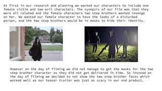
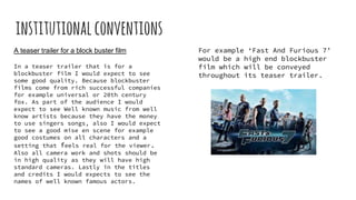
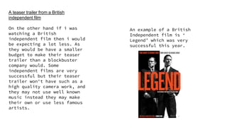
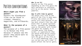
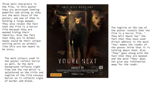
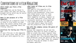
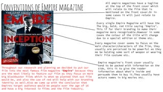
The document provides information about conventions used in teaser trailers, including:
- Teaser trailers are shorter (40 seconds to 1 minute) and outline the film's narrative theme, main characters, sound, titles/credits, and release date.
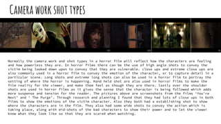
- Camera work includes a range of shots (close-ups, long shots, mediums shots) to showcase the genre within the short time frame.
- The purpose is to promote and sell the film to its target audience by showing what the film is about and its release date.
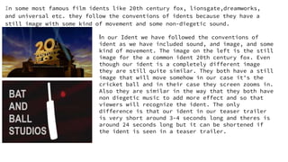
- Idents are typically 1-3 seconds and include still images with some movement and non-diegetic sound to represent the studio or film brand.