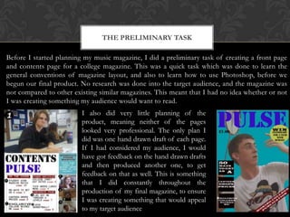
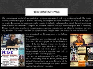
The preliminary task of creating a college magazine front page and contents page taught the author about general magazine layout conventions but lacked research into the target audience. For the final music magazine:
1) The author conducted thorough research into the target audience to create professionally designed pages that would appeal to readers.
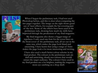
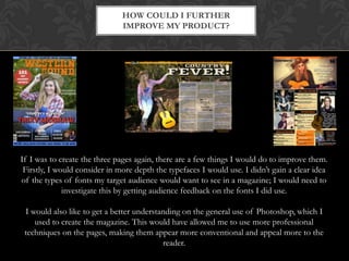
2) Photoshop skills improved greatly, shown by effective images, layer effects, and color schemes on final pages.
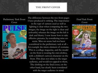
3) Layouts included varied fonts, more content, and well-considered photo mise-en-scene compared to preliminary pages.
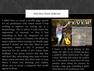
4) Creating a double-page spread taught the importance of audience research and feedback to design appealing magazine content and photos.