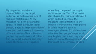
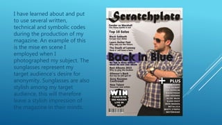
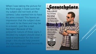
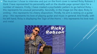
The document discusses the design choices made for a magazine targeted towards fans of rock and metal music. It describes selecting dark colors like black, blue, and grey for the cover based on a target audience survey. These colors were also chosen for their aesthetic appeal to attract attention on store shelves. An inside photo features a subject wearing sunglasses to represent the audience's desire for anonymity and stylish image. The subject's pose with crossed arms and neutral expression was meant to leave an impression of a real teenager's mood without being misunderstood.