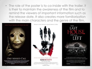
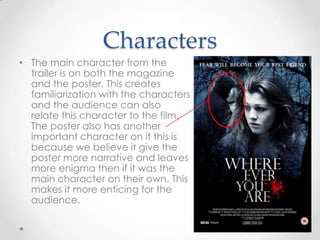
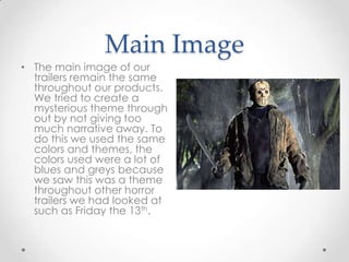
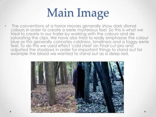
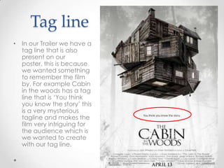
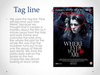
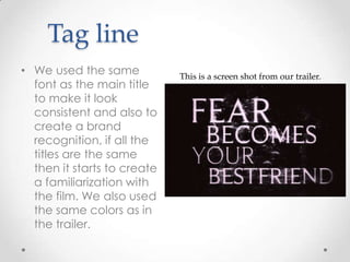
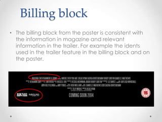
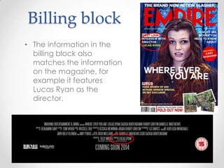
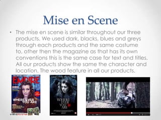
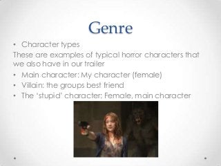
Evaluation question 2:
How effective is the combination of
your main product and artillery text?

Danielle Matthews
• All three of our products relate and work together in
order to create a brand awareness around our film.
We have kept colour and narrative themes concise
throughout and kept the same characters
particularly visible in order to create clarity over the
products as a whole.
• We tried to create brand recognitions with titles,
fonts, characters, mise en scene and tag lines,
giving an idea of the genre.
• Although all three products work together they
each have a specific role to play. The teaser trailers
job is to create narrative themes with out giving to
much away. It uses more visual elements in order to
entice the audience to view the entire film and to
do the this it needs to create enigma, it needs to
give a feel of the entire film and entice the viewer
to want to watch more.
• The role of the poster is to co-inside with the trailer, it
is their to maintain the awareness of the film and to
remind the viewers of important information such as
the release date. It also creates more familiarisation
with the main characters and the genre of the film.
• The magazine is the source of the most inside
information on the film, cast, set etc. It is a way of
promoting the product as the magazine has asked
for it to feature. It sticks to its own conventions and
uses promotional features from the film and cast in
order to entice people to buy that magazine.
Title and design
In our teaser trailer and poster we
have the same text and title fonts
to create a brand recognition
between the products. Although
both logos are the same design
we used more effects on the logo
in the trailer because we thought
it would fit better with the colour
scheme and feel of the trailer.
Title and design
On the magazine cover
we have used a different
font and text style
compared to the other
two products. We have
done this because Empire
magazine has its own
conventions and ways
they want their magazines
to look. We looked at
several Empire magazine
covers and decided that
using a bold font with
contrasting colours
worked well.
Iconography

• Throughout all three of our
products we have symbols
that instigate the genre and
type of film it is. We also
have tag lines that are
iconic to our trailer. An
example of an Icon that
runs through all three of our
products would be the
darkness and woodland
setting. Examples of
iconography in the trailer
would be the knife, blood,
screams and terror. All
these things suggest horror.
Characters
• The main character from the
trailer is on both the magazine
and the poster. This creates
familiarization with the characters
and the audience can also
relate this character to the film.
The poster also has another
important character on it this is
because we believe it give the
poster more narrative and leaves
more enigma then if it was the
main character on their own. This
makes it more enticing for the
audience.
Main Image
• The main image of our
trailers remain the same
throughout our products.
We tried to create a
mysterious theme through
out by not giving too
much narrative away. To
do this we used the same
colors and themes, the
colors used were a lot of
blues and greys because
we saw this was a theme
throughout other horror
trailers we had looked at
such as Friday the 13th.
Main Image
•

The conventions of a horror movies generally show dark dismal
colours in order to create a eerie mysterious feel. So this is what we
tried to create in our trailer by working with the colours and de
saturating the clips. We have also tried to really emphasise the colour
blue as this generally connotes coldness, loneliness and a foggy eerie
feel. To do this we used effect 'cold steel' on Final cut pro and
adjusted the shadows in order for important things to stand out for
example the blood we wanted to stand out as a deep red.
Tag line
• In our Trailer we have a
tag line that is also
present on our poster,
this is because we
wanted something to
remember the film by.
For example Cabin in
the woods has a tag
line that is ‘You think
you know the story’ this
is a very mysterious
tagline and makes the
film very intriguing for
the audience which is
we wanted to create
with our tag line.
Tag line
• We used the tag line ‘Fear
will become your best
friend’ because we
thought that it creates a
mystery about the film as it
moves away from the hide
and seek theme and
connotes the later story
line where the plot for the
whole film was that the
murderer turns out to be
one the group of friends
best friend. We think this
particularly well on the
poster as the two
characters are almost
looking at each other.
Tag line
• We used the same
font as the main title
to make it look
consistent and also to
create a brand
recognition, if all the
titles are the same
then it starts to create
a familiarization with
the film. We also used
the same colors as in
the trailer.

This is a screen shot from our trailer.
Billing block
• The billing block from the poster is consistent with
the information in magazine and relevant
information in the trailer. For example the idents
used in the trailer feature in the billing block and on
the poster.
Billing block
• The information in the
billing block also
matches the information
on the magazine, for
example it features
Lucas Ryan as the
director.
Mise en Scene
• The mise en scene is similar throughout our three
products. We used dark, blacks, blues and greys
through each products and the same costume to,
other then the magazine as that has its own
conventions this is the same case for text and titles.
All our products show the same the character and
location. The wood feature in all our products.
Target Audience
• The target audience for our film is young adults. This
is because the characters are teenagers and
people tend to relate more when the characters
are around their own age. Also our film would be a
15+ rating because of the fear and grim scenes
therefore could not be targeting at a younger
audience. This remains consist throughout our
products.
Target Audience
• We had our target
audience in mind
when creating our
poster, we put the
main character as the
main image as this will
be the character most
featured in the film so
will there for will be the
most relatable.
Target Audience
•

The magazine has its own target
audience, but we had our target
audience in mind when we chose
Empire. Empire was more of a
mainstream/blockbuster
advertisement Magazine. It
contained merchandise and film
posters for main and upcoming
films in the film industry, mainly well
known films or films from major
directors. We think the target
Audience is a mass market and
aimed at the age range of
teenagers and up. We believed It
would appeal to our target
audience as it is very celebrity
orientated and focuses on current
stories, films and movies.
Genre
• Setting:
• We stuck to the setting conventions of a horror film
by using an isolated, dark place. The woods is a
common setting for horror movies for example
cabin in the woods and orphan.
Genre
• Camera work/ technical codes:
• We stuck to the conventions of horror films by using
handheld shots, this connotes panic and the
unknown other films that do this are Blair Witch
project and clover fields
• We also used depth of field and shallow focus to
make a sense of unknown and creeping.
• We used an extreme close up for the killer to give a
sense of tension and confusion as not being able to
see anything else.
Genre
• Iconography:
• Visual- we used dark colors along with red to
connote the horror genre
• Lighting- we used dark lighting to create shadows
this is common in horrors.
• Props- we used fake blood and a knife as props
which are related to the genre.
• We had a villain, these are iconic to the horror
genre as they create fear.
Genre
• Narrative
• We have a very cliché narrative for our trailer based
on the horror genre. We have a protagonist, a villain
and a ‘final girl 'and a survivor. We challenged this
convention by the ‘stupid character’ being left until
last rather then killed of first.
Genre
• Character types
These are examples of typical horror characters that
we also have in our trailer
• Main character: My character (female)
• Villain: the groups best friend
• The ‘stupid’ character: Female, main character

Evaluation question 2

  • 1.
    Evaluation question 2: Howeffective is the combination of your main product and artillery text? Danielle Matthews
  • 2.
    • All threeof our products relate and work together in order to create a brand awareness around our film. We have kept colour and narrative themes concise throughout and kept the same characters particularly visible in order to create clarity over the products as a whole. • We tried to create brand recognitions with titles, fonts, characters, mise en scene and tag lines, giving an idea of the genre.
  • 3.
    • Although allthree products work together they each have a specific role to play. The teaser trailers job is to create narrative themes with out giving to much away. It uses more visual elements in order to entice the audience to view the entire film and to do the this it needs to create enigma, it needs to give a feel of the entire film and entice the viewer to want to watch more.
  • 4.
    • The roleof the poster is to co-inside with the trailer, it is their to maintain the awareness of the film and to remind the viewers of important information such as the release date. It also creates more familiarisation with the main characters and the genre of the film.
  • 5.
    • The magazineis the source of the most inside information on the film, cast, set etc. It is a way of promoting the product as the magazine has asked for it to feature. It sticks to its own conventions and uses promotional features from the film and cast in order to entice people to buy that magazine.
  • 6.
    Title and design Inour teaser trailer and poster we have the same text and title fonts to create a brand recognition between the products. Although both logos are the same design we used more effects on the logo in the trailer because we thought it would fit better with the colour scheme and feel of the trailer.
  • 7.
    Title and design Onthe magazine cover we have used a different font and text style compared to the other two products. We have done this because Empire magazine has its own conventions and ways they want their magazines to look. We looked at several Empire magazine covers and decided that using a bold font with contrasting colours worked well.
  • 8.
    Iconography • Throughout allthree of our products we have symbols that instigate the genre and type of film it is. We also have tag lines that are iconic to our trailer. An example of an Icon that runs through all three of our products would be the darkness and woodland setting. Examples of iconography in the trailer would be the knife, blood, screams and terror. All these things suggest horror.
  • 9.
    Characters • The maincharacter from the trailer is on both the magazine and the poster. This creates familiarization with the characters and the audience can also relate this character to the film. The poster also has another important character on it this is because we believe it give the poster more narrative and leaves more enigma then if it was the main character on their own. This makes it more enticing for the audience.
  • 10.
    Main Image • Themain image of our trailers remain the same throughout our products. We tried to create a mysterious theme through out by not giving too much narrative away. To do this we used the same colors and themes, the colors used were a lot of blues and greys because we saw this was a theme throughout other horror trailers we had looked at such as Friday the 13th.
  • 11.
    Main Image • The conventionsof a horror movies generally show dark dismal colours in order to create a eerie mysterious feel. So this is what we tried to create in our trailer by working with the colours and de saturating the clips. We have also tried to really emphasise the colour blue as this generally connotes coldness, loneliness and a foggy eerie feel. To do this we used effect 'cold steel' on Final cut pro and adjusted the shadows in order for important things to stand out for example the blood we wanted to stand out as a deep red.
  • 12.
    Tag line • Inour Trailer we have a tag line that is also present on our poster, this is because we wanted something to remember the film by. For example Cabin in the woods has a tag line that is ‘You think you know the story’ this is a very mysterious tagline and makes the film very intriguing for the audience which is we wanted to create with our tag line.
  • 13.
    Tag line • Weused the tag line ‘Fear will become your best friend’ because we thought that it creates a mystery about the film as it moves away from the hide and seek theme and connotes the later story line where the plot for the whole film was that the murderer turns out to be one the group of friends best friend. We think this particularly well on the poster as the two characters are almost looking at each other.
  • 14.
    Tag line • Weused the same font as the main title to make it look consistent and also to create a brand recognition, if all the titles are the same then it starts to create a familiarization with the film. We also used the same colors as in the trailer. This is a screen shot from our trailer.
  • 15.
    Billing block • Thebilling block from the poster is consistent with the information in magazine and relevant information in the trailer. For example the idents used in the trailer feature in the billing block and on the poster.
  • 16.
    Billing block • Theinformation in the billing block also matches the information on the magazine, for example it features Lucas Ryan as the director.
  • 17.
    Mise en Scene •The mise en scene is similar throughout our three products. We used dark, blacks, blues and greys through each products and the same costume to, other then the magazine as that has its own conventions this is the same case for text and titles. All our products show the same the character and location. The wood feature in all our products.
  • 18.
    Target Audience • Thetarget audience for our film is young adults. This is because the characters are teenagers and people tend to relate more when the characters are around their own age. Also our film would be a 15+ rating because of the fear and grim scenes therefore could not be targeting at a younger audience. This remains consist throughout our products.
  • 19.
    Target Audience • Wehad our target audience in mind when creating our poster, we put the main character as the main image as this will be the character most featured in the film so will there for will be the most relatable.
  • 20.
    Target Audience • The magazinehas its own target audience, but we had our target audience in mind when we chose Empire. Empire was more of a mainstream/blockbuster advertisement Magazine. It contained merchandise and film posters for main and upcoming films in the film industry, mainly well known films or films from major directors. We think the target Audience is a mass market and aimed at the age range of teenagers and up. We believed It would appeal to our target audience as it is very celebrity orientated and focuses on current stories, films and movies.
  • 21.
    Genre • Setting: • Westuck to the setting conventions of a horror film by using an isolated, dark place. The woods is a common setting for horror movies for example cabin in the woods and orphan.
  • 22.
    Genre • Camera work/technical codes: • We stuck to the conventions of horror films by using handheld shots, this connotes panic and the unknown other films that do this are Blair Witch project and clover fields • We also used depth of field and shallow focus to make a sense of unknown and creeping. • We used an extreme close up for the killer to give a sense of tension and confusion as not being able to see anything else.
  • 23.
    Genre • Iconography: • Visual-we used dark colors along with red to connote the horror genre • Lighting- we used dark lighting to create shadows this is common in horrors. • Props- we used fake blood and a knife as props which are related to the genre. • We had a villain, these are iconic to the horror genre as they create fear.
  • 24.
    Genre • Narrative • Wehave a very cliché narrative for our trailer based on the horror genre. We have a protagonist, a villain and a ‘final girl 'and a survivor. We challenged this convention by the ‘stupid character’ being left until last rather then killed of first.
  • 25.
    Genre • Character types Theseare examples of typical horror characters that we also have in our trailer • Main character: My character (female) • Villain: the groups best friend • The ‘stupid’ character: Female, main character