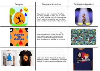
The designer created an app icon for Pyro Pete that initially showed Pete standing still similar to another icon, but received feedback that it did not capture how frantic Pete looks. So the designer combined elements of both icons to better represent the character. For a repeating wallpaper, orange and blue balloons were used to evoke fire and make it more interesting, but feedback suggested adding something with contrast to the balloons. Shirt designs for the game included funny quotes but the fonts and a quote were changed based on additional feedback.