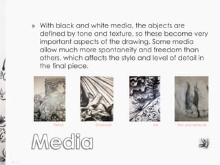
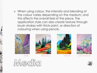
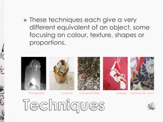
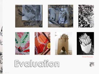
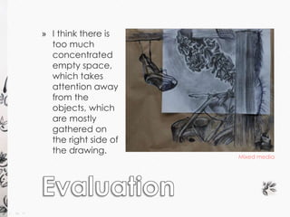
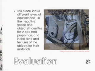
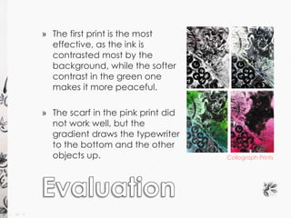
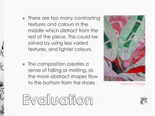
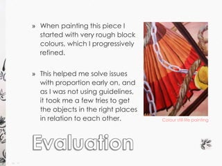
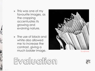
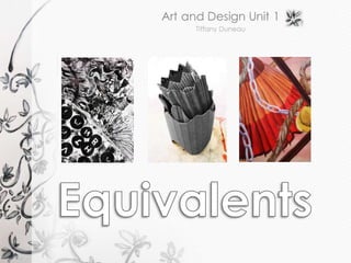
» The work of others » My own work 
» Still life 
observation 
» Photographs of 
the still life 
» Artist studies 
» Composition 
» Mark making 
» Colour 
» Collage
The work of others 
Photograph of the still life 
» By looking at and copying 
other artists’ work, I was able 
to develop my techniques 
and style, and practise 
different ways of 
representing what I see. 
» Drawing from the still life 
allowed me to put what I 
had learnt into practice, 
and later inspired some of 
the compositions for my final 
outcomes.
Artist studies 
Albrecht Durer – 
Feet of An Apostle 
Vincent Van Gough – 
Corn field with 
cypresses 
Ronald Pratt – 
Serene Alpine autumn 
Anthony Casay – 
Pink Sunset
Edward Bawden – 
A frog and an ox 
Juan Gris – 
Still life with violin and glass 
Katsushika Hokusai – 
Peonies and butterfly 
Artist studies
My Work 
Collage inspired by 
Pablo Picasso 
Composition inspired 
by Ronald Pratt 
» Using the rule of thirds, I organised 
and split my piece, which gave it a 
more abstract, cubist feel; and limited 
my colours to red so the composition 
would remain harmonious. 
» Here, I created a scene similar to a 
landscape, using shells and stones. 
The colours are the opposite to what 
we would expect which creates a 
slightly surreal mood, complemented 
by the objects in the landscape.
» Line 
» Tone 
» Proportion 
» Mark Making 
» Texture 
» Colour 
» Composition
» The different techniques allow focus to be drawn to 
different areas or aspects of a drawing, and gives 
different information about the objects and their 
properties. Combining the formal elements within 
one drawing creates a more realistic drawing as it 
describes multiple aspects of the object. 
Colour Mark making Tone 
Line Proportion
» Pencil 
» Charcoal 
» Ink 
» Pen 
» Coloured pencils 
» Oil Pastel 
» Watercolour 
» Acrylic Paint
» With black and white media, the objects are 
defined by tone and texture, so these become very 
important aspects of the drawing. Some media 
allow much more spontaneity and freedom than 
others, which affects the style and level of detail in 
the final piece. 
Pencil Charcoal Ink Pen and white ink
» When using colour, the intensity and blending of 
the colour varies depending on the medium, and 
this affects the overall feel of the piece. The 
application style can also create texture through 
brush strokes with thick paint, or direction of 
colouring when using pencils. 
Acrylic Watercolour Oil Pastel Coloured pencils
» Painting 
» Collage 
» Collograph Printing 
» Sculpture 
» Photography
» These techniques each give a very 
different equivalent of an object, some 
focusing on colour, texture, shapes or 
proportions. 
Painting with colour 
Photography Sculpture Collograph Plate Collage
» General Workshop 
˃ No running around. 
˃ Keep bags out of the way. 
» Collograph Printing 
˃ Wear an apron and gloves to protect skin and clothes 
from ink. 
˃ Avoid ink or water spillages; clean up immediately if any 
occur 
˃ Take care when using rollers so fingers do not get stuck or 
crushed. 
˃ When cleaning up use white spirit; avoid spillages or 
inhaling it.
» Large Scale Mixed Media Drawings 
» Collograph Prints 
» Abstract Collage 
» Colour Painting 
» Sculpture and Photography
Final Pieces
» I think there is 
too much 
concentrated 
empty space, 
which takes 
attention away 
from the 
objects, which 
are mostly 
gathered on 
the right side of 
the drawing. 
Mixed media
Negative space in mixed media 
» This piece shows 
different levels of 
equivalence - in 
the negative 
space and 
object silhouettes 
for shape and 
proportion, and 
in the tone and 
textures of the 
objects for their 
materials.
» The first print is the most 
effective, as the ink is 
contrasted most by the 
background, while the softer 
contrast in the green one 
makes it more peaceful. 
» The scarf in the pink print did 
not work well, but the 
gradient draws the typewriter 
to the bottom and the other 
objects up. Collograph Prints
» There are too many contrasting 
textures and colours in the 
middle which detract from the 
rest of the piece. This could be 
solved by using less varied 
textures, and lighter colours. 
» The composition creates a 
sense of falling or melting, as 
the more abstract shapes flow 
to the bottom from the shoes Abstract Collage
» When painting this piece I 
started with very rough block 
colours, which I progressively 
refined. 
» This helped me solve issues 
with proportion early on, and 
as I was not using guidelines, 
it took me a few tries to get 
the objects in the right places 
in relation to each other. Colour still life painting
Sculpture 
» This was one of my 
favourite images, as 
the cropping 
accentuates its 
growing and 
evolving nature. 
» The use of black and 
white also allowed 
me to increase the 
contrast, giving a 
much bolder image.
» Overall I enjoyed this project as it allowed me to 
develop my skills and techniques whilst 
experimenting with different media, some of which 
I had never used before. 
» I also had the opportunity to develop ideas 
through the different outcomes, inspiring the next 
one from aspects of the previous outcome, which 
allowed me to refine and develop ideas as I went 
along, both through planning and through 
analysing each outcome and ways in which I 
could improve its composition.
Equivalents project summary presentation

Equivalents project summary presentation

  • 2.
    » The workof others » My own work » Still life observation » Photographs of the still life » Artist studies » Composition » Mark making » Colour » Collage
  • 3.
    The work ofothers Photograph of the still life » By looking at and copying other artists’ work, I was able to develop my techniques and style, and practise different ways of representing what I see. » Drawing from the still life allowed me to put what I had learnt into practice, and later inspired some of the compositions for my final outcomes.
  • 4.
    Artist studies AlbrechtDurer – Feet of An Apostle Vincent Van Gough – Corn field with cypresses Ronald Pratt – Serene Alpine autumn Anthony Casay – Pink Sunset
  • 5.
    Edward Bawden – A frog and an ox Juan Gris – Still life with violin and glass Katsushika Hokusai – Peonies and butterfly Artist studies
  • 6.
    My Work Collageinspired by Pablo Picasso Composition inspired by Ronald Pratt » Using the rule of thirds, I organised and split my piece, which gave it a more abstract, cubist feel; and limited my colours to red so the composition would remain harmonious. » Here, I created a scene similar to a landscape, using shells and stones. The colours are the opposite to what we would expect which creates a slightly surreal mood, complemented by the objects in the landscape.
  • 7.
    » Line »Tone » Proportion » Mark Making » Texture » Colour » Composition
  • 8.
    » The differenttechniques allow focus to be drawn to different areas or aspects of a drawing, and gives different information about the objects and their properties. Combining the formal elements within one drawing creates a more realistic drawing as it describes multiple aspects of the object. Colour Mark making Tone Line Proportion
  • 9.
    » Pencil »Charcoal » Ink » Pen » Coloured pencils » Oil Pastel » Watercolour » Acrylic Paint
  • 10.
    » With blackand white media, the objects are defined by tone and texture, so these become very important aspects of the drawing. Some media allow much more spontaneity and freedom than others, which affects the style and level of detail in the final piece. Pencil Charcoal Ink Pen and white ink
  • 11.
    » When usingcolour, the intensity and blending of the colour varies depending on the medium, and this affects the overall feel of the piece. The application style can also create texture through brush strokes with thick paint, or direction of colouring when using pencils. Acrylic Watercolour Oil Pastel Coloured pencils
  • 12.
    » Painting »Collage » Collograph Printing » Sculpture » Photography
  • 13.
    » These techniqueseach give a very different equivalent of an object, some focusing on colour, texture, shapes or proportions. Painting with colour Photography Sculpture Collograph Plate Collage
  • 14.
    » General Workshop ˃ No running around. ˃ Keep bags out of the way. » Collograph Printing ˃ Wear an apron and gloves to protect skin and clothes from ink. ˃ Avoid ink or water spillages; clean up immediately if any occur ˃ Take care when using rollers so fingers do not get stuck or crushed. ˃ When cleaning up use white spirit; avoid spillages or inhaling it.
  • 15.
    » Large ScaleMixed Media Drawings » Collograph Prints » Abstract Collage » Colour Painting » Sculpture and Photography
  • 16.
  • 17.
    » I thinkthere is too much concentrated empty space, which takes attention away from the objects, which are mostly gathered on the right side of the drawing. Mixed media
  • 18.
    Negative space inmixed media » This piece shows different levels of equivalence - in the negative space and object silhouettes for shape and proportion, and in the tone and textures of the objects for their materials.
  • 19.
    » The firstprint is the most effective, as the ink is contrasted most by the background, while the softer contrast in the green one makes it more peaceful. » The scarf in the pink print did not work well, but the gradient draws the typewriter to the bottom and the other objects up. Collograph Prints
  • 20.
    » There aretoo many contrasting textures and colours in the middle which detract from the rest of the piece. This could be solved by using less varied textures, and lighter colours. » The composition creates a sense of falling or melting, as the more abstract shapes flow to the bottom from the shoes Abstract Collage
  • 21.
    » When paintingthis piece I started with very rough block colours, which I progressively refined. » This helped me solve issues with proportion early on, and as I was not using guidelines, it took me a few tries to get the objects in the right places in relation to each other. Colour still life painting
  • 22.
    Sculpture » Thiswas one of my favourite images, as the cropping accentuates its growing and evolving nature. » The use of black and white also allowed me to increase the contrast, giving a much bolder image.
  • 23.
    » Overall Ienjoyed this project as it allowed me to develop my skills and techniques whilst experimenting with different media, some of which I had never used before. » I also had the opportunity to develop ideas through the different outcomes, inspiring the next one from aspects of the previous outcome, which allowed me to refine and develop ideas as I went along, both through planning and through analysing each outcome and ways in which I could improve its composition.