Download to read offline


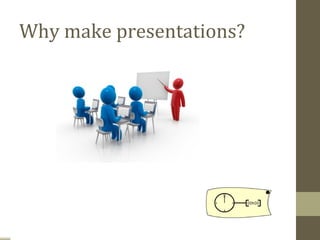

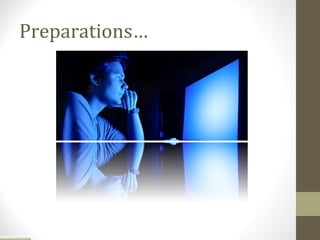
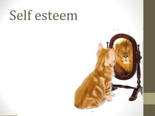


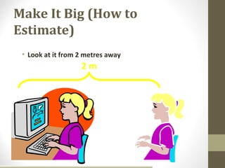
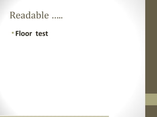
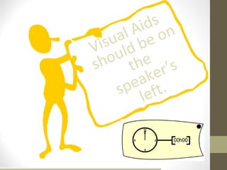
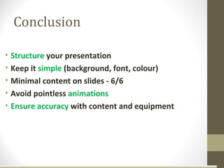


The document provides tips for giving effective presentations with minimal anxiety. It discusses preparing for presentations by practicing techniques to manage nerves like deep breathing. It recommends getting enough sleep, avoiding caffeine or alcohol before presenting, and rehearsing. The document gives advice for the presentation itself, such as making eye contact, using body language effectively, speaking clearly, and keeping the audience engaged. It also provides tips for using visual aids like keeping slides concise and easy to read from a distance. Overall, the document outlines best practices for managing nerves and delivering presentations in a clear, organized manner focused on the audience.


