Effective presentation
•Download as PPT, PDF•
1 like•784 views

Thank you very much to Satyajeet Singh for sharing the original file. I edited and used this version as a guidance to my seminar students.

More Related Content
What's hot
What's hot (10)
Viewers also liked
Viewers also liked (14)
Similar to Effective presentation
Similar to Effective presentation (20)
Effective presentation
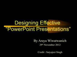
- 1. Designing Effective “PowerPoint Presentations” By Araya Wiwatwanich 29th November 2012 Credit : Satyajeet Singh
- 2. Designing Effective PowerPoint Presentation Simple Big Clear Progressive Suggestions Consistent
- 3. Make It Big
- 4. Make it Big (Text) • This is Arial 12 • This is Arial 18 • This is Arial 24 • This is Arial 32 • This is Arial 36 • This is Arial 44
- 5. Make it Big (Text) • This is Arial 12 • This is Arial 18 Too Small • This is Arial 24 • This is Arial 32 • This is Arial 36 • This is Arial 44
- 6. Make It Big (How to Estimate) • Look at it from 2 metres away 2m
- 8. Keep It Simple (Text) • Too many colours • Too Many Fonts and Styles • The 6 x 7 rule – No more than 6 lines per slide – No more than 7 words per line
- 9. Keep It Simple (Text) Instructional Technology: A complex integrated process involving people, procedures, ideas, devices, and organization, for analyzing problems and devising, implementing, evaluating, Toosolutions to those and managing detailed ! problems in situations in which learning is purposive and controlled (HMRS 5th ed.)
- 10. Keep It Simple (Text) Instructional Technology: A process involving people, procedures & tools for solutions Simpler Much to problems in learning (HMRS 5th ed.)
- 11. Falling Leaves Observed Delhi Mumbai Goa January 11,532,234 14,123,654 3,034,564 February 1,078,456 12,345,567 16,128,234 March 17,234,778 6,567,123 16,034,786 April 16,098,897 10,870,954 7,940,096 Too detailed ! May 8,036,897 10,345,394 14,856,456 June 16,184,345 678,095 4,123,656 July 8,890,345 15,347,934 18,885,786 August 8,674,234 18,107,110 17,230,095 September 4,032,045 18,923,239 9,950,498 October 2,608,096 9,945,890 5,596,096 November 5,864,034 478,023 6,678,125 December 12,234,123 9,532,111 3,045,654
- 12. Falling Leaves in Millions In 106 Delhi Mumbai Goa January 11 14 3 February 1 12 16 March 17 6 16 April 16 10 7 May 8 10 14 June Much Simpler 16 0 4 July 8 15 18 August 8 18 17 September 4 18 9 October 2 9 5 November 5 0 6 December 12 9 3
- 13. Falling Leaves 50 Goa 45 Mumbai 40 Delhi 35 30 25 Too dazzled ! 20 15 10 5 0January February March April May June July August September October November December
- 14. Falling Leaves 50 Goa Mumbai Delhi 40 30 Much Simpler 20 10 0 January March May July September November
- 15. Keep It Simple (Sound) • Sound effects may distract too • Use sound only when necessary
- 16. Keep It Simple (Transition) • This transition is annoying, not enhancing • "Appear" and "Disappear" are better
- 17. Keep It Simple (Animation) 2m Too distracting !
- 18. Keep It Simple (Animation) 2m Simple & to the point
- 19. Make It Clear
- 20. Make It Clear (Capitalisation) • ALL CAPITAL LETTERS ARE DIFFICULT TO READ • Upper and lower case letters are easier
- 21. Make It Clear (Fonts) Sanserif Z Serif Z clear busy
- 22. Make It Clear (Fonts) • Serif fonts are difficult to read on screen • Sanserif fonts are clearer • Italics are difficult to read on screen • Normal or bold fonts are clearer • Underlines may signify hyperlinks • Instead, use colours to emphasise
- 23. Make It Clear (Numbers) Use numbers for lists with sequence For example: How to put an elephant into a fridge? 1. Open the door of the fridge 2. Put the elephant in 3. Close the door
- 24. Make It Clear (Numbers) How to put a giraffe into a fridge? 1. Open the door of the fridge 2. Take out the elephant 3. Put the giraffe in 4. Close the door
- 25. Make It Clear (Bullets) Use bullets to show a list without • Priority • Sequence • Hierarchy, …..
- 26. Make It Clear (Colours) • Use contrasting colours • Light on dark vs dark on light • Use complementary colours
- 27. Make It Clear (Contrast) • Use contrasting colours • Light on dark vs dark on light high contrast • Use complementary colours low contrast
- 28. Make It Clear (Contrast) • Use contrasting colours • Light on dark vs dark on light • Use complementary colours This is light on dark
- 29. Make It Clear (Contrast) • Use contrasting colours • Light on dark vs dark on light • Use complementary colours This is dark on light
- 30. Make It Clear (Complement) • Use contrasting colours • Light on dark vs dark on light • Use complementary colours These colours dominate your text
- 31. Make It Clear (Complement) • Use contrasting colours • Light on dark vs dark on light • Use complementary colours These colours complement
- 32. Make It Clear (Size) • Size implies importance
- 33. Make It Clear (Size) • Size implies importance
- 34. Be Progressive
- 35. Understanding Technology Mouse I/O Error Main Storage CPU Function key Too many & User interface Software not focused Debugger Floppy disk Backup system
- 36. Understanding Technology Mouse I/O Error Main Storage CPU Function key Progressive & interface User Software thus focusedDebugger Floppy disk Backup system
- 37. Be Consistent
- 38. Be Consistent • Differences draw attention • Differences may imply importance • Use surprises to attract not distract
- 39. Be Consistent Differences draw attention • Differences may imply importance • Use surprises to attract not distract This tick draws attention
- 40. Be Consistent Differences draw attention Differences may imply importance o Use surprises to attract not distract These differences distract!
- 41. Be Consistent • Differences draw attention • Differences may imply importance • Use surprises to attract not distract This implies importance
- 42. Be Consistent • Differences draw attention • Differences may imply importance • Use surprises to attract not distract Confusing differences!
- 43. Be Consistent • Differences draw attention • Differences may imply importance • Use surprises to attract not distract This surprise attracts
- 44. Be Consistent • Differences draw attention • Differences may imply importance • Use surprises to attract not distract These distract!
- 45. Some Suggestions • At the beginning, summarize scope and goal • At the end, give a conclusion • Aware of the time allotted for presentation • Speak loudly and clearly with fluctuation • Don’t read the slides word-for-word • Keep your eyes on the audience
- 46. Closing Remarks Relax, Be polite, Be confident
- 47. Thank You !