I spent the afternoon editing and creating a poster for my upcoming music performance. I wanted the poster to highlight the key details about the show including the date, time, location and list of songs I will be performing. After tweaking the design and text, I finalized the poster and am ready to start distributing and promoting my show.
Recreational mathematics magazine number 2 september_2014Θανάσης Δρούγας
This document summarizes several hat puzzles:
1. An old hat puzzle is presented where logicians in a line each guess the color of their own hat based on seeing the colors of hats in front of them. A strategy is discussed to maximize the number who guess correctly.
2. A new variation is introduced where logicians can have hats of any color from a finite set of colors. The same strategy works to ensure all but the last logician guesses their hat color correctly.
3. The reader is presented with a new hat puzzle to solve.
Sony Music Entertainment (SME) is a major music conglomerate and subsidiary of Sony Corporation of America. SME has many record labels and owns the rights to music from a long list of popular artists. It produces and sells music in various formats and through media convergence in movies and games. While SME was profitable in 2010, it saw an 11% revenue decline in 2008 due to a decline in physical music sales not offset by digital growth.
This presentation discusses up-selling strategies and tactics. It defines selling as the process of relating a product or service offering to enable a buyer to achieve economic goals. Up-selling is exposing customers to additional options during a sales process. The gap between selling and up-selling occurs due to a lack of planning, information, and questions. The presentation provides strategies like knowing your goals, audience, products, and limits, as well as tactics like qualifying questions and closing techniques to improve up-selling skills.
The document outlines ways for a company to maximize its margins. It discusses that maximizing margins provides more profitability and financial strength but can also miss market opportunities or lose sales. Some ways to increase margins include raising prices, buying materials at a lower cost, outserving competitors through quality and service, and focusing efforts. To sustain higher margins, the document recommends creating strong customer relationships, being reliable, addressing problems proactively, and exhibiting product knowledge. The overall goal is to increase margins by selling on more than just price.
This document discusses the importance and process of developing an effective value proposition. It defines a value proposition as a clear statement outlining a company's unique value-creating features. It then outlines a 10 step process for discovering a value proposition, including starting with core competencies, studying customers, turning competencies into values, analyzing competition and trends, identifying a core value, building a value chain, articulating the proposition, and testing it. Developing a strong value proposition can help businesses stand out and communicate their unique benefits to customers.
Mathematical Recreations and Essays,W. W. Rouse BallΘανάσης Δρούγας
This document appears to be the preface to a book on mathematical recreations and essays. It discusses the contents of the book, which is divided into two parts - the first part containing accounts of mathematical recreations, and the second part containing essays on various historical mathematical problems. The preface notes that additional material has been added to the book since the first edition, and that references have been included and verified as thoroughly as possible. It expresses the hope that readers will find many of the discussed problems and questions interesting, despite the fact that most results are not new.
The document discusses different techniques that could be used for an album cover design, including montage effects, bold fonts, lighting effects, and morphing/distorting effects. The author indicates a preference for covers that use busy collaborations of different mediums, eye-catching bold fonts incorporated into the artwork, electronic/distorted lighting and text, and extreme close-up shots related to the music video's focus on lip-syncing. Specific examples highlighted include a montage cover connoting a fast-paced song, matching an artist's lipstick color to the album name font, and a cover with distorted electronic text and figures.
The document provides an introduction to learning about Cuba, including a brief history, facts, hurricanes, the flag, government, and Pablo Picasso's connection to Cubism. Students will partner up to review materials on an assigned topic, become experts on that topic, teach the class, and add to their knowledge by learning from classmates.
This document provides a six-step process for effective time management. It begins by connecting one's work to a clear mission and vision. The next steps are to identify your roles and responsibilities, set goals based on those roles, and organize your weekly schedule by prioritizing important versus urgent tasks. It also recommends exercising integrity by adjusting plans if needed, and evaluating your progress and challenges each week. The overall goal is to focus your time on important tasks and stay out of less productive quadrants of urgency over importance or tasks that are neither urgent nor important.
The document discusses the forms and conventions the author considered when producing their Britpop media products, including a magazine front cover, contents page, and double page spread. Some conventions applied included an appealing design for the target audience, a recognizable logo and masthead, eye-catching images and colors, and organized layouts. The author also challenged some conventions, such as using a white background and hand-drawn elements, to add a personal touch while still appearing professional. Comparisons are made to established media products to highlight both similarities and differences in conventions.
I recently created an abstract painting inspired by Jackson Pollock's drip technique. I poured and splattered different colored paints directly onto a large canvas laid out on the floor of my garage. The random patterns and intermingling of colors that emerged felt very freeing and spontaneous. While my work is not on the same artistic level as Pollock's, I enjoyed experimenting with this style and method of painting without preconceived notions of what the end result should look like.
I went on a trip to Newquay Aquarium. The aquarium had a variety of sea creatures on display including fish, sharks, stingrays, and seahorses. It was an educational experience learning about the different marine animals.
This document provides an overview of several major players in the music industry, including Sony Music Entertainment (SME), Universal Music Group, EMI Music, Spotify, and Napster. It discusses their business models, labels, artists, revenues, and roles within the changing music industry landscape. SME is highlighted as one of the "big four" record companies and its subsidiaries spanning production, consumption, distribution, and artists are listed. Financial figures from 2008 and 2010 are presented for SME. Brief histories and descriptions of services for the other companies are also summarized.
The document discusses how using strategic questioning, also known as question-based selling, can double sales. It provides tips for leading a sales conversation through questions that establish credibility, generate curiosity in prospects, and help determine solutions. The goal is to ask questions that provide value to customers and move them to action through exploring status, issues, implications, and solutions.
RPWORLD offers custom injection molding service to help customers develop products ramping up from prototypeing to end-use production. We can deliver your on-demand parts in as fast as 7 days.
Double Page Spread/ Contents/ Front Cover deconstructions:
1. This double page spread is a feature of an
NME magazine. It’s an overall attractive
layout and although there isn’t much This main image of the artist is portrayed to look uninterested and rather
balance between the two pages, I still think dejected; this is because of his facial expressions. The fact this is such a
that this is appealing and looks quite easy close up shot means that his facial expressions are the main focus and are
to follow and read. There is one page looked at with great detail. This lack of light and the overall gloominess of
which is for the textual side of this spread the image exaggerates the suspected glumness of this artists personality.
and the visual side also. However, the main The fact that there is no artificial lighting used throughout this entire
focus is definitely the ‘extreme close up spread creates the feeling that he is not being photographed, but is just
shot’ of the artist, Graham Coxon. stood there looking at the audience, making this image more powerful.
The colour palette used This use of altering
is rather soft and dull; word colouration
which remains creates an ‘arty’
throughout the entire twist on the article
spread with this same and could link in
theme on both pages. with this particular
This is quite relevant to artists’ music style.
this theme of article, as This also could be
the large quote gives us seen as having a link
the sense that this in with the text, as
particular article could it has a subtle vomit
be quite like the ‘drug, inducing shade of
sex, and rock and roll’ green. Also, this is
theme of the 60’s- an effective way of
therefore, this glazed, breaking up the text
‘blurred’ effect is quite and contrasts
The artist is addressing the audience This overly large quote
well suited as it almost greatly with the
connotes ‘recklessness’. directly through eye contact, pulling the taken from the interview cleanliness and
Although this could also readers towards reading the article, and below it, adds to the purity of this white
the blankness of this man’s expression overall quirkiness and
been seen in a totally background.
opposing way, and that almost makes us feel sympathy towards unique look of this
him; before even reading the article. layout. It has altering
it’s a nice change to the
Supported by the use of white space, this font sizes for each letter
typical ‘punk’ style, loud
overall simplicity of this double page and this draws the
brightly coloured
spread creates that individual and reader into reading this
photographs and busy
modern effect. particular text extract.
layouts.
2. This double page spread is taken from a magazine called ’Clash’. The The colour palette used in this double page
Kaiser Chiefs is the main subject of this particular magazine and spread is black, yellows and white. This use of
therefore this is their double page feature. yellows creates a sense of positivity as it is
This is a fantastic example of a good double page magazine spread particularly ‘happy’ colour, therefore connoting
with a balanced layout. It is far more unique than any other happiness.
magazines and overall looks very appealing. The background/main image that spans
The strong background image is so strong and relevant to the subject through both pages of this double page spread
that this layout simply couldn’t go wrong! Is of the band walking down through a busy
There is almost a perfect balance between text amounts on either street. This gives a sense that the band
side of the pages, both with an even extract of bold text. This sense members are not very glamorized and we get
of ‘symmetry’ with both the image, heading and text makes this the feeling that they are more genuine and
double page spread much easier and simple to read. ‘real’, that we can relate to them more easily.
Band members Band members all
appear to be well appear to be smiling
dressed and and happy. This
suave. This could creates the sense that
connote a target they are lighthearted
audience of men and carefree; the type
who take an of people that you
interest as to look up to, and make
what they wear good role models,
and, like this connoting that this is
band in representation of a
particular, have ‘fun’ ethic in the
an individual band.
sense of style.
The masthead is quite transparent, this simple outline of the The large bold quote shown in the centre of the article
text allows the reader to see the background image, and looks is a perfect way to break up the text and make it appear
effective. But still it’s noticeable from quite a distance. This more ‘readable’. This is a quote is probably seen as the
title is also positioned just below the heads of the band, most humorous and interesting thing that the band
therefore nothing form the main image is lost. This masthead member said during this interview, which seems to
also sticks with the colour palette of white, black and yellows. have been taken from the bulk of the article. This is
The font style is also rather vintage and unique, much like the most likely going to be the first thing that the viewers
music genre and the overall individuality of the band members will read, therefore it is important that this quote
shown in this feature. intrigues and encourages them to read on.
3. This contents page is spread over a double
page. This has worked well because the
text and the images do not appear too
crowded and confusing. These supporting images are conventional and located next to the
Everything has been spaced out evenly text column.
and it is nicely balanced and easy to look All of the images relating to the magazine contents and therefore
at. sticking to the main subject and purpose of the magazine.
I think that this magazine could be aimed
There seems to be a main contents page image, this is a self
at both females and males, because the
portrait image of a musician. However, only people familiar with
colours and images used are not biased in
this particular music genre, shown in this magazine would be
any way or directly appealing towards just
familiar with who this man would be. His direct eye contact
the one gender. I also think that this
appears to be a ‘soft gaze’ and he appears to be happy and holding
particular magazine would have the target
a relaxed pose. This instantly makes the audience want to read this
audience of both females and males of
predominant article he is supporting.
15+.
There is definitely The text columns are
a sense of balance laid out vertically,
and symmetry next to the coloured
with both of these design on the edges
pages. The two of the page this
graphics, coloured means that the text
patterns on either is a lot easier to read.
side of the pages
are quite unusual
The main headlines
and different,
of this contents page
these bright happy
would be the subject
colours connote
headings which are
that the magazine
shown above the
is unique and
page numbers. This
bright.
makes it a lot easier
for the audience to
These other supporting images are much smaller and less The colour palette is quite simple clearly distinguish
eye catching. Simply because they are at the bottom of the with a slash of colour from the what the sorts of
page and all bunched up together, side by side. coloured graphics well suited to aspects of the
Also, I think that the page numbers shown by each image the music genre. magazine there are.
are all different sizes and this highlights there importance.
4. By looking at this particular double page The mise en scene of this DPS aiming This spread has been divided up
spread, taken from the music magazine to present the artist as a very strong into a textual page and a visual
'Mojo', i get the impression that the target and almost vicious character. His page. This, to me, is not a very
audience would be, males and possibly facial expressions and stance over conventional way of
females that are fans of this particular artist, his guitar are both key gestures that presentation as there is nothing
Neil Young. The type of people who would show he is very passionate about his that breaks up the text in any
enjoy this music genre, generally ages 35+ music. The light is highlighting the way. However, i do like that this
because Neil Young is a musician from artists face which also shows that creates the article to be more
about 40 years ago. Therefore, people from this ‘musical passion’ he is ‘straight to the point’ and easy
that era would be most familiar with his expressing is a focal point of this to read and follow.
work. double page spread.
This particular colour palette used is made up of white, gold, On the right page of this spread, the image of the guitar
grey and black. Making it appear quite formal if compared to is very slightly overlapping onto the left page. This is an
other music magazine articles, which are quite commonly used indication that this particular article is a double page
with lots of loud and vibrant colours. This is quite well suited spread and is an important feature of this layout as it
to the particular target audience, as they are all quite classical gives the impression that the two pages are just one and
colours that show importance and class. both relate to the same thing, Neil young’s work.
The main title, “BE The use of a black and
THERE, BE HERE NOW, BE white image is also
IN IT” is quite effective relevant to the target
because it stands out audience as it shows
amongst the rest of the that this photograph
text and the capital could have been
letters also show they are taken ‘in the moment’
particularly import and when black and white
words. The bold white images were all the
contrasts greatly with the rage. This is a great
black background. The way to help
golden colour also adds a emphasize it’s age
certain level of and also the style of
importance as gold Is a the photograph. This
very powerful colour that also presents the
is known for its value. artist in a powerful
and energized way.
The use of a single text Directly underneath the main heading, there is the ‘lead’. Which
column creates a unique has purposefully been placed just under the masthead to drip
layout because a typical
feed information about this article and describe clearly to the
double page spread
would commonly be 3 or audience what the contents shall include and try to attract the
more columns. readers into reading the rest of the article!
5. The main image is most definitely the focal point of the page, because the The direct eye contact could suggest
balance between text and image is nonproportional. The majority of the page that this artist wants the viewers to
is made up of this one image. However, I think this is an unconventional grid read on and this makes him also
use, because the layout of this page isn’t balanced. Therefore, the eyes are appear like his music is meaningful
naturally drawn straight to the image and the text is not acknowledged until and emotional perhaps.
last. This, taking the viewers off the aim and main purpose of this contents This single image would purposefully
page and are distracted by this image. Although, this could also be seen as a draw the viewers in to reading that
good thing because viewers could then question what this image is showing, predominant article.
therefore they are encouraged to read on.
The text columns are laid out The main page headline
vertically down the left hand would be the masthead,
side of the page, providing a ‘Contents’ and the
simple layout. magazine title restated in
the top left corner. This
could be to remind the
The contents section features
viewers of the magazine
the articles in bold text along
name and signify this
with a ‘tagline’ from those
importance; making it
particular articles. This could be
more memorable. Also,
to give the viewers a quick
this title is the largest text
insight into what these articles
on the page and the
will include. And the type of
letters are all in capital
content included with this
letters, connoting the
particular magazine.
importance of this
masthead, so that viewers
Each of the page numbers are recognize this as being the
highlighted in red. This use of contents page.
colour amongst the other black
text and white background could This contents page is
signify their importance and minimalistic and less
encourage the readers to notice complex which makes this
these first. This suggests that particular magazine
this page has been well-thought- The colour palette is of a simple and appear more modern and
out and has stuck to its main minimalistic red white and black. This is quite ‘to the point’ because it
purpose, which is to guide the traditional and makes the red text stand out the does not include too much
readers to the articles that this most and so the text can be broken up text or imagery.
contents page has highlighted. effectively into levels of importance.
Making the magazine easy to
read and follow.
6. This particular contents page seems to be directed more Each of the other supporting images are all quite
to the male audience. The images show only males and similar in size. This could suggest that each of these
the colour palette used all support this. The target are of equal importance and the purpose of this
audience seems to be men ages 17+. Simply because the contents page was not to draw the viewers
bands shown in the images are not very modern and the attention towards just one or two main articles, but
use of a black and white image also suggests that this for all to be acknowledged evenly. All of these
magazine would only appeal to a more mature audience. images are also conventional and relate to the
music genre being supported.
I think that the red text signifies heat,
anger and violence. This, to me, is quite
like the heavy sort of rock and roll music. The ‘grid’ appears to be dominated mainly by images
This is again well suited as it all links to and the text is not the most important aspect/focus of
the subject of the magazine. the page because it is the last thing that the eyes are
naturally drawn to on the page setup.
All of the four supporting
The main contents images each have the same
image includes band font and font size. This also
members standing side shows that they are all of
by side. The four men equal importance and also
are each holding the that this page has a ‘set’
stance and expression theme. This use of just one
as if they seem to think font and an appropriate
highly of themselves colour palette also gives the
and this could possibly sense or an organized and
reflect their well though-out magazine.
personalities and the
music that they The main headlines of this
produce. Therefore, this contents page would be the
particular image could subject headings which are
predominately draw the shown above the page
audience towards that numbers. This makes it a lot
article in which this easier for the audience to
image is supporting. The colour palette used is relevant to the clearly distinguish what the
‘Rock’ genre as there is a lot of colour sorts of aspects of the
included and the red, black and white all magazine there are.
seem quite ‘old school’ and attractive and There are also taglines for
easy to look at. each image which makes it
easier for the reader to
There is a sense of balance shown in this contents page as I distinguish what each article
think that the images have been laid out quite neatly and is going to be about.
the one overlapping image works well and makes the page
appear more ‘laidback’ and as if the images have been quite
carelessly places. But this could connote the personalities of
the target audience.
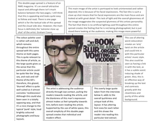
7. There is no ‘selling line’ presented on the magazine
cover. However, there is a short list of well-known
artists names headlined up the very top of the page; The main figure of this magazine cover is
presented neatly and clearly, so that they are not holding a very strong stance and
missed or lost amongst other text. This is almost expression. This could connote that he is a
acting as a selling line because we recognize these powerful and important man who seems to
are music related articles, so we then know what the be focused and well-off (by his smart 3-
purpose of the magazine is. piece tuxedo).
The masthead is very bold They have combined the word ‘terror’ with the rap artist ’50
and powerful. The solid white Cent’. This has also been shown through the main image. There
is well contrasted with the is ‘terror’ being shown in the background and the artist is being
background colour and the shown strong-faced stood in the foreground.
colour of the main figures
skin. This rather abrupt ‘mode of
language’ used- ‘best damn’
His strong, forceful gaze is is almost pushing the readers
projected directly towards the into buying and reading this
audience/viewers almost particular magazine. This
making us feel quite ‘slang’ could well of been
intimidated and small. used for their intended
- Also makes me wonder what audience.
has angered him. Whether, it
was the action happening Although the background is
behind him? very busy and eye-catching,
the main focal point is still the
There is quite a lot of use of rap artist. Therefore keeping
symbols throughout this front in with the magazine’s
cover. These are a great way purpose and not putting
to capture the attention of the forward the wrong message
readers and to break up the and attracting the wrong sort
text as well. of audience.
The brief case also seems to be well suited with his The red and yellow text also
suit and his ‘business class look’. But also makes me brings out the strong colours
wonder what is inside it… Money, important files, a of the flames, shown in the
bomb? Creating a sense of mystery. background.
8. The masthead is also a very
attractive and recognizable colour- The font of the masthead is
‘red’ and ‘white’. These work powerful, strong and eye
really well together and stand out The large whit text of the
lure/hook matches well with the catching. The outline of the
amoungst all of the other text. white and the black shadowed
man’s clothing and almost
‘brings out’ the smaller white effect contrast each other and
Red text signifies violence, text. This also proves that there make it appear as though it is
aggression, death and unsettlement, is a colour palette used, jumping out from the page
so is very well suited and including white and red. and towards the audience.
thoughtout to the magazine cover. It is also well suited to the
main image and the type of
magazine- powerful and
The main fugure has no direct rather abrupt.
eye contact, this to me isnt
very captivating and effective
because it doesn’t grasp the Text is well balanced out on
attention of the target either sides of the image and
audience. page.
- However, this to me is also a
really effective way to display
the mans real emotion and
All of the text is red and
pain. Almost making us, as
white. Which, as stated
viewers almost feel his pain
before, symbolizes hurt and
and affliction.
anger and therefore, this is
keeping to a theme and
‘Suicide’- links I well structure.
with the strong,
disturbing main image
which connotes self The man has tattoos and is
harm and ‘suicide’. shown wearing a wife beater
vest on. These could be seen
as stereotypical ‘bad man’
This is a very eye-opening main image with a strong gesture that seems features. Which, to me the
to have some sort of meaning behind why it’s being used as the cover of gun just proves this, as he
a magazine. Creating a sense of curiosity as to what the magazine content appears to be a violent sort of
would be about. person.
9. The large ‘Q’-the
Main image has no emotion masthead is very
showing. This connotes that he is recognizable and distinct
quite a powerful and strong as it’s clearly placed on a
character. The men shown also in solid colour; almost
the reflection are holding no separated from the rest of
expression either. This could the magazine cover.
mean that this band in particular
may want to be taken quite
seriously. The cover is really well balanced out. For example, the
large circular ‘Q’ of the masthead and the opposite side of
it is some smaller text inside a circular outline. This gives
The main figure is a sense of balance and is also an effective way to ‘bring
quite clean cut. This out’ this smaller text by giving it a border.
makes the cover
appear more tidy and
smart.
All of the text is running
The text is all in red, horizontally. This is proof
white, black and a that it has been designed
gold-brown colour. not to become confusing
Showing that a colour and appear unattractive
palette has been and untidy.
included and there is a
sense of structure and
balance.
- The gold-brown text
matches with parts of
the main image. His The cover lines are a
clothing and skin tone. mixture of quotations,
- The red, being a very band/artist names and
strong and powerful also article features.
colour also shows This is quite a nice way
through with the main to show variation, and
figures lip colour. that the content of this
particular magazine will
be varied and not all just
the same.
‘Liam’s’- it is only his
first name, which
could prove that he is
very well known in the The main cover line
includes a personal There is no background. It
band and that the is quite bland and bare, with
target audience of this pronoun, ‘Liam’s’
which could connote no distractions. This makes
particular magazine our eyes automatically focus
would clearly know that the main image of
the single figure could in on the main image, and
who he is, simply by what we make of it.
reading his first name. be the most important of
the group. The leader.