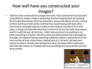
Graphic Narrative Evaluation
Use this template to help you evaluate your project.
You should give specific details about your work.
You should provide both written and visual examples to explain your project.
You should find areas to praise in your work. Be specific about why you think they are
good or why you are proud of them.
You should also find areas that could be improved. Look for areas that you could make
better if you went back to them. Be specific about what you would improve.
Add additional slides as you need to. Don’t be restricted by what is here.
Any blank slides should be deleted before submission.
Does your final product reflect your original
intentions?
• When I started my planning it didn't really have an image of what I wanted my
characters to look like, I knew what I wanted the characters to be and where the story
was set so I just used doodles and stock images off the internet of the what had in mind
just for my plan. It was only later when I sat down to design my digital flat plan I started
to get an image of what I wanted the characters to look like, but there was some
character like the empress of space and the bounty hunter I had no idea what I wanted
them to be. My finished product sticks to the same story line some characters do reflect
what they were in the plans, some characters went through minor changes e.g. changing
the colour of there skin and others changed completely.
Plan Digital Flat Plans Finished
As you can see the characters and the setting went through major changes but they stayed true t
How well have you constructed your
images?
• I believe I have constructed my images very well, I have constructed my characters
using different shapes I made in photoshop and then warping them or liquifying
them to give them shape. All of my characters, scenes and objects all have a theme
to them and they all look similar and that they should belong with each other. I
have tried to use bright colours to make it more mystical and also to fit in with
space so things still resemble what they're meant to be but they look more spacey
and fit in with the over all story line. I didn't add any texture to anything in my
book, everything is smooth, I did this so that everything looked like it belonged on
the page. So instead of having everything a different texture I wanted them all the
same so they all look a little similar, looking back at it i do wish i did add some
texture to make it all look more detailed but some characters didn't really work
that well with texture so it looked odd have everything else textured then just one
thing smooth.
How well have you used text to anchor your
images
• I put my text at the bottom of the page in a little cloud I did this to space the image
and the text away from each other I wanted it like this so whilst they are reading
the text they can also look at the whole image. I could have put the text into the
spare space of the image but I didn’t want to attract all of the attention to that
specific spot.
• I think my text describes what is going on in the story very well and it is easy to
follow my only regret is that some times I couldn't get enough information in the
images to match the text so some times more happens in the text than in shown in
the images but i don't think it is too much of a problem since the text explains it
well enough.
Is your product suitable for your audience?
• In my proposal I mentioned that my target audience for my book was children
between 4 -7, I didn't target any gender because I didn't see how my story could
have been gender specific. I think I have met my goals for my age range and gender
goals for my children's book
What do you like/dislike about the
techniques you have used?
• Reference specific tools you used with images
What do you like/dislike about how your
final product looks?
Why did you include the content you used?
• Images, fonts, effects, colours
• The font I used for my text is Luminari because it gives the text a Mystical /
adventure like look, some thing to make the boring text looking interesting and
inviting, for the same reasons this is why I made the text box a cloud, so it looks like
a fantasy and the children are being told more of a story.
• I used bright colours to attract the view of my audience and make the characters
and objects more appealing. I tried to avoid any dark colours on my characters and
objects because I felt that space being black there was too much dark and any
more would have made it look to droll.
What signs, symbols or codes have your
used in your work?
• Choices of colour, style, locations, character
design and tone all give additional meaning to
your work.
Creative Media Production 2012
Audience Responses
Cultural competence:
Media texts require us to have a certain level of cultural understanding to
be able to interpret them.
At a basic level, this could mean being able to read the language that a
magazine is written in.
At a deeper level, it means being able to interpret signs and symbols that
we use a visual shorthand to communicate ideas.
We recognise these signs in our own culture but find it harder to
understand when looking at others.
We create and attach meaning to signs and symbols in many different
forms.
15
Creative Media Production 2012
Audience Responses
Cultural competence:
What is this?
This is a Norwegian Pine tree, covered in
snow and with a red ribbon on.
Our cultural understanding allows us to
interpret its meaning.
To us, in British society, it means
Christmas, presents and family.
This is because we share a cultural
knowledge.
16
Creative Media Production 2012
Audience Responses
Cultural competence:
There are many other signs and symbols
that we attach meaning to.
A leather jacket can imply rebellion.
A sports car can imply wealth and power.
A cross can represent religion.
17
Creative Media Production 2012
Audience Responses
Cultural competence:
Visual representations of everyday objects are often the same the world
over. A car appears as a car, no matter what country it appears in.
What that car means however, can be very different depending on your
cultural background.
18
What representations can be found in your
work?
• How are men, women or children shown in
your work? Does your work feature different
ages, races, social groups or religions? Does a
lack of any variety of character types create its
own representation?
What style have you employed in your
products?
• Discuss influences/ existing products
• What visual style does your work have and
why did you choose it?
What were the strengths and weaknesses of
the pre-production and planning
• How did the planning and research help
• How well did you manage your time
• Reference specific examples
Historical and cultural context
• How does your work compare to what has
come before? What other similar products
have existed in the past? What current
products exist?
Peer Feedback
• Summarise peer feedback and discuss
– Responses you agree with
– Responses you disagree with
Digital graphics evaluation pro forma

Digital graphics evaluation pro forma

  • 1.
  • 2.
    Use this templateto help you evaluate your project. You should give specific details about your work. You should provide both written and visual examples to explain your project. You should find areas to praise in your work. Be specific about why you think they are good or why you are proud of them. You should also find areas that could be improved. Look for areas that you could make better if you went back to them. Be specific about what you would improve. Add additional slides as you need to. Don’t be restricted by what is here. Any blank slides should be deleted before submission.
  • 3.
    Does your finalproduct reflect your original intentions? • When I started my planning it didn't really have an image of what I wanted my characters to look like, I knew what I wanted the characters to be and where the story was set so I just used doodles and stock images off the internet of the what had in mind just for my plan. It was only later when I sat down to design my digital flat plan I started to get an image of what I wanted the characters to look like, but there was some character like the empress of space and the bounty hunter I had no idea what I wanted them to be. My finished product sticks to the same story line some characters do reflect what they were in the plans, some characters went through minor changes e.g. changing the colour of there skin and others changed completely.
  • 4.
    Plan Digital FlatPlans Finished As you can see the characters and the setting went through major changes but they stayed true t
  • 5.
    How well haveyou constructed your images? • I believe I have constructed my images very well, I have constructed my characters using different shapes I made in photoshop and then warping them or liquifying them to give them shape. All of my characters, scenes and objects all have a theme to them and they all look similar and that they should belong with each other. I have tried to use bright colours to make it more mystical and also to fit in with space so things still resemble what they're meant to be but they look more spacey and fit in with the over all story line. I didn't add any texture to anything in my book, everything is smooth, I did this so that everything looked like it belonged on the page. So instead of having everything a different texture I wanted them all the same so they all look a little similar, looking back at it i do wish i did add some texture to make it all look more detailed but some characters didn't really work that well with texture so it looked odd have everything else textured then just one thing smooth.
  • 6.
    How well haveyou used text to anchor your images • I put my text at the bottom of the page in a little cloud I did this to space the image and the text away from each other I wanted it like this so whilst they are reading the text they can also look at the whole image. I could have put the text into the spare space of the image but I didn’t want to attract all of the attention to that specific spot. • I think my text describes what is going on in the story very well and it is easy to follow my only regret is that some times I couldn't get enough information in the images to match the text so some times more happens in the text than in shown in the images but i don't think it is too much of a problem since the text explains it well enough.
  • 7.
    Is your productsuitable for your audience? • In my proposal I mentioned that my target audience for my book was children between 4 -7, I didn't target any gender because I didn't see how my story could have been gender specific. I think I have met my goals for my age range and gender goals for my children's book
  • 9.
    What do youlike/dislike about the techniques you have used? • Reference specific tools you used with images
  • 11.
    What do youlike/dislike about how your final product looks?
  • 13.
    Why did youinclude the content you used? • Images, fonts, effects, colours • The font I used for my text is Luminari because it gives the text a Mystical / adventure like look, some thing to make the boring text looking interesting and inviting, for the same reasons this is why I made the text box a cloud, so it looks like a fantasy and the children are being told more of a story. • I used bright colours to attract the view of my audience and make the characters and objects more appealing. I tried to avoid any dark colours on my characters and objects because I felt that space being black there was too much dark and any more would have made it look to droll.
  • 14.
    What signs, symbolsor codes have your used in your work? • Choices of colour, style, locations, character design and tone all give additional meaning to your work.
  • 15.
    Creative Media Production2012 Audience Responses Cultural competence: Media texts require us to have a certain level of cultural understanding to be able to interpret them. At a basic level, this could mean being able to read the language that a magazine is written in. At a deeper level, it means being able to interpret signs and symbols that we use a visual shorthand to communicate ideas. We recognise these signs in our own culture but find it harder to understand when looking at others. We create and attach meaning to signs and symbols in many different forms. 15
  • 16.
    Creative Media Production2012 Audience Responses Cultural competence: What is this? This is a Norwegian Pine tree, covered in snow and with a red ribbon on. Our cultural understanding allows us to interpret its meaning. To us, in British society, it means Christmas, presents and family. This is because we share a cultural knowledge. 16
  • 17.
    Creative Media Production2012 Audience Responses Cultural competence: There are many other signs and symbols that we attach meaning to. A leather jacket can imply rebellion. A sports car can imply wealth and power. A cross can represent religion. 17
  • 18.
    Creative Media Production2012 Audience Responses Cultural competence: Visual representations of everyday objects are often the same the world over. A car appears as a car, no matter what country it appears in. What that car means however, can be very different depending on your cultural background. 18
  • 20.
    What representations canbe found in your work? • How are men, women or children shown in your work? Does your work feature different ages, races, social groups or religions? Does a lack of any variety of character types create its own representation?
  • 22.
    What style haveyou employed in your products? • Discuss influences/ existing products • What visual style does your work have and why did you choose it?
  • 24.
    What were thestrengths and weaknesses of the pre-production and planning • How did the planning and research help • How well did you manage your time • Reference specific examples
  • 26.
    Historical and culturalcontext • How does your work compare to what has come before? What other similar products have existed in the past? What current products exist?
  • 28.
    Peer Feedback • Summarisepeer feedback and discuss – Responses you agree with – Responses you disagree with