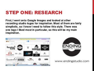
STEP ONE: RESEARCH
First,I went onto Google Images and looked at other
recording studio logos for inspiration. Most of them are fairly
simplistic, so I know I need to follow this style. There was
one logo I liked most in particular, so this will be my main
inspiration.
3.
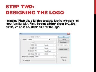
STEP TWO:
DESIGNING THELOGO
I’m using Photoshop for this because it’s the program I’m
most familiar with. First, I create a blank sheet 500x500
pixels, which is a suitable size for the logo.
4.
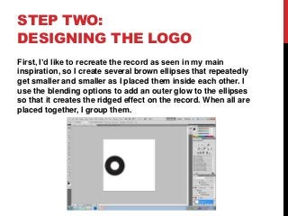
STEP TWO:
DESIGNING THELOGO
First, I’d like to recreate the record as seen in my main
inspiration, so I create several brown ellipses that repeatedly
get smaller and smaller as I placed them inside each other. I
use the blending options to add an outer glow to the ellipses
so that it creates the ridged effect on the record. When all are
placed together, I group them.
5.
STEP TWO:
DESIGNING THELOGO
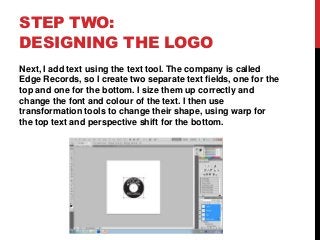
Next, I add text using the text tool. The company is called
Edge Records, so I create two separate text fields, one for the
top and one for the bottom. I size them up correctly and
change the font and colour of the text. I then use
transformation tools to change their shape, using warp for
the top text and perspective shift for the bottom.
6.
STEP TWO:
DESIGNING THELOGO
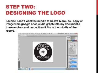
I decide I don’t want the middle to be left blank, so I copy an
image from google of an audio graph into my document. I
then recolour and resize it so it fits in the middle of the
record.
7.
STEP THREE: THE
FINISHEDLOGO
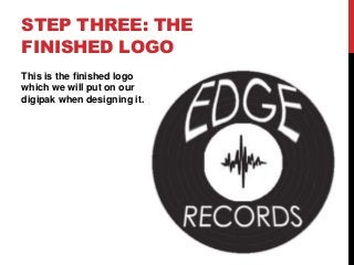
This is the finished logo
which we will put on our
digipak when designing it.