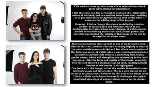
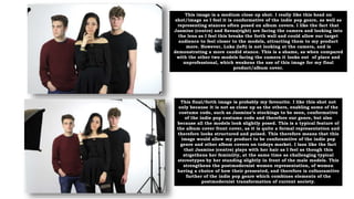
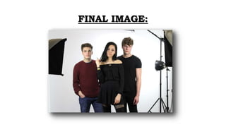
POSSIBLE IMAGES FOR ALBUM
COVER DESIGN:
CONTACT SHEET
This medium close up shot is one of the selected shortlisted
shots taken during our photoshoot.
I like this shot, as I feel as though it captures the collaborative
nature of our band, and is a medium loose frame shot, enabling
us to get some white background in the shot useful when it
comes to the editing stage of the project.
However, I feel as though the stance modelled by Jasmine
(centre) is too laid back and mundane, which is not
conformative to typical album cover designs, of which present
models demonstrating more structured, formal posses, and
therefore questioning the validity of this image as the one to
be used for our album cover.
This second medium close up shot is one of my favourite ones. I
like the fact that Jasmine (centre) is standing slightly in front of
the male models (savas and luka) as I feel this is conformative of
the Indie pop genre, of which takes a more postmodernist stance
on society, and therefore reflects a subverting from typical
gender norms, which will strengthen my conforming to the indie
pop genre. I like the focus and quality of this image, especially
with the fact that it’s a medium close up shot, enabling specific
features of our models to be highlighted.
One issue with this image, is that the models demonstrate more
laid back posses and facial codes. This is a nice feature for an
insert in an album cover, however for the front of an album cover
I find it a little too informal because it challenges the typical
structured stereotype of current album covers on the market
today.
This image is a medium close up shot. I really like this head on
shot/image as I feel it is conformative of the indie pop genre, as well as
representing stances often posed on album covers. I like the fact that
Jasmine (centre) and Savas(right) are facing the camera and looking into
the lens as I feel this breaks the forth wall and could allow our target
audience to feel closer to the models, attracting them to my product
more. However, Luka (left) is not looking at the camera, and is
demonstrating a more candid stance. This is a shame, as when compared
with the other two models facing the camera it looks out of place and
unprofessional, which weakens the use of this image for my final
product/album cover.
This final/forth image is probably my favourite. I like this shot not
only because it is not as close up as the others, enabling some of the
costume code, such as Jasmine’s stockings to be seen, conformative
of the indie pop costume code and therefore our genre, but also
because all the models look slightly posed. This is a typical feature of
the album cover front cover, as it is quite a formal representation and
therefore looks structured and poised. This therefore means that this
image would allow my product to be conforamtive of the indie pop
genre and other album covers on todays market. I laos like the fact
that Jasmine (centre) plays with her hair as I feel as though this
strgethens her feminiity, at the same time as challenging typical
stereotypes by her standing slightly in front of the male models. This
strengthens the postmodernist women representation, of women
having a choice of how their presented, and therefore is cofnoramtive
further of the indie pop genre which combines elements of the
postmodernist transformation of current society.
FINAL IMAGE:

Contact sheet analysis deisgn

  • 1.
    POSSIBLE IMAGES FORALBUM COVER DESIGN: CONTACT SHEET
  • 2.
    This medium closeup shot is one of the selected shortlisted shots taken during our photoshoot. I like this shot, as I feel as though it captures the collaborative nature of our band, and is a medium loose frame shot, enabling us to get some white background in the shot useful when it comes to the editing stage of the project. However, I feel as though the stance modelled by Jasmine (centre) is too laid back and mundane, which is not conformative to typical album cover designs, of which present models demonstrating more structured, formal posses, and therefore questioning the validity of this image as the one to be used for our album cover. This second medium close up shot is one of my favourite ones. I like the fact that Jasmine (centre) is standing slightly in front of the male models (savas and luka) as I feel this is conformative of the Indie pop genre, of which takes a more postmodernist stance on society, and therefore reflects a subverting from typical gender norms, which will strengthen my conforming to the indie pop genre. I like the focus and quality of this image, especially with the fact that it’s a medium close up shot, enabling specific features of our models to be highlighted. One issue with this image, is that the models demonstrate more laid back posses and facial codes. This is a nice feature for an insert in an album cover, however for the front of an album cover I find it a little too informal because it challenges the typical structured stereotype of current album covers on the market today.
  • 3.
    This image isa medium close up shot. I really like this head on shot/image as I feel it is conformative of the indie pop genre, as well as representing stances often posed on album covers. I like the fact that Jasmine (centre) and Savas(right) are facing the camera and looking into the lens as I feel this breaks the forth wall and could allow our target audience to feel closer to the models, attracting them to my product more. However, Luka (left) is not looking at the camera, and is demonstrating a more candid stance. This is a shame, as when compared with the other two models facing the camera it looks out of place and unprofessional, which weakens the use of this image for my final product/album cover. This final/forth image is probably my favourite. I like this shot not only because it is not as close up as the others, enabling some of the costume code, such as Jasmine’s stockings to be seen, conformative of the indie pop costume code and therefore our genre, but also because all the models look slightly posed. This is a typical feature of the album cover front cover, as it is quite a formal representation and therefore looks structured and poised. This therefore means that this image would allow my product to be conforamtive of the indie pop genre and other album covers on todays market. I laos like the fact that Jasmine (centre) plays with her hair as I feel as though this strgethens her feminiity, at the same time as challenging typical stereotypes by her standing slightly in front of the male models. This strengthens the postmodernist women representation, of women having a choice of how their presented, and therefore is cofnoramtive further of the indie pop genre which combines elements of the postmodernist transformation of current society.
  • 4.