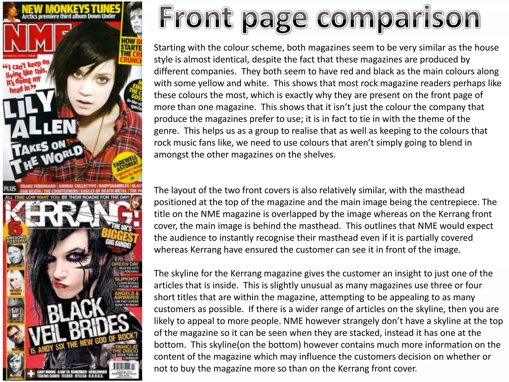
Starting with the colour scheme, both magazines seem to be very similar as the house
style is almost identical, despite the fact that these magazines are produced by
different companies. They both seem to have red and black as the main colours along
with some yellow and white. This shows that most rock magazine readers perhaps like
these colours the most, which is exactly why they are present on the front page of
more than one magazine. This shows that it isn’t just the colour the company that
produce the magazines prefer to use; it is in fact to tie in with the theme of the
genre. This helps us as a group to realise that as well as keeping to the colours that
rock music fans like, we need to use colours that aren’t simply going to blend in
amongst the other magazines on the shelves.


The layout of the two front covers is also relatively similar, with the masthead
positioned at the top of the magazine and the main image being the centrepiece. The
title on the NME magazine is overlapped by the image whereas on the Kerrang front
cover, the main image is behind the masthead. This outlines that NME would expect
the audience to instantly recognise their masthead even if it is partially covered
whereas Kerrang have ensured the customer can see it in front of the image.

The skyline for the Kerrang magazine gives the customer an insight to just one of the
articles that is inside. This is slightly unusual as many magazines use three or four
short titles that are within the magazine, attempting to be appealing to as many
customers as possible. If there is a wider range of articles on the skyline, then you are
likely to appeal to more people. NME however strangely don’t have a skyline at the top
of the magazine so it can be seen when they are stacked, instead it has one at the
bottom. This skyline(on the bottom) however contains much more information on the
content of the magazine which may influence the customers decision on whether or
not to buy the magazine more so than on the Kerrang front cover.
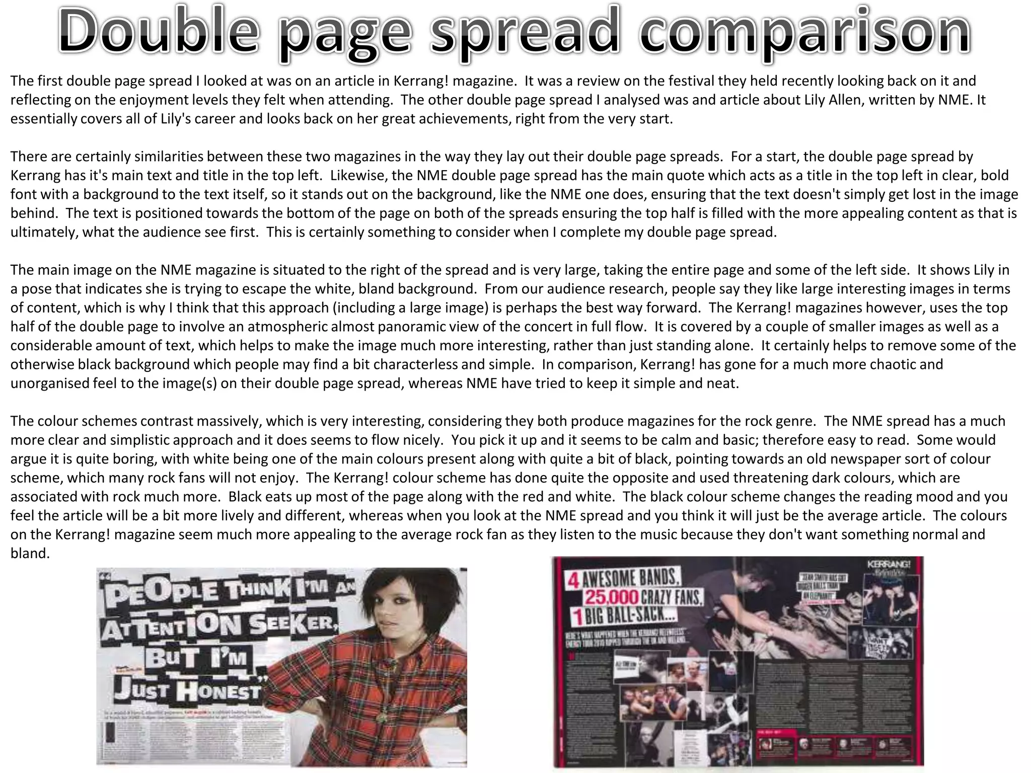
The first double page spread I looked at was on an article in Kerrang! magazine. It was a review on the festival they held recently looking back on it and
reflecting on the enjoyment levels they felt when attending. The other double page spread I analysed was and article about Lily Allen, written by NME. It
essentially covers all of Lily's career and looks back on her great achievements, right from the very start.

There are certainly similarities between these two magazines in the way they lay out their double page spreads. For a start, the double page spread by
Kerrang has it's main text and title in the top left. Likewise, the NME double page spread has the main quote which acts as a title in the top left in clear, bold
font with a background to the text itself, so it stands out on the background, like the NME one does, ensuring that the text doesn't simply get lost in the image
behind. The text is positioned towards the bottom of the page on both of the spreads ensuring the top half is filled with the more appealing content as that is
ultimately, what the audience see first. This is certainly something to consider when I complete my double page spread.

The main image on the NME magazine is situated to the right of the spread and is very large, taking the entire page and some of the left side. It shows Lily in
a pose that indicates she is trying to escape the white, bland background. From our audience research, people say they like large interesting images in terms
of content, which is why I think that this approach (including a large image) is perhaps the best way forward. The Kerrang! magazines however, uses the top
half of the double page to involve an atmospheric almost panoramic view of the concert in full flow. It is covered by a couple of smaller images as well as a
considerable amount of text, which helps to make the image much more interesting, rather than just standing alone. It certainly helps to remove some of the
otherwise black background which people may find a bit characterless and simple. In comparison, Kerrang! has gone for a much more chaotic and
unorganised feel to the image(s) on their double page spread, whereas NME have tried to keep it simple and neat.

The colour schemes contrast massively, which is very interesting, considering they both produce magazines for the rock genre. The NME spread has a much
more clear and simplistic approach and it does seems to flow nicely. You pick it up and it seems to be calm and basic; therefore easy to read. Some would
argue it is quite boring, with white being one of the main colours present along with quite a bit of black, pointing towards an old newspaper sort of colour
scheme, which many rock fans will not enjoy. The Kerrang! colour scheme has done quite the opposite and used threatening dark colours, which are
associated with rock much more. Black eats up most of the page along with the red and white. The black colour scheme changes the reading mood and you
feel the article will be a bit more lively and different, whereas when you look at the NME spread and you think it will just be the average article. The colours
on the Kerrang! magazine seem much more appealing to the average rock fan as they listen to the music because they don't want something normal and
bland.

Comparison

  • 1.
    Starting with thecolour scheme, both magazines seem to be very similar as the house style is almost identical, despite the fact that these magazines are produced by different companies. They both seem to have red and black as the main colours along with some yellow and white. This shows that most rock magazine readers perhaps like these colours the most, which is exactly why they are present on the front page of more than one magazine. This shows that it isn’t just the colour the company that produce the magazines prefer to use; it is in fact to tie in with the theme of the genre. This helps us as a group to realise that as well as keeping to the colours that rock music fans like, we need to use colours that aren’t simply going to blend in amongst the other magazines on the shelves. The layout of the two front covers is also relatively similar, with the masthead positioned at the top of the magazine and the main image being the centrepiece. The title on the NME magazine is overlapped by the image whereas on the Kerrang front cover, the main image is behind the masthead. This outlines that NME would expect the audience to instantly recognise their masthead even if it is partially covered whereas Kerrang have ensured the customer can see it in front of the image. The skyline for the Kerrang magazine gives the customer an insight to just one of the articles that is inside. This is slightly unusual as many magazines use three or four short titles that are within the magazine, attempting to be appealing to as many customers as possible. If there is a wider range of articles on the skyline, then you are likely to appeal to more people. NME however strangely don’t have a skyline at the top of the magazine so it can be seen when they are stacked, instead it has one at the bottom. This skyline(on the bottom) however contains much more information on the content of the magazine which may influence the customers decision on whether or not to buy the magazine more so than on the Kerrang front cover.
  • 2.
    The first doublepage spread I looked at was on an article in Kerrang! magazine. It was a review on the festival they held recently looking back on it and reflecting on the enjoyment levels they felt when attending. The other double page spread I analysed was and article about Lily Allen, written by NME. It essentially covers all of Lily's career and looks back on her great achievements, right from the very start. There are certainly similarities between these two magazines in the way they lay out their double page spreads. For a start, the double page spread by Kerrang has it's main text and title in the top left. Likewise, the NME double page spread has the main quote which acts as a title in the top left in clear, bold font with a background to the text itself, so it stands out on the background, like the NME one does, ensuring that the text doesn't simply get lost in the image behind. The text is positioned towards the bottom of the page on both of the spreads ensuring the top half is filled with the more appealing content as that is ultimately, what the audience see first. This is certainly something to consider when I complete my double page spread. The main image on the NME magazine is situated to the right of the spread and is very large, taking the entire page and some of the left side. It shows Lily in a pose that indicates she is trying to escape the white, bland background. From our audience research, people say they like large interesting images in terms of content, which is why I think that this approach (including a large image) is perhaps the best way forward. The Kerrang! magazines however, uses the top half of the double page to involve an atmospheric almost panoramic view of the concert in full flow. It is covered by a couple of smaller images as well as a considerable amount of text, which helps to make the image much more interesting, rather than just standing alone. It certainly helps to remove some of the otherwise black background which people may find a bit characterless and simple. In comparison, Kerrang! has gone for a much more chaotic and unorganised feel to the image(s) on their double page spread, whereas NME have tried to keep it simple and neat. The colour schemes contrast massively, which is very interesting, considering they both produce magazines for the rock genre. The NME spread has a much more clear and simplistic approach and it does seems to flow nicely. You pick it up and it seems to be calm and basic; therefore easy to read. Some would argue it is quite boring, with white being one of the main colours present along with quite a bit of black, pointing towards an old newspaper sort of colour scheme, which many rock fans will not enjoy. The Kerrang! colour scheme has done quite the opposite and used threatening dark colours, which are associated with rock much more. Black eats up most of the page along with the red and white. The black colour scheme changes the reading mood and you feel the article will be a bit more lively and different, whereas when you look at the NME spread and you think it will just be the average article. The colours on the Kerrang! magazine seem much more appealing to the average rock fan as they listen to the music because they don't want something normal and bland.