Choosing A Good Chart 09
•
0 likes•1,341 views

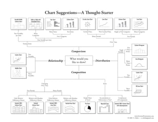
The document provides a chart selection guide with suggestions for which types of charts to use based on the type of data to present and relationships to show. It displays various chart types such as line charts, column charts, bar charts, scatter plots, histograms and pie charts. The guide indicates which charts are best for displaying cyclical or non-cyclical data, single or many categories, few or many items/periods, and whether the data shows relationships, distributions, compositions or changes over time.

More Related Content
More from Grégoire Hervé-bazin
More from Grégoire Hervé-bazin (18)
Choosing A Good Chart 09
- 1. Chart Suggestions—A Thought-Starter Circular Area Chart Line Chart Column Chart Line Chart Column Chart Variable Width Table or Table with Bar Chart Column Chart Embedded Charts Cyclical Data Non-Cyclical Data Single or Few Categories Many Categories Many Items Few Items Two Variables Many per Item Categories Few Categories Many Periods Few Periods One Variable per Item Over Time Among Items Column Histogram Few Data Single Comparison Points Variable Two Scatter Chart Variables What would you Line Histogram Distribution Relationship Many like to show? Data Points Bubble Chart Composition Scatter Chart Th ree Two Variables Variables Changing Static Over Time 3D Area Chart Th ree Variables Few Periods Many Periods Simple Share Accumulation or Components Only Relative Relative and Absolute Only Relative Relative and Absolute of Total Subtraction to Total of Components Differences Matter Differences Matter Differences Matter Differences Matter Stacked 100% Stacked Stacked 100% Stacked Area Chart Pie Chart Stacked 100% Column Chart Waterfall Chart Column Chart Column Chart Area Chart with Subcomponents www.ExtremePresentation.com © 2009 A. Abela — a.v.abela@gmail.com