Report
Share
Recommended
CIPP US_Moriah Peters
This single sentence document provides a verified certificate number that can be accessed online at the given URL www.credential.net/10133064. The certificate verifies an individual's qualifications or credentials related to that number.
Cửa cuốn trượt trần
Là sự lựa chọn hoàn hảo khi bạn đang tìm kiếm loại cửa cuốn cho Garage nhà mình khi bị giới hạn về độ cao.
Estadsitica 9no
En una pastelería hay 28 hombres y 32 mujeres. De los hombres, 15 prefieren tortas de piña y el resto prefiere lúcuma, mientras que de las mujeres, 20 prefieren piña y el resto lúcuma. Se pide calcular varias probabilidades relacionadas a la preferencia de tortas y el género de las personas en la pastelería.
Read the article about halloween and complete these sentences using only one ...
Halloween is celebrated on October 31st, with traditions including trick-or-treating where children dress in costumes and go from house to house asking for treats. It has origins in an ancient Celtic festival celebrating the end of the harvest season. The article discusses the date of Halloween, common activities like trick-or-treating and wearing costumes, and asks questions about the reasons for costumes and traditions as well as the origins of the holiday.
Desistimiento
Un demandante solicita desistirse de su pretensión y del proceso en curso sobre Nulidad de Acto Jurídico. El demandante legaliza su firma ante el secretario para mostrar conformidad. Solicita que el juez apruebe el desistimiento y archive definitivamente el caso de acuerdo a la ley, lo que produciría los efectos de una demanda infundada con autoridad de cosa juzgada.
Oct 23 2015 toyota etios Cross Accessories brochure
This document advertises Toyota genuine accessories for the Etios Cross vehicle, including seat covers, steering wheel covers, floor mats, child seats, and more. The accessories are designed to ensure a perfect fit, easy installation, and Toyota quality standards. Various accessory packages and financing options are available to help customers customize their vehicle and express their style.
O que são indicadores sociais
Os indicadores sociais são estatísticas sobre aspectos da vida de uma nação que retratam seu estado social e nível de desenvolvimento, como características da população, demografia, trabalho, saúde e educação. No Brasil, o IBGE é responsável por produzir as estatísticas que compõem os indicadores sociais usando pesquisas como o Censo Demográfico.
Genre conventions (1)
The document summarizes key traits seen in generic rock, pop, and rap music videos:
Rock music videos often feature the band performing with instruments like guitars and drums. They commonly tell a story that relates to the song's message.
Pop videos aim to feel happy and positive. Dancers of a different gender than the artist are usually included. Stories are less common than in rock since pop songs have fewer underlying messages.
Rap videos vary between calm scenes of substance usage and angry scenes of confronting the viewer. Artists are usually in urban settings without much story, as rap songs don't often have hidden meanings.
Media evaluation
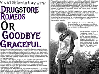
The document discusses the design choices made for the magazine cover. It was inspired by styles used in Kerrang! and Alternative Press magazines, such as the large bold title, banner advertisements, and central placement of the main image. The document examines how conventions from other magazines were used, such as the placement of the barcode and inclusion of free materials. Color scheme and layout were chosen to match the genre while making the cover eye-catching. The target audience of 14-21 year olds interested in rock and metal music is addressed through the cover design.
Media evaluation
The document discusses the design choices made for a music magazine cover and layout. It describes copying conventions from existing magazines like Kerrang! and Alternative Press, such as using large images of featured artists and banners to advertise free items. The document also discusses challenges made to conventions, such as using red text instead of white on black. Inspiration was taken from studying various magazine covers, contents pages, and spreads to structure the new magazine and maximize its potential while making it unique.
Double page spread progress
This document summarizes the beginning design of a double-page magazine spread. It includes an image of the featured character to make the article attractive and informative. The title was moved to make more room for text while differentiating the design from other magazines. The title color was changed to match the contents page and cover. The text was experimented with in different positions and sizes for readability and was sorted into columns so the sections fit well together.
Contents page progress
This document summarizes revisions made to a magazine contents page. It overhauls the layout based on peer feedback, changes colors and styles to match the cover, inserts descriptions of article pages, and adds three images with explanations to highlight important articles. The final version is completed.
Chimera progression
This document describes the process of designing a magazine cover from initial sketches to the final design. It involves experimenting with colors, fonts, images and layouts. The designer receives feedback suggesting improvements and makes adjustments accordingly, such as adding more colors, changing text placements, and increasing the size of titles to make elements stand out more. A banner and album cover are eventually added to fill empty space. The final design aims to look visually appealing and professionally presented.
Colour palette
The document discusses color palettes for rock music magazines. It notes that Kerrang! magazine uses a mix of dark and light colors to represent both heavy and less heavy rock music. Metal Hammer's colors are darker, showing its focus on heavier styles of music, though it also includes some lighter colors. The document concludes that since its own magazine will focus on rock and metal genres, it has selected colors similar to those used in Kerrang! and Metal Hammer.
Media final evaluation
The document discusses how the student used conventions from existing magazines like Kerrang! and Metal Hammer to structure their own music magazine. They studied the front covers, contents pages, and double-page spreads of these magazines to inform the layout and design of their magazine. The student provides examples of how they implemented conventions like placement of the title, artist images and plugs while also developing their own style with unique elements like font color and placement of elements. They learned new skills using technologies like cameras, image editing software, and layout programs.
Music magazine contents pages
The document discusses the color schemes and layouts of three different magazine contents pages. It notes that the colors used do not clash with the images or text, making the pages visually appealing. The images are relevant to the magazines' themes and featured artists that would interest readers. However, some of the text is small and could be difficult to read. Overall, the colors and images are used effectively but the text size could be improved in places.
Music magazine contents pages
The document discusses the design elements used in contents pages from three different magazines. It analyzes the color schemes, images, and text used in each contents page. The color schemes are used effectively and do not clash with images. However, some of the text is small and could be difficult to read for some. The images are relevant to the magazine themes and artists featured in articles.
Music magazine reviews
The layout of the double-page spread allows for the inclusion of the article, main image, and other relevant information. However, because there is a lot included, the text size has been reduced, which may make it difficult for some readers to read. The text at the top grabs attention but the article text size is small. The colors used are effective at attracting attention but could cause reading issues in some areas.
More Related Content
More from MoltenPhoenix
Genre conventions (1)
The document summarizes key traits seen in generic rock, pop, and rap music videos:
Rock music videos often feature the band performing with instruments like guitars and drums. They commonly tell a story that relates to the song's message.
Pop videos aim to feel happy and positive. Dancers of a different gender than the artist are usually included. Stories are less common than in rock since pop songs have fewer underlying messages.
Rap videos vary between calm scenes of substance usage and angry scenes of confronting the viewer. Artists are usually in urban settings without much story, as rap songs don't often have hidden meanings.
Media evaluation
The document discusses the design choices made for the magazine cover. It was inspired by styles used in Kerrang! and Alternative Press magazines, such as the large bold title, banner advertisements, and central placement of the main image. The document examines how conventions from other magazines were used, such as the placement of the barcode and inclusion of free materials. Color scheme and layout were chosen to match the genre while making the cover eye-catching. The target audience of 14-21 year olds interested in rock and metal music is addressed through the cover design.
Media evaluation
The document discusses the design choices made for a music magazine cover and layout. It describes copying conventions from existing magazines like Kerrang! and Alternative Press, such as using large images of featured artists and banners to advertise free items. The document also discusses challenges made to conventions, such as using red text instead of white on black. Inspiration was taken from studying various magazine covers, contents pages, and spreads to structure the new magazine and maximize its potential while making it unique.
Double page spread progress
This document summarizes the beginning design of a double-page magazine spread. It includes an image of the featured character to make the article attractive and informative. The title was moved to make more room for text while differentiating the design from other magazines. The title color was changed to match the contents page and cover. The text was experimented with in different positions and sizes for readability and was sorted into columns so the sections fit well together.
Contents page progress
This document summarizes revisions made to a magazine contents page. It overhauls the layout based on peer feedback, changes colors and styles to match the cover, inserts descriptions of article pages, and adds three images with explanations to highlight important articles. The final version is completed.
Chimera progression
This document describes the process of designing a magazine cover from initial sketches to the final design. It involves experimenting with colors, fonts, images and layouts. The designer receives feedback suggesting improvements and makes adjustments accordingly, such as adding more colors, changing text placements, and increasing the size of titles to make elements stand out more. A banner and album cover are eventually added to fill empty space. The final design aims to look visually appealing and professionally presented.
Colour palette
The document discusses color palettes for rock music magazines. It notes that Kerrang! magazine uses a mix of dark and light colors to represent both heavy and less heavy rock music. Metal Hammer's colors are darker, showing its focus on heavier styles of music, though it also includes some lighter colors. The document concludes that since its own magazine will focus on rock and metal genres, it has selected colors similar to those used in Kerrang! and Metal Hammer.
Media final evaluation
The document discusses how the student used conventions from existing magazines like Kerrang! and Metal Hammer to structure their own music magazine. They studied the front covers, contents pages, and double-page spreads of these magazines to inform the layout and design of their magazine. The student provides examples of how they implemented conventions like placement of the title, artist images and plugs while also developing their own style with unique elements like font color and placement of elements. They learned new skills using technologies like cameras, image editing software, and layout programs.
Music magazine contents pages
The document discusses the color schemes and layouts of three different magazine contents pages. It notes that the colors used do not clash with the images or text, making the pages visually appealing. The images are relevant to the magazines' themes and featured artists that would interest readers. However, some of the text is small and could be difficult to read. Overall, the colors and images are used effectively but the text size could be improved in places.
Music magazine contents pages
The document discusses the design elements used in contents pages from three different magazines. It analyzes the color schemes, images, and text used in each contents page. The color schemes are used effectively and do not clash with images. However, some of the text is small and could be difficult to read for some. The images are relevant to the magazine themes and artists featured in articles.
Music magazine reviews
The layout of the double-page spread allows for the inclusion of the article, main image, and other relevant information. However, because there is a lot included, the text size has been reduced, which may make it difficult for some readers to read. The text at the top grabs attention but the article text size is small. The colors used are effective at attracting attention but could cause reading issues in some areas.