Download as PDF, PPTX
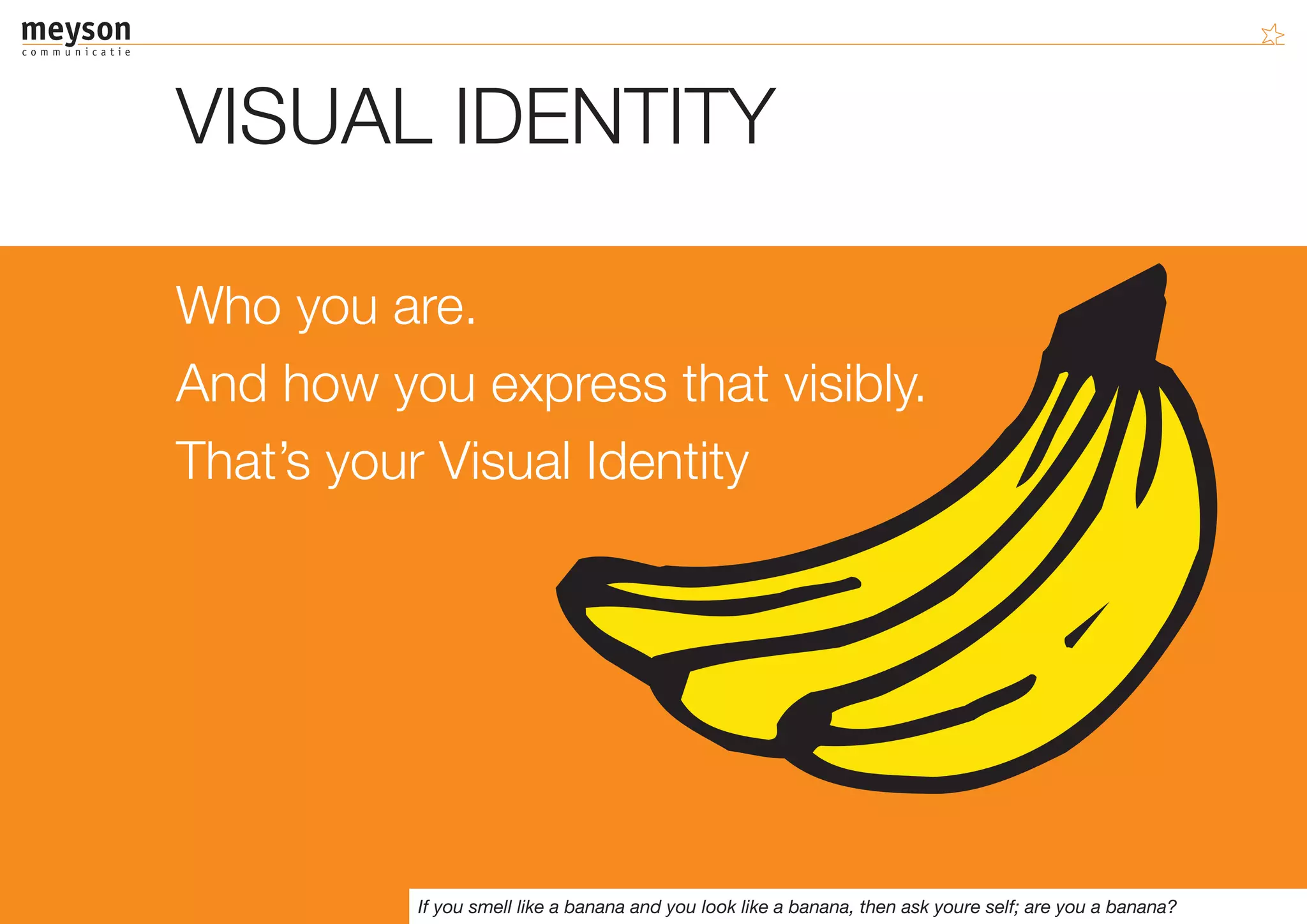
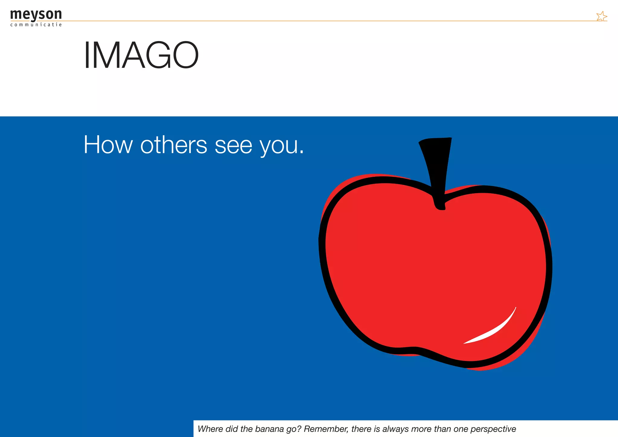
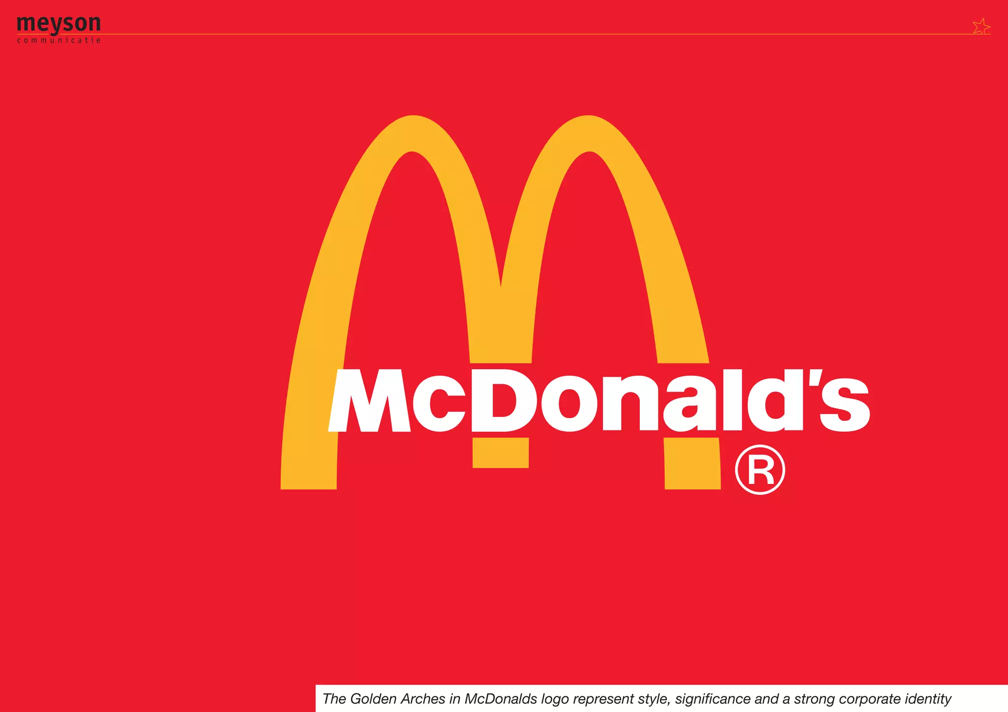
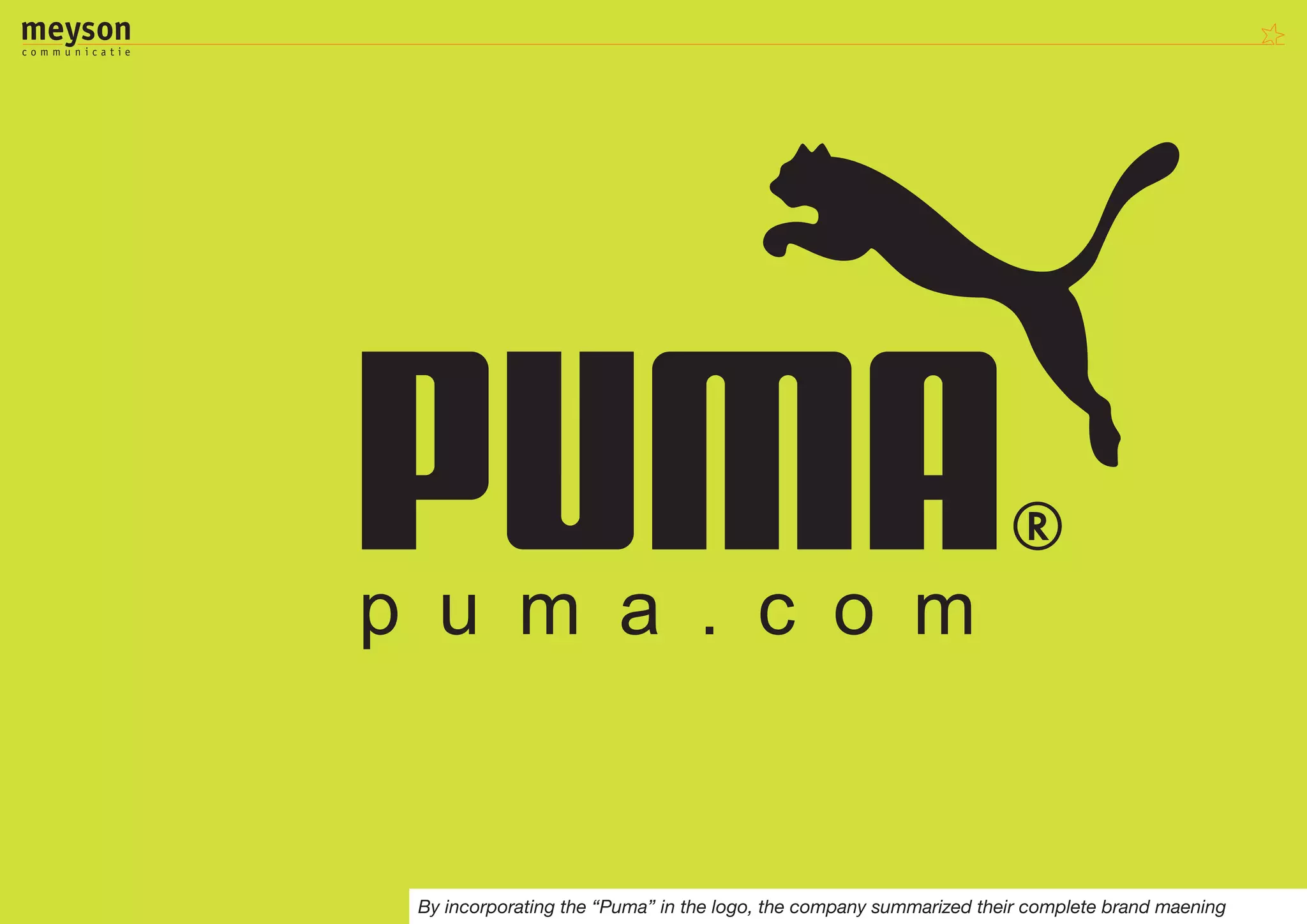
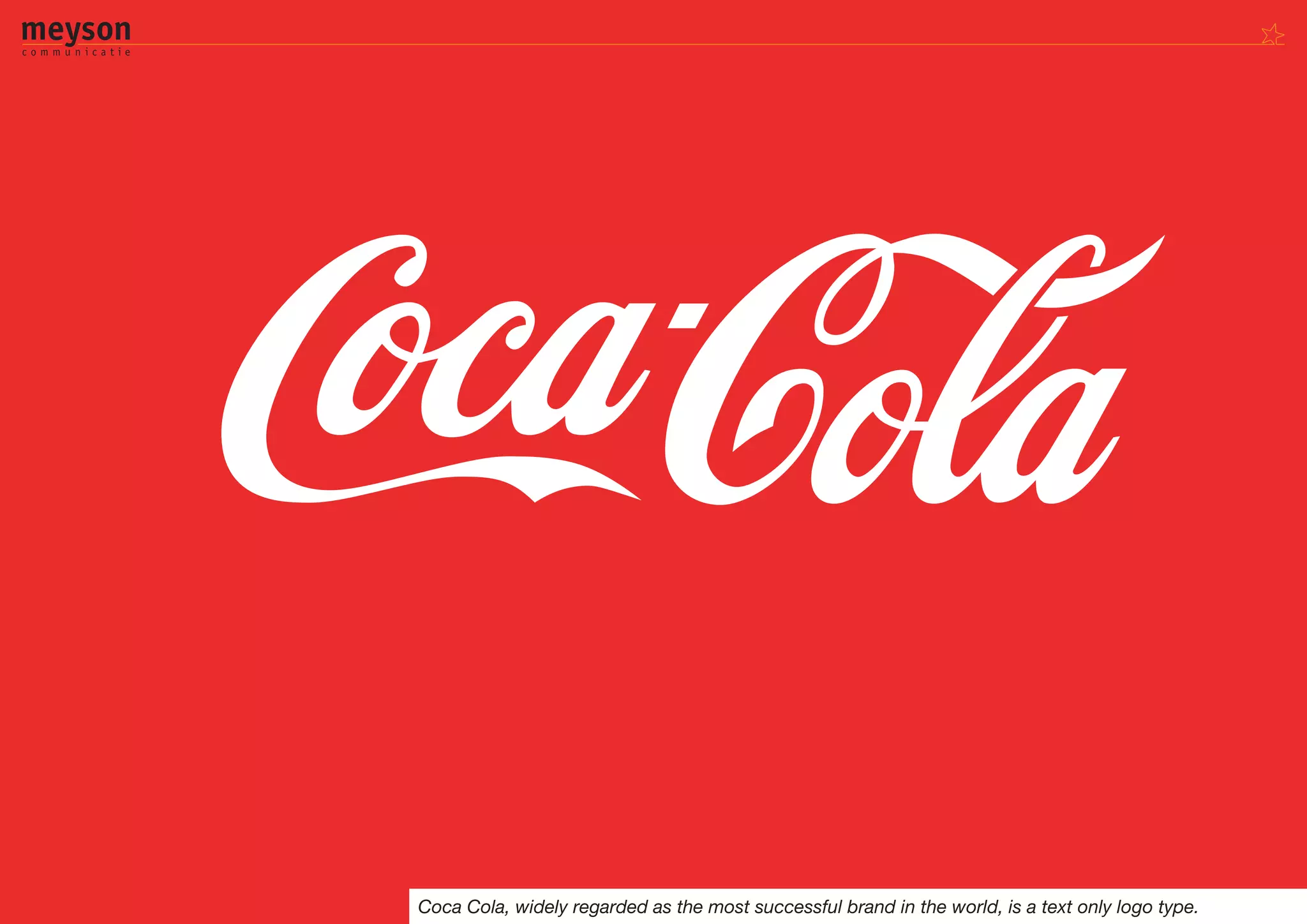
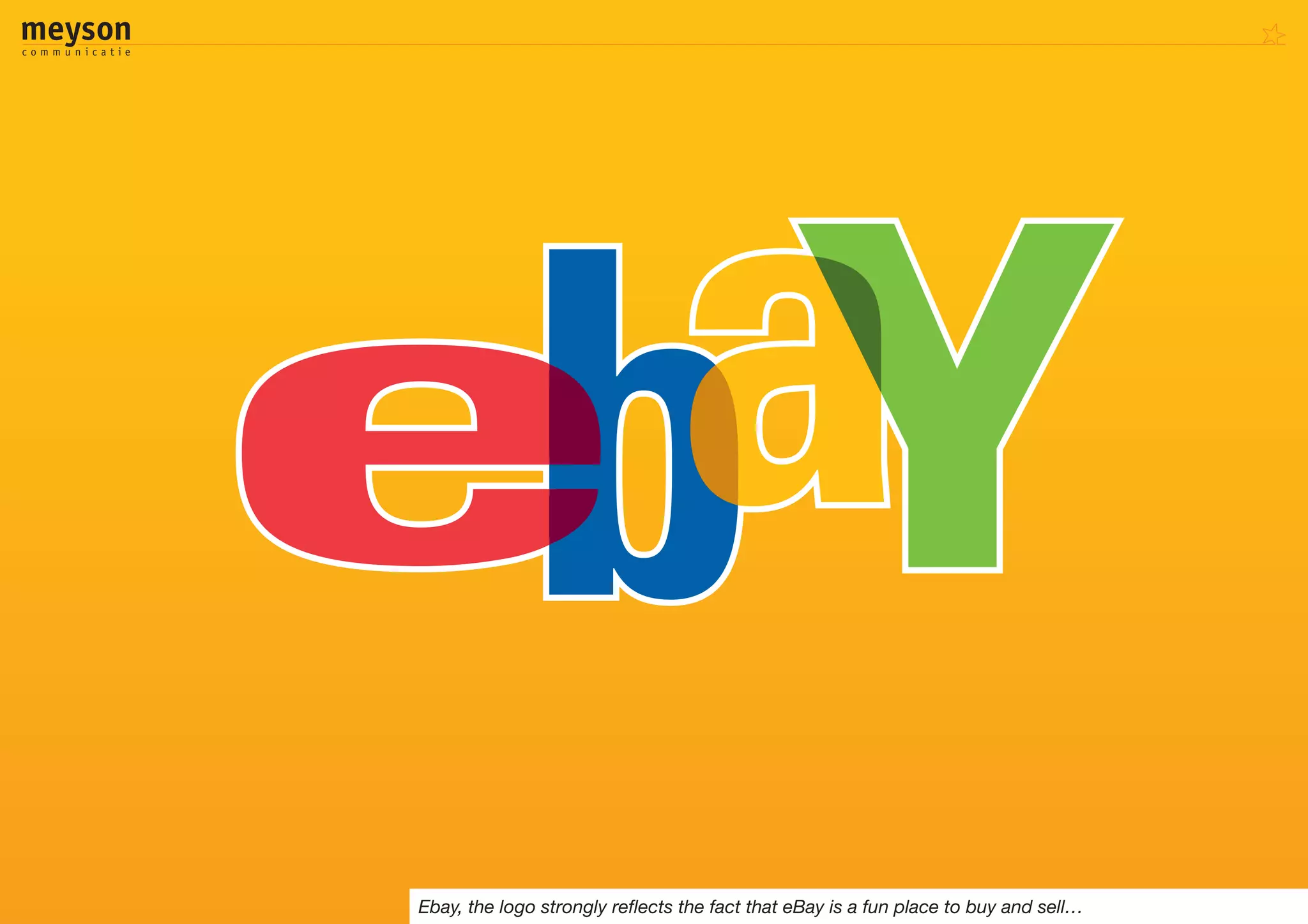
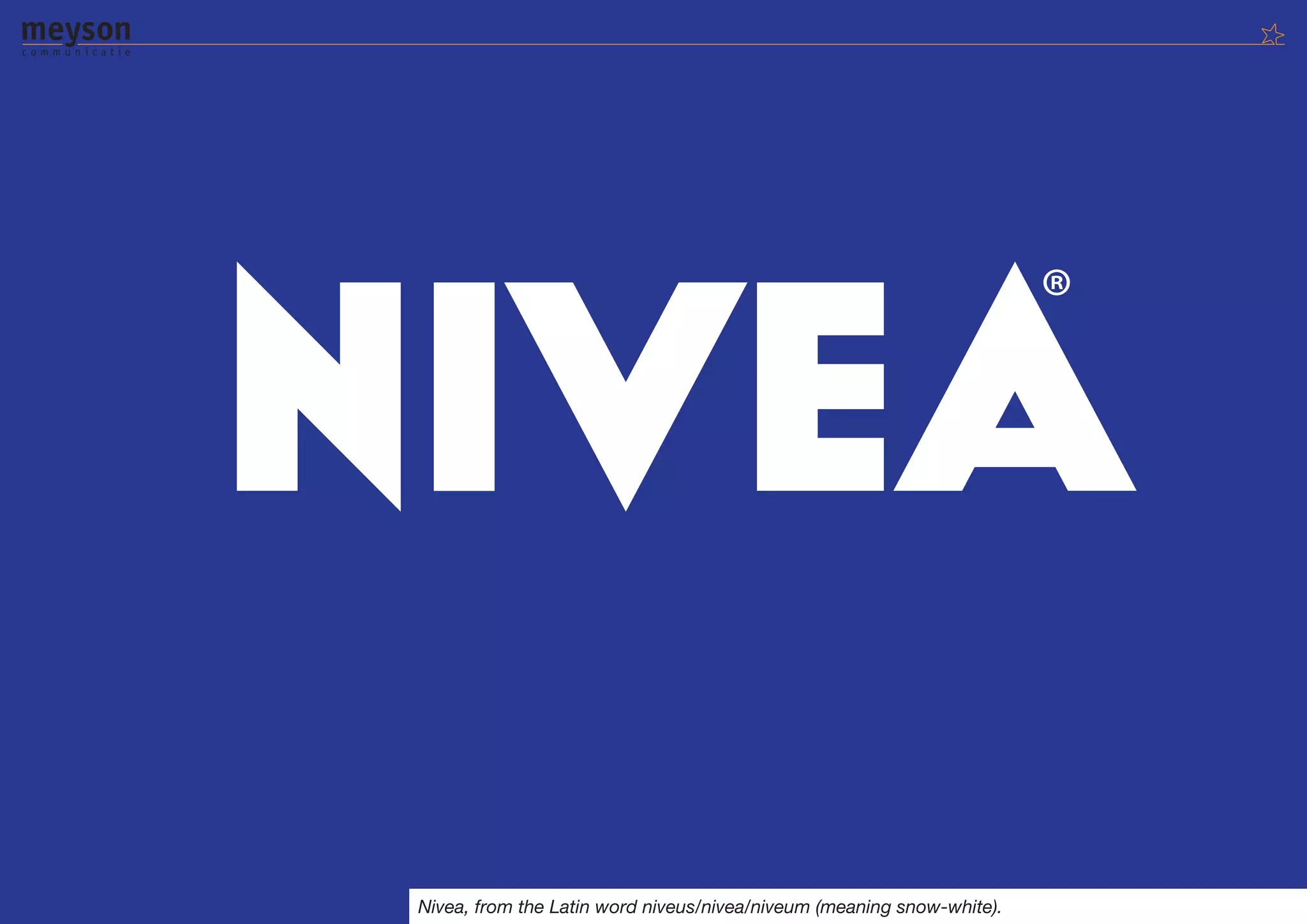
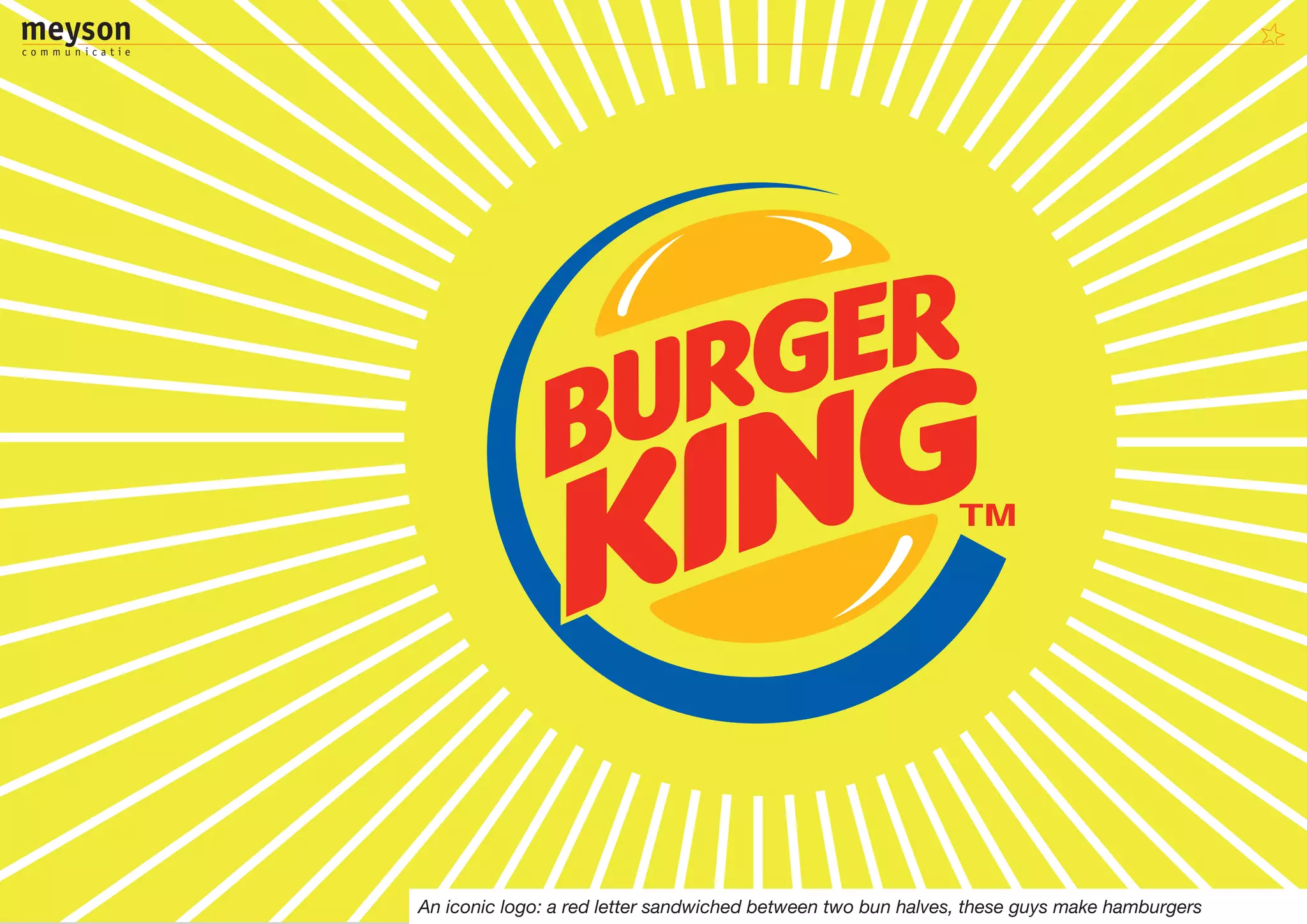
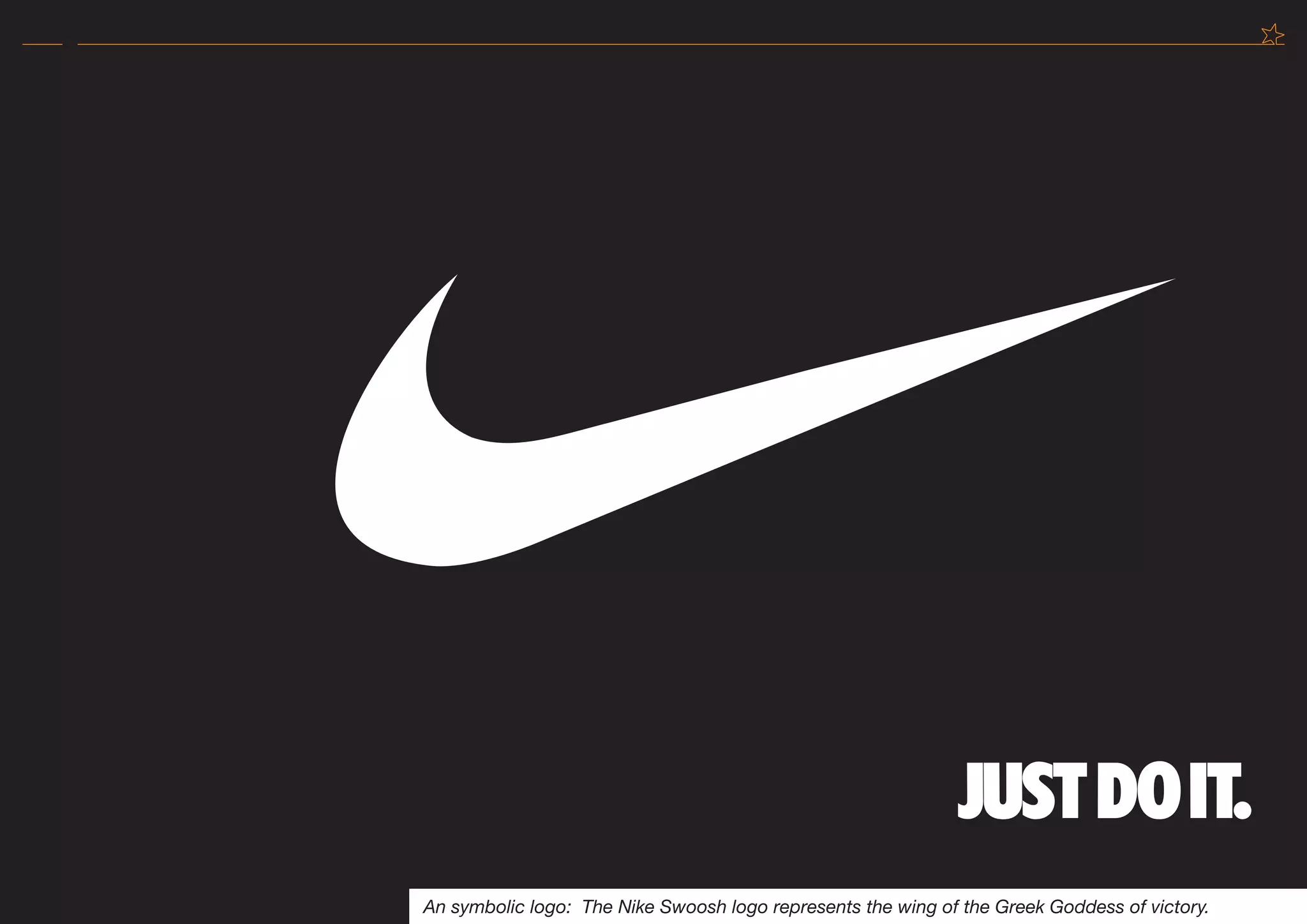
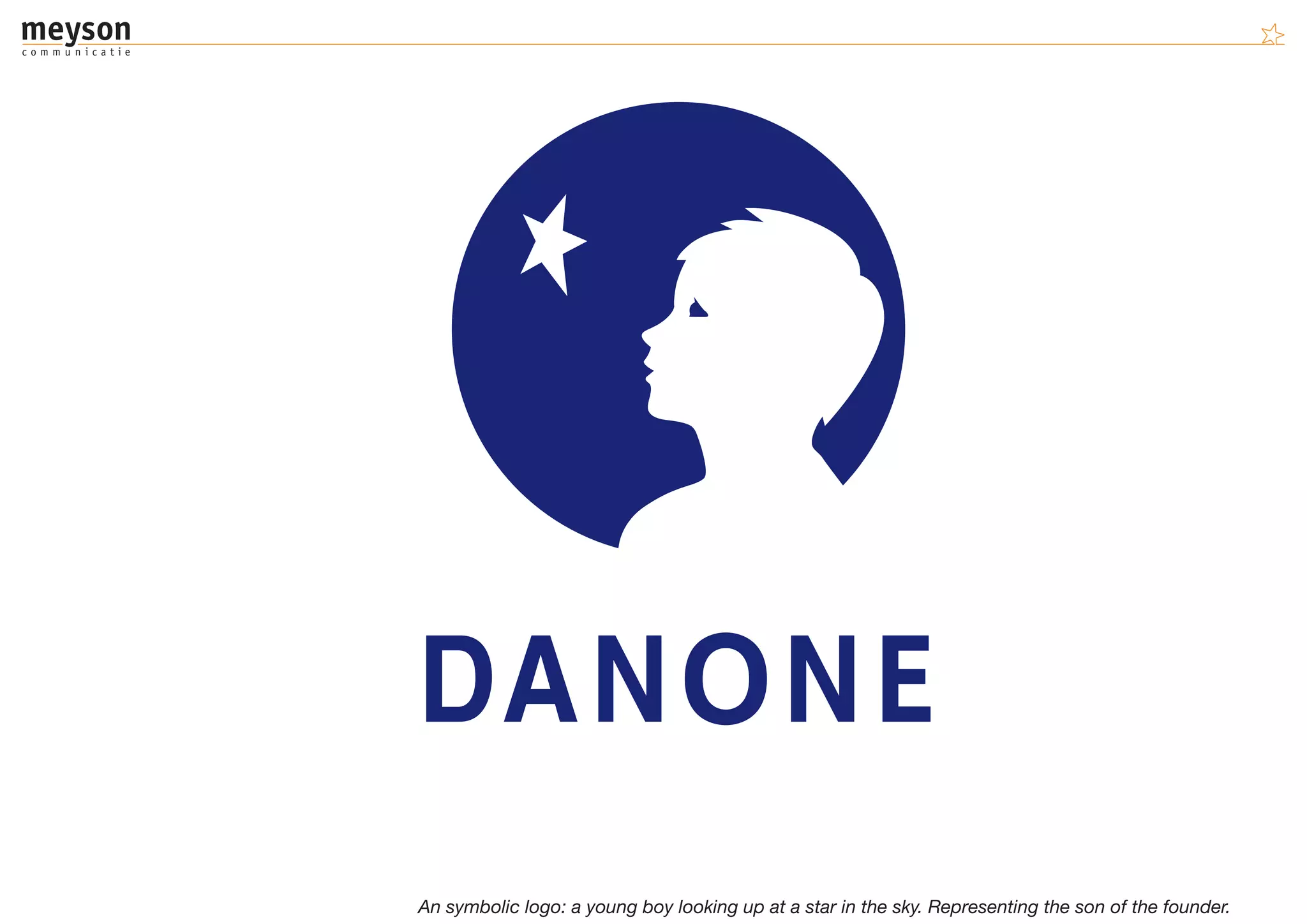
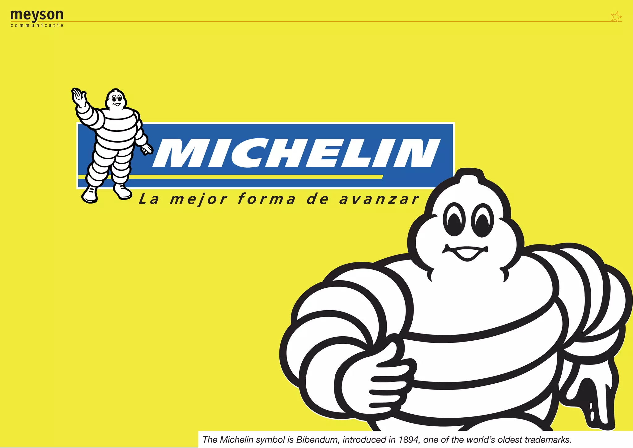
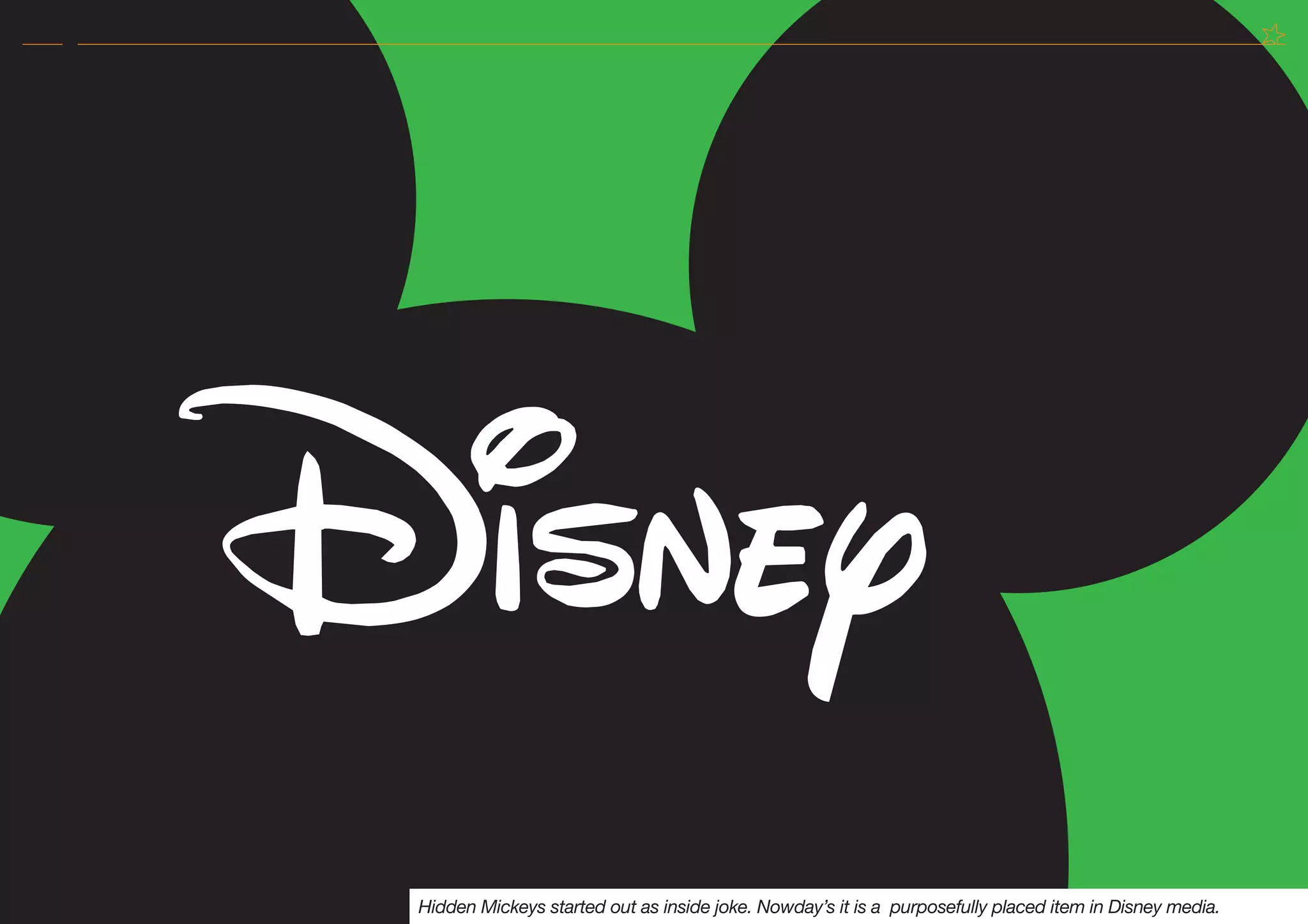

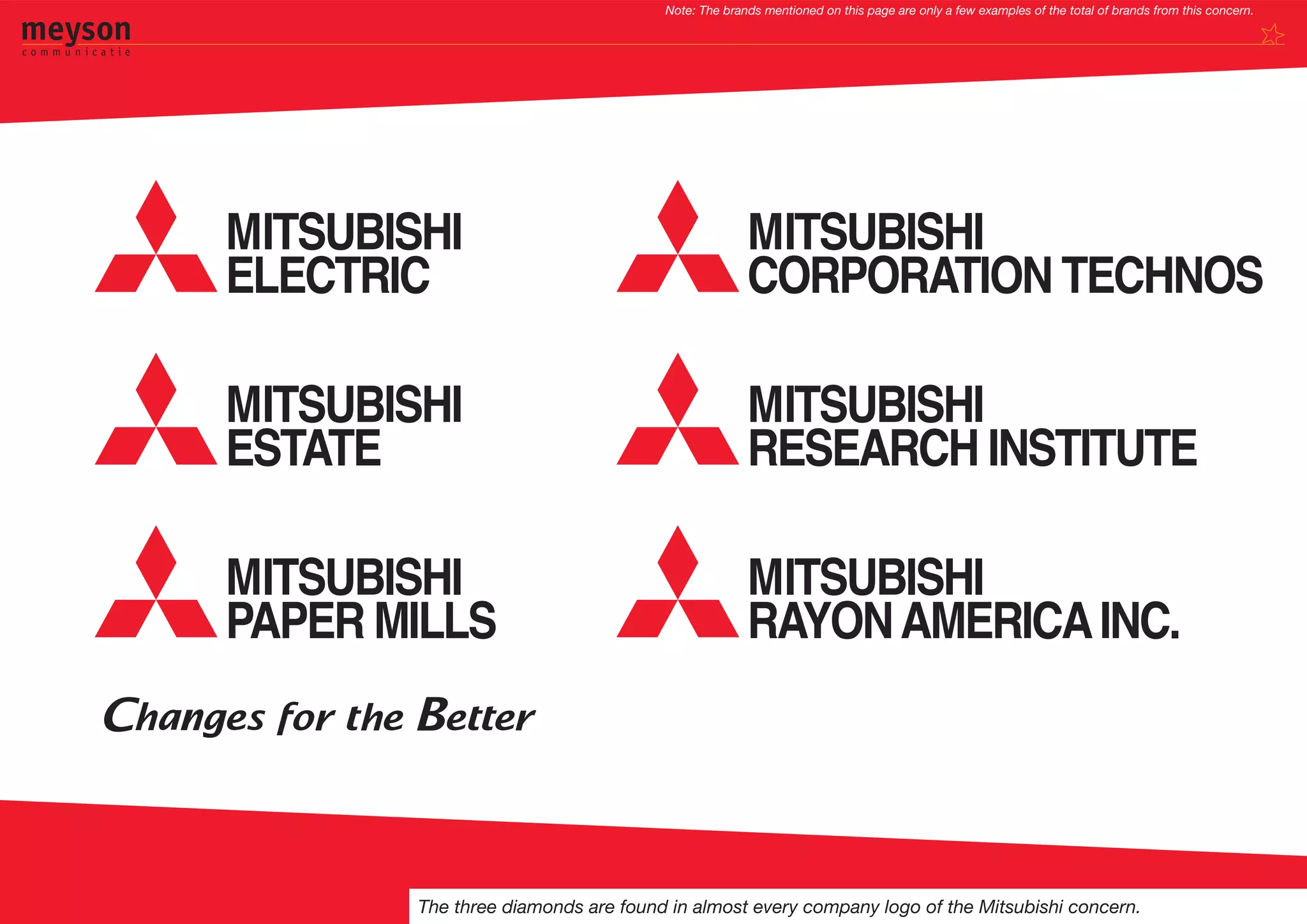
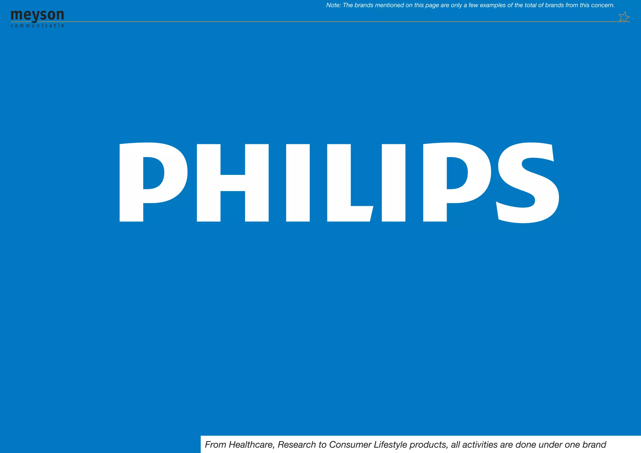
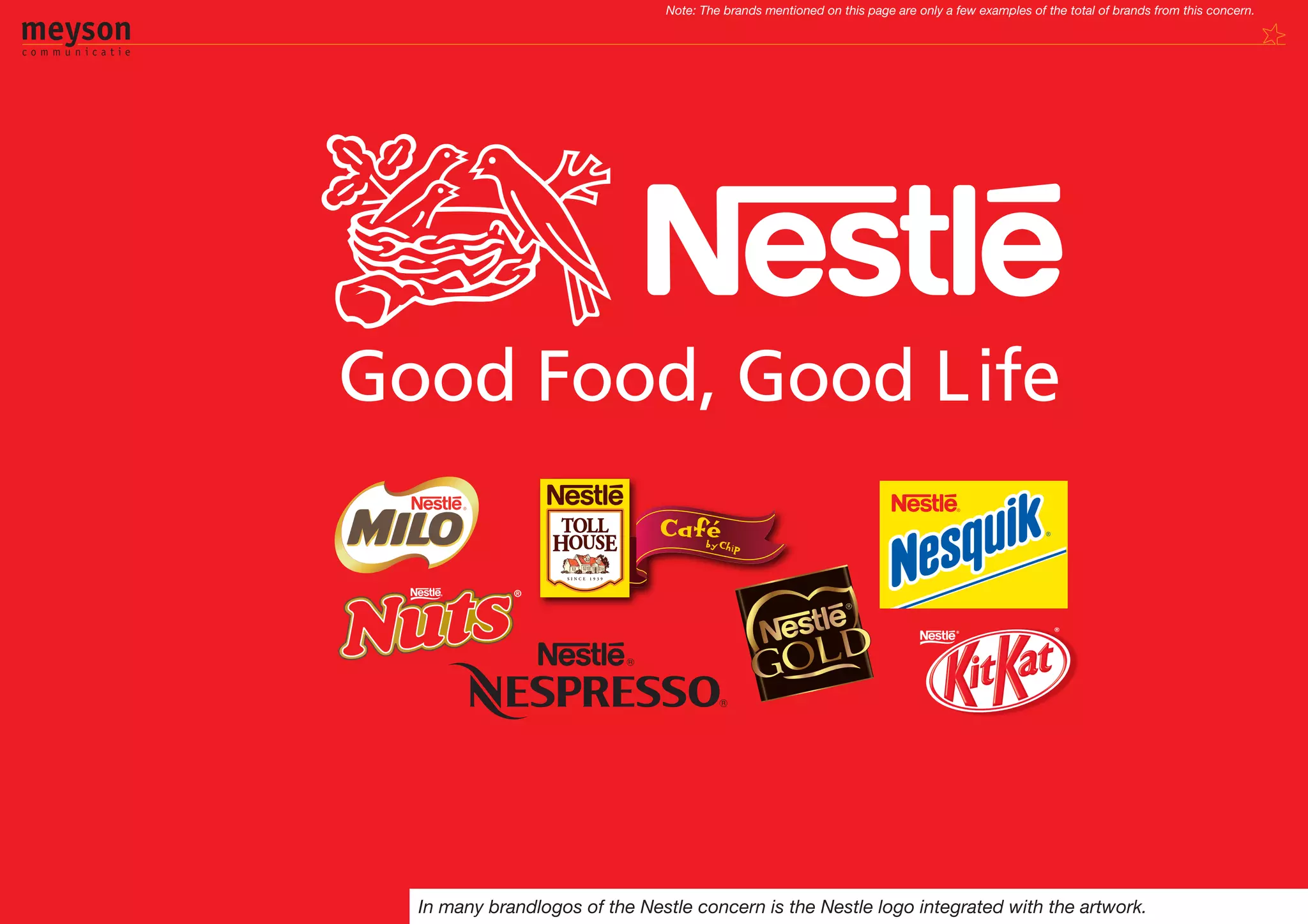
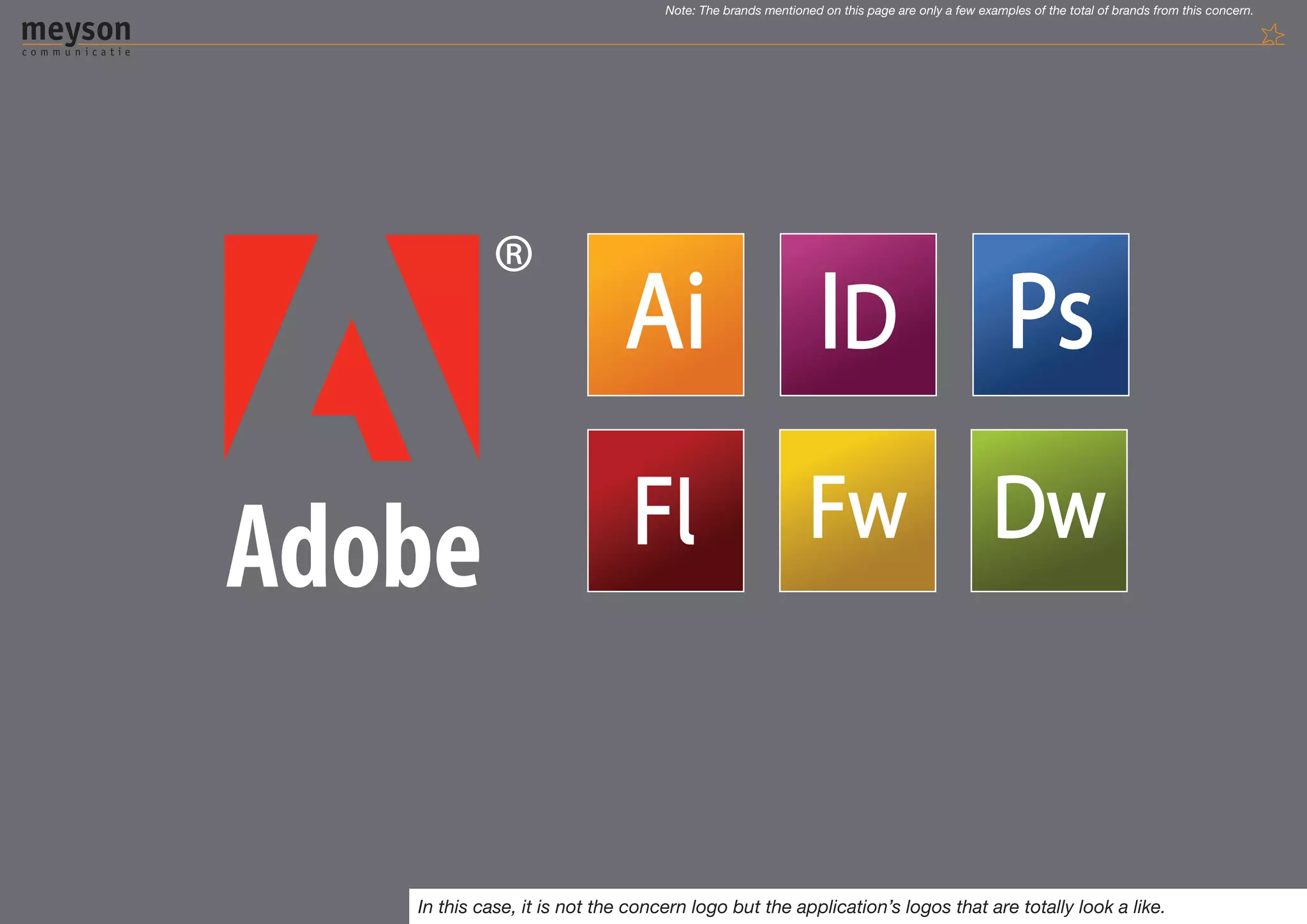
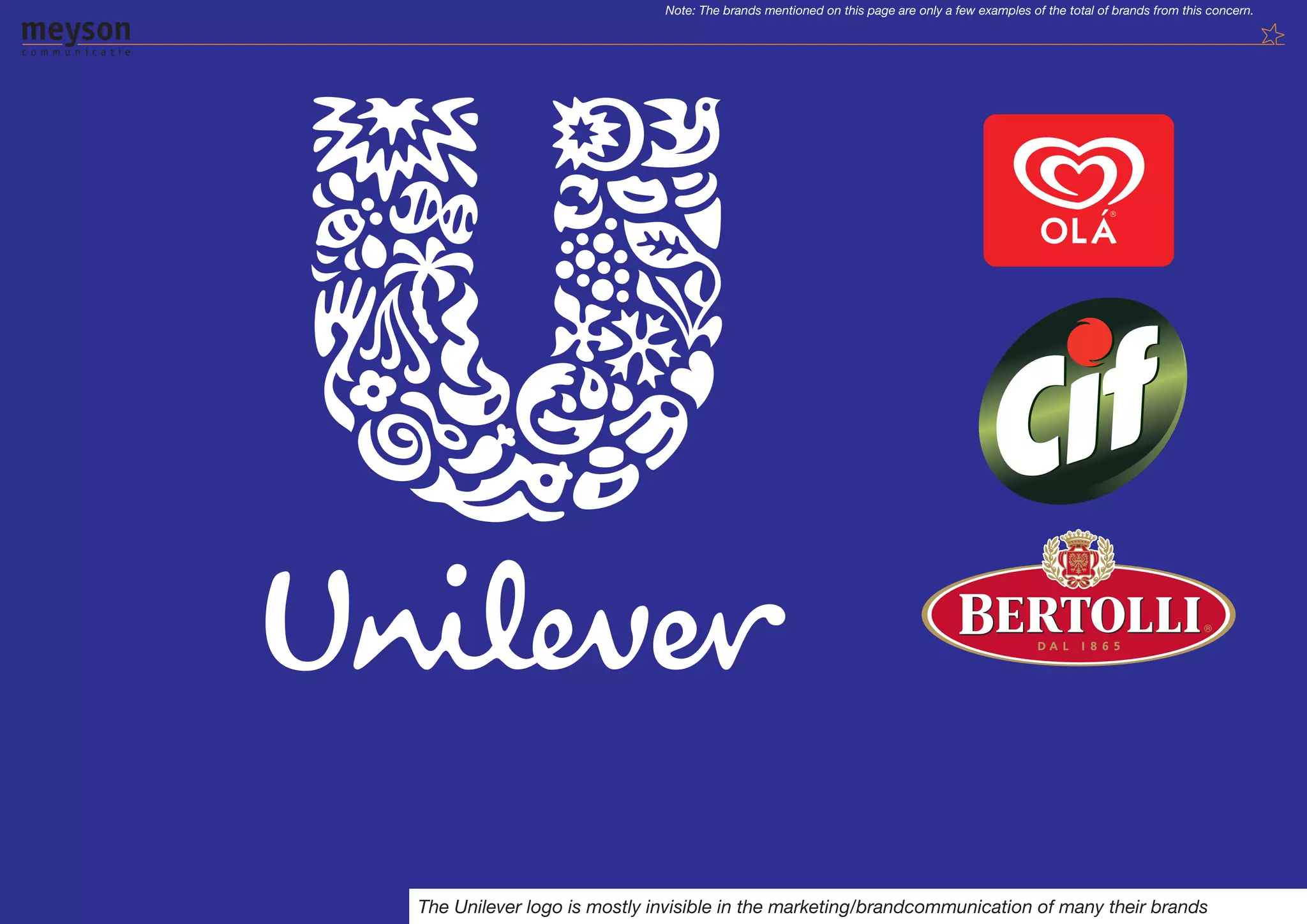
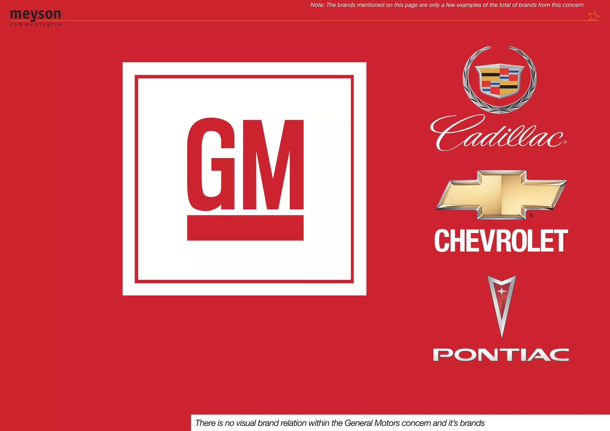
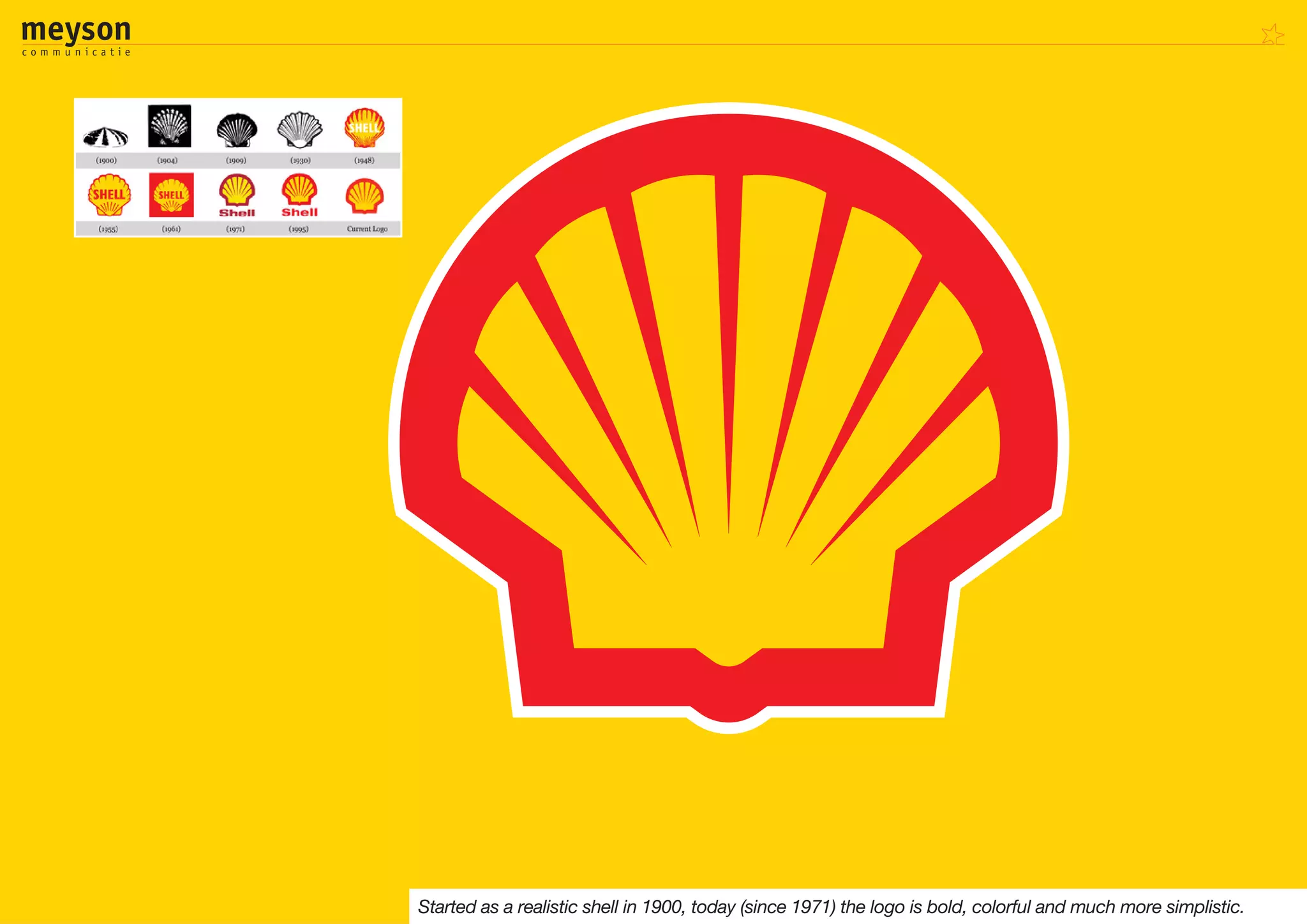
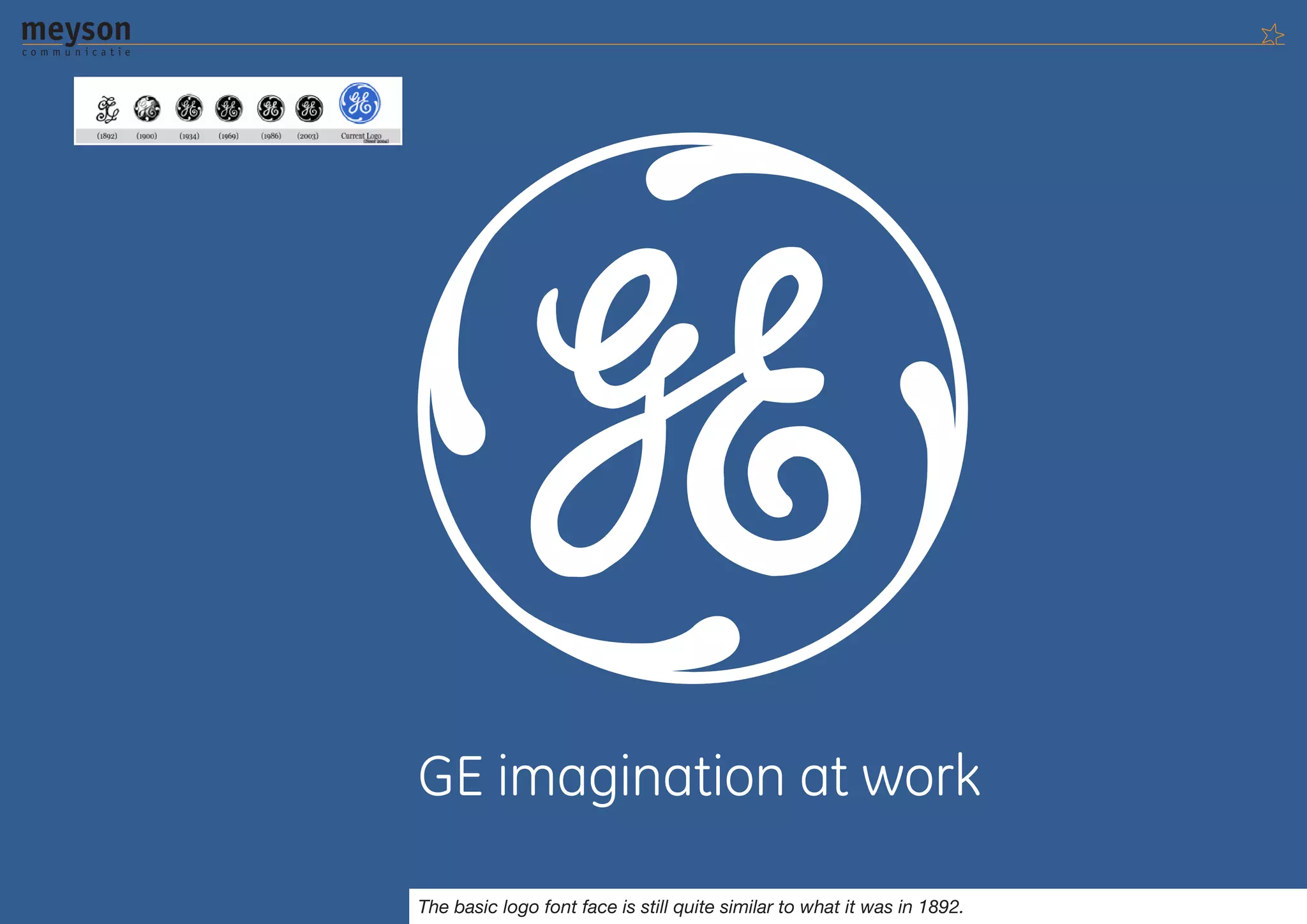

The document provides an overview of key concepts in corporate design including logos, branding, color palettes, typefaces, and identity structures. It discusses the core elements that make up a corporate design such as the logo, colors, typography, and additional graphical elements. It also explores different corporate identity structures like monolithic, endorsed, and branded and how the lifespan of a design depends on maintaining brand guidelines.


