Bootstrap is a popular open-source front-end framework developed by Twitter for creating responsive web applications, consisting of CSS and JavaScript. The framework has evolved through several major versions and provides a range of tools for responsive design, including a grid system, containers, buttons, and forms, along with various UI components such as alerts and carousels. Bootstrap 5 is set to release with enhancements such as dropping jQuery and introducing responsive containers.
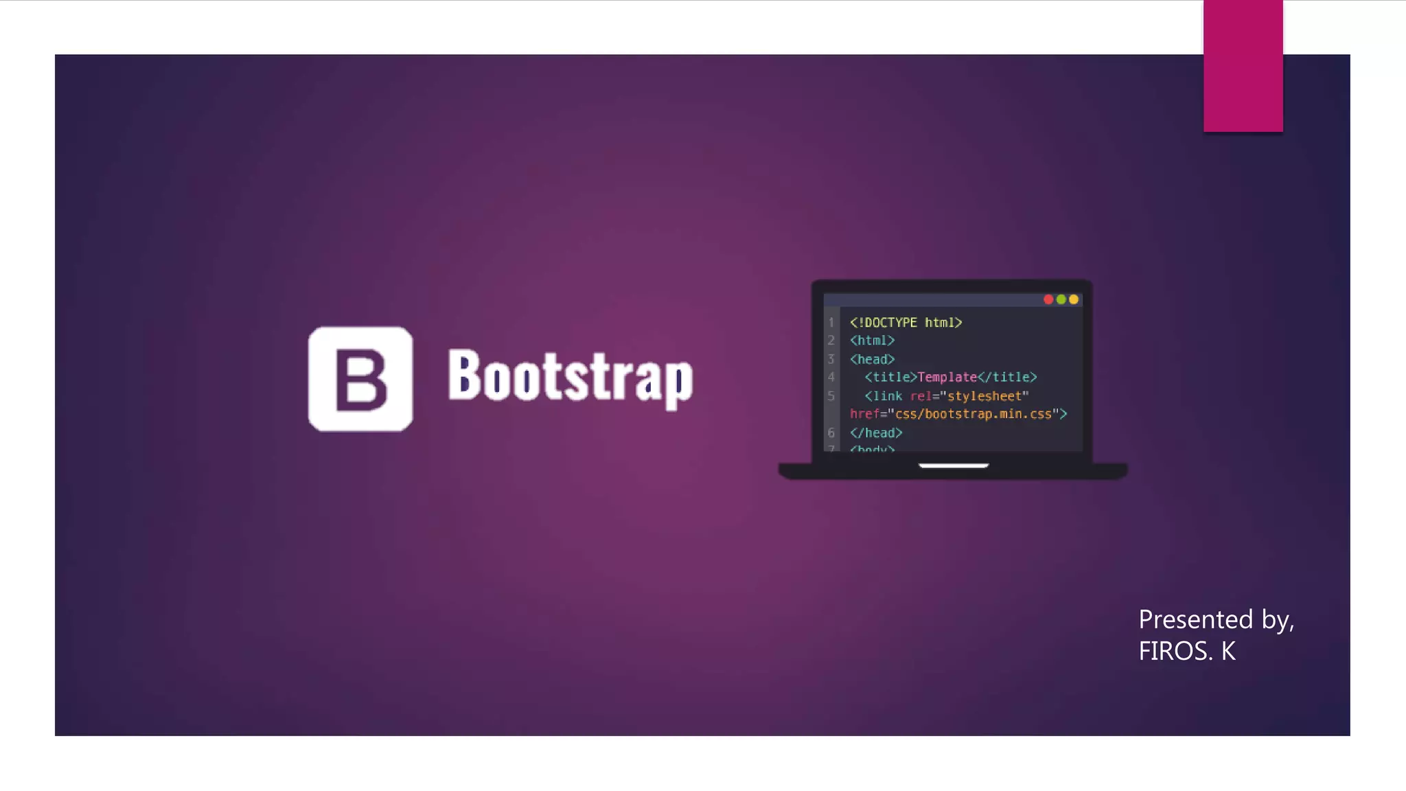
Introduction of the presenter and an outline of the presentation content, which includes topics on Bootstrap.
Bootstrap is a free, open-source front-end framework developed by Twitter, known for responsive web applications, with over 135,000 stars on GitHub.
Bootstrap was developed by Mark Otto and Jacob Thornton and has three main versions: Bootstrap 2 (2012), 3 (2013), and 4 (2018). Notable developments highlighted.
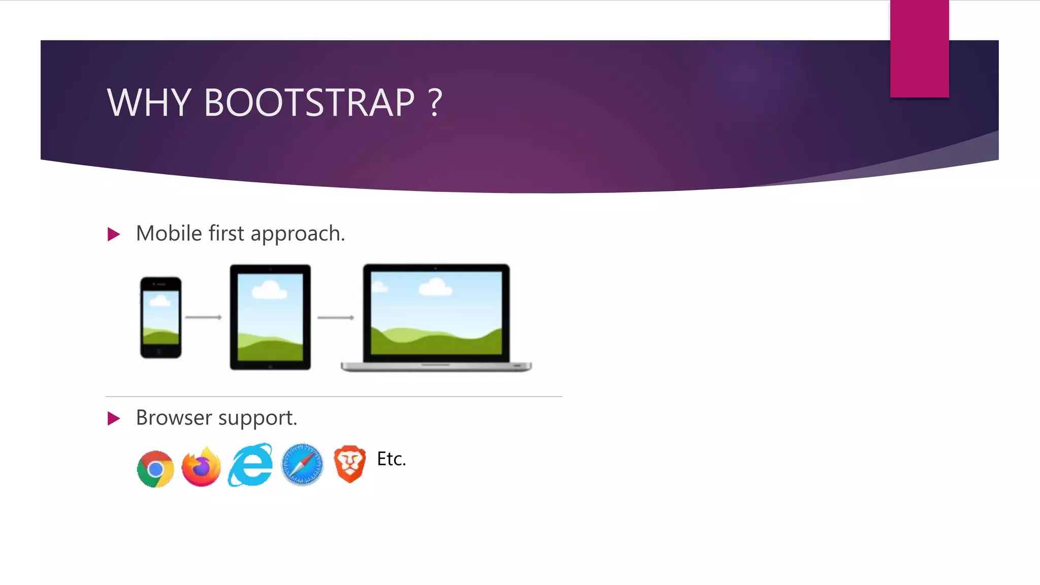
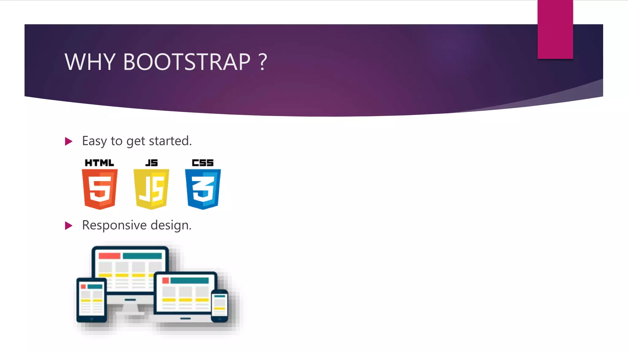
Highlights Bootstrap's mobile-first approach and responsive design benefits, making it user-friendly and adaptable.
Bootstrap includes three essential files for functionality: bootstrap.min.css, jquery.min.js, and bootstrap.min.js.
Instructions on including Bootstrap in projects via CDN or downloaded files with syntax examples provided.
Explains the concept of containers in Bootstrap with two types: .container (fixed width) and .container-fluid (full width), with usage syntax.
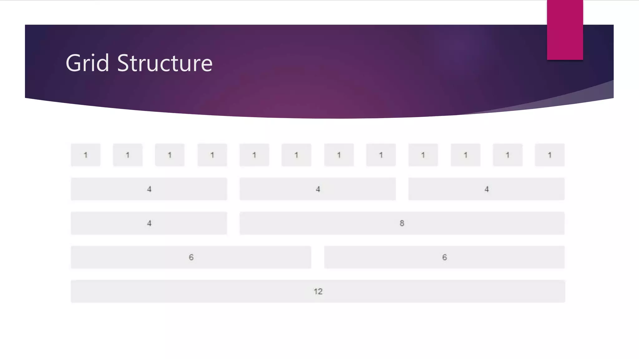
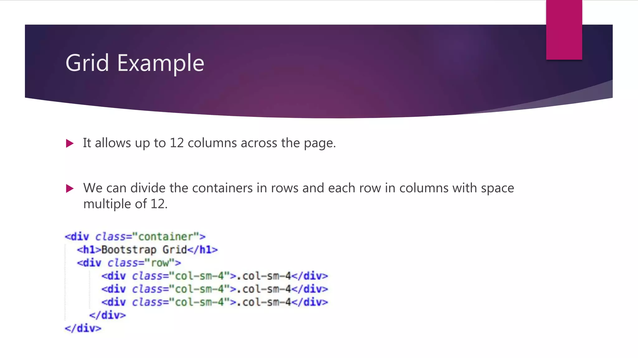
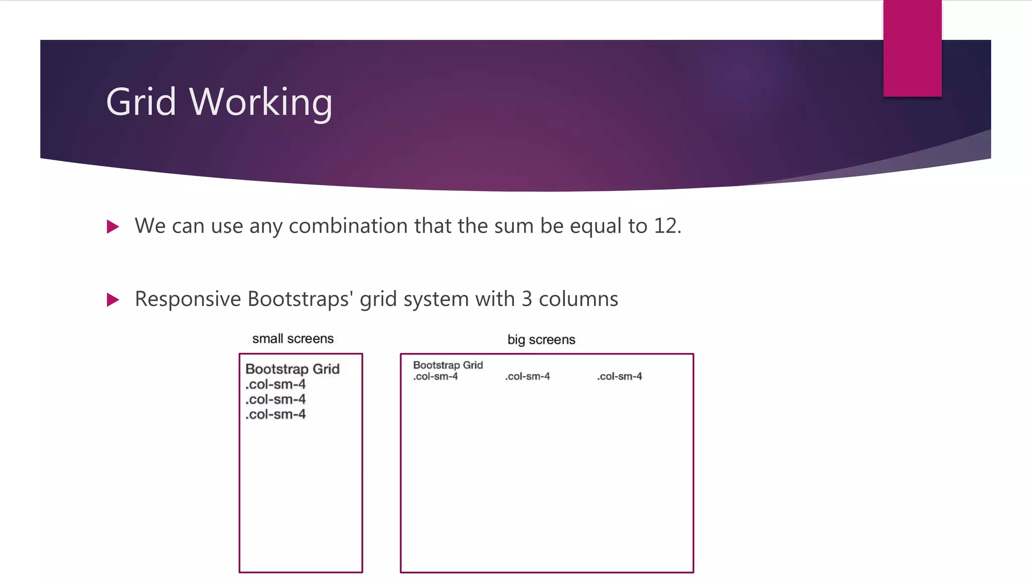
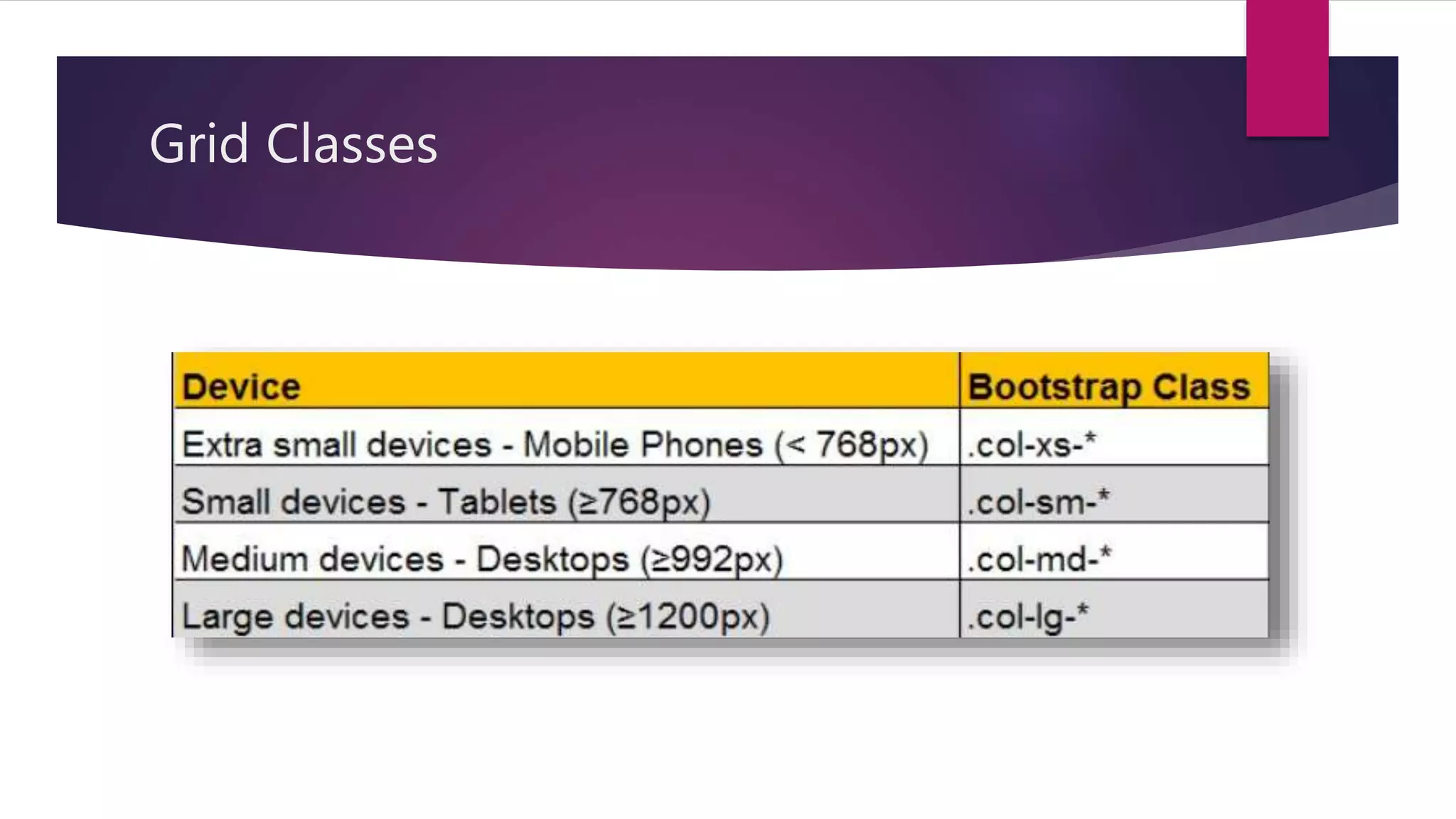
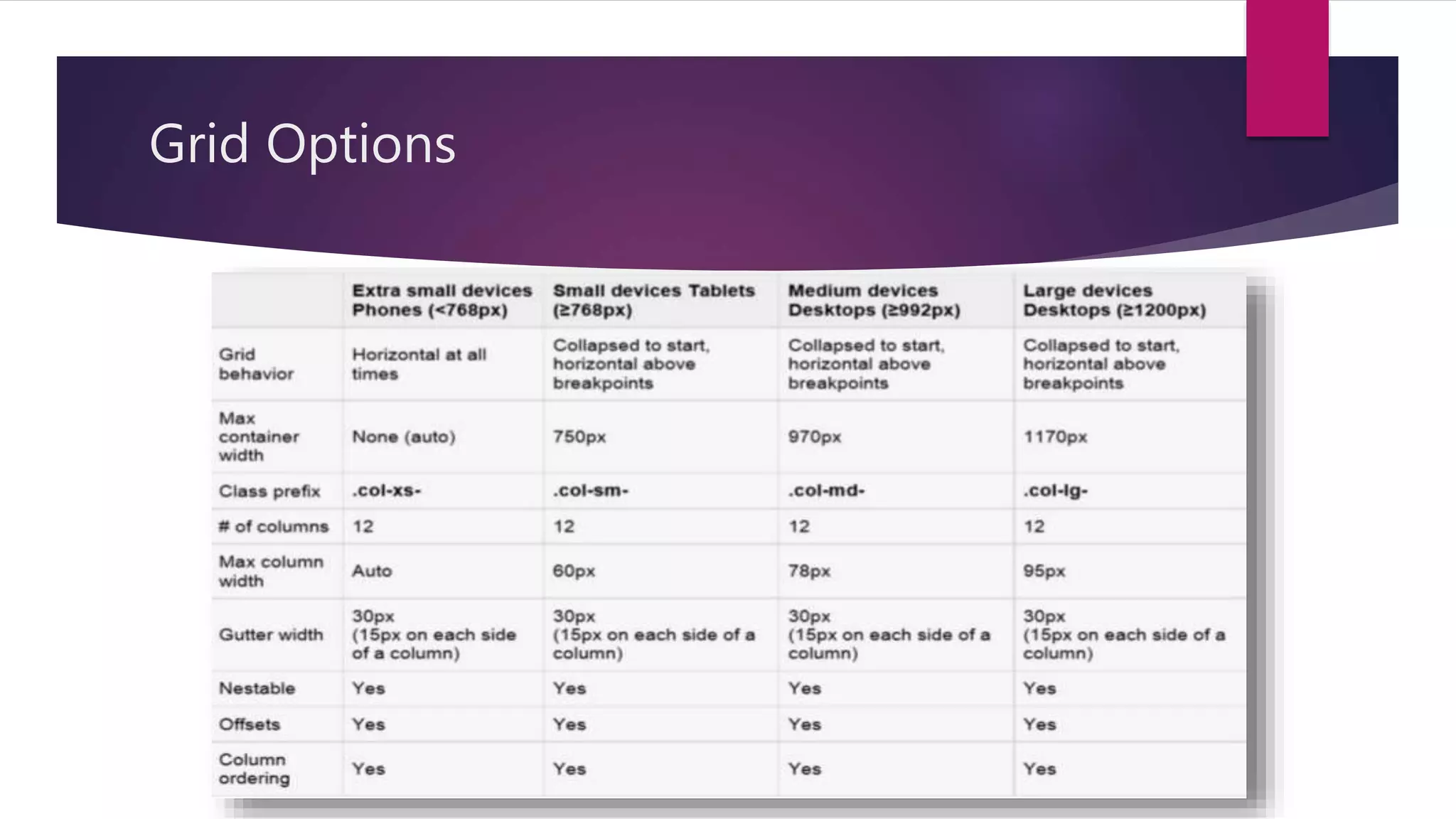
Details on the grid system, consisting of up to 12 columns and methods for creating consistent layouts, including grid classes and options.
Overview of working practically with Bootstrap, indicating the focus on practical implementation.
Explains various types of tables in Bootstrap, including classes for styling and responsive design capabilities.
Describes how to use image classes including responsive options, with syntax examples.
Introduction to the carousel component for creating image slideshows with syntax for implementation.
Describes predefined alert messages in Bootstrap, detailing contextual classes for styling.
Overview of 7 styles of buttons in Bootstrap with use of the btn class, including example usage.
Information on creating loaders using the spinner-border class, with syntax for customization.
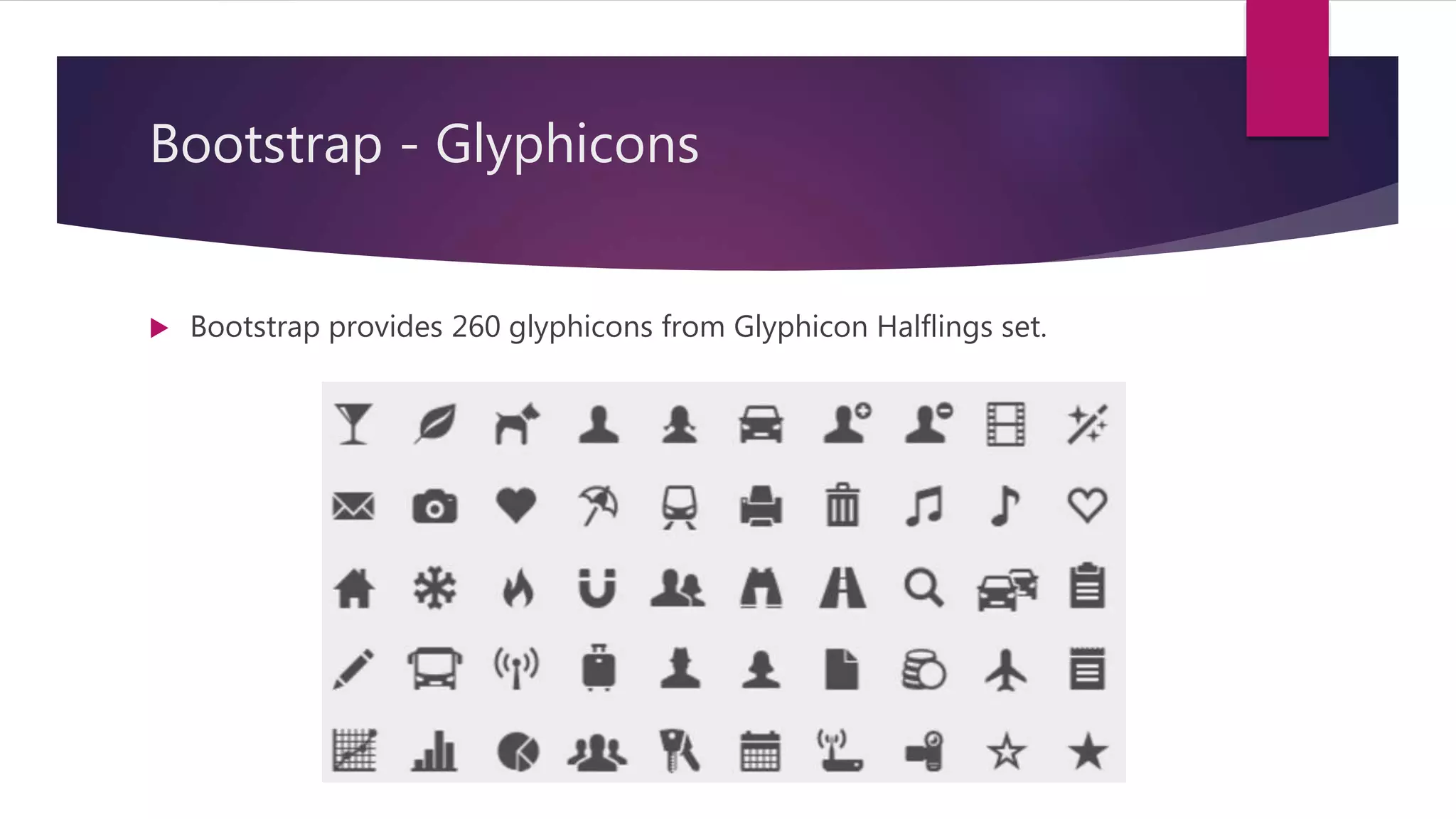
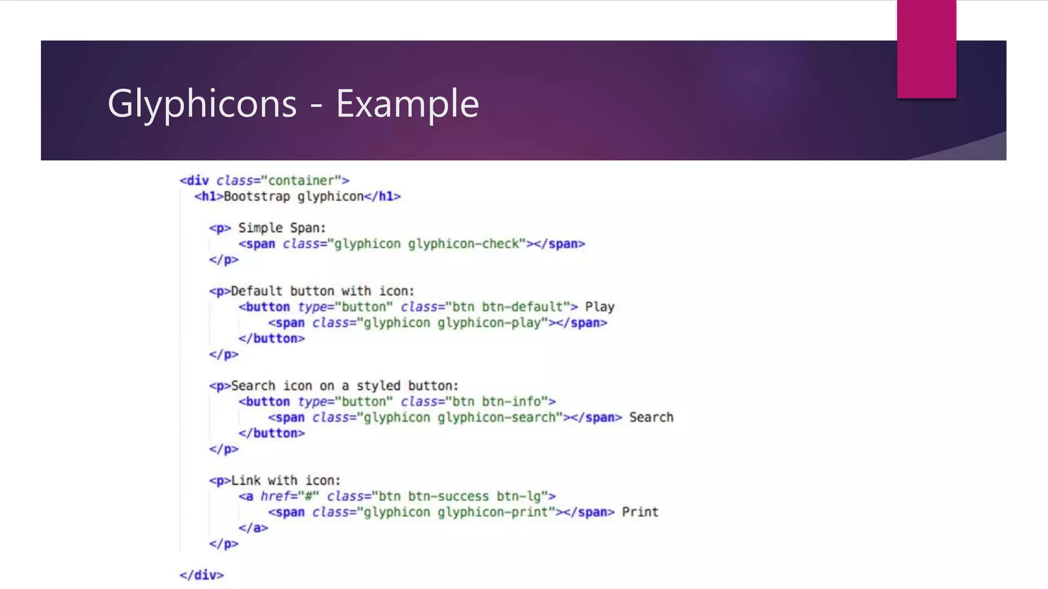
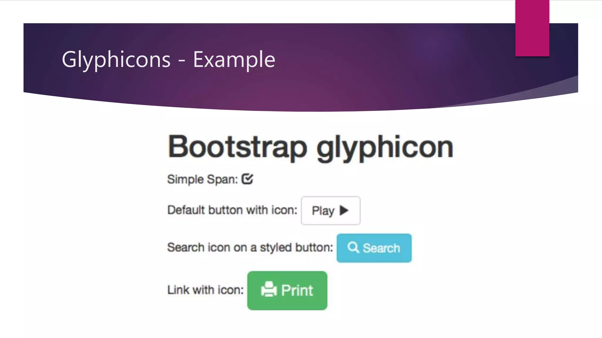
Details on the Glyphicon font icon set provided by Bootstrap, including examples.
Explains the creation and use of labels in Bootstrap to enhance text presentation using contextual classes.
Describes the panel component for highlighting content, including contextual class usage.
Overview of form control styling, with details on different form layouts: vertical, horizontal, and inline.
Information on finding and downloading Bootstrap themes and templates for customized designs.
Introduction to new features in Bootstrap 5 such as dropped jQuery, new responsive containers, and modular usage.
Summarizes Bootstrap as a free, open-source CSS framework that simplifies responsive web design.
List of references and sources for further reading and understanding of Bootstrap.
Engagement with the audience to address any questions or doubts regarding the presentation.
A Thank You note from the presenter, closing the session.
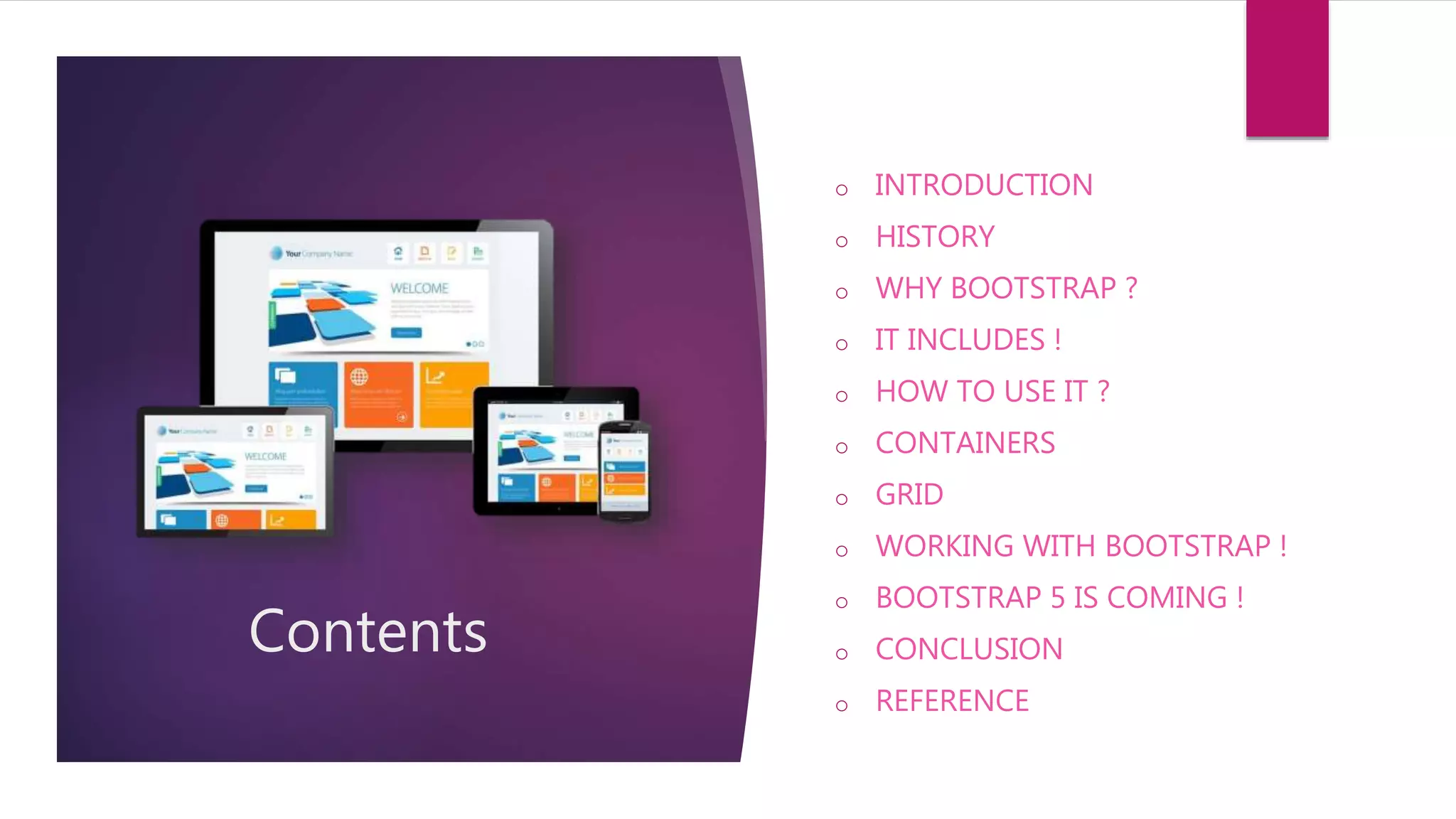
Contents
o INTRODUCTION
o HISTORY
oWHY BOOTSTRAP ?
o IT INCLUDES !
o HOW TO USE IT ?
o CONTAINERS
o GRID
o WORKING WITH BOOTSTRAP !
o BOOTSTRAP 5 IS COMING !
o CONCLUSION
o REFERENCE
3.
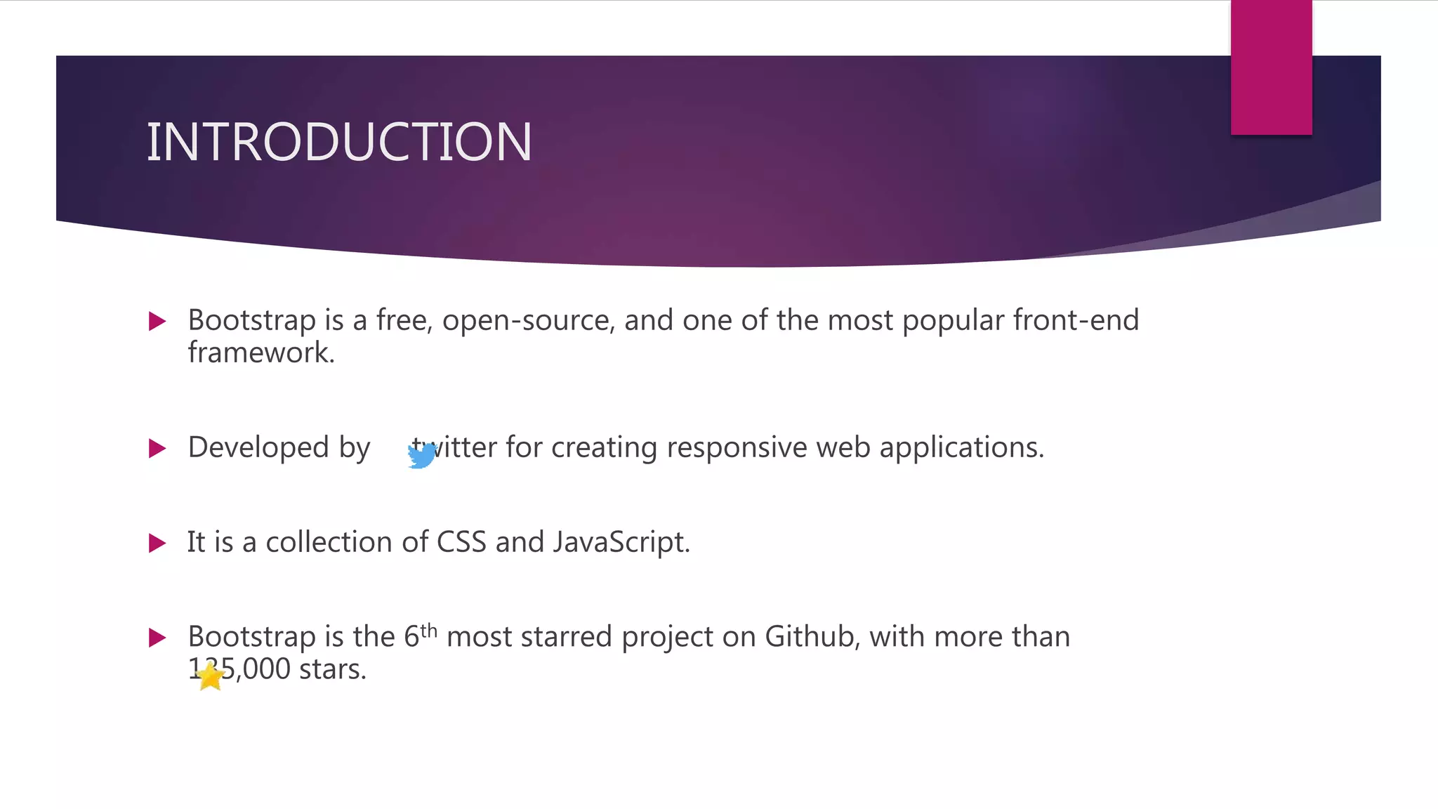
INTRODUCTION
Bootstrap isa free, open-source, and one of the most popular front-end
framework.
Developed by twitter for creating responsive web applications.
It is a collection of CSS and JavaScript.
Bootstrap is the 6th most starred project on Github, with more than
135,000 stars.
4.
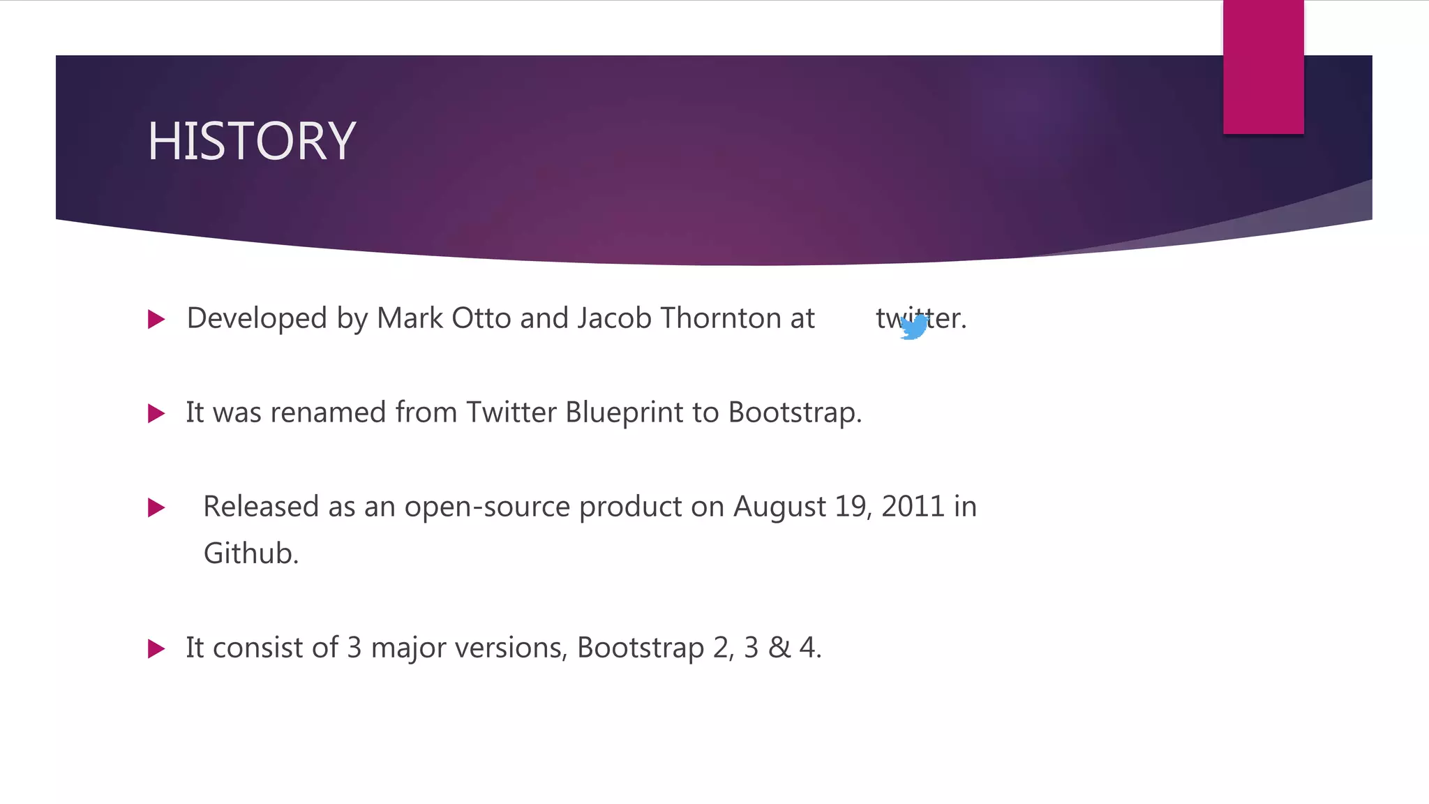
HISTORY
Developed byMark Otto and Jacob Thornton at twitter.
It was renamed from Twitter Blueprint to Bootstrap.
Released as an open-source product on August 19, 2011 in
Github.
It consist of 3 major versions, Bootstrap 2, 3 & 4.
5.
HISTORY
Bootstrap v2.0
Released on January 31, 2012.
Built-in support for Glyphicons.
Supports responsive web designing.
Bootstrap v3.0
Released on August 19, 2013.
Redesigned components to use flat design and a mobile first approach.
6.
HISTORY
Bootstrap v4.0
The first alpha version of Bootstrap 4 was released on August 19, 2015.
The first beta version was released on August 10, 2017.
Mark Otto suspended work on Bootstrap 3 to free-up time to work on
Bootstrap 4.
V4.0 was finalized January 18, 2018.
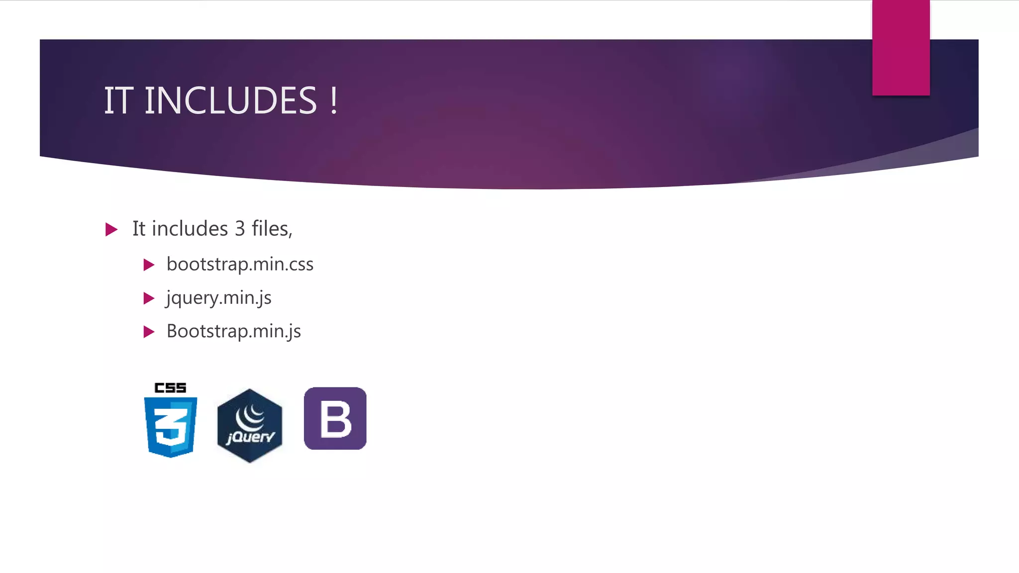
IT INCLUDES !
It includes 3 files,
bootstrap.min.css
jquery.min.js
Bootstrap.min.js
10.
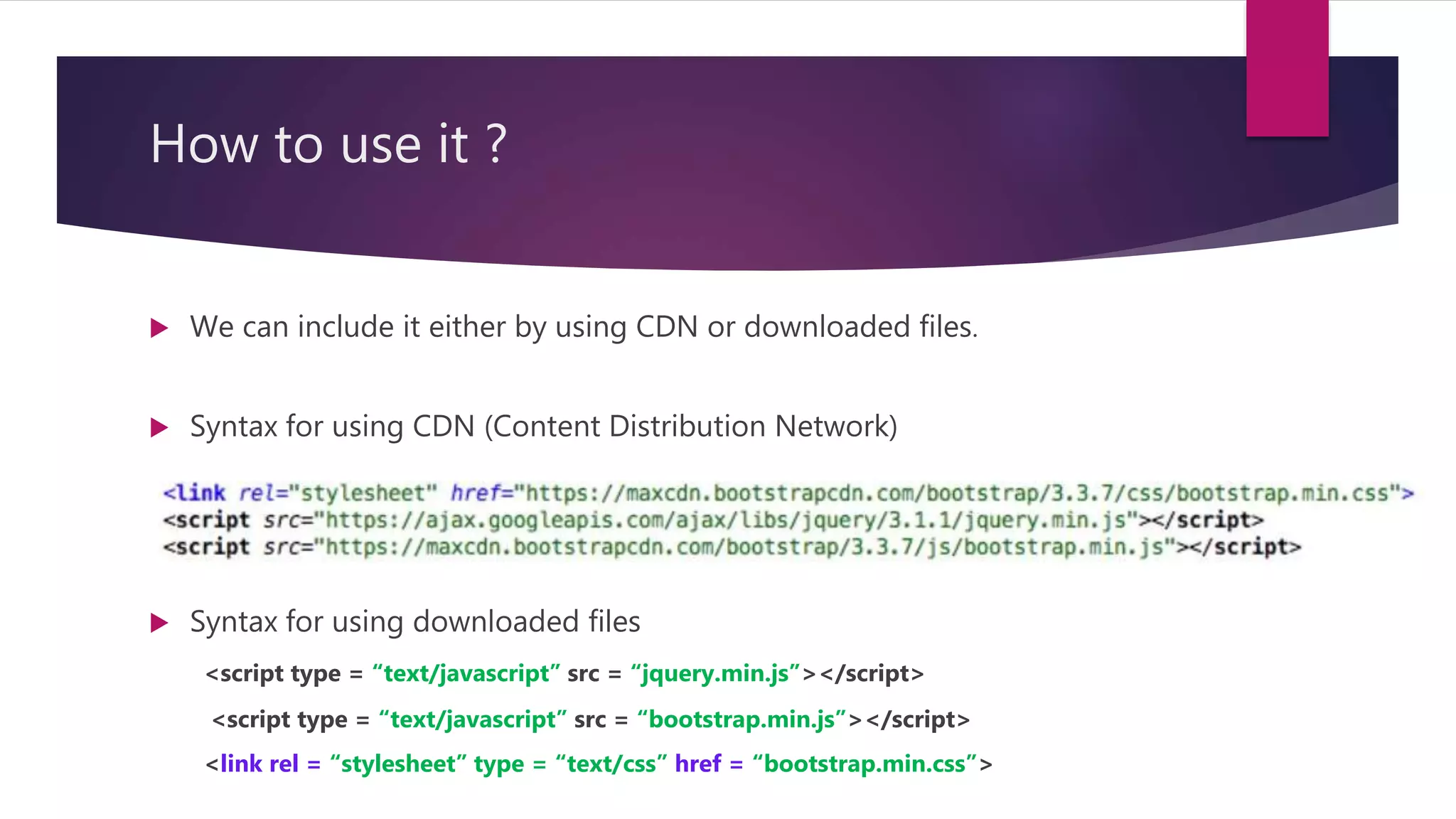
How to useit ?
We can include it either by using CDN or downloaded files.
Syntax for using CDN (Content Distribution Network)
Syntax for using downloaded files
<script type = “text/javascript” src = “jquery.min.js”></script>
<script type = “text/javascript” src = “bootstrap.min.js”></script>
<link rel = “stylesheet” type = “text/css” href = “bootstrap.min.css”>
11.
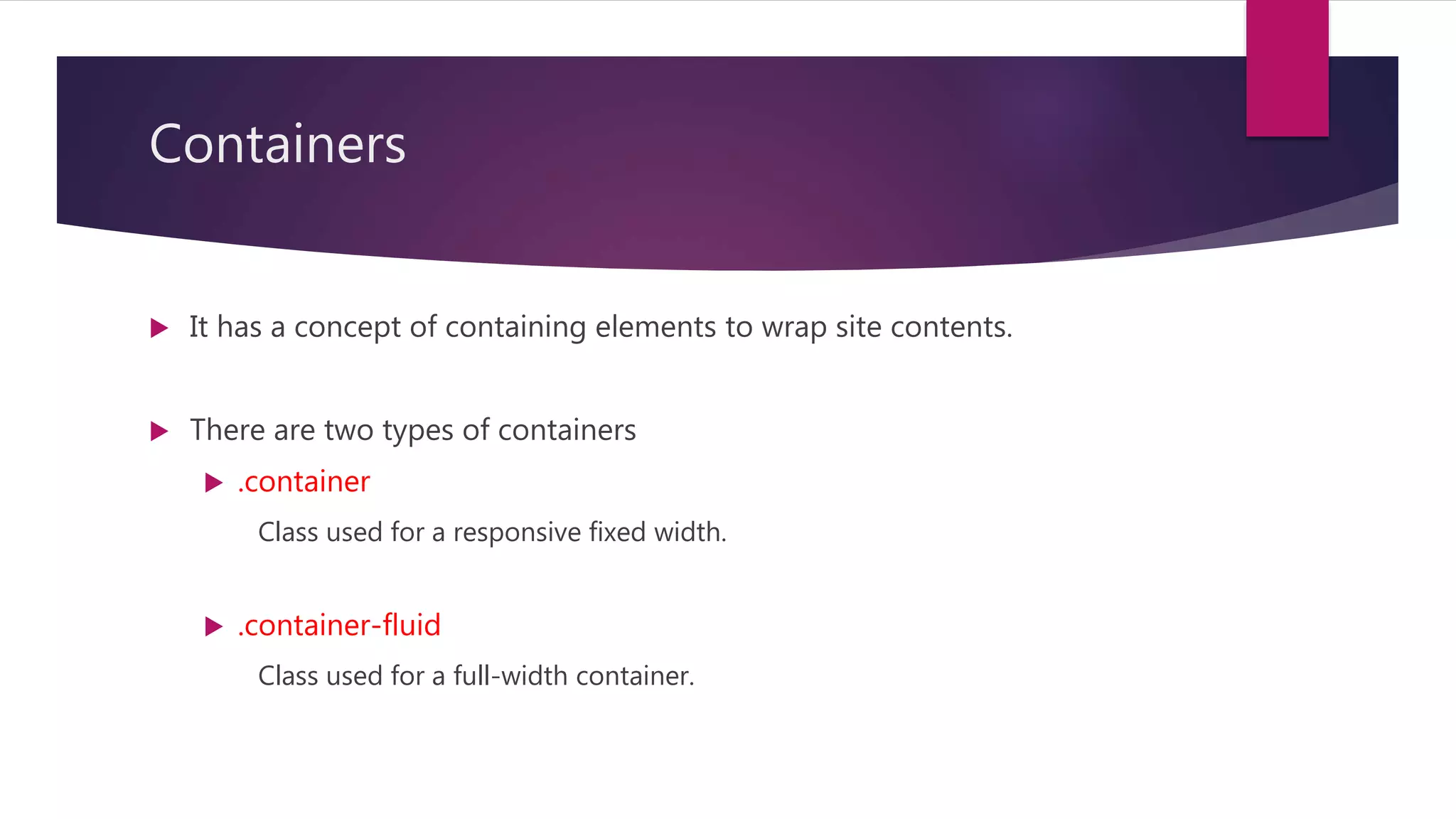
Containers
It hasa concept of containing elements to wrap site contents.
There are two types of containers
.container
Class used for a responsive fixed width.
.container-fluid
Class used for a full-width container.
12.
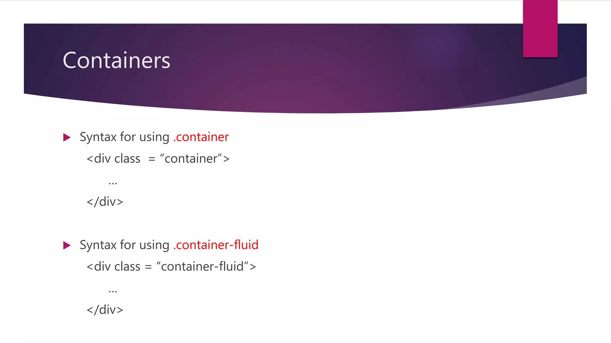
Containers
Syntax forusing .container
<div class = “container”>
…
</div>
Syntax for using .container-fluid
<div class = “container-fluid”>
…
</div>
13.
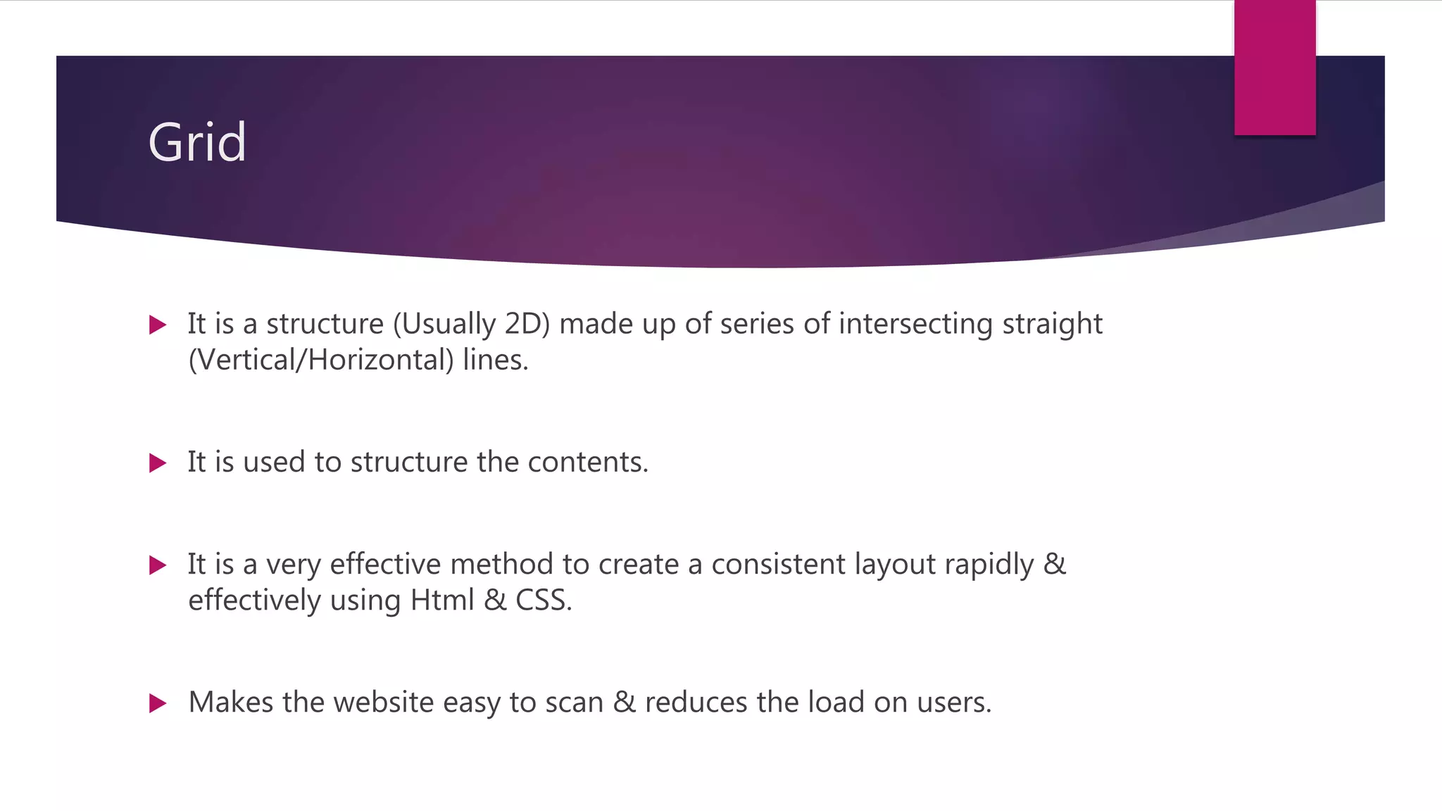
Grid
It isa structure (Usually 2D) made up of series of intersecting straight
(Vertical/Horizontal) lines.
It is used to structure the contents.
It is a very effective method to create a consistent layout rapidly &
effectively using Html & CSS.
Makes the website easy to scan & reduces the load on users.
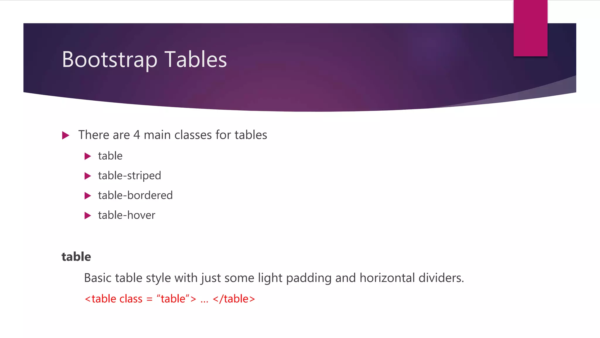
Bootstrap Tables
Thereare 4 main classes for tables
table
table-striped
table-bordered
table-hover
table
Basic table style with just some light padding and horizontal dividers.
<table class = “table”> … </table>
21.
Bootstrap Tables
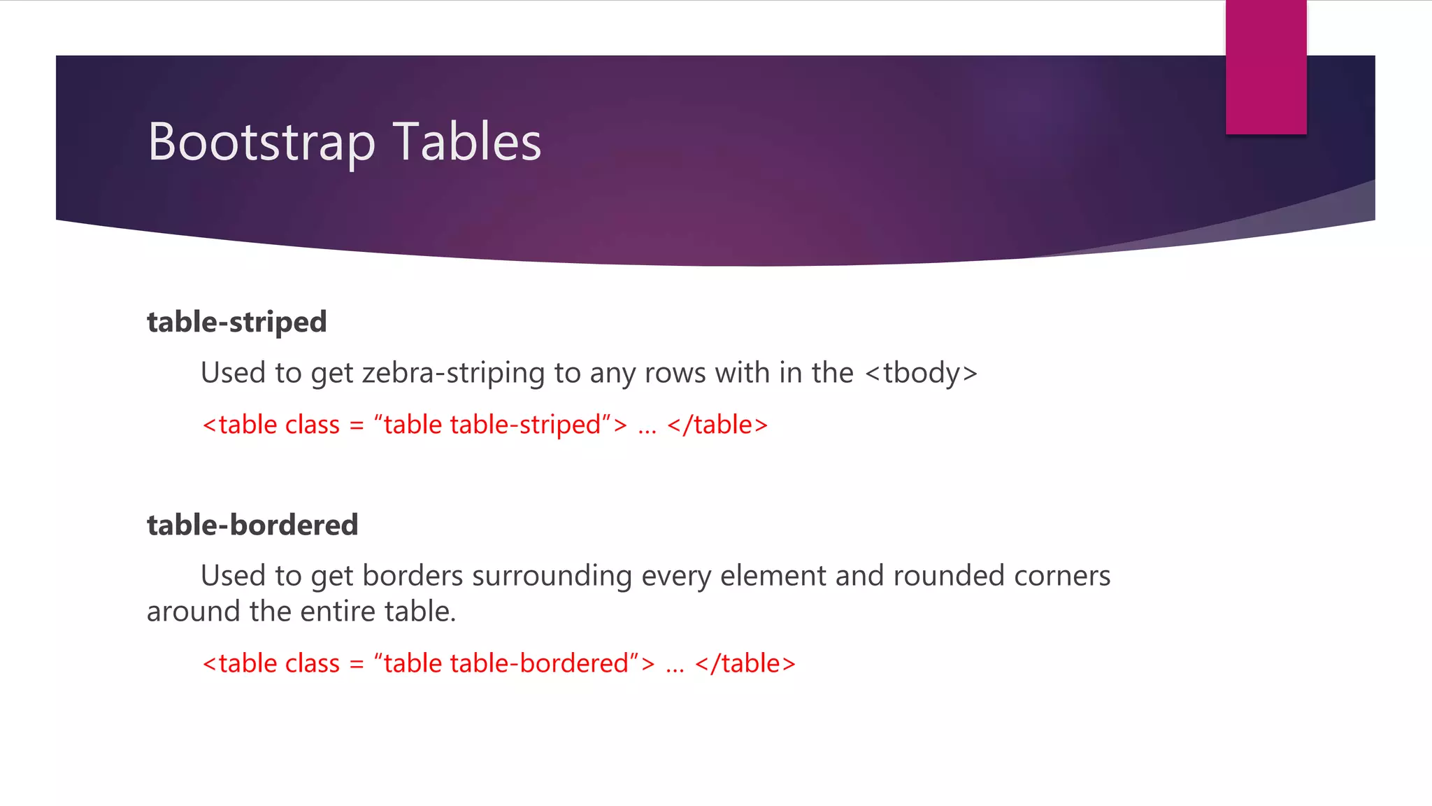
table-striped
Used toget zebra-striping to any rows with in the <tbody>
<table class = “table table-striped”> … </table>
table-bordered
Used to get borders surrounding every element and rounded corners
around the entire table.
<table class = “table table-bordered”> … </table>
22.
Bootstrap Tables
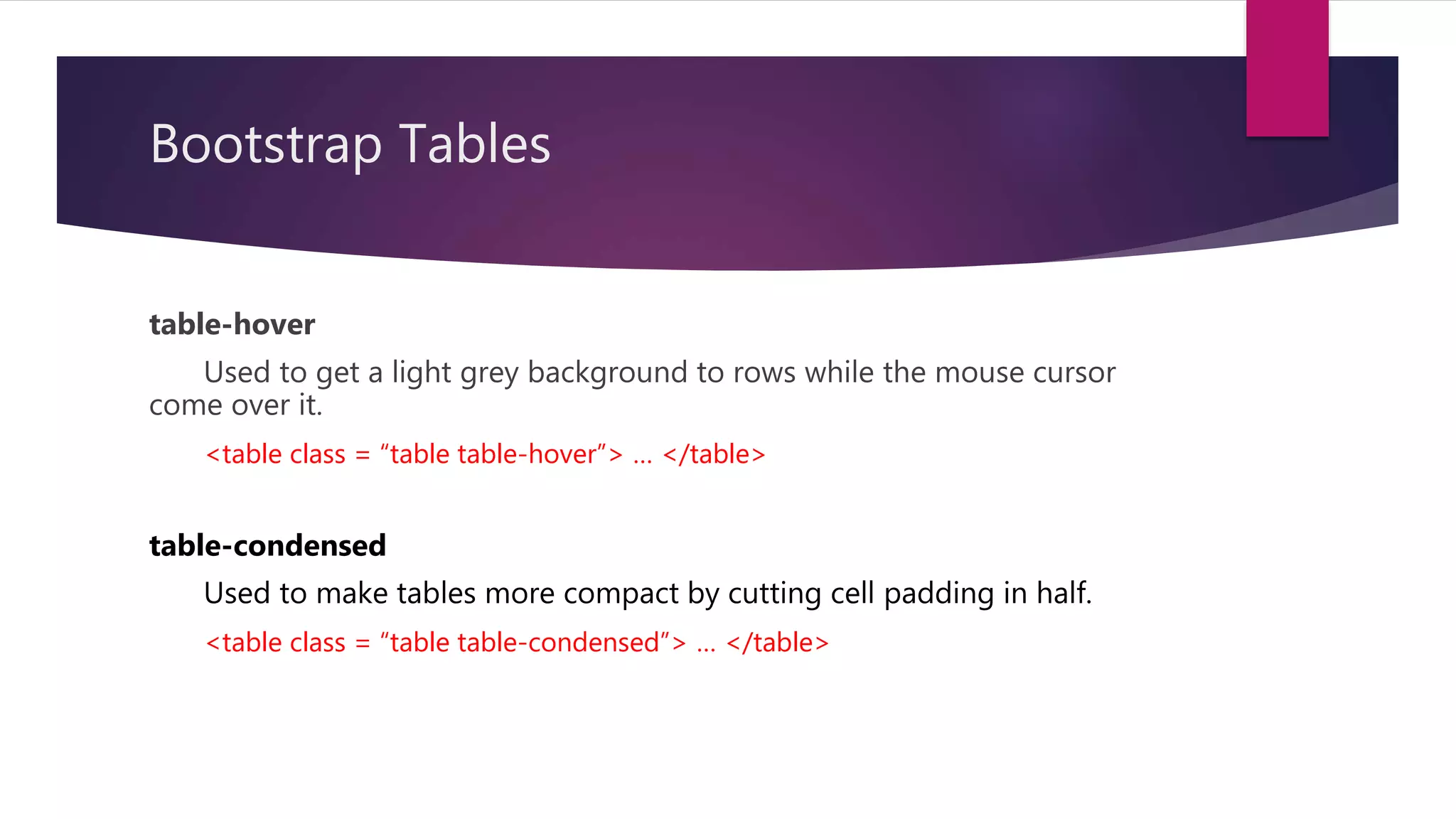
table-hover
Used toget a light grey background to rows while the mouse cursor
come over it.
<table class = “table table-hover”> … </table>
table-condensed
Used to make tables more compact by cutting cell padding in half.
<table class = “table table-condensed”> … </table>
23.
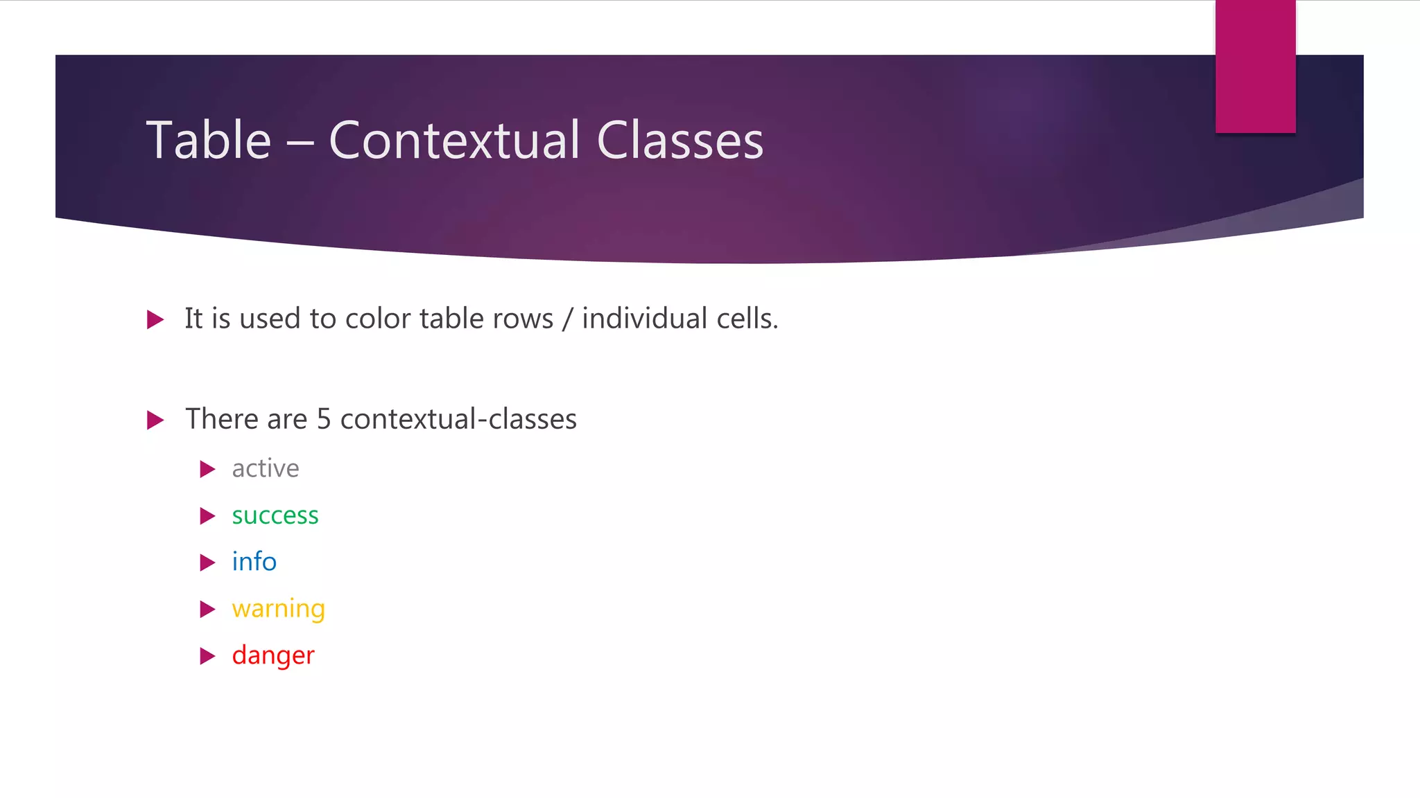
Table – ContextualClasses
It is used to color table rows / individual cells.
There are 5 contextual-classes
active
success
info
warning
danger
24.
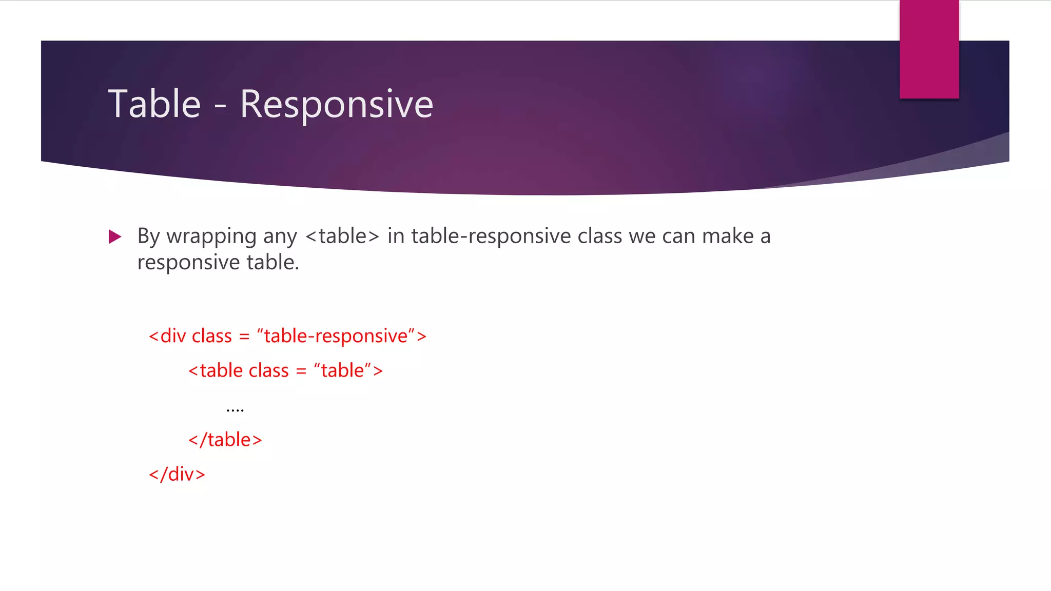
Table - Responsive
By wrapping any <table> in table-responsive class we can make a
responsive table.
<div class = “table-responsive”>
<table class = “table”>
….
</table>
</div>
25.
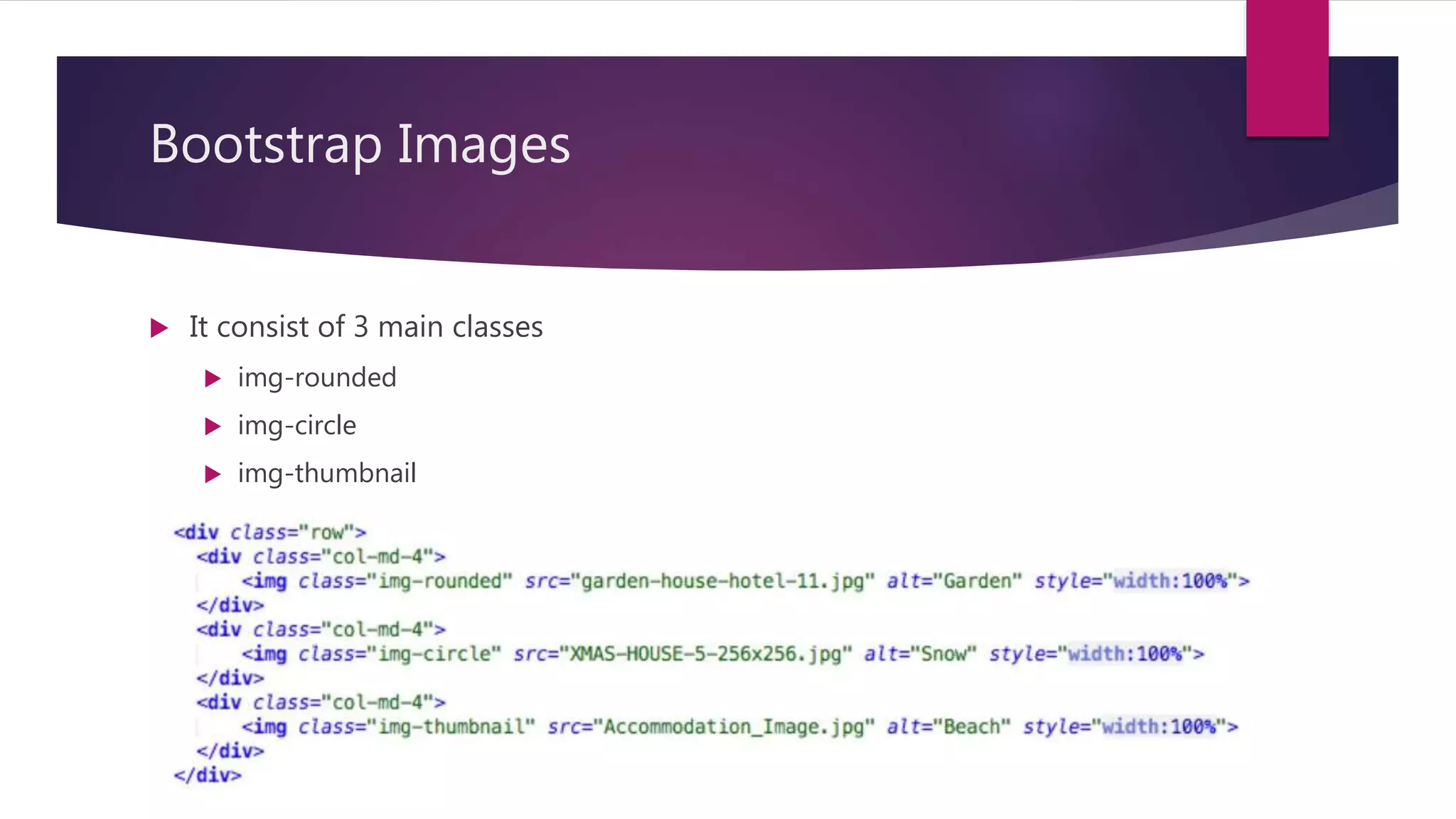
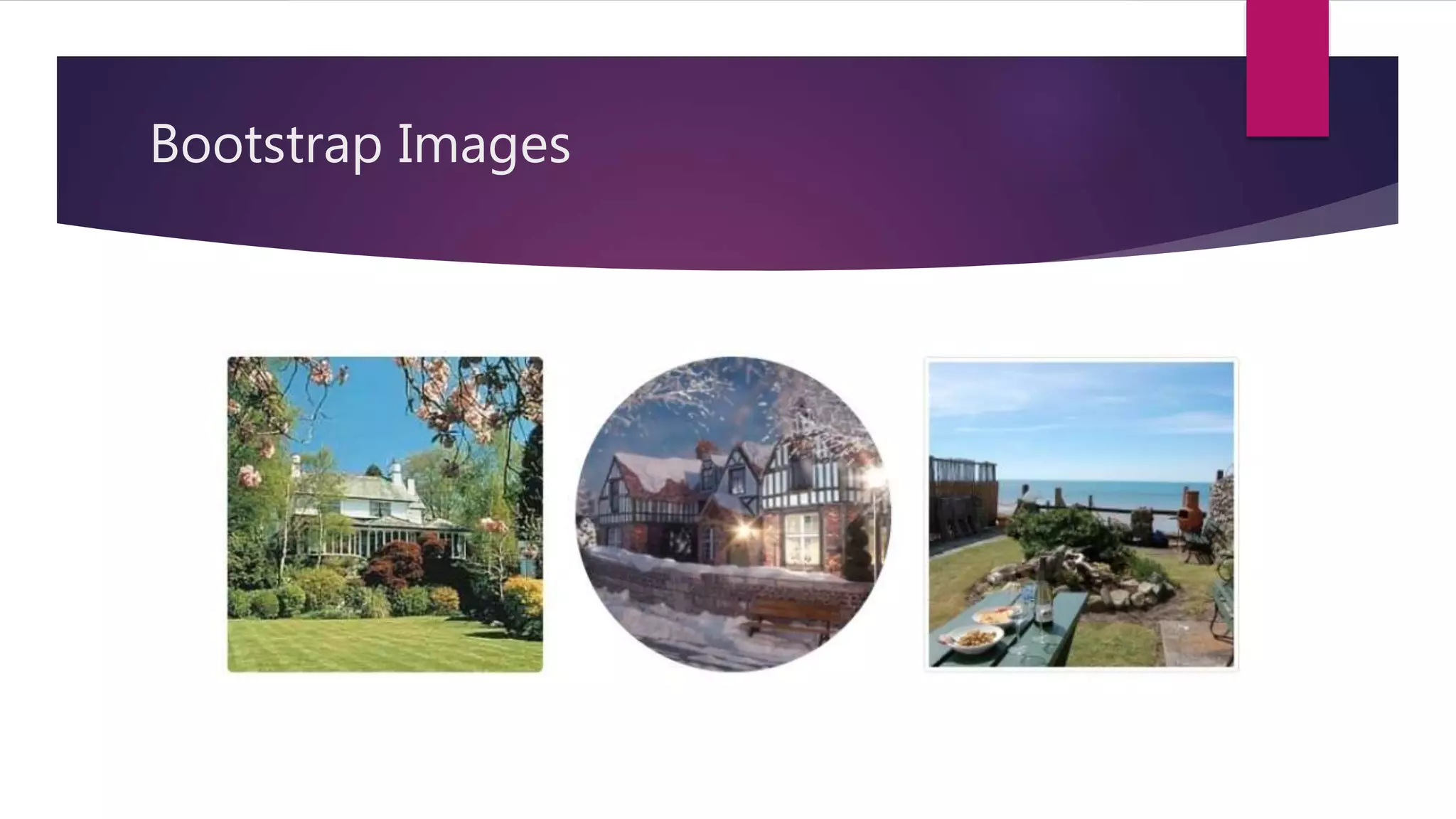
Bootstrap Images
Itconsist of 3 main classes
img-rounded
img-circle
img-thumbnail
Image - Responsive
We can also make responsive images by using img-fluid class.
<img src = “…” class = “img-fluid” alt = “Responsive_Image” />
28.
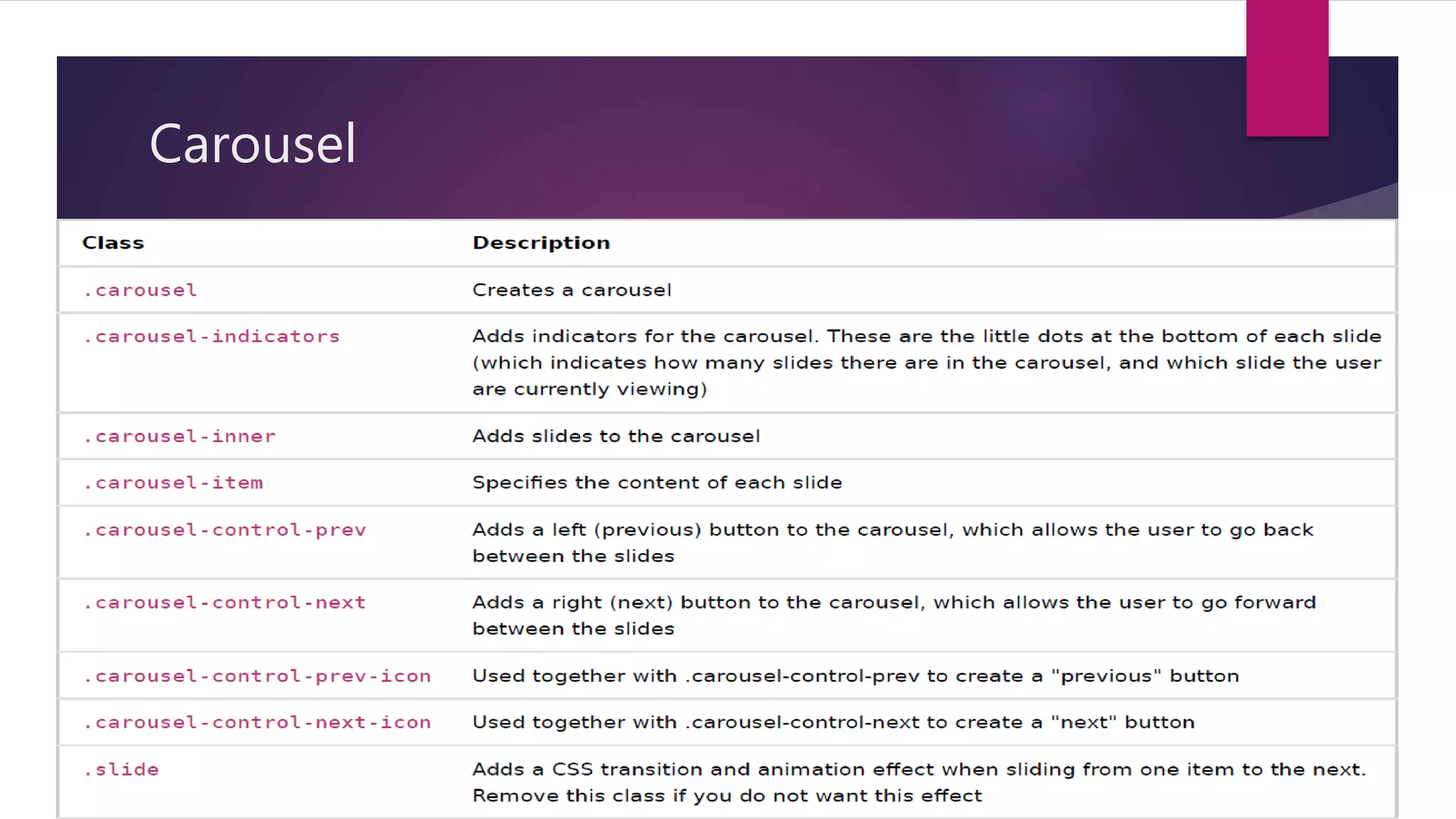
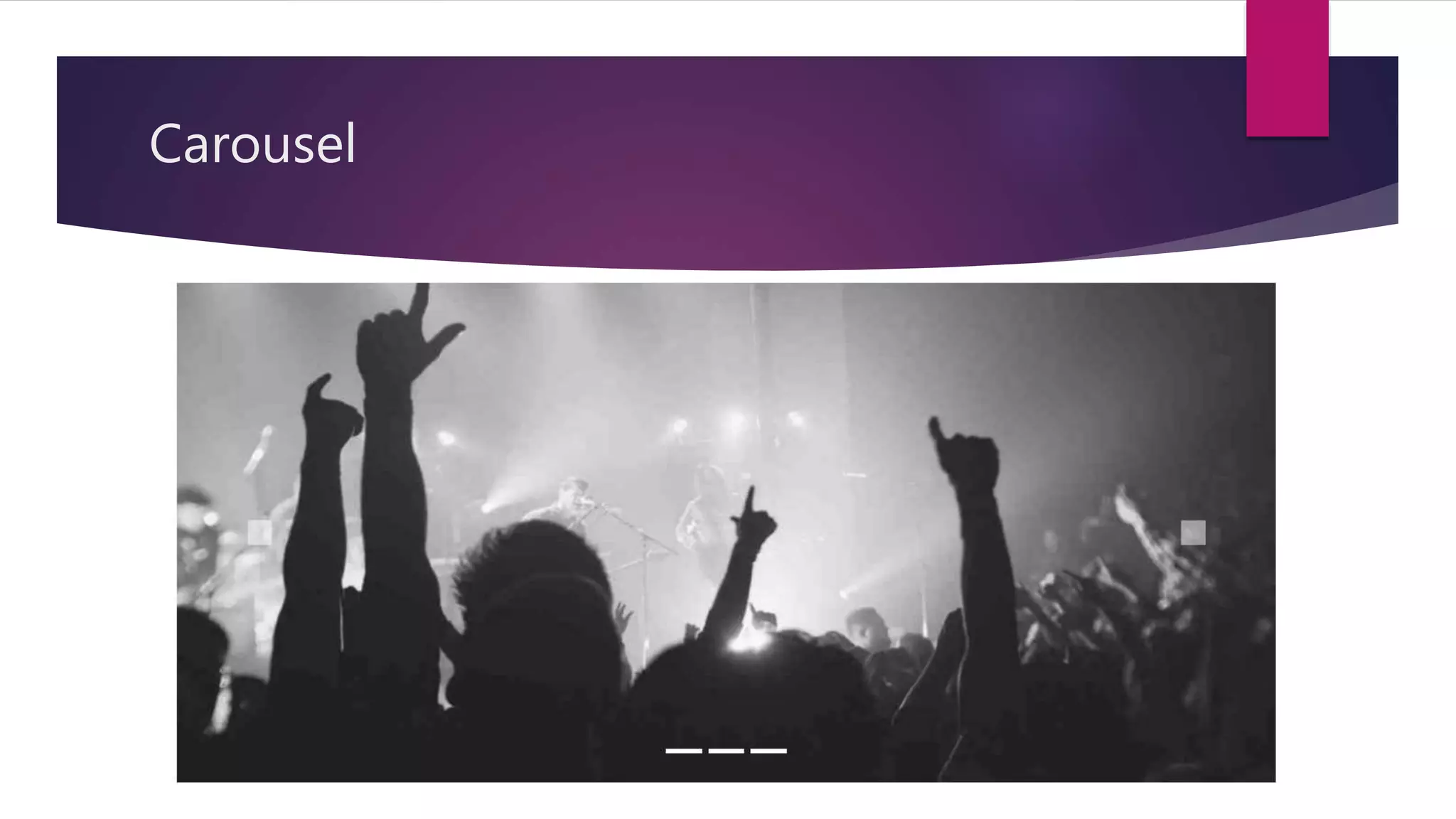
Carousel
It isa slideshow for cycling through elements.
We can use the carousel slide class to create slideshow.
Syntax is,
<div id="demo" class="carousel slide" data-ride="carousel">
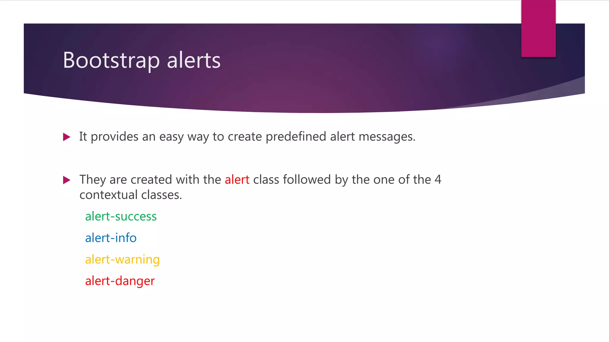
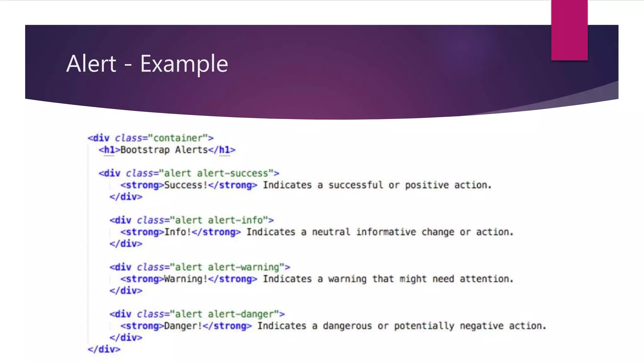
Bootstrap alerts
Itprovides an easy way to create predefined alert messages.
They are created with the alert class followed by the one of the 4
contextual classes.
alert-success
alert-info
alert-warning
alert-danger
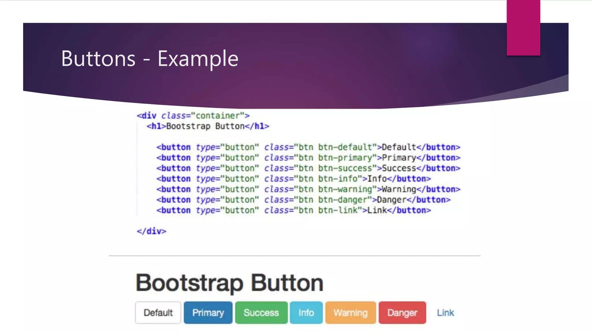
Bootstrap Buttons
Bootstrapprovides 7 styles of buttons. We can use the btn class to obtain
it.
btn-default
btn-primary
btn-success
btn-info
btn-warning
btn-danger
btn-link
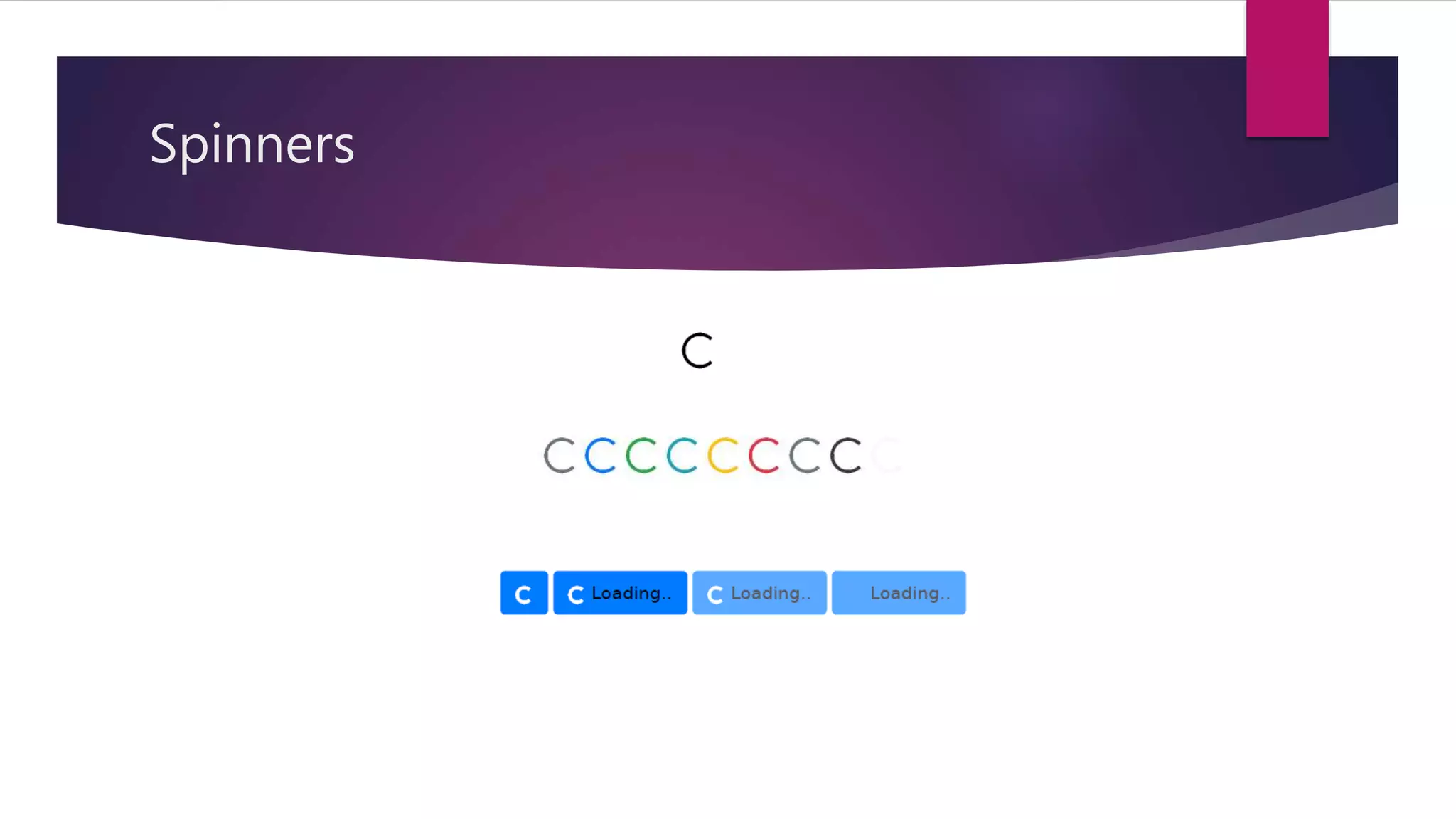
Spinners
It isused to create a spinner/loader.
We can use the spinner-border class to create it.
Syntax is,
<div class="spinner-border"></div>
By using contextual class we can change the color of the spinner
accordingly.
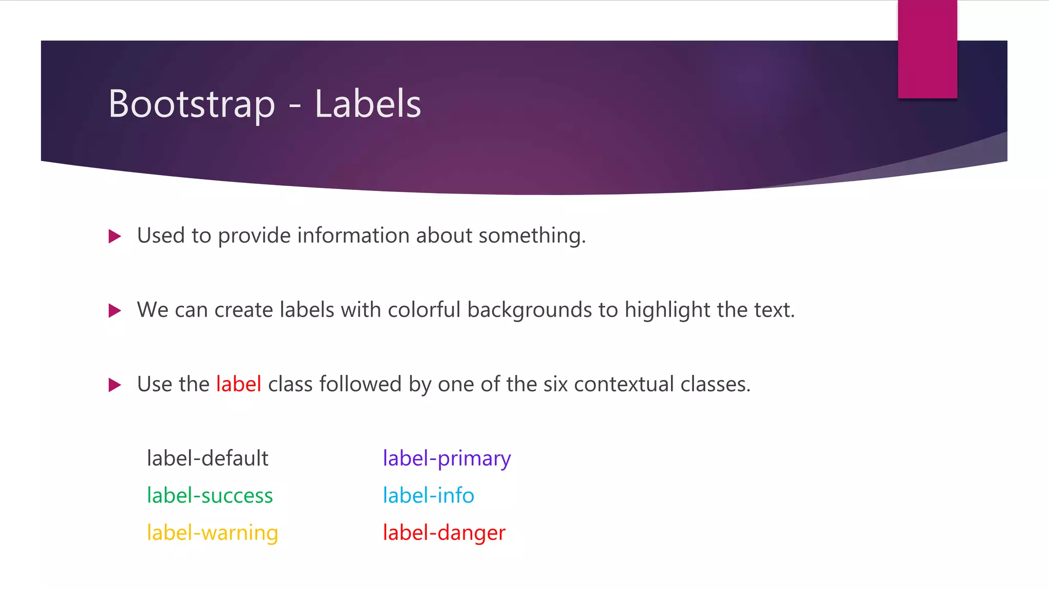
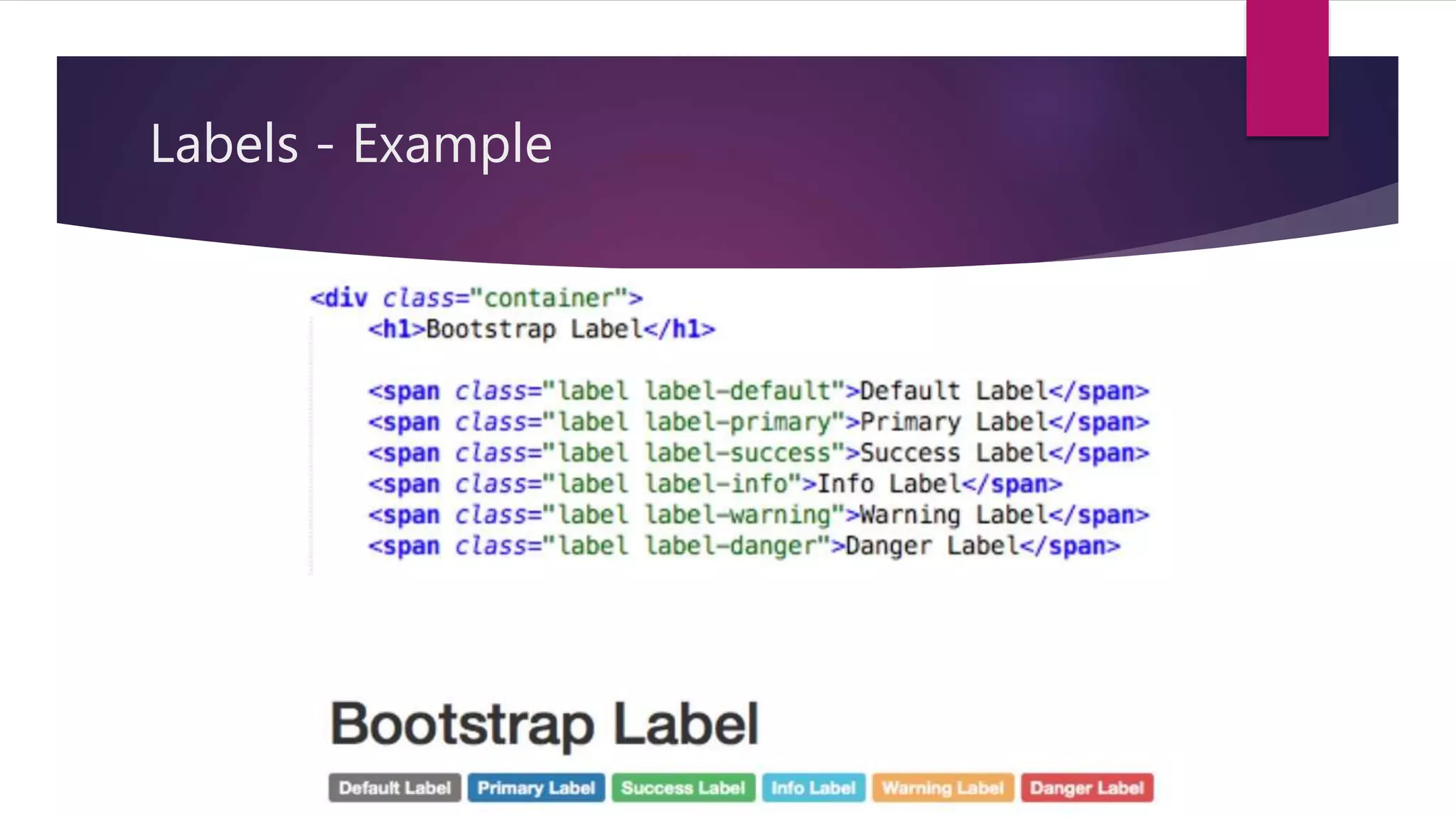
Bootstrap - Labels
Used to provide information about something.
We can create labels with colorful backgrounds to highlight the text.
Use the label class followed by one of the six contextual classes.
label-default label-primary
label-success label-info
label-warning label-danger
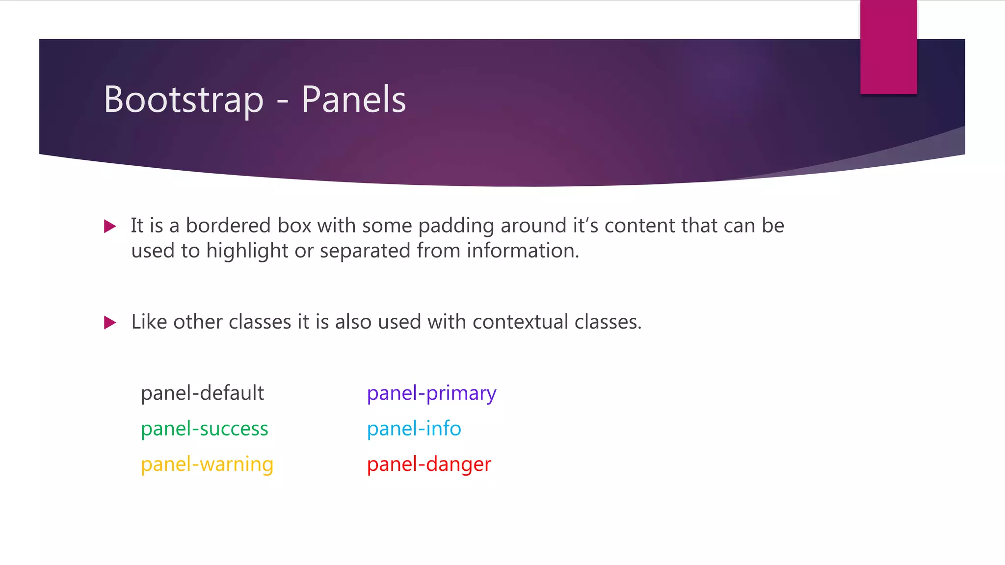
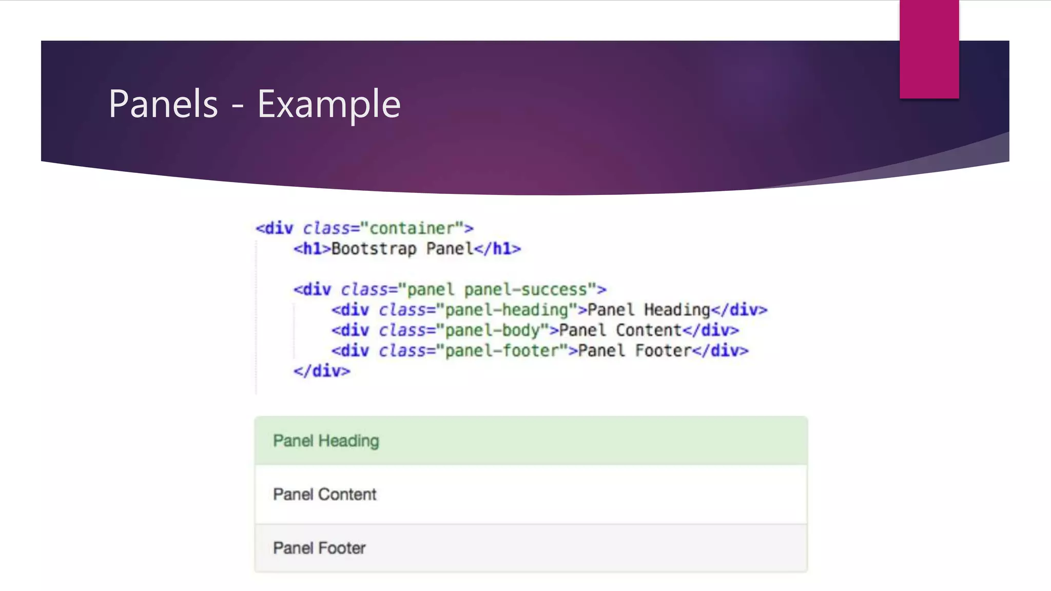
Bootstrap - Panels
It is a bordered box with some padding around it’s content that can be
used to highlight or separated from information.
Like other classes it is also used with contextual classes.
panel-default panel-primary
panel-success panel-info
panel-warning panel-danger
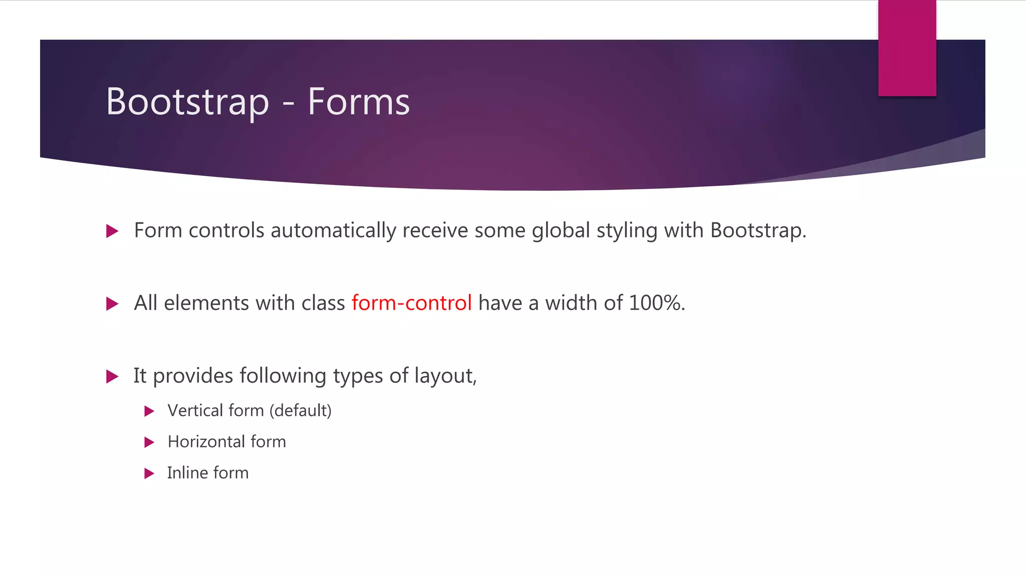
Bootstrap - Forms
Form controls automatically receive some global styling with Bootstrap.
All elements with class form-control have a width of 100%.
It provides following types of layout,
Vertical form (default)
Horizontal form
Inline form
46.
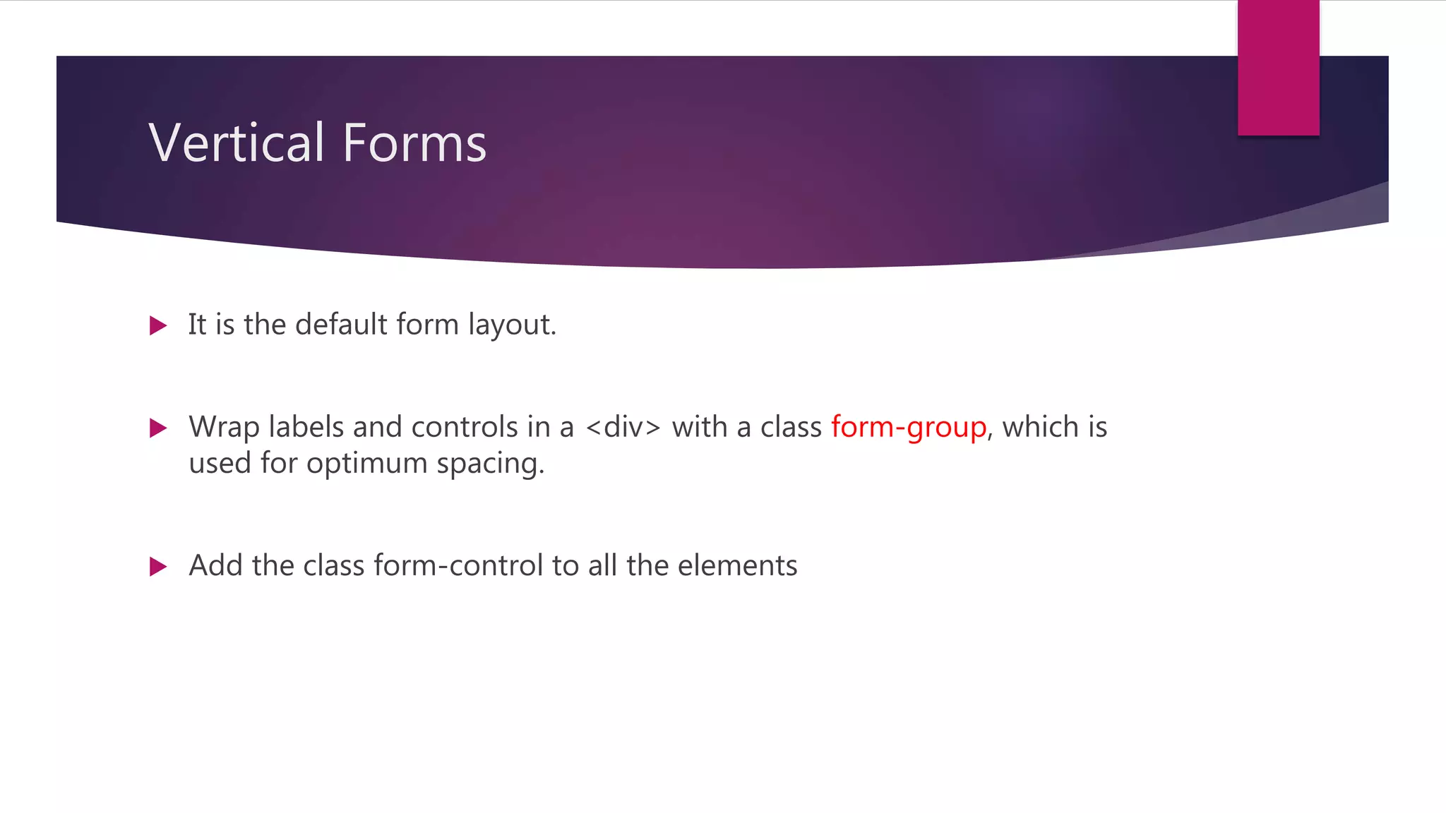
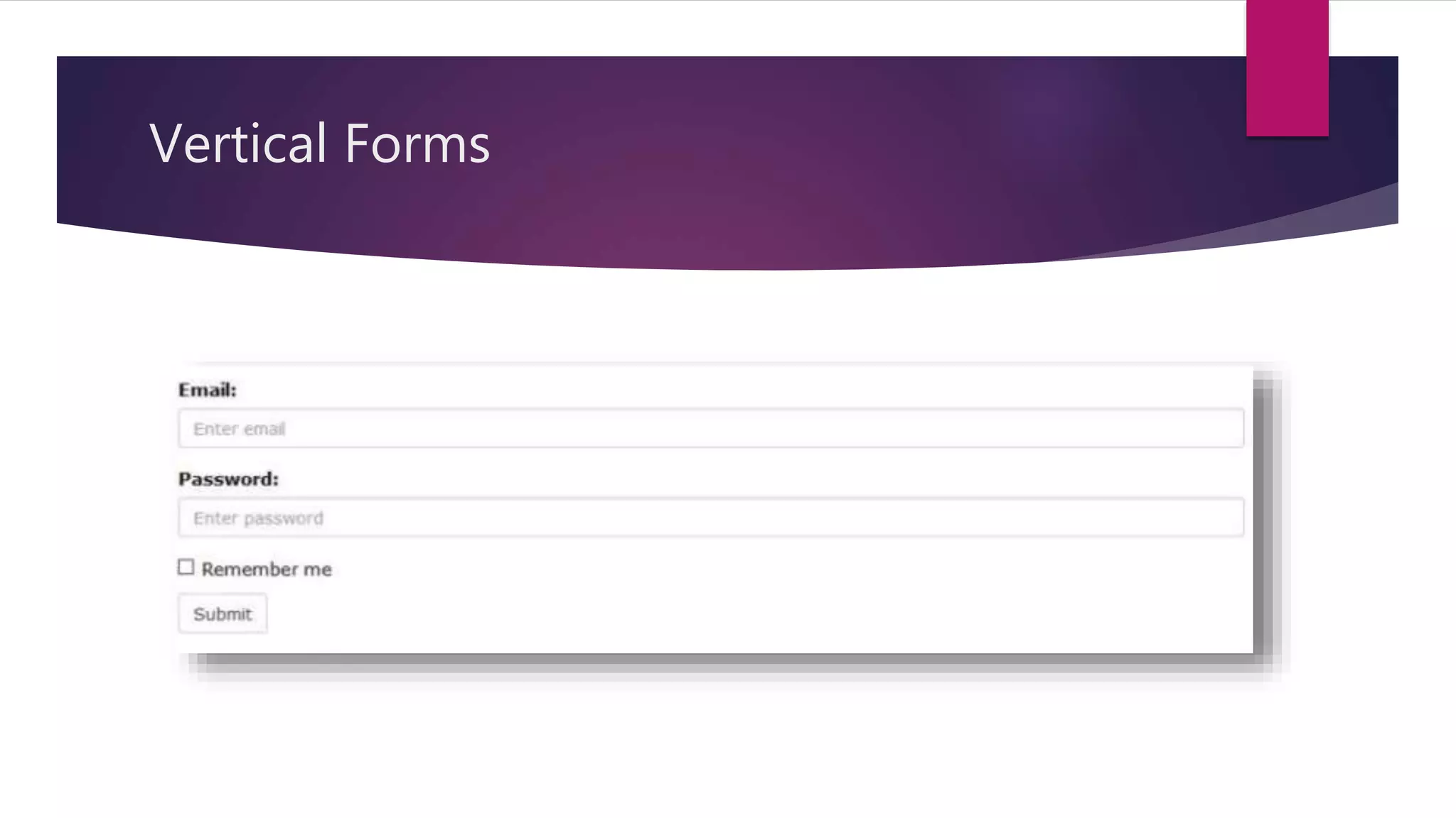
Vertical Forms
Itis the default form layout.
Wrap labels and controls in a <div> with a class form-group, which is
used for optimum spacing.
Add the class form-control to all the elements
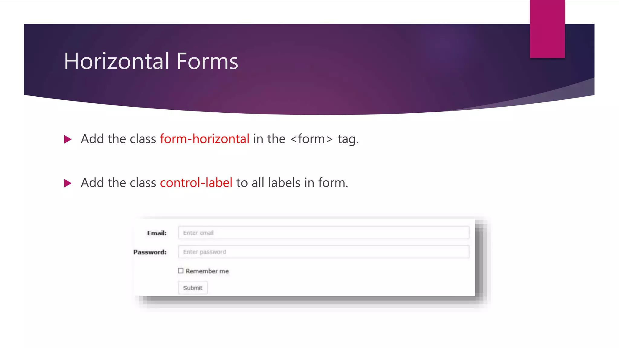
Horizontal Forms
Addthe class form-horizontal in the <form> tag.
Add the class control-label to all labels in form.
49.
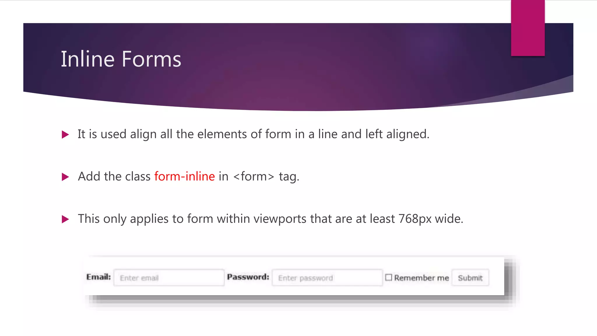
Inline Forms
Itis used align all the elements of form in a line and left aligned.
Add the class form-inline in <form> tag.
This only applies to form within viewports that are at least 768px wide.
50.
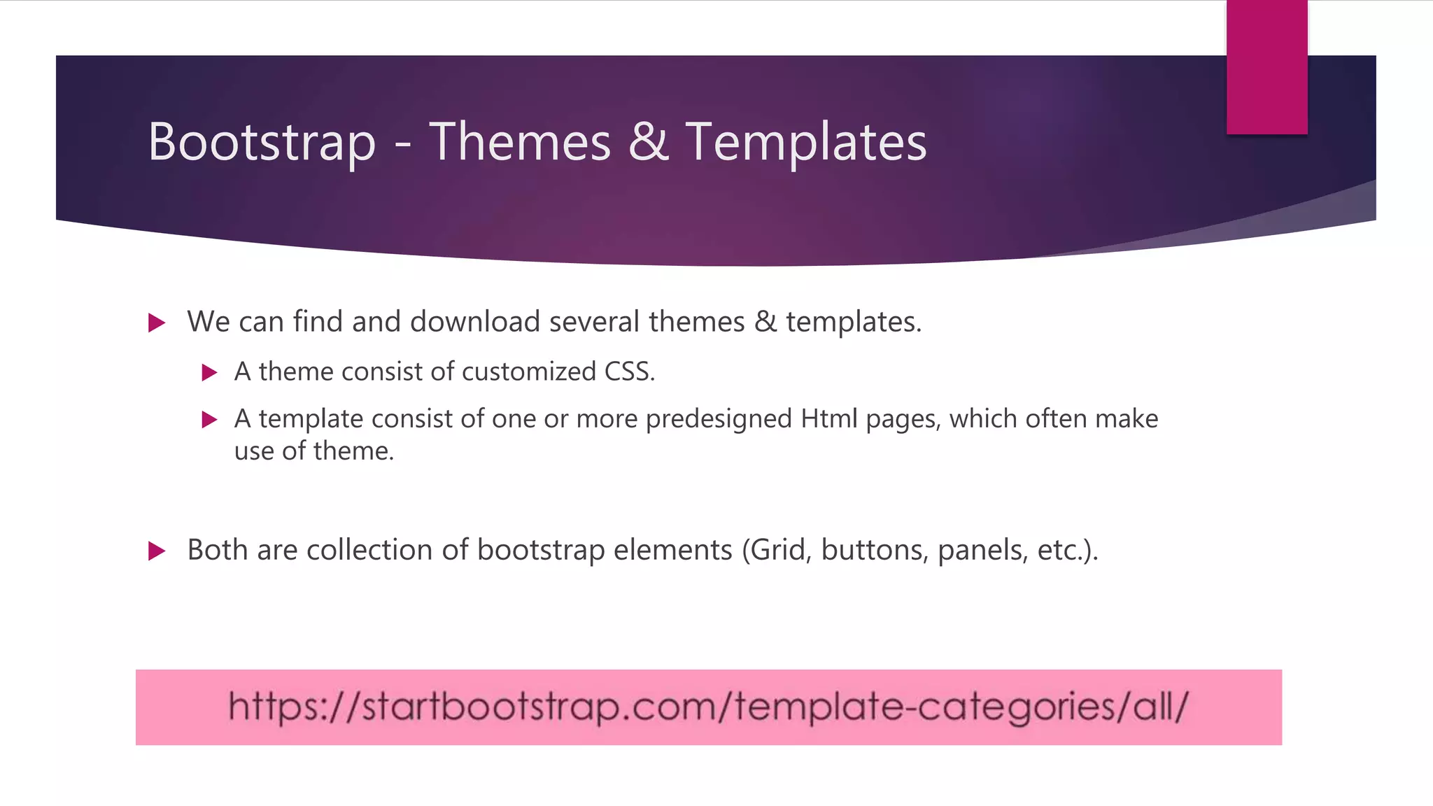
Bootstrap - Themes& Templates
We can find and download several themes & templates.
A theme consist of customized CSS.
A template consist of one or more predesigned Html pages, which often make
use of theme.
Both are collection of bootstrap elements (Grid, buttons, panels, etc.).
51.
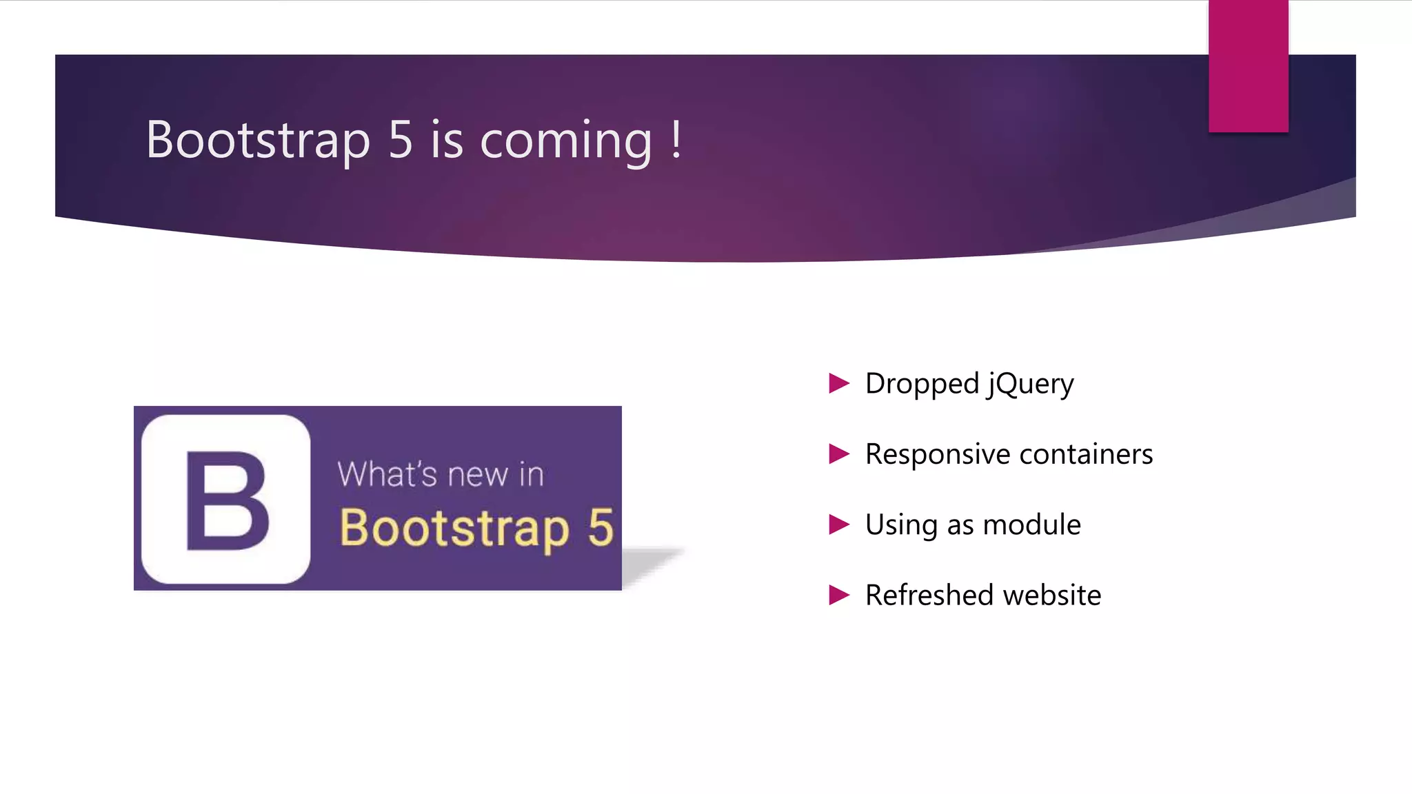
Bootstrap 5 iscoming !
► Dropped jQuery
► Responsive containers
► Using as module
► Refreshed website
52.
Conclusion
Bootstrap isa free and open-source CSS framework directed at
responsive, mobile-first front-end web development.
It makes the responsive web designing more easy and effective.
It contains CSS, jQuery / Javascript that makes the designing more easier.


![Bootstrap [part 1]](https://cdn.slidesharecdn.com/ss_thumbnails/bootstrappart-11-170208154053-thumbnail.jpg?width=640&height=640&fit=bounds)


