Beginners Guide to TikTok for Search - Rachel Pearson - We are Tilt __ Bright...
Editor's Notes
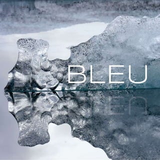
Glossy Cover!
Front Cover Design by Lynne Chen
132 Larkin Lane, Chapel Hill, NC 27516
Feedback: It’s an exceptionally beautiful and haunting photo for the cover. I would encourage you to work with it just a little bit more to manipulate the color a little more into the blue spectrum instead of grey. I know you have small line of blue between the ice and the water, but this being a sponsored product, it could use a tiny push. The typeface of Bleu looks very good knocked out in white here, but maybe there’s an option where there’s a nod to some blue there. Not sure. These are subtle adjustments.
I increased saturation and cyan balance to bring out the blue a little more but I’m not sure if it’s still too subtle!
Summer - title page 1
Summer - title page 2
Summer - title page 3
Feedback: the layout and graphic treatments are lovely and really emphasize the quiet of the rest of the book. They type is too close to edge of the page, however. The size of this Google slide deck includes the bleed area that will get cut off when it prints. (It prints ¼ inch smaller all around). To keep it really simple and elegant, don’t change typefces in mid-sentence for the subhead. Let the title typeface stand alone for emphasis.
Spread 1 Poem Page, Left Slide by AD: Emily Rattanavong
1802 W Chapman Court, Hillsborough, N.C. 27278
Feedback: Try using just the thin lines like you’ve done on the rest of the book instead of the large block of color. It will flow nicely as the lines go from hard to soft by beginning that idea here.
AD: Kenny Sevilla
Spread 1, Right Side Photo Page by Jeremy Bishop 228 Greene st Chapel Hill NC 27516
Feedback: The curation of photos flows nicely and each of the photos fits the page well. In class we will take a look at how it lays out. You can see how the spreads relate to each other and make any adjustments you’d like in the arrangement. I got resolution warnings on the pages. Please make sure you have downloaded the highest resolution UnSplash offers and that if you did layouts in Illustrator, then exported them, you used 300dpi setting for your exports. It looks like these were done at 72dpi. That’s screen resolution. 300 is needed for print. The total page count needs to be 46. Add 4 more photo pages to make the page count work.
Spread 2, Left Side Photo Page by Levi Bare
Spread 2, Right Side Photo Page by OB OA
Spread 3, Poem Page, Left Side AD: Emily Rattanavong
Feedback: Again, look for a way to use the thin graphic lines to keep the tone on the text on a similar level as you “designate” these words.
Spread 3, Right Side Photo Page by Daniele Levis Pelusi
Spread 4, Left Side Photo Page
Spread 4, Right Side Photo Page by Ciprian Morar
JM dav
Kei
Spread 5, Left Side Photo Page
Feedback: Check that you’ve downloaded a high resolution version of this photo. It appears to be a little broken up in the details.
Spread 5, Right Side Photo Page
Spread 6, Poem Page, Left side by AD: Emily Rattanavong
Spread 6, Right Side Photo Page
Spread 7, Left Side Photo Page by Michael Weidner
Spread 7, Right Side Photo Page by Philip Kock
Spread 8, Left Side Photo Page by Jack Ward
Spread 8, Right Side Photo Page by Robert V. Ruggiero
Spread 9, Left Side Photo Page by David Gavi
Spread 9, Right Side Photo Page by Casey Horner
Spread 10, Poem Page, Left Side by AD: Emily Rattanavong
Spread 10, Poem Page, Right Side by AD: Emily Rattanavong
Spread 11, Left Side Photo Page by Mustaches Cactus
Spread 11, Right Side Photo Page by Ryan Loughlin
Spread 12, Left Side Photo Page
Spread 12, Right Side Photo Page
Spread 13, Poem Page, Left Side by AD:Emily Rattanavong
Feedback: As you transition into darkness here, can the thin graphics be a part of it?
Spread 13, Right Side Photo Page by Daniel Olah
Spread 14, left Side Photo Page by Ayesha Firdaus
Spread 14, Poem Page, Right Side by AD:Emily Rattanavong
SpaceX
Gabriella Sudjono
Spread 15, Left Side Photo Page by Hao Zhang
Spread 15, Right Side Photo Page
Spread 16, Poem Page, Left Side by AD:Emily Rattanavong
Spread 16, Right Side Photo Page
Spread 17 Poem Page, Left Slide by AD:Emily Rattanavong
Spread 17, Right Side Photo Page by Tess
Photographer Index by Cameron Sharer 309 Brookside Dr, Chapel Hill, NC, 27516
Feedback: Break the Photo Index into two equal pages instead of having it all on one page and only one listing on the second page. Balance it out as a spread. Since these two pages are a spread, you do not need the title “about the photos” on both. The size of the document is includes the bleed that will get cut off in printing. You will need to move your elements away from the page edges to ensure a good fit for your text. When the index is broken up more evenly between the two pages, you’ll have the room to do that.
Photographer Index by Cameron Sharer
AD: Allison Manning
501 Hwy 54 Bypass Apt. 12F, Carrboro NC, 27510 Feedback: Since you are going for the dramatic transition from light to dart to mirror the book, try heightening that feel by taking the block text down from the upper right, deleting the big Chanel logo and leaving only the text and the gradient on the page. Control how the reader’s eye moves around the page instead of filling up the corners. The final focus is on the bottle. The size of the document includes the bleed, so the bottle is too close to the edge of the page. (It will print ¼ inch smaller).
Back Cover Design by Lynne Chen
Feedback: An elegant addition to the cover. The same idea of “blueness” could subtly apply here. The text is too tight to the left since the slide deck page includes the bleed area.
Edited the ocean to be more obviously blue and added the “Bleu” title along with decreasing the font size of the body text.