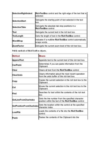
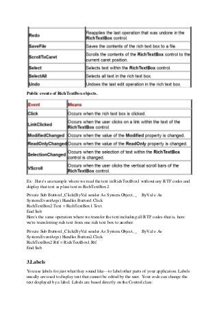
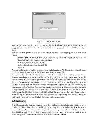
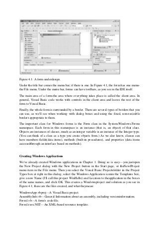
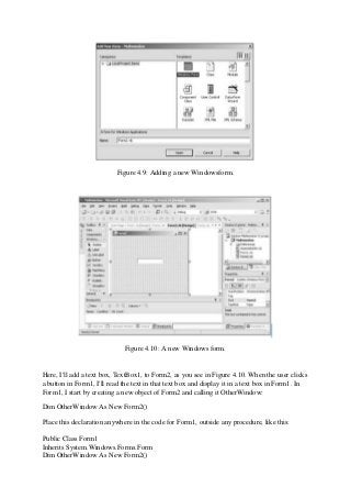
The document discusses forms and controls in Windows applications created using Visual Basic .NET. It covers key topics like:
1) Forms are windows that appear in applications and are represented by the Form class. Controls like buttons and text boxes are added to the form's client area.
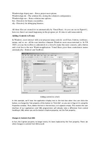
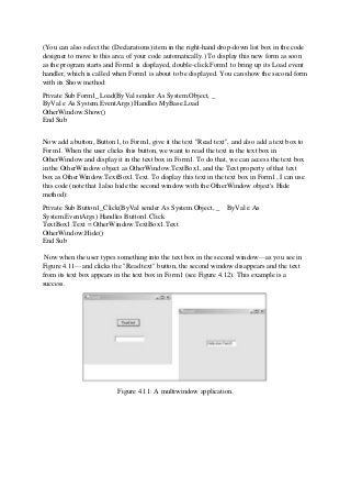
2) Event handlers allow code to run when events occur, like a button click. The Button1_Click handler displays text in a text box when its button is clicked.
3) Message boxes and input boxes can be used to display messages and get user input using functions like MsgBox and InputBox or the MessageBox class. Results are returned indicating the user's response.
![Running a Windowsapplication.
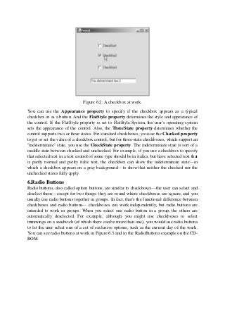
Using the MsgBox Function
Visual Basic—you can use the MsgBox andInputBox functions. You can also use the
MessageBox class built into the .NETFramework to display messages and accept input from
the user. You'll find all of theseat work in the MsgAndInputBoxes example on the
CDROM—all you need to do is toclick a button to use these various functions. I'll start with
the MsgBox function in this
topic:
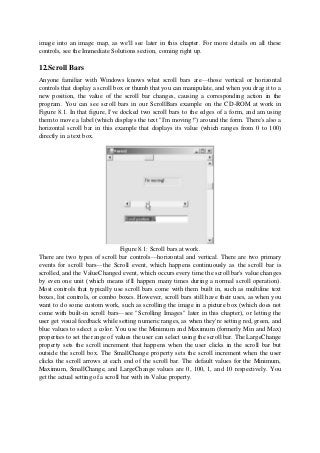
Public Function MsgBox(Prompt As Object [, Buttons As MsgBoxStyle =
MsgBoxStyle.OKOnly [, Title As Object = Nothing]]) As MsgBoxResultArguments
Here are the arguments you pass to this function:
Prompt—A string expression displayed as the message in the dialog box. Themaximum
length is about 1,024 characters (depending on the width of thecharacters used).
Buttons—The sum of values specifying the number and type of buttons todisplay, the icon
style to use, the identity of the default button, and the modalityof the message box. If you
omit Buttons, the default value is zero. See below.
Title—String expression displayed in the title bar of the dialog box. Note that ifyou omit
Title, the application name is placed in the title bar.
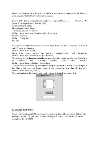
You can find the possible constants to use for the Buttons argument in Table 4.4.
Table 4.4: MsgBox constants.
Constant Value Description
OKOnly 0 Shows OK button only.
OKCancel 1 Shows OK and Cancel buttons.
AbortRetryIgnore 2 Shows Abort, Retry, and Ignore buttons.
YesNoCancel 3 Shows Yes, No, and Cancel buttons.](https://image.slidesharecdn.com/s8svd5w0seo99zaswk3x-signature-4ff4bfc09514e30c3ce3e3f21cb3fac6a5e5734d83c8830413c33e45e478f20f-poli-201004160437/85/Unit-IV-Checkboxes-and-Radio-Buttons-in-VB-Net-in-VB-NET-5-320.jpg?cb=1694160216)
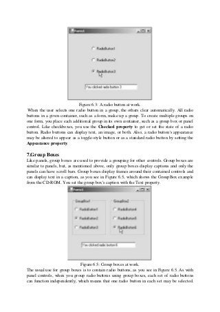
![MessageBoxButtons.OKCancel, MessageBoxIcon.Information, _
MessageBoxDefaultButton.Button1, _
MessageBoxOptions.DefaultDesktopOnly)
If (Result = DialogResult.OK) Then
TextBox1.Text = "You clicked OK"
End If
End Sub
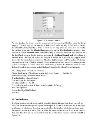
You can see the results of this code in Figure 4.6. Note that this message box looks justlike
the one created with the MsgBox function in the previous topic.
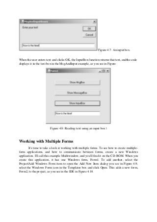
Using the InputBox Function
You can use the InputBox function to get a string of text from the user. Here's the
syntax for this function:
Public Function InputBox(Prompt As String [, Title As _
String = "" [, DefaultResponse As String = "" [, _
XPos As Integer = -1 [, YPos As Integer = -1]]]]) As String
And here are the arguments for this function:
Prompt— A string expression displayed as the message in the dialog box. Themaximum
length is about 1,024 characters (depending on the width of thecharacters used).
Title— String expression displayed in the title bar of the dialog box. Note that ifyou omit
Title, the application name is placed in the title bar.
DefaultResponse— A string expression displayed in the text box as the defaultresponse if no
other input is provided. Note that if you omit DefaultResponse,the displayed text box is
empty.
XPos— The distance in pixels of the left edge of the dialog box from the leftedge of the
screen. Note that if you omit XPos, the dialog box is centeredhorizontally.
YPos— The distance in pixels of the upper edge of the dialog box from the topof the screen.
Note that if you omit YPos, the dialog box is positioned verticallyabout one-third of the way
down the screen.
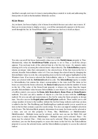
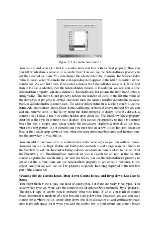
Input boxes let you display a prompt and read a line of text typed by the user, and the
InputBox function returns the string result. Here's an example from theMsgAndInputBoxes
example on the CD-ROM:
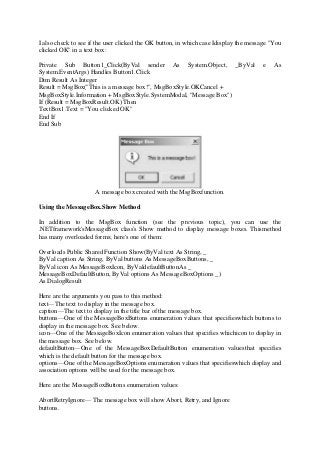
Private Sub Button3_Click(ByVal sender As System.Object, _ByVal e As
System.EventArgs) Handles Button3.Click
Dim Result As String
Result = InputBox("Enter your text!")
TextBox1.Text = Result
End Sub
You can see the results of this code in Figure 4.7.](https://image.slidesharecdn.com/s8svd5w0seo99zaswk3x-signature-4ff4bfc09514e30c3ce3e3f21cb3fac6a5e5734d83c8830413c33e45e478f20f-poli-201004160437/85/Unit-IV-Checkboxes-and-Radio-Buttons-in-VB-Net-in-VB-NET-9-320.jpg?cb=1694160216)
![strText += e.KeyChar
MsgBox(strText)
End Sub
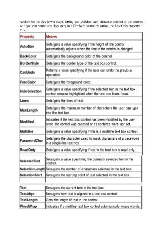
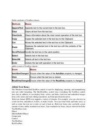
Common controls
1.Text Boxes
Every Windows user is familiar with text boxes: they're exactly what their name implies:
box-like controls in which you can enter text. Text boxes can be multiline, have scroll bars,
be read-only, and have many other attributes, as we'll see in this chapter. (Not every
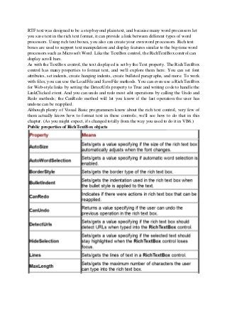
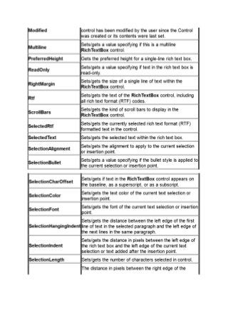
Windows user is familiar with rich text boxes, on the other hand. Rich text boxes support not
only plain text, but also rich text format [RTF] text.) The TextBox class is derived from the
TextBoxBase class, which is based on Control:
Object
MarshalByRefObject
Component
Control
TextBoxBase
TextBox
Note :In fact, most of the functionality of the text box control is simply inherited from the
TextBoxBase class, which is also a base class for the rich text box control.
Windows forms text boxes are used to get input from the user or to display text. The TextBox
control is generally used for editable text, although it can also be made readonly. Text boxes
can display multiple lines, wrap text to the size of the control, and add basic formatting, such
as quotation marks and masking characters for passwords.
The text displayed by the control is contained in the Text property. By default, you can enter
up to 2,048 characters in a text box. If you set the MultiLine property to True to make the
control accept multiple lines of text, you can enter up to 32KB of text. The Text property can
be set at design time with the Properties window, at run time in code, or by user input at run
time. The current contents of a text box can be retrieved at run time by reading the Text
property. We've seen how to do this already, as in this example, which inserts text into a text
box:
Private Sub Button1_Click(ByVal sender As System.Object, _ ByVal e As
System.EventArgs) Handles Button1.Click
TextBox1.Text = "Hello from Visual Basic"
End Sub
You can set or read text from text boxes at run time, and the user can enter and edit text in
text boxes as well. You can limit the amount of text entered into a TextBox control by setting
the MaxLength property to a specific number of characters. TextBox controls also can be
used to accept passwords if you use the PasswordChar property to mask characters.
You also can restrict text from being entered in a TextBox control by creating an event](https://image.slidesharecdn.com/s8svd5w0seo99zaswk3x-signature-4ff4bfc09514e30c3ce3e3f21cb3fac6a5e5734d83c8830413c33e45e478f20f-poli-201004160437/85/Unit-IV-Checkboxes-and-Radio-Buttons-in-VB-Net-in-VB-NET-20-320.jpg?cb=1694160216)