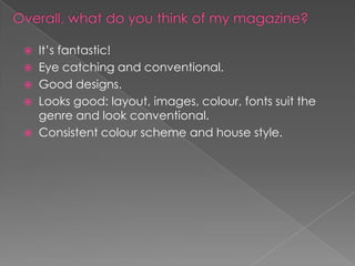
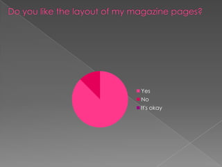
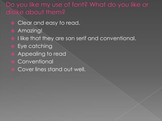
The document provides feedback on a magazine design. It repeatedly notes that the design is "conventional" - the layout, images, colors, fonts, and overall style fit genre conventions well. However, some comments note that the contents page and double page spread could be improved. The cover stories are described as "eye catching" but "cluttered." Overall, the feedback is positive about the design's consistency, images, and adherence to color scheme and conventions, with some suggestions to add more images and yellow and reduce overcrowding in a few areas.
