The document analyzes magazine front covers and identifies several key elements:
- The masthead is usually positioned left and in a unique font to stand out from cover lines and grab attention.
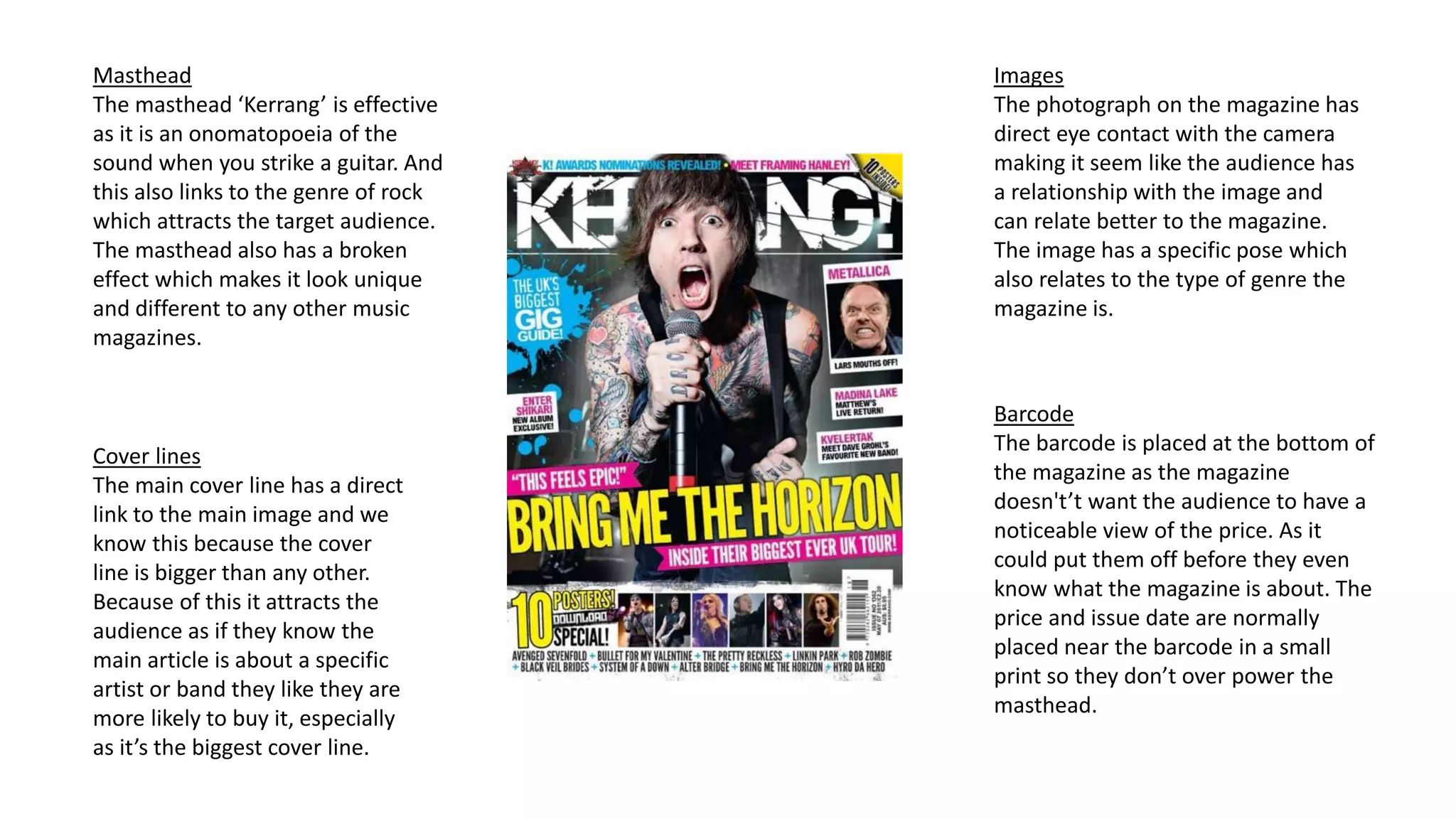
- The main image features the artist looking at the camera to create a personal relationship with audiences. It also portrays the genre.
- The main cover line about Adele is the biggest to attract attention and links to the main image. Other lines promote other artists.
- A splash under the masthead provides intrigue and information to entice audiences.