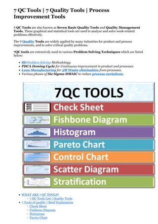
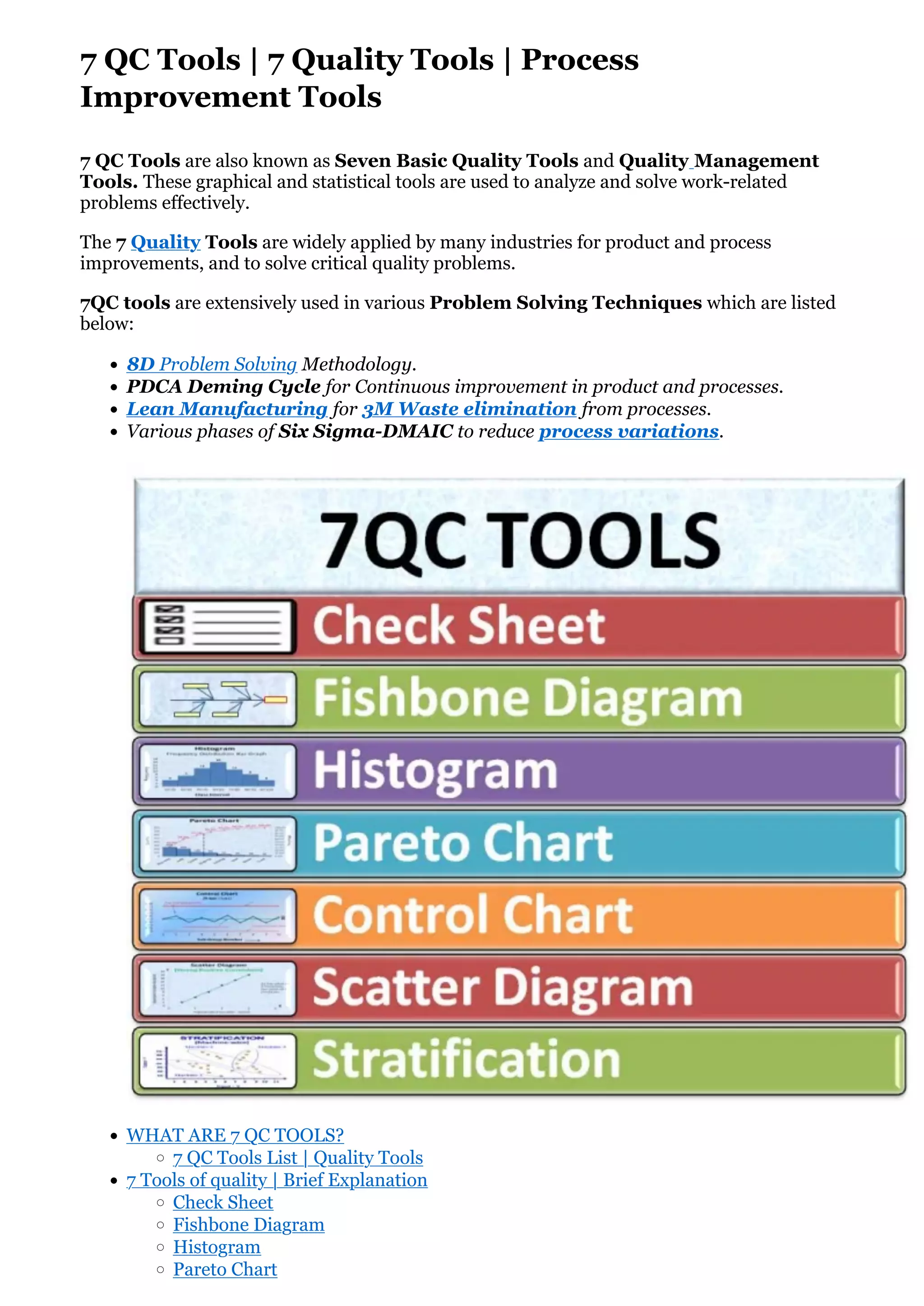
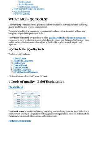
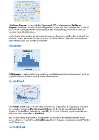
7 QC Tools | 7 Quality Tools | Process
Improvement Tools
7 QC Tools are also known as Seven Basic Quality Tools and Quality Management
Tools. These graphical and statistical tools are used to analyze and solve work-related
problems effectively.
The 7 Quality Tools are widely applied by many industries for product and process
improvements, and to solve critical quality problems.
7QC tools are extensively used in various Problem Solving Techniques which are listed
below:
• 8D Problem Solving Methodology.
• PDCA Deming Cycle for Continuous improvement in product and processes.
• Lean Manufacturing for 3M Waste elimination from processes.
• Various phases of Six Sigma-DMAIC to reduce process variations.
• WHAT ARE 7 QC TOOLS?
◦ 7 QC Tools List | Quality Tools
• 7 Tools of quality | Brief Explanation
◦ Check Sheet
◦ Fishbone Diagram
◦ Histogram
◦ Pareto Chart
◦ Control Chart
◦ Scatter Diagram
◦ Stratification Diagram
• WHY DO WE NEED 7 QC TOOLS?
• 7QC Tools benefits
• 7 QC TOOLS NEW
WHAT ARE 7 QC TOOLS?
The 7 quality tools are simple graphical and statistical tools but very powerful in solving
quality problems and process improvement.
These statistical tools are very easy to understand and can be implemented without any
complex analytical competence or skills.
The 7 tools of quality are generally used by quality control and quality assurance
engineers to solve product or process related quality issues on a daily/weekly/monthly basis
and to reduce/eliminate non-value-added activities like product rework, repair, and
rejection.
7 QC Tools List | Quality Tools
The list of 7 QC tools are:
1. Check Sheet
2. Fishbone Diagram
3. Histogram
4. Pareto Chart
5. Control Chart
6. Scatter Diagram
7. Stratification Diagram
Click on the above links to Explore QC tools.
7 Tools of quality | Brief Explanation
Check Sheet
The check sheet is used for collecting, recording, and analyzing the data. Data collection is
an important activity in the problem-solving process as it provides a basis for further action.
Data may be numerical, observations and opinions, etc.
Fishbone Diagram
Fishbone diagram is also called as Cause and Effect diagram and Ishikawa
diagram. It helps to Identify all possible potential causes and select the real/best potential
cause which contributes to the problem/effect. The brainstorming technique is used for
potential cause identification.
In a brainstorming session, all 4M or 6M factors are taken into consideration to identify the
potential causes. 4M or 6M factors are – Man, Machine, Method, Material, Measurement,
and Mother nature also called Environment.
Histogram
A Histogram is a pictorial representation of a set of data, and the most commonly used bar
graph for showing frequency distributions of data/values.
Pareto Chart
The Pareto chart helps to Narrow the problem area or prioritize the significant problems
for corrective measures. Pareto principle based on the 80-20 rule. It means that 80
percent of the problems/failures are caused by 20 percent of the few major causes/factors
which are often referred to as Vital Few.
And the remaining 20 percent of the problems are caused by 80 percent of many minor
causes which are referred to as Trivial Many. Hence, it gives us information about Vital few
from Trivial many.
Control Chart
A control chart is also known as the SPC chart or Shewhart chart. It is a graphical
representation of the collected information/data and it helps to monitor the process
centering or process behavior against the specified/set control limits.
A control chart is a very powerful tool to Investigate/disclose the source of Process
Variations present in the manufacturing processes. Tells when to take necessary action to
eliminate the Common or Random or Chance variations and Special cause of variations.
The control chart helps to measure and analyze the process capability and performance (Cp
and Cpk and Pp and Ppk) of the production process.
Scatter Diagram
Scatter diagram is also known as Correlation Chart, Scatter Plot, and Scatter Graph. A
Scatter graph is used to find out the relationship between two variables. In other words, it
shows the relationship between two sets of numerical data. Scatter graph shows Positive or
Negative correlation between two variables.
Independent variable data and dependent Variable data are customarily plotted along the
horizontal X-axis and Vertical Y-axis respectively. Independent variable is also called
controlled parameters.
Stratification Diagram
A technique used to analyze and divide a universe of data into homogeneous groups called
-Strata. Stratification tools are used when the data come from different sources or
conditions, such as data collected from different shifts, machines, people, days, suppliers
and population groups, etc.
Some lists replace stratification with Flowchart.
WHY DO WE NEED 7 QC TOOLS?
We need Quality Tools for :
• Problem Solving – making decisions & judgments.
• For Process Measurement.
• For continual improvement in products, processes, and services.
• To improve Quality, Productivity, and Customer Satisfaction.
Kaoru Ishikawa
“95% of the problem is solved when clearly defined”
“95% of quality related problems in the organization can be solved by using seven
fundamental quantitative tools.”
7QC Tools benefits
The major benefits of QC tools are:
• To analyze and solve quality problems effectively.
• Improve product and process quality.
• Enhance customer satisfaction.
• Reduce cost due to poor quality.
• Helps in investigating the potential causes and real root cause of the problem for taking
effective countermeasures.
• Check sheet helps in data collection and recording for quality problem analysis.
• Identify and reduce the process variation using the SPC quality tool.
• Pareto QC tool helps to narrow down the quality problem using the 80/20 rule.
• Helps in identifying the various sources of variations present in the process.
• Improve the employee’s analytical and problem-solving skills.
The new seven QC Tools are used for planning, goal setting, and problem-solving. These
are explained below :
Affinity Diagram – KJ Method. This tool is used for Pinpointing the Problem in a Chaotic
Situation and generating solution strategies.
Gathers large amounts of verbal data such as ideas, opinions, issues, and organizes the data
into groups based on natural relationships.
Tree Diagram – Also known as Systematic diagram or Dendrograms, Hierarchy diagram,
Organisation chart, and Analytical Tree.
This diagram is used for systematically pursuing the best strategies for achieving an
objective.
The advantages of the tree diagram are that it facilitates agreement among the team and is
extremely convincing with strategies.
Relation Diagram – It is used for cause identification. For finding solutions strategies by
clarifying relationships with Complex Interrelated Causes.
Allows for “Multi-directional” thinking rather than linear. Also known as
Interrelationship diagrams.
Process Decisions Program Charts (PDPC) – Also called as Decision Process Chart. It
is used for producing the desired result from many possible outcomes.
The chart is used to plan various contingencies.
PDPC enables problems to pinpoint.
Matrix Diagram – used for Clarifying Problems. It clarifies relationships among different
elements.
Matrix Data Analysis – Matrix + Num. Analysis.
This can be used when the Matrix diagram does not give sufficient information.
This is used in various fields like process analysis, new product planning and market surveys
etc.
Arrow Diagram – Gantt Chart + PERT/CPM Chart.
Arrow diagram is employed for understanding Optimal Schedules and controlling them
effectively.
This shows relationships among tasks needed to implement a plan.
This diagram is extensively used in PERT (Program Evaluation and Review Technique) and
CPM (Critical Path Method).
You’ll also like:

7 QC Tools 7 Quality Tools Process Improvement Tools.pdf

  • 1.
    7 QC Tools| 7 Quality Tools | Process Improvement Tools 7 QC Tools are also known as Seven Basic Quality Tools and Quality Management Tools. These graphical and statistical tools are used to analyze and solve work-related problems effectively. The 7 Quality Tools are widely applied by many industries for product and process improvements, and to solve critical quality problems. 7QC tools are extensively used in various Problem Solving Techniques which are listed below: • 8D Problem Solving Methodology. • PDCA Deming Cycle for Continuous improvement in product and processes. • Lean Manufacturing for 3M Waste elimination from processes. • Various phases of Six Sigma-DMAIC to reduce process variations. • WHAT ARE 7 QC TOOLS? ◦ 7 QC Tools List | Quality Tools • 7 Tools of quality | Brief Explanation ◦ Check Sheet ◦ Fishbone Diagram ◦ Histogram ◦ Pareto Chart
  • 2.
    ◦ Control Chart ◦Scatter Diagram ◦ Stratification Diagram • WHY DO WE NEED 7 QC TOOLS? • 7QC Tools benefits • 7 QC TOOLS NEW WHAT ARE 7 QC TOOLS? The 7 quality tools are simple graphical and statistical tools but very powerful in solving quality problems and process improvement. These statistical tools are very easy to understand and can be implemented without any complex analytical competence or skills. The 7 tools of quality are generally used by quality control and quality assurance engineers to solve product or process related quality issues on a daily/weekly/monthly basis and to reduce/eliminate non-value-added activities like product rework, repair, and rejection. 7 QC Tools List | Quality Tools The list of 7 QC tools are: 1. Check Sheet 2. Fishbone Diagram 3. Histogram 4. Pareto Chart 5. Control Chart 6. Scatter Diagram 7. Stratification Diagram Click on the above links to Explore QC tools. 7 Tools of quality | Brief Explanation Check Sheet The check sheet is used for collecting, recording, and analyzing the data. Data collection is an important activity in the problem-solving process as it provides a basis for further action. Data may be numerical, observations and opinions, etc. Fishbone Diagram
  • 3.
    Fishbone diagram isalso called as Cause and Effect diagram and Ishikawa diagram. It helps to Identify all possible potential causes and select the real/best potential cause which contributes to the problem/effect. The brainstorming technique is used for potential cause identification. In a brainstorming session, all 4M or 6M factors are taken into consideration to identify the potential causes. 4M or 6M factors are – Man, Machine, Method, Material, Measurement, and Mother nature also called Environment. Histogram A Histogram is a pictorial representation of a set of data, and the most commonly used bar graph for showing frequency distributions of data/values. Pareto Chart The Pareto chart helps to Narrow the problem area or prioritize the significant problems for corrective measures. Pareto principle based on the 80-20 rule. It means that 80 percent of the problems/failures are caused by 20 percent of the few major causes/factors which are often referred to as Vital Few. And the remaining 20 percent of the problems are caused by 80 percent of many minor causes which are referred to as Trivial Many. Hence, it gives us information about Vital few from Trivial many. Control Chart
  • 4.
    A control chartis also known as the SPC chart or Shewhart chart. It is a graphical representation of the collected information/data and it helps to monitor the process centering or process behavior against the specified/set control limits. A control chart is a very powerful tool to Investigate/disclose the source of Process Variations present in the manufacturing processes. Tells when to take necessary action to eliminate the Common or Random or Chance variations and Special cause of variations. The control chart helps to measure and analyze the process capability and performance (Cp and Cpk and Pp and Ppk) of the production process. Scatter Diagram Scatter diagram is also known as Correlation Chart, Scatter Plot, and Scatter Graph. A Scatter graph is used to find out the relationship between two variables. In other words, it shows the relationship between two sets of numerical data. Scatter graph shows Positive or Negative correlation between two variables. Independent variable data and dependent Variable data are customarily plotted along the horizontal X-axis and Vertical Y-axis respectively. Independent variable is also called controlled parameters. Stratification Diagram A technique used to analyze and divide a universe of data into homogeneous groups called -Strata. Stratification tools are used when the data come from different sources or conditions, such as data collected from different shifts, machines, people, days, suppliers and population groups, etc. Some lists replace stratification with Flowchart. WHY DO WE NEED 7 QC TOOLS?
  • 5.
    We need QualityTools for : • Problem Solving – making decisions & judgments. • For Process Measurement. • For continual improvement in products, processes, and services. • To improve Quality, Productivity, and Customer Satisfaction. Kaoru Ishikawa “95% of the problem is solved when clearly defined” “95% of quality related problems in the organization can be solved by using seven fundamental quantitative tools.” 7QC Tools benefits The major benefits of QC tools are: • To analyze and solve quality problems effectively. • Improve product and process quality. • Enhance customer satisfaction. • Reduce cost due to poor quality. • Helps in investigating the potential causes and real root cause of the problem for taking effective countermeasures. • Check sheet helps in data collection and recording for quality problem analysis. • Identify and reduce the process variation using the SPC quality tool. • Pareto QC tool helps to narrow down the quality problem using the 80/20 rule. • Helps in identifying the various sources of variations present in the process. • Improve the employee’s analytical and problem-solving skills. The new seven QC Tools are used for planning, goal setting, and problem-solving. These are explained below : Affinity Diagram – KJ Method. This tool is used for Pinpointing the Problem in a Chaotic Situation and generating solution strategies. Gathers large amounts of verbal data such as ideas, opinions, issues, and organizes the data into groups based on natural relationships. Tree Diagram – Also known as Systematic diagram or Dendrograms, Hierarchy diagram, Organisation chart, and Analytical Tree. This diagram is used for systematically pursuing the best strategies for achieving an objective. The advantages of the tree diagram are that it facilitates agreement among the team and is extremely convincing with strategies. Relation Diagram – It is used for cause identification. For finding solutions strategies by clarifying relationships with Complex Interrelated Causes. Allows for “Multi-directional” thinking rather than linear. Also known as Interrelationship diagrams.
  • 6.
    Process Decisions ProgramCharts (PDPC) – Also called as Decision Process Chart. It is used for producing the desired result from many possible outcomes. The chart is used to plan various contingencies. PDPC enables problems to pinpoint. Matrix Diagram – used for Clarifying Problems. It clarifies relationships among different elements. Matrix Data Analysis – Matrix + Num. Analysis. This can be used when the Matrix diagram does not give sufficient information. This is used in various fields like process analysis, new product planning and market surveys etc. Arrow Diagram – Gantt Chart + PERT/CPM Chart. Arrow diagram is employed for understanding Optimal Schedules and controlling them effectively. This shows relationships among tasks needed to implement a plan. This diagram is extensively used in PERT (Program Evaluation and Review Technique) and CPM (Critical Path Method). You’ll also like: