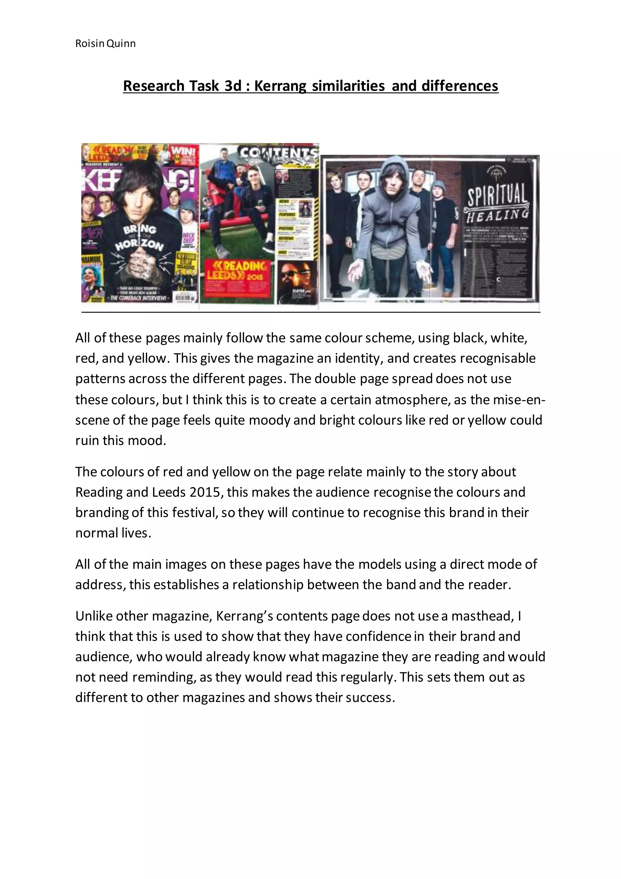
The document discusses the color scheme, images, and layout of the magazine Kerrang. It notes that the magazine primarily uses black, white, red, and yellow colors to create an identifiable style across pages. A double page spread does not use these colors to establish a moody atmosphere. Images on the pages feature band members directly addressing the reader to build a relationship between artists and fans. Unlike other magazines, Kerrang does not include a masthead because its loyal audience already recognizes the brand without needing to be reminded.